
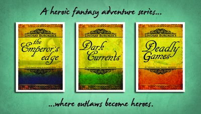
Adventures in Business Card Creation
Even though I've been thinking of self-publishing as a business from the beginning (it's hard not to when you have start-up costs such as editing and cover art design), it's taken me an unforgivably long time to have business cards designed. As some of you know, I've been traveling for the last couple of months, and there have been a lot of instances where someone has asked what I do and then wanted to check out my books. Too bad I didn't have a card to give them…
Well, that is soon to be remedied. Syd Gill, a writer and designer I met on Twitter, has hooked me up with business card designs. I ordered the first batch of 1,000 from GotPrint, and they'll be waiting for me when I get home.
1,000 cards, you say? Whatever will an author do with that many? Well, I bet I'll find uses for them. I can hand them out to everyone I meet out in the real world (hey, you never know when that lady with the doberman at the dog park will be a fantasy fan), give them to folks at conventions or workshops, and even drop them into the "free lunch drawing" bowls at sandwich shops.
For those who are curious, here is the design for the front and back of my cards:

Syd was also kind enough to offer some tips for those who are designing their own cards:
Business cards should make an instant statement, actually you may only have an instant to get recognized. In a pile of cards if your card stands out you're ahead of the pack. To design your own business cards, here are a few tips to remember:
Card Stock & Shape: If you want to stand out, you want your card to stand out in a stack of cards. Rounded corners, square cards, even lip shaped cards are an option these days. If that's not your cup of tea, choose a heavier paper weight to give you that edge. Personally, I love a heavy paper weight square card I can leave lying round, especially at restaurants — it almost looks like a coaster!
Keep It Simple Stupid: This hasn't ever been more relevant. Do not try to "over design" your card with graphics and symbols and every wonderfully clever line you've ever written. The pertinent information (email/web address/etc.) plus a clever little tagline that represents your writing is about all you really need. Any other further elements you add to the cards should be added carefully and with a distinct purpose (such as cover images).
Typeface Over Graphics: A beautifully designed card will be cleverly designed with typeface as the major player. Invest some time into searching for the right typeface. Many free fonts for commercial use may be found at http://www.dafont.com/ or http://new.myfonts.com/.
QR Codes: Paper business cards are not obsolete just yet, but rolodex's just aren't the standard desk art they used to be. You can make an initial statement with your pretty card, but to get your information into the hands of agents/publishers/readers, you need to make it easy and…electronic. This is where QR codes come in. With the availability and affordability of smartphones, many people will have the ability to scan your QR code directly to their phone. Make sure you use a QR code generator that allows the user to download your v-card/me-card from a URL as opposed to downloading the v-card/me-card directly as the more information stored on your QR code the more intricate it has to be and therefore harder to read by lower pixel smartphones.
Happy designing, guys!
If you're looking for a designer, Syd was a pleasure to work with and affordable to boot. Here's the link to her site again.
For more information on what an author business card should and shouldn't do for you, check out Robin Sullivan's post on the subject. She runs a small press and has plenty of experience with authors and business.
Related Posts:
No Related Posts


Lindsay Buroker

- Lindsay Buroker's profile
- 6198 followers

