
Setting the Type
Time for a letterpress update. As I mentinoed before, the project I'm working on is a broadside -- essentially a big piece of paper with some artwork and a few lines of text, the sort of thing you might frame and put on the wall. The text I've chosen is a quote from Evelyn Waugh's Paris Review interview. Click the photo below to enlarge, then see if you can figure out what it says:
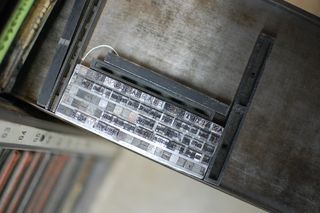
The type above is wrapped in string and sitting on a galley, which is a long, thin metal tray. It was set upside down, left to right, but you're getting to see it right side up, right to left. If that sentence confuses you, don't worry: you're normal. If it doesn't, you should be setting lead type.
Fortunately, there's a proof press that leaves an impression of the text on carbon paper for examination. In the photo below, I've placed the lino block on top of the proof to approximate the appearance of the finished broadside. Each one will be printed on white Crane's Lettra paper, which I cut down to size (10" x 10.25") on a special cutter. Now can you read the text?
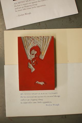
It reads: "An artist must be a reactionary. He has to stand out against the tenor of the age and not go flopping along; he must offer some little opposition." I could write a whole book unpacking that statement. But instead, I'm making a broadside. The book would probably take less time!
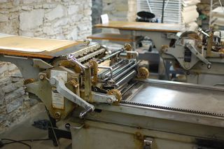
The next step is to ink up the press below, lock up the lino block, and run some prints to get the registration. Since the artwork will be printed in an ink called Dutch Fireball (Pantone 185) and the text in black, the sheets will have to go through twice. The trick is to line the two impressions up so that the artwork and text are in proper relation.
In other words, the fun is just about to begin. I'll share again once more progress has been made.


