Rebranding - Ins & Outs

Last week I shared the new outsides of the Sammy Keyes series. This week we look inside.
There's a lot that goes into the interior design of a book. A lot more than you might think. There are decisions regarding font, point size, margins, chapter headings, as well as little style touches.
In the case of the Sammy Keyes series, the interior style is pretty basic. Each of the 18 books begins with the word Prologue, followed by an enlarged point size and offset first sentence. These, as well as each chapter heading, are set in the same font that's used on the book covers: Expose.
There are bits of art from the cover design inserted sparsely throughout the book--usually to accentuate the beginning or end of a chapter--but the rest of each volume is simply text.
Those design choices resulted in an integrated look for the hardcovers. When the paperback covers started getting different artwork the designers bridged the looks by continuing to use the Expose font on the covers. Expose was the "Sammy Keyes font."
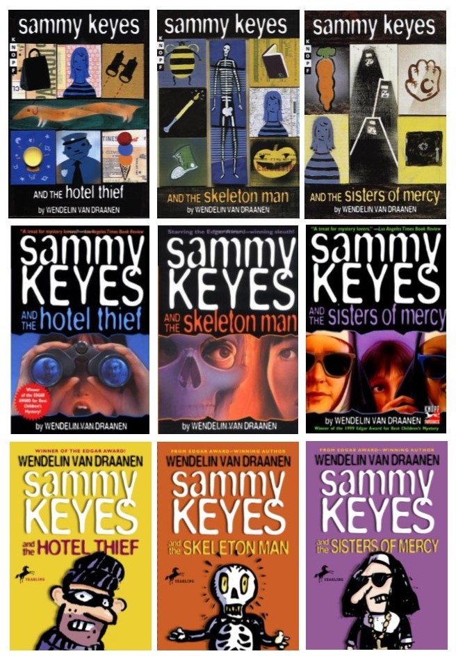
So the interior chapter headings and opening sentences still made sense, but once they moved away from the original art, the bits of art that echoed the hardcover jackets did not. Readers who'd only seen the paperbacks wouldn't understand the odd squares of different art, so why weren't they removed?
I asked, but the answer was kind of vague, and it didn't seem that crucial, so I just let it go.
But as the series progressed, some of the inserted squares of art in the interiors of new hardcover editions looked murky. Some were almost unrecognizable as art.
I was told they just weren't printing clearly on the paper that was now being used. That situation coupled with the weirdness of having the squares in the paperback pages led to the logical decision to stop adding them to the interior pages in upcoming titles. That is why, from Wedding Crasher (book 13) on, the bits of art no longer appeared past the Prologue page.
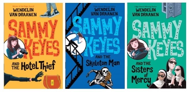
(The new font is hand lettered.)
This all relates to the new look in that the new paperback covers do not use Expose. After much discussion about the pros and cons, the design team decided they wanted to rebrand the whole series with a completely fresh look.
And yet, when I mentioned updating the interiors so that all the old art bits were removed and the chapter headings and opening lines were no longer in Expose, I got some worrisome news: They maybe, probably, couldn't do that.
WHAT? WHY?!?!
 Nancy (my editor) explained that the first books in the series were originated long enough ago that there were no digital files; the pages were on actual film, like negatives, and so it would be cost-prohibitive (and way too much work) to regenerate the books digitally.
 She gave me a little glimmer of hope, though, saying they would approach a different printer to see if there was any way around the situation.
This maybe-probably-not impacted more than just the style of the interior. It threw a monkey wrench into a decision I've been agonizing over for a couple of years: Should I take this opportunity to gently address text that might make the series seem dated? If interior changes were impossible, that option was off the table.
Fans of the series will recognize how important a decision to-tweak or not-to-tweak the text is. It has been truly agonizing! And I do plan to tell you all about it, but sharing that decision and the rationale behind it will make this post much too long.
Also, it's an ongoing, evolving situation.
So I'm afraid I'm leaving you with...
A cliffhanger!
Sorry, no peeking ahead possible. The story will continue next week. (And I will finish, but bring your flashlight - it may be a long night.)
Until then, thank you for stopping by. See you in the comments!


No comments have been added yet.