New Look for Sammy Keyes!
I am so excited for this week's post! Finally, finally, finally, I have new Sammy Keyes art to show you.
But first! From last weekend's post...our drawing winner is....Ashli B. from Ohio! (Congratulations on your Charmin' good luck. Your box of Lincoln Jones goodies will ship out on Monday.)
(Did y'all, uh, snicker about the "Charmin' good luck"? No? Well, go read Lincoln Jones--it's magically delicious!)
Okay, okay. I feel like I tapped the mic, read last week's minutes, got sidetracked, and lost my grip.
But what else is new, right?
Wendelin! FOCUS!
Right, right! Sorry! I'm just excited!! And honestly, I don't know where to begin. Some of you have been reading this blog since I first started soliciting your input regarding new Sammy Keyes artwork, and you have probably wondered, what the heck ever happened with that? Well, it's a huge thing, redoing the art of 18 books! And in the end, it's a business decision. Do sales--past and future--warrant an investment in new art? And, if so, what is the purpose for the investment, and how will the new art serve that purpose?
It's not unusual for books to get a "refreshed" look periodically, and having multiple looks across the life of a series is pretty normal. I've been told that Sammy having the same art/artist for all 18 hardcovers was very unusual.
Here's a post from back in 2014, where I was trying to get a bead on the direction the art should take once the series was complete. The dilemma with Sammy Keyes is that she doesn't fit neatly into "Middle Grade" (8-12 yrs) or "Young Adult" (12 yrs & up, but more realistically, 14 yrs & up). Sammy is edgy, funny, irreverent, and not obsessed with boys. And she deals with stuff like meth labs, buried bodies, gangs, and seriously scary adults.

I personally wanted the new art to move in a more realistically rendered direction (as proposed in that linked post). And, because her name can confuse the uninitiated, I wanted the new art to make clear that Sammy is a girl.
So for a good year I gathered input from booksellers and kids at schools and people here and online. One of the crucial questions I posed was, where do you think Sammy should be shelved? YA, or MG? It makes a huge difference in bookstores and in schools.
The data was pretty evenly divided...which reflects the situation with middle school itself: it's that transitional ground between childhood and near adulthood.
Here's what finally came down as the reality of current trends: Realistic covers are for YA books, and although Sammys are read by a wide range of ages, the books belong on shelves accessible to kids younger than 14.
Realistic was out.
I was bummed.
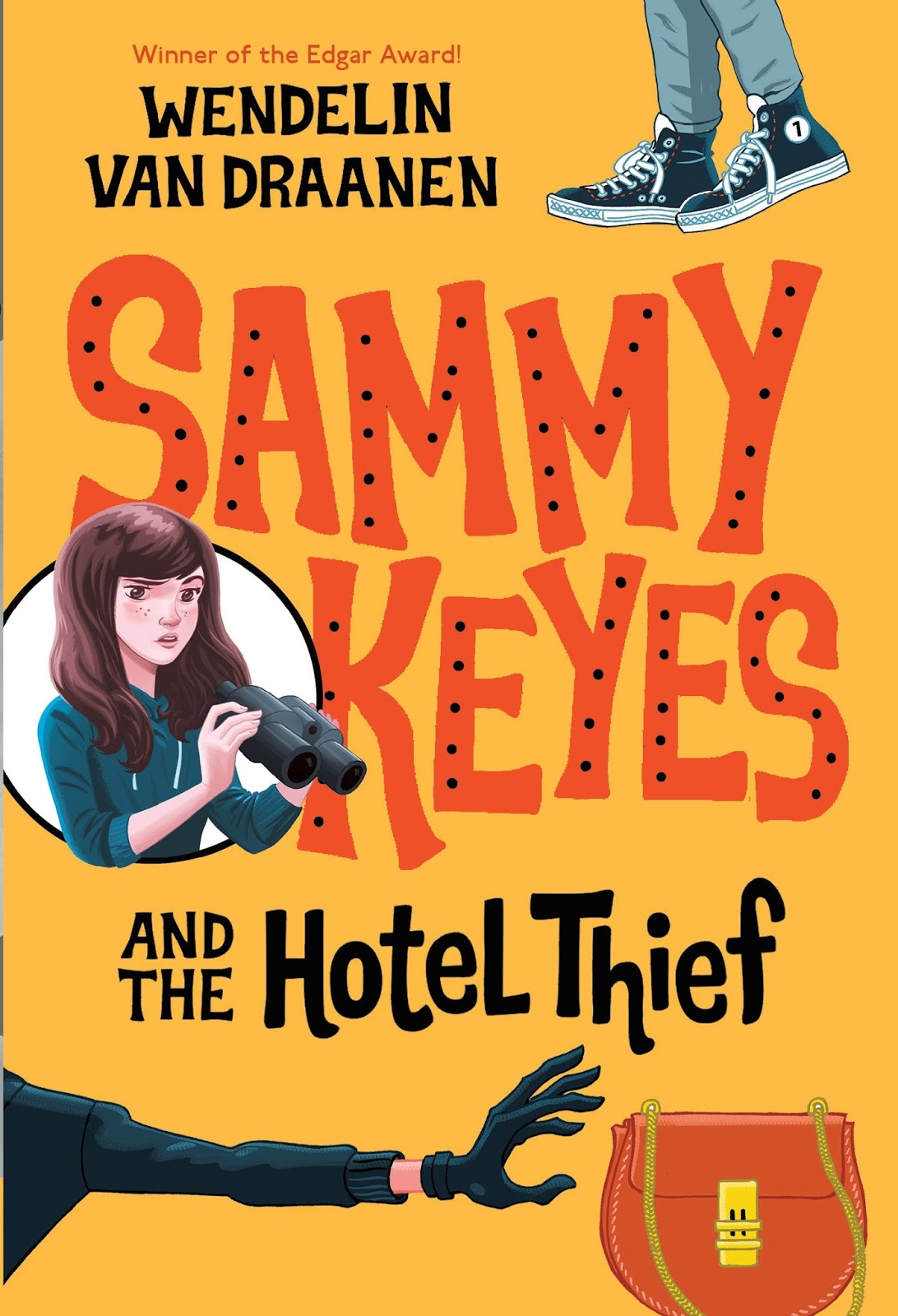
And then I was shown some preliminary sketches done by New Zealand artist Craig Phillips.
And I got a whole lot less bummed in a hurry.

The new look still had humor, but there was also an edginess to it. And a girl! I know we all have our own picture of what Sammy looks like, and that was the goal. We wanted readers to picture her their way.
So after all this time, seeing Sammy on these covers is a little strange. And it may not match the Sammy you see in your head, but give it time. I hope you can adjust and learn to like this new art as much as I do.
A couple of other quick things:
One of the many questions I asked when collecting data was...should the books be numbered? Again, the answers were evenly divided. Readers edged toward yes, but booksellers edged toward no. And really, although it's best to read the series in order, I wrote them so you don't have to. So if the title you have in front of you is, say, Hollywood Mummy, don't think you have to find the previous five books before you read it. Open it up, get on that bus to Hollywood, and go!
So, again, the team at Random House concluded: No numbers.
Only this time I countered with an idea that originated in the comments of this blog:
Hide the numbers in the art.
And guess what, guys? That's exactly what they're doing! Some of the numbers are easy to spot, some are a little more challenging. (I've seen art for the first 8 books but I can only share 3 at this time.) I think hidden numbers are super fun, and I just love that the idea originated here. (Yes, okay, go find them. Then come back and read the rest of the post.)
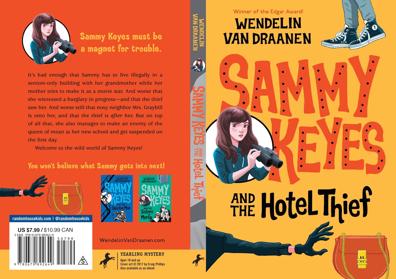
The other thing that I'm crazy nutso happy about is the spines. There's a piece of art (to remain unnamed) that will span the width of the series. When you have the (secretly numbered) books on the shelf, spines out in the proper order, an image is created behind the spines' titles and text. It's like putting together a puzzle. Very appropriate for Sammy Keyes! I'm including the full span art of Hotel Thief so you can see its spine and get a taste for it.
There's a ton more to share, but this is probably enough for one post. But I promise to be back next weekend with more!
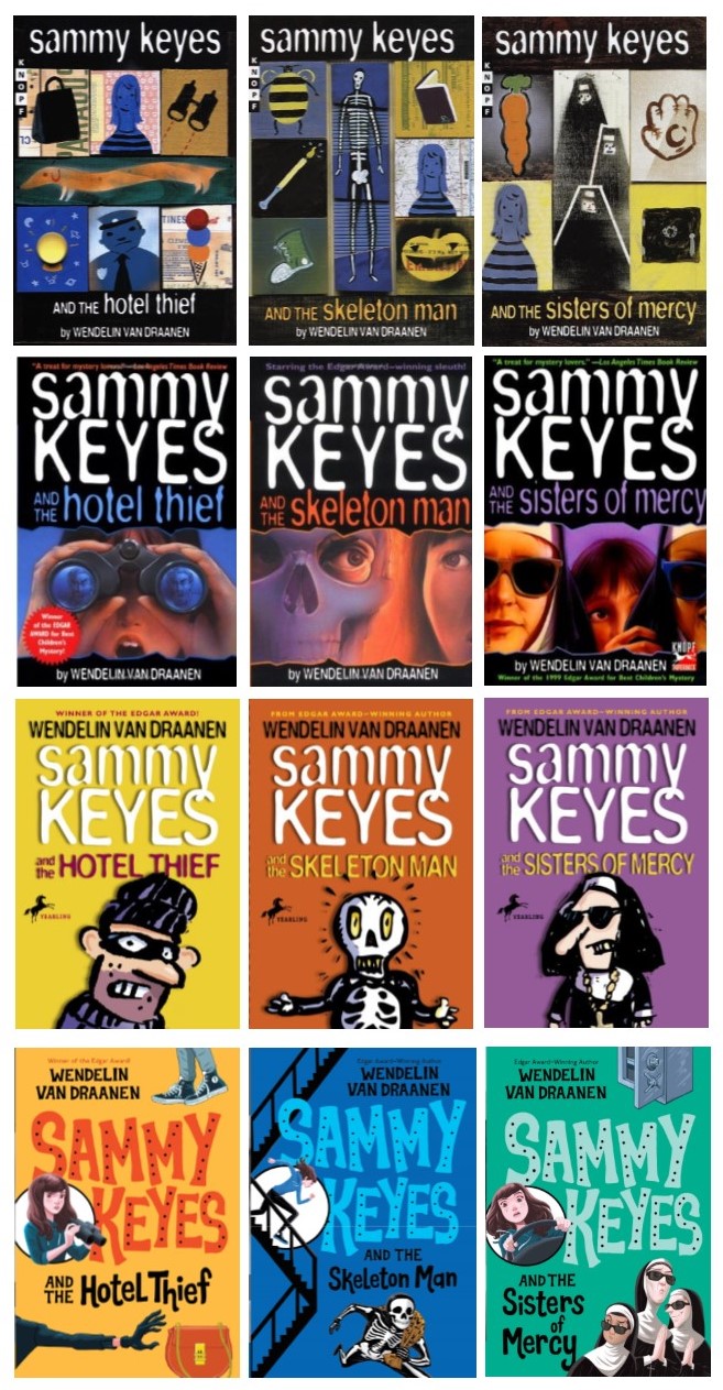
Meanwhile, thanks so much for checking in, (And for those of you who have been waiting years for this post, thank you for your patience and steadfast loyalty.) I will leave you with a compilation of the first three Sammy paperback covers over time, from the original puzzle-piece art (which was only out in paperback for a short time), to the realistic interim art (lasted about 8 books, after which it was replaced by) the "cartoony" art (which was available up to but not including the very last book), to the upcoming art (to be released beginning May 2nd).
So...what do you think? I'm looking forward to hearing your thoughts. See you in the comments!


No comments have been added yet.