
Inside the updated look for my BEHOLDER series
Now, I know some folks like to see the ‘inside story’ on how this stuff happens, so I’ll fill you in on the process before showing you the final.
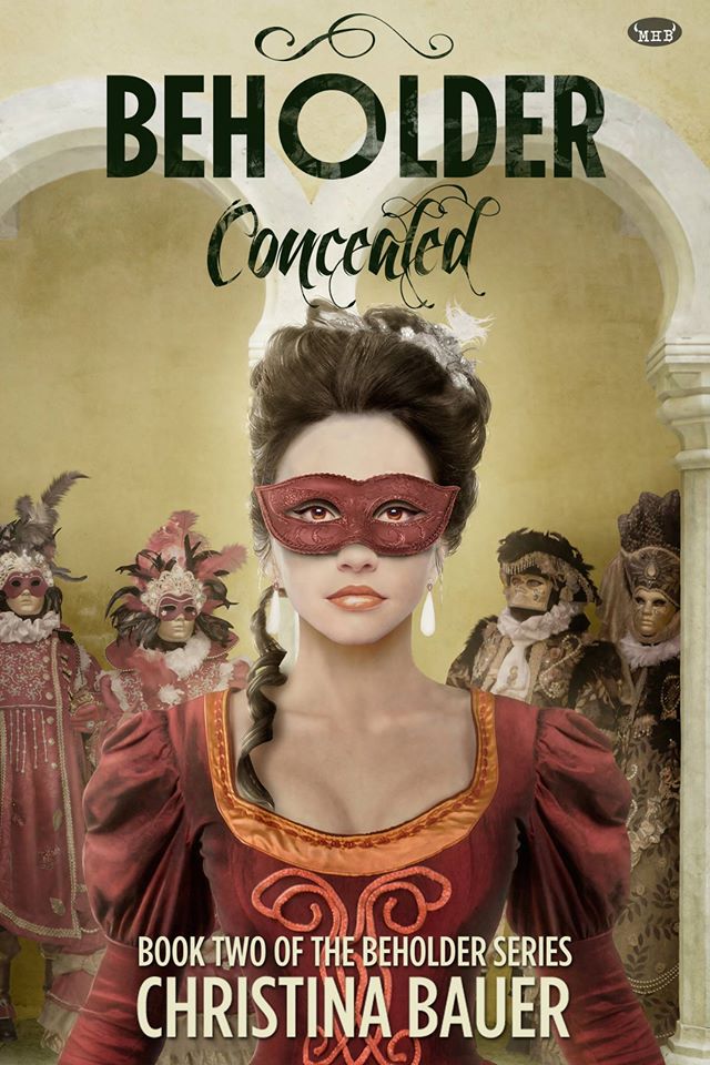
Step 1
We start with the CONCEALED cover, since this is the one that seems to cause the most questions. Here it is in original format:
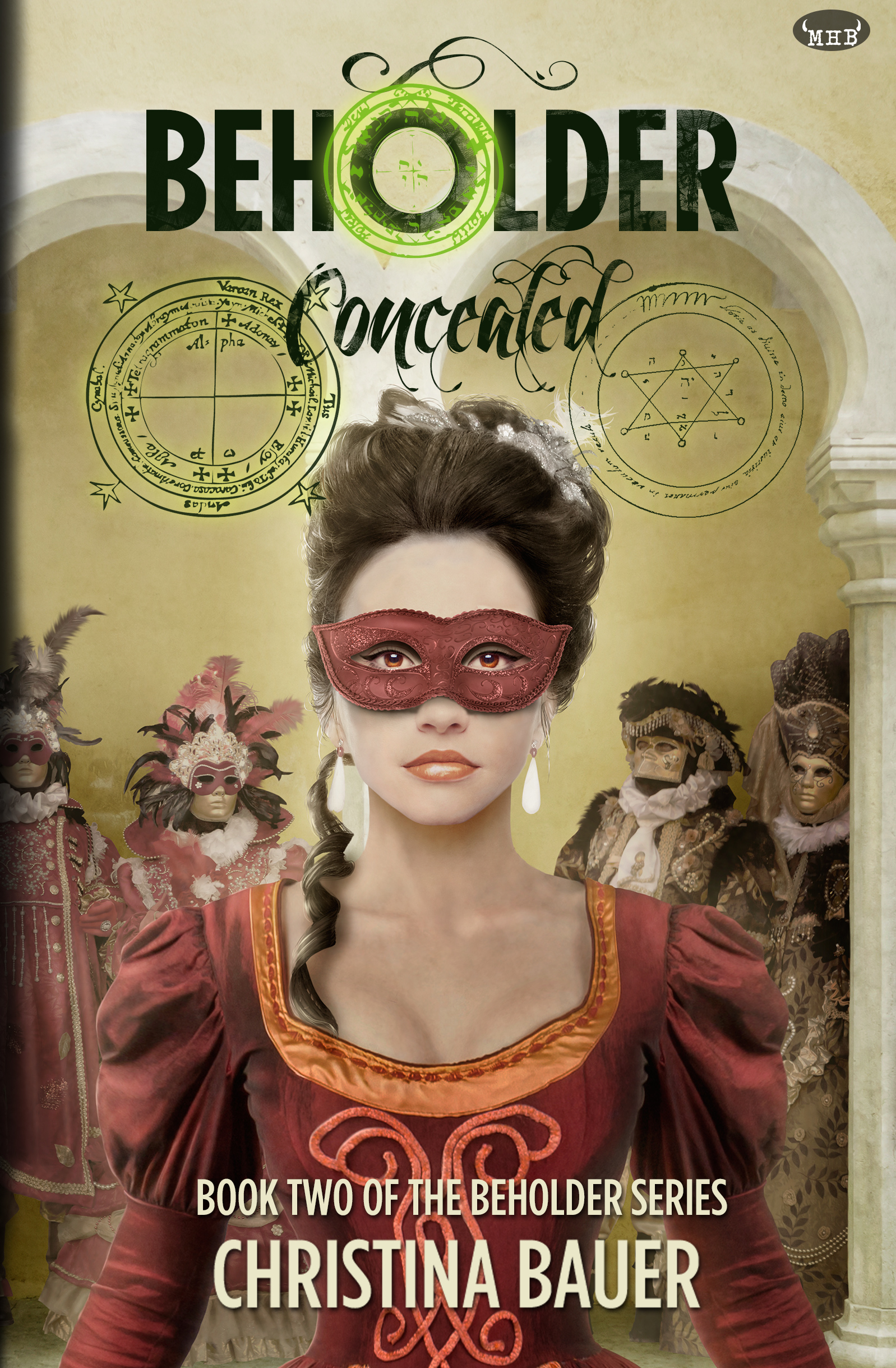
Step 2
I ask our designer to add some witchy looking icons. The result is partly cool, partly an explosion of neon. Also, the images don’t say ‘occult’ to me.
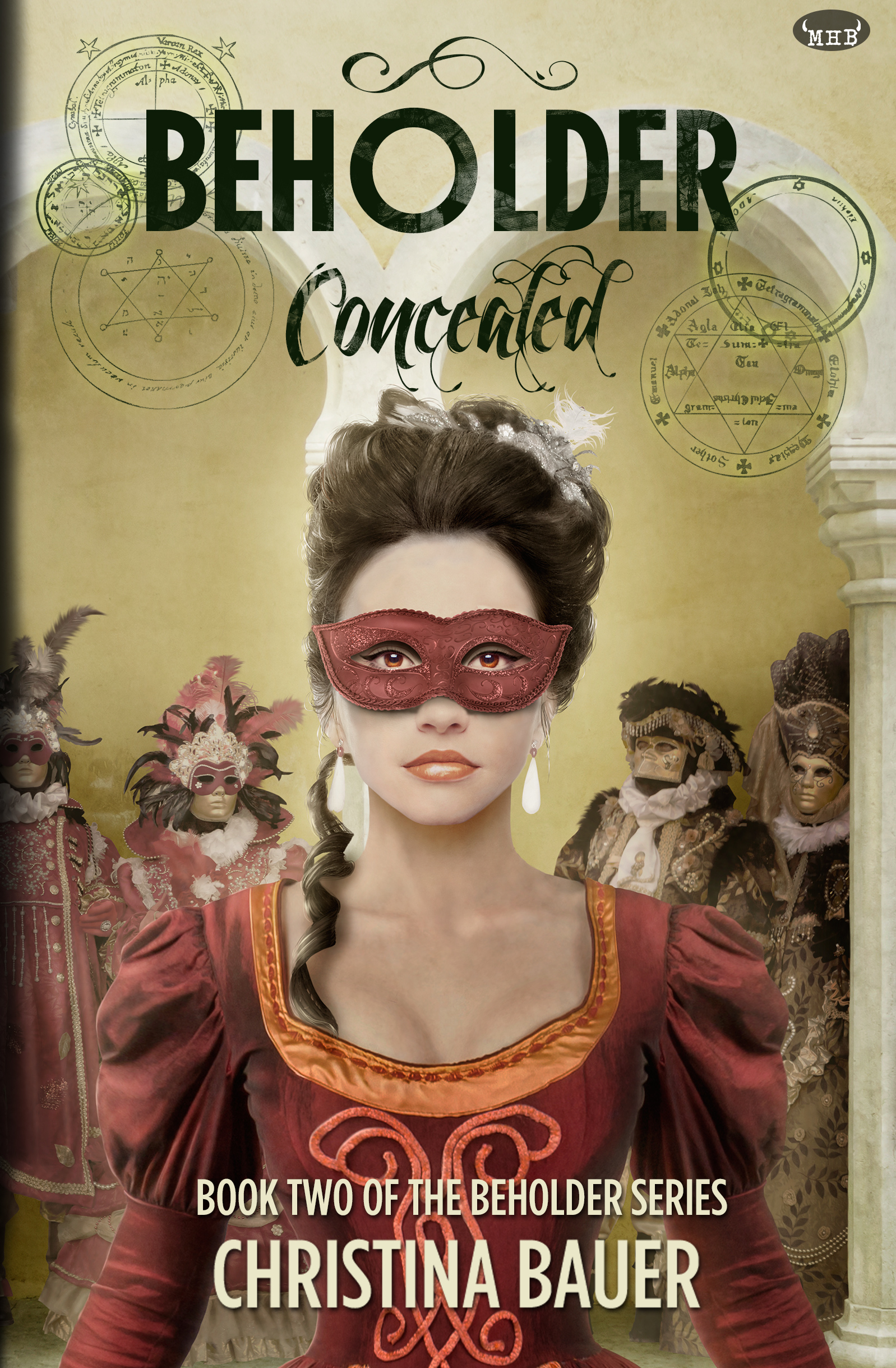
Step 3
Where we get more icons, lose the neon and still don’t necessarily say ‘occult.’
Step 4:
Where the designer decides to have some green blood drip everywhere.
Ah, no.
After this, I sent along a powerpoint of occult images so we could get something else going.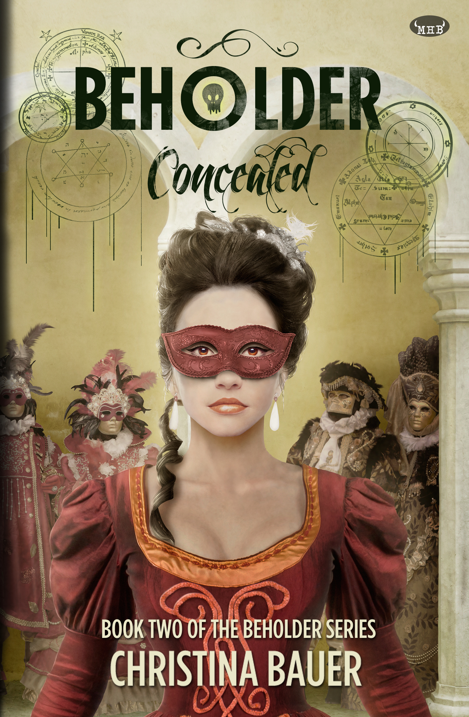
Step 5
Where we lose the drips and fine-tune the images. Huzzah!
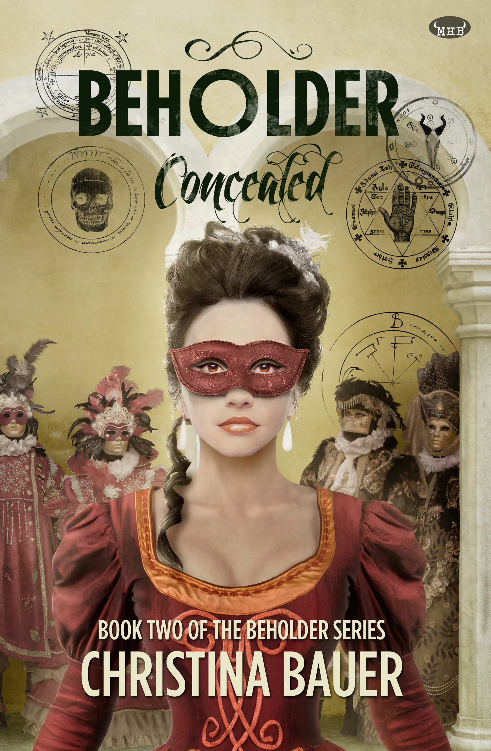
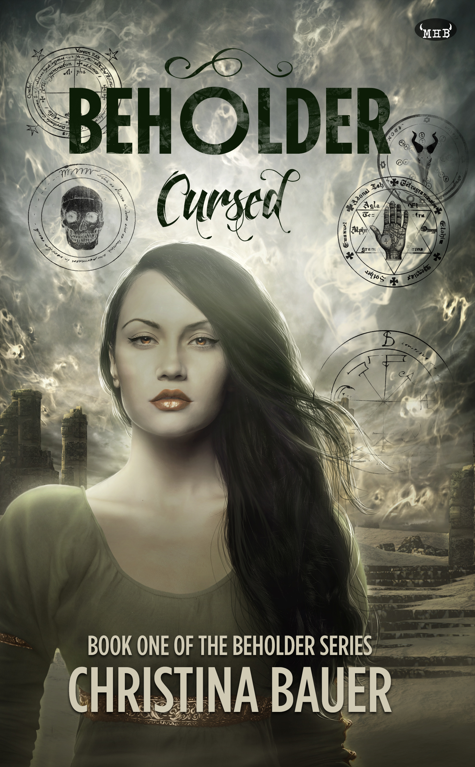
And here are all the currently-released covers! Occult me, baby!

The post Inside the updated look for my BEHOLDER series appeared first on Monster House Books.


