
Preventing Developer Conflict in Web Design: An Everyday Guide

When faced with tight timelines, collaboration can turn catastrophic.
Trying to keep designers and developers on the same page is hard enough. Throw them in a room with a website that needs to be up and running pronto and you may want to duck for cover.
So how can you design quickly and seamlessly and still end up with a world-class website at the end?
In this guide, designers will get everyday tips for less collaboration headaches. All the advice draws from all the successes and issues I’ve experienced in the past decade as a web designer and developer.
1. Master Responsive Design in Grid Systems
You’re probably not new to the idea of grid systems. The issue that I face as a developer is when designers fall short on implementing responsive grids.
Set specific grid widths
Let’s get technical: it’s helpful to start with a specific width to your grid and to know the exact gutter size for each part of the grid. Having this up-front will unify your design and keep you from making repeated minor adjustments.
When you turn this over to your dev team, you want it to look spot-on. If you set a padding of 15 pixels, it should be exactly 15 pixels. If your grid should be 1,000 pixels wide in its entirety, it should be exactly a 1,000 pixels wide. While responsive design means it should work well on any type of device and any type of system, it’s important to have a solid starting point.
Don’t leave guesswork for mobile views
Everything looks beautiful, but wait…what about the mobile view?
As a developer, I’m often in the position where I have to completely make up the mobile view. I end up interpreting the design intent and making decisions on my own to make it work well.
Designers should have a good understanding of how responsive grid systems work.
To better collaborate on a project, a designer can imply on the desktop design the mobile stacking order. If time allows, it’s extremely helpful to provide a high-fidelity mockup of the mobile view as well. Providing a mobile view will allow you to get a better interpretation of your design intent in the final product.

Sometimes using a desktop-based grid system to design a mobile view doesn’t make sense. This is often the case with wide user interface elements, which typically don’t compress well when put on mobile devices.
Another example of incompatibility between desktop and mobile interfaces is the standard timeline UI element.

It works wonderfully on a desktop, and gives a great representation of where you are, where you’ve been, and where you’re going to go. It’s a clear pattern that’s frequently seen. However, what about on mobile? The pattern falls apart.
As a designer, you need to solve these issues so your developer isn’t coming up with weird ideas that conflict with with your intent.
2. Use Modern Tools For Accurate Representation
Don’t be too shocked, but Photoshop is not the best tool for building modern websites.
As a developer, I’m often handed Photoshop high-fidelity mockups. Unfortunately, Photoshop mocks can create problems when a developer needs to build the actual site. Photoshop lacks the precision and accuracy developers crave and need.
Font consistency
First, font consistency from Photoshop to the web does not exist.
Often, the fonts I’m working with on a Photoshop file are completely off. They may be bolder, a heavier weight, or rendered in a different way. The high-fidelity mocks rarely show an accurate representation. Even open-source fonts may look different when rendered in Photoshop.
As a designer, you’ll need to adjust the design based on font weights. When they’re not accurately represented, you’re making decisions based on data or a visual representation of the font that is going to be inconsistent. The design will likely look weird or slightly off-brand when built out.
Performance concerns
Another aspect of pixel perfect representation relates to the way designers create most Photoshop files for the web.
Let’s use drop shadows as an example.
Photoshop includes gorgeous drop shadows. Designers have a lot of flexibility when they create shadows, as well as masks and other design elements. But when a developer recreates those on the web, the options are far more limited.
When a developer is creating a website’s front end, he or she is very concerned about performance. Any time they need to use a huge image representation like a translucent or transparent 24-bit PNG to represent some stylistic UI element, the site will take longer to load. Multiply this times hundreds of components and your site is going to be very laggy.
The ideal solution is to recreate drop shadows with CSS.
You can create many effects with CSS, including drop shadows. If a developer can use CSS to make shadows instead of embedding one in a PNG, he or she will. On the plus side, CSS is more lightweight, allowing you to get assets down to a much smaller size. On the down side, typography and drop shadows won’t look identical to those created in CSS.

One of the images above is a transparent PNG. The other is a SVG.
Although they’re visually identical, the PNG weighs 12.3k while the SVG is only 1.7k. Also, the shadow on the SVG can be articulated and will always blend correctly. If you change the background color on a transparent PNG, you can get artifacts where the background color blends into the alpha channel, often creating rings or halos around other elements.
CSS, FTW.
Consider Photoshop alternatives
Regardless of what tool you choose to use, I think it’s clear that Photoshop isn’t the best tool for the job. I prefer to use Bohemian Coding Sketch 3.
Now, Bohemian Coding Sketch 3 has its own bugs and funky features. However, it’s exceptional for maintaining design consistency.
Sketch allows you to quickly and easily get pixel-perfect representation. Using it ensures your fonts and drop shadows will render as if they were done in CSS. Plus, these values are so accurate, it’s possible to copy and paste the CSS so there’s no guesswork or interpretation between the design you’ve created and the final design that’s created with HTML and CSS.
Using modern tools that allow you to be pixel perfect and create accurate representations of your project will ensure your design intent comes through in the final product, making your job easier and taking some of the burden off of your developer teammates.
For further clarity, I’ll sometimes import my Sketch mockups into UXPin to prototype each layer. At that point, developers can see how the design works, not just how it looks.

3. Consistency Rules the Day
Consistency in margins, fonts, and lines all reduce frustration during fast-paced projects.
Plus, limiting font sizes, weights, letter spacing, and line heights is usually an important part of good design. Below are some specific tips for dealing with these aspects of web design.
Margins
This is a simple one. Round off margins and padding to the nearest five wherever possible. Rather than using 13 and 17 pixels, use 10, 15, or 20. This keeps everything neat and orderly from both design and a development perspectives.
Line Heights
Consistent line height improves readability.
If you use a program like Photoshop with standards for print line heights, you’ll encounter readability issues. Plus, the 1.2 line height (20% greater than the height of the font) isn’t consistent with how design is typically implemented on the modern web. This can be problematic for developers and end-users.
Many websites use a 1.5 or 1.6 line height for maximum readability. It makes a lot of sense for most body text and should consistently be used during the design process to ensure a developer doesn’t need to reinterpret a design. Now, a 1.2 line height can look great for a lot of headlines, which is fine.
The rule, though, is consistency. If your goal is to have headlines with line heights of 1.2 and body text with line heights of 1.5, your high fidelity mockup or prototype should clearly indicate this so that the final build accurately represents your design.
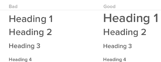
Font Sizes and Letter Spacing
Limit yourself to using three or four specific sizes, five at the most.
Responsive frameworks such as Bootstrap or ZURB Foundation typically have these sizes specified. Plus, they also have mobile versions that allow you to render headline fonts in a slightly smaller size. When designing, lock down these heights.
When creating headlines, use nice round numbers. A medley of headlines with one at 40 pixels and another 42, one at 38 and another 38.5 can be confusing. Keep headlines looking sharp with round numbers and consistency from page to page.
The same principle applies to letter spacing. Letter spacing can make your headlines pop with great typography. To keep developers off your back, choose a standard for letter spacing for all elements.
Font Weights
From a developer’s perspective, every weight a designer adds increases the time to download a font.
This is true in regards to Google Fonts, Adobe Typekit, and every other font source. Every additional weight takes extra time to download. How much time? Two font weights doubles the load time. The slower the site loads, the slower the experience feels.
I recommend using font weights and rendering sparingly. Designers should ask themselves, “Can this design be accomplished with fewer weights? Can it be done with three instead of five weights?”
Using fewer weights makes a project simpler to execute and keeps it lighter, which improves the user experience by speeding load time on mobile devices and other platforms.
Grab design ebooks created by best designers
All for free
 Download
 Download
 Download
 DownloadDo you want to know more about UI Design?
Download 'The Designer’s Guide to Collaborating With Developers' FOR FREE!
Download e-book for freeClose4. Clear, Concise Communication: Collaborative Prototypes
When I’ve worked on projects without a collaborative prototype, communication becomes a mess of meetings, phone calls, and scribbled notes (possibly with coffee stains). Not to mention, the documentation grows out of control as PMs and designers struggle to clearly convey their concepts.

Annotated wireframe PDF from hell.
Here’s a useful process for improving clarity while reducing documentation:
At the start of a project, suggest that the documentation acts as a knowledge hub rather than encyclopedia. For example, as Autodesk shows below, lay out the basic design and technical principles, then link out to additional tools where the most updated builds will live. Depending on the tool, you can then mark up the designs and builds for contextual documentation.

Product Requirements Document created in UXPin by Autodesk
Once you start the project, create user flows to plan out the interactions for the whole system. As Autodesk shows below, add notes that describe key moments in the experience. Developers and PMs can now better understand how the pieces all fit together.

Annotated user flow created in UXPin by Autodesk
Once you’ve discussed and iterated the user flows, you want to actually demonstrate the experience. Create a lo-fi prototype and add notes for developers in the margins.
5. Don’t Rule Out Desktop-First
About 95% of the projects I work on are what I would call ‘Desktop First’. Designers think about the web interface, design and interaction from the desktop perspective first.
This is opposed to mobile first, which is a great philosophy and a good way to approach mobile web products. However, the reality is it’s very difficult to accomplish in a meaningful way. Because of this, designers shouldn’t rule out designing for a desktop persona.
Once you know you’re working desktop-first, and if you have an existing audience, you can use Google Analytics to identify the approximate screen size of the bulk of your traffic. You might find that for your particular project, you should design for a 13-inch retina MacBook Pro or possibly a 15-inch variant. Maybe the most popular screen size is some sort of 12-inch netbook.
This information lets you know how your audience is viewing your content and how to design it so it looks best on their screens.
Think about the breakpoint where your design will look great and fall short. Try to understand in a general sense how breakpoints and media queries work hand-in-hand with responsive design.
6. Pay Close Attention to Asset Handoff
Handing over an asset can be simple, or it can be full of back-and-forth communication attempting to get an asset working properly.
Should they be Progressive JPEG? Compressed at what amount? Should they be an SVG? How can SVGs be optimized? How should those SVGs be created?
Let’s say a designer uses a random bunch of differently-sized icons.

A developer will need to generate a bunch of SVGs. Although they are very performant, the SVGs will have different heights. If they’re aligned to the top or bottom of the screen, they won’t look consistent. As a result, the developer needs to redo all of the assets or create a slew of specific CSS code for each inconsistency.
To avoid unnecessary work, ask about the most useful file type as early as possible.
Next Steps
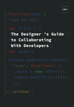
If you found these tips useful, check out the free Designer’s Guide to Collaborating With Developers.
The e-book offers tips for simpler handoffs: visual hygiene, style guides, browser fallbacks, responsive mockups, and more.

The post Preventing Developer Conflict in Web Design: An Everyday Guide appeared first on Studio by UXPin.


UXpin's Blog

- UXpin's profile
- 68 followers

