
An Early Image for Sascha Martin's Time Machine, and a Layout Decision for Kindle
The beginning of a picture-book. This is Manuela’s super-quick, pre-storyboard sketch to accompany a verse in Sascha Martin’s Time Machine.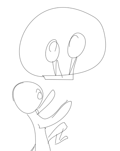
It looks so simple, and of course it is. But take a closer look and you'll begin to appreciate the art in that simplicity, and how almost half the image is drawn in a single, fluid line.
A quick squiggle it may be but it’s a place-holder, too, visual short-hand for a scene that’s fully visualised in Manuela's mind.
When Manuela looks at this sketch, it's that finished picture that she sees.
And as the writer, looking here, I can picture what it was that I had in mind. Manuela has captured, in a few quick lines, exactly what I wanted to say. It's why I'm in awe of the illustrator's art.
Laying Out the Book on Kindle
It’s a happy accident for Manuela and I, in designing a children’s book both for print and for Kindle devices, that we settled originally on a print size of 8 inches by 10 inches, because Kindle eReaders, and Kindle Fire tablets, are moving to a screen size that happily matches what we want to do.
Kindle’s aspect ratio (the relationship between its screen width and its screen height) is 10:16 - ten units wide and 16 units high. If we rotate the device and view it in landscape orientation, we reverse that ratio - now it’s 16:10, so we have a width of 16 units, and a height of 10. This means that two of our pages (which are each 8 units wide and 10 units high) will sit comfortably side by side.
That makes it much easier to display spreads, a spread being just a single image drawn across two facing pages. Two facing pages are precisely what each “page” of the Kindle will display.
 By comparison, in our Kindle edition of Sascha Martin’s Rocket-Ship, the two halves of each spread appear on individual pages in portrait orientation, and they can only be viewed one at a time. You can swipe back and forth to see how they ought to join up, but the impact of the broader image is diminished nevertheless.
Viewing two pages side by side on the Kindle solves one problem, but it creates others (as solutions often do). Children (and parents) need to be able to make out all the details in a picture-book, and read all of the text. But our Kindle pages will be much reduced in size, since each is allocated only half the screen, and this will make it so much harder to read them.
To resolve this dilemma, we’ll be experimenting this time round with Kindle’s interactive features for magnifying text and images (and for doing so much more besides). As our guide in this endeavour we’ll be using How To Make Kindle Comics & Children's Books by R. Scot Johns.
The features we need to make our eBook readable will only work on Kindle hardware, unfortunately. They won’t work on Kindle apps for other platforms.
So I’ve finally had to order a real live Kindle device, which will arrive this week. I chose a Fire tablet because it makes full use of colour, which the Kindle readers don’t, but otherwise renders books in the manner of any Kindle device.
Till the tablet arrives I can’t do any testing of Kindle-specific features, so I’ll report on progress in the next post.


Developing a Children's Picture Book

- John Arthur Nichol's profile
- 6 followers

