
John Arthur Nichol's Blog: Developing a Children's Picture Book
October 9, 2016
Sascha Martin's Time Machine: The Storyboard Develops
Well we're certainly storyboarding in earnest now for Sascha Martin's Time Machine. The files are flying back and forth between Sydney and Sant'Antioco.
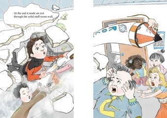
 As destruction rains down on the classroom, Mary-Alice Cooper sees her opportunity. This is a development of Manuela's sketch that I included with the post on August 28.
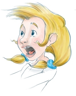
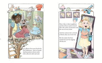
 Aggie discovers the jarring difference between academic knowledge and real life field research. But it doesn't deter her from sharing what she knows.
 Safe for the moment, Mary-Alice does what she does best, as Sascha struggles to fix the settings on his Time Machine.

 Sascha's efforts are to no avail. Chaos, panic and destruction engulf the school.
And order is restored at last ... or is it?


September 16, 2016
Sascha Martin’s Time Machine: Moping, Maps and Megafauna
 I'm not really moping, of course, but progress does seem very slow at the moment. Time is dragging, but it's also racing away from me.
On the other hand, I know that Manuela is very busy behind the scenes and across the sea, working to design the map of Sascha's world that has to exist before she can even begin storyboarding our second book.
The map has its own separate project home at 99Designs, because it will form the backdrop for all subsequent books in the series, and while Sascha's school may be the epicentre each time, the catastrophe inevitably overflows into the surrounding area.
For the time machine disaster, Manuela's eye-in-the-sky will show the catastrophe in broad strokes and fine detail.
She's also designing Sascha's school crest.
In between, this overworked illustrator is finalising changes to the latest version of Sascha Martin's Rocket-Ship, a new edition that features our connection with record-breaking Australian rocketeer, Samantha Ridgeway.
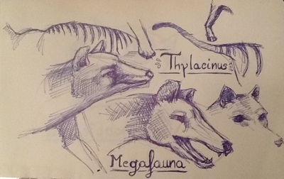
And finally, in her spare time, Manuela's warming up her drawing hand to deal with Australian Pleistocene megafauna. At the top of this post is a page of preliminary sketches of Thylacine, the striped marsupial hunter which, though itself not strictly one of the megafauna, certainly lived alongside them and was a descendant of giants.
September 9, 2016
Sascha Martin’s Time Machine: Designing the Characters
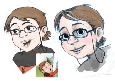
Even though we haven't reached the stage of character design, Manuela's already making changes to some of her creations.
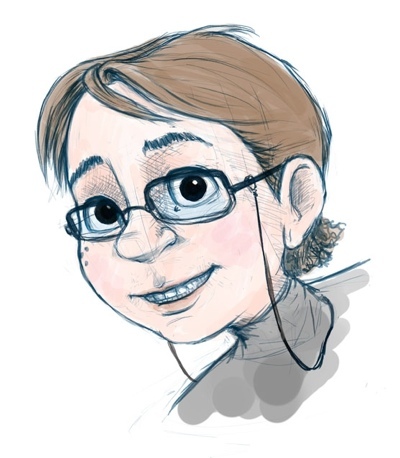 In the last post I previewed something of what she has in store for Sascha Martin himself, with a touch more depth added to his character and some tweaks to his mouth and eyes.
You might notice that his hair has changed as well in this picture. That's partly in preparation for the new persona he'll adopt to show off his latest invention at Show and Tell.
The new look involves not only a hair style change, but a complete new outfit to match.
 In the image above Sascha Martin is still wearing his outfit from the first book, Sascha Martin's Rocket-Ship ...
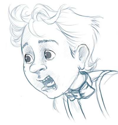
But in the second adventure, Sascha Martin's Time Machine, he's going to look something like this picture on the left.
I wonder if you can spot Manuela's reference to one of Sascha's all-time heroes from television ... who also happens to be one of hers!
Sascha's not alone in receiving an illustrator's overhaul for the new title. Mary-Alice Cooper has stormed back to the drawing-board (Manuela's Ugee 19 touch-screen graphics tablet) for a complete make-over.
Mary-Alice will also appear in a new outfit (of course!) but she won't be outdone by Sascha and insists on bringing more depth to her personality as well. No one's going to call Mary-Alice Cooper shallow!

September 3, 2016
Sascha Martin’s Time Machine: Mapping His Second Adventure
Sascha Martin’s Time Machine is an all-encompassing disaster for Sascha’s school.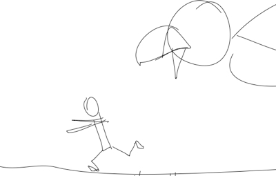
And the best way to show an all-encompassing disaster is from high above, where everything can be revealed in a single image.
We’ll have a spread or two that do just this, as well as lots of close-up images like this one, and the one below, showing how the characters react in their individual moments of truth.
But a bird's-eye view means we need a map … a map of the school, and a map of the area surrounding it, so that each element of Sascha’s latest catastrophe can be placed precisely within the overall chaos.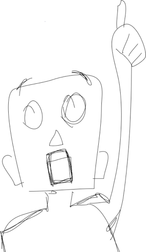
Sascha’s school is based on a typical Sydney public school with a mix of building types, asphalt playgrounds, grassed areas, and a playing field at the bottom called The Oval (despite its shape). The school’s surroundings, however, are quite fanciful. The school borders a creek that feeds into a river nearby, and there’s a big area of undeveloped land known locally as The Wilderness, which surrounds the homes of Sascha, Luca, and their non-friend Mary-Alice.
But there are streets and houses too, a park, the local shops. And a haunted house.
We want our map to be an artwork in itself, intriguing and wonderful and stirring to the imagination of children. It will span two pages, and in the Kindle version (free to anyone who buys the print edition), the map will be interactive: children can tap on sections to enlarge them, to find information, or even uncover details hidden beneath the map and its text.
That’s the plan, anyway. We're still discussing what to include and where to place each element of Sascha's world.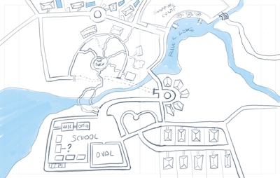
In the meantime, here's a preliminary sketch that I love by Manuela.
She's even included the snooty new-money area with cafe tables by the lake and backyard swimming pools; and you can tell her architectural background from the cool way she's drawn the houses.
Kindle Development Work: Region Magnification
Well, my Kindle Fire tablet arrived this week, and I’ve finally been able to begin experiments with the interactive features explained by R. Scot Johns in his eloquent tutorial, How To Make Kindle Comics & Children's Books.
Our picture-book, Sascha Martin’s Time Machine, will be displayed two pages at a time on a very small screen. Even the Fire tablet I’ve acquired (and it’s larger than Kindle e-readers), has less real-estate than an open paperback novel, let alone a large-format children’s picture-book spread. So if children and their parents are going to be able to read our book at all, we need to make it easy for them to enlarge the text.
R. Scot Johns explains this very well, and I’m pleased to be able to report that my experiments with magnified text are going very well indeed.
 The image here is of a spread from the first book, Sascha Martin’s Rocket-Ship, as it appears on the screen of the Kindle Fire. It’s a very small image (400 pixels is as wide as we can go at GoodReads) of a very small screen, so the text at its initial appearance is a challenge to make out.
The second image shows the same page with some of the text magnified. It’s much easier to read, even here in this tiny screenshot.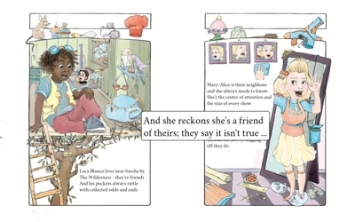 On the tablet screen, the magnified text is as clear as crystal, and it's just a matter of double-tapping on the piece you want to enlarge. Then you can swipe back and forth between the text boxes, each one magnifying automatically until you dismiss magnification with another double-tap.
Zooming text may be the simplest use of Kindle’s Region Magnification, as Mr Johns asserts, but it took me some time and a lot of focused effort to become relatively comfortable with it. I certainly haven’t mastered the technique, but I’m confident now that I can use it to make Sascha Martin's Adventures readable - and enjoyably so - on the Kindle platform.
Next post: Tweaking the Character - Manuela's changes to Sascha Martin.
August 28, 2016
An Early Image for Sascha Martin's Time Machine, and a Layout Decision for Kindle
The beginning of a picture-book. This is Manuela’s super-quick, pre-storyboard sketch to accompany a verse in Sascha Martin’s Time Machine.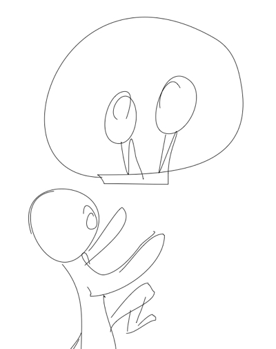
It looks so simple, and of course it is. But take a closer look and you'll begin to appreciate the art in that simplicity, and how almost half the image is drawn in a single, fluid line.
A quick squiggle it may be but it’s a place-holder, too, visual short-hand for a scene that’s fully visualised in Manuela's mind.
When Manuela looks at this sketch, it's that finished picture that she sees.
And as the writer, looking here, I can picture what it was that I had in mind. Manuela has captured, in a few quick lines, exactly what I wanted to say. It's why I'm in awe of the illustrator's art.
Laying Out the Book on Kindle
It’s a happy accident for Manuela and I, in designing a children’s book both for print and for Kindle devices, that we settled originally on a print size of 8 inches by 10 inches, because Kindle eReaders, and Kindle Fire tablets, are moving to a screen size that happily matches what we want to do.
Kindle’s aspect ratio (the relationship between its screen width and its screen height) is 10:16 - ten units wide and 16 units high. If we rotate the device and view it in landscape orientation, we reverse that ratio - now it’s 16:10, so we have a width of 16 units, and a height of 10. This means that two of our pages (which are each 8 units wide and 10 units high) will sit comfortably side by side.
That makes it much easier to display spreads, a spread being just a single image drawn across two facing pages. Two facing pages are precisely what each “page” of the Kindle will display.
 By comparison, in our Kindle edition of Sascha Martin’s Rocket-Ship, the two halves of each spread appear on individual pages in portrait orientation, and they can only be viewed one at a time. You can swipe back and forth to see how they ought to join up, but the impact of the broader image is diminished nevertheless.
Viewing two pages side by side on the Kindle solves one problem, but it creates others (as solutions often do). Children (and parents) need to be able to make out all the details in a picture-book, and read all of the text. But our Kindle pages will be much reduced in size, since each is allocated only half the screen, and this will make it so much harder to read them.
To resolve this dilemma, we’ll be experimenting this time round with Kindle’s interactive features for magnifying text and images (and for doing so much more besides). As our guide in this endeavour we’ll be using How To Make Kindle Comics & Children's Books by R. Scot Johns.
The features we need to make our eBook readable will only work on Kindle hardware, unfortunately. They won’t work on Kindle apps for other platforms.
So I’ve finally had to order a real live Kindle device, which will arrive this week. I chose a Fire tablet because it makes full use of colour, which the Kindle readers don’t, but otherwise renders books in the manner of any Kindle device.
Till the tablet arrives I can’t do any testing of Kindle-specific features, so I’ll report on progress in the next post.
August 20, 2016
Designing a Fixed Layout Childrens Book for Print and Kindle
When we designed Sascha Martin’s Rocket-Ship, we chose an 8” x 10” format for the print edition, because it was an industry-standard size that CreateSpace could produce easily.
For our fixed layout eBook we settled on a page size of 640 x 1024 pixels, based on a recommendation by Charles Spender in his book Formatting of Children's Books and Comics for the Kindle. It gave us a different aspect ratio of 10:16 for the eBook, compared with 8:10 for print. It displayed well because its ratio of 10:16 matches the screens of Kindle’s newer devices.
But it meant that Manuela, right from the very beginning, was designing pages not just for two different formats, but for two different layouts as well.
Manuela solved this problem by using guidelines on each page that showed where the Kindle image would sit within the larger print version. You can see the guides in this early sketch (above) that Manuela made for the cover. She kept all the text and all the essential imagery inside these guide lines, so that nothing vital would be lost in the narrower eBook format.
Extra, non-essential details filled the space outside the guidelines in the printed version.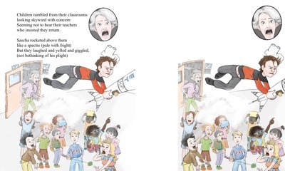
The image on the left shows a page from Sascha Martin's Rocket-Ship. You can see the two formats side by side, with the wider, print version on the left, and the narrower Kindle version on the right.
But now that we're starting a new project with Sascha Martin’s Time Machine we’re going to try something different. We’ll keep the print version at 8” x 10”, but this time the Kindle layout will use the same 8:10 aspect ratio with a page size of 1200 x 1500 pixels.
In practical terms this means that Manuela only needs to produce one set of drawings, which will work for both formats - no cropping necessary. But it also opens new possibilities for the way we handle the pages on Kindle, and particularly the spreads.
More on this in the next post.
August 19, 2016
Sascha Martin's Time Machine: The Work Begins
We’re just beginning work on the illustrations for Sascha Martin’s Time Machine. It’s the second book in the series, following Sascha Martin’s Rocket-Ship, and it will probably be a year’s work to arrive at the finished product.
The illustrator is Manuela Pentangelo, and she lives on the other side of the world from me, in a town called Sant’Antioco on the island of the same name. Sant’Antioco is just off the coast of Sardinia.
We communicate, of course, via the internet, sending ideas and images and comments back and forth on a service called 99Designs. Sometimes that doesn’t work, and for really big uploads we have to use something else.
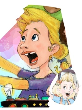
The image at left is the one that brought Manuela and I together. I'd launched a design contest for the cover illustration, and this was Manuela's entry. I loved it!
I wanted to share the process with readers and authors this time around, because it was such an eye-opening experience for me to work with an illustrator, and I’ve learnt so much along the way - about picture books, about working with an illustrator, about designing for print and for a digital platform at the same time.
The Sascha Martin books are more text-heavy than your average picture book, so it’s a tricky process to fit them into the format. We exceed the usual picture-book page-count of 24 or 32 pages, but we’re trying to keep it down to 40. It was hard to do this with Sascha Martin’s Rocket-Ship, and the text of Sascha Martin’s Time Machine is even longer.
So this time round we’re playing more with the words and pictures, and seeing how the images can step up and take over the narrative role in parts of the book. This is hard for me, as the writer, because I love creating Sascha Martin’s disasters and catastrophes, and I use verse to do it. Every verse removed is like throwing out a piece of the story - only it won’t turn out that way, because Manuela’s pictures will put those parts of the story back, visually.
I’m also thinking about the eBook version, and how features available on the digital platform can enhance the story we’re telling in print. When someone buys the print edition they’ll get the eBook version free, so it’s like a bonus feature full of … bonus features!
But we have to work out how to use it.
The first thing Manuela does when she’s starting work on my book (once she’s over the shock of just how much text she has to work with) is to cut the text into sections that roughly match the number of pages we’re aiming for - in this case, about 40. As soon as she starts reading, the images pop into her mind, so while she’s apportioning the text she’s also imagining the pictures that might appear on each page, or each spread.
A spread is a single picture spread over two facing pages of the book.
 From that first rough cut, Manuela will produce a really basic storyboard, which at this stage will be little more than a page of rectangles with the text she's allocated to each page.
Here’s an early storyboard from Sascha Martin’s Rocket-Ship. It’s really just the text laid out on pages. Of the blank pages, some represent spreads, where there's no need to show the text on the second page. Other pages are blank because they'll contain front matter (copyright, title page and so on) or something at the end. In Rocket-Ship we finished with a page listing the following titles in the series.
We’ll have one of these beginning storyboards for Sascha Martin's Time Machine soon, and I’ll upload it here.
Developing a Children's Picture Book

- John Arthur Nichol's profile
- 6 followers

