M. Shannon Hernandez's Blog, page 6
May 8, 2025
Benjamin Moore Tapestry Beige (OC-32) Review
Are you considering BM Tapestry Beige for your next project?
Tapestry Beige from Benjamin Moore is a warm, comforting neutral that makes any room feel like home.
This paint color brings a soft, welcoming feel that works well with many home styles.
The gentle beige shade has subtle, warm undertones that create a cozy feeling in living rooms, bedrooms, bathrooms, and kitchens.
You can match it with white trim for a clean look or pair it with darker colors to add depth to your space.
This blog covers everything about Tapestry Beige, read on to know more!
What Makes Tapestry Beige the Right Choice?If you want a warm and inviting paint color without being too bold, Tapestry Beige might be just the thing.
The Color ProfileTapestry Beige is a soft, neutral color that makes rooms feel calm and welcoming.
It’s not too dark or too light—it’s right in the middle, making it easy to work with.
The color brings warmth to your walls without being too noticeable, letting your furniture and decor stand out naturally.
Undertones of Tapestry BeigeLook closely at this paint color, and you’ll notice gentle yellow hints that give it life.
These warm touches make the color look different as sunlight changes throughout the day.
In morning light, it feels bright and fresh, while evening light brings out its cozy, golden glow.
Best Placement for Tapestry Beige
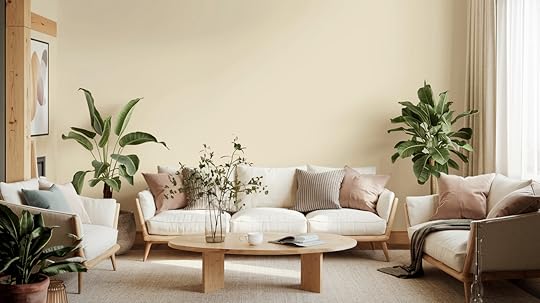
This color works well in many spots around your home. Let’s look at some of the best places to use it.
Living RoomTapestry Beige makes living rooms feel warm and inviting – like a big, comforting hug.
It creates a perfect backdrop for your family gatherings and quiet evenings.
Try mixing it with soft blue pillows, muted green plants, or warm gray furniture.
These color combinations help create a space that feels balanced and homey.
BathroomWant your bathroom to feel like a peaceful retreat? Tapestry Beige can help with that.
It adds warmth without making the space feel dark or small.
The color looks great with white tiles, marble counters, and bronze fixtures.
It works equally well in small powder rooms and large master bathrooms.
Other Rooms and AccentsTapestry Beige shines in hallways, where it makes these connecting spaces feel warm and welcoming.
It’s also a great choice for ceilings – it adds subtle warmth without drawing too much attention.
When used on doors, it creates a soft contrast with the white trim.
The color also works well with wooden furniture, making both the walls and your pieces look their best.
How to Pair Tapestry Beige with Other Colors
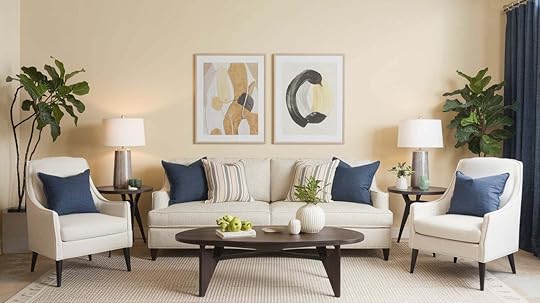
Getting your color combinations right can make a big difference in how your room feels.
Here’s how to mix Tapestry Beige with other colors.
Monochromatic Color SchemeWant a calm, pulled-together look? Try using different shades of beige in the same room.
Pair Tapestry Beige walls with Benjamin Moore’s lighter Natural Cream for trim, or add Swiss Coffee for a brighter touch.
For a deeper accent, try Monroe Bisque on doors or built-in cabinets.
This approach creates a peaceful feeling that’s easy on the eyes.
Complementary Color SchemeIf you want your room to feel more lively, try mixing Tapestry Beige with contrasting colors.
Benjamin Moore’s Approaching Storm (a cool grey) or Comet (a deep blue-grey) work well as accent colors.
You could paint one wall in these darker shades or use them for furniture pieces.
This mix of light and dark colors adds interest to your room without being too bold.
Tapestry Beige vs. Other Popular ColorsHere’s a clear look at how Tapestry Beige compares to other top choices to help you pick the perfect shade.
Edgecomb Gray vs. Tapestry BeigeEdgecomb Gray brings a cooler feel with its gray base, while Tapestry Beige adds warmth to your space.
In sunny rooms, Edgecomb Gray shows its true gray nature.
Meanwhile, Tapestry Beige stays consistently warm and creates a cozy feeling throughout the day.
Tapestry Beige vs. Revere PewterRevere Pewter shows stronger gray tones and can look slightly darker than Tapestry Beige.
In low light, Revere Pewter might feel heavy, but Tapestry Beige keeps its light, airy quality.
The beige undertones in Tapestry Beige make rooms feel warmer compared to Revere Pewter’s cool touch.
Tapestry Beige vs. Balboa MistBalboa Mist offers a lighter, more subtle look than Tapestry Beige. It shifts between white and pale gray, depending on the lighting.
Tapestry Beige stays more constant and brings more color to your walls.
Balboa Mist works well in bright spaces, while Tapestry Beige fits any lighting setup.
The Importance of Lighting with Tapestry Beige
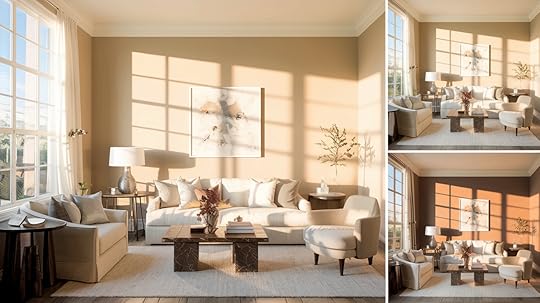
Like all paint colors, Tapestry Beige can look different depending on your lighting. Here’s how lighting affects Tapestry Beige.
Natural sunlight brings out the best in Tapestry Beige. In the morning light, the color feels fresh and bright, while the afternoon sun makes it feel warmer and cozier. If your room doesn’t get much sunlight, try using warm light bulbs – they help show off the color’s warm notes. Cool white bulbs might make the color look a bit flat, so stick with soft white or warm white bulbs if you can. Table lamps and wall sconces at different heights can help the color look rich and full throughout the day.How to Incorporate Tapestry Beige in Your HomeGetting started with a new paint color can feel like a big step. You can make it work in your space using these tips.
Practical Tips for PaintingStart small; try Tapestry Beige in a powder room or guest bedroom to see how you like it.Before painting the whole room, put up some sample squares and look at them at different times of the day. Use two coats of paint for the best coverage, and don’t skip the primer – it helps the true color shine through. The paint looks best when you work in sections, keeping a wet edge to avoid lap marks.Design Ideas and InspirationIn real homes, Tapestry Beige shows its flexibility.
Think of a living room with Tapestry Beige walls, crisp white trim, and brown leather furniture – it feels warm and put-together.
Or picture a kitchen where Tapestry Beige walls blend smoothly with white cabinets and dark countertops.
Many homeowners use it in bedrooms with light bedding and natural wood furniture for a calm, restful feel.
ConclusionNow you know why so many people love Tapestry Beige. It’s not just another neutral – it’s a color that makes your home feel more welcoming and relaxed.
From sunny mornings to cozy evenings, this paint shade keeps your spaces feeling fresh and inviting.
It plays well with other colors and fits right in with any style you choose.
You don’t need to be a paint expert to make it work. With the right lighting and some simple planning, you can transform your rooms into spaces that feel just right.
Ready to give your walls a fresh look? Tapestry Beige might be the perfect choice for your next paint project.
For more such paint reviews, check out our website!
The post Benjamin Moore Tapestry Beige (OC-32) Review appeared first on Amenity Home.
April 23, 2025
Spiritualism & Mushroom Symbolism: Everything You Need to Know
Mushrooms hold a special place in our world’s natural story. These forest dwellers appear like magic after rain, growing where life has ended to create something new.
They connect the underground world with what we see above, working as nature’s recyclers.
Many cultures view mushrooms as symbols of quick growth, change, and life’s constant cycles. Their hidden networks beneath the soil mirror how things in nature are connected in ways we can’t always see.
Mushrooms remind us that growth often happens quietly before suddenly becoming visible.
In this blog, we’ll learn how mushrooms have been an important part of cultures for centuries, what significance they hold and how we interpret their symbolism in our everyday lives.
The Spiritual Meaning of Mushrooms

Many spiritual traditions value mushrooms for their sacred properties.
In shamanism, certain mushrooms open doors to other worlds, helping healers connect with spirits and find cures.
The Mazatec people of Mexico call mushrooms “holy children” and use them in religious rituals to speak with gods.
In witchcraft, mushrooms represent hidden knowledge and magic that grows in darkness. They appear in spells for transformation and truth-seeking.
The mushroom life cycle mirrors spiritual teachings about life and death. They feed on what has died, then emerge to spread new life before returning to earth. This pattern shows how endings create beginnings. When trees fall, mushrooms help turn them into the soil for new growth.
Mushrooms teach us that valuable things can grow from difficult times, just as they thrive in darkness before reaching the light.
Cultural and Historical SignificanceMushrooms have significant cultural importance worldwide.
Aztecs called certain mushrooms “flesh of the gods” for religious ceremonies, with temple carvings showing this connection. Ancient Greeks linked mushrooms to lightning strikes, giving them magical status.
In Japan, the matsutake mushroom symbolizes good fortune and autumn, with family gathering traditions spanning centuries. Chinese medicine texts from 2,000 years ago mention the reishi as the “mushroom of immortality” given to emperors.
Viking sagas describe warriors consuming mushrooms before battle to gain courage and strength. Siberian shamans decorated their clothing with mushroom patterns and ate fly agaric mushrooms during ceremonies to enter trances for spiritual journeys between worlds.
Different Types of Mushrooms and Their Symbolic MeaningLet us come look at the different types of mushrooms and their symbolic significance.
1. Fly Agaric Mushroom

The fly agaric mushroom, with its red cap and white spots, is one of the most visually striking mushrooms.
In European folklore, it’s often shown in fairy tales and connected to magic and other worlds. Many believe Siberian shamans used it to reach altered states of mind.
In modern culture, it’s the classic “toadstool” seen in children’s books and games.
2. White Button Mushroom

Though common in kitchens, the white button mushroom carries its own meaning.
In some Eastern European traditions, finding white mushrooms during forest walks brings good luck and signals a change in fortune.
Its pure color links it to simplicity and basic goodness in many cultures.
3. Shiitake Mushroom

Shiitake mushrooms hold a special status in East Asian cultures.
In Japan, they stand for health and long life. Gift baskets with dried shiitake are common presents for sick friends, showing wishes for recovery.
For centuries, their rich flavor and health benefits have made them symbols of wealth and wellness.
4. Matsutake Mushroom

The matsutake mushroom is highly valued in Japanese culture. Its rare status and smell, like cinnamon and pine, symbolize the autumn season and good fortune.
The tradition of hunting for these mushrooms in the fall months ties families to the natural cycles of the year.
5. Black Morel Mushroom

With their brain-like appearance, black morel mushrooms often represent wisdom and thinking in regional European traditions.
Their short growing season after forest fires makes them symbols of things that come from hard times. Morel hunting brings communities together each spring in many rural areas.
6. Reishi Mushroom

The reishi mushroom’s fan shape and red-brown color link it to strength and long life in Chinese culture.
For thousands of years, it’s been called the “mushroom of immortality” and used as medicine for royalty. Its slow growth represents patience and the rewards of waiting.
7.Psilocybin Mushroom

Psilocybin mushrooms carry deep spiritual meaning in many native cultures of Mexico and Central America.
The Mazatec people see them as living beings with souls, calling them “little saints” or “holy children” who can help humans speak with gods and find healing.
Mushrooms in Art and Popular CultureMushrooms have shown up in many forms of art and media throughout history. Early painters included mushrooms in still-life works, with Dutch masters of the 1600s adding small fungi to their detailed natural scenes.
Lewis Carroll’s 1865 book “Alice’s Adventures in Wonderland” made mushrooms famous in literature with the caterpillar sitting on a mushroom that could change Alice’s size when eaten.This story set the pattern for mushrooms as magical objects in books and movies.
In the 1960s and 1970s, mushrooms became common in psychedelic art, with bright colors and wavy patterns. Artists like Allyson Grey created works showing mushrooms as doorways to other mental states.
Today, mushrooms appear on t-shirts, in video games like “The Last of Us” and “Super Mario Bros.,” and as popular tattoo designs. The Mario games made the red and white spotted mushroom one of the most-known images in gaming history.
Modern artists use mushrooms as symbols of growth, change, and the links between all living things. Films like “Fantastic Fungi” have helped more people see mushrooms as not just food but as important parts of our world and culture.
Mushrooms and Personal Growth

Mushrooms offer powerful symbols for personal growth.
Their ability to thrive in tough spots shows how we can push through hard times. How they transform decay into new life mirrors how our setbacks can lead to fresh starts.
The hidden growth of mushrooms underground before suddenly appearing reminds us that personal change often happens slowly and invisibly before becoming obvious.
Their connected networks reflect how our growth links to others in our communities.
Some people use mushroom imagery in journals or homes as reminders to stay patient with their growth process. By watching how mushrooms appear after rain, we can find hope when our progress feels stalled.
ConclusionMushrooms carry rich meaning across cultures, art, and personal growth. They show us how to turn hard times into chances for growth and how we’re all connected.
These fungi teach us that important changes often happen quietly before becoming visible.
Looking at mushrooms can help us see our own lives differently – finding strength in tough spots and patience during slow periods.
Consider taking a forest walk to spot mushrooms, keeping a nature journal, or simply pausing to think about what these remarkable organisms might teach you about your life journey.
The post Spiritualism & Mushroom Symbolism: Everything You Need to Know appeared first on Amenity Home.
Maximalist Aesthetic: 27 Ideas for the “More Is More” Style
Want to break free from plain, boring spaces? Maximalist aesthetic might be your answer. This bold style says “yes” to more color, more patterns, and more of what makes you happy.
Unlike simple, bare-bones design, maximalism celebrates mixing things you love. But don’t think it’s just random clutter, good maximalism carefully combines colors, textures, and objects to tell your story.
In this blog, we’ll cover everything you need to know about maximalism – from its basic ideas to practical tips. You’ll find fresh ideas to try in your home, wardrobe, and even social media. Each section gives you simple ways to start small or go all-out with this fun style.
Ready to add a flair of personality to your life? Let’s get started!
Understanding the Maximalist AestheticWe need to talk about this fun style that’s all about showing off more of what you love. Maximalism isn’t just throwing things together – it’s about creating spaces that feel like you.
What Is Maximalism?Maximalism is all about filling your space with things that make you happy. Think bright colors, mixed patterns, and lots of cool stuff that tells your story. This style has been around for ages – from fancy old European palaces to today’s colorful homes on social media.
What’s funny is how different generations see it.
Your parents might call it “too much stuff,” but for many young people, it’s the perfect way to show who they really are. It’s like wearing your personality on your walls.
The Philosophy of “More Is More”The “more is more” idea turns the rules upside down. Instead of taking things away, maximalism says add what you love! It’s about making spaces that feel alive and full of joy.
Your room becomes your canvas, where every color, pattern, and object has meaning. There are no strict rules – just what feels right to you. It’s a design that puts your happiness first.
The Rise of the Maximalist Aesthetic
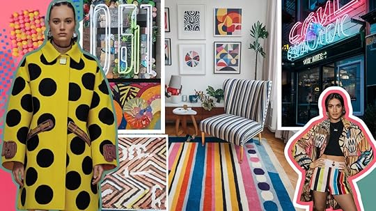
The maximalist movement is growing fast. Let’s look at why so many people are filling their homes and closets with bold colors and fun designs instead of keeping things simple.
Social Media and Gen Z InfluenceHave you scrolled through TikTok lately? Young people are showing off rooms and outfits packed with colors and cool stuff. Fashion trends like Y2K (think bright 2000s styles) fit perfectly with the maximalist vibe. Those chunky shoes and colorful tops aren’t just random – they’re part of this bigger trend.
On social media, people love sharing videos of how they dress or fix up their spaces with layers of interesting things. It’s about making your mark.
Why People Are Embracing MaximalismAfter being stuck at home during COVID, many of us got tired of plain walls and boring spaces. We wanted our rooms to feel alive again.
Bright colors and fun patterns actually make your brain release happy chemicals. That’s right – a colorful room can literally improve your mood.
Even companies are catching on, creating stores and ads with this “more is more” feeling to grab your attention and make shopping more fun.
Maximalist Decor InspirationsReady to add some maximalism to your life? Here are some of the best ways to bring maximalist style into your world! These de ideas range from small touches to big changes, so you can find something that fits your comfort level and budget.
1. Pattern Drenching
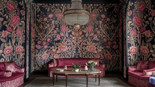
Why stop at the walls? Wrap that beautiful wallpaper onto your ceiling too! This creates a cozy, wrapped-up feeling that makes your room feel special.
Try it in a small space like a bathroom first if you’re nervous.
2. Statement Wallpapers
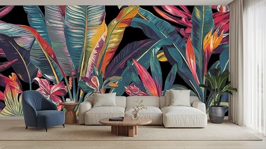
Pick wallpaper that tells a story. Big flowers, cool shapes, or even scenes with animals or nature can turn a boring wall into the star of your room.
One wall is enough to make a big difference.
3. Layered Rugs
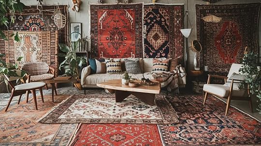
Place a smaller rug on top of a bigger one for instant style points. Mix a striped rug with a floral one, or try different textures like a fluffy rug on a flat-woven one.
It adds warmth and makes your floor more interesting!
4. Gallery Walls with Chunky Frames
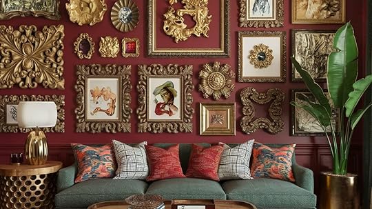
Collect frames in different sizes and colors, then fill them with art you love.
Mix in mirrors, small objects, or even empty frames for a wall that shows off your personality and starts conversations.
5. Bold Painted Ceilings
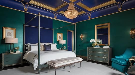
The ceiling is your room’s fifth wall! Paint it blue, green, or even pink for a surprise element that makes your space feel complete.
It’s easier than you think and makes a huge difference.
6. Maximalist Tiles
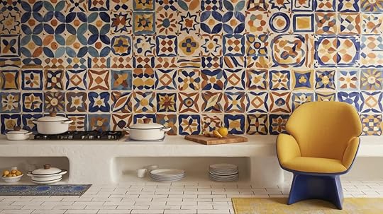
Colorful tiles in the kitchen or bathroom add so much character. Try a busy pattern for your floor or a splash of color behind your sink.
Even a small area of fun tiles can change the whole room.
7. Mixing Patterns
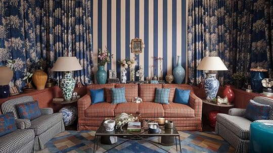
Don’t worry about matching. Stripes, flowers, and dots can live together happily.
The trick is to vary the size (big flowers with tiny dots) and keep some colors the same between patterns.
8. Mismatched Furniture
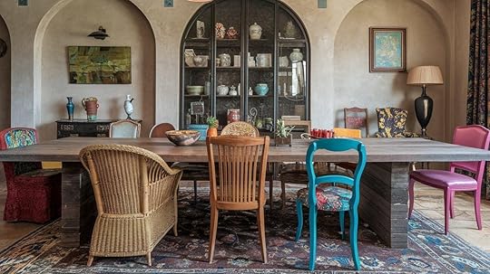
Your couch doesn’t need to match your chairs! Mix old and new pieces, different colors, or different styles.
This makes your room look like it came together over time, not from a store catalog.
9. Floor-to-Ceiling Bookshelves
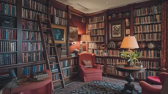
Fill a whole wall with shelves and pack them with books, plants, pictures, and cool objects you’ve found.
It’s like creating your own personal museum that shows what you love.
10. Handmade & Vintage Touches
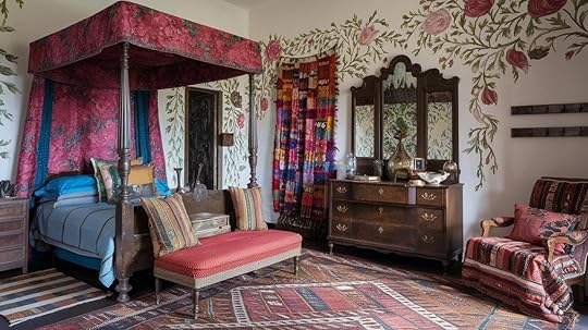
Hunt for one-of-a-kind pieces at thrift stores or local craft fairs.
Old ceramics, hand-stitched pillows, or painted furniture add soul to your space that new items just can’t match.
Maximalist Fashion: Bold & Expressive StylingGo big and bold with these maximalist fashion ideas that put self-expression front and center. This style isn’t about blending in—it’s about standing out, mixing unexpected elements, and creating looks that truly reflect your personality. Here’s how to embrace the “more is more” approach.
11. Y2K Revival

Channel your inner 2000s with bright colors and fun shapes.
Add chunky plastic rings, baggy pants with lots of pockets, and tops in candy colors. Layer a baby tee over a long-sleeve shirt for that classic early-2000s look that’s making a big comeback.
12. Power Clashing
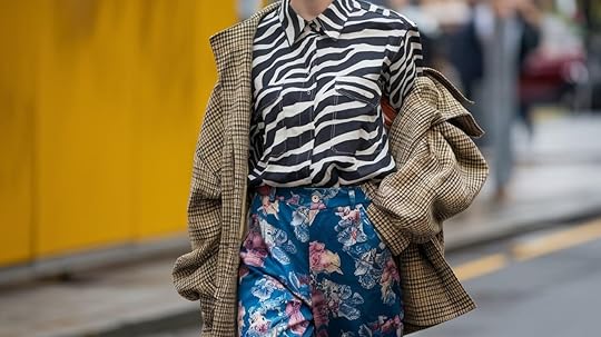
Break the rules by wearing patterns that “shouldn’t” go together.
Zebra print pants with a floral top? Yes! A plaid jacket over a polka dot dress? Absolutely! The bolder the clash, the more eye-catching your outfit becomes.
13. Layering Accessories
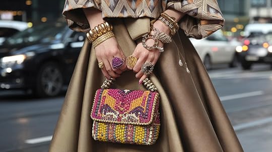
More is more with jewelry. Stack rings on every finger, mix gold and silver, wear big dangling earrings with your chunky necklaces.
Don’t forget a bright, busy handbag to carry all your stuff in style.
14. Exaggerated Silhouettes

Play with shapes that make a statement. Try coats that look a bit too big, pants with super wide legs, or tops with big, padded shoulders.
These dramatic shapes turn basic outfits into fashion moments.
15. Bright & Metallic Footwear

Your shoes can be the star! Go for lime green heels, silver boots, or sneakers covered in patterns.
Colorful shoes add pop to simple outfits or complete an already bold look.
16. Maximalist Outerwear

A show-stopping coat or jacket makes even jeans and a t-shirt look amazing.
Try a fuzzy faux fur in a bright color or a jacket covered in sparkles – it’s like wearing a party on your shoulders!
17. Mixing Textures
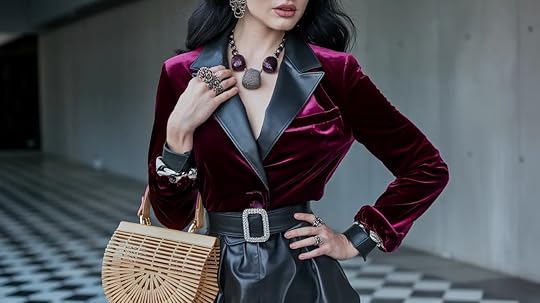
Combine fabric types to add depth to your outfit. Pair a smooth silk top with rough denim, add a soft velvet jacket, or mix in some shiny leather.
Different textures feel good and look interesting.
18. Statement Hats & Headpieces

Top off your look with something fun for your head!
A big floppy hat, a headband with gems, or even a clip with feathers can turn a simple outfit into something special and show off your style.
19. Funky Tights & Socks

Don’t forget your legs. Bright tights with patterns, fishnets in unexpected colors, or knee socks with fun designs add playfulness to skirts and dresses.
Plus, they keep you warm in cold weather!
Maximalist Lifestyle & Digital PresenceTake the maximalist approach beyond your closet and into your whole life. These tips help you create spaces, both online and in your home, that feel full of energy and personal style. From social media to dinner parties, here’s how to bring that “more is more” feeling to every aspect of your day.
20. Maximalist Social Media Feeds

Make your Instagram pop with bold colors and busy backgrounds.
Layer text over patterns, mix different photo styles on one page, and use bright filters. Try making photo collages where images overlap. Your followers will stop scrolling when they see your eye-catching posts!
21. Over-the-Top Home Office Setup
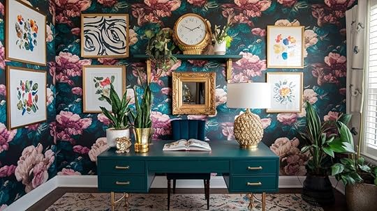
Working from home? Make it fun. Cover your office wall with busy wallpaper, get a desk chair in bright blue or deep green, and mix in old-school lamps or typewriters.
A happy workspace helps you feel more creative during long work days.
22. Layered & Eclectic Table Settings
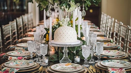
Dinner parties come alive when you mix different plates, glasses, and table linens. Pair your grandma’s fancy china with modern colorful glasses. Add cloth napkins in clashing colors and plenty of candles.
Each place setting can be different but still work together.
23. Dopamine Décor in Everyday Spaces
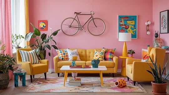
Bring happy colors into spots you use every day! A bright shower curtain, fun kitchen towels, or colorful pillows on your couch can lift your mood.
Small touches of joy in your daily spaces make regular life feel more special.
24. Eye-Catching Digital Branding

Notice how brands are using bold colors and busy designs online? Websites now feature moving parts, bright colors, and fun shapes instead of clean white backgrounds. It’s about catching your eye and standing out in a crowded digital world.
25. Vibrant Personal Stationery
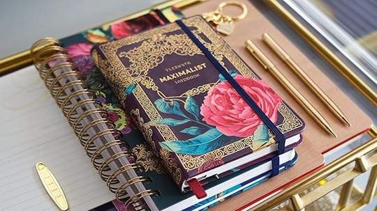
Make planning and note-taking more fun with colorful supplies! Get a planner with bright patterns, use pens in many colors, and find notebooks with fun covers.
Writing your grocery list becomes more enjoyable when your paper makes you smile.
Maximalism in Entertainment & Pop Culture26. The Euphoria Effect

TV shows like Euphoria have changed how we think about makeup and style!
Those sparkly face gems, bright eyeshadows, and bold outfit choices have jumped from the screen into real life.
Try adding a few face rhinestones for a night out or using bright colors around your eyes to channel your inner Euphoria character.
27. Pop-Up Experiences & Immersive Spaces

Have you noticed how many interactive spaces are popping up in cities?
From rooms designed to look exactly like your favorite TV show sets to museums where you can touch and play with the art.
These spaces aren’t shy about using tons of color, texture, and detail to make you feel like you’ve stepped into another world.
Comparing Maximalism to Other StylesNot sure how maximalism fits with other popular styles? Let’s break it down!
Feature
Maximalism
Minimalism
Mid
Century
Modern
Eclectic
Style
Colors
Bright, many colors used together
Neutral, limited color palette
Warm woods with pops of color
Varied but often cohesive
Patterns
Lots of patterns mixed together
Few or no patterns
Simple, geometric patterns
Mix of patterns with some restraint
Space
Filled spaces, lots of items
Open spaces, few items
Balance of open and filled spaces
Thoughtfully filled with diverse items
Mood
Playful, personal, busy
Calm, clean, simple
Retro, functional, organic
Worldly, collected, unique
Textures
Manydifferent textures layered
Limited, smooth textures
Natural materials with clean lines
Various textures that complement each other
Philosophy
“More is more”
“Less is more”
“Form follows function”
“Mix what you love”
How to Blend Maximalism with Other AestheticsYou don’t have to pick just one style! Maximalism plays well with others, creating fun hybrid looks that show off your personality.
Here are some of my favorite mix-and-match options:
Boho MaximalismTake the free-spirited feel of boho and crank it up!
Use natural materials like rattan and macraméAdd in bright colors and busy patterns. Layer rugs Pile on the pillows in different texturesMix plants with your treasures from travelsIt feels cozy, worldly, and full of stories.
Vintage MaximalismLove old things? Vintage maximalism celebrates them!
Fill your space with furniture from past decades, colorful glassware, and those special items Grandma saved. Think deep oranges and greens from the 70s, lots of gold details,Walls covered in framed pictures and mirrors from different eras.Modern MaximalismYes, you can be modern AND maximalist!
Keep some clean lines and open spacesAdd bold art, crazy-colored furniture, and interesting lamps or vases.Think white walls with giant abstract paintings and a hot pink velvet couch that makes you smile.
The Psychology of Maximalism
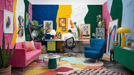
Ever wonder why some people love rooms filled with color and stuff while others feel stressed?
Our surroundings actually have a big impact on how we feel and think! Let’s look at the emotional side of maximalist style.
Impact on Mood and CreativityColorful, busy spaces can boost your creativity and energy!
When your eyes have lots to look at, your brain makes new connections.
Many artists and writers create their best work in spaces full of inspiration and visual interest.
Different Strokes for Different FolksSome people feel calm and happy in busy rooms filled with treasures. Others get overwhelmed and need simpler spaces to relax.
This often comes down to how our brains process information – neither way is wrong, just different!
Sustainability in Maximalist AestheticYou might wonder if loving “more is more” style means buying tons of new stuff.
Good news – maximalism can actually be super eco-friendly! Here’s how to create a bold look while still caring for our planet.
How to Practice Maximalism Without WasteThrift stores are your best friend!
Most of your maximalist treasures can come from secondhand shops, saving items from landfills.
Fix up old furniture with bright paint or new fabric instead of buying new things.
Ethical Shopping Tips for Maximalist DecorWhen you do buy new, look for small businesses making unique items built to last. Choose natural materials like cotton, wool, and wood that break down naturally. Quality over quantity means each piece stays special longer.Maximalist Trends & Future Predictions

The world of maximalism keeps changing and growing. New ideas pop up all the time as people find fresh ways to express themselves through this bold style.
Let’s look at what’s hot right now and where it’s all heading.
The Latest Decor and Fashion Trends: Curved, bubbly furniture shapes are taking over from sharp lines. Nature-inspired patterns like big leaves and fruits are showing up everywhere. Dark, moody colors are joining the bright ones, creating rich, complex spaces.
How Social Media is Shaping the Aesthetic: TikTok and Instagram are pushing maximalism in new directions. Quick videos show people how to layer patterns and mix styles. Online communities celebrate bold choices, giving people the courage to try wilder looks at home.
ConclusionReady to learn all about the colorful world of maximalism? It’s all about making your mark. This style isn’t just pretty pictures – it’s a way to show who you are through the things you love. Your home, clothes, and even social media can tell your story in living color.
There are no rules. Start small with a fun pillow, or go big with a painted ceiling. Mix old treasures with new finds. Layer patterns that make you smile.
In a world that often plays it safe, maximalism gives you permission to be bold, mix things up, and have fun.
Your space should make you feel “at home” whenever you walk in!
The post Maximalist Aesthetic: 27 Ideas for the “More Is More” Style appeared first on Amenity Home.
Proper Rug Placement with Living Room Sectional: A Guide
Putting a rug in the right spot under your sectional sofa can make a big difference in how your room looks and feels. When done right, a well-placed rug ties all your furniture together and creates a complete space.
Getting it wrong can make even the nicest room feel off-balance or awkward.
In this guide, you’ll learn the basic rules for rug placement with sectional sofas.
We’ll cover how to pick the proper rug placement with the living room sectional, where to put the rug, and common mistakes to avoid. You’ll also find useful tips for different room layouts and sofa shapes.
By the end, you’ll know exactly how to place a rug that makes your living room look put together and feel just right.
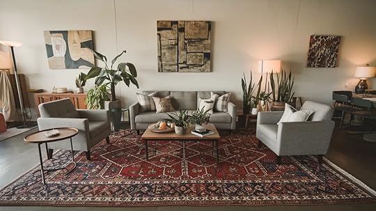
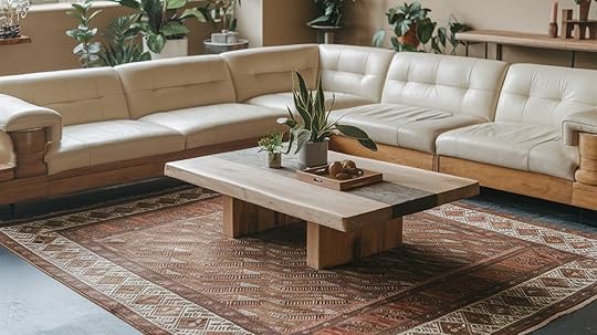
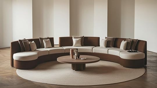
Size Considerations for Rugs with SectionalsFor most sectional arrangements, 8×10 or 9×12 rugs work best. Larger rooms may need 10×14 rugs, while small sectionals can use 6×9 rugs.To measure your space correctly, measure your sectional’s full footprint, then add 18-24 inches on each open side to find your ideal rug size.The “front legs on the rug” rule means positioning your rug so that at least the front legs of your sectional rest on it, creating a unified seating area.For good size ratios, your rug should extend 18-30 inches beyond your sectional on open sides and be at least as wide as your sectional’s longest part.Avoid rugs that stop at the edge of your sectional (too small) or nearly touch the walls (too large). Leave 8-12 inches of floor showing between your rug and walls.
Rug Placement Options for Sectional SofasProper rug placement helps tie your sectional and furniture together, making your space feel cohesive and visually pleasing.
1. All Legs on the Rug (Oversized Area Rug)
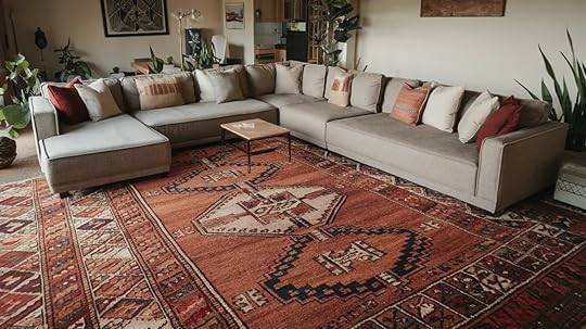
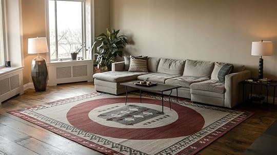
[image error]
Techniques for visual symmetry: Place the rug parallel to the longest part of your sectional, with equal amounts of rug showing on each end.Handling the shorter sides of the sectional: The shorter side can have less rug extension, but aim for at least 6-8 inches beyond the sectional edge.6. Special Considerations for L-Shaped Sectionals
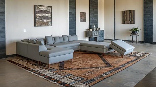
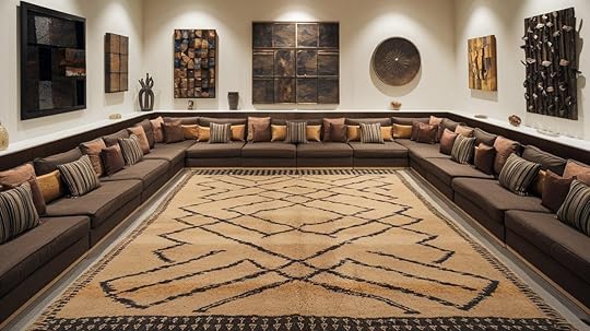
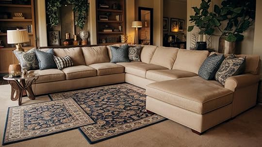
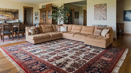
Leave 18-24 inches of walking space around your sectional and furniture to create clear pathways.
To protect your floor, position the rug to cover main walking paths in high-traffic areas. Choose rugs with low piles and dark patterns to hide dirt.
Always use rug pads to prevent shifting and protect your floor. Consider all furniture in the room; side tables and bookshelves should be fully on or off the rug.
Make sure the carpet doesn’t block doors from opening freely.
Style and Pattern SelectionFor color coordination, pick rug colors that connect with your sectional. If your sectional is solid, choose a rug with that color as an accent.
For patterned sectionals, pull out one of the less noticeable colors for your rug. Aim for contrast—light rugs with dark sectionals or dark rugs with light sectionals create visual interest.
Small rooms work better with smaller patterns or solid colors. Make sure the pattern size feels right for your space—too small can look fussy, and too large can feel overwhelming.
Match the rug texture to your sectional fabric. Smooth leather or microfiber sectionals pair well with plush, soft rugs that add warmth. For textured fabric sectionals, consider flatter weave rugs to avoid competing textures. The carpet should offer a nice contrast to how your sectional feels.
Neutral rugs (beige, gray, cream) work in most settings and make furniture the focus. They’re also easier to keep when you change other decor. Statement rugs with bold colors or patterns become the room’s main feature and set the tone for everything else.
Consider how the rug will look from different angles, especially with L-shaped sectionals where people view the room from various positions.
Solutions for Common ProblemsWhen your sectional is too large for standard rugs, consider using two matching rugs side by side or custom-cutting a larger rug to fit your space.
For awkward room layouts, focus on creating balance rather than following strict rules; sometimes, placing the rug at a slight angle works better than perfect alignment.
If your existing carpet is too small, use it under the coffee table as a focal point, or ensure it extends partly under the sectional.
Layering rugs offers a versatile solution—start with a large, plain base rug covering most of the seating area, then add a smaller, more colorful rug on top.
This approach creates the right size while adding style and texture, protecting carpeting, or adjusting positions seasonally.
ConclusionAlways measure your space and sectional before buying a rug to avoid costly mistakes.
The right rug should extend 18-24 inches beyond your sectional on open sides, with at least the front legs on the carpet.
Choose colors that complement your sectional and match the rug texture to contrast with your sofa fabric for the most cohesive look.
Proper placement defines your seating area and ties the room together. Don’t forget a quality rug pad to prevent slipping.
Whether you choose a neutral base or bold statement piece, the perfect rug will make your sectional arrangement feel complete and well-designed.
The post Proper Rug Placement with Living Room Sectional: A Guide appeared first on Amenity Home.
Moroccan Interior Design: Bring Warmth to Homes
Moroccan design has deep roots in North African culture and history. It mixes Arab, Berber, and Mediterranean styles, creating spaces known for bold colors, detailed patterns, and varied textures.
This design style shows Morocco’s unique position as a crossroads of many cultures over centuries. You can see this in the mix of geometric shapes and flowing lines in rugs, tiles, and architectural details.
People worldwide value Moroccan design for its warmth, comfort, and careful attention to detail, making spaces feel both lived-in and special.
In this blog, we’ll cover what makes Moroccan interior design special, how you can use it in your home, design ideas, and much more.
Let’s get straight to it!
Key Elements of Moroccan Interior Design
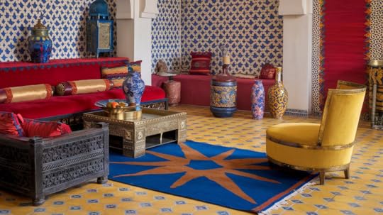
Moroccan design blends comfort with beauty in a style that feels both cozy and eye-catching. The mix of colors, patterns, materials, and furniture creates spaces that feel warm and welcoming.
Let’s look at what makes this style special.
ColorsMoroccan design mixes bright colors with earth tones.
You’ll see reds, blues, oranges, and yellows that add life to rooms. Browns and tans create a nice balance with these brighter shades. Gold touches often show up on important pieces in a room.
These add a touch of luxury without going overboard.
PatternsGeometric shapes form the core of most Moroccan patterns.
You’ll notice stars, hexagons, and complex repeating designs throughout these spaces. Curved arabesque motifs and colorful mosaic tiles (called zellige) create striking visual impact on walls and floors.
These patterns tell stories and add depth to each room.
MaterialsThe key materials include colorful tiles, soft velvet fabrics, rich mahogany wood, shiny brass objects, and detailed wrought iron work. When you touch these materials, you feel the mix of smooth and rough textures.
This blend creates rooms that appeal to both your eyes and hands.
FurnitureMoroccan rooms typically have low, plush seating that makes you want to sit down and chat. These comfortable spots are perfect for family time and hosting friends.
Wooden furniture often shows off detailed hand carving, with complex designs that skilled craftspeople spend many hours creating. Each piece feels special and one-of-a-kind.
How to Incorporate Moroccan Style in Your Home
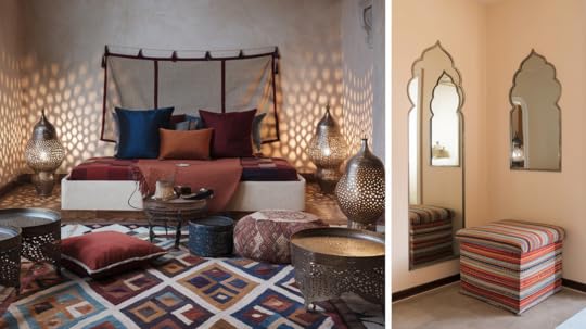
Start with a colorful Moroccan rug as your room’s centerpiece. These rugs typically feature geometric patterns in rich colors that instantly add warmth.
Add floor cushions around a low table to create a casual seating area perfect for gathering with friends.
For lighting, try metal lamps with tiny holes that cast patterned shadows across your walls. A few metal trays or tables with detailed work can complete the look without going overboard.
BedroomTransform your bedroom into a peaceful space using Moroccan-inspired textiles.
Layer your bed with covers and pillows in complementary colors like deep blue, burnt orange, or soft red. A fabric headboard or wall hanging can add texture without permanent changes.
Paint an accent wall in a warm color or add a simple stenciled pattern for more impact without overwhelming the space.
Small SpacesIn smaller rooms, focus on just one or two Moroccan elements rather than filling the space.
A single statement piece like a small patterned rug or a metal lamp can add style without crowding the room. Use mirrors with Moroccan-style frames to make spaces feel larger while adding character.
Choose multipurpose items like storage ottomans covered in colorful fabric that serve as seating and storage.
Moroccan Design for Different Rooms
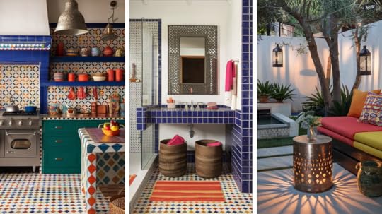
Create a striking kitchen with colorful tile backsplashes in traditional Moroccan patterns. These tiles work well behind stoves or sinks, adding style and practical wall protection.
For cabinets, consider painted wood in blue or green tones or natural wood with simple cutout designs. Open shelving lets you display colorful dishes and pottery that enhance the Moroccan feel.
Metal pendant lights hung over an island or eating area can tie the whole look together.
BathroomTransform your bathroom into one unlike any other using Moroccan design elements. Install patterned floor tiles in blues and whites for a clean yet interesting base.
Consider a tiled accent wall in the shower or behind the sink. Add a metal mirror with an interesting shape or pattern for a focal point.
Finish with practical items that also add style – think woven baskets for storage, glass containers for cotton balls, and plush towels in colors that match your tiles.
Outdoor SpacesTurn your patio or garden area into a relaxing outdoor space with Moroccan touches.
Start with comfortable seating using weather-resistant fabrics in bright colors. Add a metal side table with cutout patterns that cast interesting shadows. Lanterns placed on tables or hung from trees create the prettiest lighting in the evening.
A water feature, even a small one, adds the pleasant sound common in traditional Moroccan courtyards. Potted plants like citrus trees or herbs complete the Mediterranean feeling.
Combining Moroccan Design with Other Styles
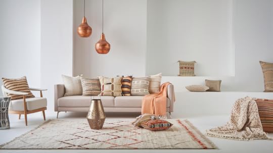
Moroccan design brings rich colors, patterns, and textures that work well with other design styles. Here’s how to blend Moroccan touches with different interior approaches for a unique home feel.
Mixing with Modern StyleModern design focuses on clean lines and open spaces. To add Moroccan elements:
Place a few patterned cushions on a simple modern sofaAdd a metal lantern with geometric cut-outs on a plain coffee tableUse a single colorful Moroccan rug as the focal point in a neutral roomInstall simple pendant lights with subtle Moroccan patternsThe key is balance—let the Moroccan items stand out against the simpler modern background.
Pairing with Minimalist DesignMinimalist spaces value “less is more.” Try these combinations:
Choose one statement Moroccan piece, like a handcrafted side tableAdd small touches of warm metals (copper, brass) to bring in Moroccan warmthSelect Moroccan items in neutral colors that match your minimalist paletteUse textured Moroccan throws or pillows for subtle depthThis approach adds character without overwhelming the calm, minimalist feel.
Blending with Scandinavian StyleScandinavian design values light, function, and coziness. Combine with Moroccan elements by:
Using Moroccan textiles in light, muted colorsAdding a simple patterned pouf for extra seatingIncorporating small metalwork pieces that catch the lightChoosing Moroccan-inspired wall hangings in simple framesThe natural materials common in both styles create a smooth connection between them.
Benefits of Mixed Design ApproachesWhen you mix different cultural design elements, you create spaces that truly feel like yours. Your home tells your own story through its unique look.
You’ll enjoy rooms full of interesting textures and visual appeal. This approach gives you flexibility to update your space as you find new items you love. These mixed designs show an appreciation for global styles.
The best part? Your home won’t look like you bought everything from one store. Instead, it feels like a collection of special finds gathered over time.
ConclusionMoroccan design stays popular because it mixes beauty with meaning. The patterns, colors, and textures bring warmth to any home.
To create your own Moroccan-inspired space, start small with a few key pieces that speak to you. Pay attention to quality craftsmanship and authentic materials. Mix old and new items for a lived-in feel.
Most importantly, create a space that makes you feel good when you’re in it.
The best homes tell stories about the people who live there, using bits of different cultures to create something truly personal.
The post Moroccan Interior Design: Bring Warmth to Homes appeared first on Amenity Home.
April 4, 2025
How to Use Texture in Interior Design to Upgrade Your Home
Texture is an essential element in interior design. It adds depth, warmth, and character to a space, making it feel inviting and well-balanced. Every material, from soft fabrics to rough wood, contributes to the overall atmosphere.
A room without texture can appear flat and lifeless. The right mix of smooth and rough surfaces, light and heavy materials, creates contrast and interest.
Texture also affects how light interacts with a space, influencing its mood and perception. By understanding texture, you can make any space feel more dynamic and comfortable.
This guide will take you through different types of textures, their effects, and practical ways to use them in home decor. Small changes in texture can transform the entire look and feel of a room.
Understanding Texture in Interior DesignTexture goes beyond how things feel—it shapes the entire experience of a room. Either you notice it or not, texture influences comfort, style, and even the perception of space. It adds life to surfaces, making them look and feel more interesting.
The right balance of texture brings energy and movement to interiors. It makes the difference between a plain space and one that feels thoughtfully designed.
What Texture Means in Home DecorTexture refers to how surfaces feel or appear in your home. Some textures are tangible, like soft cotton or rough stone, while others are visual, like a patterned wallpaper that looks three-dimensional.
Every surface, from flooring to furniture, carries texture that contributes to your space’s character. Mixing these creates layers that add interest without clutter.
Even a simple color scheme feels complete when textures vary. Texture keeps your space from feeling empty, making every corner feel designed and welcoming for daily living.
The Role of Texture in Shaping a SpaceTexture helps set the tone and personality of your space, giving it emotional depth and visual appeal.
Soft materials like wool throws or velvet cushions bring warmth and comfort, perfect for cozy spaces like living rooms and bedrooms.
In contrast, sleek surfaces like glass or metal add a modern, clean vibe, reflecting light and creating an airy feel. Rough textures, like raw wood or stone, ground the space, giving it a natural, earthy atmosphere.
Mixing these textures adds depth and interest, drawing the eye around the room, making it feel fuller and more thoughtfully designed.
How Texture Affects Mood and PerceptionTexture plays a significant role in how we perceive the mood and feel of a room.
Warmth vs. Coolness: Soft fabrics and natural materials make a room feel inviting, while glass and polished stone create a cooler ambiance.Depth and Dimension: A mix of textures prevents a space from looking flat or dull.Light Reflection: Smooth textures reflect more light, making spaces appear larger, while rough surfaces absorb light, adding a sense of intimacy.Types of TextureTexture can be classified into two main types: tactile and visual. Each type plays a distinct role in how a space feels and looks, contributing to its overall atmosphere and design.
Tactile Texture
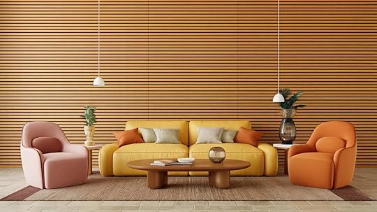
Tactile texture refers to how a material feels to the touch. It is the physical quality that you experience with your hands, whether it’s the smoothness of glass, the roughness of brick, or the softness of velvet. These textures provide sensory appeal and are often used in furniture, fabrics, and flooring.
Tactile textures add warmth and depth to a space, making it feel more inviting and comfortable.
Materials like grainy wood or plush textiles evoke different emotional responses, such as warmth, comfort, or a feeling of luxury.
Visual Texture
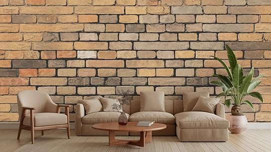
Visual texture refers to how a surface appears, even if it doesn’t physically feel that way. It’s the illusion of texture created through patterns, colors, and design elements.
Examples of visual textures include faux wood wallpaper, printed fabrics, or layered tile patterns. These textures don’t invite physical interaction, but they still create visual depth and contrast.
By introducing visual textures, you can make a space feel more dynamic and engaging, providing visual interest and enhancing the design without altering the tactile experience of the room.
Why Texture Matters in Interior Design
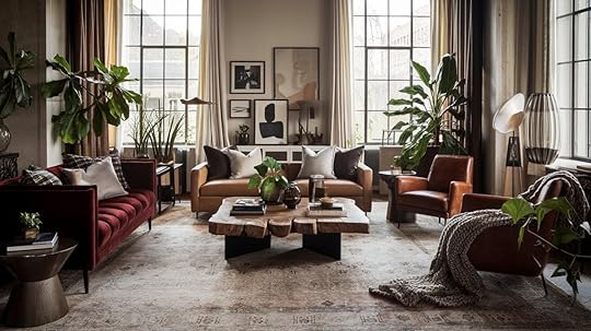
Texture is essential for adding depth to a room. Without it, the space can feel flat and lifeless. Mixing different textures, such as rough fabrics with smooth surfaces, creates contrast.
The contrast adds visual interest and makes the room feel more dynamic. The combination of textures makes the space feel fuller and richer. It also invites the eye to explore different areas of the room.
By layering textures, you bring the room to life and create a more inviting atmosphere, keeping the space visually engaging.
Adds Warmth or Coolness to a Space
Texture can influence a room’s temperature. Soft, plush textures, like velvet or wool, create warmth and coziness. They make a space feel inviting and comfortable.
Conversely, sleek materials like metal or glass bring a cooler, more modern feel and lend a fresh, airy vibe to the space.
Finding a balance between warm and cool textures helps set the desired tone for the room. This balance impacts the overall mood and atmosphere, influencing how the room makes you feel.
Improves Light Reflection and AbsorptionDifferent textures affect how light interacts with a room. Smooth surfaces reflect light, making the space brighter and larger.
For example, polished stone or glass will help bounce light around the room. In contrast, rough or matte textures absorb light, creating a more intimate, cozy feel.
Textures like wood or fabric can create warmth by absorbing light. By adjusting textures, you can control how light moves through the room. This can drastically change the mood and perception of a space, making it feel more open or cozy.
Ways to Add Texture to Your Home
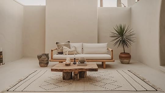
Incorporating different textures into your space can make a big difference in how the room feels.
By layering materials, mixing fabrics, and adding textured furniture, you can create a space that feels dynamic, inviting, and visually interesting.
Layering Different MaterialsCombining soft and hard textures adds richness and depth to a room. Layering different materials, such as a plush wool rug with a sleek leather sofa, creates contrast, keeping the space visually interesting.
For example, pairing a textured stone backsplash with soft fabric cushions brings both visual appeal and tactile pleasure.
By using different materials in your design, you add dimension to the space, making it feel more dynamic. This layering technique prevents the room from feeling flat and balances the aesthetic and functional aspects of the design.
Contrasting FabricsMixing smooth and rough fabrics adds variety and balance to the space. For example, combining a soft linen throw with a velvet pillow can create a beautiful contrast that feels both inviting and luxurious.
Similarly, pairing a smooth cotton curtain with a rough-hewn wooden bench introduces texture variety. The contrast between soft and firm textures improves the room’s visual and tactile appeal.
By using fabrics with varying textures, you create layers of interest that make the space feel more dynamic and appealing to the senses.
Textured Furniture
Furniture made from materials like wood, metal, and upholstery can significantly influence a room’s texture. A wooden coffee table brings an earthy, natural texture, while a velvet armchair adds softness and warmth.
A metal-framed bed introduces a cool, industrial feel. These textures not only make the space visually engaging but also invite physical touch, adding warmth or coolness depending on the material.
Textured furniture pieces serve as functional art, allowing you to create a unique atmosphere and enhance the overall design of your space.
Decor and Accessories
Using decor items like vases, sculptures, and mirrors with different textures can add layers to a room. For example, a glossy ceramic vase paired with a textured metal sculpture creates contrast and visual interest.
A wooden-framed mirror can complement both elements while introducing more texture variety. Accessories such as these help create a layered, cohesive look in a room.
However, be mindful of balancing the textures—too many contrasting materials can overwhelm the space. The key is to select accessories that harmonize with the room’s overall design and maintain a consistent feel.
Plants and FlowersBringing in plants and flowers introduces natural textures that add both visual and tactile appeal. For example, the smooth, shiny leaves of a fern contrast beautifully with the rough texture of a ceramic pot.
A delicate floral arrangement can add softness and movement to the room. By selecting plants and flowers that complement the space’s existing textures, you create a seamless connection between nature and interior design.
Plants not only improve the art value but also promote a sense of calm and well-being in the room.
Lighting and ShadowsLighting plays a key role in how texture is perceived. Proper lighting can bring out the beauty of textured surfaces, creating intriguing highlights and shadows.
Soft, diffused light can help soften rough textures like stone or wood, making them feel warmer and more inviting. On the other hand, directional lighting can accentuate the details in textured fabrics or materials, making them stand out.
By adjusting lighting based on the room’s textures, you can enhance the overall feel, adding depth and warmth or creating a more dramatic atmosphere.
Balancing Textures for a Cohesive Look
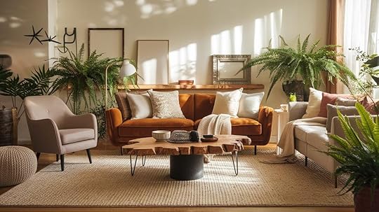
It’s important to ensure that the textures in a room complement each other to create a cohesive look. While contrast can be interesting, too many competing textures can create chaos.
Aim for a balance where rough, smooth, soft, and hard textures work together to support the overall style.
For example, if you have a rugged wooden coffee table, pair it with plush cushions and a sleek metal lamp to maintain harmony.
The Role of Color and Pattern in Texture ChoicesColor and pattern play a significant role in how textures interact. The accompanying color scheme can improve or soften the texture.
For instance, neutral colors like beige, gray, or white allow textures to stand out, while bold, vibrant colors might distract from the texture itself.
Patterns, too, can work in harmony with textures—striped fabrics can complement smooth textures like glass or ceramics, while intricate patterns pair well with subtle textures.
Adjusting Texture for Small and Large SpacesTexture can visually alter the perception of space. In larger rooms, you can afford to use heavier, more pronounced textures like leather or wood without overwhelming the space.
For smaller rooms, opt for lighter textures, such as sheer fabrics or smooth surfaces, to prevent the space from feeling cluttered.
Additionally, in tight spaces, consider using uniform textures to maintain a sense of openness and flow, while larger areas can handle a mix of textures for added depth.
Practical Tips for Using TextureTexture plays a key role in creating balanced, inviting spaces.
By thoughtfully selecting textures and considering their impact on the atmosphere, you can improve both the look and feel of any room. These practical tips will help you effectively use texture.
Choosing the Right Textures for Each RoomEach room in your home has different needs, and texture can help fulfill those.
Softer textures like velvet, cotton, and wool are perfect for creating comfort and warmth in living rooms and bedrooms. Kitchens and bathrooms, on the other hand, benefit from more durable textures like stone, tile, and stainless steel.
Consider the function of the room and the feeling you want to evoke when selecting materials.
Seasonal Texture ChangesTextures can be updated to match the seasons, offering a fresh look and feel throughout the year.
For example, in the summer, light and airy fabrics like linen or cotton work well, while in the winter, heavier materials like velvet or faux fur add warmth and coziness.
Changing throws, pillows, and curtains with the seasons can easily refresh your space without major renovations.
Avoiding a Cluttered or Mismatched LookWhile mixing textures adds interest, it’s important to avoid overwhelming a space. Stick to a few key textures that complement each other and maintain a consistent theme.
Too many competing textures can make a room feel chaotic. For a balanced look, choose textures that vary in scale but not in their overall tone or style.
For example, pair a soft wool throw with a sleek leather chair, but avoid overloading the space with multiple bold textures.
Final ThoughtsTexture plays a crucial role in bringing depth and character to interior design. It creates contrast, adds warmth or coolness, and improves the visual appeal of a space.
Small changes, such as adding a textured rug or changing fabric cushions, can significantly impact a room’s feel. Thoughtful texture choices help create inviting, balanced spaces that are both functional and stylish.
By combining the right textures, you can make a room feel dynamic, cozy, and well-designed, turning any space into a more enjoyable and visually engaging environment.
Frequently Asked QuestionsHow do I choose the right texture for my room?Match textures to the room’s function—soft fabrics for living areas and durable materials for kitchens and bathrooms.
Can texture be added in small spaces?Yes, use lighter textures and subtle layering to maintain openness.
The post How to Use Texture in Interior Design to Upgrade Your Home appeared first on Amenity Home.
March 21, 2025
BM Collingwood (OC-28) Review: A Soft Neutral Shade
When selecting the perfect neutral for your home, the variety of grays available can be overwhelming.
Benjamin Moore Collingwood (OC-28) might be the ideal color if you’re looking for a warm and inviting shade.
With its subtle beige undertones, this light gray is a favorite among homeowners and designers alike for its versatility and understated style.
If you’re looking to refresh a single room or redesign your entire home, Collingwood offers a perfect balance of light and warmth, making it suitable for virtually any space.
In this blog, we’ll share everything you need to know about Collingwood — from its unique undertones to how to incorporate it into your home design.
By the end, you’ll understand why this gray should be at the top of your list.
Why Collingwood Stands Out: A Balance of Light and Warmth
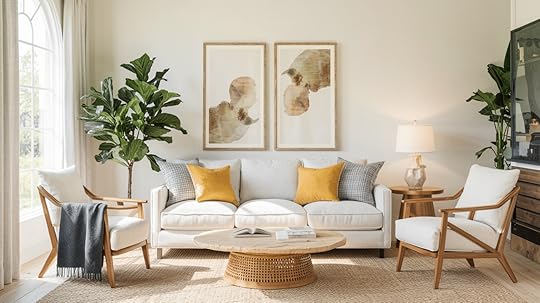
Unlike cooler grays, which sometimes feel too harsh, Benjamin Moore Collingwood leans toward a warmer, softer side.
Its subtle blend of gray with soft beige undertones makes it the perfect choice for those who want gray’s calm, neutral quality without the coldness that other shades may bring.
One of the biggest draws of Collingwood is its ability to work seamlessly across different types of interiors.
This gray can adapt to a modern, minimalist space or a more traditional, cozy atmosphere.
It creates a serene and inviting environment, so it’s often used in bedrooms, living rooms, and even kitchens.
Understanding Collingwood’s Unique CharacterThe Perfect Balance of Warmth and LightCollingwood strikes an ideal balance with its warm undertones, unlike cooler grays that can feel harsh or clinical.
The color maintains its gray base while incorporating subtle beige notes, creating a refined neutral that feels both contemporary and welcoming.
A Closer Look at UndertonesCollingwood’s undertones are what truly set it apart:
Primary undertone: Soft beige that provides warmthSecondary notes: Subtle taupe that adds depthNo purple or green undertones that can make some grays feel coldThe Science of Light: LRV and Room ImpactWith an LRV (Light Reflectance Value) of 63, Collingwood sits in the sweet spot of the medium-light range. This means that:
Reflects enough light to brighten spaces without causing glareMaintains its color integrity in both bright and dimmer conditionsCreates an excellent backdrop for artwork and furnishingsSeasonal ConsiderationsNatural Light ChangesSpring/Summer: Color appears lightest and warmestFall/Winter: Takes on a slightly cooler, more gray appearanceMorning light: Brings out warm undertonesEvening light: Creates a softer, more muted effectBest Application TimingIdeal temperature range: 65-85°FOptimal humidity: 40-50%Best seasons: Spring and FallAvoid painting during extreme temperature conditionsComplementary Colors for CollingwoodOne of the main advantages of Collingwood is its versatility in pairing with other colors.
It blends beautifully with a wide range of hues, allowing you to create diverse looks based on your preferences and needs.
Below are a few complementary colors that work wonderfully with Collingwood in various settings:
1. Soft Neutrals and CreamsIf you’re looking for a subtle, cohesive palette, pairing Collingwood with soft neutrals like cream, beige, or off-white creates a calm and serene space.
This combination is perfect for bedrooms, bathrooms, or any area where you want a relaxed, inviting atmosphere.
Best Matches:
Benjamin Moore White Dove (OC-17)Benjamin Moore Swiss Coffee (OC-45)Sherwin-Williams Alabaster (SW 7008)2. Rich, Deep GraysYou can pair Collingwood with darker, more intense grays for a more modern and refined look.
This creates a balanced contrast that adds depth to the room without feeling too dark or moody.
Best Matches:
Benjamin Moore Kendall Charcoal (HC-166)Benjamin Moore Chelsea Gray (HC-168)Sherwin-Williams Dorian Gray (SW 7017)3. Earthy Tones and GreensCombine Collingwood with muted greens or soft brown tones for a more organic, nature-inspired design.
The earthy elements work beautifully with the warm undertones in Collingwood, creating a grounded, natural feel.
Best Matches:
Benjamin Moore Ashwood (AF-10)Benjamin Moore Rushing River (SW 7746)Sherwin-Williams Sea Salt (SW 6204)4. Warm Wood TonesPairing Collingwood with natural wood tones brings a rustic warmth to your space.
Whether it’s oak, walnut, or cherry wood, the combination of soft gray with rich wood accents creates a balanced and timeless look.
Best Matches:
Stain Color Classic Cherry (SW 3110) and Walnut Stain(MW439).Roy Croft Copper Red(SW2839), Green Vibes(SW6928) complement the warmth in Collingwood5. Soft PastelsPair Collingwood with pastel tones such as pale pinks, blues, or lavender for a softer, lighter look.
This combination works well for nurseries, bedrooms, or spaces where you want a light and refreshing vibe.
Best Matches:
Benjamin Moore Passion Pink (2075-60)Benjamin Moore Wickham Gray (HC-171)Sherwin-Williams Regale Blue (SW 6801)How to Use Collingwood in Your Home
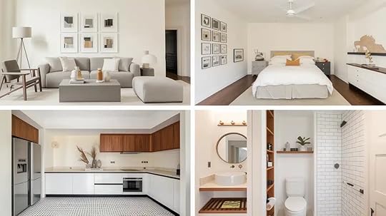
Due to its versatility, Collingwood works well in various areas of the home.
Here are a few ways you can incorporate this soft gray into your space:
Living RoomCollingwood can provide a light and airy atmosphere in the living room while feeling warm and inviting.
Pair it with soft neutrals, deep Grays, or pops of rich colors to create a space that feels refined yet comfortable.
The warmth in the color makes it ideal for creating a cozy setting for entertaining or relaxation.
BedroomCollingwood is an excellent choice for the bedroom if you’re after a serene, restful retreat.
Its subtle warmth helps promote relaxation and pairs beautifully with soft whites, pastel tones, or rich wood furniture.
The neutral color allows you to easily switch up your bedding and accessories and refresh your space whenever you like.
KitchenCollingwood provides a fresh, neutral backdrop for your cabinetry and countertops in the kitchen.
Pair it with white or Gray cabinets, stainless steel accents, or warm wood finishes for a clean, timeless look.
If you’re going for a modern or classic style, this soft Gray works beautifully in the heart of your home.
BathroomIn the bathroom, Collingwood creates a spa-like, best atmosphere.
Combine it with white tiles, natural stone, or even wood accents to create a refined, relaxing space.
Its ability to reflect light while maintaining warmth makes it a great choice for bathrooms with limited natural light.
Final ThoughtsBenjamin Moore Collingwood is a soft, refined Gray that can uplift any room in your home.
Its balanced undertones of Gray and beige create a versatile, warm neutral that works well in various settings.
If you’re designing a modern, minimalist space or a traditional, cozy retreat, Collingwood offers the flexibility and timeless appeal you’re looking for.
Its moderate LRV reflects just the right amount of light, making it perfect for bright and dimly lit rooms.
The range of complementary colors you can pair with Collingwood only adds to its versatility, allowing you to create a space that is uniquely yours.
If you’re searching for a color that strikes the perfect balance between light and warmth, Collingwood is an excellent choice to enhance your home for years to come.
The post BM Collingwood (OC-28) Review: A Soft Neutral Shade appeared first on Amenity Home.
Snowfall White (2144-70)– A Crisp, Warm White for Your Home
Snowfall White (2144-70) is a clean, crisp white paint that makes spaces feel bright and open.
This shade adds a fresh feel to any room while staying warm enough to feel comfortable and lived-in.
As a wall color, it creates a blank canvas that lets your furniture and decor stand out.
In kitchens, it brightens work areas, while in bedrooms, it creates a peaceful atmosphere.
Living rooms painted in Snowfall White feel airy and welcoming.
The right white paint can change how a room feels, and Snowfall White strikes the perfect balance between pure white and soft warmth.
What Makes Snowfall White Unique?
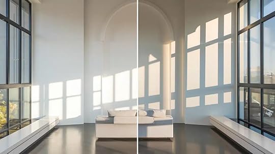
Snowfall White brings a clean brightness that’s never harsh. Like fresh winter snow, it creates a peaceful feeling in any room.
The color stays soft and inviting while maintaining its crisp appearance throughout the day.
The Ideal LRV for Light SpacesWith an LRV of 89.72, Snowfall White reflects almost 90% of light that hits it.
This high reflection makes rooms feel bigger and brighter, perfect for both small spaces and large areas where you want maximum light bounce.
Best Uses for Snowfall White in Your Home
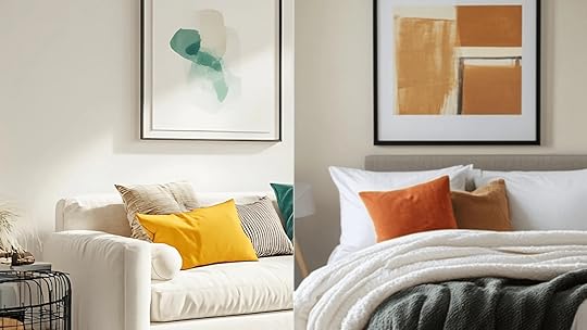
Snowfall White opens up living spaces, making them feel spacious and bright.
It creates a perfect background for colorful furniture and art pieces.
The clean color helps sunlight spread through the room, making gathering spaces feel more open and social.
Bedrooms for a Relaxing RetreatIn bedrooms, Snowfall White creates a calm, peaceful setting for rest.
The soft white walls help reduce visual noise, making it easier to unwind.
It pairs well with both light and dark bedding choices.
Accent Walls and TrimAs trim or on accent walls, Snowfall White adds clean lines and contrast.
It makes dark wall colors look richer and brings out the best in wood finishes.
For crown molding and baseboards, it creates sharp, clean edges that define your space.
How to Pair Snowfall White with Other Colors
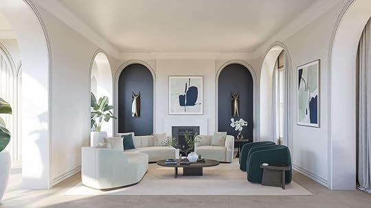
Snowfall White works well with many colors.
Soft grays create a clean, modern look, while pastels add gentle color.
For bold statements, pair it with deep blues or rich browns.
The white’s clean base lets other colors show their true tones without clashing.
Popular Color CombinationsTry Snowfall White with Benjamin Moore’s Simply White on trim for subtle depth.
Pair it with Soft Fern for a fresh, natural feel.
For a clean, bright look throughout your space, mix it with Chantilly Lace on ceilings or cabinets.
Snowfall White vs. Other Whites

When planning your next painting project, comparing similar white paints helps you find the exact shade that works for your space.
Let’s compare Snowfall White to two popular alternatives—White Dove and Simply White—to help you make the best choice for your home.
FeatureSnowfall WhiteWhite DoveSimply WhiteUndertoneSlight cool/blue undertoneWarm with gray-yellow undertoneClean with very slight yellow undertoneBrightnessMedium-bright whiteSofter, more muted whiteBright, crisp whiteLight ReflectionModerate light reflectionLower light reflectionHigh light reflectionBest RoomsBedrooms, living rooms, north-facing roomsTraditional spaces, south-facing roomsModern spaces, dark roomsTrim CompatibilityWorks with cool trim colorsBest with warm trim colorsVersatile for most trim colorsCeiling UseGood for ceilingsExcellent for ceilingsCan be too bright for ceilingsCabinet UseClean look for cabinetsSoft, classic look for cabinetsVery bright for cabinetsNatural Light EffectMaintains consistencyAppears creamierCan appear stark in bright lightWhy Choose Benjamin Moore’s Snowfall White?Snowfall White is a versatile and open white that can work in every house.
Let us look at why it would be the perfect fit for your home.
Quality and DurabilityBenjamin Moore’s Snowfall White proves its strength in daily use.
The paint resists marks and scratches, and keeps its bright white shade against sunlight and time.
Testing shows it stays fresh without yellowing, making it a reliable choice for busy homes.
Color Preview CollectionThe Color Preview collection sets high standards, and Snowfall White meets them all.
Each can brings tested quality in coverage and finish.
The paint goes on smooth and keeps its look through cleaning and daily wear.
Snowfall White in the Real WorldSee Snowfall White in your home before you paint.
Benjamin Moore’s Virtual Color Consultation helps you see the color in different lighting and room settings.
You can also get real paint samples to test on your walls – watch how the shade changes from morning to night for the best results.
ConclusionSnowfall White brings a clean, bright feeling to any room while keeping spaces cozy and inviting.
This paint shows its worth through lasting quality and easy care – making it a smart pick for busy homes.
See how it looks at different times of day and in various lighting.
Ready to start?
Visit a Benjamin Moore store for expert tips, color matching help, and special deals on paint gallons.
Get the perfect white that stays fresh and true for years to come.
Frequently Asked QuestionsWhat Makes Snowfall White Special?Snowfall White’s slight cool/blue undertone maintains consistency in different lighting conditions while creating a clean, fresh feel without being too stark.
What Rooms Work Best with Snowfall White?Bedrooms, living rooms, and north-facing rooms benefit most from Snowfall White’s balanced brightness and cool undertones.
What Colors Go Well with Snowfall White?Cool blues, soft grays, navy, sage green, and silver accents complement Snowfall White’s cool undertones for a balanced, fresh color scheme.
The post Snowfall White (2144-70)– A Crisp, Warm White for Your Home appeared first on Amenity Home.
Gossamer Veil (SW 9165): A Soft and Versatile Neutral
Gossamer Veil (SW 9165) by Sherwin-Williams has become a go-to neutral for many homes.
This medium-toned gray sits in the sweet spot between gray and beige, offering more depth than plain white walls without overwhelming a space.
Homeowners and designers favor this shade for its flexibility and subtle character.
It works well in various rooms and complements many design styles, from modern to traditional.
In this article, we’ll examine
What makes Gossamer Veil specialFocusing on its unique undertonesIdeal color combinationsDifferent lighting conditionsUnderstanding these aspects will help you decide if this popular paint color suits your space.
What is Gossamer Veil?Gossamer Veil (SW 9165) is a soft, warm gray paint color with subtle beige influences that place it in the greige family.
This gentle neutral sits comfortably in Sherwin-Williams’ collection of versatile neutral paints.
The shade offers a perfect middle ground – not too dark to close in a space, yet not so light that it lacks character.
Its balanced tone makes it highly adaptable to different rooms throughout the home.
One of Gossamer Veil’s key strengths is its performance across varying light conditions.
Morning sunlight may bring out its warmer notes, while evening light often emphasizes its gray foundation.
This chameleon-like quality helps it transition smoothly from bright, sun-filled spaces to rooms with limited natural light.
Understanding Gossamer Veil UndertonesGossamer Veil has primarily green-gray undertones at its core. This subtle green base gives the color its distinctive character without being obvious.
When light changes throughout the day, this paint might shift slightly.
In some lighting situations, particularly north-facing rooms, it can flash hints of violet. The beige qualities become more apparent in warmer south or west-facing spaces, softening the effect.
Unlike Agreeable Gray, which leans more consistently toward beige, or Drift of Mist, which has stronger green notes, Gossamer Veil maintains a more balanced profile.
This makes it less likely to appear too cool or warm when light conditions change suddenly.
Compared to cooler grays like Repose Gray, it feels more welcoming while maintaining a fresh look.
The versatility of these undertones explains why Gossamer Veil works well with many color schemes and furniture finishes.
How Lighting Affects Gossamer VeilUnderstanding how different lighting conditions impact Sherwin-Williams Gossamer Veil (SW 9165) is essential for achieving your desired aesthetic.
This versatile greige paint color shifts dramatically throughout the day and under various light sources.
Natural Light vs. Artificial LightLighting ConditionHow Gossamer Veil AppearsNorth-facing roomsCooler with stronger gray tones and visible green-violet undertonesSouth-facing roomsWarmer with beige notes becoming more prominent, especially in the afternoon sunWarm bulbsEnhances beige undertones, creates a soft, welcoming glowCool/daylight bulbsHighlights gray tones, creates a cleaner, modern lookGossamer Veil vs. Similar ColorsSherwin-Williams Gossamer Veil (SW 9165) is a popular light gray-beige (greige) paint color that offers subtle elegance and versatility in home decor.
When choosing the perfect neutral for your space, it’s helpful to understand how it compares to similar options that might better suit your lighting conditions and design preferences.
Understanding Subtle Differences ColorUndertones & DifferencesAgreeable GrayWarmer with brown undertonesDrift of MistLighter with subtle green huesPale OakCreamier with soft beige warmthAccessible BeigeMore beige, less gray than Gossamer VeilBest Rooms for Gossamer VeilGossamer Veil excels in transitional spaces like living rooms, kitchens, and hallways.
Its versatile greige tone creates a neutral backdrop that adapts beautifully to changing light conditions throughout the day.
Living Room
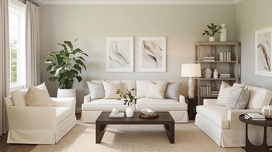
Gossamer Veil adds a subtle warmth to living spaces without competing with furniture or decor.
Its neutral base adapts to contemporary and classic design elements while providing more interest than plain white walls.
Bedroom
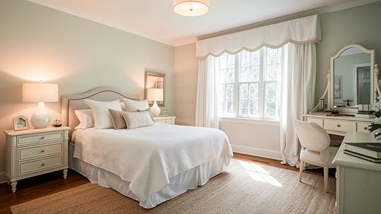
The soft gray-beige balance creates a calming backdrop for rest.
Gossamer Veil complements wooden bed frames and neutral bedding while maintaining enough character to stand independently.
Kitchen & Dining Room
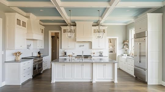
Against white cabinetry, this color creates a gentle contrast.
It harmonizes with marble countertops, stainless appliances, and natural wood elements without feeling cold or stark.
Bathroom & Small Spaces
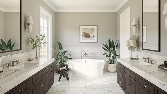
In smaller areas, Gossamer Veil helps spaces feel larger and more open.
It pairs well with white fixtures and various tile options while providing a more sophisticated alternative to pure white.
Trim & Ceiling Pairings for Gossamer VeilPair the Gossamer Veil with Pure White for crisp contrast or Alabaster for subtle elegance.
Best White Trim ColorsPure White (SW 7005) creates a clean, distinct contrast with Gossamer Veil.
This pairing works well in spaces where you want architectural details to stand out against the wall color.
Alabaster (SW 7008) offers a softer transition between wall and trim.
Its warm undertones complement Gossamer Veil for a more cohesive, subtle look that feels elegant and intentional.
Ceiling PairingExtra White (SW 7006) on ceilings helps reflect light downward and creates a sense of height.
This bright white ceiling makes spaces open and airy when paired with Gossamer Veil walls.
Complementary Colors & Design PairingsGossamer Veil pairs beautifully with muted blues, deep greens, and earthy neutrals.
This adaptable greige creates sophisticated, balanced spaces with limitless design possibilities.
Accent Colors That Work WellMuted blues create a refreshing coastal feel.
Deep greens offer natural contrast without overpowering.
Soft browns and tans enhance warmth for an earthy, grounded atmosphere.
Furniture & Decor SuggestionsLight oak and walnut wood tones highlight the subtle green undertones in Gossamer Veil.
Gold hardware adds elegance, while black fixtures provide crisp, modern contrast against this versatile gray.
Choosing the Right Sheen for Gossamer VeilSheen TypeBest ForFinish DetailsFlat/MatteBedrooms, low-traffic areasHides imperfections, soft, velvety appearance, maintains true colorEggshell/SatinLiving rooms, hallwaysSubtle shine enhances depth, easier to clean, sophisticated lookSemi-GlossKitchens, bathroomsMoisture-resistant, durable, slightly lighter appearance, very easy to cleanTips for Painting with Gossamer VeilTest in morning, afternoon, and evening lightApply quality primer for even coverageAllow 4-6 hours between coatsUse 3/8″ nap roller for smooth wallsCut in edges before rolling each sectionPair with natural textures for best resultsConclusionGossamer Veil offers the perfect balance of gray and beige with subtle green undertones that adapt to various lighting conditions.
This versatile neutral works across different room types and complements many design styles.
Always test paint samples on your walls before committing.
Watch how the color changes throughout the day in your space, as lighting significantly affects its appearance.
Whether in living areas, bedrooms, or kitchens, Gossamer Veil creates a sophisticated backdrop that’s neither warm nor cool.
It provides enough character to stand on its while allowing your furnishings and decor to take center stage.
Frequently Asked Questions What Undertones Does Gossamer Veil (SW 9165) Have?Gossamer Veil has soft green-gray undertones. Certain lighting may show subtle violet hints, while warmer light enhances its beige tones.
Does Gossamer Veil Look More Gray or Beige?It balances between both. It appears more gray in cooler lighting, while the beige tones become more noticeable in warmer spaces.
Is Gossamer Veil a Warm or Cool Color?Gossamer Veil is a warm greige. It leans warm in bright light but can appear slightly cool in north-facing rooms.
The post Gossamer Veil (SW 9165): A Soft and Versatile Neutral appeared first on Amenity Home.
Compare Repose Gray (SW 7015) vs. Silverpointe (SW 7653)
Choosing the perfect gray paint can be overwhelming. Sherwin-Williams offers two exceptional options. Silverpointe and Repose Gray stand out for their versatility.
These grays transform spaces in unique ways, each creating its own distinct atmosphere.
Silverpointe brings cool sophistication with blue undertones, while Repose Gray offers warm elegance with beige notes.
Selecting between them requires careful consideration. Your choice will impact your entire space. This guide compares these popular grays side by side.
We’ll find out how they react to light and examine how they work with different design elements.
By the end, you’ll know which gray suits your home and understand how each color behaves in various conditions. This will help you make the perfect choice for your space.
What Makes Silverpointe and Repose Gray Unique?
Before looking into the differences, let’s first understand what makes these shades special.
Silverpointe: A Cool, Subtle Gray with Blue Undertones
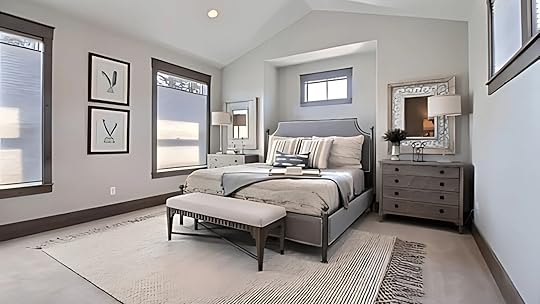
Silverpointe (SW 7653) is a soft, cool gray with a hint of blue.
It’s part of Sherwin Williams’ “Architectural Colors” collection, which is designed to create a refined and serene backdrop.
Silverpointe is known for its light, airy feel and is often described as a cool gray or even a “blue-gray” because of its subtle undertones.
It works well in contemporary, modern, and minimalist spaces where a clean, fresh look is desired.
One of Silverpointe’s standout qualities is its ability to reflect light beautifully. This makes it ideal for rooms that receive a lot of natural sunlight.
It doesn’t overpower the room but enhances the space by making it feel bright and spacious.
Repose Gray: A Warm, Soft Gray with Beige Undertones
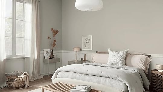
Repose Gray (SW 7015), on the other hand, is a more versatile and warmer gray.
It has a strong beige undertone, giving it a slightly brownish or taupe appearance.
This warmth makes it perfect for creating a cozy, welcoming environment in spaces that need a bit of softness.
Unlike Silverpoint, which feels cooler, Repose Gray feels more balanced and inviting, making it a favorite for traditional, rustic, and transitional interiors.
Repose Gray is a great choice for areas where you desire a neutral backdrop, steering clear of the harshness of pure white or the chilliness of a true gray.
It pairs effortlessly with natural materials like wood, stone, and brass, bringing a sense of calm to larger spaces.
Key Differences Between Silverpointe and Repose GrayThe most significant difference between Silverpointe and Repose Gray lies in their undertones and the atmosphere they create in a room. Let’s break it down further.
Undertones and Temperature: Cool vs. WarmFeatureSilverpointeRepose GrayUndertonesCool blue and green undertonesWarm beige and taupe undertonesTemperatureCool, fresh, and crispWarm, inviting, and cozyBest Suited ForModern, minimalist spaces seeking a clean, sleek lookLiving rooms, bedrooms, and areas that need a cozy backdropImpact in Low LightIt may appear stark or cold in dimly lit areasProvides warmth and comfort, even in low-light environmentsIdeal Design StyleContemporary, modern, and minimalisticTraditional, transitional, and rustic designsLight Reflectance: How Lighting Affects Both ColorsAnother important factor to consider is lighting, which can significantly impact the color’s appearance.
Natural and artificial light can shift these colors, so understanding their light reflectance is key.
Silverpointe has an LRV (Light Reflectance Value) of 60. This is considered a light to medium color, which means it will reflect a decent amount of light, brightening up a space.
However, because of its cooler undertones, Silverpointe may appear more muted or cold in rooms lacking ample natural light. In a sunlit room, however, it will feel bright and airy.
Repose Gray, with an LRV of 58, is slightly darker but still falls within the light gray range. It has enough warmth to look inviting in both natural and artificial lighting.
In a room with natural light, Repose Gray will feel soft and neutral, while in artificial lighting, the beige undertones will come forward, creating a cozy, calm atmosphere.
Ideal Spaces for Silverpointe and Repose Gray
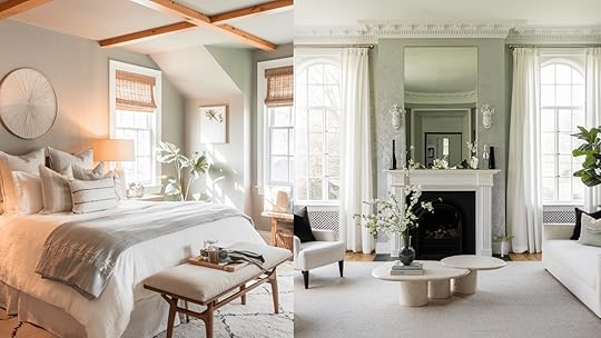
The ideal space for each color depends on the mood you want to create and the amount of natural light your room receives.
Silverpointe is perfect for rooms that receive a lot of natural light.
Its cool, reflective nature makes it a great option for living rooms, dining rooms, and entryways where you want to create a bright, clean, modern feel.
However, it may not be suitable for rooms with limited natural light, as it can seem cold and uninviting.
With its warm, neutral undertones, Repose Gray works well in bedrooms, kitchens, and bathrooms, especially if you want to create a comfortable, balanced atmosphere.
It’s also great for larger spaces like open-concept living rooms where you want to maintain a warm, inviting vibe without the room feeling too dark.
Because it works well with warm and cool tones, it can complement various interior styles, from traditional to modern.
Which Color Should You Choose? Silverpointe or Repose Gray?Now that we’ve discussed their differences, how do you decide which is the right choice for your home?
Here are some tips to help you choose between Silverpointe and Repose Gray.
Choose Silverpointe if:
You have a modern, minimalist, or contemporary home.You want a cooler, fresher vibe in rooms with plenty of natural light.You prefer a light, airy feel in living or dining rooms.You’re looking for a color that pairs well with white, silver, or cool tones in your furniture and décor.Choose Repose Gray if:
You want a warmer, inviting color for living rooms or bedrooms.You have warm lighting or want to balance out the cooler aspects of your home’s design.You prefer a neutral color that works well with light and dark furniture.You’re designing a traditional or transitional space with natural elements like wood or stone.Lighting and Silverpointe vs. Repose GrayThe lighting in a room plays a huge role in how each of these shades looks.
For example:
Silverpointe in Natural Light: The blue undertones in Silverpointe come forward when the room is filled with natural light.
It will appear cooler and fresher, making it an excellent choice for sun-filled rooms or open spaces where you want to create a sense of airiness.
Repose Gray in Natural Light: In rooms with plenty of natural light, Repose Gray’s beige undertones soften the space, making it feel cozy but still neutral.
It works wonderfully in spaces like living rooms or kitchens where you want to avoid the starkness of white.
Styling Guide: Decorating with Gray Walls
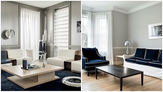
When decorating with gray walls, the right furniture can make or break the look.
For Silverpointe, cool gray, modern white, or light oak furniture fits perfectly.
Add depth with navy or charcoal accents and complement with glass or chrome finishes. Avoid dark brown woods, as they clash with Silverpointe’s cooler tones.
For Repose Gray, warm gray, dark wood furniture pairs beautifully.
Softening with cream or beige upholstery, mix brass or bronze metals for sophistication.
Natural wood tones bring warmth and balance to the space.
Flooring MaterialsTo complement Silverpointe’s cool tones, opt for light oak hardwood, white marble, cool-toned luxury vinyl, or light gray carpet.
For Repose Gray’s warm undertones, go with medium to dark hardwoods, warm stone tiles, beige or taupe carpet, or rustic wood-look flooring.
Window TreatmentsFor Silverpointe, white sheer curtains provide an airy, light atmosphere. Crisp Roman shades add structure, while navy or charcoal drapes bring contrast.
Modern cellular blinds ensure privacy and light control, making it ideal for contemporary spaces.
Repose Gray pairs well with natural linen curtains for warmth and texture.
Woven wood blinds offer an earthy vibe, while cream Roman shades and textured neutral drapes add depth.
These treatments enhance the color’s warmth, creating a cozy atmosphere for traditional or relaxed interiors.
Art and DecorBlack and white photography, abstract blue or silver art, chrome accessories, and white ceramics perfectly suit Silverpointe’s cool undertones.
Repose Gray pairs well with botanical prints, warm landscapes, brass or copper accents, and natural woven baskets, enhancing its cozy, warm ambiance.
Common Mistakes to AvoidUndertone MismatchingMixing cool Silverpointe with warm-toned furniture can create a clash. Place large paint samples next to existing furnishings to see how the colors interact.
When choosing a paint color, always consider the undertones of fixed elements like countertops, tiles, and flooring.
Sample Testing ErrorsTiny paint chips can lead to inaccurate results. Use large sample boards (at least 2′ x 2′) and test them in different lighting conditions throughout the day.
Always test over white primer to avoid interference from existing colors.
Application MishapsSkipping proper wall preparation is a common mistake. Clean, repair, and prime the walls before painting, and be sure to fill any holes.
Plan for two full coats of paint, even with premium paint, to ensure consistent coverage. Maintain a wet edge while painting.
Tool SelectionUsing low-quality brushes and rollers can result in poor paint application.
To get the best finish, invest in professional-grade tools and use the right roller nap for your wall texture.
Environmental FactorsPainting in extreme temperatures or high humidity can affect the paint’s drying time and final appearance.
Paint when the temperature is between 50-85°F and avoid painting in high humidity conditions.
By avoiding these common mistakes and following the styling guidelines, you’ll achieve the best possible results with either Silverpointe or Repose Gray.
Remember that planning and testing properly will save time and money in the long run.
ConclusionChoosing between Silverpointe (SW 7653) and Repose Gray (SW 7015) depends on the feel you want to create in your space.
Silverpointe brings a cool, fresh tone ideal for modern or minimalist designs, especially in areas with ample natural light.
Conversely, Repose Gray offers a warmer, softer feel, making it perfect for traditional or cozy spaces.
Lighting will influence each shade’s appearance, so testing samples in your home is recommended.
Both colors are flexible, allowing you to raise the beauty and atmosphere of your home effortlessly.
Whichever you choose, you’ll enjoy the calm and welcoming ambiance they bring to your rooms.
Frequently Asked Question Can Silverpointe and Repose Gray Be Used Together?Yes, they can. Silverpointe’s cool tones complement Repose Gray’s warm shades, making them work well together in the same room.
Which Paint is Better for High-Traffic Areas?Both are durable, but Silverpointe’s lighter color may show dirt and scuffs more easily. Repose Gray’s warmer tones may hide marks better.
The post Compare Repose Gray (SW 7015) vs. Silverpointe (SW 7653) appeared first on Amenity Home.


