M. Shannon Hernandez's Blog, page 3
October 15, 2025
Herringbone Floor Pattern: Types & Design
Looking for a floor design that adds instant grace without feeling outdated or too trendy for your home? A herringbone floor pattern delivers classic style with its distinctive zigzag layout that catches every eye walking through.
This classic pattern changes plain floors into statement features that upgrade your entire home’s appearance and value. You see herringbone in luxury hotels, historic buildings, and designer homes because it works beautifully everywhere it goes.
Installing a herringbone floor pattern might seem complicated, but understanding the basics makes the process much clearer. I’ll walk you through everything about this pattern so you can decide if it perfectly suits your space.
What is a Herringbone Floor Pattern?A herringbone floor pattern uses rectangular planks arranged in a distinctive zigzag design that creates visual movement. Each plank sits at an angle, forming a V-shape that repeats across your entire floor surface.
This classic pattern has deep historical roots in European architecture and traditional parquet flooring designs. You’ll find it in old palaces, mansions, and homes throughout France, Italy, and England, dating back centuries.
The herringbone pattern looks completely different from standard straight or diagonal floor layouts you commonly see today.
Instead of planks running in one direction, they alternate angles to create an eye-catching woven appearance.
How a Herringbone Pattern Is Laid?Installing a herringbone pattern requires careful planning and precise measurements before you place any planks down. Each rectangular piece sits at an exact angle, meeting the next plank to form a distinct V-shape.
You can choose between a straight installation that runs parallel to your walls or a diagonal placement for added drama.
Diagonal layouts create more visual interest but require more cutting and waste during the installation process overall.
Proper subfloor preparation makes all the difference in how your finished herringbone floor looks and performs long-term. The surface must be completely level, clean, and dry before you begin laying any planks down.
You’ll need specific tools, including a miter saw, measuring tape, and spacers, for achieving perfect alignment throughout.
Types of Herringbone Floor PatternsI’ve gathered the most popular herringbone variations so you can find the perfect style for your space. Each pattern offers a unique look while maintaining that classic zigzag appeal everyone loves. Here are the main types to choose from:
1. Classic Herringbone
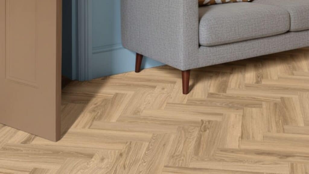
This traditional pattern lays rectangular planks in a zigzag V-shape with ends meeting the sides of adjacent planks. It’s classy and works beautifully in any room style or decor scheme you choose.
The classic design adds natural movement and flow to your floors without feeling too busy or overwhelming. This pattern remains the most popular choice for homeowners wanting luxury floors that never go out of style.
2. Double Herringbone
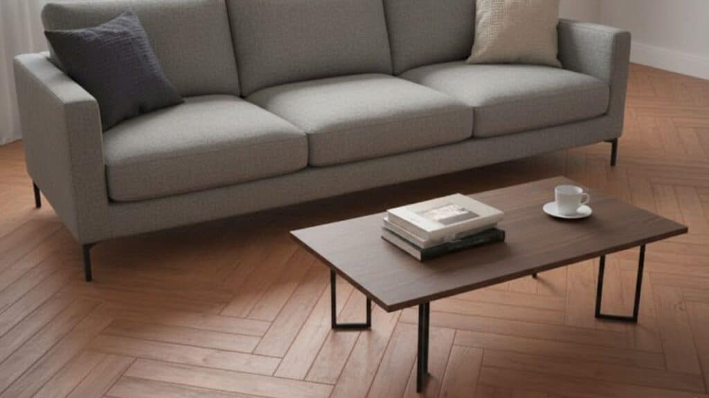
Two planks are placed side by side in each V-shape, making a wider and more textured design overall. It adds extra depth and visual interest to your floors compared to the single plank version.
This pattern works especially well in larger rooms where the doubled effect creates more impact and presence. The wider design makes your space feel grander and more luxurious without changing the basic herringbone concept.
3. Block Basket Weave (Mosaic)
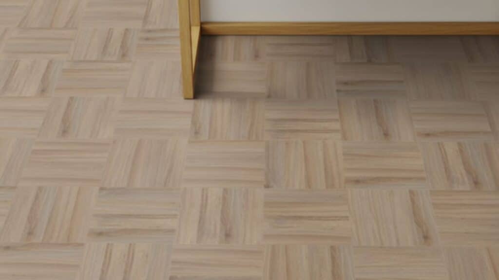
Planks are laid in small blocks, creating a boxed or mosaic appearance that catches the eye immediately. It’s more intricate and detailed than standard herringbone, giving floors a formal and urbane style.
This pattern requires more precision during installation but delivers incredible results that impress guests and visitors. The geometric blocks create interesting shadows and dimensions that change throughout the day with natural light.
4. Straight Lay Herringbone (Brick Bond)
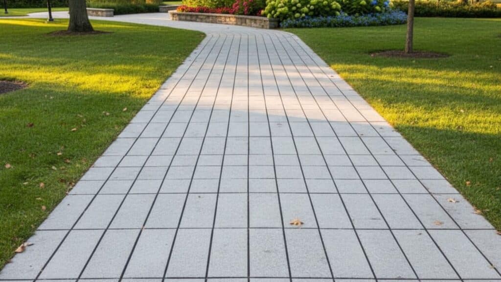
Planks lie side by side in straight rows, resembling traditional brickwork patterns you see on walls. It gives a sleek and modern update to classic herringbone while maintaining that structured appearance.
This simplified version is easier to install than angled herringbone patterns and uses less material waste. The clean lines work perfectly in contemporary homes that favor minimalist design and straightforward aesthetics.
5. Ladder Herringbone
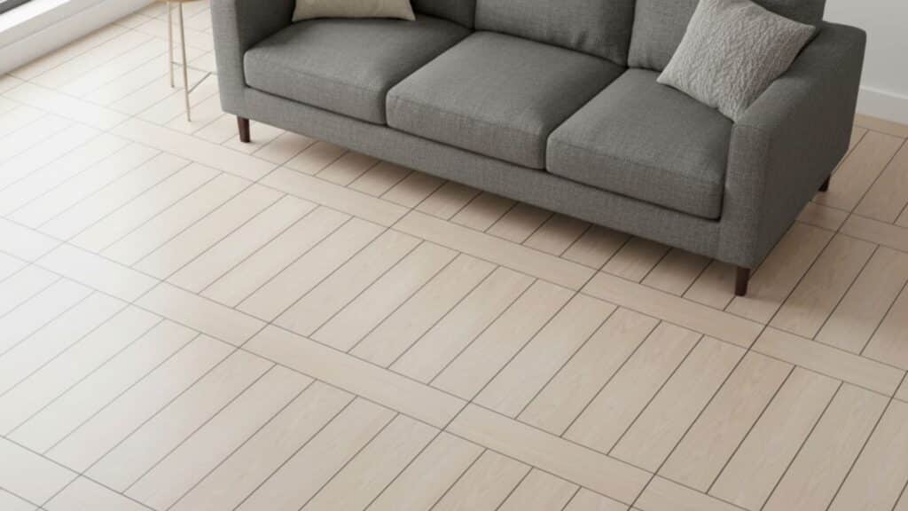
Grouped vertical planks are interrupted by horizontal rung planks, resembling a ladder leaning against a wall. This bolder style adds instant visual magnetism and drama to any space you install it in.
The pattern creates strong horizontal and vertical lines that draw eyes across the entire room naturally. It’s perfect for making a statement in entryways, hallways, or feature walls where you want attention.
6. Diagonal Herringbone
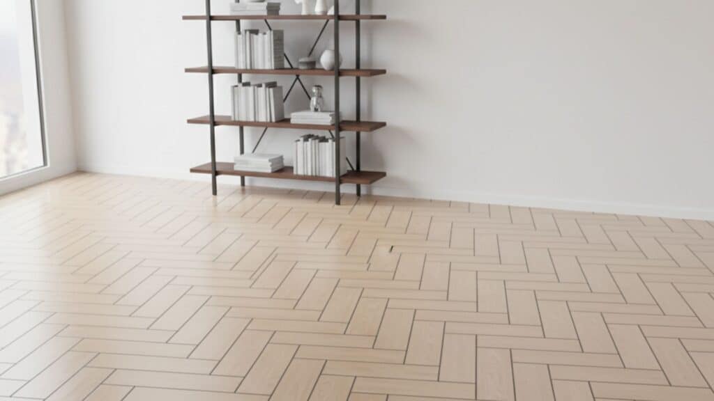
Traditional herringbone set diagonally to the room edges instead of running parallel to the walls like usual. It creates a dynamic and dramatic visual effect that makes rooms feel larger and more interesting.
The diagonal orientation adds energy and movement that standard straight herringbone installations cannot quite achieve alone. This layout works beautifully in square rooms where you want to break up the predictable geometry.
Herringbone vs Chevron FlooringBoth patterns look similar at first glance, but their installation and effect differ. Understanding these key differences helps you choose the right pattern for your home and budget:
FeatureHerringboneChevronPlank ShapeRectangular planks with straight endsPlanks cut at precise angles on both endsPattern TypeOverlapping zigzag with staggered jointsContinuous V-shape with pointed meeting pointsVisual FeelTraditional, textured, and classic appearanceSleek, modern, and streamlined lookInstallation DifficultyEasier to install with less precision requiredRequires more precise cutting and measurementsMaterial WasteLess waste due to rectangular cutsMore waste from angled cuts on planksRepair ProcessEasier to replace individual planksMore difficult to repair without disrupting the patternCostModerate pricing for materials and laborSlightly higher due to cutting and installation timeWhile chevron is technically a variation of herringbone, it creates a distinctly different visual effect. Choose classic herringbone for traditional appeal or chevron for a sleeker, more contemporary finish in your space.
Best Materials for Herringbone FlooringChoosing the right material for your herringbone floor affects both appearance and durability over time. Different materials work better in specific rooms and climates, depending on your needs and budget. Here are the top options to consider:
Solid hardwood: Oak, walnut, and hickory offer natural beauty and can be refinished multiple times throughout their lifespan.Engineered wood: This layered construction handles moisture better than solid wood and works great in basements or humid climates.Luxury vinyl and laminate: These affordable materials mimic real wood appearance while being waterproof and easy to maintain for busy households.Tile and stone: Ceramic, porcelain, or natural stone herringbone patterns add grace to wet areas where wood would be damaged.Each material offers unique advantages depending on where you install it and how much you want to spend. Match your material choice to your room’s function, moisture levels, and the overall look you want to achieve.
Room-by-Room Styling IdeasHerringbone floors work beautifully in every room but require different design approaches depending on the space’s function. I’ll show you how to style and design herringbone flooring to match each room’s unique needs perfectly.
1. Living Room
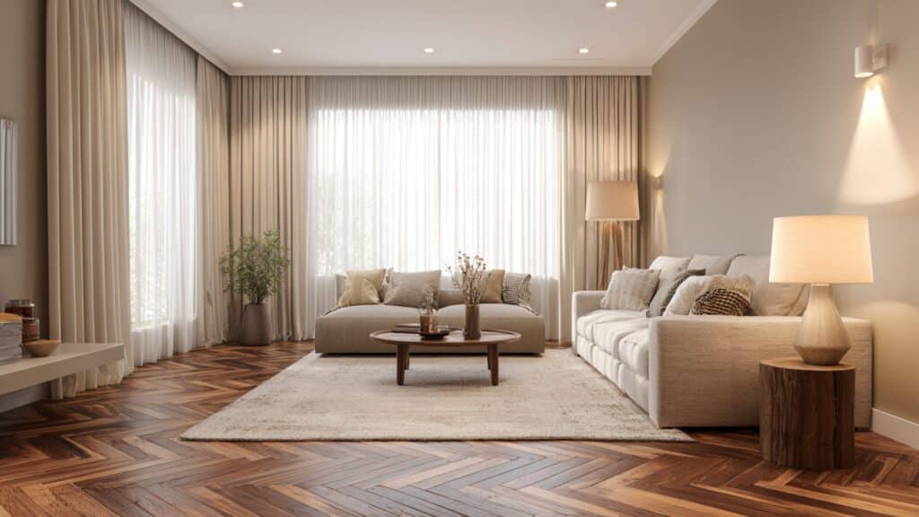
Herringbone floors add a warm, inviting vibe to living rooms with their classic pattern and rich wood tones. They bring depth and charm to open spaces. Consider these ideas for a cozy yet lavish feel:
Warm wood tones create cozy, graceful atmospheres filled with natural light and soft textures.Works beautifully with large area rugs that define seating areas and add comfort.Pairs well with plush furniture and soft lighting for relaxed, stylish living spaces.These approaches bring a graceful style to your living room with careful layering. Herringbone flooring can elevate the whole room’s atmosphere organically and beautifully.
2. Kitchen
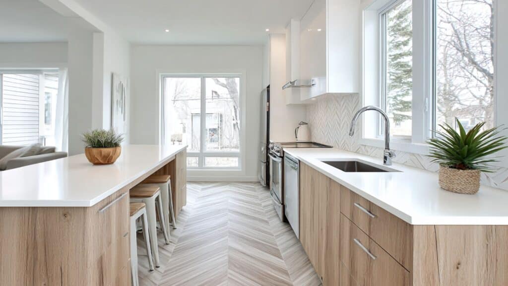
Herringbone floors in kitchens balance beauty with practicality. The pattern adds visual interest while durable materials stand up to spills. Consider these tips for a durable, stylish kitchen:
Use waterproof vinyl or tile herringbone designs that resist moisture and wear.Combine with simple cabinetry to create a balanced, uncluttered look that pops.Opt for light shades to brighten and open up smaller kitchen spaces.These choices keep your kitchen floors looking great and easy to clean. They help make kitchens feel fresh and inviting while lasting long.
3. Hallways and Entryways
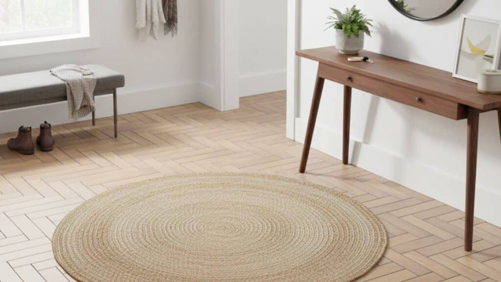
The right herringbone pattern in hallways and entryways can change tight spaces. It helps elongate and widen narrow paths, boosting curb appeal indoors. Try these ideas to enhance flow and space:
Diagonal or chevron layouts create eye-catching lines that trick the eye into wider spaces.Use contrasting colors or grout to highlight the pattern and add drama.Add complementary baseboards or trims for clean, finished edges that frame the pattern.These patterns make hallways feel larger and more welcoming overall. Herringbone floors in entryways set a stylish first impression.
4. Bedrooms
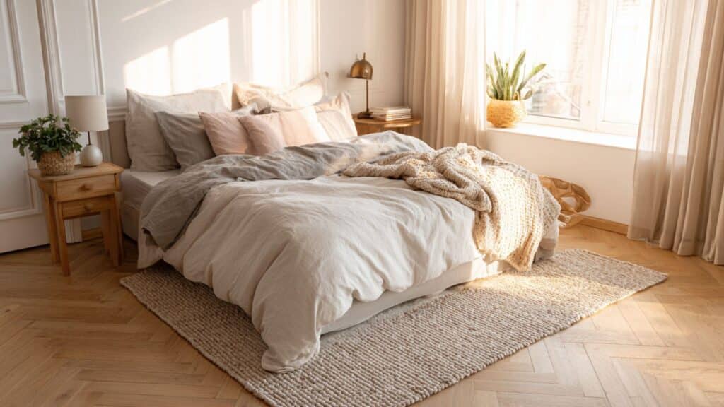
A herringbone floor can calm and comfort bedrooms with soft colors and finishes. It adds interest without overwhelming peaceful spaces. These tips help create relaxing retreats:
Softer stains and matte finishes produce calm, inviting bedroom floors with muted glam.Pair with textured area rugs for warmth and to gently break up patterns.Choose muted or pastel hues to keep bedrooms restful and cozy.These ideas ensure bedrooms feel balanced and serene with stylish flooring. Herringbone adds character while supporting a peaceful, cozy atmosphere.
Pros and Cons of Herringbone FlooringEvery flooring choice comes with advantages and drawbacks you should weigh before making a decision. Understanding both sides helps you decide if herringbone flooring is the right fit for your home.
ProsConsClassy appeal that never goes out of styleRequires precise installation and careful measurementsAdds visual space and makes rooms feel largerSlightly costlier than straight plank layoutsIncreases home value and resale appealMay require professional installation for best resultsConsider your budget, skill level, and timeline when deciding if herringbone flooring works for your project. The unexpected results often justify the extra effort and cost for homeowners who value distinctive, high-end flooring.
Maintaining Your Herringbone FloorsKeeping your herringbone floors looking beautiful requires simple routine care and attention to potential damage sources. Following basic maintenance practices extends your floor’s lifespan and preserves its attractive appearance for years ahead. Here’s how to care for your herringbone flooring properly:
Regular vacuuming and dusting remove dirt and debris that can scratch the surface when walked on repeatedly.Use furniture pads under all chairs, tables, and heavy items to avoid scratches and dents in the flooring.Refinish wood floors every few years to restore their shine and protect them from wear and damage.Clean spills quickly with a dry cloth to prevent warping, staining, or moisture damage to your floors.These simple habits protect your investment and keep your herringbone floors looking fresh and new longer. Consistent care prevents expensive repairs and maintains the beauty that makes herringbone flooring so special in homes.
Final WordsYou now understand everything about the herringbone floor pattern and how it can alter your home’s look. This versatile design works in any room and pairs beautifully with different materials and decorating styles throughout.
If you prefer traditional wood or modern vinyl, herringbone adds character that plain floors simply cannot match.
The pattern makes small rooms feel bigger and large rooms feel more interesting without overwhelming your space. Remember that proper installation matters more than rushing through the project to save time or money.
Your home deserves flooring that makes you smile every time you walk through the door. Share your herringbone floor questions or experiences in the comments below!
The post Herringbone Floor Pattern: Types & Design appeared first on Amenity Home.
9 Subway Tile Patterns for Every Style & Room
Are you tired of staring at plain, boring walls that make your home feel flat and lifeless? Subway tile patterns can completely change how your kitchen, bathroom, or any room looks and feels.
These simple rectangular tiles offer unlimited layout possibilities that fit any style you love. I’ve worked with subway tiles for years, and I’m always amazed by how different patterns create totally unique looks.
The right layout can make small spaces feel bigger, add character to bland walls, and boost your home’s value. You don’t need to be a professional designer to choose a pattern that works perfectly for your space.
I’ll walk you through everything about subway tile patterns so you can pick the best one. Let’s convert your walls into something you’ll love looking at every single day.
What Are Subway Tile Patterns?Subway tiles are rectangular tiles originally inspired by the classic New York City subway stations from the early twentieth century. The way you arrange these tiles dramatically changes how your walls look and feel in any space.
Standard subway tile sizes include three by six inches and four by eight inches, though other dimensions exist, too.
You can find subway tiles in ceramic, glass, marble, porcelain, and other materials to match different styles.
Different layout patterns affect how light reflects off your walls and creates visual flow throughout the room. Choosing the right pattern helps you achieve balance and guides the eye exactly where you want it.
Most Popular Subway Tile PatternsI’ve compiled the most popular subway tile patterns that can completely change how your walls look and feel. Each layout creates a different mood and works best in specific spaces, so here are the top options:
1. Classic Running Bond
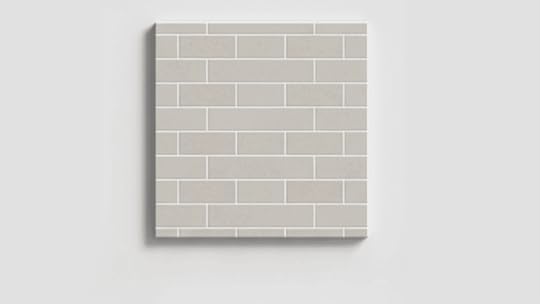
This layout is the most familiar and widely used subway tile pattern. It hides wall flaws well and gives a neat, balanced finish.
I’ve seen it used in both vintage and modern kitchens with great results. It’s simple, classy, and always feels right for any style.
Tip: Use darker grout to highlight each tile and create that brick-style contrast.
2. Vertical Stack Pattern

Tiles are aligned in tall, even columns that bring structure and a modern edge. My friend Michael mentioned, “Our small bathroom felt taller right after we installed this pattern.”
Designers like it because it’s easy to plan and makes low ceilings appear higher. It’s clean, sharp, and perfect for minimalist homes.
Tip: Pick glossy tiles to reflect light upward and brighten smaller spaces.
3. Horizontal Stack Pattern

This simple grid-style layout creates calm and order on open walls. A designer told me it’s popular in Scandinavian-inspired kitchens because of its soft symmetry and visual balance.
I recommend this one for anyone who wants a no-fuss, sleek design that feels contemporary.
Tip: Match your grout to your tile color for a smooth, uninterrupted surface.
4. Herringbone Pattern
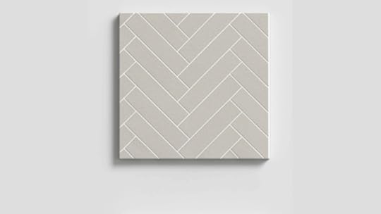
The zigzag design brings instant motion and character to any room. Emily, my colleague, said, “We used it behind our stove, and now everyone notices that wall first.”
I like how it creates a bold accent without feeling overwhelming. It’s the perfect choice for kitchens or entryway walls that need energy.
Tip: Start tiling from the wall’s center so the pattern looks symmetrical.
5. Diagonal Herringbone

Rotating the herringbone 45 degrees gives it a fun, modern twist. It’s bold but not overdone, which makes it perfect for feature walls or backsplashes.
I’ve used this layout in smaller kitchens, and it always catches the eye without overpowering the space. It adds movement in a subtle way.
Tip: Keep decor simple so the tile layout remains the focal point.
6. Chevron Pattern
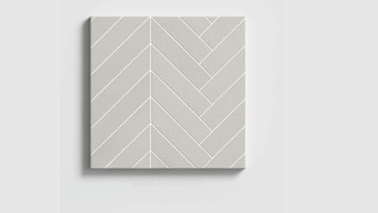
Tiles cut at 45 degrees form perfect “V” shapes that flow smoothly across the wall. This pattern looks sharp, polished, and adds a sense of direction to your design.
I’ve seen it upgrade basic kitchen backsplashes into something truly designer-worthy. It’s clean, flawless, and full of quiet refinement.
Tip: Keep grout lines thin for a smooth, continuous finish.
7. Basketweave Pattern
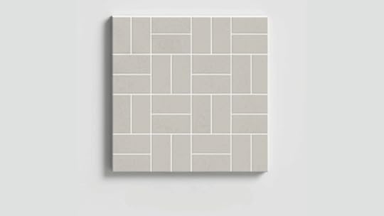
This woven look mixes horizontal and vertical tiles to create texture and rhythm. Claire, one of my friends, mentioned, “It gave our bathroom walls a handmade, cozy feel.”
The pattern works best in mid-sized rooms where the detail can really stand out. It’s graceful, tactile, and brings warmth to simple spaces.
Tip: Choose slightly darker grout to make the woven look stand out.
8. Crosshatch or Grid Pattern

Alternating vertical and horizontal tiles gives structure and playfulness to walls. It’s great for those who want order without monotony.
I often recommend it for modern living rooms or small accent walls that need gentle texture. The layout adds a quiet personality while keeping a clean, geometric appearance overall.
Tip: Stick to a single tile color so the alternating layout stays visible.
9. Step Ladder
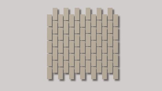
Each vertical row shifts slightly upward, adding a gentle sense of movement. My Client Mark said, “It feels like the tiles are rising; subtle but lively.”
Designers appreciate how it adds dimension without distraction. I like this for showers or modern feature walls that need something fresh and eye-catching.
Tip: Use light grout to keep the stepped pattern smooth and cohesive.
Creative Subway Tile Layout Ideas by RoomDifferent rooms benefit from specific subway tile layout patterns that perfectly enhance their function and visual appeal. I’ll show you how to choose the best layouts for kitchens, bathrooms, showers, and utility spaces:
1. Kitchen Subway Tile Patterns
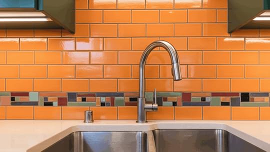
Kitchen subway tiles can completely alter the way your cooking space looks and feels. The layout you choose adds both charm and structure. To make your kitchen design stand out, try these ideas:
Use horizontal layouts to make open kitchens appear wider and more spacious.Try herringbone behind the stove to create a standout backsplash that becomes the room’s focal point.Mix two complementary tile colors or textures; begin layout planning from the center of the backsplash for balanced alignment.These choices give kitchens a clean, open feeling while keeping maintenance easy. Simple changes in layout can make a big visual difference.
2. Bathroom Subway Tile Patterns
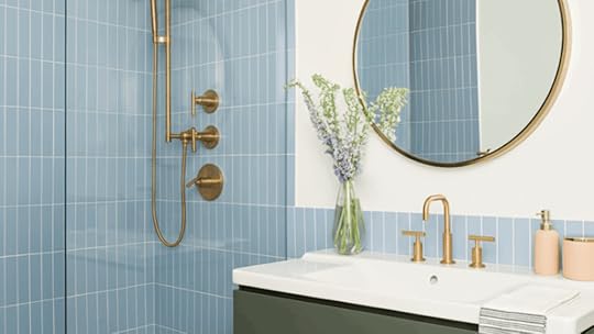
Subway tiles in bathrooms bring calm, clean lines, and beauty. They’re also an easy way to make small spaces feel relaxing. To build comfort and character into your bathroom, try these ideas:
Go vertical with your layout to make ceilings appear taller instantly.Choose basketweave or diagonal herringbone for a classic hint that adds movement without clutter.Try softly colored tiles like sage or pale blue; start layout planning around mirrors or vanity walls for a natural focal point.These layouts bring harmony and lightness to your bathroom. A few smart adjustments can turn it into a personal retreat.
3. Laundry or Mudroom Patterns

Laundry rooms and mudrooms benefit from subway tiles that are both stylish and tough. A good layout keeps the area organized while adding personality. To create a space that feels neat and put together, try these ideas:
Choose stacked or basketweave layouts for durability and a crisp finish that stands up to daily use.Go with darker grout shades to hide dirt and scuffs between cleanings.Try elongated subway tiles for a modern hint; start layout planning from the most visible wall for clean alignment.These small design moves make practical spaces feel intentional. Even simple layout choices can add warmth and balance.
How to Choose the Right Subway Tile LayoutSelecting the perfect subway tile layout can change your space from ordinary to extraordinary. The pattern you choose affects both the visual flow and the overall feel of your room. Here are the key factors to consider when making your decision:
Consider your room’s dimensions and shape: Horizontal patterns make narrow spaces feel wider, while vertical layouts add height to rooms with low ceilings.Match the layout to your design style: Classic brick patterns suit traditional homes, herringbone works beautifully in modern spaces, and vertical stacks create a contemporary look.Factor in grout line visibility and maintenance: Different patterns create varying amounts of grout lines, which affect both appearance and cleaning requirements.Test the pattern in your actual space: Use painter’s tape or cardboard to mock up different layouts on your wall before committing to one design.Your chosen layout will set the tone for the entire room, so take time to explore your options. The right pattern creates a cohesive look that you’ll love for years to come.
Subway Tile Pattern Mistakes to AvoidEven experienced DIYers can make mistakes when installing subway tiles. Small errors can affect how your finished project looks and lasts. Watch out for these common problems that can ruin your tile work:
Misaligned tiles in grid layouts can make your whole wall look sloppy, so use spacers and check your alignment frequently as you work.Poor planning of edge cuts leaves you with tiny slivers that look bad and are hard to install, so measure your wall before you start.Choosing grout that clashes too strongly creates a harsh contrast that overwhelms your design unless that’s the exact bold look you’re going for.Mixing patterns without balance or a visual reason makes your space feel chaotic and confusing instead of interesting, so stick to one main pattern.Taking time to avoid these mistakes saves you money and frustration. A little extra planning upfront leads to professional-looking results you’ll be proud to show off.
Final ThoughtsChoosing subway tile patterns doesn’t have to feel overwhelming or complicated once you understand your options. I hope this helps you see how different layouts can change your space and match your personal style.
The beauty of subway tiles is that they work in almost any room and suit nearly every design preference.
Remember that even simple patterns can make a huge impact when installed correctly and matched with the right grout.
Take your time, test different layouts, and trust your instincts about what feels right for your home. Your perfect subway tile pattern is out there waiting to bring your vision to life.
What pattern are you most excited to try in your space? Share your tile plans in the comments below.
The post 9 Subway Tile Patterns for Every Style & Room appeared first on Amenity Home.
How to Paint a Metal Front Door: Best Method
Want to refresh your home’s entrance but not sure how to paint a metal front door correctly? I understand the challenge of getting a smooth, lasting finish on metal surfaces that face the weather daily.
Many homeowners skip crucial preparation steps and end up with peeling paint within months of finishing. Others use the wrong products and watch their hard work literally chip away after one season.
Learning how to paint a metal front door properly protects your investment and boosts curb appeal instantly. The right technique prevents rust, weathering, and costly repairs down the road.
I’ll show you the exact process professionals use for durable, beautiful results every time. Get ready to alter your entrance with confidence and skills that last.
Why You Should Paint a Metal Front Door?Painting your metal front door does more than just change its color or appearance. It creates a protective barrier that shields the metal from rust and moisture damage over time. A fresh coat of paint also helps weatherproof your door against rain, snow, and harsh sunlight.
This protection keeps your door functioning smoothly and looking good for many years ahead. Repainting extends the lifespan of your door by preventing corrosion and wear from daily use.
It’s a simple maintenance task that saves you money on premature door replacement costs. A newly painted front door instantly boosts your home’s curb appeal and overall value, too.
It’s one of the easiest upgrades that makes a noticeable difference to visitors and potential buyers.
Materials and Tools Needed for PaintingGathering the right materials before you start makes the painting process smoother and more efficient. Here’s what you’ll need for this project:
MaterialEstimated Cost Range (USD)DTM (Direct-to-Metal) Paint$30 – $120 per gallon400-Grit Sandpaper$5 – $15 per packPainter’s Tape$5 – $15 per rollPaintbrush (Angled)$5 – $20 eachFoam Roller$5 – $20 eachDrop Cloth or Tarp$10 – $30 eachScrewdriver (for hardware)$10 – $30 eachVacuum with Brush Attachment$50 – $150Damp Rag or Microfiber Cloth$5 – $15 per packSawhorses (optional)$30 – $70 per pairHow to Paint a Metal Front Door: Step-by-Step GuideNote: These costs are estimated and may vary based on your location, brand preferences, and current market prices at retailers.
Painting a metal front door requires careful preparation and the right materials for a lasting finish. Follow these steps to modify your door like a pro:
Step 1: Remove the Door and Hardware

Begin by taking your metal door off its hinges so you can paint it on a flat surface. This setup helps prevent drips and streaks while giving you better control.
Lay the door across two sturdy sawhorses and remove all hardware, including the handle, lock, and any plates. Keeping these parts separate makes painting easier and ensures a smooth, clean finish without missing tight corners or edges.
Step 2: Lightly Sand the Surface

Use 400-grit sandpaper to gently sand the metal surface, just enough to rough it up a little. This helps the primer and paint grip better without scratching the metal.
Once you’re done sanding, vacuum the dust with a brush attachment and wipe everything down using a damp rag. Make sure the surface is completely clean and dry before moving on to priming or painting.
Step 3: Choose the Right Paint

For a lasting finish, use DTM (Direct-to-Metal) paint designed for metal surfaces. Regular latex paint won’t bond well and will peel after a few months. DTM paint sticks tightly to metal and resists moisture and UV damage.
Stir it thoroughly before painting to make sure the color and texture are even. Choosing the right paint ensures your door stays durable and fresh-looking for years.
Step 4: Apply the Paint

Start by painting around the edges and panels with an angled brush, keeping your strokes light and even. Next, switch to a foam roller for the larger, flat areas of the door.
Roll slowly and evenly with medium pressure to avoid streaks or bubbles. Let the first coat dry completely, usually around two hours, before applying the second coat for a smoother, more polished finish.
Step 5: Add a Second Coat and Reattach Hardware
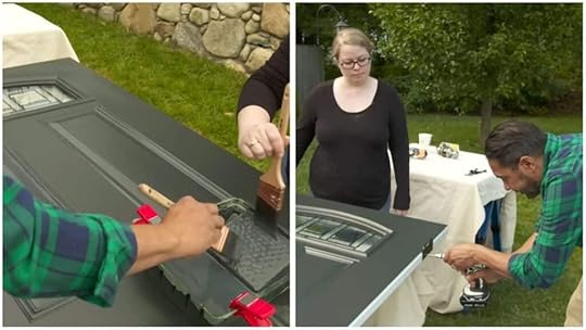
After the first coat dries, apply another thin, even layer of paint for solid coverage. Allow the paint to dry fully before reattaching any hardware like handles or locks. Once everything is secure, hang the door back in place.
Darker colors may fade a little faster, so plan to repaint every three to five years to keep your door looking sharp and protected.
For more information, watch the detailed video explanation by This Old House
Tips for a Professional Finish in PaintingGetting a smooth, professional-looking paint job on your metal door requires attention to small details. Follow these helpful tips for the best results:
Paint in mild, dry weather conditions and avoid direct sunlight or high humidity that affects drying.Always paint from top to bottom using smooth, even strokes to prevent visible brush marks or streaks.Don’t overload your roller with too much paint since thin coats prevent annoying drips and runs.Lightly sand between coats with fine sandpaper for an ultra-smooth finish that looks professionally done.These simple techniques make a noticeable difference in how your finished door looks and performs. Take your time with each step, and you’ll achieve results that rival professional painters’ work.
Mistakes You Should Avoid When PaintingMany DIY painters make preventable errors that ruin an otherwise good paint job on metal doors. Here are the common pitfalls you should steer clear of:
Skipping primer or using the wrong paint type: This leads to peeling and poor adhesion on metal surfaces.Painting in humid or rainy conditions: This prevents proper drying and causes the paint to stay tacky longer.Not allowing enough drying time between coats: This results in streaks, smudges, and an uneven final appearance.Ignoring rust spots before painting: This causes bubbling later as moisture gets trapped underneath the paint layer.Avoiding these mistakes saves you time, money, and the frustration of having to redo your work. Take the extra steps to prepare properly, and your door will look great for years.
That’s a WrapNow you know exactly how to paint a metal front door like a skilled professional would. The process is straightforward when you follow the right steps and use appropriate materials for metal.
Your freshly painted door will protect your home while creating an impressive first impression for guests. The time you spend on proper preparation and application pays off with years of beauty.
Remember that patience during each drying phase makes the biggest difference in your final results. Rushing through coats or skipping sanding creates problems that show up quickly and frustrate you.
Your door deserves the care and attention that makes it shine for years ahead. Share your painting experience or ask questions about tricky spots in the comments below!
The post How to Paint a Metal Front Door: Best Method appeared first on Amenity Home.
How to Build a Wall: Easy Steps for a Professional Finish
Tired of living in one giant room with no privacy or struggling to find a quiet space to work from home? Learning how to build a wall yourself creates the separate spaces you need without spending thousands on contractors or renovations.
You don’t need special skills or fancy tools to transform your home layout and boost your property value. Just a clear plan, basic supplies, and some patience will help you divide that oversized bedroom or create a home office.
I’ll walk you through simple steps that anyone can follow, so you feel confident every step of the way. By building your own wall, you save money and gain a useful skill at the same time. Let’s get your project going with clear, easy instructions!
Define Your Wall Purpose FirstBefore you pick up a single tool, think about what you need this wall to do. You might be splitting one big room into two separate spaces. Maybe you want to add some shelves or cabinets right into the wall itself. Some people need to keep noise from traveling between rooms.
Your wall’s job matters because it changes how you build it. A simple room divider can be basic and lightweight. But a wall for soundproofing needs extra insulation and special materials. Storage walls require stronger framing to hold the weight.
Take five minutes to write down your main goal. This helps you choose the right materials and avoid wasting money on stuff you don’t actually need.
How to Build a Wall: Step-by-Step GuideBuilding a new wall yourself is easier than you think when you break the project into simple, manageable steps. I’ve outlined the complete process from gathering materials to applying the final coat of paint:
Materials RequiredGathering all your materials before starting your wall project saves time and prevents frustrating trips to the hardware store. Here’s everything you’ll need to frame and finish a standard interior wall successfully:
2×4 LumberFraming nailsStud Master toolFraming nailerDrywall sheetsCaulkPower drillLevelHammerBaseboard moldingDrywall mudPrimer and paintHaving these materials ready beforehand lets you work efficiently without stopping mid-project for missing supplies. Check your local building supply store for bulk discounts if you’re building multiple walls at once.
Step 1: Clear the Space
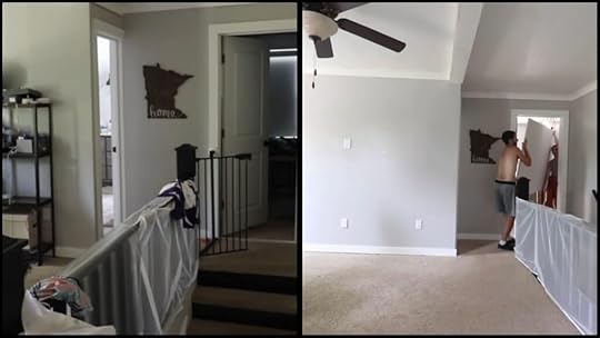
Start by clearing the area where you want to build the wall. Move out any furniture, boxes, or clutter. This gives you enough space to move around freely.
You will also need enough room to work and set up tools safely. Take the time to measure and mark the location of your new wall. Planning ahead makes everything easier.
Step 2: Plan and Mark the Layout

Use a tape measure to measure your wall location. Mark the floor first, then snap a chalk line for a straight reference.
Transfer marks to the ceiling with a plumb bob or laser level, ensuring perfect vertical alignment. Mark stud positions every 16 inches on center along your layout lines.
For an 8-foot wall section, you’ll need approximately 6-7 studs. Start 3/4 inch from one end, then mark at 16-inch intervals. Mark both top and bottom plates simultaneously for accuracy.
Step 3: Frame the Wall

Cut your 2x4s to the correct length for the bottom and top plates, as well as the studs. Begin by attaching the studs to the plates using a framing nailer.
Make sure that the studs are placed 16 inches apart, as this is standard spacing for most walls. Secure the frame to the floor and ceiling, ensuring it is level and sturdy.
Step 4: Install the Drywall

Once the framing is complete, it’s time to install the drywall. Measure and cut the drywall sheets to fit the frame. Begin by placing the top sheet and work your way down.
Use a power drill or screwdriver to attach the drywall to the studs. If needed, have a helper hold the sheets in place while you secure them to the frame. Ensure everything is level for a clean look.
Step 5: Finishing Touches

Now that the drywall is up, it’s time to finish the wall. Apply drywall mud to the seams, then place drywall tape over the mud. Use a drywall knife to smooth out the mud.
Once dry, sand the surface to create a smooth finish. Finally, paint the wall and add baseboard molding to complete the new look. Enjoy your freshly built wall!
For more information, watch the detailed video explanation by Welcome to the Woods.
Understanding Building Permits and Wall CodesBuilding permit requirements vary significantly across states and cities, so always check your local regulations before starting any wall project. Here’s a breakdown of common wall types and their typical permit requirements across the United States:
Wall TypePermit Required?Key Code/RequirementExamples of States with Permit RulesLoad-Bearing WallsYesMust meet International Building Code (IBC) and local standardsCalifornia, Texas, Florida, New York, IllinoisNon-Load-Bearing WallsSometimes (depends on locality)Fire safety, electrical, and structural guidelinesNew York (some cities), Illinois, FloridaWall Removal/ModificationYesStructural engineer review and permit neededNationwide, including California, Washington, and GeorgiaRetaining WallsYes, if height > 3-4 feet or load-supportingIRC/IBC structural and safety standardsMaryland, California, Texas, VirginiaElectrical/Plumbing in WallsYes, separate permitsMust follow national and state electrical/plumbing codesNationwideContact your local building department early in the planning process to understand exactly what permits you need. Failing to get proper permits can result in fines, project delays, or even forced removal of your new wall.
Tips for a Professional FinishGetting a smooth, professional finish makes a big difference once the wall is complete. Small details can really improve how it looks and lasts. Here are a few easy tips to help your wall look more polished and well-built:
Sand rough edges: Sand rough lumber edges before framing to make sure everything fits tightly and the drywall sits flat.Use construction adhesive: Use construction adhesive along studs before installing drywall for a stronger, longer-lasting bond.Check level and alignment: Double-check the level and alignment before securing the drywall to avoid uneven surfaces or visible gaps.Seal all gaps: Seal gaps with caulk where the wall meets the floor or ceiling to improve insulation and block drafts.Taking these extra steps keeps your wall solid and neat for years. It’s worth a few extra minutes of effort.
Common Mistakes to Avoid When Building a WallBuilding a wall isn’t too hard, but small mistakes can cause big problems later. Paying attention to details helps your wall stay solid and safe. Here are some common mistakes you should try to avoid while building your wall:
Using uneven lumber or incorrect measurements can throw off your wall’s alignment and cause gaps or uneven surfaces.Forgetting to check for electrical lines or pipes before cutting or drilling can lead to expensive and dangerous damage.Over-tightening screws and splitting wood weakens the frame and makes it harder to attach drywall properly.Not verifying wall alignment before fastening can leave your wall crooked and tough to fix once secured.Skipping safety gear and workspace cleanup can lead to injuries or accidents that easily could have been avoided.Avoiding these simple mistakes saves time, money, and frustration. With careful prep and patience, your wall will turn out great.
Is Building a Wall a Good DIY Project?Building a small interior wall is a great DIY project for beginners and can usually be finished in a day or a weekend without much experience. It’s a good way to add extra space or divide rooms.
Most simple walls don’t carry the weight of the house, making them easier to build safely. However, if you’re dealing with a load-bearing wall, it’s best to call a contractor because it involves more skill and safety concerns.
For materials, expect to spend between $100 and $400, depending on the size of the wall. Optional costs like insulation, drywall, or paint can add to the budget. For real-life insights and tips, you can check out this helpful discussion on Reddit.
Advanced Framing: A Smarter Way to Build WallsThese costs are estimated and may vary depending on materials, location, and the complexity of the project.
Advanced framing is changing how we build walls today. It uses less wood while making structures just as strong.
This method spaces studs farther apart than traditional framing does. You’ll use fewer materials and save money in the process.
The technique also reduces thermal bridging, which means better insulation for your home. Your energy bills will thank you later.
You’ll align studs with roof trusses and floor joists above and below. This creates a more efficient load path through your structure.
Advanced framing works best for non-load-bearing walls and residential projects. Always check your local building codes first, though.
It’s a forward-thinking approach that benefits both your wallet and the environment.
Final ThoughtsHow to build a wall yourself can feel very rewarding and save you money as well. It’s a fun way to customize and improve your home exactly how you want it.
When you take your time and follow the right steps, you get a strong, neat wall that you can be proud of for years.
Plus, doing it yourself means you have control over every detail and learning valuable skills. If you run into questions or want to share your own wall-building stories, I want to hear from you.
Don’t be shy; drop a comment below and join in. Your tips and questions help everyone learn and make future projects easier!
The post How to Build a Wall: Easy Steps for a Professional Finish appeared first on Amenity Home.
21 Stepping Stone Path Ideas and Building Guide
Tired of wet shoes and wondering if building your own stepping stone path is actually doable? A stepping stone path is a walkway made of individual stones spaced across your yard or garden.
These paths create designated routes through your outdoor space without covering the entire ground with concrete.
Each stone provides a stable place to step while letting grass or decorative materials fill the gaps between.
You can customize your stepping stone path with different materials, shapes, and creative designs that match your style. I’ll show you exactly how to build one that enhances your yard’s beauty and functions easily.
Why Install a Stepping Stone Path in Your YardA stepping stone path makes walking through your yard much easier and keeps your shoes clean and dry. You won’t track mud into your house after walking through wet grass or garden beds anymore.
These paths add visual interest and help guide people through your outdoor space in an intentional way. They create natural flow between different garden areas and make your landscape look more polished and planned.
Installing stepping stones is much simpler than pouring concrete walkways that require heavy equipment and professional skills. Stepping stone paths require very little maintenance once installed and last for many years without needing repairs.
Materials and Tools You’ll NeedGathering your materials before starting makes the project run smoothly without unnecessary trips to the store. Here’s what you’ll need and what it typically costs:
MaterialEstimated Cost Range (USD)Garden hoe and shovel$15 – $40 (each)Weed killer spray$8 – $25Crushed rock (aggregate)$3 – $50 per bag (20-50 lbs)Weed barrier fabric$12 – $40 per rollYard pins or stakes$5 – $15 per packLeveling sand$4 – $25 per bagFlexible landscape edging$15 – $40 (10-20 ft. pieces)Stepping stones or pavers$2 – $8 eachOutdoor paint (optional)$8 – $25 per canPaint sprayer or brush$5 – $30 eachWhite marble chips$5 – $20 per bagHand tamper$25 – $50How to Lay a Stepping Stone Path?Building a stepping stone path is straightforward when you follow the right steps in order. Here’s how to create a beautiful walkway that lasts:
Step 1: Clear the Land

Start by clearing all the weeds, grass, and overgrowth using a hoe and shovel. You want the area completely clean before building your path. After removing the plants, spray weed killer over the entire space to keep anything from growing back.
Work slowly and double-check corners and edges. Once done, the ground should look smooth and bare, like a clean dirt base ready for your walkway.
Step 2: Plan and Dig the Path

Decide where you want your walkway to go and mark the outline using a rope or spray paint. Then dig out the marked area to a depth of about two to four inches. Go deeper if your ground slopes or feels uneven.
This will make room for the layers of gravel and sand you’ll add later. Try to keep the surface even and remove any leftover roots or rocks as you dig.
Step 3: Add the Base and Weed Barrier

Pour a layer of crushed rock into the trench to make a firm foundation for your walkway. Use a hand tamper to press it down tightly so it doesn’t shift later. After that, roll out your weed barrier fabric to cover the full width of the walkway.
Secure it with yard pins along the edges. This simple layer keeps weeds from poking through and helps your walkway last longer.
Step 4: Spread Sand and Add the Border

Next, add a layer of leveling sand on top of the weed barrier. Smooth it out evenly with a rake or board so the stones will sit flat. Then install flexible landscape edging along the sides of the path.
This keeps the sand and stones in place and helps define the shape. If you dug too deep, use a taller border so the walkway looks even with the yard.
Step 5: Paint, Place, and Finish

If you’d like to add some personality, paint your stepping stones before placing them. Use outdoor paint and let it dry fully. Then set each stone carefully on the sand, checking that every one is level with the ground.
Follow the slope of your yard naturally. Once all stones are in, fill the gaps with decorative marble chips to finish the walkway. It’ll look clean, neat, and balanced.
For more details, watch the complete video explanation by DIY for Home and Life.
Common Mistakes to AvoidMany DIY projects fail because people skip important steps or rush through the installation process. Watch out for these common errors when laying your stepping stone path:
Uneven stone placement causing tripping hazards: Make sure each stone sits level with the ground to prevent accidents and falls.Skipping the base layer leads to instability: Without proper crushed rock and sand, your stones will shift and sink over time.Poor drainage leading to mud or moss buildup: Water needs somewhere to go, or your path becomes slippery and unusable after rain.Stones placed too far apart or too close together: Space them at a comfortable walking stride for easy, natural movement along the path.Avoiding these mistakes ensures your stepping stone path looks professional and lasts for years. Taking extra time during installation prevents frustration and costly repairs down the road.
Creative Ideas for Your Stepping Stone PathStepping stone paths don’t have to be boring or look the same as everyone else’s walkway. Here are creative design ideas that add personality and style to your outdoor space:
1. Winding Natural Stone Pathway

This path winds gently through a garden, using irregularly shaped stones for an organic and relaxed look. The stones seem almost random, but invite you on a pleasant stroll.
Each curve feels inviting and works well in landscaping that mimics nature. Its uniqueness comes from its flowing shape and natural materials, making every installation different from the rest.
2. Circular Marble Stones Across Water

Large, round marble stones create bold stepping points as they cross a small pond or stream. The glossy surface reflects sunlight and water, giving a bright touch.
Each stone is evenly spaced, so you skip across the water easily. This idea stands out because of the shape, smooth texture, and the fun experience of crossing water.
3. Geometric Pavers That Spell a Word

Each paving stone is shaped and placed to form readable letters, spelling out a word along your path. It adds personality, guiding guests playfully through your yard.
No other pathway is exactly like this, since your message is yours alone. The effect is bold, custom, and eye-catching, making every step along this path truly personal.
4. Glow-in-the-Dark Stepping Stones

During the day, these stones look like regular path slabs, but at night, they glow softly. They guide you along your route after dark.
This glowing feature adds magical appeal, making evening strolls more fun and safe. Their uniqueness comes from the ability to shine at night, creating a gentle, inviting glow for your path.
5. Stones Surrounded by Glass Mulch

Flat stones are placed along your route, but the gaps are filled with vivid, recycled glass mulch. The colors catch sunlight, giving each step brightness.
Glass mulch reduces weeds and adds sparkle. Each path adapts to your color choices, so none look quite the same. This idea offers both beauty and good practicality for garden maintenance.
6. Wood Log Slice Path Under Trees

Round slices cut from old tree trunks form a rustic trail beneath leafy branches. The wood blends into the natural setting and feels gentle to walk on.
Each log slice shows its own pattern and grain. These natural textures are unique, and over time, the wood weathers for a classic woodland look.
7. Concrete Leaves for a Botanical Walk
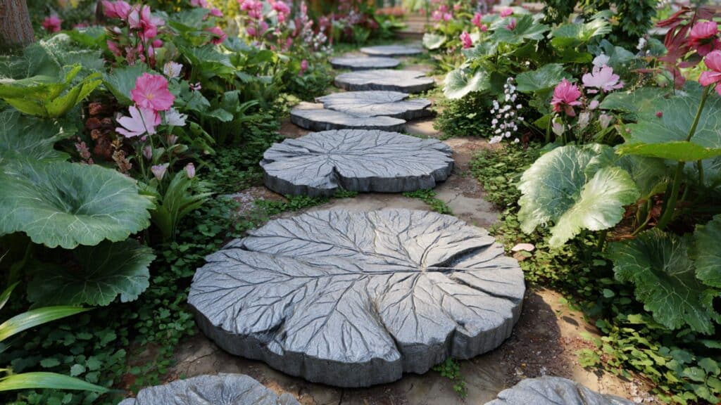
Stepping stones are cast from actual leaves, keeping the detailed veins and shapes in concrete. The pathway looks like scattered garden leaves, blending in beautifully among flowers. Each concrete leaf is one-of-a-kind.
This idea stands out because it mimics nature, but is sturdy and long-lasting. Every step feels like walking through a leafy path.
8. Checkerboard Path With Mixed Shapes
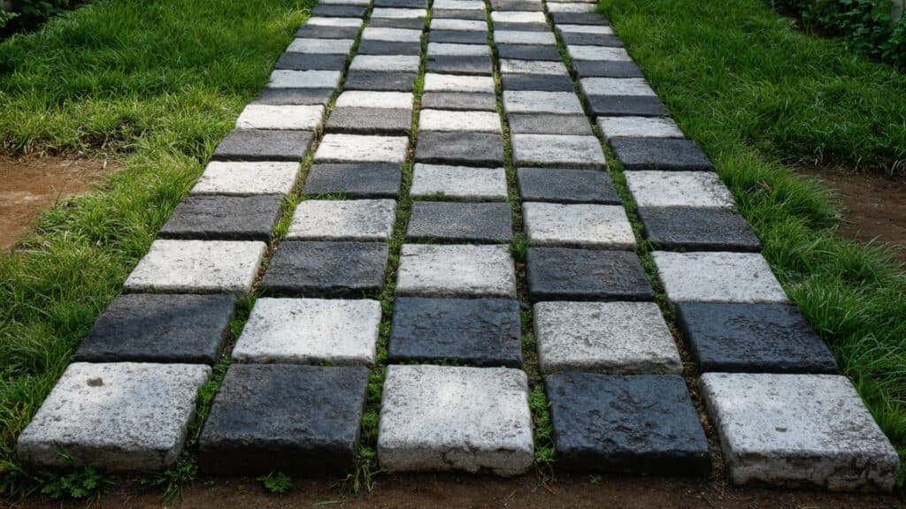
Square and rectangular stones alternate like a checkerboard down the path. The mixed shapes create a fun, patterned look that people notice right away. Contrasting stone colors make the pattern pop even more.
Each layout is different, based on your color and size choices. This playful, geometric design is very different from plain stone rows.
9. Pebble Mosaics in Animal Patterns

Artists arrange pebbles in patterns that form animals, like birds or fish, right in the stepping stones. Each mosaic is a small work of art, and every path has its own wildlife theme.
The look is detailed, colorful, and unique to every garden. No other idea mixes art and nature this closely for a stepping path.
10. Bricks Engraved With House Numbers

Stepping stones are made from thick bricks, with your house number or other information engraved on them. Each one marks the way to your door, helping visitors find your address.
These stones combine usefulness and beauty. You can change the words or numbers to suit your family, making the path personal and truly different from others.
11. Slate Tiles Set on Moss Bed

Dark rectangular slate tiles sit over a lush, green moss carpet, creating a cool and calming pathway. The contrast between sleek slate and soft moss makes each step feel gentle and welcoming.
This idea feels modern and natural at the same time. The moss adds unique life and softness that stone alone cannot give.
12. Granite Stones Over Sand Zen Trail

Large granite stones are spaced carefully over smooth sand, reflecting a peaceful Japanese Zen garden style. The trail feels simple and meditative as you walk slowly across.
Its uniqueness stands out in how it combines raw granite shapes with clean, raked sand. This design brings calm and focus to any garden space.
13. Honeycomb-Shaped Hexagonal Pavers

Hexagonal pavers nest together in a honeycomb pattern, creating a striking geometric look. Each step connects perfectly with the next, making a pleasing visual rhythm.
This idea is unique in both shape and layout. The pattern draws attention and makes your garden look organized while staying fun and creative.
14. Fossil-Stamped Tiles for Nature Lovers
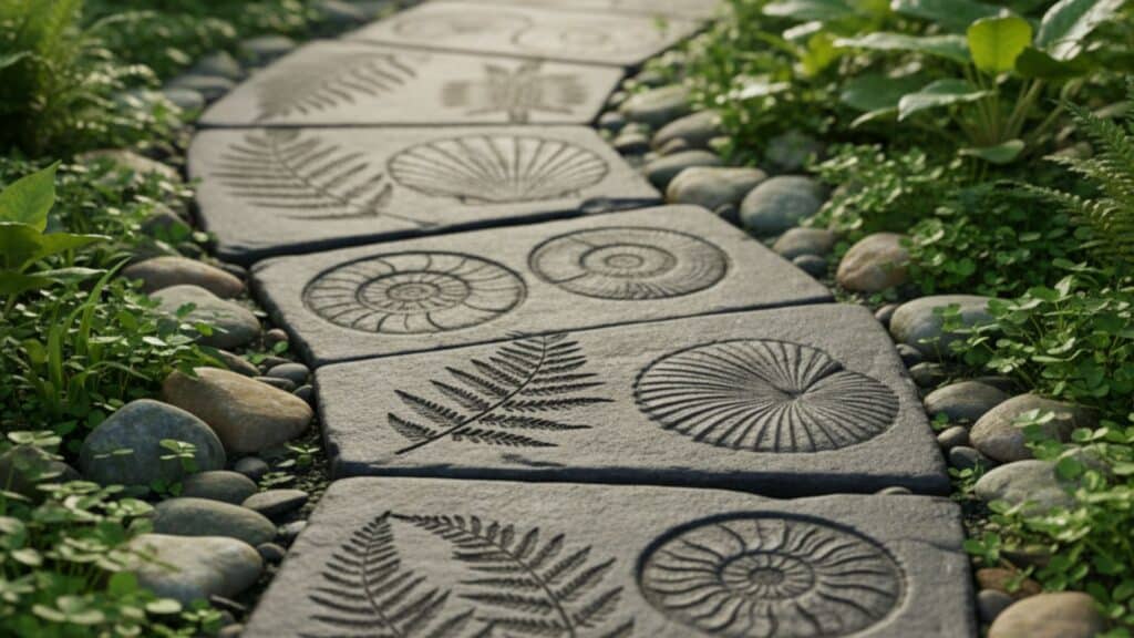
Tiles are decorated with fossil patterns, like ferns or shells, adding a love of ancient nature to each step. The design feels educational and artistic, inviting you to discover new details with every walk.
Fossil-stamped tiles are rare, making each path feel personal and full of character. It’s a tribute to natural history.
15. Painted Stepping Stones With Flowers

Smooth stones are hand-painted with bright flower designs. Each one turns into a piece of art along your walkway. This idea is different because each stone has its own color scheme.
Painted stones let you customize and refresh the path as much as you want, helping express your style directly in the landscape.
16. River Cobbles Mixed With Pavers
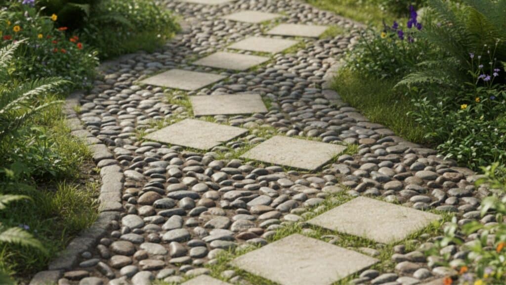
Large river cobbles alternate with regular square pavers for a playful look. The rounded stones feel ancient, while pavers add a touch of order. Each step changes texture underfoot.
This idea stands out by mixing shapes and sizes. It’s a great way to add interest and keep paths from looking too uniform.
17. Glass Bottle Bottoms in Concrete
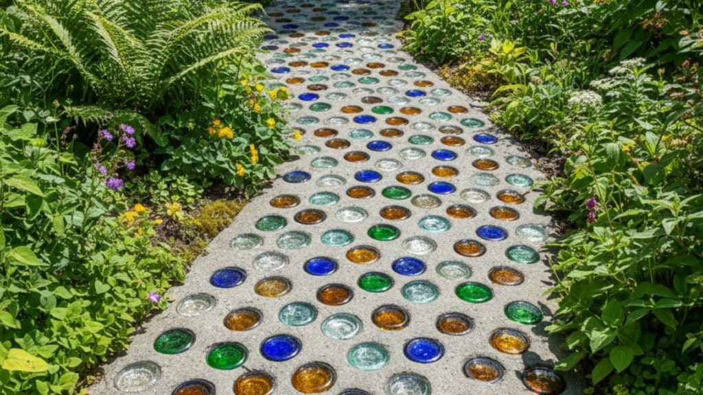
Clear and colored glass bottle bottoms are set into concrete, creating a sparkly walkway when the sun hits. Each step catches light from a new angle. This idea is unique because it uses recycled material.
Glass bottle paths look modern but are fun for families to make together, and each section is never the same.
18. Terracotta Discs in Vegetable Garden

Uneven, handmade discs of terracotta clay form winding paths between garden beds. The clay’s warm color pops against green vegetables and dark soil. Differences in disc size give a playful, rustic feel.
This idea works uniquely well in edible gardens, making harvests easier and adding earthy appeal around growing plants.
19. Colorful Recycled Tile Mosaic Path

Broken tile bits in every color are set in patterns, turning the walkway into a mosaic. The colors form pictures or abstract shapes that change as you move along.
This path is unique since every mosaic is made by hand, reflecting your personality and creativity. Recycled tile helps the planet and makes gardens more vibrant.
20. Porcelain Squares Bordered by Lavender

Clean, white porcelain squares make up the path and are surrounded by rows of deep purple lavender. The fragrance and color bring instant joy with each step.
Porcelain’s smooth texture looks high-end, and lavender’s scent is calming. This combination is unique because it blends garden beauty with luxury for truly memorable walks.
21. Ceramic Bird-Shaped Stepping Stones

Hand-molded ceramic birds line the path, each one painted or glazed with unique patterns. These stones feel playful and welcoming, especially for children. The bird shapes are rare and not found in regular garden stores.
This idea is different because it brings nature’s inspiration directly underfoot, celebrating creativity and life in gardens.
Maintenance Tips for Stepping Stone PathsKeeping your stepping stone path looking great requires minimal effort throughout the year. Follow these simple maintenance practices to extend your path’s lifespan:
Remove weeds and debris regularly by pulling any weeds growing between stones and sweeping away leaves or dirt.Refill joints with sand or gravel as needed, since the material between stones washes away over time and needs replacement.Reset stones that shift over time by checking for wobbly or uneven stones and adjusting them back into place.Rinse or pressure wash occasionally to keep the surface clean and remove built-up dirt, moss, and algae.These basic tasks keep your path safe, attractive, and functional for many years ahead. Spending a little time on maintenance prevents bigger problems and costly repairs later on.
Final ThoughtsNow you have all the knowledge needed to design and build a beautiful stepping stone path yourself. Your yard will look more polished and function better once you add this simple but effective feature.
A stepping stone path changes how you experience your outdoor space while solving practical problems like wet shoes.
The installation process is straightforward enough for beginners yet offers endless creative possibilities for personal expression outdoors.
Remember that proper preparation and base layers make the biggest difference in how long your path lasts.
Your dream walkway is just a weekend project away with the right materials and motivation ready. Drop your questions about building stepping stone paths in the comments below!
The post 21 Stepping Stone Path Ideas and Building Guide appeared first on Amenity Home.
October 10, 2025
What is a Hip Roof: Definition, Types, Costs, and Benefits
When I first started looking at different roof designs, I didn’t realize how much the shape actually impacts everything, from your home’s curb appeal to how well it handles storms and snow loads.
Your roof isn’t just about keeping rain out; it’s about drainage patterns, structural stability, and the overall character of your house. That’s where the hip roof comes in, and honestly, it’s one of the smartest choices you can make if you live in an area with unpredictable weather.
I’m going to break down exactly what a hip roof is, walk you through its key components, and explain why so many homeowners and builders prefer it over other styles.
I’ll also compare it directly to the gable roof so you can see the real differences.
What is a Hip Roof?
A hip roof is pretty straightforward once you understand the basics: it has slopes on all four sides that meet at a ridge at the top, creating either a pyramid shape or a ridge-like peak.
Unlike other roof styles, there are no vertical gable ends; every side slopes downward toward the walls at roughly the same angle.
Think of it this way: if you’re standing outside and looking at the house from any direction, you’ll see a sloped surface rather than a flat, triangular wall.
That continuous slope is what defines a hip roof and gives it that clean, balanced appearance. It’s one of those designs that looks simple but delivers serious structural benefits.
Key Components of a Hip Roof
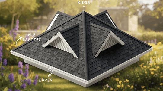
Understanding how a hip roof works means knowing its essential parts. Let me walk you through the three main components that define this roof style and make it so structurally sound.
1. RidgeThe ridge is the horizontal peak where all your roof planes converge; it’s literally the backbone of the entire structure. This is the highest point of your roof, and it plays a critical role in distributing weight evenly across the frame.
When I look at a hip roof from the side, the ridge is that clean line running along the top. It’s not just there for show; it provides the structural stability that keeps everything locked in place during high winds and heavy snow loads.
Without a solid ridge, the whole roof system would lack the support it needs to hold up over time.
2. Hip Rafters (Hips)Hip rafters are the diagonal beams that run from each corner of your house up to the ridge, and they’re what create those distinctive sloping edges.
These aren’t just decorative; they’re structurally transferring the roof’s load to the walls’ corners. What I love about hip rafters is their efficiency in shedding water; rain and snow slide off in multiple directions, preventing pooling.
They also give the hip roof its characteristic shape, making it instantly recognizable from any angle. Think of them as the skeleton that defines the entire roof profile.
3. EavesThe eaves are the lower edges of your roof that extend beyond your exterior walls, and they’re more important than most people realize. This overhang protects your siding, windows, and foundation from rain runoff, which prevents water damage and keeps your walls dry.
I’ve seen homes without proper eaves, and trust me, they age faster because water constantly hits the walls during storms. Eaves also improve ventilation by creating airflow underneath the roof deck, which helps regulate attic temperature.
Plus, they add visual balance to the roofline, giving the house a finished, proportional look that feels intentional rather than boxy.
Hip Roof vs. Gable Roof

Hip and gable roofs differ in structure, cost, and function. Knowing these differences helps you choose the best option.
FeatureHip RoofGable RoofStabilityVery stable, handles strong winds wellLess stable in high winds, but adequateCostHigher due to complexity and materialsLower, simpler design with fewer materialsAttic SpaceLimited because all sides slope inwardMore usable space under steep triangular endsAppearanceBalanced, pyramid-like, uniform designTraditional triangular shape, more variation possibleClimate SuitabilityExcellent in windy or snowy areasBetter for mild climates, less ideal for heavy snow/windChoosing between them depends on your needs. Hip roofs suit harsh climates, while gable roofs fit tighter budgets or extra attic space.
Types of Hip RoofsHip roofs come in several styles, each offering unique shapes, appearances, and benefits for different house designs and needs.
1. Pyramid Hip Roof

A pyramid hip roof has four equal sides that slope inward and meet at one single point at the top. This design resembles a pyramid and works best on square buildings.
It provides excellent stability, sheds water efficiently, and offers a simple yet strong form. These roofs are often chosen for smaller structures like gazebos or compact houses.
2. Cross-Hipped Roof

A cross-hipped roof combines two hip roofs that intersect at a right angle, forming a T- or L-shaped design. This style is common on larger homes with multiple wings or extensions.
It creates valleys where the roof sections meet, which helps with water flow but requires careful construction to prevent leaks. Cross-hipped roofs add depth and dimension to the building’s overall look.
3. Mansard Roof
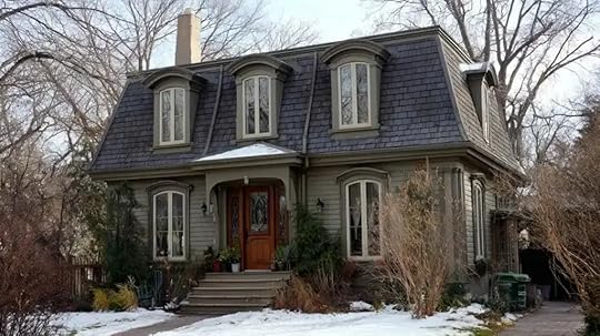
A mansard roof is a variation with two slopes on each side, where the lower slope is much steeper than the upper. This design allows for more usable space inside, often turning the attic into a functional living area.
It is popular in French architecture and gives the building a taller appearance. The steep lower slope also helps with shedding rain and snow effectively.
4. Half-Hipped Roof

A half-hipped roof, also called a jerkinhead roof, is like a gable roof but with the upper ends partially sloped. Instead of full triangular walls, the gable ends are shortened and angled.
This design improves wind resistance compared to a standard gable while still providing more attic space than a full hip. It combines stability with added function, making it a practical choice.
Pros and Cons of Hip RoofsHip roofs offer serious advantages for homeowners, but they come with trade-offs you need to understand before making a decision.
Let me break down both sides so you can see exactly what you’re getting into:
AdvantagesHip roofs are known for their strength, weather resistance, and visual balance—making them a reliable choice if you live in areas with challenging weather conditions.
Structural Stability and Strength: The inward slopes on all sides create a self-supporting framework that distributes weight evenly, making the roof incredibly strong and long-lasting compared to designs with flat gable ends.Strong Performance in High Winds and Snow: Those sloped surfaces shed wind, rain, and snow far more effectively than flat or gable roofs, which is why you see hip roofs dominating coastal and mountain regions.Balanced, Symmetrical Appearance: The even slopes on all four sides provide a uniform, attractive look that complements almost any architectural style, from traditional colonials to modern ranch homes.DisadvantagesWhile hip roofs perform exceptionally well, they cost more to build and limit your attic space compared to simpler roof designs like gable roofs.
Higher Construction Costs: The complex framing requires additional materials, more labor hours, and skilled craftsmanship, which can push your total roofing expenses significantly higher than a basic gable roof.Reduced Attic Space: The sloping sides on all four walls eat into your usable attic area, limiting headroom and storage capacity; something to consider if you need that extra space.More Complex Design and Installation: Building a hip roof demands experienced contractors who understand proper alignment, drainage patterns, and structural integrity, so you can’t cut corners on labor quality.Weigh your budget against your climate and storage needs; sometimes paying more now saves you thousands in repairs later.
Costs of Hip Roofs

Hip roofs typically cost between $8 and $12 per square foot. The four sloping sides require more roofing surface area, which increases both materials and labor.
Compared to gable roofs, the additional framing, flashing, and precision cuts drive costs upward. For a 2,000-square-foot roof, this means homeowners might expect a total of $16,000 to $24,000 before regional adjustments.
Breakdown of Materials vs. LaborMaterials make up a large share of costs because hip roofs need extra shingles, underlayment, flashing, and structural components. Labor expenses are also higher due to the intricate framing, angled cuts, and precise installation.
Contractors typically charge $40 to $80 per hour. Complexity in valleys and hips extends project time, making skilled craftsmanship crucial to avoid leaks and ensure long-term stability.
Regional Cost DifferencesLocation significantly affects the total project cost. Areas like Florida and Massachusetts often have higher rates due to stricter building codes, hurricane resistance standards, or higher labor wages.
Permit and disposal fees also vary by region, adding to costs. In some states, homeowners may receive insurance discounts for wind-resistant hip roofs, balancing out the expense. Always compare bids locally to understand regional pricing trends.
Best Materials for Hip RoofsChoosing the right material affects cost, durability, and appearance. Here’s how common hip roof materials compare.
MaterialProsConsLifespanBest ForTop BrandsAsphalt ShinglesAffordable, easy to install, and many color optionsShorter lifespan, more maintenance needed20–30 yearsBudget-conscious homes, most climatesGAF, Owens Corning, CertainTeedMetal RoofingHighly durable, excellent wind/snow resistance, energy-efficientHigher upfront cost, requires skilled installation40–70 yearsHarsh weather areas, energy efficiencyDecra, Englert, McElroy MetalTile or ClayFire-resistant, extremely long-lasting, classic lookHeavy (needs reinforced framing), expensive50–75+ yearsHot, dry climates, Mediterranean styleLudowici, Boral, Eagle RoofingWood ShakesNatural rustic appearance, good insulationFire/rot/insect vulnerable, high maintenance20–40 yearsCottage homes in dry regionsCedar Shake & Shingle Bureau certifiedSlatePremium durability, fire-proof, elegant appearanceVery heavy, most expensive, complex installation75–100+ yearsHistoric homes, upscale buildsVermont Slate, GAF TruSlate, EcoStarEnergy Efficiency and Climate Suitability of Hip RoofsNote: Your climate plays the biggest role in material selection; metal and tile excel in extreme weather, while asphalt shingles work well in moderate conditions. Always check if your roof framing can support heavier materials, as retrofitting structural support adds significant cost.
Hip roofs perform well in different climates and can improve overall energy efficiency when designed correctly. Their inward slopes allow for effective ventilation, which helps regulate attic temperatures and prevents moisture buildup.
Proper insulation works with this ventilation to reduce heating and cooling costs year-round. In hot regions, reflective materials or lighter colors can minimize heat absorption, while in cold or snowy areas, sloped surfaces shed snow easily to avoid excess weight.
In windy climates, the design resists uplift. Hip roofs are also compatible with solar panels, though angled placement may require careful planning for maximum efficiency.
When to Choose a Hip Roof?Hip roofs aren’t the right choice for every home, but they absolutely shine in specific situations. Here’s when they make the most sense, and when you might want to consider other options.
Ideal for:
Windy or Storm-Prone Regions: The aerodynamic slopes on all sides handle high winds and heavy snow loads far better than gable roofs, making them the go-to choice for coastal areas and regions with severe weather.Homes with Wraparound Porches or Complex Layouts: Hip roofs work beautifully with architectural features that wrap around the house, providing consistent coverage and a cohesive look from every angle.Modern Designs Seeking Clean Symmetry: If you want that polished, balanced appearance without any harsh vertical lines, hip roofs deliver a sleek profile that complements contemporary and traditional styles alike.Not ideal for:
Homeowners on Tight Budgets: The complex framing and additional materials push costs higher than simpler gable roofs, so if you’re watching every dollar, this might not be your best option.Projects Requiring Large Attic Spaces: Those inward slopes eat into your usable attic area, limiting headroom and storage capacity compared to gable roofs with vertical walls.Maintenance Tips for LongevityA hip roof can last decades with consistent maintenance, but small issues turn into expensive repairs when ignored. Staying on top of these routine checks keeps your roof performing at its best.
Inspect Hip and Ridge Joints Regularly: These seams are where leaks typically start, so check them at least twice a year for cracked sealant, lifted shingles, or gaps that let water through.Clean Gutters and Eaves Seasonally: Clogged gutters cause water to back up under your roof edge, leading to rot and fascia damage that compromises the entire system.Examine Shingles and Flashing After Major Storms: High winds can lift or crack shingles along the hips, and damaged flashing around chimneys or vents creates instant leak points.Add Ridge Vents if Airflow is Inadequate: Proper attic ventilation prevents moisture buildup and extends your roof’s lifespan by regulating temperature and reducing ice dam risks in winter.Staying proactive with these simple checks saves you from major headaches later. An hour of inspection twice a year beats a weekend of emergency repairs, and your wallet will thank you.
The Bottom LineHip roofs deliver on all sides, literally. With their key components like the ridge, hip rafters, and eaves working together, they create a structurally sound system that handles harsh weather better than most alternatives.
Yes, they cost more and limit attic space, but the durability and weather resistance make them worth it for storm-prone areas.
Before deciding, consult a roofing professional who understands your local climate and budget. Every home has different needs, and expert input ensures you’re making the right choice for long-term performance.
Have questions about whether a hip roof fits your home? Drop them in the comments, and I’ll help you figure it out.
The post What is a Hip Roof: Definition, Types, Costs, and Benefits appeared first on Amenity Home.
When to Decorate for Fall at Home: A Complete Guide
I used to rush my fall decor out the moment September hit, only to realize it felt too early, or I’d wait too long and miss half the season. So, when should you actually start decorating for fall?
For most people, late September through mid-October hits the sweet spot, but it really depends on your climate, personal style, and if you’re planning around specific holidays.
In this guide, I’ll help you figure out the best timing for your home, whether you’re someone who loves a month-long autumn vibe or prefers a quick weekend refresh.
I’ll cover flexible timelines, room-by-room strategies, easy projects you can tackle in an afternoon, and a handy checklist to keep you on track without the overwhelm.
Quick Timeline for Fall DecorationWhen you start decorating for fall depends on your style and climate, but here’s the general breakdown:
Early Decorators (early September): Jump into fall as soon as the calendar flips, especially if you love extending the season.Mainstream Decorators (late September to early October): Wait for cooler weather and peak selection at stores before setting up.Late Decorators (mid-October): Prefer decorating closer to Halloween or Thanksgiving when fall is in full swing.Keep in mind that timing varies by location; warmer climates often wait until October when temperatures finally drop, while colder regions start earlier to maximize the cozy season.
Full Seasonal Timeline: When to Start Decorating for FallIf you like a clear calendar guide, this table helps you plan updates at a steady pace. Dates can shift a bit depending on where you live.
DatesFocusActionsSept 1–15Early September: Subtle SwapsChange pillows, table linens, or towels to warmer shades. Add a candle or small seasonal bowl for an easy start.Sept 20–Oct 10Late Sept–Early OctRefresh main spaces like the living room or porch with wreaths, pumpkins, throws, and heavier textures.Oct 11–20Mid-October: Indoor SetupFinish indoor spaces before events. Update mantels, dining areas, and bedrooms with candles, soft light, and thicker blankets.Oct 21–Nov 5Late Oct–Early NovAdd Halloween touches if you celebrate, then swap spooky items for neutral pumpkins, dried stems, or deeper tones.Late Nov–Early DecPost-ThanksgivingKeep fall neutrals a bit longer or start adding winter touches like pine branches or soft lights.Use this table as a quick guide to time each phase of your decorating so it feels smooth and low-stress.
Room-by-Room Timing & PrioritiesStill wondering when do you decorate for fall in each space? Focus on small, high-impact updates that shift your home into the season without a full makeover.
1. Entry/Porch

Kick off early in the season (around Sept 1–15) with a wreath and planters at your door. Combine real mums, pumpkins, and seasonal greenery with a few faux accents so it lasts all fall.
A lantern, welcome mat, or basket of pinecones makes the space even more inviting without much effort.
2. Living Room
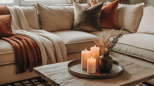
Layer in throws, pillows, and candles mid-to-late September (Sept 20–Oct 5) for a fast cozy lift.
Use warm textures like knits, velvet, or plaid, and bring in a tray vignette with stems or pinecones. These small changes quickly make the room feel welcoming without a full décor overhaul.
3. Dining Room/Kitchen
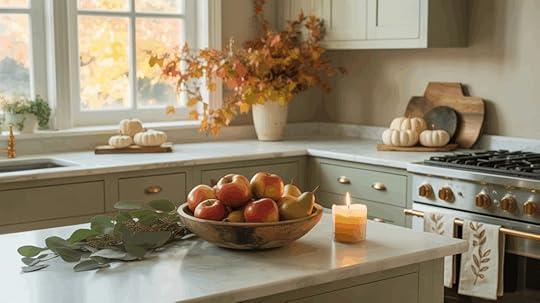
Focus on harvest touches from late October to early November (Oct 21–Nov 5). Update tablescapes with rustic linens, seasonal dishware, or a centerpiece of apples, mini pumpkins, or dried grasses.
Simple swaps like changing napkins or adding a table runner get you Thanksgiving-ready without heavy decorating.
4. Bedroom Fall Decor

Add subtle textures, soft lighting, and autumn scents anytime in early fall. Place a warm throw at the foot of the bed, change to a softer bulb in lamps, or use a candle or diffuser in the bathroom.
These gentle updates keep private spaces restful and seasonal without clutter.
5. Office & Small Spaces

Refresh desks or small corners with seasonal mugs, a mini pumpkin, or a print with autumn colors any time.
Swap desk accessories for warmer tones, switch a plant pot to a woven basket, or add a small candle. Even tiny accents can make these areas feel in tune with the season in minutes.
Practical Fall Decorating Schedules You Can UseNot everyone approaches seasonal decorating the same way. Some enjoy spreading the process out over several weeks, while others prefer to get it done quickly and move on.
To make the choice easier, here are two clear options you can follow depending on your pace and lifestyle.
4-Week Ease-In PlanThis plan works well if you like to take your time and enjoy each step of the season as it arrives.
WeekFocusDetailsWeek 1Clear & PreparePut away summer décor, check your stash, make a shopping list, and pick a color scheme.Week 2Add LayersSwap in fall throws, pillows, and stems to create a cozy base indoors.Week 3Outdoor TouchesDecorate porch and entryway; buy pumpkins, mums, or other seasonal plants.Week 4Final DetailsStyle the mantel, coffee table, and add warm lighting with candles or lamps.Weekend Sprint (48 Hours)If your schedule is packed or you simply prefer to refresh your home in one go, the sprint plan is a better fit.
DayFocusDetailsDay 1Indoor ResetDeclutter, set base fabrics like pillows and throws, then style the mantel and dining area.Day 2Outdoor & FinishingFocus on the porch and entryway, add kitchen accents, and set up lighting for cozy evenings.Both approaches help you know when to start decorating for fall in a way that feels natural. The ease-in plan gives you space to layer gradually, while the sprint plan delivers instant results.
Weather, Climate & Practical Considerations for Fall DecorWhere you live can significantly impact how and when you decorate for the fall season. Temperature swings, humidity, and even your housing type can affect what lasts, what fades, and when to start setting things up.
These tips help you plan décor that suits your environment and still feels cozy all season long.
Warm or Humid RegionsIf you live in the South or coastal areas, fall heat can linger well into October. High humidity shortens the lifespan of real pumpkins, wreaths, and certain plants.
Start decorating indoors first — think textiles, candles, and faux greenery.Add dried florals, rattan baskets, and ceramic pumpkins that won’t spoil in warm air.Move to outdoor décor once the temperature drops, focusing on metal lanterns, weather-resistant doormats, and faux foliage garlands.Skip early real pumpkins or gourds; they’ll rot quickly in direct sun.Cool or Northern ClimatesIn colder regions, frost can arrive early and damage certain décor items. The key is pacing your setup to match the season’s change.
Begin with indoor transitions in late September — throws, layered bedding, and warm lighting.For outdoors, use hardy mums, ornamental kale, or faux pumpkins until frost danger passes.Add real pumpkins, hay bales, and natural wreaths in early to mid-October when daytime temps stabilize.Use LED candles and solar lights instead of real ones to avoid freezing or wax cracking.Dry or Windy AreasIf you live in a region with strong winds or dry air, lightweight or fragile décor can blow away or fade quickly.
Choose heavier planters, sturdy lanterns, and wooden signs that can handle gusts.Avoid paper or fabric items outdoors unless they’re secured with clips or ties.Use UV-resistant materials for outdoor rugs or pillows to prevent fading from constant sun exposure.Renters & Shared HousingWhen you’re in an apartment or shared space, flexibility is everything. You can still create a beautiful design without drilling holes or causing damage.
Hang wreaths or garlands with command hooks or over-the-door hangers.Use peel-and-stick wall decals or removable window clings for seasonal color.Try lightweight décor, such as throw blankets, accent pillows, or table runners, that pack away easily after the season.Add battery-powered candles or plug-in string lights for instant warmth without the need for nails or tools.Final Tip: Whatever your climate, choose durable base pieces, such as baskets, vases, and trays, that work year-round. You can swap seasonal accents (like leaves, pumpkins, or pinecones) as the months change without having to start over each time.
With these adjustments, your fall decorating plan will not only look great but also last longer, no matter where you live.
Budget and Timing Tips for Fall DecoratingDecorating for fall doesn’t have to strain your wallet or feel like starting from scratch every year. These tips help you match your style to your spending while keeping things simple.
Budget-Friendly: Start small in September by slowly collecting pieces. Swap out inexpensive accents like candles, kitchen towels, or pillow covers first, then add one or two larger items each week.Splurge Items: Wait until mid-October to invest in bigger pieces such as a quality wreath, heavier throws, or statement porch décor.Buying them means you’ll still enjoy them through Halloween and Thanksgiving without paying for them months in advance.Capsule Approach: Build a neutral fall “capsule” with one rug, two throws, and three versatile decor accents in warm tones. Add greenery or twinkle lights later for an easy seasonal refresh without buying everything twice.
With these three approaches in mind, you can plan your shopping and decorating pace so it feels organized, affordable, and perfectly timed for your home.
How to Transition from Halloween to Thanksgiving?
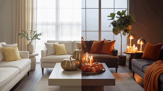
Once Halloween passes, you don’t need to pack everything away. A few small swaps can shift your décor from spooky to seasonal in a single afternoon. The goal is to keep the warmth and texture of fall while removing anything too theme-specific.
1. Swap Textiles: Start by replacing Halloween-themed throws and pillows with solid or plaid fabrics in deep oranges, browns, and neutrals. Add a soft knit or wool throw to instantly warm up your space.
2. Edit Décor and Keep the Base: Remove anything overtly Halloween, like bats, skeletons, or black accents, but keep pumpkins, candles, and natural textures. These work perfectly for Thanksgiving once paired with warm tones and greenery.
3. Add Seasonal Greenery: Bring in dried grasses, eucalyptus, wheat bundles, or faux leaves for a softer, more rustic look. These add height and a sense of harvest without looking spooky or overdone.
4. Create a Harvest Centerpiece: Trade the jack-o’-lanterns for bowls of apples, pinecones, or unscented pillar candles. A mix of mini pumpkins, wooden trays, and small vases filled with dried stems creates a simple but inviting table or mantel display.
5. Adjust Lighting for Warmth: Shorter days call for softer lighting. Replace bright bulbs with warm-toned LEDs, add a few flameless candles, or drape string lights across open shelves. A gentle glow makes your home instantly feel cozy and festive.
6. Layer Natural and Metallic Accents: Mix wood, rattan, and brass for a balanced, autumn look. Wooden chargers, woven baskets, and metallic candleholders bridge the gap between casual fall décor and Thanksgiving table style.
Final ThoughtsBonus Tip: If you plan ahead, buy neutral fall pieces that can carry you from September through November. Think natural wreaths, amber glass vases, and linen table runners that work for both Halloween and Thanksgiving simply by changing the smaller accents around them.
So there you have it; late September through early October tends to be the sweet spot for most of us, but honestly, the “right” time is whatever feels right for your home and climate.
If you’ve been waiting for permission to pull out those cozy throws and pumpkins, this is it. Start small this weekend with something quick, like swapping a candle or tossing a few fall pillows on the couch.
You’ll be surprised how much of a difference it makes.
Now I’m curious! When do you usually start decorating for fall? Are you an early bird or do you wait until the leaves really start turning? Drop a comment below!
The post When to Decorate for Fall at Home: A Complete Guide appeared first on Amenity Home.
What is MCM Furniture: Origins, Features, and Style Inspo
I first came across Mid-Century Modern furniture while helping a friend furnish a tiny apartment, and it immediately caught my eye.
The clean lines, tapered legs, and warm wood felt fresh yet familiar, and I wanted to know why it still works so well decades later.
If you’ve been curious about this style too, you’re not alone. Its mix of function and understated beauty continues to show up in homes of every size.
In this guide, I’ll walk you through where Mid-Century Modern furniture came from, how to recognize authentic pieces, and easy ways to use them in your own space so you can enjoy its classic look without guesswork.
What is MCM Furniture?Mid-Century Modern (MCM) furniture refers to a design style that emerged between the 1940s and 1960s during a period of rapid innovation in home living. It’s recognized for clean lines, geometric shapes, and an emphasis on practicality without excess decoration.
The term “Mid-Century Modern” itself was coined decades later to describe the look of that era’s furniture and interiors. Beyond furniture, MCM represents a wider architectural and interior design movement that reshaped homes and public spaces.
Mid-Century Modern also describes a wider architectural and interior design movement. Homes built during this period featured low, horizontal lines, large windows, and open floor plans designed to complement the furniture.
Understanding this connection helps you see how MCM furniture fits naturally into today’s spaces as well.
Origins of Mid-Century Modern Furniture
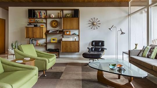
Before we get into where Mid-Century Modern furniture came from, it’s good to know why it still matters today. This style isn’t just about looks; it changed the way people thought about home design:
Post–World War II OptimismMid-Century Modern furniture grew out of a hopeful postwar culture focused on rebuilding homes and lifestyles. Designers sought to simplify daily living while reflecting progress and optimism.
Clean lines and open layouts emerged as symbols of a new start. Affordable materials and lighter forms replaced the heavy, ornate furniture of earlier decades.
This shift allowed more families to create comfortable, stylish interiors that matched a forward-looking society and laid the groundwork for decades of modern design influence.
Rise of Mass Production and AffordabilityAdvances in manufacturing after World War II allowed designers to produce high-quality furniture at scale.
Factories used new techniques and materials such as plastics, laminates, and molded plywood to create lighter pieces at lower costs. This opened modern design to everyday households rather than only the wealthy.
Catalog sales, department stores, and exhibitions spread the style quickly. Mass production turned Mid-Century Modern from an elite trend into a mainstream movement, changing how people furnished their homes.
Designers and InfluencersKey figures such as Charles and Ray Eames, George Nelson, and Arne Jacobsen defined Mid-Century Modern furniture. They introduced molded plywood, fiberglass chairs, and sleek storage systems through brands like Herman Miller.
Danish Modern emphasized craftsmanship and natural woods, bringing warmth to clean silhouettes. These innovators blended art and function, creating accessible designs that still feel current.
Their work shaped homes, offices, and public spaces, proving modern furniture could be comfortable, attractive, and affordable at the same time.
Cultural Impact of MCM StyleMid-Century Modern furniture changed more than interiors; it reshaped how people lived. Open floor plans, indoor-outdoor flow, and multi-use pieces reflected a culture moving toward casual living, family gatherings, and efficiency.
Workplaces also adopted sleek, modular layouts inspired by the same principles. This shift mirrored broader social changes of the mid-20th century, where design promoted optimism, innovation, and democratic access to good style.
The influence continues today, making MCM a symbol of progress and simplicity.
Timeline of MCM EvolutionDecadeKey Innovations & TrendsNotable FeaturesDesign Highlights1940sEarly postwar innovationsFocus on function and simplicity; use of new industrial materials after WWIIIntroduction of molded plywood (Charles & Ray Eames); affordable modern furniture emerges1950sRise of molded plywood and fiberglassSleek, organic forms; emphasis on comfort and mass productionEames Lounge Chair, Saarinen Tulip Chair, Nelson benches1960sBold color and modular furniturePlayful palettes; flexible layouts; influence of pop cultureSpace-age shapes, vibrant plastics, modular storage systems1970sShift toward environmental awareness and new plasticsEarth tones, natural materials, and sustainability influence designBlending of modernism with organic design; rise of eco-conscious manufacturingKey Characteristics of MCM Furniture
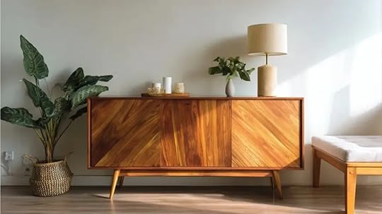
Mid-century modern furniture highlights simplicity, practicality, and distinctive shapes, utilizing natural and innovative materials that remain appealing today. Here are the key features that define this style:
1. Clean Lines and Geometric ShapesMCM furniture uses sharp, simple lines and basic geometric shapes to create uncluttered pieces. Tables, chairs, and storage units show straight edges or gentle curves with no heavy decoration.
The focus on form makes furniture appear lighter, more open, and easy to fit into many settings, from small apartments to larger homes, without feeling dated or crowded.
2. Organic Forms and Bold ColorsAlongside clean lines, MCM incorporates soft, natural curves inspired by plants and landscapes. Armchairs may feature flowing silhouettes, while tables have rounded edges.
Color palettes combine earthy tones with bright pops, such as orange, turquoise, or mustard, to add energy. These contrasts bring warmth and personality to spaces, making MCM furniture stand out while still blending seamlessly with various décor styles, keeping rooms lively yet balanced.
3. Natural and Innovative MaterialsMCM furniture often features woods like teak and walnut for their warmth and strength. Designers also adopted new materials, such as fiberglass, molded plywood, and plastics, to create lighter, more affordable pieces with innovative shapes.
Combining these elements gave the look its distinct identity, merging tradition with progress. This material mix makes vintage MCM items durable, and it continues to influence modern furniture production and sustainable choices today.
4. Functionality and Minimalist DesignFunction comes first in MCM furniture. Pieces are designed to be practical, comfortable, and space-saving, without unnecessary decoration. The minimalist approach means fewer heavy details and more open surfaces, so rooms feel larger and easier to use.
Storage units double as display pieces, chairs are lightweight yet supportive, and tables serve multiple purposes. The result is a clean, uncluttered environment that feels organized and welcoming.
Why MCM Furniture Remains Popular?Mid-century modern furniture remains relevant because it strikes a balance between beauty, practicality, and classic design. Here’s why it still works today:
Simple, Recognizable Design: Its clean lines and geometric forms create a sense of balance that feels both classic and modern in any room.Functional for Everyday Living: MCM pieces are made for real use, comfortable, durable, and practical without sacrificing good design or proportion.Works in Any Space: Light silhouettes and minimal detailing make rooms appear open and uncluttered, even in small apartments or tight layouts.Natural Warmth and Texture: Teak, walnut, and other natural woods add warmth and authenticity, grounding interiors with organic beauty and depth.Easy to Maintain Over Time: High-quality materials and craftsmanship ensure these pieces last for decades with minimal upkeep or special treatment.Accessible Through Modern Reproductions: Faithful replicas from today’s brands make it easy to achieve the MCM look across different budgets and design needs.Classic Adaptability: Its balance of simplicity and function allows MCM furniture to blend with new styles while staying effortlessly current.Recognizing True Mid-Century Modern PiecesWhen you’re trying to identify authentic Mid-Century Modern furniture, keep these key details in mind. Each point below highlights a reliable sign to help you tell originals from copies:
Maker’s Marks, Labels, and Key DesignersLook for maker’s marks, serial numbers, or branded labels on the underside, back, or inside drawers. Many original pieces include stamps or paper tags naming designers like Eames or Nelson.
Cross-check these markings with reliable databases or reference books. Knowing the designer or manufacturer adds confidence that the furniture is genuinely from the mid-20th century rather than a later reproduction.
Construction Details and MaterialsUnderstand how a piece is built and what it’s made from to spot genuine Mid-Century Modern furniture.
Look for solid wood frames rather than particleboard.Check for dovetail joints and smooth, even edges.Teak, walnut, or molded plywood shows quality and age.Consistent grain and rich color often signal authenticity.Avoid staples, rough finishes, or flimsy hardware that suggest reproductions.Pricing Tiers and Reproduction Red FlagsTrue mid-century pieces tend to cost more due to scarcity, designer reputation, and material quality. Be cautious of deals that seem too low or of mass-market versions claiming authenticity without proof.
Research typical price ranges for specific designers or item types before purchasing. Understanding the market helps avoid paying premium prices for reproductions and ensures you’re investing in genuine furniture.
Styling MCM FurnitureStyling MCM furniture is all about balance by mixing vintage character with modern comfort. Here are a few simple ways to style your pieces so they stand out while keeping your space warm and inviting:
1. Modern Farmhouse Combinations
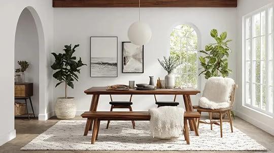
Combine MCM’s sleek shapes with farmhouse warmth for a cozy yet polished look. Pair walnut or teak furniture with white walls, woven rugs, and soft linens. Keep décor minimal, try ceramic vases, matte black fixtures, or simple metal lamps.
Tip: Hang a mid-century pendant above a rustic dining table to blend farmhouse charm with MCM sophistication effortlessly.
2. Scandinavian Influences
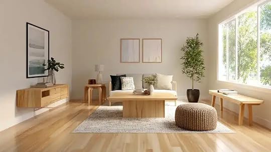
Scandinavian and MCM designs both favor simplicity, function, and light. Use pale woods, muted tones, and minimal clutter for a bright, calming environment. Add warmth with textured fabrics such as wool throws or leather accents.
Tip: Limit your color palette to whites, light grays, and soft blues, letting natural materials and clean lines create the visual depth.
3. Minimalist Interiors
Focus on one or two bold MCM pieces to define your room. A walnut credenza, molded chair, or glass-top coffee table makes an impact without overpowering the space. Keep walls neutral and surfaces clear to highlight craftsmanship.
Tip: Fewer items, thoughtfully arranged, create a sense of harmony; one sculptural lamp or patterned rug can complete the look.
How to Bring Mid-Century Modern Style into Your Home?Here’s how you can bring Mid-Century Modern style into every corner of your home. From the living room to the bedroom, each space offers a chance to show off clean lines, warm wood tones, and timeless design in your own way:
Living Room
Use low-profile sofas with tapered legs to keep the space open. Pair them with slim coffee tables or nesting tables for flexibility. Add one accent color, like mustard or navy, through cushions or wall art. Include warm wood tones for balance.
Tip: Keep walkways clear and let natural light emphasize the furniture’s clean silhouettes.
Bedroom
Choose a wooden bed frame with matching nightstands for a cohesive base. Stick to soft, neutral bedding and introduce warmth with a wool throw or textured rug. Add a single pop of color through a retro lamp or framed print for interest.
Tip: Keep the layout minimal to promote calm and highlight the furniture’s craftsmanship.
Dining Area
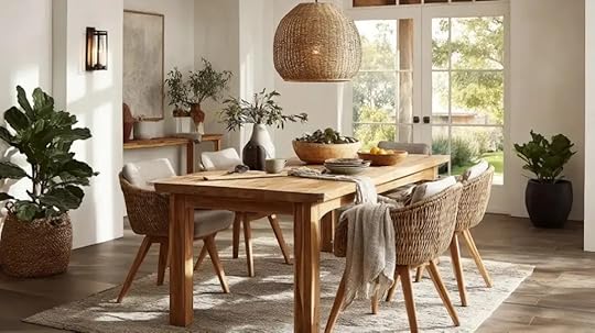
Place a round or rectangular teak table at the center and pair it with molded plastic or fiberglass chairs. A globe pendant or cone-shaped light overhead adds a period touch. Keep table décor minimal, just a vase or woven runner.
Tip: Maintain symmetry and space around each piece to preserve the open, uncluttered mid-century feel.
Caring for MCM FurnitureKeeping your Mid-Century Modern furniture in good shape is simple with a bit of regular care. Here are some easy ways to protect the wood, keep the finishes looking smooth, and make sure your pieces last for years:
Wood and Veneer Protection
Mid-Century Modern pieces made from teak or walnut need gentle care to stay vibrant. Dust regularly with a soft cloth and clean spills quickly to prevent staining. Use coasters and mats to protect from heat or moisture.
Apply teak oil or wood polish twice a year to restore luster. Avoid harsh cleaners and direct sunlight, as both can dull or dry the finish over time, reducing the furniture’s natural warmth.
Fabric and Upholstery Care

Keep upholstered furniture fresh with regular maintenance. Vacuum cushions weekly and rotate them to prevent uneven wear. Blot spills gently with a clean cloth; never rub, as it spreads stains.
For deeper cleaning, use mild upholstery shampoo or hire professionals. Avoid strong sunlight to prevent fading, especially on vintage fabrics. Slipcovers can help preserve delicate upholstery in high-traffic areas while allowing easy updates without altering the original piece’s look or structure.
Plastic and Fiberglass Maintenance

Many MCM classics feature molded plastic or fiberglass, prized for their sculptural forms. Clean them using mild soap and a damp cloth, avoiding abrasive cleaners that scratch the surface. For dull finishes, apply a light coat of automotive wax to restore shine.
Check metal fittings and screws regularly to maintain stability. Keep these materials away from direct heat or extreme cold, which can cause cracking or discoloration, ensuring their sleek appearance lasts for decades.
Buying MCM Furniture TodayMid-Century Modern furniture is easy to find through vintage shops, auctions, and online retailers offering both originals and reproductions.
Cities like Palm Springs, Los Angeles, and Copenhagen are known hotspots for authentic finds, often featuring estate sales and design fairs filled with verified pieces.
Prices vary widely; an authentic Eames molded chair might cost $800–$2,000, while a Danish teak sideboard could range from $1,500–$5,000.
Reproduction pieces inspired by these classics are more affordable, typically between $300 and $800, making the MCM look accessible for any budget.
Buying vintage MCM furniture also supports sustainability. Each piece is built to last, crafted from durable materials like teak and walnut that age beautifully.
Choosing pre-owned items helps reduce waste and keeps furniture out of landfills while maintaining timeless style. Whether you buy one statement chair or a full set, MCM furniture blends design, practicality, and eco-friendly appeal.
Summing UpI’ve always admired how Mid-Century Modern furniture brings together beauty, comfort, and purpose so naturally. The clean lines, natural materials, and balanced design make every space feel calm yet full of life.
Even a single piece, such as a chair, lamp, or sideboard, can change the mood of a room and make it feel more grounded and welcoming. It’s a style that never feels forced, just quiet class.
Now it’s your turn to bring that feeling into your home. Try adding one piece and see how it changes your space. You’ll notice how easily it mixes in and adds warmth without effort.
If you want more simple ways to design a classic, cozy home, check out my other guides for fresh ideas and tips!
The post What is MCM Furniture: Origins, Features, and Style Inspo appeared first on Amenity Home.
11 Best Warm Beige Paint Colors for Every Room
Have you ever stood in the paint aisle, staring at what feels like a hundred shades of beige, and wondered which one is actually right? I’ve been there too, and that’s why I love talking about warm beige paint colors.
Beige today isn’t the dull shade we used to think of it as. Instead, it’s warm, inviting, and incredibly versatile.
If you’re trying to brighten a dark corner or make a space feel calm and welcoming, warm beige can be a great choice.
In this blog, I’ll walk you through some of the most loved shades from Sherwin-Williams, Benjamin Moore, PPG, and Valspar so you can find your perfect match.
What Defines a Warm Beige Paint Color?Before we get into the list of colors, let’s talk about what makes a beige warm. Warm beige has undertones that lean toward yellow, peach, or even a soft orange.
These undertones give the color a cozy, welcoming feel that works in almost any room. Unlike cool beige, which can sometimes look gray or flat, warm beige brings a gentle glow that pairs well with natural light and wood tones.
It’s also versatile; you can use it as a main wall color, a whole-home neutral, or even as a backdrop for bold décor pieces.
FeatureWarm BeigeCool BeigeUndertonesYellow, peach, soft orange, goldenGray, taupe, sometimes green or blueRoom FeelCozy, inviting, and comfortableCalm, crisp, and more modernBest ForLiving rooms, bedrooms, family spacesBathrooms, offices, and bright sunny roomsLighting EffectBalances cooler/north-facing lightHelps tone down bright southern lightStyle FitFarmhouse, traditional, rustic, cozyModern, minimalist, contemporaryIf you want your space to feel warm and welcoming, go with a warm beige. If you’re aiming for sleek and modern, cool beige is your friend.
Best Warm Beige Paint ColorsChoosing the right beige can be overwhelming, so use this list of the most loved warm beige paint colors from top brands to pick your perfect shade.
1. Sherwin-Williams Accessible Beige (SW 7036)
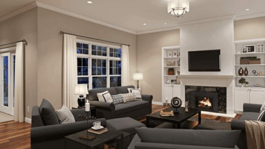
Accessible Beige is a warm greige (gray+beige) that works almost anywhere. It has a soft, understated tone that feels neutral but still warm.
This shade adapts beautifully to various lighting conditions, making it one of Sherwin-Williams’ most popular choices. It’s lasting, cozy, and versatile enough to use as a whole-home color.
Subtle gray undertones keep it from looking too yellowPairs well with white trim and wood accentsWorks in both bright and low-light roomsGreat balance of warm and neutralBest for: Living room or open floor plan
2. Sherwin-Williams Kilim Beige (SW 6106)
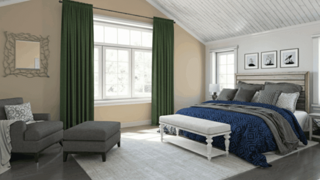
Kilim Beige has golden undertones that bring a natural warmth to any space. It’s richer than some other beiges, which makes it a great choice for rooms that need a bit more depth.
Depending on your lighting, it can lean warmer or more neutral. This paint color exudes a sense of warmth and classic refinement.
Golden undertones for a sunny, cozy lookBalances cool natural light in north-facing roomsWorks well with earthy tones and natural materialsTimeless appeal for both modern and traditional spacesBest for: Bedroom or family room
3. PPG Toasted Almond (PPG1097-3)
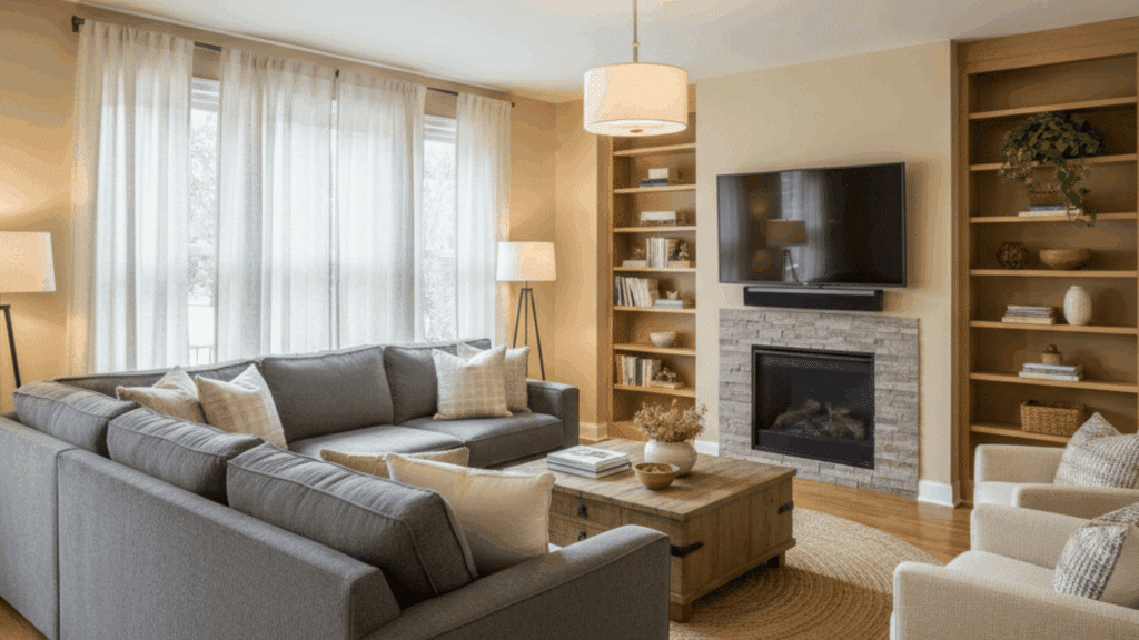
Toasted Almond is a soft, creamy beige with gentle golden undertones. It gives off a comforting, sunlit feel that instantly warms up any room.
The subtle richness makes it a great option for cozy living spaces or bedrooms where you want a relaxed, welcoming vibe.
Soft beige with warm golden undertonesCreates a cozy, light-filled atmosphereWorks beautifully with wood tones and white trimIdeal for spaces needing subtle warmth without heavinessBest for: Living room or hallway
4. PPG Wheat Sheaf (PPG14-21)
Wheat Sheaf is a golden beige with a hint of amber, bringing depth and natural warmth to a space. It’s perfect for those who want a cheerful yet grounded tone that complements both traditional and modern interiors.
Golden beige with soft amber undertonesBalances well in both natural and artificial lightEnhances warm wood furnishings and earthy décorGreat option for open-concept homes or kitchensBest for: Kitchen or family room
5. Sherwin-Williams Natural Linen (SW 9109)
Natural Linen is a muted, soft beige that creates a calm backdrop. It doesn’t have strong undertones, so it feels balanced and easy to work with.
This shade brings a gentle warmth that makes spaces feel comfortable without overpowering. It’s a great choice if you want a neutral that feels timeless but not flat.
Soft, understated warmth with minimal undertonesBlends well with both warm and cool finishesCreates a cozy, welcoming environmentIdeal for a whole-home neutralBest for: Hallways or entryways
6. Benjamin Moore Muslin (OC-12)
Muslin is a soft, muted beige with a slight orange undertone that adds just the right amount of warmth. It’s versatile and an all-time classic, making it a favorite among designers.
This shade looks especially beautiful in spaces with natural light, where its subtle warmth shines without looking too strong.
Muted beige with a gentle orange undertoneWorks well with whites, woods, and earthy colorsA versatile choice for both small and large roomsAdds a touch of warmth without being overwhelmingBest for: Living room or dining space
7. Benjamin Moore Manchester Tan (HC-81)
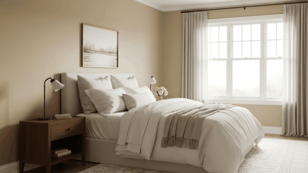
Manchester Tan is a warm beige that adjusts to the light in your home. In bright spaces, it looks more neutral, while in darker areas, it leans warmer.
This adaptability makes it one of Benjamin Moore’s most reliable beige tones. It’s soft, classy, and works beautifully as a backdrop for almost any style.
A flexible shade that shifts with lightingWarm but not too yellow or orangePairs well with crisp whites and soft colorsGreat option for a classic, timeless lookBest for: Home office or guest bedroom
8. Benjamin Moore Shaker Beige (HC-45)
Shaker Beige is a warm, earthy beige with a slightly deeper tone than Muslin or Manchester Tan. It leans slightly toward a peachy undertone, which adds richness without being too bold.
This shade brings warmth and refinement, making it a great choice for traditional or cozy spaces.
Warm beige with a hint of peach undertoneRicher and deeper than softer beige shadesWorks beautifully with wood tones and warm décorOffers a classic, inviting atmosphereBest for Room: Dining room or formal living room
9. Sherwin-Williams Balanced Beige (SW 7037)
Balanced Beige is a slightly deeper shade than Accessible Beige, with stronger warmth that makes it stand out. It’s perfect if you want something richer but still neutral.
This color creates a grounded, cozy atmosphere without feeling heavy, making it a great choice for larger spaces where lighter beiges may get washed out.
Deeper, warm beige with subtle greige undertonesAdds richness and coziness without overwhelmingWorks beautifully with wood furniture and earthy décorHolds its warmth even in cooler lightBest for Room: Living room or Kitchen
10. Valspar Brown Owl (X46R93C)
Brown Owl is a toasty, yellow-tinted beige that feels cozy and welcoming. It has a soft depth that makes it stand out from lighter beiges while staying neutral enough to use in many rooms.
This shade adds warmth and comfort, making it a great choice for family-centered spaces.
Warm, toasty beige with yellow undertonesCreates a cozy, comfortable environmentWorks well with rustic or farmhouse décorPairs nicely with whites and dark accentsBest for Room: Family room or Living room
11. Valspar Puppy Paws (M144)
Puppy Paws is a creamy, soft beige with gentle, warm undertones. It’s lighter than Brown Owl, giving it a fresh and airy feel.
This shade is ideal if you want warmth without going too dark. Its friendly, inviting vibe makes it a popular choice for creating a calm and relaxed space.
Creamy beige with subtle warmthLighter option for a fresh, open lookBlends seamlessly with a wide range of finishesAdds a soft, welcoming touch to any roomBest for Room: Nursery or bedroom
How to Choose the Right Warm Beige for Your Space?Picking the right warm beige paint color can be tricky because undertones and lighting can significantly alter the appearance. The same shade may look soft and balanced in one room but appear too yellow or flat in another.
Here are a few tips to help you choose with confidence:
Test Samples First: Always paint a small patch on your wall to see how it looks in your actual lighting.Check Undertones: Warm beige can lean towards yellow, peach, or even a slightly pink tone. Make sure the undertone complements your flooring, trim, and furniture.Consider the Direction of Light: In north-facing rooms, warm beige helps balance the cool light. In bright, south-facing rooms, opt for a softer beige to avoid making the space look too warm.Match Your Style: Farmhouse and traditional spaces often pair well with golden beiges, while modern homes tend to work better with greige-beige shades.The key is to compare at least two to three options in your own space before making a decision.
Pro Designer Tips for Styling Warm Beige WallsWarm beige works like a blank canvas, but how you style it changes everything. Here’s how designers make this versatile shade truly shine.
Styling ElementDesigner TipWhy It WorksTexturesPair beige walls with linen, rattan, or soft wool throws.Adds warmth and depth without overwhelming the neutral base.FurnitureUse wood tones (light oak or walnut) or black metal accents.Balances the softness of beige with natural or modern contrast.Décor AccentsAdd pops of greenery, earthy ceramics, or muted metallics like brass or gold.Brings character and freshness to beige’s neutral backdrop.LightingChoose warm white bulbs (2700–3000K) instead of cool white bulbs.Improves beige’s warm undertones and prevents the space from looking flat.Beige doesn’t have to feel plain; it’s all about layering. When paired thoughtfully, warm beige paint colors can look just as stylish as bold colors while staying timeless.
Final ThoughtsAfter going through all these shades, it’s clear why warm beige paint colors remain a favorite year after year. They’re not just “safe neutrals”; they actually set the tone for how a room feels.
From cozy golden tones to soft greige blends, each beige has its own personality, and that’s what makes it exciting.
I’ve found that the real magic happens when you pair the right beige with your home’s lighting and style. Even if you lean towards modern or traditional, warm beige provides a backdrop that feels inviting, flexible, and enduring.
If you’re unsure, sample a couple of shades on your wall, because the beige that feels “just right” in your home will always be the best one.
If you found this blog helpful, don’t forget to check out more such home decor blogs on the website.
The post 11 Best Warm Beige Paint Colors for Every Room appeared first on Amenity Home.
October 9, 2025
What Color is Alabaster: A Complete Paint Guide
When I first started comparing paint colors, I kept asking myself the same thing: What color is Alabaster, and why does everyone recommend it? If you’ve ever felt stuck between bright whites and warmer tones, I know exactly how that feels.
Sherwin-Williams’ Alabaster is one of those rare shades that sits right in the middle, soft, inviting, and versatile.
In this blog, I’ll share what makes it unique, how it looks in different light, and the best ways to use it so you can decide if it’s the right white for your home.
Alabaster Paint Color OverviewAlabaster (SW 7008) is a warm, white paint color from Sherwin-Williams, widely chosen for both interior and exterior use. If you’ve ever asked what color Alabaster is, the answer is that it’s a warm white with soft undertones that balance brightness and comfort.
Name & Code: Sherwin-Williams Alabaster (SW 7008)HEX Code: #EDEAE0RGB: 237 / 234 / 224LRV (Light Reflectance Value): 82Availability: Interior and exterior paintsSherwin-Williams Alabaster white is available in both interior and exterior formulas, making it a flexible choice.
Alabaster Undertones and Lighting Effects
Alabaster reacts strongly to lighting, which is why it can look different from room to room. Its undertones reveal themselves in unique ways depending on exposure, time of day, and the type of light used.
Warm vs. Cool BalanceAlabaster is a warm white at its core, but it doesn’t always read the same way. In south-facing spaces, it feels soft and creamy, complementing natural warmth.
In cooler settings, like shaded exteriors or rooms styled with gray or blue decor, its warmth settles down, and the color appears closer to a balanced neutral. This shifting quality makes Alabaster more adaptable than other warm whites.
Why It Can Look YellowAlabaster’s beige undertones sometimes push forward, especially in low-light spaces or under incandescent bulbs. This is when the paint may appear more yellow than expected.
The effect isn’t a flaw in the color but a reaction to lighting. If yellowing worries you, pair Alabaster with cooler accents or test it in several spots to see how strong the creamy undertone appears in your home.
How Natural and Artificial Light Changes Its AppearanceSunlight, shadows, and bulbs all affect the appearance of Alabaster. North-facing daylight emphasizes the beige in its base, while south-facing light makes it feel softer and brighter.
In the evening, warm bulbs highlight its creaminess, while cool LEDs neutralize it. Because of these shifts, the same color can feel cozy in one home and crisp in another. Testing samples at different times of day is the best way to anticipate results.
How Does Alabaster Look in Different RoomsAlabaster changes beautifully across rooms, adapting to light and decor. Its warmth makes bedrooms cozy, kitchens clean, and exteriors bright yet soft. Here is how the color looks in different parts of your home:
1. Bedrooms
Alabaster brings calmness to bedrooms. Its soft warmth pairs perfectly with linen bedding, light wood furniture, and cozy lighting. It creates a restful atmosphere that helps you unwind at the end of the day.
The color’s gentle cream tone adds comfort without overpowering the space, making it ideal for rooms meant to feel soothing and peaceful. If you want a warm, inviting retreat, Alabaster is a dependable bedroom wall color.
2. Kitchens
In kitchens, Alabaster works as a bright yet welcoming backdrop. It pairs beautifully with natural stone, tile backsplashes, and both light and dark cabinets. The tone keeps the space open and comfortable, not stark or cold.
It reflects light well, making smaller kitchens feel bigger and more cheerful. Alabaster’s balanced warmth complements stainless steel, wood finishes, and neutral countertops, blending easily with any decor style. It’s a great choice for classic or modern kitchen designs.
3. Living Rooms
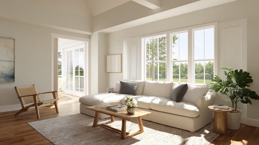
Alabaster gives living rooms a balanced, timeless feel. It reflects just enough light to make the space bright without glare. Whether your style is rustic, farmhouse, or modern, it works effortlessly with any palette.
The soft white tone allows furniture and decor to stand out naturally. It pairs beautifully with warm woods, natural fabrics, and soft accents. If you want your living space to feel open, welcoming, and grounded, Alabaster delivers that harmony perfectly.
4. Exteriors
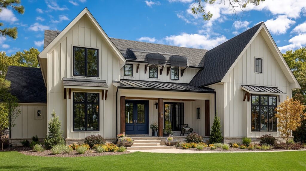
On exteriors, Alabaster stands out as a warm yet clean white. It keeps its tone consistent in natural light, avoiding the starkness that some whites show outdoors. The color pairs beautifully with dark trim, black doors, or navy shutters for striking contrast.
It’s a favorite for farmhouse, coastal, and cottage-style homes because it feels bright but never too harsh. Alabaster’s softness gives exteriors an inviting, timeless look that stays fresh throughout every season.
Alabaster with Trim, Cabinets, and CeilingsAlabaster’s gentle warmth makes it perfect for details like trim, cabinets, and ceilings, bringing balance and cohesion throughout your home. Things like these are great to keep in mind before deciding on a contrasting color:
TrimAlabaster trim offers a soft, natural outline that enhances walls without feeling too sharp. It works beautifully with warm or cool wall shades, creating a seamless flow from room to room.
The color’s subtle warmth softens bold tones and complements natural materials like wood or stone. Many homeowners use it for doors, baseboards, and moldings because it brightens edges while keeping the overall space calm, balanced, and timeless.
CabinetsFor cabinets, Alabaster gives just the right mix of warmth and freshness. It makes kitchens and bathrooms look open and inviting without feeling cold. The color pairs perfectly with brass, black, or nickel hardware, giving you flexibility with finishes.
It also blends well with stone, quartz, and butcher block countertops. If you want a farmhouse, coastal, or classic look, Alabaster cabinets keep the space grounded while adding a soft, sophisticated glow.
CeilingsUsing Alabaster on ceilings creates a smooth transition from wall to overhead space. It removes the harsh contrast that pure white ceilings often create, making the room feel more unified.
The color’s light reflectivity keeps rooms bright without glare, especially in open or vaulted spaces. It’s an excellent option for homes with mixed lighting conditions, helping ceilings feel airy and natural while maintaining a cohesive, connected look across the entire space.
Comparing Alabaster White to Other WhitesAlabaster is often compared to other popular whites. Understanding these differences helps you choose the right shade for your home:
Alabaster vs. Pure White (Sherwin-Williams)

Pure White is cooler and crisper, while Alabaster leans warmer and softer. On walls, Pure White delivers a clean finish that suits modern spaces, while Alabaster adds subtle warmth and comfort.
If you want a color that feels welcoming without looking stark, Alabaster is the better choice. Pure White works best when paired with contemporary designs or cooler-toned accents.
Alabaster vs. White Dove (Benjamin Moore)

Benjamin Moore’s White Dove is often compared to Sherwin-Williams’ Alabaster white because of their shared softness.
White Dove shares similarities with Alabaster, but it has stronger gray undertones. This makes White Dove feel slightly more muted and less creamy. Alabaster, on the other hand, holds onto warmth that feels cozy in low-light settings.
Choosing between them often depends on your lighting conditions. White Dove works well in brighter spaces, while Alabaster is dependable in dimmer or north-facing rooms.
Sherwin-Williams vs. Benjamin Moore Alabaster

Sherwin-Williams Alabaster (SW 7008) is warm with beige-gray undertones, while Benjamin Moore Alabaster (OC-129) leans cooler with a faint pink undertone.
The two are not direct matches, and side-by-side, they read differently. If you’re considering “Alabaster,” make sure you specify the brand since each offers a distinct take on soft white. Both can work, but context and palette matter.
When to Choose Each OptionSelect Alabaster (Sherwin-Williams) if you want a warm, versatile white that feels soft in most conditions. Choose Pure White for a clean, modern finish with cooler accents.
Go with White Dove if you need a neutral white that balances gray undertones. Consider Benjamin Moore Alabaster for subtle pink warmth. Testing swatches under your own lighting is the safest way to decide.
ColorUndertoneBest UseNotesSherwin-Williams Alabaster (SW 7008)Warm beige-grayInteriors/exteriorsSoft warmth, versatileSherwin-Williams Pure White (SW 7005)Neutral, coolerModern trim/wallsCrisp and cleanBenjamin Moore White Dove (OC-17)Gray-creamBright interiorsSlightly muted, cozyBenjamin Moore Alabaster (OC-129)Pink-whiteAccent walls, trimSubtle pink castCoordinating Colors with AlabasterPairing Alabaster with the right colors creates a balanced and inviting space. These tips will help you choose shades that highlight its soft warmth without overwhelming the room:
Neutral PairingsPairing Alabaster with neutrals creates a calm, layered effect. Light grays add balance, while warm taupes and soft beiges enhance its creaminess. This approach works well for bedrooms, living rooms, or kitchens where subtle contrast is preferred.
For trim, deeper grays like Sherwin-Williams’ Mindful Gray can ground the palette. These combinations keep Alabaster feeling soft and adaptable without pulling the attention away from furniture or architectural details.
Bold Accent OptionsAlabaster also handles bold colors well. Navy offers crisp contrast for cabinets, doors, or accent walls. Deep greens bring out its warmth while keeping the overall scheme grounded and natural.
Terracotta, with its earthy red-orange tone, introduces richness and complements Alabaster’s creamy undertones.
Using these accents strategically, on front doors, statement furniture, or feature walls, adds interest without overpowering the soft neutrality that Alabaster provides as the base color.
Whole-House Palette ExamplesFor a cohesive whole-house palette, use Alabaster as the anchor across walls or trim. Pair it with warm neutrals like Accessible Beige in common areas, add depth with Iron Ore for accents, and soften transitions with Agreeable Gray in hallways.
In bedrooms or bathrooms, introduce muted blues or greens to create subtle variation. This approach ensures continuity while still allowing each room to feel distinct, practical, and welcoming throughout the home.
Pros and Cons of The ColorAlabaster is a popular white paint that offers warmth and adaptability, though certain conditions highlight drawbacks like which makes it worth considering before choosing:
Pros of AlabasterAlabaster’s strengths make it one of Sherwin-Williams’ most used whites, valued for flexibility, comfort, and suitability across design styles.
Works well for both interiors and exteriorsSoft white that feels inviting, not sterileComplements a wide range of color palettesPairs easily with wood tones and natural texturesAdaptable across farmhouse, modern, and transitional stylesCons of AlabasterDespite its appeal, Alabaster can present challenges depending on light conditions and design context, requiring careful testing before full application.
May appear yellow in dimly lit roomsWarm bulbs can exaggerate creaminessIt can look flat under strong sunlight outdoorsUndertones sometimes clash with cool, crisp palettesLighting and room orientation heavily affect resultsWhere to Buy Alabaster PaintSherwin-Williams Alabaster (SW 7008) can be purchased directly from Sherwin-Williams stores or through their official website at www.sherwin-williams.com. You can also find it at authorized retailers.
Many homeowners prefer to start with sample sizes or peel-and-stick swatches from services like Samplize, which let you test how the color looks in your space before committing.
Full gallons are available in both interior and exterior formulas, making this shade suitable for any project. Don’t forget to check Sherwin-Williams’ Paint Perks program for current promotions and confirm availability at your local store before purchasing.
ConclusionAfter testing it myself, I finally understood the answer to what color is Alabaster: it’s a comfortable, flexible white that works anywhere. It doesn’t come across too harshly, and it blends beautifully with other colors.
The real test, though, is how it looks on your walls. That’s why I always recommend sampling first before making a commitment.
If you want a white that’s flexible and dependable, Alabaster is a strong choice. I hope this guide gave you clarity, and I’d love for you to check my other paint reviews to find more colors that could work perfectly in your home!
The post What Color is Alabaster: A Complete Paint Guide appeared first on Amenity Home.


