M. Shannon Hernandez's Blog, page 5
May 27, 2025
Grant Beige (HC-83) Exterior Color Details: A Quick Guide
Tired of walls that blend into the background? Grant Beige might be the perfect answer you’ve been searching for.
Many homeowners struggle to find a paint color that feels just right. Something that brings warmth without feeling overwhelming. Something that makes your home feel truly special.
This color offers a fresh start without a complete makeover. It’s a simple change that can breathe new life into your space.
It’s a big decision—choosing the right paint color isn’t simple. But it could change how you feel about your home.
In this guide, we’ll walk you through everything about Grant Beige. From understanding its unique qualities to seeing how it can work in different spaces, we’ve got the insights you need to make a smart choice.
About Grant Beige (HC-83)

This paint color adds a warm, creamy look that works well with many types of homes. From modern houses to more traditional designs, Grant Beige can help bring your vision to life.
It gives your home a welcoming and calming vibe.
Plus, it’s versatile, meaning you can use it as the main color for your home or as an accent to highlight other features.
One of the biggest reasons people love Grant Beige is its ability to work in many settings.
A house with lots of sunlight or one in a shaded area, this color adapts well. It never appears too dark or too light, making it a reliable choice for any homeowner.
How Light Changes the Color
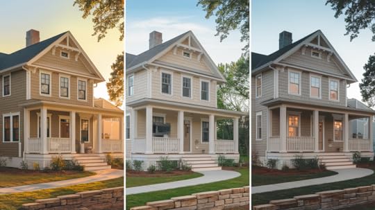
Grant Beige sits between beige and cream on the color scale. Its Light Reflectance Value (LRV) of 55.81 indicates that it reflects a medium amount of light.
This makes it the perfect middle ground, not too light but also not too dark. It keeps your home looking bright without overwhelming the senses.
One of the unique things about Grant Beige is how it changes throughout the day based on the natural light around it. Here’s what you can expect:
Morning Sun: The golden tones come to life, making the color appear warmer and more inviting.Midday Light: The color takes on a more neutral appearance, showcasing its true beige-cream balance.Evening Light: As the sun sets, you may notice cooler tones emerging, adding depth to the color.These subtle shifts make Grant Beige an ideal choice if you’re looking for a color that looks great at different times of the day.
Color Base NotesLike most beige colors, Grant Beige has base notes that can sometimes show up more strongly depending on the lighting. The mild green and yellow undertones may be more noticeable in the following cases:
Bright natural light: This can bring out more of the yellow tone in the paint.
Pure white trim: The green undertones may appear more prominent next to crisp white accents.
Shaded areas of your home: When the sun isn’t directly hitting the walls, the color can take on a slightly muted look, sometimes showing more of the green undertone.
If you like the look of beige but want to avoid a strong yellow or green hue, testing the color in your environment is key.
Exterior House Styles That Match Well With Grant Beige

Grant Beige is a flexible color that fits many home styles. It doesn’t matter if you live in a Mediterranean house or a more modern, traditional home. This color works.
Here are some examples of where Grant Beige really shines:
Mediterranean Homes: The warm, earthy tones of Grant Beige pair perfectly with clay tile roofs and stucco finishes. This classic look never goes out of style.Traditional Ranch Houses: This color complements the clean lines and simple architecture of a ranch-style home.Coastal Homes: Grant Beige helps reflect the soft, natural light often found in coastal settings, making it ideal for beach houses or homes near the water.Lake Houses and Cabins: Grant Beige’s warmth blends well with its natural surroundings, providing a cozy, welcoming vibe.Colonial Style Homes: This color enhances the traditional charm of colonial homes with its timeless feel.Grant Beige As Main Color or Extra Touch

Grant Beige can be used in different ways depending on your vision for your home:
Grant Beige works well as the main color for your house’s exterior, offering a soft, neutral backdrop that complements other elements.
For a balanced look, pair it with darker trim, such as deep green or brown. This contrast helps the beige stand out without overwhelming the design.
You can also use Grant Beige for columns, windows, or other features to create a cohesive appearance.
Materials that Go Well TogetherGrant Beige works well with natural stone, particularly in homes with stone walls or accents. It blends easily with various stone colors, especially warm-toned varieties.
The versatility of Grant Beige allows it to enhance both traditional and modern stone designs, providing a timeless, neutral backdrop.
If your home features red or brown roof tiles, Grant Beige complements these shades, helping to unify the design and creating a balanced, cohesive look.
The warm undertones of Grant Beige also pair beautifully with wood trim and doors, adding a natural touch to the exterior. Your wood accents are light or dark, this color adapts, creating an inviting and organic feel.
For homes with brick facades, it creates a smooth transition, harmonizing with the red and brown tones in the brickwork while giving the structure an understated yet elegant appeal.
Overall, Grant Beige is a flexible choice for enhancing the beauty of various exterior materials, making it ideal for homeowners seeking warmth and cohesion in their design.
Colors that Mix Well with Grant Beige
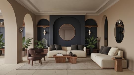
Grant Beige is highly adaptable and pairs with many different colors. Some of the best combinations include:
Navy Blue: This makes for a striking contrast when used for shutters or doors. It brings a bold, fresh look to your exterior.Sage Green: A soft, muted green complements the warm tones of Grant Beige, especially for garden features like planters and outdoor furniture.Deep Brown: Dark brown trim or accents can ground the warmth of Grant Beige, offering a balanced, understated look.Gray-Green: If you want a more subtle effect, gray-green can pair with Grant Beige to create a calm, neutral palette.Advantages and LimitationsGrant Beige offers long-lasting appeal, making it a smart choice for homeowners seeking a versatile, low-maintenance color. It pairs effortlessly with both bold and muted tones, creating a balanced look in any space.
Used for walls, trim, or furniture, its adaptable nature ensures it always complements other design elements.
Additionally, its ability to mask dirt and scuffs means it requires less frequent cleaning, saving time and effort. The color maintains its integrity over time, resisting fading and ensuring your home’s look stays fresh for years.
Updating a room or designing a new space, Grant Beige provides the perfect backdrop for a variety of interior styles.
What to ConsiderGreen tones can vary depending on the light, with certain undertones becoming more noticeable than anticipated.
It’s essential to test the color in your home environment before making a final decision.
Testing the paint on a small section of the wall helps to see how it reacts to the specific lighting and surroundings.
Also, keep in mind that exterior paint, including shades like Grant Beige, may appear slightly different due to weather conditions.
Taking this into account can ensure the best result for your project.
Similar Colors to Grant BeigeIf you’re unsure about Grant Beige, here are a few alternatives to consider:
Sherwin Williams Jogging Path: This color is more of a gray beige, offering a cooler, less warm option compared to Grant Beige.
Benjamin Moore Manchester Tan: A lighter alternative with fewer yellow undertones, giving it a more neutral appearance.
Other similar choices include:
Benjamin Moore Revere PewterSherwin Williams Accessible BeigeBenjamin Moore Edgecomb GrayTesting Grant Beige

Before committing, here’s how you can test Grant Beige on your home:
Paint a 2×2-foot sample area on your house to see how it looks in different lights.Check the color at different times of the day, in full sunlight and in shade, to get a sense of how it changes.Compare it with your roof and trim to see how it complements the whole exterior.Using Online ToolsOnline tools offered by most paint brands can be very helpful. These tools make it easy for you to see how different colors look on sample houses. You can try combining colors to see what looks best together.
Many tools also allow you to track your favorite colors for later use, so you don’t have to worry about forgetting a color you liked. These tools are simple to use and can save you time.
They give you the chance to experiment with colors without needing to buy samples or make any decisions right away.
You can take your time, and when you’re ready, you’ll have a clear idea of which colors you want to use for your home. It’s a convenient way to plan and make sure you choose the best colors for your space.
Painting TipsBefore you start painting, it’s important to clean the surfaces well. Dust, dirt, and grime can affect how the paint sticks, leaving an uneven finish.
Use a gentle cleaner or warm, soapy water, depending on the surface, and dry it properly before moving to the next step.Next, use a quality primer. This is a base coat that helps the paint stick better and ensures a smooth finish. It also improves the durability of the paint. Don’t skip this step, as it’s essential for good coverage.When applying the paint, it’s a good idea to use two coats. The first coat will give the surface an even color, and the second coat will ensure full coverage. It also helps the paint last longer.Lastly, choose a day with good weather for painting. Avoid painting on humid or rainy days, as this can affect how the paint dries. Opt for a dry, mild day so the paint sets well and doesn’t get ruined by the weather.Maintenance Tips for Grant BeigeTo keep your Grant Beige surfaces looking their best, there are a few simple care tips that can help.
First, make sure to clean the surfaces once a year. This will help remove any dust or dirt that may have built up over time. It’s easy to do and will keep the color fresh.
Be sure to fix any cracks or chips as soon as you notice them. This will prevent any further damage and keep the surface smooth.
Another helpful tip is to keep trees or shrubs trimmed and away from the house.
Branches that brush up against the walls can cause scratches or damage to the finish. By trimming plants regularly, you can protect your home and maintain its beautiful appearance.
When is It Time for New Paint?
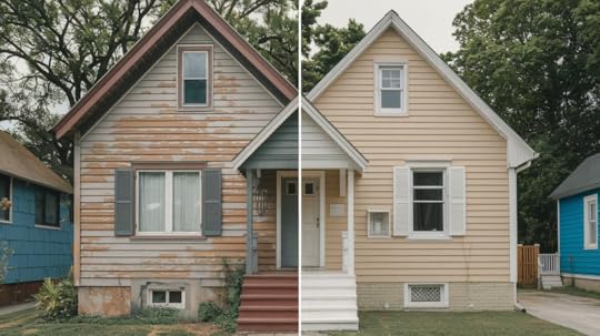
If your paint is starting to look worn out, it might be time to consider a fresh coat. There are a few signs that suggest that repainting may be needed.
Faded Color: Over time, colors can lose their vibrancy. If your walls are looking dull or washed out, new paint will bring back the original freshness.
Peeling Paint: When the paint begins to peel or flake off, it means the surface is no longer properly protected. This can lead to further damage, so repainting will help maintain the look and condition of your space.
Worn Spots or Chips: If there are visible spots where the paint has chipped away or worn thin, it can make your room look neglected. A touch-up or full repainting will restore its appeal.
Outdated Look: Sometimes, the style of your room just doesn’t feel right anymore. A new coat of paint in a more modern or refreshing shade can make a huge difference in updating the feel of the space.
Repainting is a simple way to bring new life to your home. Keep an eye out for these signs, and you’ll know when it’s time to make a change.
ConclusionGrant Beige is a versatile and practical exterior paint color that suits many home styles. It works well with various materials and can complement both traditional and modern designs.
If you’re looking for a calm, welcoming feel, this color could be the right choice for you.
Before settling on it, take the time to test it in your space.
This step ensures it blends smoothly with your home’s surroundings and helps you confirm it’s the best fit for your outdoor look.
The post Grant Beige (HC-83) Exterior Color Details: A Quick Guide appeared first on Amenity Home.
Comparing Healing Aloe (BM 1562) vs Quiet Moments (BM 1563)
Paint colors can make a big difference in how you feel at home.
Today, we’re looking at two popular paint shades: Healing Aloe and Quiet Moments.
These colors have gotten lots of attention from people wanting to create calm spaces in their homes.
If you’re planning to paint your walls soon, this guide is perfect for you. I’ve helped homeowners refresh their spaces.
Even if you like doing home projects yourself or are an interior designer helping clients, we’ll help you choose between these two lovely options.
Both colors bring a special feeling to a room, and we’ll show you exactly how they differ.
Overview of Each ColorLet’s get to know these two popular Benjamin Moore colors better – they might look similar at first glance, but each has its own unique personality.
Healing Aloe (BM 1562)
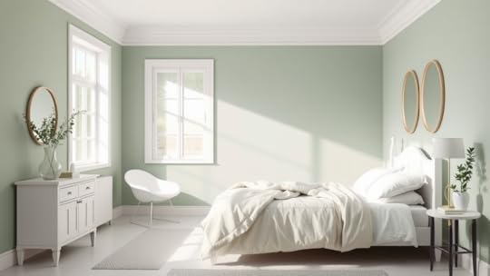
This soft green-gray paint has a gentle blue undertone that shows up more in natural light.
It’s a light shade that reminds me of the sea glass you might find on the beach.
Benjamin Moore describes it as a calming pastel that brings a fresh feel to any room.
The color shifts subtly throughout the day, appearing more green in the morning and grayer in the evening.
Quiet Moments (BM 1563)
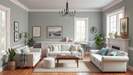
This is a softer, more gray-focused color with gentle green and blue hints mixed in.
Think of early morning fog over a lake – that’s the feeling it creates.
Benjamin Moore calls it a tranquil shade that works well in spaces where you want to relax.
The color stays pretty steady in different lights but can look slightly more blue when paired with pure white trim.
Healing Aloe vs Quiet Moments: Side-by-Side Comparison
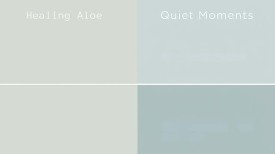
When you compare these colors, you’ll notice some subtle but important differences that can help you make your choice.
Key DifferencesHealing Aloe has a Light Reflection Value (LRV) of 61, slightly brighter than Quiet Moments, which has an LRV of 60.
Healing Aloe shows more green, while Quiet Moments leans more into gray with a touch of blue.
How They Look in Different Lighting ConditionsMorning sun brings out the green in Healing Aloe while it makes Quiet Moments look more blue.
In evening light, both colors get softer – Healing Aloe turns more grayish, and Quiet Moments keeps its calm gray look.
Which One is Warmer or Cooler?Healing Aloe feels a bit warmer thanks to its green notes.
Quiet Moments stays on the cool side because of its blue-gray base.
This makes Healing Aloe feel more like spring, while Quiet Moments feels more like a misty morning.
Best Uses for Each ColorLet’s look at where these colors shine brightest in your home. Each one has spots where it works especially well.
Healing Aloe: Where it Works BestThis color feels right at home in bedrooms and bathrooms.
Its soft green hints make it perfect for spaces where you want to feel refreshed.
Many people love it in home offices, too – it’s bright enough to keep you alert but gentle enough to help you focus.
It also looks amazing in rooms that get lots of natural light.
Quiet Moments: Where it Works BestThis color creates a cozy feeling in living rooms and family spaces.
It’s also a great pick for kitchens and reading nooks where you want to feel peaceful.
If you’re thinking about painting outside, this color holds up really well on exterior walls and looks beautiful with white trim and natural stone.
Color Pairing Guide for Healing Aloe vs Quiet MomentsPicking the right colors to go with your main paint choice can make a big difference.
Here’s what works well with each shade.
Best Trim ColorsBoth colors look clean with pure white trim like White Dove or Chantilly Lace.
For something softer, try Swiss Coffee with Healing Aloe.
Quiet Moments pairs nicely with Light Gray – it creates a subtle, smooth look.
Complementary Colors for Accent WallsHealing Aloe works well with light blues and soft grays.
Quiet Moments matches beautifully with deeper grays and gentle cream colors.
These pairings help create a calm, connected feel in your space.
Matching Furniture & Decor StylesLight wood and white furniture look great with both colors.
Add natural textures like cotton and linen.
Brown leather chairs and cream-colored sofas stand out nicely against these wall colors.
Expert & User OpinionsIt’s helpful to hear from people who work with these colors and those who live with them every day. Here’s what they have to say.
Interior designer insightsDesign pros often pick these colors for clients who want a calm space.
They say Healing Aloe looks great in sun-filled rooms and brings a fresh feel.
For Quiet Moments, designers love how it changes through the day while keeping its peaceful mood.
Homeowner ReviewsPeople who chose Healing Aloe say their rooms feel bright and clean.
Many mention how it makes small spaces feel bigger.
Those with Quiet Moments in their homes love its calming effect, especially in busy areas like kitchens and family rooms.
Testing & Painting TipsGetting the color right the first time saves you time and money.
Let’s look at how to test these colors and make sure you’ll love your choice.
How To Sample the Colors CorrectlyPaint a 2-foot square on each wall you plan to paint.Look at it during the morning, afternoon, and evening. Use two coats of paint on your test spot – this shows the true color. Take photos in different lights to help you decide.Tips for Avoiding Color RegretBuy small paint samples first. Paint them on white poster boards that you can move around the room.Live with the samples for a few days. Check how they look with your furniture and in natural light. Remember, both colors need two coats for the best results.Final ThoughtsPicking between Healing Aloe and Quiet Moments comes down to what you want for your space.
Go with Healing Aloe if you like fresh and bright colors, especially in rooms where you spend your mornings.
It’s great when you want a hint of green that’s not too bold.
Choose Quiet Moments if you’re looking for a more laid-back, calming color that works in any room.
It’s perfect if you prefer gray tones with just a touch of blue and green. This color is especially good for spaces where you want to relax.
Remember, both colors work well in modern and traditional homes, so you can’t really go wrong with either choice.
Trust your gut feeling when you look at your paint samples!
The post Comparing Healing Aloe (BM 1562) vs Quiet Moments (BM 1563) appeared first on Amenity Home.
Benjamin Moore Going to the Chapel (1527): The Perfect White
Choosing the right white paint for your interior can feel like guiding an ocean of options.
However, one shade stands out for its ability to provide a harmonious, inviting atmosphere in various spaces: Benjamin Moore’s Going to the Chapel (OC-171).
This distinctive white paint, developed as part of Benjamin Moore’s Off-White Collection, has earned its reputation among designers and homeowners alike for its exceptional versatility.
With its perfect balance between warm and cool undertones, this versatile hue transforms any room with its subtle refinement.
In this guide, we will introduce you to its unique properties, practical applications, and expert techniques, which can help you achieve a flawless finish for your next project.
Understanding the Color Analysis of BM White PaintTechnical SpecificationsRGB Values: R: 242, G: 240, B: 235Hex Code: #F2F0EBPaint Code: OC-171Collection: Off-White CollectionLight Reflectance Value (LRV)Light Reflectance Value (LRV) measures how much light a paint color reflects, with a scale from 0 to 100.
A higher LRV means more light is reflected, brightening the space. With an LRV of 87.5, this white paint brightens rooms without being too harsh, making it ideal for small or darker spaces.
It adapts to various lighting conditions, enhancing the room’s ambiance throughout the day.
Warm Undertones and Light ResponseThis shade has warm undertones that adapt beautifully to different lighting conditions, creating a cozy ambiance throughout the day. The way it interacts with light depends on the room’s orientation:
Light SourcePaint ResponseRoom EffectNorth-FacingMaintains warmthBalanced and invitingSouth-FacingShows clarityCrisp, clean appearanceEast-FacingMorning glowSoft and welcomingWest-FacingEvening depthRich and dimensionalIn addition to natural light, artificial lighting plays a role in how the color appears:
LED lights preserve the paint’s true color.
Incandescent lighting enhances warm undertones.
Fluorescent lighting may slightly cool the appearance.
Halogen lighting provides excellent color accuracy.
This versatility ensures that Going to the Chapel remains a beautiful and adaptable white, providing depth and dimension in any space.
Application Methods OF BM Going to the Chapel

Achieving a professional-looking finish requires careful preparation and technique. Start by ensuring the surfaces are clean and free of imperfections.
Apply a primer suitable for the wall type and allow it to dry completely. When it’s time to apply the paint, opt for a high-quality roller or brush.
Use a 3/8-inch nap roller for smooth surfaces and a 1/2-inch nap for textured walls. Apply thin, even coats of paint to avoid drips and achieve a consistent finish.
Make sure to maintain a wet edge while painting to avoid noticeable streaks.
Room-Specific ApplicationsThis white shade can benefit every room, but the recommended finish can vary depending on the space’s specific needs.
Here’s a guide for achieving the best look:
Room Type
Recommended Finish
Key Benefits
Living Areas
Eggshell
Subtle sheen, durable finish
Kitchens
Satin
Easy to clean and maintain
Bedrooms
Matte
Creates a calm, serene atmosphere
Bathrooms
Semi-Gloss
Moisture-resistant and durable
Color Coordination Of BM Going to the Chapel

This white works exceptionally well with a wide range of complementary colors. Here are a few pairings that will uplift your design:
Navy Blue: Hale Navy (HC-154) – Provides a classic contrast for living spaces or accent walls.Soft Grays: Gray Owl (OC-52) – Adds a sophisticated, contemporary touch in bedrooms or offices.Natural Greens: October Mist (1495) – Ideal for an organic, calming feel in bedrooms or bathrooms.Warm Browns: Kingsport Gray (HC-86) – Grounding and earthy, this combination suits kitchens or dining rooms.Black Accents: Black Iron (2120-20) – Perfect for modern spaces, creating striking visual contrastsProfessional Tips and Techniques

Proper surface preparation is crucial for achieving the best results when painting. Start by removing wall fixtures such as light switches and outlet covers.
Next, repair any cracks or holes using spackle and sand the surface smoothly to ensure an even finish.
Finally, clean the walls with a mild detergent to remove dust, dirt, and grease, providing a clean surface for the paint to adhere to.
Application ToolsFor an even and smooth finish, use these professional-grade tools:
Microfiber rollers for a smooth application.Angled brushes for precise edges and corners.Clean mixing equipment to avoid any contamination of your paint.Environmental ConsiderationsWhen painting, it’s important to ensure proper ventilation to allow fumes to dissipate.
Maintain the room temperature between 60-75°F for optimal drying conditions.
Additionally, use a drop cloth to protect floors and furniture from any accidental splashes, keeping the space clean while you work.
Common Mistakes to AvoidHere are some common mistakes you can avoid when using Going to the Chapel. These include poor surface preparation and application errors.
For surface prep, don’t skip cleaning the walls. Always fill holes and cracks properly. Don’t rush sanding. Remove all dust before painting. Use clean and dry tools.
For application, don’t apply paint too thickly. Avoid cheap brushes and rollers.
Don’t remove painter’s tape too early or too late—always box paint. Never paint in poor lighting. Proper preparation and technique are key to a smooth finish.
Maintenance Guide
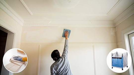
Once your space is painted, it’s important to maintain the beauty of your new walls. Here’s how:
Regular Care: Dust walls regularly using a microfiber cloth or a vacuum with a soft brush attachment. For any marks or stains, clean them with a mild soap solution.Preventive Measures: Keep humidity levels in check to avoid peeling or warping.If you need to clean it, use a soft cloth and avoid harsh chemicals that could damage the finish.
ConclusionThis white paint is an excellent choice for any home, offering a versatile and timeless appeal. Its balanced, warm undertones create a cozy and welcoming atmosphere, making it suitable for various interior styles.
A high Light Reflectance Value (LRV) brightens spaces without feeling too harsh. It adapts beautifully to different finishes and lighting, whether used in living rooms, kitchens, or bedrooms.
By following the right application techniques and considering the room’s needs, you’ll achieve a smooth, lasting finish.
This white is perfect for creating a classy neutral base that adds character and warmth to your home, ensuring it remains a beautiful choice for years.
The post Benjamin Moore Going to the Chapel (1527): The Perfect White appeared first on Amenity Home.
May 26, 2025
Painting 101: Pearly White (SW 7009) Undertones
Looking for the perfect off-white paint color? Sherwin Williams Pearly White (SW 7009) might be what you need.
The color has a warm, welcoming feel that makes spaces feel open without being stark white.
Many homeowners and designers choose this shade because it is neither too bright nor too dull- it sits right in that sweet spot.
In this guide, we’ll look closely at what makes Pearly White special, focusing on its soft undertones that change with the light.
You’ll learn how this gentle off-white shade works in different rooms and what colors go well with it.
By the time you finish reading, you’ll know if this popular paint color is right for your home.
Get in on why Sherwin Williams Pearly White is such a widely loved option and how you can use it in your home.
What is Pearly White?Pearly White by Sherwin Williams has gained fans for good reasons – it’s gentle on the eyes and works well in many homes.
Pearly White is a soft off-white paint color that leans warm without being too yellow.
Its Light Reflectance Value (LRV) of 77 means it reflects quite a bit of light, making rooms feel open and bright.
Think of it as a cozy blanket of color that wraps your room in warmth without being too strong.
AppearanceWhen you see Pearly White on walls, you’ll notice its subtle creamy tone. It’s lighter than typical cream colors but warmer than pure white.
The color shifts slightly throughout the day as sunlight changes.
In bright spaces, it appears almost white, while in shadowy areas, its warm hints become clearer.
Many people love how it makes rooms feel comfy without being too beige or too stark.
The Subtle Undertones of Pearly White
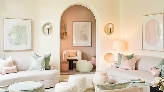
Understanding the hidden colors within Pearly White helps you see how it will look in your home.
These small hints of color make a big difference in how the paint appears on your walls.
Soft Yellow UndertonesThere’s a tiny bit of yellow hiding in Pearly White, but don’t worry – it won’t make your walls look like a banana.
This soft touch of yellow gives the color its cozy feel. Think of it like adding a drop of cream to your coffee – it softens the color without taking over.
The yellow is so mild that most people won’t even notice it’s there.
But this small amount of warmth keeps the color from feeling cold or harsh like pure white can.
In morning light, you might catch a hint of this creamy tone, making your space feel sunny and welcoming.
The Gray InfluenceMixed into Pearly White is a touch of gray that does something special – it calms down the warm yellow hints.
This gray acts like a filter, making the color softer and easy on the eyes. Without this gray touch, the color might look too creamy.
But with it, you get a clean, fresh look that stays warm without going overboard.
Occasional Pink and Green TonesHere’s something interesting about Pearly White – it can play tricks with light!
Sometimes, when the sun hits it just right, you might see tiny hints of pink or green. This happens because of how light bounces around your room.
How to Test Pearly White in Your SpaceBefore you buy gallons of paint, let’s discuss how to ensure that Pearly White is right for your home.
It’s so important to test this paint before you commit. Put some sample patches on different walls and watch them throughout the day.
Morning sun might bring out one tone, while evening light shows another.
Make sure you like all these subtle changes before you paint your whole room.
Testing helps you avoid any surprises once the paint is on your walls.
The Importance of LightingYour room’s lighting makes a big difference in how Pearly White looks.
In bright morning sun, it might appear almost white, while late afternoon light brings out its warmer side.
Turn on your lamps, too – different light bulbs can change how the color looks at night.
Try This Simple TestPaint a big piece of poster board and move it around your room during the day.
Check it in sunny spots and shady corners.
This helps you see all the ways the color can change in your space.
Using Peel-and-Stick SamplesPaint samples you can stick on your wall are a great way to test Pearly White.
Companies like Samplize make these easy-to-use squares that show you exactly how the color will look. Just stick them up and move them around!
Put these samples next to your couch, curtains, and other items in your room. Leave them up for a few days.
This gives you time to see if you like how the color works with everything in your space.
Where to Use Pearly White in Your Home
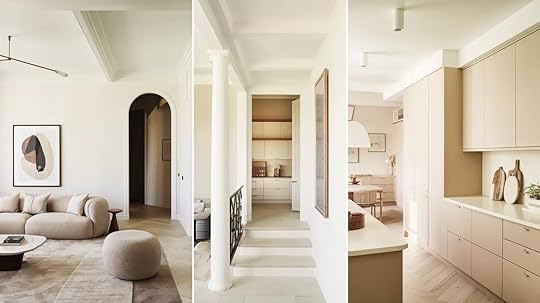
This paint color fits well in many spots around your home.
Let’s look at the best ways to use it and what colors work well with it.
Best Applications for Pearly WhitePearly White shines on walls, but that’s not all it can do!
It looks clean and fresh on kitchen cabinets and adds a soft glow to ceilings.
In living rooms, it creates a cozy feel without making the space too dark.
Bathrooms look clean and bright with this shade, while bedrooms feel peaceful and calm.
This color works extra well in spaces that get lots of natural light.
But don’t worry if your room is a bit darker. Pearly White can still work its magic by making the space feel bigger and more open.
Pairing Pearly White with Other ColorsYou don’t have to guess what goes well with Pearly White. Dark blues and grays make it pop, while wood tones bring out its warm side.
For trim, try Sherwin Williams Pure White for a clean look or Greek Villa if you want to keep things soft and warm.
Brown furniture looks rich against Pearly White walls, and silver or gold accents sparkle next to it.
Even black metal fixtures stand out nicely against this gentle background.
The key is balance – this color plays well with others without fighting for attention.
Pearly White in Exterior Design
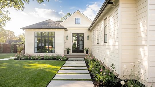
On house exteriors, Pearly White really shows its strength in sunny spots.
The sun brings out its clean, bright look without making it glare like pure white might.
It holds up well in different types of light and makes homes look fresh and clean.
This color looks amazing next to red brick, giving a clean contrast that’s not too sharp. It also pairs beautifully with gray stone, creating a soft, natural blend.
For a modern touch, try it with black windows or dark gutters – these create nice clean lines that catch the eye.
If you have natural wood elements like a front door or porch beams, Pearly White lets these features stand out while staying subtle itself.
Pearly White vs Other Similar Off-Whites
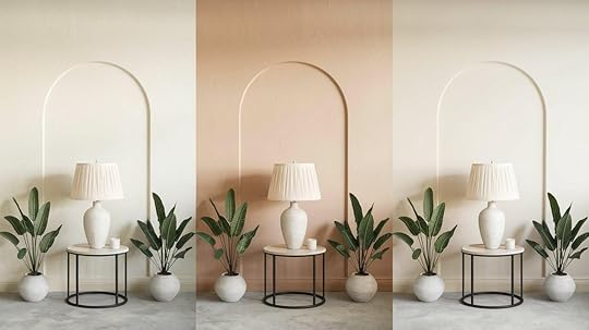
Picking between off-white paint colors can be tricky since they look so similar at first glance.
Let’s see how Pearly White stands up against other popular options.
Pearly White vs Greek VillaWhile both colors bring warmth to a room, they’re not twins. Greek Villa has more yellow in it, making it feel a bit warmer than Pearly White.
Think of Pearly White as the middle ground – it’s not as warm as Greek Villa but not as cool as pure white.
Greek Villa works better for rooms that need extra warmth, while Pearly White is best for spaces that want just a hint of coziness.
Pearly White vs Aesthetic WhiteThese two colors might look alike on tiny paint chips, but they act differently on walls.
Aesthetic White shows more gray, giving it a cooler feel. Pearly White keeps its soft, warm glow while staying light and fresh.
In bright rooms, Aesthetic White can look more crisp, while Pearly White maintains its gentle warmth.
Pearly White vs CreamyHere’s where the differences really show up.
Creamy lives up to its name – it has strong yellow tints that make it much warmer.
Pearly White is more subtle, with just a touch of warmth.
If you like the idea of Creamy but worry it might be too yellow, Pearly White gives you that warm feeling without going too far.
ConclusionWe’ve taken a good look at what makes Pearly White special – from its tiny hints of yellow to its touch of gray that keeps things balanced.
Now you know why this color changes throughout the day and how it works both inside and outside your home.
Remember, paint colors are personal choices. What looks perfect in your friend’s living room might feel different in yours.
That’s why testing is so important. Try some samples, watch how the light plays with the color, and see how it feels with your furniture.
If you’re still not sure, don’t worry! A paint expert can help you make the final call.
After all, you wouldn’t want any regrets when looking at your walls.
The post Painting 101: Pearly White (SW 7009) Undertones appeared first on Amenity Home.
Benjamin Moore’s Early Morning Mist(1528): A Complete Review
When choosing paint for a home or office, the color sets the tone for the entire space.
Soft grays have long been favored for their versatility, and Early Morning Mist from Benjamin Moore is a perfect example.
This balanced gray combines a gentle warmth with refined neutrality, making it adaptable to various settings.
Whether you’re working on a modern home or a more traditional environment, Benjamin Moore’s Early Morning Mist (1528) offers timeless appeal and exceptional functionality.
This guide examines the technical qualities, practical applications, and methods for achieving a flawless finish with this versatile shade.
Technical Analysis of Early Morning MistUnderstanding the technical aspects of paint is essential for achieving the best results. Here’s a breakdown of what makes Early Morning Mist a great choice:
Key Technical Specifications Light Reflectance Value (LRV): Early Morning Mist’s LRV of 62.37 indicates it reflects 62% of light while absorbing 38%. This medium-light rating means the color brightens spaces effectively while maintaining enough depth for visual interest. It performs well across different lighting conditions, preventing glare in bright light while staying visible in dimmer settings.Base Composition: Premium acrylic. High-quality acrylic ensures durability and a long-lasting finish, making it ideal for residential and commercial applications.Coverage Rate: 400-450 sq ft per gallon. This coverage is typical for a premium paint and means you’ll need fewer coats to cover large areas.Recommended Coats: 2 For optimal coverage and color accuracy, apply two coats.Drying Time: Touch dry in 1 hour, recoat in 2 hours. Quick drying times allow for efficient project completion.VOC Content:Available Finishes: Flat, Eggshell, Satin, and Semi-gloss. Early Morning Mist has various finishes, allowing you to choose the right one for each room.Light Response PatternHow light interacts with a color can change its appearance throughout the day. Here’s how Early Morning Mist adapts to different lighting conditions:
Light Direction
Morning Effect
Afternoon Effect
Evening Effect
North-Facing
Cool, balanced
Steady, neutral
Soft, muted
South-Facing
Clear, bright
Warm, vibrant
Rich depth
East-Facing
Fresh, crisp
Subtle, calm
Gentle glow
West-Facing
Muted start
Building warmth
Deep dimension
Each exposure brings out different characteristics in the paint, from its cool undertones in the morning to its rich depth in the evening.
Surface Preparation for Early Morning MistProper surface preparation ensures that your paint job lasts and looks professional. Follow these steps for the best results:
Steps to Prepare Your Walls for PaintingWall Assessment: Start by removing any surface debris, filling imperfections, sanding smooth, and thoroughly cleaning the wall to remove dirt and grease.Priming: For better coverage, use a high-quality gray-tinted primer. Apply it evenly and allow it to dry completely before applying the paint. Light sanding after priming can help ensure a smooth surface for the topcoat.Color Combinations for Early Morning Mist
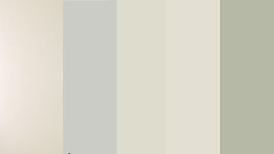
Here’s a comparison table for Early Morning Mist versus other similar paint colors:
FeatureEarly Morning MistEdgecomb GrayStonington GrayGray MistOctober MistMorning DewUndertoneCool gray with hints of blueWarm beige-grayCool graySoft gray with green undertonesSage greenPale gray with soft greenTemperatureCoolWarmCoolNeutral to warmWarmCoolDepth / IntensityLight and softMedium-lightMedium-depth, more dramaticVery lightMediumVery light, almost whiteOverall FeelFresh and airyCozy and invitingBold and crispCalm but can lean greenEarthy and naturalSoft and barely-thereBest ForSubtle, modern spacesCozy traditional roomsAccent walls, modern contrastNeutral rooms with warm lightNature-inspired designsBright, clean aestheticsLight ResponseStays consistently coolWarms up in sunlightConsistent gray toneCan shift green in certain lightShifts warmer in low lightCan appear white in bright lightThe Best Places to Use Early Morning MistEarly Morning Mist adapts beautifully to various rooms in the home. Here are some of its best uses:
Living SpacesThis paint feels right at home with any style. It’s not too bold – just a soft background that makes your furniture and decor stand out.
If you’ve got modern pieces or family heirlooms, the color plays nicely with everything in the room.
BedroomsEarly Morning Mist’s calm, neutral tones promote relaxation, and the color’s flexibility with light makes it a great choice for creating a restful atmosphere.
KitchensThis paint is perfect for high-traffic areas. It offers easy maintenance, resistance to cooking residue, and a fresh look.
BathroomsIts moisture-resistant properties make it ideal for bathrooms, where it will maintain its appearance while being easy to clean and maintain.
Design Integration for Early Morning Mist

Early Morning Mist is versatile enough to work with both modern and traditional settings:
Modern ApplicationsUse clean lines and minimal contrast to showcase the color’s simplicity. Its soft gray tone pairs perfectly with clean lines and open spaces.
It’s ideal for highlighting architectural features and offers subtle contrast in spaces with sleek furniture and industrial elements like metal and exposed brick.
Light wood accents can enhance its versatility, creating a balanced, airy look.
Traditional SettingsCombine Early Morning Mist with rich textures, detailed trim, and classic furnishings for a refined atmosphere.
It complements rich textures like velvet and leather and enhances detailed trim and moldings.
The gray tone’s subtle warmth complements classic furnishings, antique wood pieces, and vintage fabrics, creating an inviting, cozy atmosphere.
It also pairs beautifully with warm lighting, enhancing its depth and character.
Maintenance for Early Morning MistOnce the paint is applied, ongoing maintenance will keep your walls looking fresh for years.
Regular CareDust walls regularly using a soft cloth.For spot cleaning, use a mild soap solution.Perform a general wash annually and touch up small imperfections as needed by feathering in new paint.Prevention StrategiesControl humidity to prevent issues like peeling or bubbling.Ensure good ventilation to avoid moisture build-up.Use gentle cleaners to avoid damaging the paint’s finish.ConclusionEarly Morning Mist offers a balanced, calming presence that works well in any room. This gentle gray shade combines warmth and neutrality, making it suitable for many design approaches and settings.
When applied with careful attention to preparation and technique, the paint provides a high-quality finish that responds well to various lighting conditions throughout the day and across seasons.
Early Morning Mist delivers reliable, lasting results if you’re updating one room or repainting your entire home.
Its subtle depth creates an inviting atmosphere while maintaining a clean, contemporary feel.
The color’s ability to complement modern and traditional decor and its excellent coverage and durability make it a practical choice for any interior painting project.
The post Benjamin Moore’s Early Morning Mist(1528): A Complete Review appeared first on Amenity Home.
Benjamin Moore Alaskan Skies (972): A Comprehensive Review
Choosing the right paint color can completely modify a room, and Benjamin Moore’s Alaskan Skies is a flexible option that works with many styles. This soft taupe mixes the best of beige and gray, giving warmth without feeling too heavy.
If you’re updating one room or doing a full renovation, Alaskan Skies adapts to different lighting and design choices.
In this post, we’ll look at what makes this color stand out, how it compares with other popular shades, and the best spaces to use it. Keep reading to see if Alaskan Skies is the right choice for your next project!
What is Benjamin Moore’s Alaskan Skies?Benjamin Moore’s Alaskan Skies is a soft, inviting taupe that sits between beige and gray, offering a warm but balanced tone. This color has a gentle, calming effect that works well in a variety of spaces without overpowering the room.
One of its standout qualities is its flexibility—it adapts beautifully to different lighting conditions, maintaining its warmth without appearing too yellow or too gray.
Alaskan Skies brings a cozy, welcoming feel to interiors while staying neutral enough to match a wide range of design styles, from classic to contemporary.
What Makes Alaskan Skies Stand Out?
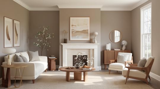
Alaskan Skies offers a refreshing change from common gray or beige hues. The color’s adaptability is its greatest strength.
Alaskan Skies adapts to lighting, looking light in sunlit rooms and deeper in spaces with less natural light. Its balanced undertones make it versatile, complementing a range of design elements.
Technical Details You Should KnowAlaskan Skies offers great performance with practical features. Below are key technical details to consider before starting your painting project.
Paint Finishes Available: Eggshell, Matte, Satin, and Semi-glossCoverage: One gallon typically covers 350-400 square feetVOC Content: Low VOC formula for better indoor air qualityNumber of Coats: Usually requires two coats for optimal coverageBest Primer: Benjamin Moore Fresh Start Multi-Purpose PrimerComparing Alaskan Skies with Other ShadesWhen choosing the perfect paint color for your home, it’s essential to consider how different shades will interact with your space.
Alaskan Skies is a beautiful, versatile color that can complement a variety of room styles and décor. However, it’s important to compare it with other popular shades to see how it stands out and how it fits into different home environments.
In this comparison, we’ll examine Alaskan Skies alongside other commonly used neutral shades like Revere Pewter, Balance Beige, and Cedar Key.
Understanding their undertones, appearance, and best uses can help you make a more informed decision about your living room, bedroom, kitchen, or hallway.
ShadeUndertonesAppearanceBest UseUnique CharacteristicsAlaskan SkiesBalanced taupe with beige & graySoft taupe, neither too warm nor too coolLiving rooms, bedrooms, kitchens, or hallwaysMore balanced between beige and gray, pairs with light and dark accentsRevere PewterWarm gray with green undertonesClassic light gray with warmthLiving rooms, dining rooms, or open spacesWarmer gray, may feel too greenish in certain lighting conditionsBalance BeigeWarm brown with beige undertonesRich beige with a touch of grayTraditional spaces, offices, and living roomsWarm and rich, may feel heavier in large spacesCedar KeyPinkish taupeSoft, warm taupe with subtle pinkLiving rooms or accent wallsPink undertones make it warmer and more invitingPaint Finish Guide for Alaskan SkiesChoosing the right paint finish can change how Alaskan Skies looks and feels in a space. The finish not only affects how light reflects off the walls but also determines how well the surface holds up over time.
From matte to semigloss, each option offers a different balance of appearance and durability. Matching the right finish to the room’s use and traffic level is key for creating a lasting, beautiful result. Below are the best sheen choices to consider for various rooms and conditions.
Best Sheen for Different SpacesDifferent finishes bring out different qualities in Alaskan Skies. Matte adds softness with no shine, while semi-gloss brings in light reflection and durability.
Satin and eggshell fall between the two, giving a subtle glow without too much gloss. Each one serves a unique purpose based on how much wear and tear a room sees, how much light it gets, and how often the walls need cleaning.
Picking the right sheen helps balance the warm, cozy feel of Alaskan Skies with practical needs.
MatteMatte finishes have a non-reflective quality that gives a room a soft, smooth look. This finish works well in bedrooms and ceilings, creating a relaxed, cozy feel.
Matte paint doesn’t reflect light, which can help hide imperfections like bumps or cracks in the wall.
However, it’s best suited for areas with low traffic since it can be more challenging to clean. It’s perfect for creating a serene, understated environment where shine is not the focus.
EggshellEggshell finishes strike a balance between matte and satin, offering a subtle shine that adds depth to walls. Ideal for living rooms and hallways, this finish provides a stylish look while still being easy to maintain.
Eggshell finishes hide minor wall imperfections well, making them a great option for medium-traffic areas. They’re also easier to clean than matte finishes, which makes them suitable for spaces that see occasional touch-ups or mild dirt, like living and dining areas.
SatinSatin finishes offer a soft gloss that works well in kitchens and bathrooms.
Satin is perfect for spaces that require both aesthetics and functionality. Its subtle sheen gives walls a polished, refined look, while its durability resists stains and moisture—making it ideal for high-use, high-moisture areas.
Satin is also more washable than matte or eggshell, making it easier to maintain in spaces where splashes, fingerprints, or dirt may occur. Its versatility makes it a great choice for family-friendly or busy spaces.
Semi-GlossSemi-gloss finishes are known for their shiny, reflective appearance, making them ideal for areas that need frequent cleaning or extra durability.
Best used on trim, doors, and cabinets, semigloss paint holds up well in high-traffic areas such as kitchens, bathrooms, and hallways. It’s resistant to moisture, stains, and dirt, making it a great option for spaces that get a lot of use.
While semi-gloss provides a more formal, polished finish, it’s easy to wipe clean, making it perfect for surfaces that see a lot of wear and tear.
Application Tips for Alaskan SkiesApplying Alaskan Skies correctly can make a big difference in how the final result looks and lasts. Proper preparation, the right tools, and attention to drying times ensure a smooth finish.
From how many coats are needed to whether a primer helps, every step matters in creating walls that not only look great but also stand up to daily use. The following tips will help you apply this versatile color with confidence.
How Many Coats Are Needed?Most walls need two coats of Alaskan Skies to reach full coverage. The first coat lays down the color, but the second coat builds depth and eliminates uneven spots.
For darker base colors or textured surfaces, a third coat may be needed. Always allow the first coat to dry completely before applying the next to prevent streaks.
A roller gives smoother coverage on large areas, while a brush is useful for corners and trim. Using quality tools helps the color apply evenly and cuts down on paint waste.
Does It Work Well with Primer?Yes, Alaskan Skies pairs well with primer, especially on porous, patched, or dark-colored surfaces. A primer helps the paint stick better and reduces the number of coats needed.
Benjamin Moore’s Fresh Start Multi-Purpose Primer is often recommended for even application. Priming also helps seal imperfections and evens out surface texture. This step ensures the final color appears clean and consistent across the entire wall.
Skipping primer can lead to uneven absorption, resulting in a patchy or dull finish—even with high-quality paint.
DIY vs. Professional Painting ConsiderationsFor those choosing between DIY and hiring a pro, it’s important to think about time, tools, and experience. DIY painting is budget-friendly and rewarding if done carefully.
Preparing the walls, using good brushes and rollers, and applying paint in even strokes are key to a successful outcome. However, hiring a professional saves time and ensures precision—especially in larger rooms or tricky areas like crown molding or built-in shelving.
Professionals also know how to choose the right finish and apply it efficiently, reducing the chances of streaks or missed spots.
How to Pair Alaskan Skies with Other ColorsAlaskan Skies is a versatile color that pairs well with both light and dark tones.
Its neutral taupe hue complements bold accent colors, such as navy, deep green, or burgundy, while also blending seamlessly with soft whites and natural wood tones.
Living Rooms
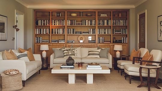
Alaskan Skies works wonderfully in living rooms, where it creates a calm and balanced atmosphere.
Pair it with whites, off-whites, or light grays for a clean and soft contrast. These shades allow the room’s furniture and decor to stand out.
To add more depth, you can introduce accent colors like navy blue, soft greens, or deep brown. These colors create visual interest while still maintaining a relaxing vibe.
Light or medium wood furniture pairs perfectly with Alaskan Skies for a cozy and welcoming feel. It complements natural wood finishes without overwhelming the space.
If you want to add a touch of modernity, incorporating metallic accents such as brushed gold or silver will highlight the warmth of Alaskan Skies.
Bedrooms
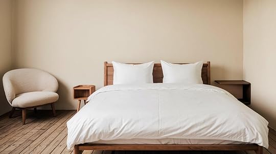
In bedrooms, Alaskan Skies promotes relaxation and tranquility. For a serene atmosphere, combine it with soft, muted greens or blues. These colors enhance the peaceful vibe of the room, allowing you to unwind after a long day.
Wood tones, especially light or medium finishes, work beautifully with this color.
The contrast between Alaskan Skies and natural wood creates a calming, nature-inspired ambiance. To complete the look, you can add soft fabrics like linen or cotton bedding, which will further raise the soothing quality of the room.
Kitchens
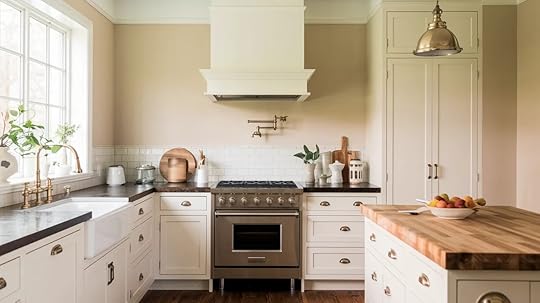
Alaskan Skies is a great option for kitchens, where its warm undertones balance out the space’s often high-traffic and functional nature.
Pair it with light wood cabinetry or modern white fixtures for a bright, inviting space. The color improves the warmth of wood, making the kitchen feel more cozy and welcoming.
For a more contemporary feel, add metallic elements like brushed stainless steel or brass fixtures. These metallic accents can add a sleek touch to the room while complementing the neutral warmth of Alaskan Skies.
Bathrooms
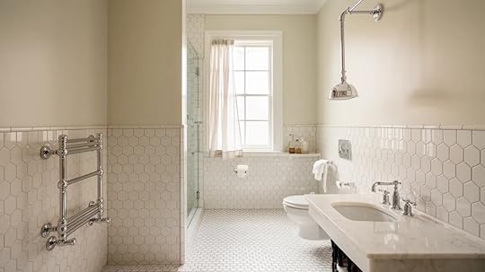
Bathrooms are another excellent space for Alaskan Skies, offering a refreshing, spa-like atmosphere. The soft taupe hue helps create a soothing environment, perfect for relaxing baths.
Pair it with white tiles or fixtures for a clean, crisp contrast. Natural stone accents, such as marble or quartz, will complement the color and create a luxurious feel.
For a modern bathroom design, consider using Alaskan Skies with black or dark gray accents. The contrast between the light taupe and dark fixtures brings a touch of sophistication to the space. Adding plants or green elements will provide a refreshing, organic touch to the overall art.
Dining Rooms
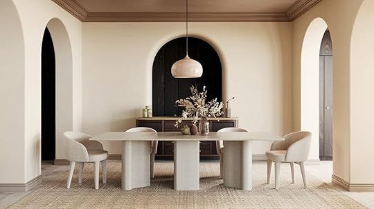
In dining rooms, Alaskan Skies serves as an excellent backdrop that doesn’t overpower the space. Pair it with soft neutrals like light grays or beiges to create an inviting, stylish atmosphere.
For a more dramatic touch, consider adding dark wood furniture or deep-colored chairs to bring out the warmth in the taupe.
For added interest, you can incorporate rich jewel tones like emerald green, deep blue, or even burgundy. These accent colors add a pop of vibrancy while maintaining the overall harmony of the room.
Hallways
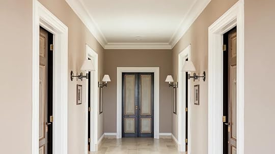
Alaskan Skies is also perfect for hallways, as it brings a sense of openness to the space. Its neutrality works well in corridors that connect different rooms.
Pair it with light trim to improve the clean, cohesive feel. You can also experiment with accent lighting to highlight the soft taupe hue, making the hallway feel wider and more inviting.
If you want to introduce a little more drama into the hallway, consider adding darker colors for the doors or trim. This creates a sense of contrast while maintaining a refine and modern look.
How Alaskan Skies React to Different LightingIn rooms with abundant natural light, Alaskan Skies appears lighter and more beige.
The soft glow enhances its warm tones, making the space feel open, calm, and inviting. It works especially well in living rooms, sunrooms, or areas with large windows. The natural light lifts the color, giving it an almost creamy effect.
On the other hand, Alaskan Skies leans more toward gray undertones in rooms with limited natural light.
While the space still feels warm, the cooler base gives it a grounded, stable look. It’s a great choice for home offices, bedrooms, or hallways where you want a cozy but calm atmosphere.
Understanding how this paint color shifts throughout the day can help you place it where it shines best—literally and visually.
ConclusionIn conclusion, Benjamin Moore’s Alaskan Skies is a versatile, soft taupe that adapts beautifully to different lighting and spaces. Its balance of beige and gray offers warmth without feeling heavy, making it suitable for various rooms, such as living rooms, bedrooms, and kitchens.
If you’re tackling a full renovation or updating a single room, Alaskan Skies provides a neutral base that complements a wide range of design styles.
Remember to test the color in your space before committing, as lighting can influence its appearance. With its flexibility and timeless appeal, Alaskan Skies is a great choice for any home project.
Frequently Asked Questions
Are Alaskan Skies Suitable for Small Rooms?Yes, Alaskan Skies can make a small room feel larger because of its light and neutral tones. It won’t overpower the space and adds to its openness.
Can Alaskan Skies Work in Modern or Traditional Settings?Definitely, Alaskan Skies is flexible enough to complement both modern and traditional decor. Its neutral undertones make it adaptable to any style.
The post Benjamin Moore Alaskan Skies (972): A Comprehensive Review appeared first on Amenity Home.
A Guide for Blue Note by Benjamin Moore (2129-30)
Benjamin Moore’s Blue Note (2129-30) is a unique blend of blue and Gray that brings calm and depth to any space.
This adaptable shade works well in various settings to create a cozy, intimate atmosphere or a modern, chic vibe.
Blue Note is ideal for living rooms, bedrooms, kitchens, and bathrooms, making it a great choice for your next design project.
Its classic appeal ensures it pairs beautifully with various other colors, giving Infinite options for creating a balanced, refined space.
In this post, we’ll guide you on how to use Blue Note to improve your home.
Why Choose Blue Note?Blue Note is a color that communicates strength without being overpowering.
It’s not just blue but a careful mix of blue with gray, creating a depth that isn’t seen in other colors.
A sense of quiet refinement makes it suitable for various interior spaces, from bedrooms to living rooms and even kitchens.
Here’s why Blue Note stands out:
Classic and FlexibleOne of the primary reasons Blue Note is a fan favorite is its adaptability.
If you’re looking for a modern look or a more traditional feel, Blue Note adapts to both styles.
It holds up well in various lighting conditions, allowing it to shift slightly in tone, which means it will never feel out of place, even as trends evolve.
It’s a color that feels fresh and timeless, grounding your home.
Subtle and CalmingUnlike brighter blues, which sometimes feel too bold or loud, Blue Note has a muted, grayish quality that gives it a calming presence.
The result is a soft yet impactful color that encourages relaxation.
Ideal for spaces like bedrooms or reading corners, it invites peace and serenity without overwhelming the senses.
Complements a Wide Range of DecorBlue Note easily complements other design elements from mid-century modern to farmhouse chic.
Its neutral undertones allow it to blend well with natural wood tones, metals, and even other colors.
Whether it’s sleek stainless steel in a kitchen or rustic wooden furniture in the living room.
Blue Note serves as a versatile backdrop that improves any design scheme.
Where to Use Blue Note in Your Home
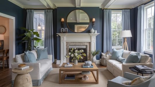
Blue Note is a flexible color that can be used in almost every room. Its ability to adapt to different spaces and lighting makes it a top choice for large and small rooms.
Let’s look at how you can make the most of Blue Note in different areas of your home:
Living RoomsBlue Note can serve as a calming backdrop and a focal point in living rooms. Pair it with light gray or beige furniture to allow the color to shine without overpowering the space.
You can use it for an entire wall or as an accent behind a sofa or fireplace. The richness of Blue Note adds complexity while keeping the room open and welcoming.
If your living area has plenty of natural light, Blue Note will appear lighter and brighter, infusing the room with energy.
It will create a deeper, more intimate atmosphere in rooms with limited natural light, perfect for evening relaxation.
BedroomsBlue Note works wonders in bedrooms, creating a natural environment for relaxation. It brings a sense of calm that’s perfect for winding down at the end of the day.
Combine Blue Note with crisp white bed linens or soft beige accents for an airy yet cozy, balanced look.
Pair it with rich wood tones and metallic gold or silver accents for a more luxurious touch. These pairings bring out the grace of Blue Note and create a serene, improved sleeping area.
BathroomsAlthough dark colors are often avoided in smaller spaces, Blue Note’s muted tones make it an excellent option for bathrooms.
Paired with white tiles, a modern shower, or vintage fixtures, Blue Note can transform your bathroom into a serene sanctuary.
For a cohesive look, incorporate light wood or stone accents that complement the soft richness of the color.
Hallways and EntrywaysUse Blue Note in your hallway or entryway to immediately set the tone for the rest of your home. A soft, welcoming shade that doesn’t overwhelm creates an inviting atmosphere while still making a statement.
This can be particularly effective when paired with neutral furniture and soft lighting fixtures that allow the color to stand out.
How to Style Blue Note
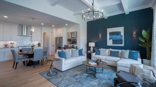
Once you’ve decided on Blue Note for your walls, the next step is styling the room. Here are a few tips to bring out the best in this adaptable color:
Use Lighter AccentsTo balance out Blue Note’s deep tones, consider incorporating lighter hues for furniture, trim, and accessories.
Crisp whites, soft beiges, or light grays can keep the room from feeling too heavy.
For example, white trim along the baseboards, windows, and doors adds a crisp contrast to the richness of the Blue Note walls.
This helps brighten the space without detracting from the main color.
Pairing with MetallicsIf you want to add a touch of glam to your design, Blue Note pairs wonderfully with metallic accents. Gold, copper, or brushed nickel can all enhance the class of this shade.
You might consider metallic light fixtures, picture frames, or mirrors that reflect light and make the color pop.
Bring in Natural ElementsWood accents are an excellent way to bring warmth and texture to a Blue Note-painted room.
Whether it’s a wooden coffee table, bookshelves, or even hardwood floors, the earthy tones contrast beautifully with the cooler hues of Blue Note, adding depth and character.
Blue Note pairs wonderfully with reclaimed wood furniture if you have a vintage or rustic style.
DIY Application TipsWhat finish works best for this shadeBest primers for optimal coverageHow to paint step-by-stepCommon mistakes to avoid when using Blue NoteWhat Finish Works Best?High-end paint like Benjamin Moore’s Blue Note comes in several finishes.
For living spaces, eggshell offers the perfect balance of durability and sophistication.
Pearl or satin works beautifully in bathrooms and kitchens. For a dramatic look, consider matte in low-traffic areas.
Best Primers to UseThe deep blue tone requires proper priming. Use Benjamin Moore’s Fresh Start High-Hiding Primer or their Color Foundation Primer.
For dark walls, a gray-tinted primer helps achieve true color coverage.
Comparison of Blue Paint Colors with Blue Note (2129-30):Benjamin Moore BluesColor CodeCharacteristicsBest Used For Blue Note 2129-30Deep navy with subtle purple undertones; sophisticatedAccent walls, built-ins Hale Navy HC-154Classic dark navy; balanced neutral undertonesTraditional spaces, doors Gentleman’s Gray 2062-20Dark blue-gray with green undertonesLibraries, offices Van Deusen Blue HC-156Historical blue with gray undertones; lighter than Blue NoteBedrooms, living rooms Blue Danube 2062-30Vibrant maritime blue; brighter than Blue NoteCoastal homes, bathrooms Kensington Blue 840Mid-tone blue with slight gray undertonesLiving spaces, exteriors Admiral Blue 2065-10Deep, intense navy; darker than Blue NoteDramatic accents, cabinetry Newburyport Blue HC-155Traditional navy blue; warmer than Blue NoteColonial homes, studiesComplementary Color PairingsBlue Note doesn’t just complement neutral tones; it works well with several other colors, including:
Light Grays and Whites: These colors help create a balanced, airy feeling when paired with Blue Note.
For instance, Benjamin Moore’s Chantilly Lace (OC-65) is a perfect white complementing deep blue-gray.
Earthy Greens: For a touch of nature, consider adding shades of green.
Benjamin Moore’s Hunter Green (2041-10) can offer an earthy contrast to Blue Note while keeping the design grounded and natural.
Soft Pastels: Soft pinks or muted yellows can add a gentle touch of warmth to a Blue Note room. This combination is perfect for a more subtle, relaxing ambiance.
Lighting Considerations for Blue NoteLighting plays a crucial role in how Blue Note looks in your home.
Depending on the amount of natural or artificial light in the room, it can alter its tone, making it appear brighter or deeper.
Natural LightBlue Note can look lighter and more vibrant in rooms with plenty of natural light.
The bright sunlight will reflect off the cool tones of the paint, creating an open, airy atmosphere. Blue Note offers the perfect balance of style and lightness for rooms that receive a lot of sunlight.
Artificial LightBlue Note may appear darker and moodier in rooms with limited natural light.
To ensure the room doesn’t feel too heavy, use warm artificial lighting, such as yellow or amber tones, to bring a cozy, inviting feel.
You can also improve the color’s depth with strategic lighting, highlighting Designer features like artwork, shelves, or furniture.
Common Mistakes to AvoidDon’t skip proper wall preparation. Never thin this premium paint. Avoid painting in direct sunlight. Don’t rush between coats.
Skip the cheap rollers that can leave lint. Remember to maintain consistent room temperature during application and drying.
ConclusionBlue Note is a perfect example of how a single color can change the entire atmosphere of a room. Whether you use it on all walls or as an accent, it creates a calm yet polished environment.
It works across different spaces—living rooms, bedrooms, kitchens, and even bathrooms—and pairs beautifully with various furniture and design styles.
Combining Blue Note with natural materials, metallic accents, or complementary hues can bring a fresh, flexible beauty to your home.
No matter your style or space size, Blue Note offers an adaptable solution that suits various tastes and design ideas.
Frequently Asked QuestionsCan I use Blue Note in a small room?Blue Note works well in small rooms when balanced with light-colored furniture or accessories. It creates an intimate feel while still adding depth.
What trim colors look best with Blue Notes?White, light gray, or soft beige trim colors help to highlight Blue Note’s rich tones and provide contrast, keeping the space bright and open.
Is Blue Note a good choice for a kitchen?Absolutely! Blue Note pairs well with white countertops, stainless steel appliances, and wooden elements, making it a great choice for modern or farmhouse kitchens.
The post A Guide for Blue Note by Benjamin Moore (2129-30) appeared first on Amenity Home.
Healing Aloe Benjamin Moore (1562): A Paint Review
Color is one of the most powerful design tools at our disposal. It sets the tone, evokes emotions, and can transform a space.
When creating a serene, refreshing, and calm environment, Benjamin Moore Healing Aloe (1562) stands out as a top choice.
This soft, muted greenish-blue shade brings a sense of calmness and harmony to any room, be it the bedroom, living room, kitchen, or bathroom.
This post will explain why Healing Aloe is an adaptable and calming tool for your next home design project. We’ll also guide you on incorporating this beautiful shade into your rooms for a lasting impression.
Why Choose Healing Aloe?
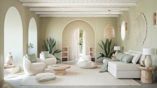
One of the main reasons Healing Aloe (1562) has become a favorite among homeowners and interior designers is its calming and balanced nature.
This color offers the perfect mix of green and blue, which creates a soothing atmosphere while maintaining depth and richness.
Its muted, grayish tones allow it to blend seamlessly into any room without feeling too bold or overpowering.
The calming effect of this color makes it especially suitable for spaces designed for relaxation, such as bedrooms and bathrooms.
It invites a sense of calmness and encourages relaxation and stress relief after a long day.
Healing Aloe can also be a great choice for common areas like living rooms, where you want to create an inviting, peaceful atmosphere for family gatherings or quiet time alone.
Timeless, Adaptable ChoiceAnother reason why Healing Aloe is a sought-after color is its versatility. Healing Aloe can adapt to both if you aim for a contemporary or a traditional design.
It pairs well with modern minimalist furniture and classic or rustic décor, ensuring it fits seamlessly into various interior styles.
Additionally, this color complements a wide range of materials, including wood, metal, glass, and textiles. In terms of lighting, Healing Aloe remains consistent and balanced.
Whether your room receives abundant natural light or relies on artificial lighting, this color will maintain its soft, soothing tones.
It offers a peaceful ambiance no matter the lighting conditions, making it an excellent option for rooms that see changing lights throughout the day.
Best Paint FinishesLet us look at some Paint Finishes that complement healing aloe perfectly.
MattePerfect for low-traffic rooms like bedrooms and office spacesHides small wall flaws and surface marksTakes well to touch-ups when neededLimited cleaning resistance – not ideal for kids’ roomsBest used in Master bedrooms, formal dining rooms, home officesEggshellIt offers a subtle sheen without being too shinyGood resistance to daily wearEasy to clean with light wipingThe small amount of light reflectionBest used in Living rooms, hallways, dining roomsSatinBalances durability with a gentle shineStands up well to cleaning and scrubbingGood moisture resistanceIt shows wall imperfections more than matteBest used in Kids’ rooms, kitchens, family rooms, bathroomsSemi-GlossStrong durability against moisture and wearVery easy to clean and maintainCreates a bright, reflective surfaceIt shows every wall imperfection clearlyBest used in Bathrooms, kitchens, trim work, doorsPaint Finish TipsConsider room lighting – shinier finishes reflect more lightThink about wall condition – more shine reveals more flawsFactor in room use – high-traffic areas need tougher finishesTest samples – the same color looks different in various finishesBest Rooms for Healing Aloe
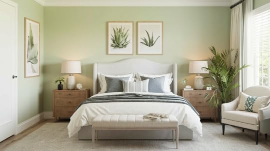
The bedroom is where we unwind, rest, and recharge, and Healing Aloe provides the perfect color to promote sleep and relaxation.
This shade’s soft, muted quality creates a peaceful retreat free from distractions. It pairs well with soft neutrals like off-white, beige, and light gray to create a serene sanctuary for rest.
Healing Aloe can help the room feel airy and open in smaller bedrooms without feeling too bold or overpowering. Pair it with natural wood and soft lighting for warmth and texture.
Living RoomsThe living room is often the center of the home, where families gather, relax, and entertain guests. Healing Aloe can transform your living room into a cool, welcoming space.
The subtle nature of this color allows it to blend well with various furniture styles, from modern to traditional.
Add soft, neutral fabrics like beige or cream-colored sofas and curtains to create a cohesive, peaceful look.
With large windows and natural light, Healing Aloe looks even more appealing as it enhances brightness and keeps the room open and airy.
Kitchens and BathroomsWhile kitchens and bathrooms are often filled with activity, Healing Aloe can help create a calm oasis.
It pairs well with modern stainless steel appliances and light-colored cabinetry in kitchens, creating a soothing backdrop that balances out the busyness while adding refinement.
In bathrooms, Healing Aloe can transform a regular bath area into a spa-like retreat. The soft, refreshing color works well with white porcelain, marble countertops, and natural wood accents.
Whether in a small powder room or large master bath, Healing Aloe brings a sense of relaxation that is perfect for unwinding after a long day.
Complementary Colors for Healing AloeHealing Aloe pairs beautifully with a wide range of colors, making it easy to design a cohesive and balanced palette for your home.
Color CategoryComplementary ColorsEffectSoft NeutralsCream, off-white, light grayHighlights the depth of Healing Aloe while maintaining a calm, serene vibe.Wood TonesLight oak, dark walnutAdds warmth and texture, contrasting with the coolness of Healing Aloe.Muted PastelsBlush pink, muted peach, soft lavenderAdds subtle color without overpowering the space, maintaining harmony.Warm MetallicsGold, brass, copper accentsCreates a classy, luxurious atmosphere with contrast against cool tones.These color pairings can help enhance the tranquil, fresh feel of Healing Aloe while maintaining a balanced and inviting space.
Key Differences Between Healing Aloe and Similar ColorsPaint ColorUndertonesBest LightingIdeal Room TypesKey Characteristics Healing Aloe (BM 1562) Balanced sage-green and grayVersatile – works in most lighting conditionsLiving rooms, bedrooms, bathroomsOrganic, balanced, subtle color shifts throughout the day Sea Salt (SW 6204) Cool gray with subtle greenNorth-facing roomsBathrooms, kitchens, officesCooler, more contemporary feel Comfort Gray (SW 6205) Strong green with gray baseBright, natural lightLiving rooms, sunrooms, well-lit spacesDeeper, more saturated appearance Pale Smoke (BM 1584) Blue-gray with minimal greenAny lighting conditionBedrooms, offices, meditation spacesCalming less organic than Healing Aloe Gray Cashmere (BM 2138-60) Pure gray with minimal greenNatural to artificial lightAny room, especially transitional spacesMost neutral option, very versatile Quiet Moments (BM 1563) Blue-green with gray baseNatural light preferredBedrooms, bathrooms, coastal spacesSimilar muteness to Healing Aloe, more aquaPractical Benefits of Healing Aloe

Beyond its visual appeal, Healing Aloe offers practical benefits, making it an excellent choice for various home environments.
Here are a few reasons why this color stands out:
Adapts to Light ConditionsOne of the key advantages of Healing Aloe is its interaction with different types of lighting.
If the room is bathed in sunlight or lit with artificial lighting, Healing Aloe’s undertones adjust naturally, keeping the space balanced and soothing.
It won’t feel too dark or light depending on the time of day, making it suitable for rooms with varying light conditions.
Suitable for High and Low-Traffic AreasHealing Aloe is versatile enough to be used in high and low-traffic areas.
In busy family rooms, it offers a calm contrast to the activity, helping to maintain a peaceful atmosphere.
Private spaces like bedrooms foster a calm environment that promotes rest.
Durable and TimelessHealing Aloe’s soft tones are not just visually appealing—they are also a timeless addition to your home.
This color won’t go out of style anytime soon, making it a durable choice that you can enjoy for years.
Whether you plan to update your space now or in the future, Healing Aloe will continue to look fresh and inviting.
Pro Painting TipsNumber of Paint Coats NeededThis typically depends on several factors, including:
The surface you’re painting (new drywall vs previously painted walls)The color change (going from dark to light or vice versa)The type and quality of paint being usedMost jobs require two coats for optimal coverage, even with premium paints that claim “one-coat coverage.Choosing the Right Primer Use oil-based primers for raw wood, surfaces with tannins, or heavy stainsUse latex primers for new drywall, previously painted surfaces, and masonryPVA primers work best for new drywall, specificallyAlways consider your topcoat – match your primer type to your paint type when possibleUsing Healing Aloe Paint Common mistakes includeNot testing the color in your particular lighting conditionsSkipping proper surface preparationNot using the appropriate primer underneathApplying improper temperature or humidity conditionsConclusionBenjamin Moore’s Healing Aloe (1562) is more than just a color; it’s a tool for creating a balanced and calming atmosphere in your home.
Whether you’re designing a peaceful bedroom, a serene living room, or a spa-like bathroom, this color brings a sense of tranquility to every room it graces.
Its adaptability to different lighting conditions and styles makes it versatile, while its understated beauty creates an inviting and welcoming space.
When choosing a color for your home, Healing Aloe offers a lasting solution that combines refinement, warmth, and peace.
Healing Aloe is the perfect option if you’re ready to refresh your space with a soft, calming hue.
The post Healing Aloe Benjamin Moore (1562): A Paint Review appeared first on Amenity Home.
How a Paint Color Consultant Can Transform Your Space
Choosing the right paint color for your home can be an overwhelming task. With hundreds of colors available, it’s easy to feel unsure about what works best in your space.
Finding the perfect hue can seem like a huge challenge if you are renovating, building a new home, or just wanting to refresh a room.
This is where a paint color consultant comes in.
These professionals help simplify decision-making, ensuring that your chosen colors will upgrade your space and match your vision.
In this post, we will find out what a paint color consultant does, why you should hire one, and the benefits of having an expert.
What is a Paint Color Consultant?
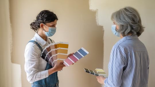
A paint color consultant is an expert who specializes in helping homeowners and businesses choose the right paint colors.
They understand the nuances of color theory and how colors interact with light, furniture, and other design elements in your home.
Consultants offer personalized recommendations based on your space’s specific needs.
They don’t just suggest colors that look good on a swatch but also consider practical aspects like room size, lighting conditions, and the overall vibe you want to create.
Services provided by a consultant may include:
Assessing the space and existing decor.Creating a custom color palette for the room or home.I recommend painting that matches the room’s style and purpose.Help you choose finishes and textures to complement the colors.Providing expert advice on current trends and timeless color choices.Why Hire a Paint Color Consultant?
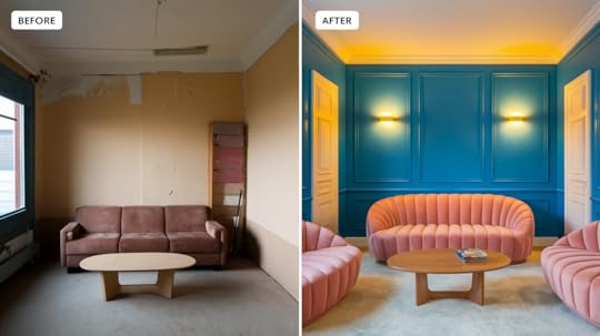
Color selection requires skill and understanding beyond personal preferences. Professional color consultants have spent years studying how colors shape our feelings in different spaces.
They can help create your desired atmosphere – making rooms feel more open or building warm, inviting spaces through smart color choices.
Personalized RecommendationsOne of the main reasons to hire a consultant is their personalized approach.
They take the time to understand your preferences, home decor, and how you use each space.
This ensures that the colors chosen are not only pleasing but also functional and reflective of your style.
Time-SavingChoosing the right color can take hours or even days, especially with countless paint samples.
A consultant saves you time by narrowing the options to a select few that will work best in your space.
They’ll also help you visualize how colors will look once applied, reducing the risk of dissatisfaction.
Avoiding Common MistakesOne of the biggest challenges in choosing paint colors is picking something that looks great in the store but doesn’t work once it’s on your walls.
A consultant helps you avoid these mistakes by considering how light affects colors and how a particular shade will interact with the furniture and design of your space.
Their knowledge of color theory ensures you won’t make impulsive choices that could lead to costly repaints.
Choosing Colors That Improve the SpaceThe right color can completely transform a room, making it feel bigger, warmer, or more inviting.
A consultant knows how to enhance your space with color If you’re trying to create a relaxing retreat or a lively, energetic environment.
They understand how different tones and shades can affect a room’s feeling and are skilled at choosing the perfect color for any atmosphere.
Increased Home ValueIf you’re planning to sell your home, color choice is crucial. A fresh coat of paint can significantly increase your home’s appeal to potential buyers.
Neutral colors are generally preferred, allowing buyers to imagine their style in the space.
A consultant can recommend colors that work well for staging purposes, helping you make your home more attractive to a wider audience.
How a Paint Color Consultant Works

The process of hiring a paint color consultant is straightforward. Here’s what you can expect:
1. Initial ConsultationThe consultant will first meet with you to discuss your vision for the space.
They’ll ask questions about your preferences, lifestyle, and how you plan to use the space.
They’ll also assess the room’s lighting, size, and layout.
2. RecommendationsBased on the consultation, the consultant will present a few color options.
These colors will align with your vision, the function of the room, and the space’s overall design.
They may also suggest different finishes (e.g., matte, satin, gloss) depending on the style you’re going for.
3. Final SelectionAfter reviewing the options, you’ll choose the final colors.
The consultant may provide additional samples or even mockups to help you visualize the outcome.
Some consultants will even recommend the best brands and types of paint for long-lasting results.
When Should You Hire a Paint Color Consultant?There are several situations where hiring a paint color consultant can be especially helpful:
Renovating a Home: A consultant can help you choose colors that align the new design elements with existing ones.New Construction: They can assist in creating a cohesive look across all rooms in your new home.Selling Your Home: When you must appeal to a broad range of buyers, a consultant can recommend colors to enhance your home’s marketability.Feeling Overwhelmed by Choices: If you’re unsure where to start, a consultant can help narrow down the best options based on your preferences.DIY vs. Professional Consultation: Pros & ConsDIY Paint SelectionCosts less – you only pay for paint samplesIt takes more time as you test different optionsRequires research about color theory and lightingThis may lead to expensive mistakes or repaintingProfessional ConsultationSaves time by getting it right the first timeComes with expert knowledge of paint types and finishesIt costs more upfront but prevents costly mistakesProvides confidence in your final choiceBest Tools for Color SelectionMobile Apps for Paint SelectionColor Snap by Sherwin-Williams: Take photos of your room and test paint colors on your walls in real time
ColorReader: A small device that works with your phone to match any color to paint brands
Paint My Place: Upload room photos and try different paint colors before buying.
AI Color ToolsBenjamin Moore Color Portfolio: Uses smart tech to show how light affects paint colors throughout the day
Behr Color Smart: Gives you color matches and suggests color combinations that work well together
Project Color by Home Depot: Shows you how colors look in different lighting conditions
Tips for Using These ToolsTry colors in your actual space – screens can show colors differentlyTest paint colors during different times of dayCheck how colors look with your current furnitureSave and compare multiple options before decidingConclusionHiring a paint color consultant is a smart investment for homeowners seeking a cohesive, well-designed space.
Their expertise takes the guesswork out of choosing paint colors, ensuring your selections enhance your home’s functionality.
A consultant provides invaluable support if you’re renovating, moving into a new space, or preparing to sell.
By hiring a professional, you’ll have a stress-free, well-planned paint strategy that will leave you confident in your choices for years.
Frequently Asked QuestionsWill a paint color consultant provide paint samples?Many consultants will provide paint samples to test in your space, helping you see how colors will look under different lighting conditions.
Can a paint color consultant help with creating accent walls?Yes, they can recommend colors for accent walls that complement your overall color scheme and improve the room.
The post How a Paint Color Consultant Can Transform Your Space appeared first on Amenity Home.
Sherwin Williams Niebla Azul (SW 9137) Review
Looking for a paint color that brings calm and style to your home? SW Niebla Azul is a soft, misty blue that has won over designers.
This gentle shade makes rooms feel peaceful and welcoming, and it works well in bedrooms, living spaces, and even outside your house.
People choose it because it is easy to match with other furniture and decorations and creates a relaxed feel in any room.
In this post, we’ll examine what makes Niebla Azul special, compare it to similar colors, and give you helpful tips for deciding if it’s right for your home.
Examining Sherwin Williams Niebla AzulThis lovely blue paint brings a soft, gentle touch to any room. Think of early morning fog rolling over the ocean – that’s the feeling Niebla Azul creates.
The Basic DetailsNiebla Azul (SW 9137) is a medium blue that sits perfectly between light and dark shades.
If you’re looking up the exact details,
RGB Values: R: 164, G: 174, B: 184HEX Code: #A4AEB8The color gets its name from Spanish words meaning “blue mist” or “blue fog.”
What is the Hype All About?Unlike bright blues that grab attention or dark blues that feel heavy, this dusty blue stays calm and balanced.
It’s a bit gray, which helps it feel more grown-up and less like a typical baby blue.
The color reminds many people of faded denim or a cloudy sky, which makes the color feel familiar and comfortable in your space.
Understanding the Undertones of Niebla Azul
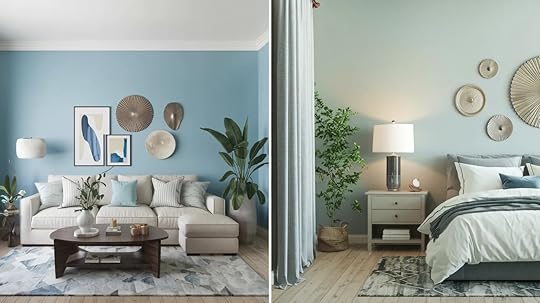
What you see in this paint can change throughout the day, making it fun to watch how it shifts with different lights.
Let’s look at what gives this color its special character.
Blue UndertonesPut Niebla Azul in a bright room, and you’ll see its blue side come out to play.
In morning light, it feels like a soft ocean breeze. When the sun hits it directly, the blue gets clearer but stays gentle.
Think of worn blue jeans or the sky on a misty morning. Next to pure white trim, the blue stands out even more.
Gray InfluenceThe gray in Niebla Azul is what makes it so easy to live with. It acts like a filter, softening the blue so it’s never too bright or bold.
In shadowy corners or on cloudy days, you might see more of this gray side.
This mix helps the color stay quiet and peaceful, perfect for making rooms feel calm without being boring.
Comparison with Other Dusty Blues
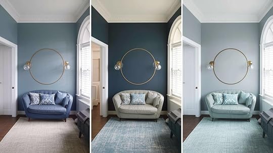
Seeing how Niebla Azul stands next to similar colors will help you pick the right shade for your space.
Niebla Azul vs. Santorini BlueSantorini Blue feels brighter and more vivid than Niebla Azul.
While Niebla Azul stays soft and misty, Santorini Blue brings more energy to a room.
If you’re picking between them, think about this: Niebla Azul is like a cloudy morning, while Santorini Blue is like a clear afternoon sky.
Niebla Azul vs. StardewStardew has a bit more purple mixed in, making it cooler than Niebla Azul. It’s also slightly darker.
Niebla Azul keeps things warmer and more casual, like your favorite old sweater.
Stardew might work better if you want a more formal feeling in your space.
Niebla Azul vs. Languid BlueLanguid Blue goes lighter and airier than Niebla Azul.
If Niebla Azul is like morning fog, Languid Blue is like the sky after the fog lifts.
Languid Blue shows less of its gray side, while Niebla Azul maintains the balanced mix of blue and gray that makes it so easy to use.
Ideal Applications for Niebla Azul
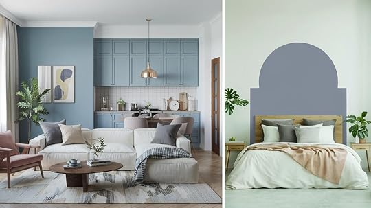
There are plenty of ways you can use this versatile color in your home. Its soft, balanced nature makes it work well in many spots.
Interior WallsWant to make your rooms feel calm but not boring?
Niebla Azul works magic in bedrooms, which helps create a peaceful sleep space.
In living rooms, it makes a perfect background for family time.
Home offices feel focused and clear with this color, helping you stay on task without feeling stressed.
The color stays soft but adds just enough life to keep spaces interesting.
Exterior UsesOn outside ceilings, Niebla Azul brings a touch of sky down to your porch or patio.
It works best near the coast or in shaded areas where it can show its subtle shifts.
Want your house to look pulled together? Pair it with warm white walls or cream-colored stone.
The mix feels natural and calm, like a perfect beach day.
Cabinets, Trim, and CeilingsPaint your kitchen cabinets with Niebla Azul for a fresh but not-too-bold look.
On trim, it adds subtle style without taking over. Put it on the ceiling to bring a hint of sky inside – it works in modern homes just as well as traditional ones.
This color fits right in with farmhouse style, modern looks, or classic designs.
Tips for Using Niebla Azul in Your Home
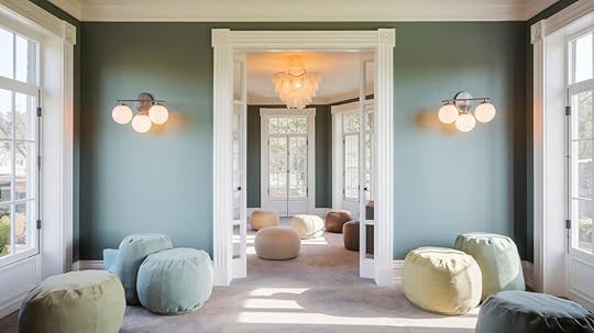
We want to ensure you get the most out of this color in your space. Here are some practical tips to help you use it well.
Lighting ConsiderationsIn south-facing rooms, Niebla Azul stays true to its soft blue-gray mix all day long.
North-facing rooms might make it look a bit cooler and grayer, perfect for a cozy feel.
Morning light brings out its blue tones, while evening light makes the gray more noticeable.
If you use LED lights, choose warm white bulbs. They help keep the color feeling gentle and welcoming.
Matching with Other ColorsNiebla Azul makes friends easily with other colors. White trim makes it pop just enough, while cream softens the look.
Light wood tones bring warmth to balance the cool blue.
Add small bits of rust orange or warm gold to your room items for a bold touch.
If you want to keep things calm, choose furniture and accessories in light grays and soft whites.
Best Rooms for Niebla AzulBedrooms love this color – it helps create a peaceful space for rest. Bathrooms with lots of natural light let Niebla Azul shine, making the space feel clean and fresh. Living rooms with windows on two sides show off how the color changes through the day. In home offices, the color helps you focus without feeling closed in.Skip rooms that already feel dark – this color needs some light to show its best side.
How to Choose the Right Paint FinishA quick guide to selecting the perfect finish for this soothing blue-gray paint in different areas of your home.
Flat/Matte FinishPerfect for bedroom walls and ceilings.This finish hides small wall flaws well and creates a soft, peaceful look.Best in spaces you don’t need to clean often.Eggshell/Satin FinishGreat for living rooms and hallways.Gives walls a slight sheen that’s easy to clean.Stands up well to daily life while keeping the color’s calm feel.Semi-Gloss/Gloss FinishWorks best on doors, window frames, and baseboards.Makes cleaning simple in busy areas.The shiny finish adds a nice contrast against matte or eggshell walls.Summing UpNiebla Azul brings something special to homes – a feeling of peace without being plain or boring.
Its mix of blue and gray tones makes it a friend to many colors and allows it to fit anywhere, from bedroom walls to kitchen cabinets.
This color shows us that paint can do more than look good – it can make a space feel right.
Before you buy buckets full of paint, take the time to test it in your space.
Put up some samples and watch how the color changes from morning to night.
When you find a paint that immediately comforts you when you walk into a room, you know you’ve found the right one.
The post Sherwin Williams Niebla Azul (SW 9137) Review appeared first on Amenity Home.


