
Simon Johnson's Blog, page 7
October 17, 2016
Economic Anxiety and the Limits of Data Journalism
By James Kwak
[Updated: see bottom of post.]
There is an ongoing battle among the liberal intelligentsia over “economic anxiety.” The basic question is whether economic factors—loss of manufacturing jobs, decline in living standards, increase in insecurity—are a valid explanation for the rise of Trump. To simplify, one side claims that economic anxiety is one reason, along with racism (and sexism, and anti-Semitism, and …), for Trump’s popularity; the other side claims that the economic argument is wrong, and the Trump phenomenon is all about racism (and sexism, and anti-Semitism, and …).
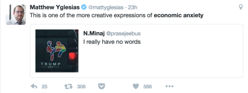
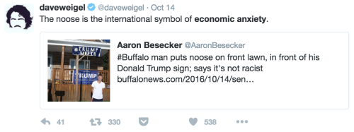
This debate has reached its cultural apogee with the genre of the economic anxiety tweet, which features a racist, sexist, anti-Semitic, or otherwise reprehensible Trump supporter, accompanied by a sarcastic comment about the supporter’s “economic anxiety.” Here are some recent examples (screenshots because WordPress doesn’t seem to display the second-level embedded tweet properly):
Why this particular debate has become so bitter has been lost to history. Probably the economic anxiety deniers think that explaining Trump in (partially) economic terms amounts to excusing or ignoring racism, while the economic anxiety believers think that the racism-only story ignores the erosion of the middle class over the past thirty years. This is why—since we’re all well-meaning liberals here—when not confined to 140 characters, the deniers take pains to say that we should help poor people, while the believers take equal pains to say that racism is bad.
The people thinking of the clever economic anxiety tweets are just doing it to annoy the other side; they know that one anecdote, or several dozen, doesn’t prove anything. But periodically there are attempts to disprove the economic anxiety hypothesis—with data! Dylan Matthews of Vox is the latest to take up the challenge, with a long, heavily documented, and very heated argument that the Trump phenomenon is about race, not economics. But it fails, for a simple reason: You just can’t prove what he wants to prove with the data we’ve got.
Matthews’s editor, unfortunately for him, gave his article this title:
It’s unfortunate because the article’s 2,000 words don’t contain a single quote by an actual Trump voter. (By contrast, two of the three articles he starts off by criticizing do quote Trump supporters.) At one point, Matthews placed a link on the suggestive text, “the statements of Trump supporters themselves”—but that link only goes to a tweet by Vox executive editor Matt Yglesias, which quotes exactly one person interviewed in a New York Times article:
This guy seems to be trying as hard as possible to clarify that it's not about economics https://t.co/Sm5EvuoDJC pic.twitter.com/iQZZdimmXb
— Matthew Yglesias (@mattyglesias) October 12, 2016
But that’s not the problem. This is Vox, the home of data journalism, and I actually beleive in their mission, for the most part: We should try to answer questions using data, not anecdote. The way to “listen to what they’re actually saying,” according to Vox, is to look at the data. The problem, as I’ll explain in perhaps excruciating length, is that the data aren’t very good.
“There is absolutely no evidence that Trump’s supporters, either in the primary or the general election, are disproportionately poor or working class,” Matthews launches in. His first source is none other than Nate Silver, who found that Trump voters “had a median household income of $72,000, a fair bit higher than the $62,000 median household income for non-Hispanic whites in America.” But Silver’s analysis doesn’t support the point that Matthews wants to make. Trump voters made more than the median family because Republican primary voters make more than the median family. Cruz voters’ median income was $73,000, while the figure for Kasich voters was $91,000. The population from which Trump voters were drawn was . . . Republican primary voters! So if Trump drew his support disproportionately from poor as opposed to rich Republicans, you would expect his voters’ median income to be lower than that of the median Republican primary voter—which is exactly what happened. Now, the effect is relatively small—Cruz voters were only slightly richer than Trump voters—so this is not strong evidence for the economic anxiety thesis. But nor is it good evidence against that thesis, especially because of the averaging problem, which I’ll come back to in a bit.
Matthews’s second source is a “major study” by Jonathan Rothwell of Gallup. I’m not sure what makes it major, except perhaps that Rothwell had a lot of data. Here’s how Matthews describes Rothwell’s findings:
Trump support was correlated with higher, not lower, income, both among the population as a whole and among white people. Trump supporters were less likely to be unemployed or to have dropped out of the labor force. Areas with more manufacturing, or higher exposure to imports from China, were less likely to think favorably of Trump.
That sounds convincing—until you actually read Rothwell’s paper, which says this:
Higher household income predicts a greater likelihood of Trump support overall and among whites, though not among white non-Hispanic Republicans. In other words, compared to all non-supporters or even other whites, Trump supporters earn more than non-supporters, conditional on these factors, but this is partly because Republicans, in general, earn higher incomes, and the difference is no longer significant when restricted to this group. …
On the other hand, workers in blue collar occupations (defined as production, construction, installation, maintenance, and repair, or transportation) are far more likely to support Trump, as are those with less education. … Since blue collar and less educated workers have faced greater economic distress in recent years, this provides some evidence that economic hardship and lower-socio- economic status boost Trump’s popularity.
In short, Rothwell provides evidence for both sides, and Matthews only tells half the story—this time. Actually, Matthews’s original writeup of the paper cited both sets of findings, because then he wasn’t trying to destroy the economic anxiety theory.
The other problem with the Rothwell paper, which I discuss at length here, is multicollinearity. It is true that Rothwell found that income was a positive and significant predictor of Trump support, at least in the full sample. But his “controls” included employment status, “works in blue collar occupation,” union member, highest degree, share of college graduates in the region, and median income in the region, all of which are correlated with household income. For example, if blue-collar workers make less money and are more likely to support Trump, that effect could be attached to the blue-collar variable (which it was) and not to the income variable (which it wasn’t). Multicollinearity doesn’t bias your results, but it makes them much more fragile.
The general problem with arguments of the form Trump-supporters-are-actually-rich is this: compared to what? If you want to answer the question of how well Trump is doing with working-class voters, you need a baseline. You can’t expect him to poll evenly with Clinton among any group of poor people: as Matthews acknowledges, “Lower-income whites are always likelier to support Democrats than other whites.” So saying that Trump supporters are richer than Clinton supporters, or that some group of poor people favors Clinton, doesn’t prove much. And as we’ve seen, Trump voters are not rich compared to other Republican primary voters.
The most obvious baseline, although it has its problems, is Mitt Romney’s vote shares in 2012. According to exit polls of the actual election, Romney lost to Obama by about 2 percentage points overall (he actually lost by more than 3 points). Among families making less than $50,000, however, Romney lost by 22 points, so in that group he under-performed his overall average by 20 points.
The first recent Clinton-Trump poll that I could find with crosstabs was by Morning Consult from last week. In that poll, Trump loses to Clinton by 4 points (see Table v16g5) in a two-way race (for comparability with 2012). Among households making less than $50,000, he loses by 7 points. So Trump does 3 points worse among poor families than he does overall, while Romney did 20 points worse.
17 percentage points are a big difference. (I think this is what journalists call burying the lede.)
It’s about as strong proof that Trump’s supporters are “disproportionately poor” as you could find. Also note that if Clinton is beating Trump by only 7 points among poor people, including African-Americans and Latinos, she could very well be losing among poor whites.
Eager to get to the primaries, where his data are more interesting, Matthews presents his theory of the general election:
The story is pretty simple: What’s driving support for Trump is that he is the Republican nominee, a little fewer than half of voters always vote for Republicans, and Trump is getting most of those voters.
But we can actually learn more from the data than this. Sure, Romney and Trump each get 40-something percent of the vote. But there’s a big difference in the composition of that 40-something percent. Compared to Romney, Trump does much better among poor people and much worse among families making more than $50,000.
That seems like pretty strong evidence for the economic anxiety hypothesis. But I wouldn’t get too excited about that, either.
The deeper flaw with all of this entrail- crosstab-reading is what I referred to earlier as the averaging problem. Donald Trump is going to get tens of millions of votes on November 8. Some of those voters will be racists. Some will be poor people concerned about their economic future. Some will be poor racists concerned about their economic future. When we look at aggregate statistics about those voters, we can get a sense for the average preferences of Trump voters, but that average mixes together a wide range of motivations.
I don’t mean to throw up my hands like a statistical nihilist and say we have to go back to interviewing people on the street. There are plenty of problems that statistics can solve reasonably well. Indeed, if we could go back in time four years and substitute this year’s Donald Trump for that year’s Mitt Romney, and run Trump against the 2012 Barack Obama, we could learn a lot about the differences between Romney supporters and Trump supporters.
But the problem with presidential elections is the same one that exists in macroeconomics: lots of things change over the same timeframe. As I said above, Trump is doing 17 points better among low-income families than you would expect based solely on Romney’s performance four years ago. On its face, that seems like strong evidence for the economic anxiety believers. But remember, Romney was a patrician who made his fortune in private equity, whom the Obama campaign successfully demonized as a ruthless job-killer, and a Mormon to boot. Almost any Republican would run better among the poor than Romney. And Obama was a child of a single mother who became a community organizer, while Clinton is the epitome of the moneyed Democratic establishment. How much of that 17 points is due to the fact that Clinton isn’t Obama, and that any generic Republican isn’t Romney? We just don’t know.
I think I could conclude here, but I want to talk about the primaries for a moment, because they illustrate another problem with this whole endeavor.
Matthews’s conclusion about the primaries (I’ll skip the sources for now, but he draws heavily on Lee Drutman and others) is this:
There is a segment of the Republican Party that is opposed to racial equality. It has increased in numbers in reaction to the election of a black president. The result was that an anti–racial equality candidate won the Republican nomination.
I’m skipping the sources because I see no reason to argue with this. Trump was the most overtly racist of the Republican candidates, and a major reason for his success was the rise in racist sentiment among the party base. This is true, and it’s bad, and it’s worrying.
But that isn’t evidence against the economic anxiety theory. It’s eminently plausible that economic dislocation makes people more receptive to racism. In fact, that’s part of the conventional historical narrative about the rise of Hitler and the Nazis, although I’m sure there are alternate theories. (It’s been more than twenty years since I studied this in graduate school, so I looked it up, and the Encyclopædia Britannica agrees.) And since the same group of people—lower-income, less-educated whites—is correlated with both poor economic outcomes and racist sentiments, it’s pretty near impossible to say from poll data whether Trump support is being driven by one and not the other.
Saying Trump is riding a wave of racism, as Matthews does, is all we need to know from an immediate practical perspective: we know we have to stop him. But it doesn’t answer the question of why racism is so popular. Racism isn’t a virus that falls out of the sky. It’s the product of historical contexts. I can’t prove that today’s heightened racism results from the Great Recession, although it seems perfectly plausible to me. But by the same token, saying “It’s racism!” doesn’t preclude the role of economic factors in making that racism attractive.
Matthews concludes his article with a moralizing critique of journalists who don’t want to call poor people racists and therefore cling to their economic anxiety narrative in the face of the evidence. Well. I think I’ve shown pretty convincingly that, insofar as the poll data say anything, they don’t say what Matthews thinks they say. (Seventeen percentage points!) But I’m not going to claim that this is incontrovertible proof of the economic anxiety hypothesis.
I think the lesson of all of this is that data journalism is a great idea, but it only works when the data are good enough, and when the journalist knows the limits of the data. But what I really want you to take away is this: Those economic anxiety tweets? It’s just a bad joke.
Update: Initially I estimated the $0–50K vote shares in 2012 by combining the $0–30K and $30–50K categories. Later I noticed that the exit polls also show the $0-50K totals. Because of rounding error, I calculated that Romney lost by 21 points, when in fact he lost by 22. So Trump’s over-performance in the $0–50K segment, relative to Romney, is actually 17 points, not 16.


October 15, 2016
The Problem with Personality Contests
By James Kwak
This presidential election has come down to a referendum on Donald Trump, the man muppet whatever he is. Tactically speaking, that’s probably a good thing. Trump is an absolutely horrendous life form, and as long as he can’t get more than 43% of the vote, he almost certainly can’t be president. (Gary Johnson just isn’t that appealing.) Of course, focusing on personal attributes has been the Hillary Clinton strategy all along, even dating back to the primaries, when she focused on her experience and seriousness in the face of Sanders’s popular proposals (single payer, free college, etc.). It’s been even more true of the general election, in which Clinton has gone out of her way to portray Trump as a unique, rather than as the culmination of the evolution of the Republican Party.
Ordinarily we bemoan the focus on personalities rather than issues. (How many millions of times have Democrats complained about voters who chose George W. Bush because they would rather have a beer with him than Al Gore or John Kerry?) This time around, we seem happy enough with the personality contest, either because it increases Clinton’s chances of winning, or because Trump is so toxic that, this time, personality really does matter.
Still, there is a cost to the fixation on personal foibles and failings, even when they are relevant. The affair of Trump’s taxes is a perfect example. Trump’s taxes are relevant: his shifting, flimsy excuses for not releasing them show him to be a liar with something to hide; the $916 million loss illustrates the colossal failure of his real estate ventures in the early 1990s, and perhaps an aggressive approach to taking deductions for paper losses. From that point, however, the fact that he carried forward that loss to avoid paying federal income tax for years is no more his fault than Mitt Romney’s low average tax rate: it simply illustrates an existing problem with the tax code that Trump is well within his rights to exploit. (If you don’t like Mitt Romney, consider Warren Buffett, everyone’s favorite multi-billionaire: Buffett is a darling of the left because he favors higher tax rates on multi-millionaires, but in the meantime he pays the same low rate as Romney.)
The real problem with Trump, when it comes to taxes, is not what he pays or doesn’t pay, but how his tax plan would affect everyone’s tax burden. And there the numbers are not pretty. From the Tax Policy Center:
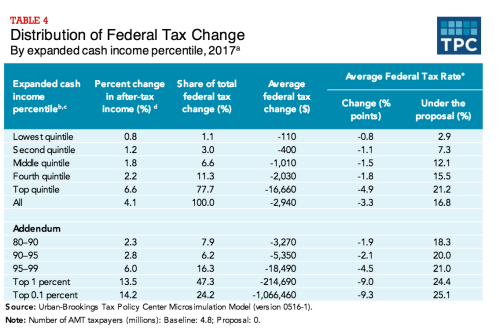
This is a classic, massive tax cut for the top 1%, similar to those proposed by Herman Cain, Marco Rubio, Ted Cruz, and every other Republican presidential candidate in recent memory. And this is on top of an existing tax code that already contains enormous loopholes for the ultra-rich. As I discuss in my latest Atlantic column, income tax is basically optional for the wealthiest families. (So is the estate tax, for the most part.) That’s the real problem we need to fix. Trump’s taxes will help Clinton get elected, which is a good thing. But the focus on Trump also distracts from the more serious problems with our tax code, which we really should should be talking about.


October 8, 2016
The Absolutely Best Debate
By James Kwak
Judging from my Twitter feed, there is one thing that we all agree on after the first two debates (including Kaine-Pence): the moderators are useless. They ask dumb questions, they don’t ask important questions, they can’t get the candidates to answer the questions anyway, they don’t call out the candidates when they lie (OK, this mainly applies to one of the candidates), etc.
So … let’s get rid of the moderators!
Here’s my idea. No moderator. Each candidate gets a lectern, a microphone, and a computer. (More about the computer later.) Each microphone has an on/off switch. You can turn on your microphone whenever you want, but it can only be on for a total of 45 minutes, with the following rules.
If neither microphone is on, and you turn yours on, you are the Talker. When you are the Talker, time counts against you second-for-second: If you talk for 30 seconds, your counter goes down by 30 seconds.
If your opponent is the Talker, and you turn your microphone on to talk at the same time, you are the Interruptor. When you are the Interruptor, your time counts against you two-for-one: If you interrupt for 30 seconds, your counter goes down by 1 minute. During that time, your opponent’s counter goes down only 30 seconds, if she continues talking. If your opponent turns off her microphone, you become the Talker.
Your microphone cannot be on continuously for more than 3 minutes. When you turn it off (or when it shuts off automatically after 3 minutes), you cannot turn it on for 10 seconds. This is to eliminate the trick of quickly turning your microphone off and on to reclaim the status of Talker.
Rules 1 and 2 give an advantage to whoever turns her microphone on first. To avoid a race, the debate is divided into 15-minute segments, and the candidates alternate who gets to begin each segment. The other candidate can interrupt immediately, but would then be the Interruptor (and lose time at twice the rate of the Talker).
At any time, either candidate can press an override button that disables the other person’s microphone. You can hold down the override button for up to 1 minute, after which it becomes unusable for 1 minute. While you are holding the override button down, your time counts against you three-for-one: If you override for 1 minute, your counter goes down by 3 minutes. (You can use the override button to extend your microphone’s life beyond the ordinary 3-minute limit.)
So what would happen? There is an advantage to being the Talker, but you can only be the Talker for up to 3 minutes. During that time, the other person can Interrupt, but pays a big penalty on the clock. So ordinarily the Talker should control the floor for up to 3 minutes, with the other person making only short interruptions. When the Talker stops, the other person has 10 seconds to turn her microphone on and become the new Talker. At any time, if you really, really need to make a point directly to the American people, you can press the override button to do it. But if you get so infuriated that you need to constantly Interrupt your opponent, you’ll run out of time and she will get the last 20 minutes all to herself.
What about the computer? The computer is for fact-checking.
The debate will be televised in split-screen, with half the screen for each candidate. At any time, each candidate can choose whether to use her half for a traditional video image of her, or for the screen of her computer. The computer will only have a web browser on it, which the candidate can use to display whatever she wants from the Internet. The domain name will be magnified, so viewers can clearly see the source of whatever is in the browser. The browser will not have bookmarks, to make it harder to create fake versions of the New York Times and show those during the debate. (That is, candidates will have to use a search engine to find their sources, unless they have prodigious memories.)
What do you think?


September 27, 2016
Is Inequality Rising or Falling?
By James Kwak
Last week, Council of Economic Advisers chair Jason Furman took to the Washington Post to announce that President Obama has “narrowed the inequality gap.” Furman’s argument, bolstered by charts and data from a recent CEA report, has won over some of the more perceptive commentators on the Internet, including Derek Thompson, who concludes that Obama “did more to combat [income inequality] than any president in at least 50 years.” In 538, the headline on Ben Casselman’s summary reads, “The Income Gap Began to Narrow Under Obama.”
But is it true?
I already wrote about the key misdirection in Furman’s argument: his measures of reduced inequality compare the current world not against the world of eight years ago, but against a parallel universe in which, essentially, the policies of George W. Bush remained in place. (This is not something either Thompson or Casselman fell for; they both realized what Furman was actually arguing.) Today I want to address the larger question of whether inequality is actually getting worse or better.
First, let’s orient ourselves. At a high level, there are two sets of forces that affect income inequality. The first set is underlying economic factors that determine inequality of pre-tax income: skills gap, globalization, bargaining power of labor, and so on. The second set is government policies that affect the distribution of income, often referred to as taxes and transfers; these policies take pre-tax income inequality as an input and produce after-tax income inequality as an output. (This isn’t a perfect distinction, since tax and transfer policies also affect the distribution of pre-tax income, but I think it’s good enough for explanatory purposes.)
Furman’s argument is that Obama has improved that second set of policies. That’s what this chart really shows; remember, it’s comparing the effect of taxes and transfers next year against the effect of taxes and transfers under George W. Bush policies.
I think that’s unequivocally a good thing, although (as I pointed out before) a lot of that redistribution was simply the product of letting the top-end Bush tax cuts expire.
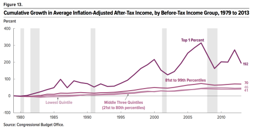
But what about the first set of underlying economic factors? We have all seen Piketty and Saez’s charts showing the 1% income share as a measure of pre-tax inequality. Here, however, I’m mainly going to use CBO data so that I can compare pre-tax and after-tax income shares from a single source.
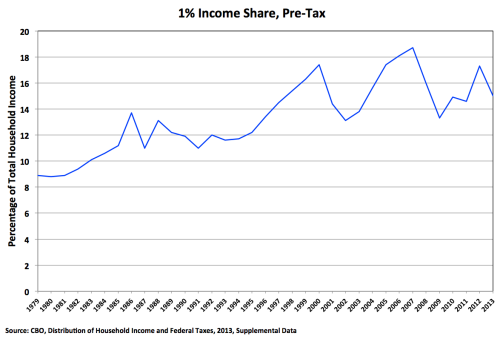
This is the 1%’s share of what the CBO calls before-tax income, which includes government transfers but does not reflect taxes. The big peaks in the second half of the chart are 2000 and 2007; the little peak near the end is 2012.
To read this chart, you have to understand that the 1% income share changes on three different timescales:
Over the period as a whole, it’s clearly increasing, because of those underlying factors (skills gap, globalization, unions, whatever).
But inequality also fluctuates with the business cycle. Expansion periods tend to increase income inequality, particularly if they are accompanied by increases in asset prices; a large share of the income of the very rich is profits from capital gains, which obviously rise and fall with asset prices. Subsequent recessions reduce inequality, because those asset prices fall rapidly. So the 1% income share grew from 1993 to 2000, fell with the collapse of the stock bubble, grew until 2007, fell with the financial crisis, and started growing again with the current economic expansion.
Finally, the 1% income share also changes in response to tax policy. There is a spike in 1986 because rich people sold assets before the higher rates set by the Tax Reform Act of 1986 would take effect; that was followed by a fall in 1987, because those same rich people essentially moved their 1987 sales into 1986.
The first conclusion you should now draw is that, with the exception of 2013 (the last year of data), little appears to have changed. The 1% income share has been growing during the recovery, even as median income remained stagnant (until 2015, that is). I’ll come back to 2013 in a minute.
But, Furman would argue, and I would agree, it’s not pre-tax income that matters; it’s income after accounting for taxes. (Transfers are already included in the measure of pre-tax income shown here.) So here’s the complete chart:
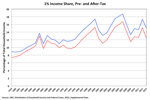
The primary conclusion you should draw, which is easy to see, is that after-tax inequality unsurprisingly moves more or less in parallel with pre-tax inequality. What’s hard to see is that the gap between the pre- and after-tax income shares of the 1% did go up significantly in 2013. From the Clinton tax increase of 1993 through 2012, the gap fluctuated between 1.8 and 2.2 percentage points; in 2013, it shot up to 2.6 percentage points. That’s because the Bush tax cuts for the very rich—including the 15% rate on capital gains and dividends—finally expired, and the 3.8% Medicare tax on investment income took effect. That is one of Obama’s major achievements on the inequality front, and he deserves credit for it.
In 2013, the fall in the pre-tax income share of the 1% and the increase in the gap between the pre- and after-tax income shares reduced their after-tax share to the comparatively low level of 12.4%, which, Furman pointed out in the Post, was “roughly equal to its share in 1997.” This is true. It’s also true that 12.4% was roughly the after-tax share in 2011, sometime between 2009 and 2010, 2003, and 2001—that’s how series that go up and down work.
The bigger question is whether that lovely dip in 2013 is the start of a trend of falling inequality, or whether it’s an aberration. Furman obviously believes the former, claiming “success to date” in the battle against inequality. In his article, Casselman says it’s too soon to say, but then concludes with this:
Even if progress has been limited, the trend line has shifted. That’s significant. The incessant increase in the income gap in recent decades often made it seem like inequality could go in only one direction: up. The recent trend suggests that’s not the case.
I think this is too optimistic. Again, the 2013 decline in the after-tax income share of the 1% was primarily due to a drop in their pre-tax income share. (The total decrease was 2.7 percentage points: 2.3 percentage points due to lower pre-tax income, and 0.4 percentage points due to changes in tax policy.) And we already know what happened to pre-tax income after 2013: it went up.
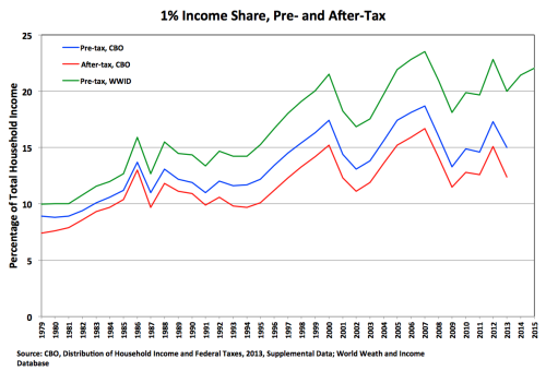
This last chart adds (green line) the top 1% income share from the World Wealth and Income Database, which has data through 2015. The green line is above the blue line, largely because it does not take transfers into account. But you can see that the two lines move together. So we can infer that in 2014 and 2015 the blue line continued climbing up and to the right.
We can also infer that the red line also climbed up and to the right. The tax changes in 2013 were a one-time event. The gap between the blue and red lines may remain larger indefinitely, which is good. But there’s no force causing that gap to increase over time. So when the CBO releases its report on household income in 2015, we’ll see that the after-tax income share of the 1% has climbed back to something like its 2005 or 2006 levels.
Most importantly, the overall pattern hasn’t changed: inequality rises during periods of economic expansion, and seems to reach a new peak during each cycle. Now that we know what happened in 2014–15, we can also explain the spike in 2012 and drop in 2013. It’s the same thing that happened in 1986 and 1987: Investors anticipating an increase in the capital gains tax rate sold their assets early to lock in a lower tax rate in 2012, and therefore took fewer gains in 2013. Smooth out 2012 and 2013 and the trend is even more clear, and conforms to the overall pattern of the past twenty-five years.
So what should we conclude from all of this? There are two questions. The less important one is how much credit the president deserves for reducing inequality. I’d say the tax “increases” of 2013 were definitely a good thing, but they largely amounted to simply not extending the Bush tax cuts. Obamacare is also a good thing. But these fall into the category of tax and transfer policy. It’s hard to point to anything he did that affected the underlying economic factors producing the increase in inequality—the general trend up and to the right you see in all of these charts. In his defense, maybe there wasn’t that much he could do. I’ll leave it at that.
The more important question is whether the trend really has shifted. I think there is little if any evidence for this hypothesis. The simplest interpretation of the last chart is that after-tax income inequality continued marching up and to the right during the current economic expansion. As Furman amply documented, changes in tax and transfer policy have widened the gap between pre-tax and after-tax inequality. But there’s no policy reason for that gap to continue widening in the future. Yes, 2015 was a good year for middle-class families, but it didn’t come close to making up for several bad years during the current expansion. There’s no obvious reason why the pre-tax income share of the 1% will stop rising anytime soon—except for the next recession, after which it will most likely continue its long-term ascent.
In summary, inequality is every bit the problem we’ve always thought it was. It’s not as bad today as it would be if John McCain had been elected eight years ago. But we’re no closer to addressing its fundamental causes.


This Chart Does Not Say What You Think It Says
By James Kwak
[Note: Usually I post things here first, then on Medium. This time I did the opposite.]
Jason Furman, chair of the Council of Economic Advisers, is in a celebratory mood:
Everyone talks about income inequality these days. President Obama has actually done something about it. pic.twitter.com/QfIjMxi2ms
— Jason Furman (@CEAChair) September 23, 2016
Looking at that chart, and at Furman’s triumphant tweet, you would think inequality had declined during the Obama administration.
Not so fast.
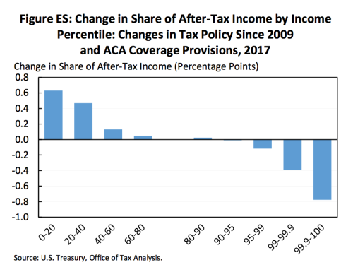
The first thing to understand is what that chart actually says. It does not say that the top 0.1 percent’s share of national income has gone down by almost one percentage point (rightmost column) since Barack Obama took office, nor does it say that the bottom 20 percent’s income share has gone up by more than half a percentage point (leftmost column).
Unless you’re the kind of person who spends a lot of time with Tax Policy Center tables, this chart requires a bit of mental reorientation. “Change in share of after-tax income” does not mean what it sounds like—change over time. It means the difference between our universe and another, parallel universe. In that alternate universe, the “changes in tax policy since 2009 and ACA coverage provisions” did not take place. Therefore, the rightmost column in the chart measures the difference between the income shares of the top 0.1 percent in these two universes—according to forecasts of 2017. (Hey, if we’re going to estimate income distribution in an alternate reality, estimating it one year in the future is child’s play.)
So what the chart really shows is that our universe is a little less unequal than that parallel universe. But for this to mean anything, we have to know how bizarro-world is defined. According to the full report by the Council of Economic Advisers (p. 26), the parallel universe is one in which the tax policies of 2008 remain in place indefinitely—that is, the Bush tax cuts were made permanent.
But remember, when President Obama took office, those tax cuts were already scheduled to expire at the end of 2010. So a large part of Furman’s “decline in inequality” would have happened anyway if the president had done absolutely nothing. In fact, Obama extended the Bush tax cuts once in 2010, and then made most of them permanent in 2013—but, to his credit, let the tax cuts for the very rich expire.
It is true that a Republican president probably would have made all of the Bush tax cuts permanent, so Obama deserves credit for not being a Republican. But essentially his accomplishment—the thing he did—was the bare minimum anyone would expect of a Democrat.
In summary, what the chart says is this: Given the current state of the economy, the tax code we have results in slightly less inequality than the tax code we had under George W. Bush, which was scheduled to go away on its own.
The same is true of this tweet by Furman:
Across many measures, reduction in inequality is clear. Ratio of average after-tax income in top 1% to bottom fifth is down by over 20%. pic.twitter.com/tMyqbmk9aw
— Jason Furman (@CEAChair) September 23, 2016
Again, when he says “ratio of average after-tax income . . . is down by over 20%,” he’s not saying what it sounds like he’s saying—that it’s 20% lower than in 2009. He means it’s 20% lower than in the alternate universe, given the current state of the economy.
That’s a good thing. But if you really want to know if “President Obama has done something about [inequality],” the bigger question is how the economy has evolved during his tenure; you can’t just take the current state as a given.
This is a much more complicated question. It’s not clear what your historical baseline should be: 2009 was obviously an unusual year. It’s less clear what your counterfactual should be: what hypothetical president do you compare Obama’s performance to?
We can look at the bottom line, however. In his accompanying Washington Post op-ed, Furman claims,
the top 1 percent’s share of income after taxes was 12 percent in 2013 (the most recent year for which data are available), well below its 2007 peak and roughly equal to its share in 1997.
Yes, this is true. But look carefully at the complete series, from theCongressional Budget Office:
The income, and hence the income share, of the top 1% fluctuates wildly. It fell precipitously in 2008 and 2009 because the worldwide market collapse vastly reduced capital gains from sales of stock and other assets. So income inequality was relatively low when Obama took office, and started increasing as the economy recovered. Furman’s point is true about 2013; about 2012, not so much. Which year is a more accurate representation of the current trend?
On the one hand, tax rates on the rich did go up in 2013. So you might think that the drop in after-tax income was the result of higher taxes, which still apply today.
On the other hand, look at this:
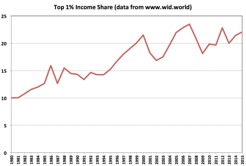
That’s the top 1% pre-tax income share, from the World Wealth and Income Database. Note that it goes through 2015, while the CBO chart ended in 2013. As you can see, the 2013 drop in after-tax income (in the CBO chart) was due to a drop in pre-tax income (in the last chart)—which was then reversed in 2014 and 2015. This makes complete sense. In 2012, rich people knew that tax rates on capital gains would probably go up the next year, so they sold assets to take advantage of the low rate; having taken their gains in 2012, they sold fewer assets in 2013, so their income was down. Since then, however, as the stock and real estate markets have continued to rise, the pre-tax income of the top 1% has climbed back close to its record levels. And as their pre-tax income share has increased, we can be pretty sure their after-tax income share has increased as well.
In summary, the economic factors that produce higher pre-tax income inequality—stagnant middle-class wages, high corporate profits, and booming asset markets—are alive and well, and it doesn’t seem the Obama administration has done much about them. The administration did pass the Affordable Care Act and let the Bush tax cuts expire for the rich, both of which helped mitigate the pre-tax inequality produced by contemporary American capitalism. But even if Barack Obama called inequality the “defining challenge of our time,” he has done little to tackle its fundamental causes. Let’s hope the next president does better.


September 22, 2016
Wells Fargo and the Cult of the Customer
By James Kwak
“An unwavering focus on the customer.” Those words grace the cover of Wells Fargo’s 2014 annual report:

The 2015 annual report features this:
One can only wonder what the bank’s public relations whizzes will think of for the 2016 version.
We know now that, over the past five years, more than five thousand Wells Fargo employees illegally opened more than 1 million bank accounts and applied for hundreds of thousands of credit cards on behalf of existing customers—all to meet aggressive “cross-selling” targets set by bank executives. At the moment, we’re not exactly sure who knew what and when they knew it. But as with the rest of the once-shocking-but-now-mundane banking scandals of the past decade—the London Whale, fixing LIBOR, manipulating foreign exchange markets, money laundering, and so on—either the bank’s top executives were unaware of what was going on, which is recklessly incompetent, or they were aware of it, which is worse.
The mantra of “the customer” is standard corporate PR fare, of course, but Wells Fargo takes it to absurd and now apparently Orwellian extremes. The bank’s “strategy” highlights the following sentence:
We start with what the customer needs — not with what we want to sell them.
This is exactly the opposite of how the bank actually behaved.
Even when caught ripping its customers off, the bank responded by saying:
Wells Fargo is committed to putting our customers’ interests first 100 percent of the time.
Now, there actually are businesses that do put their customers’ interests first, at least almost all of the time. I used to work at one. At Guidewire Software, our primary goal in everything we did was to make our customers successful using our software. If we did that , we believed that everything else would take care of itself.
This was a sensible strategy, for a few reasons. We were selling big, expensive software systems to large property and casualty insurers—a relatively small world in which everybody knows everybody else. One failed project and our reputation would be seriously harmed, perhaps fatally. The industry had seen a long succession of large and costly software project failures, in which companies spent tens of millions of dollars and had little or nothing to show for it. Promising that we would move heaven and earth to make our customers successful—and actually doing it—was a way of differentiating ourselves from the competition. Finally, we knew that each customer relationship would last for years and years, through upgrades and additional sales of new products. For us, “the customer” was, in each case, a group of real people with whom we had real relationships. And when you know people personally, you genuinely want them to succeed.
Wells Fargo is not that kind of business.
For Wells Fargo, as for any megabank, “the customer” is not a person—it’s a dataset, with means, medians, correlations, and metrics, like “cost of acquisition” and “churn rate” and “marginal profitability of product X.” Yes, customers matter, but in the generic sense that applies to all businesses: customers are where the money comes from.
There is another, more specific reason why customers matter to Wells Fargo: they play an important role in the bank’s pitch to investors. It’s cheaper to market to your existing customers than to people who aren’t your customers. You can put ads in their credit card bills, on your online banking web pages, on signs in your branches, and in the scripts that your tellers and call center operators repeat no matter what the question is. You can (supposedly) mine your customers’ purchasing data to figure out when they are going to need a mortgage or a home equity loan, and you can pounce before they have a chance to look at their other options. You can bait them with a loss-leader free checking account and reel in a mortgage with big up-front fees and a steady stream of servicing revenue, or an Individual Retirement Account invested in a crappy, high-fee mutual fund.
This is what those magical words cross-selling mean to bank executives. And the idea that you can continuously increase profits by pushing more and more overpriced junk onto the same set of suckers is music to the ears of investors. But if your story is based on cross-selling, you need to provide numbers to back it up—like the number of products per customer, the number of customers with more than one product, the percentage of deposit account customers with a credit card, and so on. To get those numbers, you set targets for tens of thousands of frontline employees . . . and we know how that story ends.
The irony of the cross-selling story is that it isn’t actually good for customers. There are business models that are good for a company and its customers. In fact, that’s the usual state of affairs: you pay $5 for a taco that your local taco truck made at a marginal cost of $2 and is so delicious that you would have paid $8 for it. Everyone wins.
But if you buy all your financial products from the same bank, the only winner is your bank. Wells Fargo probably has perfectly good checking accounts, with big ATM networks, online systems, and fancy smartphone apps. But you should get your credit card from whoever charges the lowest interest rate or offers the best rewards; you should get your mortgage from whoever charges the lowest rate, without hidden fees and penalties; and you should invest your money with Vanguard (or some other fund management company that has low-cost index funds). Banks like to talk about the advantages of “one-stop shopping,” but in the age of technology there really aren’t any. You can set up automatic payments from one institution to another, and that’s that. Cross-selling is one of those strategies that generates profits not by providing better tacos to taco lovers, but by taking advantage of existing customers’ limited attention to sell them mediocre products that they wouldn’t have chosen otherwise.
So, yes, Wells Fargo is focused on its customers—but not in the sense that they care about the people who use their products. The Customer is a story to tell Wall Street in order to prop up the stock price for as long as possible.People who have Wells Fargo accounts are the ore that has to be mined for golden nuggets of data to embellish that story. That’s the only sense in which Wells Fargo puts its customers first.


September 14, 2016
Yay! We’re Almost as Rich as We Were in 1998!
By James Kwak
There’s been a fair amount of triumphalism about the Census Bureau’s recent report on income and poverty, which showed a 5.2% increase in median real household income from 2014 to 2015. For example:
I usually try to be restrained, but this is unambiguously the best Income, Poverty & Health Insurance report ever. https://t.co/YdN4HgtIvR
— Jason Furman (@CEAChair) September 13, 2016
Congratulations!
But, and I don’t think Jason Furman would disagree, this is not particularly strong evidence that everything is rosy, or that “America is already great,” as some would have it. As many people have pointed out, median household income in 2015 was only back to its 1998 level. Actually, when you take into account a methodological change in 2013, it’s still 5% below its 1999 peak.
Also, if you’re going to celebrate the good years, you should acknowledge the bad years. Here is the annual change in median income for every year since 1985, ranked from best to worst:

(For some reason, FRED’s data series only goes back to 1984. Also, to get 2013’s figure, I went back to the Census Bureau’s report for that year, because of the methodological change.)
The years in red are the years of the current recovery. As you can see, this is the first time annual growth has exceeded 0.3%, despite the fact that the economy has been growing every year.
Now, it’s possible that 2015 will be the first of several good years. Maybe unemployment has finally reached the point where companies have to offer higher wages to workers, instead of telling them to apply for government benefits. On the other hand, going simply by how long recoveries usually last, we are due for a recession—which would mean another economic cycle in which ordinary households became worse off.
There’s no way to know for sure, of course, because this is macroeconomics. But on its own, one data point does not make a trend. And so far, this century has not turned out so well for the median American family.


September 12, 2016
Confused About Taxes
By James Kwak
In the Times a couple of days ago, Gregory Mankiw made a half-hearted case for eliminating the estate tax that was so weak I’m not even sure he convinced himself. The core of his argument is that the estate tax violates the principle of horizontal equity, according to which “similar people should face similar burdens.” The problem, on his view, is that between two rich couples that each amass $20 million, the Profligates who consume their wealth before death end up paying lower taxes than the Frugals who maintain a modest lifestyle. “To me, this does not seem right,” Mankiw concludes.
First of all, it’s not even clear why this example violates horizontal equity. The Profligates and the Frugals are not “similar people”—Mankiw specifically constructed the example that way. They may have each earned the same amount of money, but they have vastly different consumption habits.
Second, it’s not clear that the Frugals are paying more tax than the Profligates. Their estate will pay higher taxes, but by then they are dead; the estate tax does not directly limit their personal consumption in the slightest. In fact, the ones whose estate will pay the tax are the ones who apparently are not interested in consumption in the first place. Now, the defense of Mankiw is that the Frugals do care about how much money they can pass on to their children, so the estate tax does affect their utility. But that brings up the third, and most important point . . .
Only an economist, and an economist of a certain type, could evaluate the fairness of the estate tax by comparing two wealthy families. Mankiw’s point is that the estate tax is unfair to the Frugals—as compared to whom, exactly? Remember, Mr. and Mrs. Profligate spent most of their money before they died; their children get next to nothing. The Frugals’ kids end up with about $16 million ($20 million less the 40% federal estate tax on the amount above the exemption), but they’re still the richest people in the story. The Profligates’ kids get the remaining crumbs of the parents’ once-impressive fortune—yet we’re supposed to feel sorry for the Frugals.
But the people we should really be thinking about are everyone else’s children. It’s a little peculiar to profess to care about equal treatment and then proceed to talk solely about rich people. What about Mr. and Mrs. Poor and their children, who far outnumber the Profligates and the Frugals? The Poors’ children inherit nothing because their parents died with nothing; the Frugals’ kids inherit $16 million although their parents died with $20 million. There’s no reason to think the second generation of Frugals is any more deserving than the second generation of Poors—yet they are born into comfort and security, while the Poors face hardship and anxiety. From this perspective, the only fair estate tax would be one with a rate of 100%. And even then, the Frugals’ kids would be better off than those of the Poors, since they would have the most productivity-enhancing childhood that money can buy.
The bottom line is this: You can’t argue against the estate tax on fairness grounds, unless your powers of abstraction are so awesome that you can some how overlook the fact that most people wish their parents had to pay the estate tax.
As I said, I’m not sure that Mankiw bought his own argument, because he then concedes that “not all economists share my judgments about the estate tax.” So he pivots into a different point that he thinks “everyone can agree on”: that “we need more stability in the tax code than we have had in the past.” And we can only have stability, he claims, if opposing sides can compromise on outcomes that both find tolerable.
This argument about tax code stability is just a special case of the more general claim you often hear that businesses need regulatory “predictability” so that they can make long-term plans. And in both cases, this position is either naive or disingenuous. The United States is still a democracy. And in our democracy, a party that controls both the White House and Congress can do more or less what it wants, at least when it comes to economic policy. For an example, look no further than the George W. Bush administration, which eliminated the estate tax (for only one year, because it had 51 but not 60 votes) back in 2001. Even if some nonexistent master statesmen were able to come to sort of grand bargain on the estate tax, nothing would prevent Paul Ryan, Mitch McConnell, and (say) President Ted Cruz from eliminating it in 2021. Complaining about “uncertainty” is just a sophisticated way of complaining about the fact that your side might lose.
The big misdirection in Mankiw’s column, however, goes unstated: talking about the estate tax in isolation from the rest of the tax code and, for that matter, the economy. At the end of the day, the estate tax is about the inter-generational transmission of wealth. From that standpoint, the rest of the tax code effectively imposes a negative estate tax.
The main reason is step-up of basis at death. Ordinarily, when you sell an asset, you have to pay capital gains tax on your profits (sale price minus purchase price). But when you die, your heirs get to increase their cost basis to the value of the asset at the time of your death—so no one ever pays tax on the appreciation during your lifetime. This is very clearly a negative estate tax, since it makes assets worth more to your heirs than they were to you. In addition, you don’t pay capital gains tax until you sell an asset—so the longer you hold onto an asset, the lower your effective tax rate. This obviously benefits the wealthiest families the most, since they have the least need to sell assets. And if you do ever sell an asset, you get to pay capital gains tax at a preferential rate.
In short, most of the tax code benefits families with more wealth than they can consume in one lifetime. In this context, the estate tax is really just an imperfect, partial, insufficient way to slightly mitigate the inter-generational transmission of wealth and the development of an aristocracy of hedge fund managers and their children. The big question isn’t whether we should have an estate tax or not. It’s whether we should take much more aggressive measures to give all children a fair shot at a comfortable and prosperous future. Eliminating the estate tax, without addressing the sources of inter-generational inequality, would only accelerate the transformation of American into a new feudal society.


August 25, 2016
Who Cares About the Clinton Foundation?
By James Kwak
Imagine that while George W. Bush was governor of Texas and president of the United States, various people and companies decided to write him checks for hundreds of thousands of dollars, just because they thought he was a great guy. Those people and companies, just coincidentally, happened to have interests that were affected by the policies of Texas and the United States. But when he thanked them for their money, Bush never promised to do anything in particular for them. You would be suspicious, right?
Now, that’s roughly what has been happening with the Clinton Foundation. Various people and companies have been writing checks for millions of dollars to the Foundation during the same time that Hillary Clinton was secretary of state and, following that, the most likely next president of the United States—a title she has held since the day Barack Obama’s second term began. (The Clintons finally decided to scale back the Foundation earlier this week.)
There are two main defenses for Clintons’ actions. Both are distressingly naive.
One, made by Kevin Drum among others, is that Clinton didn’t actually do any favors for her Foundation donors. So even if people were trying to buy access and influence, they didn’t get any, and there’s nothing to see here.
First of all, there is evidence, some compiled by Jeff Stein, that Foundation donors were more likely to gain access to the secretary of state. On an individual basis, I’m sure that each of these meetings could be justified . But the same thing is true whenever a lobbyist arranges a meeting for a client with a member of Congress. The question is whether giving money increases your chances of getting through the door. We’ll probably never have the data you would need to answer that question.
More generally, what matters the impact that a donation has on the donee. Anyone who will want to raise money in the future naturally finds it difficult to take actions contrary to the interests of the people who are most likely to give that money. Donating to the Clinton Foundation is a great way to signal that you might donate more money in the future. And that means that, somewhere in the corner of her massive brain, Hillary knows that making a certain decision will reduce her foundation’s future revenues. That’s why we worry about campaign contributions, remember? If you want to argue that Hillary Clinton is so incorruptible that the standards we apply to other politicians shouldn’t apply to her—well, be my guest.
The second defense is: The Clinton Foundation is a charity, for God’s sake! It helps people! This is even more naive, for a simple reason that I don’t think has been emphasized enough.
The Clintons are vastly wealthy. Since 2007, they have earned more than $150 million. They have far more money than any family can reasonably consume in a lifetime. Bill and Hillary are getting on in years, they only have one child, and she is married to a hedge fund manager. When you have that much money, a dollar in your foundation is as good as a dollar in your bank account.
Once you have all your consumption needs covered, what do you need money for? If you’re a Clinton, you want to have an impact in the world, reward your friends, and burnish your legacy. A foundation is an excellent vehicle for all of those purposes, for obvious reasons. It is also an excellent way to transfer money to your daughter free of estate tax, since she can control it after you die. (That’s why it’s hardly a sacrifice for Mark Zuckerberg to donate the vast majority of his Facebook stock to a private company that he controls.) The fact that it may or may not do good things for the world is irrelevant. A $1 million donation to the foundation might as well be a $1 million donation to you, because, at the end of the day, your marginal $1 million is going to your foundation either way.
So the real question is this: Do you think it would be appropriate for people and companies affected by U.S. policy to be writing $1 million checks directly to the Clintons? If the answer is yes, then you should be against any campaign finance rules whatsoever. If the answer is no, you should be worried about the Clinton Foundation.


August 16, 2016
That “Massive New Study” Says Nothing About Economic Anxiety
By James Kwak
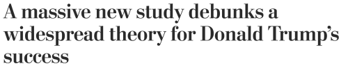
Last week, the Washington Post summarized a draft paper by Jonathan Rothwell of Gallup on the demographic correlates of support for Donald Trump. As various people have noted, the headline was a bit over-the-top:
The “widespread theory,” of course, is the idea that Trump supporters are, at least in part, motivated by economic anxiety—an idea that sophisticated columnists like Matt Yglesias like to make fun of, as I discussed recently.
The article itself, as many people have noted, is considerably more circumspect than its headline. (Note to those who don’t know: Headlines are written by editors, not the people on the byline.) This is the summary near the top of the article:
According to this new analysis, those who view Trump favorably have not been disproportionately affected by foreign trade or immigration, compared with people with unfavorable views of the Republican presidential nominee. The results suggest that his supporters, on average, do not have lower incomes than other Americans, nor are they more likely to be unemployed. [Actually, according to the paper, they are more likely to be unemployed, but that’s not particularly important.]
Yet while Trump’s supporters might be comparatively well off themselves, they come from places where their neighbors endure other forms of hardship. In their communities, white residents are dying younger, and it is harder for young people who grow up poor to get ahead.
The paper itself is more circumspect still. Here’s an excerpt:
Higher household income predicts a greater likelihood of Trump support overall and among whites, though not among white non-Hispanic Republicans. In other words, compared to all non-supporters or even other whites, Trump supporters earn more than non-supporters, conditional on these factors, but this is partly because Republicans, in general, earn higher incomes, and the difference is no longer significant when restricted to this group. …
On the other hand, workers in blue collar occupations (defined as production, construction, installation, maintenance, and repair, or transportation) are far more likely to support Trump, as are those with less education. … Since blue collar and less educated workers have faced greater economic distress in recent years, this provides some evidence that economic hardship and lower-socio- economic status boost Trump’s popularity.
Before we go further, let’s make sure we understand exactly what this paper does and does not show. For the most part, it’s based on a probit regression of the likelihood a person will support Trump (that’s the dependent, or left-side variable) on a long list of variables for that person (employment status, religion, etc.) and a long list of variables measured for the area in which that person lives (share with BA degree, share of manufacturing jobs, etc.). For each variable, there is a regression coefficient that shows the impact of that variable on the likelihood of supporting Trump, and then an indication of whether that variable is statistically significant. For example, in model 1, looking at all people, being unemployed increases the chances that someone will support Trump by about 5%, which is significant at the 99% level.
There are two reasons why this paper says less than readers might think. The first is that many of the right-side (explanatory) variables are highly correlated. When you have highly correlated explanatory variables, you can get wildly inaccurate results. Let’s say you are trying to figure out what factors determine the number of words in a child’s vocabulary. In your model, you include age, since kids learn more words as they get older. You also include grade in school, since they learn more words the longer they spend in school. Do you see the problem? Age and grade are almost perfectly correlated; you’re basically using two variables when there is only one in real life—so the actual results of your model will be highly volatile. You might find that age is significant but not grade; or vice-versa; or that both are significant. If both are significant, you might conclude that both have a positive impact on vocabulary: that is, fourth graders know more words than third graders, but within any grade, older kids know more words than younger kids. That sounds plausible—but it would be a mistake. When explanatory variables are highly correlated, results are extremely sensitive to outliers. If you have one older kid in fourth grade who knows lots of words, you could get a positive coefficient on age; but if that one kid doesn’t know very many words, you could get a negative coefficient.
How does this apply to this paper? The individual explanatory variables include, among other things: employment status (e.g., self-employed); religion; “works for government”; sex; marital status; “works in blue collar occupation”; union member, non-government; race and ethnicity; highest degree; and household income. The regional explanatory variables include: share of college graduates; share of manufacturing jobs; median income; share of white people; and white mortality rate. All of those variables are obviously correlated with income, particularly highest degree. So we have the same problem described above—too many variables for the amount of variance in our sample—which produces arbitrary results. (One way to think about this is that you could use a bunch of those variables to predict household income pretty accurately, at which point the household income variable itself becomes unnecessary.)
The Washington Post writeup remained blissfully unaware of this problem:
After statistically controlling factors such as education, age and gender, Rothwell was able to determine which traits distinguished those who favored Trump from those who did not, even among people who appeared to be similar in other respects.
This is the argument that the statistical significance of the income coefficient means that, among people who are otherwise identical, higher income does have an effect (pro-Trump, in this case). But as explained above, that’s a fallacy. Multicollinearity, as this statistical problem is called, means that individual coefficients are unreliable. The model as a whole may predict support for Trump pretty well, but you have no way of knowing which variables are doing the predicting.
That’s the first problem with this paper: we can’t trust the coefficients. The second problem is one of interpretation. Even if we accept for a moment the coefficients on the explanatory variables, the paper says nothing about why people actually support Trump; it’s just a long list of correlations.
So imagine this simple world. There are 100 people. 50 are poor and 50 are rich. In each group, one half (25 people) vote based on their feelings, such as economic anxiety. The other half vote based on their interests. So the electorate looks something like this:
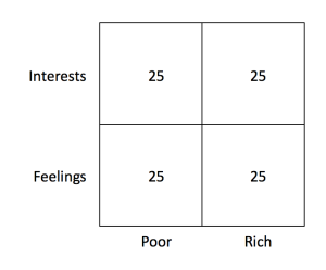
Of the people who vote their feelings, let’s say economic anxiety does increase support for Trump. So Trump gets 15 of the people in the Feelings/Poor box but only 10 people in the Feelings/Rich box. For people who vote their interests, however, income is positively correlated with Trump support, since he has promised to cut their taxes. So Trump gets 20 of the people in the Interests/Rich box but only 5 people in the Interests/Poor box (because the other 20 realize that Hillary Clinton’s policies will be better for them).
Now our exit poll looks like this:
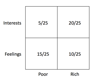
Trump gets only 40% of the poor voters, but 60% of the rich voters.
That’s what the Gallup paper shows, and that’s what the Washington Post editors used as their headline: rich people prefer Trump, so economic anxiety is a myth. But I constructed this outcome using a model that explicitly incorporated economic anxiety as a factor (in the Feelings row, Trump does better with poor people). In other words, the economic anxiety story is consistent with a study showing that, on average, rich people prefer Trump.
The lesson is very simple, and it’s one that everyone knows before becoming a poll-reading pundit: People make decisions for different reasons. Something can be an important factor—here, it gives Trump a 20-point advantage among half the population—but get outweighed by some other important factor. Or, to put it in sophisticated language, you can’t use income as an instrument for economic anxiety, because income affects Trump support through other channels (in this example, because some rich people realize that Trump’s tax cuts will be good for them). This is really just the same mistake that Matt Yglesias made yesterday with race and age.
As should be obvious, I think that economic anxiety is a reason why some people support Donald Trump. I can’t prove it from poll breakouts, or from the Gallup paper, because this type of hypothesis can’t be proven or disproven with that type of data. That’s the one thing you should remember the next time someone argues that some demographic statistics show why some politician is popular.


Simon Johnson's Blog

- Simon Johnson's profile
- 78 followers

