
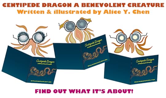
Alice Y. Chen's Blog, page 7
December 8, 2015
Red, orange, yellow, green, blue, purple...and muddy gray and brown.
Now that I had the formatting issues resolved, I was feelin’ GOOD. I was so much happier with this more harmonious and balanced square format.
I had finally reached the stage where I could make the final files that would be submitted to the POD (Print On Demand) platform. My artwork was entirely digitally created in Adobe Illustrator, save the initial sketches. MY POD platform required a PDF (Portable Document Format) file submission. This totally makes sense, as a PDF is a universal format that can be opened in any program. What’s more, the way the information is saved allows it to “Look” like how you intended it to look. Have you ever opened a file whereby your computer substitutes in a different font because the one used in the file is not installed on your computer? Well, PDF was supposed to be one way to avoid that happening (if the font was properly embedded into the PDF in the first place. But I digress).
Anyhoo, as I stared greedily at that light at tunnel’s end, smelling my victory nearing, I made my PDFs carefully and exactly as per POD platform specifications. Then I opened my file to make sure all the pages were in proper order, and what I found is what is shown in the example images. There was a strange mudification (not a real word) in the middle of the gradient I used in the background. So, went back to the Illustrator file, re-made PDF thinking it was a fluke, and re-opened in Acrobat to look at my PDF. And guess what? Still brown.
I played with many different variables, one of which we’ll go into detail in next post, but I was still always having the same issue. I had used gradients on practically all the pages, yet it was NOT occurring on all!
You may wonder, what’s the issue? The color shift is not too bad. But when color palette plays a huge role in the style, feel, and atmosphere of a book, it kind of IS a big deal when the vibrancy of the colors is lost.
So, what was the solution? Answer, next post!


December 1, 2015
Two posts in one! Book Launch Party is here, and It’s hip to be square.
What follows Black Friday and Cyber Monday? Book Launch Party Tuesday of course! Come check out my Book Launch page on the Society of Children's Book Writers and Illustrators (SCBWI) site and ENTER a contest for a PRIZE!!!!
#SCBWIparty
My book actually began as a vertical-oriented U.S. Letter format, but as previously mentioned, the horizontally long shape of Centipede Dragon seemed to work better in landscape orientation. But I never liked this format because of the shelving dilemma I mentioned in an earlier post: it either sticks way out of the shelf, or, if you shelve it vertically, you can’t see the spine to read the spine text.
Now faced with the added dilemma of the “Look Inside” problem, I considered my options:
A) Leave it and deal with it.
B) Grin and bear it, and change the format.
C) Give up and cry.
You’ll be proud to know I did NOT choose C. The driving force was NOT integrity to quality, rather, that I already had an uphill battle coming with marketing the book.
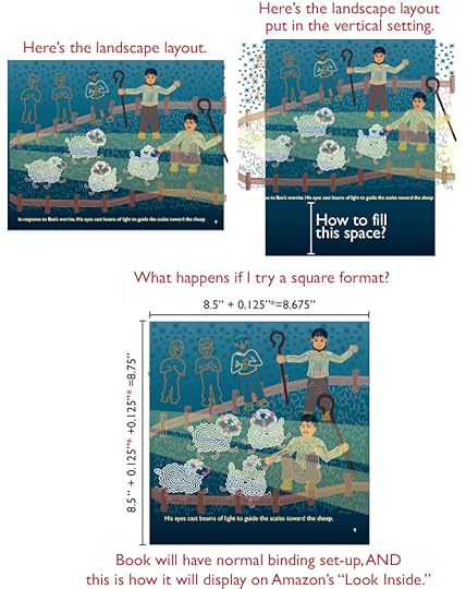
Initially, I thought about making it vertical U.S. Letter as it had originally been laid out back in 2005. But the formatting would entail much more layout restructure. Even if I could just delete what fell off the page on the left and right edges, there would still be a blank space at the top or bottom of the page (see top row, right image). As I mindlessly stared at the list of standard formats, I focused on one in particular: 8.5” X 8.5”, or square format? Interesting. Fascinating. Not only might it solve my “Look Inside” insanity, but also, the calendar-binding conundrum, the spine text disappearing act, would take less layout re-jiggering, and most importantly, it would address the “Alice doesn’t like landscape format” contradiction.
Indeed, it’s hip to be square.
#SCBWIparty
My book actually began as a vertical-oriented U.S. Letter format, but as previously mentioned, the horizontally long shape of Centipede Dragon seemed to work better in landscape orientation. But I never liked this format because of the shelving dilemma I mentioned in an earlier post: it either sticks way out of the shelf, or, if you shelve it vertically, you can’t see the spine to read the spine text.
Now faced with the added dilemma of the “Look Inside” problem, I considered my options:
A) Leave it and deal with it.
B) Grin and bear it, and change the format.
C) Give up and cry.
You’ll be proud to know I did NOT choose C. The driving force was NOT integrity to quality, rather, that I already had an uphill battle coming with marketing the book.
Initially, I thought about making it vertical U.S. Letter as it had originally been laid out back in 2005. But the formatting would entail much more layout restructure. Even if I could just delete what fell off the page on the left and right edges, there would still be a blank space at the top or bottom of the page (see top row, right image). As I mindlessly stared at the list of standard formats, I focused on one in particular: 8.5” X 8.5”, or square format? Interesting. Fascinating. Not only might it solve my “Look Inside” insanity, but also, the calendar-binding conundrum, the spine text disappearing act, would take less layout re-jiggering, and most importantly, it would address the “Alice doesn’t like landscape format” contradiction.
Indeed, it’s hip to be square.
November 17, 2015
Opposite land.
The world was finally my oyster! After “Operation Asian Conversion,” breaking spreads apart, tedious formatting for bleeds/gutter, and now the landscape binding dilemma, I had conquered all obstacles by utter perseverance!
Fortunately for me, the folks in the forum didn’t stop there. As I finished up my landscape page formatting, I began looking toward the next steps, such as the all-important marketing feature that Amazon offers: the “Look Inside” feature. Without an established name, a publishing house, a brick-and-mortar store to sell at, a formal critical review to bolster my book, nor even a marketing budget, the best weapon I had were things like “Look Inside.” In the very beginning I knew I had to take advantage of this vital marketing tool. I assumed oh-so naively that there could be no barrier, given that my publishing platform was an “Amazon” company.
In anticipation of setting up my “Look Inside,” I stumbled upon a forum that explained how to get around the improper display through the “Look Inside” feature on Amazon of self-published landscape books. Basically, “Look Inside” won’t work unless you don’t mind looking at the screen with your head cocked 90° to the right. And given that the viewer averages seconds per website, this cocking-head-to-one-side workaround was not going to fly.
But I’d already done all the work to format each of 32 pages, plus a cover page, to all the exacting specifications required for printing! I tried to convince myself, maybe it wouldn’t be so bad, maybe folks would find it fun and quirky to look at the book this way...
Who was I kidding? Only myself.
November 10, 2015
Final book reviews from Sept. 11 Science Friday Science books for kids.
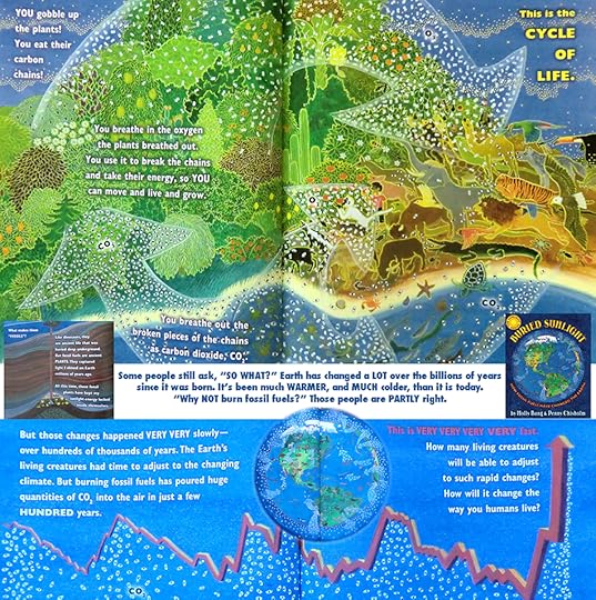
And the last of the books I'll be covering, as featured from WNYC's Science Friday Broadcast from Sept. 11, 2015: "Buried Sunlight; How fossil fuels have changed the Earth," written by Molly Bang and illustrated by Penny Chisholm.
Author Ms Bang frames the changes in the activity in a much more basic context. We are being pushed and pulled by media, by politics, and even contradicting evidence from the scientific world, to believe that perhaps it is not human activity that has caused great damage and peril to the planet. Earth has undergone cycles of warming and cooling throughout its history. Therefore, what does it matter if indeed the Earth is now slowly warming?
The fundamental difference now is that before, those warming and cooling periods took place over hundreds of THOUSANDS of years. Yet the latest measurable changes have occurred in a mere two hundred years. What has been proven in history is that these temperature changes had devastating consequences.
So, given that there is a significant change occurring NOW, and, in a blink of an eye relative to the other temperature fluctuation periods, doesn't it stand to reason that we should make greater efforts stewards for this Earth?
A straightforward, cogent take on our beloved Earth, and the choices we can make to shepherd it into the distant future.
Thanks for letting me share these books with you!
November 3, 2015
Third book review from Sept. 11 Science Friday Science books for kids.
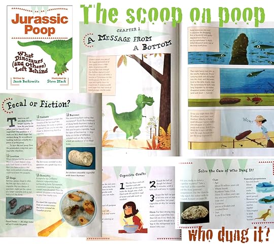
I was and still am a little hesitant to post this review only for its content, but the way it's "handled" is definitely noteworthy, so here it is: Jurassic Poop, by Jacob Berkowitz.
Now the reason I chose this book to review, aside from difficulties in obtaining some of these books from the library, is because I applaud the way the subject matter of this book is handled. There's a great balance between use of humor, without being too "fart-joke-like," blended in with some real tips about the scientific process. Being observant, using deductive reason, and having a thirst to solve mysteries and learn about our past lives, is at the foundation of this book. Once you get past the smelly content.
This balance is carried through in the use of cartoons and photography, while highlighting real scientists for kids to look up to. So, a word of caution with this book before you peruse it: either do it on an empty stomach, or not leisurely morning reading over breakfast!
October 27, 2015
Lefts from rights.
All of us have seen and even own a landscape format picture book. Maurice Sendak’s “Where the Wild Things Are,” for example, is a landscape picture book. This is NOT NEW.
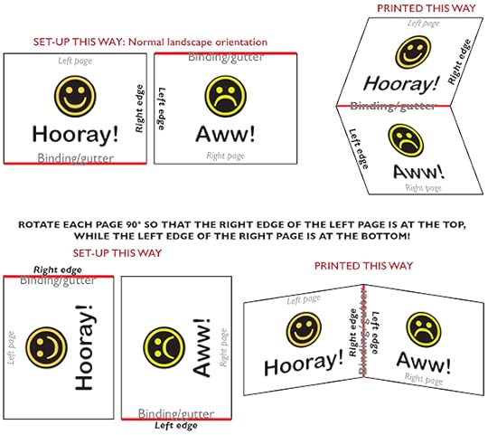
For all my formatting work to date, I discovered that landscape-format books are not, in practice, possible to publish within the self-publishing platform of the company I chose (which was the #1 top-rated self-publishing platform in 2014, FYI). After searching through the forums, I discovered THE workaround that many SMART folks were able to work out and subsequently shared. You basically have to think of the book pages as calendar pages bound at the top/bottom edges (see top row images). The pages are oriented such that upper page’s bottom edge and the lower page’s top edge meet to make the binding. In a picture book, the RIGHT edge of the LEFT page, and the LEFT edge of the RIGHT page meet to make the binding. In general, most of us do NOT want our books to be oriented like a calendar, opening vertically with image on top and calendar grid on bottom. SO, in your original software program where you created your pages, you must rotate the actual document SET-UP 90° so that your RIGHT edge of your LEFT page is now your top edge, and your LEFT edge of your RIGHT page is now the bottom edge.
Why, in the age of developing rovers for Mars and the creation of the world wide web, we cannot manufacture a book in its proper orientation on the self-publishing platform, is BEYOND my capability of understanding or explaining. But this is what worked....
OR DOES IT?
October 20, 2015
Book specs part deux.
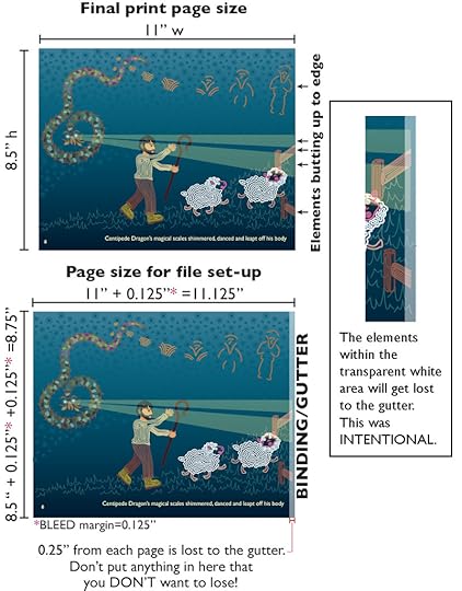
Now that we got past Step 1 of creating single-page files, let’s get to Step 2: Bleed margin.
The page size in your file needs to have a tiny bit of width and height added to 3 of the sides (outer edge, top, and bottom) that eventually get trimmed off to your final page size. This is called a bleed, and should not affect the size or placement of the content within the page. It only makes the overall page size set up in your file bigger than your final printed size. For example, say you had a 4x6 photo mounted onto a piece of paper that is 5x7. But your picture frame is 6 x9, so the 5x7 paper won’t cover the entire background in the frame. So you mount the photo onto a 7x10 paper, which you then trim down to 6x9. Now your paper covers the background entirely. This is essentially what you are doing for your pages.
And then there’s Step 3: Gutter margin. The fourth edge where the two pages meet where bleed margin was NOT added, faces into the gutter, or the binding, of the book. But if the image content goes all the way to this edge, that part of the image will get lost INTO the gutter, because a portion of paper is used to make the binding. So the image must be sufficiently outside this gutter margin to avoid losing part of the image to the binding. However, if the image is moved too far out, there will be a blank area in the middle of what is supposed to be a continual image. Personally, I didn’t want a gap in a single page or a spread image, so I decided to set up the page where my content would fall just beyond the gutter margin. Then I’d lose a tiny amount of image on purpose, but would ensure that no gap in the image spread would occur.
Another month of my life would be devoted to getting to this stage. NOW was I ready to go?
October 13, 2015
Reviews of books that are not Centipede Dragon-centric!
I've totally gotten myself so far off sequence that I am double booking booking this week's post. If any of you follow my AYC Illustration and design posts, I featured 2 of the 5 science books for kids that Science Friday reviewed on Sept. 11, 2015. I will re-post them here to this page, because after all, they are children's books!
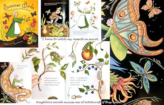
The first book, Summer Birds, features a little known, unofficial female scientist who was the first to observe that butterflies do not spontaneously generate from mud. She further documented her findings in beautiful illustrations, thus making her also a scientific illustrator! Oh, and did I mention she was born in 1647, so just imagine the true significance of what this meant!
The illustrations that accompany this story exude a traditional, folk-like feel. But the bold black backgrounds coupled with daring and inventive layouts, echo the personality of the subject herself. My favorite description of her is the quote included in this collage from this book.
Though a picture book, a wonderful “Historical Note” is included for that all important 2nd audience to enjoy. Even if you're not into bugs, pick this one up, and suggest it as a reading list item at your local elementary school!
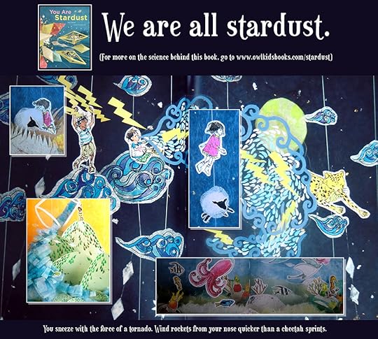
The 2nd book is by Elin Kelsey, a Ph.D. in environmental science education, who created this book as a jump-off point for teachers, providing lesson plans that integrate the common core standards of learning with activities centering on the statements made in this book.
The artwork is NOT the typical illustrations you'd expect in a picture book. Rather, they are photographs of elaborate, multimedia dioramas that frankly blow this book far and away from others.
This book is an ode to how we are intricately connected to the fabric of the Earth. Through its framework we follow particles from the big bang through to the arrival of our existence on Earth, meandering along poetic stanzas that weave scientific facts into the explanation of the singularity of the our planet's ecosystem.
But the innovative beauty of the artwork makes this book special. I fervently wished they had published this book in pop-up form.
Thanks for all these continued interruptions. Hope you check these books out!
October 6, 2015
Book size: Landscape has its privileges. No wait, scratch that...
It took nearly a month for me to complete “Operation Asian Conversion.” I confess this because it’s not that straightforward to draw Asian features, just as it’s not easy to draw the features characteristic of any ethnicity.
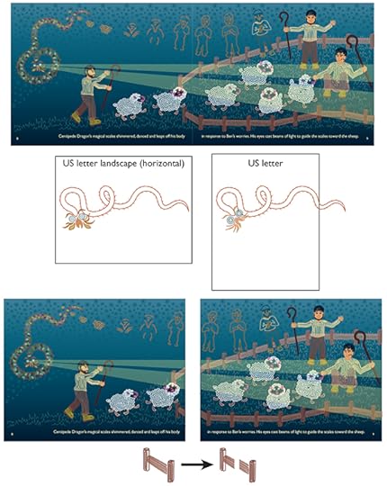
When content changes were “done,” I finally got to the nuts and bolts of the self-publishing process. The first thing to do was set up the pages for submission. I had originally made each file a spread made of two landscape-oriented U.S. letter-sized pages (top image). How did I even decide on this format? This was dictated by having a long, skinny protagonist (middle image). One important word of advice: use an industry standard size. There are plenty to choose from and will save you infinite headaches in future.
Unfortunately, they wanted each page as a separate file. So, step 1 was to create two separate documents from each double-paged spread (bottom image). This wasn’t terribly easy because I had drawn the imagery as if the two-paged spread was one piece of paper. I had to essentially “cut” pieces of imagery apart, like the fence pieces in this example.
Next post we’ll get to more technical production specifications.
September 29, 2015
Self-publishing as a means to an end, and not the end!
I get a lot of e-mail notices from the myriad lists, posts and tweeting folks to which I follow or subscribe. I'm sure I've missed a lot, but this great article came through the other day that I'd like to share, since it is relevant to the publishing journey I have been sharing with you.
http://bigstory.ap.org/article/708a5f...
I think fears about being stigmatized once you self-publish have been founded simply because self-published work had been so very....bad. Bad in quality of content, and bad in production. But there is also something to be said about those folks who see a need for some type of publication to fill a specific void and then create that something for that specific purpose.
That is the back story behind this book, which was self-published by a Psychologist, and has now been picked up by Penguin Random House.
Self-publishing is a means to an end, but never discount that the traditional publishing route is closed off for you. Both are ways to get your work out to the masses. Shouldn't matter in the end which way you choose, so long as you get it out there.


