
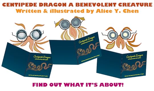
Two posts in one! Book Launch Party is here, and It’s hip to be square.
What follows Black Friday and Cyber Monday? Book Launch Party Tuesday of course! Come check out my Book Launch page on the Society of Children's Book Writers and Illustrators (SCBWI) site and ENTER a contest for a PRIZE!!!!
#SCBWIparty
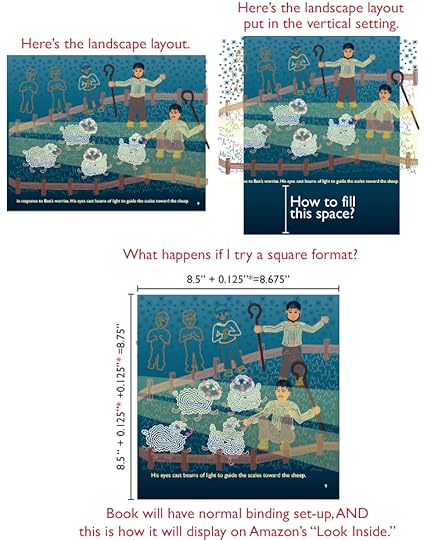
My book actually began as a vertical-oriented U.S. Letter format, but as previously mentioned, the horizontally long shape of Centipede Dragon seemed to work better in landscape orientation. But I never liked this format because of the shelving dilemma I mentioned in an earlier post: it either sticks way out of the shelf, or, if you shelve it vertically, you can’t see the spine to read the spine text.
Now faced with the added dilemma of the “Look Inside” problem, I considered my options:
A) Leave it and deal with it.
B) Grin and bear it, and change the format.
C) Give up and cry.
You’ll be proud to know I did NOT choose C. The driving force was NOT integrity to quality, rather, that I already had an uphill battle coming with marketing the book.
Initially, I thought about making it vertical U.S. Letter as it had originally been laid out back in 2005. But the formatting would entail much more layout restructure. Even if I could just delete what fell off the page on the left and right edges, there would still be a blank space at the top or bottom of the page (see top row, right image). As I mindlessly stared at the list of standard formats, I focused on one in particular: 8.5” X 8.5”, or square format? Interesting. Fascinating. Not only might it solve my “Look Inside” insanity, but also, the calendar-binding conundrum, the spine text disappearing act, would take less layout re-jiggering, and most importantly, it would address the “Alice doesn’t like landscape format” contradiction.
Indeed, it’s hip to be square.
#SCBWIparty
My book actually began as a vertical-oriented U.S. Letter format, but as previously mentioned, the horizontally long shape of Centipede Dragon seemed to work better in landscape orientation. But I never liked this format because of the shelving dilemma I mentioned in an earlier post: it either sticks way out of the shelf, or, if you shelve it vertically, you can’t see the spine to read the spine text.
Now faced with the added dilemma of the “Look Inside” problem, I considered my options:
A) Leave it and deal with it.
B) Grin and bear it, and change the format.
C) Give up and cry.
You’ll be proud to know I did NOT choose C. The driving force was NOT integrity to quality, rather, that I already had an uphill battle coming with marketing the book.
Initially, I thought about making it vertical U.S. Letter as it had originally been laid out back in 2005. But the formatting would entail much more layout restructure. Even if I could just delete what fell off the page on the left and right edges, there would still be a blank space at the top or bottom of the page (see top row, right image). As I mindlessly stared at the list of standard formats, I focused on one in particular: 8.5” X 8.5”, or square format? Interesting. Fascinating. Not only might it solve my “Look Inside” insanity, but also, the calendar-binding conundrum, the spine text disappearing act, would take less layout re-jiggering, and most importantly, it would address the “Alice doesn’t like landscape format” contradiction.
Indeed, it’s hip to be square.


No comments have been added yet.


