
Alice Y. Chen's Blog, page 6
March 29, 2016
The difference between ISBN, ISBN and ISBN.
I was going to try to group some of these self-publishing set-up details because these posts could become mind-numbing. But a big reason I am writing these posts is to prepare you for the level of detail you will be facing should you decide to self-publish in the future. So, I think I’ll take a different tack, and maybe feature a few of the issues I encountered that to this day, still kind of confound me.
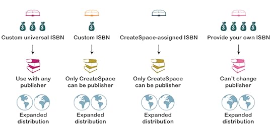
The first step, as mentioned previously, is that you need an ISBN. Now, the ISBN is inextricably tied to the identity of your book, and how people, institutions, and vendors find your book. One important point I read is that having ONLY ONE ISBN associated with your book is the best way to go, because if several ISBN numbers are associated with your book, the person, vendor or institution won’t know which ISBN to choose, and therefore may get, say, a version of your book that they did not want.
Why would you even have more than one ISBN, you ask? One possible scenario is that you self-publish, and then your book is picked up by a traditional publisher. Depending on the ISBN you chose to self-publish, your traditional publisher may not be able to use that same ISBN.
When you look at my chart, you see that there are two choices that incur little (Custom ISBN) to NO (CreateSpace-assigned ISBN) start-up cost. In starting up, you have to invest money in order to self-publish, so keeping costs down is ideal. However, should the aforementioned scenario occur, you will not be able to transfer these two types of ISBN, which means you’ll have one from self-publishing and one from the traditional publisher. You could spend hundreds to thousands of dollars on all these different choices; deciding whether or not you think it’s worth the investment is not an easy task.
Also, did you notice that all the ISBN choices have expanded distribution available? What is a distribution channel? Traditional publishers have to have a way to get their books out to stores, so they use these channels (will get into this more next time). This doesn’t necessarily mean it WILL be distributed through these channels, but simply that it will be available. Big difference.
Expanded distribution however does not include the channels that libraries and academic institutions utilize. They have their own distribution channels requiring a separate ISBN!
Ultimately, my reasoning was to give my book as many future options, knowing if necessary, I could assign a new ISBN to it in order to gain access to the academic side of the retail equation. I therefore chose the custom universal ISBN to give myself some flexibility, which I suspected would be key in this process moving forward.


March 15, 2016
Bowker, LCCN, and “Data that provides information about other data…”
I can’t believe we are finally at this point in the story, but here we are! I felt confident that there could be NO technical issues left to impede uploading and publishing.
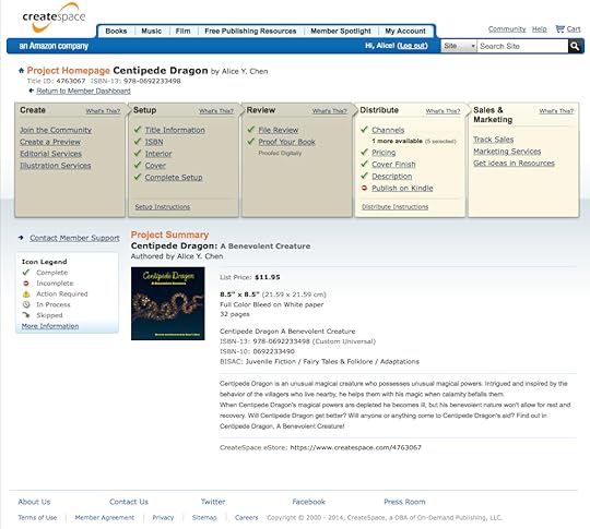
Take a look at this page, for this is the page you will encounter once you decide to self-publish. See that row of beige and yellow boxes up top? You get to go through every last item in each of those boxes. The darker boxes show when you’ve completed the steps, so if you don’t complete them in one sitting, then you know where to pick up next time you work on this.
One of the first steps is to purchase an ISBN, which you do through an association called Bowker. You will fill out information about your book; these thankfully are straightforward questions. Then you get two ISBNs: a 10-digit one, the ACTUAL one, and a 13-digit one that is printed with a barcode on the back of your book.
Then there’s the meta data, perhaps the word with the silliest definition I have ever read. However, it’s probably the most important step you can take with your book set-up. Why? Because any search that takes place going from any entity, be it an individual or an academic institution, will use this meta data to FIND YOUR BOOK and present it to the searcher. Now you can imagine how, now after 3+ months of working on the corrections to the content and the technical specs for this book, that at this point I wanted to hurry up and be done. Instead, I took a breath and started very deliberately filling out this part as best I could. This is a difficult process because not only do you want to introduce broad terms like children’s, picture etc., so that more searches will initially include your book, but you really want to be targeted about the more descriptive terms (luck, Miao/Hmong, kindness, community) you include so that your book will be categorized and subsequently found by the person or entity who really wants to find you.
Another important step that might NOT have occurred to you is to register for copyright. You cannot use the copyright symbol unless you can show proof that you’ve registered. And besides, it’s a quick, low cost step to take.
Next post, we’ll get to more set-up details, like distribution channels and LCCN numbers.
March 1, 2016
Down in the dumps, or gutters
OK, let’s review what issues we’ve solved thus far: we’ve straightened out our format, we’ve solved our muddy color issues, we’ve dealt with transparency woes, and we’ve even gotten philosophical about the virtues of digital illustration techniques. So, where to next?
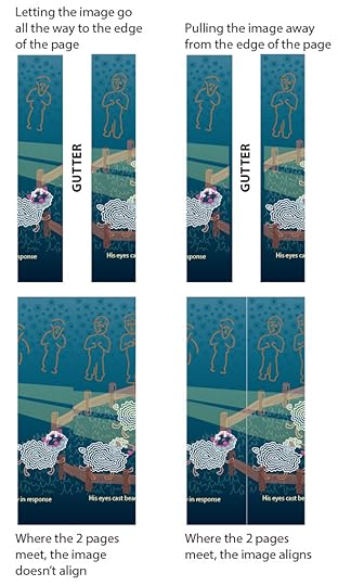
A long time ago (October 20, 2015) we discussed that I had to break up each spread image I had originally created into its two separate pages. This was a specification of the submission process, so I did what they told me to do. Now as you all know, plenty of books contain illustrations that spread across two pages, but you’ll also note that a book has a binding, where the pages get held together. This means a part of the actual page gets used in the binding. So, if my illustration went all the way to the right edge of the left-hand page, and the left edge of the right-hand page, then that piece of the illustration would get gobbled up into the binding. This particular edge had to be handled differently than the bleed margin, as discussed in the October 27, 2015 post.
With the bleed margin, I got to add a bit to the overall size of the page on 3 sides: the outer edge of the book, the top, and the bottom. This would allow for the page to be trimmed down to the final 8.5” x 8.5” size, resulting in the color of the background covering the entire page.
Now with the gutter, I had to move the image AWAY from the edge about a quarter inch, while allowing the background to extend the entire width of the page. This is because this portion of the page will be used to glue the book together. If I didn’t do that, the picture itself would be disjointed in the middle (left), rather than seemless (right).
HOORAY! Now, all we have to do is repeat this process on 30 more pages….hooray…
February 16, 2016
Photoshop is HIGH MAINTENANCE.
Let’s finish up our discussion on Illustrator versus Photoshop before we get back to the process of self-publishing.
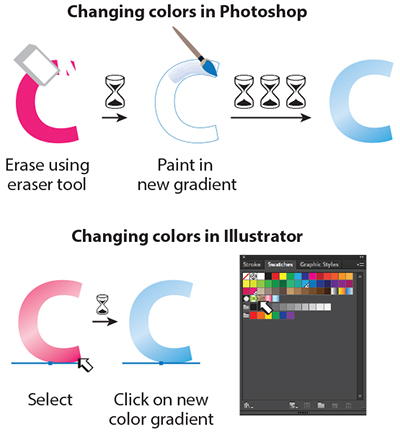
In the beginning, Illustrator was a great 2D graphics tool. In graduate school, I learned to use it as a set-up to my illustrations. This illustrator file could be brought into Photoshop, where I could then do the “real” painting, adding form through highlights, core and cast shadows, and airbrushing in all the beautiful variations in color that occur when light hits an object. But what happens when I needed to change, say, the color of an object in the image?
Because we used Photoshop in place of traditional painting, we used the tools in the same way we’d do so with traditional techniques, like airbrush. First, I’d make a frisket, which is like a stencil; in Photoshop this was called a mask. Then, I’d adhere the frisket on my board, or, make a selection in Photoshop. Finally, I’d grab my airbrush, or airbrush tool, pour my paint into the reservoir, or select it in the color palette, and then paint. Excellent!
Now, traditionally, if I want to erase what I’ve done and re-paint it, I’d have to attempt to erase it without damaging the surface of the medium (paper, canvas, illustration board). Bad things happen when the medium’s surface is damaged, like uncontrollable bleeding and splotchy patches. Then I’d need to clean out my airbrush reservoir, re-apply my frisket, and finally re-paint the new colors.
Photoshop makes this process much easier, since I can specifically select the area I want to erase with the mask I had already created, and erase that area. Then, with that area still selected, I can re-airbrush all the bumps and dips on the surface, all the highlights, core and cast shadows, and reflected lights to render that surface to look real. Kind of a pain, but still easier than traditional.
In contrast, with Illustrator I can also create these undulations, core and cast shadows and highlights using shapes. If I need to change colors, it was a matter of selecting the shape, and then clicking on the new color in the swatch palette. And scene.
Illustrator, from the beginning, was my choice, because I just KNEW that I would be making plenty of changes to the illustrations, the color scheme, the background colors and textures, the layout, everything.
Next up, we’ll get back to the specific production technicalities with gutters!
February 2, 2016
Advantage...Illustrator
So, the question I posed last post was, why did I choose to make my drawings in Adobe Illustrator versus Adobe Photoshop?
The obvious answer is that I had no way of knowing that in the production of the book (since I never expected to self-publish), that transparencies would cause such a headache. But what I’ve learned in being an Illustrator for almost 2 decades now, is that the flexibility with Adobe Illustrator far exceeds that of Photoshop. So when time is the essence, as well as the ability of an illustration to be tailored to another use, well, Illustrator wins out.
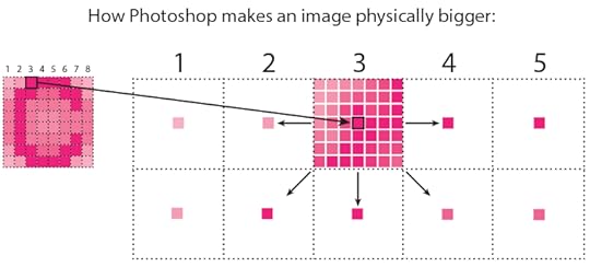
First, let’s talk about scalability, using this very crude example of what happens when you try to blow up the size of a small picture originally created in Photoshop. We learned before that Photoshop stores the image as pixels in a grid. If the original picture was small, say 1 inch by 1 inch, and you set your document at 100 dpi, that means within that 1x1 inch square, you have 100 pixels of information. The more pixels you pack into that square, the better detail and more subtlety in color shifts and changes you’ll achieve. But you’ll also have a much bigger file to save!
Now, if you decide to make that picture 2x2 or 3x3 inches, you have to distribute those 100 pixels over a canvas that is now much larger than your original 1x1 inch canvas. So original pixels #3 and 4 that used to be next to each other now have empty space in between them.
What Photoshop then does is uses a clever algorithm to make up the pixel color in between each original pixel. So in this image, each original pixel is ideally placed in the center of the now much enlarged grid square. With all the empty space in between each original pixel, the algorithm looks at the next original pixel in closest proximity to the first one, and fills in each empty pixel space in between with a color that is also “in between” the colors of each original pixel. Looking at pixel #3, the color of each pixel moving left toward pixel #2 becomes lighter, to match the pixel color in #2. In moving right, the pixels in grids #3 and 4 are the same color, so, the pixels in between are also the same color. The algorithm is much more clever though, because it has to sample the original pixels in closest proximity in ALL directions. Hence, it “recreates” the shifts in color in this way.
But the algorithm isn’t perfect either, and therefore, often as good as the theory sounds, the results are not so pretty. Sometimes the result is muddiness, fuzziness, and just a lot of noise within the picture. Not so with Illustrator, which uses math formulas to store its information and is therefore not affected quality-wise when you want to scale up or down.
One point for Illustrator!
Next, we’ll talk about what happens when we try to change the image itself.
January 19, 2016
Photoshop to the rescue!
Thanks for adapting to my new every other week posting schedule for the next few months!
So, HOW did I get around having to manually create all those regions overlapped by the transparent eye beam? Clearly I love this book enough to go through what I had gone through thus far, but frankly I don’t think ANYTHING would be worth this amount of painstaking work. Sorry.
I did the only thing I could think of, and that was to cheat.
The fundamental difference between the programs Adobe Illustrator and Adobe Photoshop is the method by which the artwork that you are creating, is “created” by each software’s programming. Adobe Illustrator is math-based, so when you draw a line, you describe it by its color, its length, and its quality through numbers and coordinates. If you recall from math class, a line that starts out thick, ends up thin, is really wiggly here, or smooth there, is described by x- and y- coordinates at each point at which it changes direction. So at MINIMUM, a line can be described as such:
Start point: x=3, y=10; end point: x=7, y=28.
Now, add in a bunch of other numbers/equations to describe the thickness/thinness, the color, etc, et voila! You get how the information about a line gets stored for Adobe Illustrator! These are called vector formulas.
Imagine what those formulas look like with a drawing filled with lines, shapes, gradients, shadows, highlights, etc. etc.
Now let’s take a look at Photoshop (right side of image). When you draw in Photoshop, pretty much the only thing Photoshop cares about is: What color is that particular square in the grid of your canvas? That’s it.
So, when it came time for me to figure out how to represent all those regions that a change in color occurs due to the eye beam overlap, it made sense just to pixelate the entire picture by “converting” it to a Photoshop image.
You may be wondering why I didn’t use Photoshop in the first place? Answers, next post!
January 12, 2016
Schedule hiccups
Good Tuesday morning all!
As a reminder, my posting schedule will be reduced to every other week over the next few months. So I'll be back on Tuesday, January 19!
As a reminder, my posting schedule will be reduced to every other week over the next few months. So I'll be back on Tuesday, January 19!
January 5, 2016
I can see right through you…but only digitally.
I hope everyone enjoyed some great holiday celebrations. Happy 2016, and let’s get back to our journey to self-publishing. One note, I may be on an altered post schedule over the next few months, so please stay tuned.

If we were trying to keep track of the real time I spent with addressing each of these technical issues, there was probably another week spent on fixing the gradients and testing them out with the PDF version of the files. But I got all the troublesome gradients switched, and in my 68th time running it through the pre-flight software (this is a program that catches any issue the actual printing process will have with your file, before you send it to the printer. The printer must provide the actual specs, as my platform did), I came upon YET ANOTHER error:
“ This file contains spot colors and transparency. This may produce unexpected results if converted to process outside of Illustrator.”
If you notice in the left-hand image (that I keep using as it seems to have had every possible error contained in it alone), Centipede Dragon’s two eye beams pass over the fence, the sheep, and the shepherd. The reason you can see what’s underneath is because I applied a transparency to the eyebeam. The right-hand image shows how the beams would look without the transparency.
Unfortunately, this is a mathematically-derived effect that the software performs for our monitor viewing enjoyment. But the printing process failed math, and therefore, cannot re-create the transparency.
One solution was to take every overlapping bit of that is a different color, actually cut that piece out, and create a new color that simulates the old color being passed over by the “transparent” color. Basically, the original color is altered due to the color of the beam. I cut that piece of the sheep face, or the sheep wool, or the leg, the fence post, the grass, whatever, and make a new color using the Cyan, Magenta, Yellow and Black percentages until I match the color created by the tinting of the beam’s color.
Now, do you think at this point I really want to do that?
December 22, 2015
Happy holidays
From the village nestled by lake and mountains to you, wishes for peace, good health and joy in the new year and beyond.
We'll be back on Tuesday, Jan. 5, 2016!
We'll be back on Tuesday, Jan. 5, 2016!
December 15, 2015
CMYK versus RGB
After switching up the two colors and trying new combinations of them ad nauseam, I finally noticed that on pages where I used only a solid color in the background, that there didn’t end up being a color issue. So I simply tried a single, or 1-color gradient, which is one color at one percentage value on one end (e.g., 100%) and the same color at a different percentage at the other end (say 75%). And the result was successful, no more muddy gray in the midst of the gradient!
So what the heck was going on?
Here’s what I understand. Color reproduction has undergone an amazing developmental history. We started, for instance with a Crayola 8-pack of crayons, before we were able to manufacture 32, and then 64 distinct colors. What we can recreate on the monitor is a color range that is far greater than what our color pigments can actually reproduce on paper. What is shown on our computer screens, the visible spectrum, represents how light truly “colors” everything it reaches, and does so in such variation depending on its strength, its proximity, any impurity in the medium through which it travels, and, what may be within its path. Not only that, two objects that are the same distance from the light source may be colored very differently from one another, depending on the angle upon which the light hits the object. And then, what color is the object itself? And THEN, is it sitting on a surface? What is the surface made of? What color is it?
Our visible spectrum is thus capable of displaying to us every conceivable hue of color and color variation. With print colors, however, light is no longer the driving factor that determines color. It’s actually chemistry that creates the array of hues we can print.
Here are two examples of how this visible color spectrum versus print color spectrum differs. There is a huge difference between RGB additive color, created by light emission as monitor screens do, versus CMY ink absorption on paper. This discrepancy between monitor screen color and print color is vast and problematic. What I realized was that I wasn’t always consistent in whether my file was set up as CMYK or RGB (WOW, rookie mistake!). So, that probably had a hand in my gradient woes. And likely, someone far better trained than I could’ve figured out the color combinations that would allow for printing a 2-color gradient. But this 1-color gradient seemed to do the trick, and after months of technical issues, I stuck a fork in the gradient problem.


