
K.M. Alexander's Blog, page 26
October 15, 2019
Ogilby: A Free 17th Century Road Atlas Brush Set for Fantasy Maps
“You come to a Descent sprinkled with Woods, whence by Loudwater, a small Village, (a Brook accompanying your Road on the Left) at 32’3. You enter High Wickham, seated in a pleasant Vale, a large and Well-built Town, numbering near 200 Houses, with several good Inns, as the Cathern Wheel, etc. Is Govern’d by a Mayor, Recorder, etc. Sends Burgesses to Parliament, hath a well-frequented Market on Fridays, and two Fairs annually…”
Outside of some slight language differences, that description of 17th century High Wycombe could be taken from any modern travel guide. It comes from John Ogilby’s 1675 book Britannia, Volume the First. Or an Illustration of the Kingdom of England and Dominion of Wales: By a Geographical and Historical Description of the Principal Roads thereof (the full title goes on much longer, and I’ll spare us all.) Britannia is, in essence, part road atlas and part travel guide—it also serves as the source for my latest brush set named after the man himself: Ogilby.
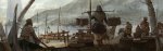
[image error]John Ogilby’s depiction of the road from Bristol to Exeter
While the depictions of British towns, inns, and valleys are charming, the actual maps themselves are a delight. They are unlike anything I’ve seen before. These maps place the traveler’s perspective front and center making for a much more intimate experience. Read bottom to top and left to right one can trace their route through the countryside. Windmills, wells, ponds, homes, and churches are lovingly depicted as well as are the small towns clustered around roads and random points of interest. Climbs and descents are documented as one would encounter them as they crossed the rolling countryside. The route will move, but barely, instead, significant turns are shown with subtle shifts indicated by the compass rose that rotates on subsequent “scrolls.” I thought this was an interesting solution to show more substantial variations in a road’s direction.
[image error]
Fiction has long had a fascination with the road story, and fantasy isn’t an exception. So it’s a wonder this sort of map hasn’t been attempted before. (Prove me wrong, if you know a book with this style of road atlas, let me know!) It’s so useful and such an interesting presentation. After spending some time with the plates and Ogilby’s descriptions, I knew at once these etchings would make an excellent brush set. Whether one is attempting to recreate an Ogilby-style road atlas or just using his various signs and symbols on a more standard map.
[image error]
As I worked, I realized that I would need to build this set off of multiple plates, and uh… the set sort of grew in the making. Ogilby is now my largest set ever. Inside you’ll find over 870 brushes (yes, seriously), including:
60 Homesteads
50 Manor Halls
10 Hamlets
60 Villages
10 Large Villages
20 Steepled Churches
70 Towered Churches
10 Priories
5 Unique Churches
20 Castles
20 Unique Settlements
10 Ponds
20 Rills/Streams
10 Rills/Streams w/ Bridges
20 Rivers w/ Bridges
20 Heath/Wetlands
20 Hills
20 Upslopes (Hills with space for roads to pass up them)
20 Downslopes (Inverted hills with space for roads to pass down them)
20 Unique Slopes
30 Scrub Lands
30 Leafy Trees
30 Evergreen Trees
30 Bushy Trees
10 Leafy Forests
10 Evergreen Forests
30 Bushy Forests
40 Windmills
10 Elevated Windmills
20 Beacons
20 Gallows
5 Wells
5 Springs
10 Quarries
10 Coal Pits
10 Lead Mines
10 Parks
10 Monuments
15 Unique Points-of-Interest
20 “Plain” Compasses
35 Standard Compasses
15 Complex Compasses
5 Combined Compasses
3 Boats
The button below links to a ZIP file that contains a Photoshop brush set (it’ll work in GIMP as well) as well as a set of transparent PNGs in case you’re using a program that doesn’t support Adobe brush files. I’ve separated them by type, Settlements, Points of Interest, Flora, Cartouches, and Landforms. They’re black, and they’ll look broken if viewed in Chrome, but trust me, they’re all there.
[ ! ] Bonus #1 – I’ve also included the option to download a blank and layered PSD of the scroll background used in Ogilby’s original maps. To save on file size, this must be downloaded separately. It also includes a transparent png.
[ ! ] Bonus #2 – I found more success mimicking Ogibly’s road styles in Adobe Illustrator. This will allow one to recreate the various styles of roads Ogilby uses across his maps quickly and efficiently. Like the Scroll background, this must be downloaded separately and it requires Adobe Illustrator.
Download the Ogilby Scrolls Background
Download the Ogilby Illustrator Road Brush Set
As with all of my previous brush sets, Ogilby is free for any use. I distribute my sets with a Creative Common, No Rights Reserved License (CC0), which means you can freely use this and any of my brushes in commercial work and distribute adaptations. (Details on this decision here.) No attribution is required. Easy peasy!
Enjoy Ogilby. Feel free to show me what you created by sending me an email or finding me on Twitter. I love seeing how these brushes get used, and I’d be happy to share your work with my readers. Let me see what you make!


October 12, 2019
Three Quotes from Edgar Allan Poe
Here in the Pacific Northwest, the nights have grown colder, the days shorter, and the leaves are starting to change. It’s my favorite time of the year. I figure it’s the perfect moment to share some of my favorite quotes from the king of gothic romanticism and inventor of the detective novel, Edgar Allan Poe.
“They who dream by day are cognizant of many things which escape those who dream only by night.”
“Words have no power to impress the mind without the exquisite horror of their reality.”
—The Narrative of Arthur Gordon Pym of Nantucket
“Experience has shown, and a true philosophy will always show, that a vast, perhaps the larger, portion of truth arises from the seemingly irrelevant.”
Do you have a favorite Edgar Allan Poe quote? Is there a story of his which you love? Let me know in the comments!
October 8, 2019
Raunch Review: District 9
Raunch Reviews is a series about profanity. Not real profanity, but speculative swearing. Authors often try to incorporate original, innovative forms of profanity into our own fantastical works as a way to expand the worlds we build. Sometimes we’re successful. Often we’re not. In this series, I examine the faux-profanity from various works of sci-fi and fantasy, judge their effectiveness, and rate them on an unscientific and purely subjective scale. This is Raunch Reviews, welcome.
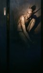
[image error]Raunch Review: District 9
The Author: Neill Blomkamp & Terri Tatchell
Work in Question: District 9
The Profanity: “Prawn”
Often when standard words are used as faux-profanity, they tend to rate poorly. But, today we’ll see where those common words can become an exception.
In the world of Neill Blomkamp’s District 9, alien refugees arrived on earth above Johannesburg, South Africa circa 1982. Thirty years later, the aliens live in an enormous slum outside of the city. The lessons in the story are immediately apparent; this is a movie about xenophobia, bigotry, classism, and segregation. Even the title, District 9, is a not-so-subtle reference to the notorious District Six that existed in Cape Town during South Africa’s apartheid. These themes are an undercurrent to the plot. It’s evident in the way aliens are treated, and we see it in the language surrounding them. The word “prawn” is used as a slur to refer to the bug-like aliens— “prawn” also happens to be the name for a large African cricket. One that’s considered a pest. The symbolism is easy to see.
Racist slurs and bigoted epithets are designed to dehumanize. The moment one can think of someone else as an “other” is the moment you no longer have to care about their well being. It removes empathy. It dissuades guilt. The victim ceases to be a person. We see that at work here. This is why the use of “prawn” in this context is so pernicious. By calling the aliens “prawns,” the humans in the story don’t have to see them as people. They’re just big bugs. Why do they deserve respect? Why do they deserve a voice? After all, they’re just a bunch of stupid criminals draining the resources of the state—they’re only pests.
One of the jobs of fiction is to shine a mirror on society, to force us to reflect on our successes and ponder our failures. Faux-profanity can do that as well, building a world and giving it a bite, and in the case of District 9, it does so with aplomb.
Score: [image error][image error][image error][image error][image error] (5.0)

October 7, 2019
Vintage Halloween Costumes Were Creepy
For the last few years, I’ve been collecting old photos of vintage Halloween costumes—early to mid-19th century, mainly. Despite their earnestness, there’s something deeply unsettling about many of them. The homespun approach only seems to amplify their eerieness, and I find that delightful. That’s not something modern costumes have really been able to replicate.
Since it’s 2019’s spooky month, I sorted through my collection and assembled my favorite for a gallery. None of the photos below are mine. Most are old enough they should be in the public domain. If something looks or seems amiss, please let me know, and I’ll happily correct it. You can click on any photo to view it larger.

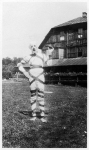
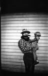


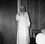


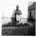


If you enjoy these images and want to see more, I highly recommend checking out Ossian Brown’s book Haunted Air. It collects some of these and many more anonymous Halloween photographs from 1875–1955. It’s weird and wonderful and perfect for October.
October 1, 2019
Revisiting My American Horror Story Title Rankings… Again.
Two years ago, I sat down and ranked all seven of the title sequences for FX’s anthology horror series American Horror Story. While I’ve never been the most die-hard fan, I’ve always been drawn in by its visuals and appreciated how well they set the mood of the show.
Recently, FX released American Horror Story 1984—the series ninth season. And, with a new season came new titles. So, once again I’m revisiting my rankings. Which opening sequence reigns supreme? How well did 1984 rank? See my updated list here.

September 26, 2019
Visual Inspiration: Sam Hogg
My readers know that I am an enthusiast of rich well-imagined worldbuilding. So when I stumbled across the work of artist and writer Sam Hogg, it’ll come as no surprise that I found myself enthralled. Her concept work is excellent, but I’ve become a bit obsessed with her high-fantasy project, The Whaler Girl.
This is visual worldbuilding at its best. Hogg captures and constructs a rich tapestry of a setting and inhabits it with fully imagined places, creatures, and characters. It’s something I strive for in my work, and here it feels so effortless which only makes it more enthralling and inspiring. These locations and characters don’t come across as templates, they feel like real people, and we can see hints of their story playing throughout the work. The sense of place is palpable and the shifts in style only cement that further, we’re exploring a world after all and worlds are not limited to a single style. As I moved through the project I found myself eager to learn more. I want to know all about Eidy’s story, and Saul’s troubles, and how a young whaler girl from Varlsbeyn ended up as a pirate courtesan. You will too.
With Sam Hogg’s permission, I’ve shared a few of my favorite pieces below. (Honestly, it was really difficult choosing, for each of these there were at least four more.) You can click on any image to view it larger.


This is just a small fraction of The Whaler Girl. You can see much more of the world and Hogg’s work on her website. Be sure to join me in following her on Twitter. Don’t forget to follow her excellent Instagram account, not only does she share work frequently, but it’s also often accompanied by evocative vignettes that only adds to the depth and richness of the story. Finally, you can buy prints of all this work from her store and hang the world of The Whaler Girl on your walls.
If you like Sam Hogg’s work, be sure to check out some of the other artists who I’ve found inspiring in the past. While there’s certainly a theme to the art that inspires me, you’ll find lots of different styles, tones, and moods.
Marilyn Mugot
Brian Coldrick
Filip Dujardin
Sebastien Ecosse
Zhichao Cai
Yuri Shwedoff
Jordan Grimmer
Kuldar Leement
Marc Simonetti
Anthony Wolff
Robin Olausson
September 24, 2019
It’s National Voter Registration Day
It’s the fourth Tuesday in September, and here in the United States, that means it’s National Voter Registration Day! Voting is an essential part of our democratic process, and everyone needs to register so they can exercise their power and make the voice of the people heard.
There are a few ways to register, but here are a few of my favorite resources:
Vote.org
This is my favorite. Here you find tools to register, and you can check the status of your registration. Be sure to do the latter, some states occasionally purge voter rolls for inactivity and people can get lost in the shuffle.
How to register to vote #RegisterToVote
Google has built a handy tool to help you figure out how to register in your state. Just simply search for that phrase (or click the link above) and all the information is at your fingertips.
Rock the Vote
This nonprofit and nonpartisan organization focuses on increasing the turnout for younger Americans and has been around since 1990.
It’s worth noting that only 38 states allow online registration. Here’s the official list. Is your state missing? Do the leg work, register, and then elect leaders that will make online registration official. It’s 2019 for goodness sake.
Finally, as I’ve said before, today is an appropriate day to restate that anyone trying to prevent or making it difficult for citizens to vote are the bad guys. In an era of voter disenfranchisement, suppression, and gerrymandering, the people must step up and elect leaders that fight for the rights of the citizenry. Do your duty: register and vote.
September 22, 2019
Be a Sadist
“Be a sadist. No matter how sweet and innocent your leading characters, make awful things happen to them—in order that the reader may see what they are made of.”
One thing I like about this quote is how it challenges both the character and the reader to discover “what they are made of.” That “they” can work on multiple levels—making this quote both straightforward and yet layered.
Interestingly enough, this is just one of Vonnegut’s eight tips for writing (number six, specifically.) He’s not the only writer to dish out eight tips—seems like a comfortable number for a lot of us. You can read all of Vonnegut’s eight and the eight tips from other great authors over at this post.
September 20, 2019
Four Notes
What do Gregorian chants, Lion King, Star Wars, It’s A Wonderful Life and The Shining have in common? The Dies irae. A particular little four-note melody from early Minor Mode chants which pop-culture has coopted as the music of suspense/death/horror. Vox breaks it down, and it’s fascinating:
September 17, 2019
Van der Aa: A Free 18th Century Cartography Brush Set for Fantasy Maps
History is rife with “impregnable” walls and it’s a long list full of failure. The ancient Wall of Amurru didn’t last long, invaders got around the Great Wall of China (many times), and the Walls of Constantinople couldn’t stop the Ottoman forces. And that’s only three examples. The record goes on and on (Berlin, Hadrian’s Wall, Walls of Ston, the Red Snake, etc.) and we see the colossal scars they leave behind all across the earth.
With that in mind, I’m happy to present a new set based on Mingrelie autrefois Colchis by Dutch cartographer and publisher, Pieter Van der Aa. A beautifully rendered map of the Mingrelia region of northwest Georgia complete with, you guessed it, a wall. (The Kelasuri Wall to be precise.)
That’s right, you too can let your arrogant fantastical kingdoms erect a border wall! Watch as they bankrupt the royal treasury and overextend their defensive forces! Finally, shake your head as the barbarians invade anyway and the whole ordeal proves once again to be a monumental waste of effort and resources. Hey, it’s drama, and at least someone gets a tourist attraction out of it. Think about it, future generations of hotel owners will thank the ancient paranoid rulers for their ignorance.
Van der Aa isn’t my most extensive set, nor is it my most complex. But what it does, it does rather well. Because of the map’s size, the brushes tend to run a little larger than other sets (the biggest is over 1000px wide), and the settlements and landforms have a very unique style. Lots of little details in the settlements and craggy mountains. I think you’ll like it.
Inside Van der Aa you’ll find over 180 brushes, including:
11 Hamlets
1 Elevated Hamlet
30 Villages
7 Elevated Villages
2 Unique Villages
30 Towns
12 Elevated Towns
8 Large Towns
3 Unique Towns
3 Towers
25 Mountains
25 Mountain Ranges
3 Unique Mountain Ranges
25 Forests
4 Walls
1 Well
2 Cartouches
The button below links to a ZIP file that contains a Photoshop brush set (it’ll work in GIMP as well) as well as a set of transparent PNGs in case you’re using a program that doesn’t support Adobe brush files. I’ve separated them by type, Settlements, Flora & Cartouches, and Landforms. They’re black, and they’ll look broken if viewed in Chrome, but trust me, they’re all there.
As with all of my previous brush sets, Van der Aa is free for any use. As of July 2019, I now distribute my sets with a Creative Common, No Rights Reserved License (CC0), which means you can freely use this and any of my brushes in commercial work and distribute adaptations. (Details on this decision here.) No attribution is required. Easy peasy!
Enjoy Van der Aa. Feel free to show me what you created by sending me an email or finding me on Twitter. I love seeing how these brushes get used, and I’d be happy to share your work with my readers. Let me see what you make!


![[image error]](https://kmalexander.files.wordpress.com/2019/09/vanderaasampler2.png)
![[image error]](https://kmalexander.files.wordpress.com/2019/09/vanderaasampler.png)