
Randy Krum's Blog, page 31
March 3, 2016
Weather Portraits 2014 US Cities
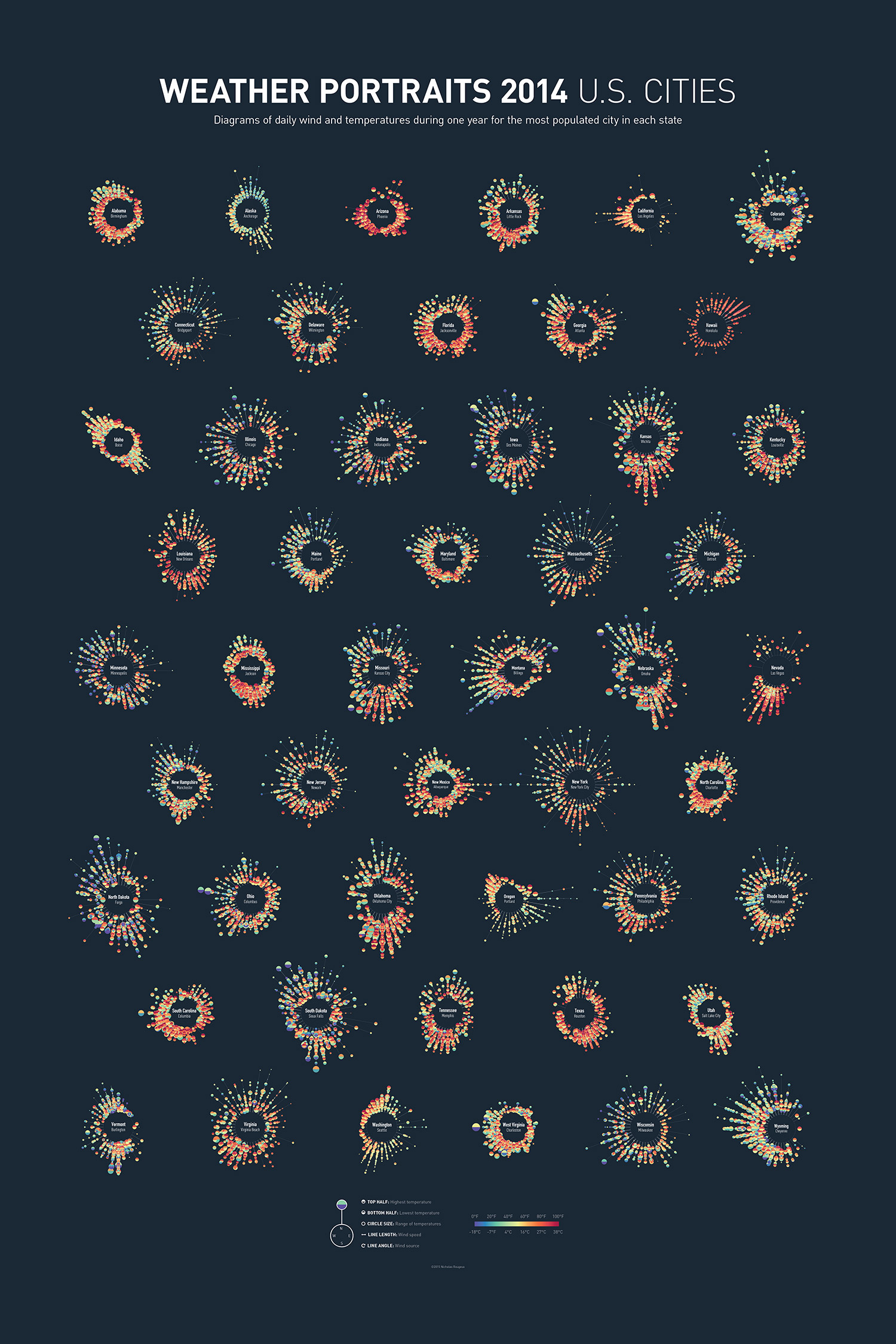
Weather Portraits 2014 US Cities infographic poster is Nicholas Rougeux's project for visualizing weather data. The poster shows diagrams of daily wind and temperatures during one year for the most populated city in each state. He tried many different ways to visualize his data, a process that he outlined in his blog post, Making of the Weather Portraits poster. The final infographic poster can be seen above.
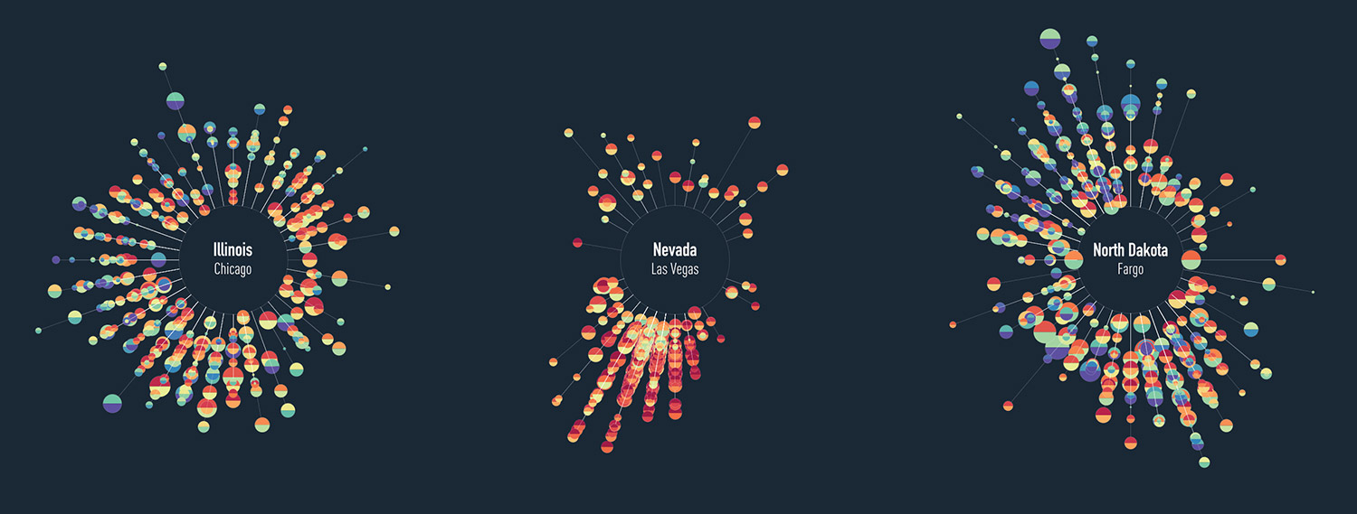
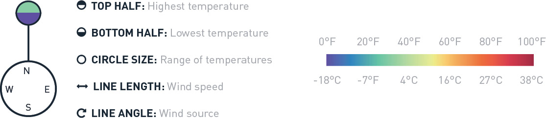
Each diagram includes five daily measurements for an full year in a city: wind direction, wind speed, high temperature, low temperature, and range of temperatures.
Poster prints for 2014 and 2015 are available for purchase.
Colorful diagrams display five daily measurements for an full year in each city: wind direction, wind speed, high temperature, low temperature, and range of temperatures. Data were collected from the Quality Controlled Local Climatological Data (QCLCD) provided freely by the National Oceanic and Atmospheric Association (NOAA).
Thanks to Nick for sending in his project!


February 27, 2016
Using Visuals to Enhance Your Credibility
Infographics and visuals have become the lifeblood of storytellers, be it marketers, professors, presenters, etc. They are constantly battling short attention spans, information overload, and little vested interest from their audience. The smart marketer knows their target, and comes with a battle plan to defend against all of these things. This is where visuals come in.
Reasons to Use Visuals
We’ve relied on visuals for everything from street signs and movie banners to websites and presentations. Using visuals to express information has long been a part of our history. Here are just a few more reasons to use them in your presentations and marketing efforts:
1. Getting Attention
A visual makes information stand out more than just text alone. Studies estimate that between 50-80% of the human brain is dedicated to forms of visual processing.
On social media, they simply take up more real estate than their text only counterparts. A post with some type of visual content has 94% more total views on average than content without images, according to MDG advertising.
[image error]
2. Simplicity
As humans, we’re simply wired to receive rich visual information, and can understand more complex information when it is presented visually. Infographics are a great way to provide your audience with context when displaying statistics that are otherwise meaningless.
3. Credibility
Credibility is one of the biggest reasons to use visuals. Put a statistic in an article and it is questioned. Put a statistic in a visual and it is fact.
In fact, every form of visual information lends credibility to what is presented. 46.1% of people say a website’s design is the number one way to determine the credibility of a company, according to the Stanford Persuasive Technology Lab.
[image error]
This works the same way in presentations. In 1986, a 3M-sponsored study at the University of Minnesota School of Management found that presenters who use visual aids are 43% more effective in persuading audience members to take a desired course of action.
[image error]
Use This Power Responsibly
In light of this information, it is important to use this responsibly. Providing accurate information is the most important thing content marketers and visual storytellers will do. No matter how beautifully crafted your infographic or visual is, it can be destroyed by one misrepresented fact, or out-of-context statistic.


February 17, 2016
Great DataViz Design: Justice Scalia's Ideology
The Upshot at the New York Times consistently does a great job visualizing data. How Scalia Compared With Other Justices is a fantastic example of clean, effective storytelling with chart design!
The death of Justice Antonin Scalia will leave the Supreme Court with equal numbers of conservative and liberal justices. Justice Anthony M. Kennedy is likely to be the swing vote in most cases.
For social media, they published a simplified version that just shows the current Justices:
Why is this design so good? Here are my thoughts on why this chart design is great:
Minimal chart legend. The color key shows only 2 colors to designate the party of the nominating President. The names of all the Justices are built into the chart itself, which keeps that important information tied to the data in the reader's field of view. Default charts in MS Office would have created a different color for every Justice, and made this chart confusing and visually noisy.
Minimal axis labels. Notice the x-axis only shows a label for each decade. You don't need to know where 2004 is specifically. I think they could have minimized further to just the first and last years.
Use of opacity. Justice Scalia is the main story of the visual, so his line is heavier weight and bright color. This is a great use of preattentive attributes! All of the other Justices are shown is lighter colors for reference, and the main story stands out.
Minimal grid lines. There are a lot of lines on this chart, so only a few gridlines are included to keep the chart as simple as possible.
Minimal Text on the page. The chart is connected to a full article, but on this landing page the data visualization tells the story all by itself. The description text on the page is only two sentences long, leaving the visual as the visual centerpiece.


February 16, 2016
London’s Expected House Price Gain

London’s Expected House Price Gain from Freehold Sale looks at the dramatic price increases expected in the London, UK, housing market.
London is an exciting place to live. Pick the right borough and you can enjoy the best of both worlds – the buzz of the city and access to amazing jobs, plus large open green spaces, top schools and an excellent quality of life.
It’s no wonder that property in our capital city remains in high demand, driven by an innate desire to live in and around the capital. It’s an investment goldmine – we hear almost daily how London’s property market outpaces the remainder of the country and will continue to do so for years to come. Real estate group, CRBE forecast prices in London could rise more than 30 per cent over the next five years.
Essentially, it could be a good gamble, but whereabouts should you look? If you have a sizeable deposit rubbing a hole on your wallet and fancy purchasing a freehold in London, here are the expected price rises for the next five years:
Color coding can be a tricky way to visualize data. The readers have to refer back to the color key frequently to understand the design, especially when it takes scrolling to look back and forth.
The footer should include the URL back to the infographic landing page so readers can find the original full-size version of the design when they come across smaller versions posting on blogs and social media.
Thanks to David for sending in the link!


February 15, 2016
What Happens on YouTube in 24 Hours?

What Happens on YouTube in 24 Hours? is an infographic that Pexeso created after taking an in-depth look into daily uploads on YouTube during the month of October 2015. Pexeso is a company that is designed to help you find your videos from multiple platforms across the web so you can better understand your virality.
It’s no secret that video is quickly becoming the #1 priority for both social media platforms and marketers alike. As consumers, we spend more and more time glued to our smartphones watching one video after another. By 2017, it is estimated that video will account for 74% of all internet traffic in the world, making the upcoming year make or break time for any company that’s betting on video.
As competition heats up, some of the most well-known platforms have rushed to report impressive statistics. While they may be staggering, such numbers tend to be cherry-picked and don’t necessarily show the full picture.
We at Pexeso are committed not only to delivering the best possible service to our customers, but also bring more transparency to this inherently non-transparent market. As we independently crawl many popular sites, we've been able to uncover some remarkably interesting, in-depth insights that we want to share.
I appreciate seeing most of the statistics visualized, but a couple of the visuals do not accurately represent the data.
The Video Uploads by Category took a creative spin on what should have been a quarter pie chart. By taking the slices out of a triangle instead, the area of the slices at the ends is oversized and is misleading to viewers.
The Languages visual of sections on the tongue, under represent the size of the values by only using the height in an odd shape. The lowest section where the tongue is narrower don't have enough area to accurately show the data.
The 3D stacked bar in the shape of a cake, way over emphasizes the 5% Taken Down by Users by also showing the area of the top of the cake.
The clock visual doesn't represent the data at all. It's confusing for readers to have evenly spaced ticks around the clock, but widely varying times in the text.
The citations for the data sources are missing from the infographic. They're listed on the landing page in text, but infographics are usually shared without the original text from the publisher.
Thanks to Lisa for sending in the link!


February 11, 2016
Power Hungry: The Rise & Fall of Electricity Consumption
Power Hungry is an infographic timeline showing the dramatic rise in energy consumption for average American homes and the recent change to a decline from energy efficient technologies and home automation. From The Home Depot and published on Inhabitat.
While the U.S. still has a long way to go with alternative energy, a new statistic has given us incredible hope for the future. For the first time in a century, energy consumption in U.S. homes has dropped. Since electricity first entered the home in the 1910’s, residential energy use has been steadily on the rise, but thanks to new developments in alternative technologies, our dependence on electricity is becoming more sustainable than ever before. From small changes, like the rise of circuit breakers and panels, to huge innovations like solar panels and home automation, the road to a cleaner, greener future has been a long — but worthwhile — process. Check out this fascinating infographic below to see how energy consumption has changed over the years.
I love my Nest thermostat and Philips Hue lights!


February 10, 2016
Beer Pairings Simplified
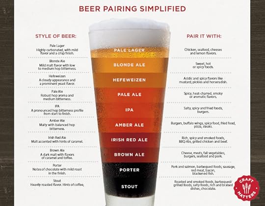
Beer Pairings Simplified is from the menu at BJ's Restaurant and Brewhouse. An infographic in the wild found IRL! A great visual guide to beer types, colors and suggested food pairings.
Beer may actually be more food-friendly than wine. There is certainly more flavor variety and it has an amazing capacity to pair with all kinds of foods BJ's encourages you to experiment. There are no wrong answers, but here are a few things to consider:
This is definitely simplified information, because the different types of beer can actually vary in color quite a bit. However, I think this design does a great job of simplifying complex information and helping the restaurant's guests make good decisions. Seasoned or expert beer drinkers will want more detailed, complex information, but this visual guide will probably be enough information for the majority of readers.
[image error]


February 9, 2016
O'Reilly Strata Conference Discount & Giveaway
The O'Reilly Strata+Hadoop World conference is coming up quickly on March 28-31 in San Jose, CA.
First, I have a discount code from O'Reilly that will get you 20% OFF the registration cost! Click this link, and use the code AFF20 during checkout to get the 20% discount.
Second, this month's giveaway is one free Bronze pass to the Strata conference! Register on the GIVEAWAYS page before 11:59pm CT on February 29, 2016 to be entered. I will randomly chose a winner on March 1st.


February 8, 2016
2016 State of Small Business Report

The 2016 State of Small Business Report from Wasp Barcode highlights some of the most pressing issues facing small business owners.
According to the 2016 State of Small Business Report, 71 percent of them expect to increase revenue in 2016, a 14 percent increase over 2015’s revenue optimism.
Their optimism is holding up in the face of a few big hurdles this year, namely hiring new employees, increasing profit, and employee healthcare. More than 1,100 small business owners and executives identified these items as their top three challenges for 2016.
In addition to identifying business challenges, the State of Small Business Report also investigated small businesses’ views on the economy, hiring, government, marketing practices, and use of information technology.
Check out a few highlights and let us know what you think.
I really like the use of the infographic to highlight a few key points to draw in readers to the full report.
A few things I would suggest that designers and publishers can learn from:
Make the fonts larger or make a larger version of the infographic image file available. Much of the text in the "full size" version is still too small to read.
Use a good description in the infographic image filename. This image was just called "Infographic-FULL-SIZE.png" which hurts you visibility with the search engines.
Visualize all of the data. When some data in an infographic is listed as text-only, it is perceived by readers as less important and often skipped over.
Include a copyright or Creative Commons license statement. I can't tell if there is one, it's too small for me to read.
Include the URL to the infographic landing page so readers can find the full-size original infographic when it appears on other sites that don't link back appropriately. I appreciate the link to the full report they are promoting, but readers also need the link to the infographic landing page.
The infographic should be linked or included in the full report page.
Thanks to Anna for sending the link!


February 5, 2016
January Roundup of DataViz News
I sent this out to the Cool Infographics Mailing list previously, but I wanted to share on the blog as well. This will be a regular feature sent out to email subscribers, but I haven't decided if I will always post these on the blog as well. Thoughts?
If you're not a subscriber, you can join the email list HERE. I try to send only a few emails per month, and load with them valuable information on dataviz news, design tools, tips, upcoming dataviz events, giveaways, discounts, discussions and other valuable links.
Please tweet links to any DataViz news that should be included in future emails to @rtkrum
Roundup of DataViz Insights, Tools, Tips and News
Can a love of abstract art and infographic design be combined? They have more in common than we originally thought! This article by Giorgia Lupi delves into how this type of infographic was applied in explaining the "global brain drain."
A woman of many talents, Dona Wong, author of Wall Street Journal Guide to Information Graphics, tells all when it comes to creating infographics that have a purpose. With infographics, data needs to be more than just design. It should provide real insight into the findings, that are easily digestible for its viewers. Read more here if you’d like to apply her wisdom to the marketing world. She will also be speaking at the AMA Analytics with Purpose Conference next week.
has announced that Amanda Cox has been named has been named editor of The Upshot.
Visually has now been acquired by Scribble Live, a leading content marketing platform, in the hopes of uniting data and creativity to reach target audiences more effectively.
Don’t be making these design mistakes! If you’re a designer, or if you’re just getting your foot in the door, use tips from Visme to ensure that each design you make is a hit. Use discount code COOL30 for a lifetime discount 30% off your subscription.
Are you a Prezi user? If so, they’ve updated a new feature to create charts using your data. Check out their tutorial.
Your business can benefit from telling stories by visualizing data. Data Storytelling: Big Data's Next Frontier from James Kerr on Inc. provided 5 Tips to establish a necessary data storytelling environment for your business.
IBM's free online dataviz site, manyeyes, was shuttered on Dec 31st, and the visualization tools are being rolled into IBM Watson Analytics over time. To learn more about what they’re offering see, click here.
KANTAR and Information Is Beautiful have announced the 2015 Information is Beautiful award winners! Check out the whole gallery.
Malofiej 24: Infographic World Summit registration is now open, with an impressive lineup of speakers coming March 6-11 in Pamplona, Spain.
The O'Reilly Strata+Hadoop World Conference will be taking place from March 29-31 in San Jose, CA. Use code AFF20 for 20% off tickets you can purchase here.
has opened for the OpenVis Conference in April, which will be held in Boston.
If you're in San Francisco, there will be a public workshop detailing storytelling using data with Cole Knaflic on February 8th.
A FREE one-day event in Miami, FL will be held on February 20 in celebration of World Information Architecture Day.
New DataViz Books:
 Building Responsive Data Visualization for the Web, by Bill Hinderman
 Storytelling with Data: A Data Visualization Guide for Business Professionals, by Cole Nussbaumer Knaflic


![[image error]](http://assets.inhabitat.com/wp-content/blogs.dir/1/files/2016/02/HomeDepot-History-of-Consumption-Infographic-889x3339.jpg)