Geof Huth's Blog, page 26
June 23, 2011
grass-fed sunlight
grass-fed sunlight by Geof Huth
I don't usually succumb to the depths it takes for a blogger in the field of poetry to post nothing more than a poem, but today is a good exception. In less than an hour, it will be the halfth-birthday of my friend Eden Myers, veterinarian, raiser of lambs, maker of lamb sausages, who lives in the bluegrass land of Kentucky. I know better her husband, an electronic records archivist for the same commonwealth of Kentucky (though born on Key West).
Eden, whose name seems like a place of beginnings, was born on December 24th, which is Christmas Eve in Christendom and, thus, a poor time to try to gather some attention to oneself alone. For that reason, Eden's family has taken to celebrating her birthday on June 24th. This poem I wrote yesterday for Eden's birthday tomorrow, and I post it today, so that it will be ready for her as soon as it becomes tomorrow.
Would that every poem were a gift. Were that this gift of a poem were good enough for the event I wrote it for.
ecr. l'inf.
I don't usually succumb to the depths it takes for a blogger in the field of poetry to post nothing more than a poem, but today is a good exception. In less than an hour, it will be the halfth-birthday of my friend Eden Myers, veterinarian, raiser of lambs, maker of lamb sausages, who lives in the bluegrass land of Kentucky. I know better her husband, an electronic records archivist for the same commonwealth of Kentucky (though born on Key West).
Eden, whose name seems like a place of beginnings, was born on December 24th, which is Christmas Eve in Christendom and, thus, a poor time to try to gather some attention to oneself alone. For that reason, Eden's family has taken to celebrating her birthday on June 24th. This poem I wrote yesterday for Eden's birthday tomorrow, and I post it today, so that it will be ready for her as soon as it becomes tomorrow.
Would that every poem were a gift. Were that this gift of a poem were good enough for the event I wrote it for.
Garden at
the flooded gates
of somewhere
going to. If history
were brief and
breviaries in
the palm for
something else.
Take a handful
of it (words,
fleece, flesh
on the bone).
It is all good,
our grass-fed
lives, and the run
of air through
the body, this
sunshine, and
scent when it
arrives. This
world alive
with growing.
Its roughness,
rudeness, when
rising. Its
tenderness in
dying, and dying
it will. What
we do, what we
could do, what
we have. A hand
full of it. All
pebbles, and
rolling. We used
to have a word
for "away"
before someone
took it. The grass
blue, the sky
green, there are
no clouds
that will stay
with us. And each
is a lamb. My
version was
the firefly, in the
nightfields and
numbers, the
flickering when
we each fell
asleep. Numbers
enough to count
them out. The
fingers of a hand
held gingerly into
the darkness. We
have dreams for
terror, dreams
for living, the
rocking bowl of
water carrying
light. Waking is
to and from,
though there is
never a waking
through. Through
and through,
needled and threats,
we arrive, we
leave, the trip
lost, the passageway's
dreaming. Halfway
to the end of a
number, we believe
we have already
arrived.
ecr. l'inf.


June 22, 2011
The Poetics of the Letter

The Knives Forks and Spoons Press out of the Newton-le-Willows in England puts out small and physically sturdy books that lean towards the experimental edge of writing and that sometimes lean towards the verbo-visual. With the book Poéticas by the great Portuguese visual poet Fernando Aguiar, KF&SP falls right into the trap of visual poetry.
(And some traps are good.)
This small book includes a number of Aguiar's iconic visual poems: the right arm of a man reaching straight up out of a roiling sea of words, four men in a boat with a sailless mast, two of them rowing themselves out of what must be that same sea.
For Aguiar is almost always foundering in a sea of words, but words that never come together, or do so for only a moment. He is one of our deepest asemic poets, aswim in a world of letters, of characters released from meaning even as they are simultaneously forced into the servitude of the image's own story. His works are collages, and those images set the scene, tell the story, set us adrift.
But it is the letters that entrance. Why has language inhabited so furiously this landscape? this drawing room? this plaza? this submarine? The images, often of people by or on the ocean, as Portugal so stands against the eastern edge of the Atlantic (which I once lived a few blocks from when I lived in Porto, so I understand the pull of the sea drawn up and down against its furious will by the placid moon). These letters are also the story of the pictures, but (except for the few times a word appears, and that word is usually simply "poésia") these letters tell their stories through shape, through size, through color.
For this is a book decorated with color, not always, but often, and usually gently but surprisingly, tenderly, harrowingly. What Aguiar does with color is to highlight parts of scenes, to bring seemingly flat things into relief. And he does all of this with an always careful and clean yet rich mise en page. His poems are compositions, visually so. And his work is always composed.
A wonder of this book is that it presents some scenes over again. The book shows us different ways to look at the same scene or the same player placed in other scenes. We see, in this way, that the work of a collagist is to image scenes with whatever is at hand, but that the most essential thing to hold is one's imagination.
These are beautiful, sad, and graceful visual poems, and they need to be relished slowly, for their fruits are many, but small and sweet.
_____
Aguiar, Fernando. Poéticas. The Knives Forks and Spoons Press: Newton-le-Willows, England, 2011.
The Knives Forks and Spoons Press's website says that this title is temporarily unavailable, so check back for it.
ecr. l'inf.

June 21, 2011
Ikon and Ekko
 Suzan Sarı, "tatarsk" (2010)
The international visual poetry portfolio being loaded at the online magazine Peep/Show continues to grow, slowly, like flowstone, and it now includes a presentation of the work of Suzan Sarı, one of the many remarkable Turkish visual poets working today.
The pieces she has in Peep/Show are monumental black and white pieces, harsh almost, and not so much made out of letters as made out of images that appear symbolic or almost letteristic. Her pieces are dramatic icons, well crafted and designed, tending to the dirty, and rugged in their ability to withstand the wrathful gaze of critics wondering where the poetry is in these pieces.
It is everywhere. The poetry here is the mute poetry of visual poetry. The image given over to symbol without the easy intervention of conventional meaning. These are poems at the end of the road of poetry, poems created when there's no way left to make a conventional poem, poems written in no language and, thus, created for all of us, no matter where we live on the globe.
This talismanic pieces fill me with awe. I am overwhelmed by their order and their disorder, by their ability to live in two worlds at once. If I were a visual poet, these are works I would wish I could create.
 Suzan Sarı, "dunya" (2010)
ecr. l'inf.

June 20, 2011
Cucamonga Isn't Better Than I Am?
Lullaby Doubled and Cut Short by Geof Huth
Sometimes words are so simple they do not seem to exist and meaning seems as clear as air, as crisp as whistling moving through the air on a wide flat still plain.
Listen to the song as you read this.
A book may be made of pictures and the words may be handmaidens to those pictures, but the words still carry it along.
The words tell us where we are.
There once was a place named Cucamonga until it became incorporated, though whatever it became incorporated into has never been verified.
A book may have a soundtrack, which may come with it, which may exist separate from it, which you (the reader) may imagine, or even listen to, while you read a book.
The main text of the book is Mrs Eaves cut by Zuzana Licko, even though her cutting was done digitally (the typeface entrances me because it is classic and yet unworldly; each of its many ligatures seems to me a micro-visual-poem all to itself).
(I read Wise Blood while listening to Bob Dylan's Blood on the Tracks over and over again; I read Elizabeth Graver's Unravelling while listening to Natalie Merchant's Ophelia obsessively.)
I am Hazel Motes, at least in the eyes.
The books are the music; the music is the books.
We are compressed into the miniature space of perception where text and image and music are one, or intermingled.
A little bit of Cucamonga lives in all of us, though maybe it is only that we took a wrong turn in Cucamonga and ended up someplace else.
I write in sentences even when the sentences are paragraphs.
Maybe it is the Lagavulin that is giving me a headache or maybe it is the thinking that won't leave me.
Super 8 is a motion picture film I rarely used; my movie camera was 8mm, which means it shot 16mm that would be cut down the middle into 8.
A film is a story (or it is not), and if the story reveals itself slowly it is more erotic (even if it is not).
Art can only be erotic (le plaisir du texte, s'il vous plait, and our bodies are textual, sextual).
It is emotion that drives us, through the eyes, through the ears, through the touch of skin on skin, the taste of another, a scent that returns you to...
Through the earth, and down and down deep and reamed into the earth.
If a monster movie rarely shows the monster, if the story provides glimpses of itself in layers moving up and into someplace else, if the people of the movie work as people do and bad things happen, if you give away your most precious possession to make it work, there may come the worth of a night's sitting in a darkened room filled with strangers to trick yourself into believing you exist and will persist, at least for a while.
We are given over to the terror of it: not the terror of the monster but the terror of who we are, of who we have failed to keep ourselves from being.
When we cannot believe in love, we believe in compassion.
Who deserves to live? and who deserves to die?
Night is no more frightening than day, but the clarity of daylight allows us to confront our fears.
"Amores perros," I whisper, and spit into the night that spits back, and harder, at me.
If a photograph is blurry or cluttered or has almost nothing within it but sky, why do we still feel its pull?
Trout Fishing in America Replicant, or the Zombies among Us.
Everything is a model of something else, even the runway models.
A plane takes off.
The sounds of the world are messy and indistinct, a mush of sounds, so loud we cannot hear a heartbeat, or a breath, or the gentlest kiss.
For some photographs, a specific set of sounds are set aside for it.
I made a film with my friends when I lived in Bolivia, but we never watched the footage, and there was no sound.
The voice is a sound, even when we cannot hear it.
When Barney says, "Don't cry for me. I'm already dead," we are meant to laugh.
Fear is a reaction; anger is an energy.
I make references to nothing because I have no books of references or references to books.
The monster represents us, of course: we are frightening, yet somehow gentle, and we must escape from this place.
These words do not tell you enough to make a decision about the book, the movie, or existence itself.
Cucamonga isn't better than I am?
_____
VanderLans, Rudy. Cucamonga. Emigre: Sacramento, Calif., 2000.
Super 8. Written and Directed by J.J. Abrams. 2011.
Existence.
ecr. l'inf.
June 15, 2011
Palmword
 Geof Huth, "Kafwgs" (15 June 2011)
I draw with my hands. I'm a wright of words, some not known. I am a wrighter, yet the creatures of my pen have fallen over and won't right themselves. A wordwright, I don't depend on words for meaning.
The little fidgetglyph above is a mere bag of shells, a pear-shaped creation, something is not right with it, and I wrote it this morning, or I drew it, or I don't know the difference between writing and drawing at some points during the day, and this was during the morning as the brand-new commissioner of my state agency gave a little welcome speech to us, huddled masses accumulated at 32 locations throughout the state.
A fidgetglyph is a doodle assigned the significance of assured retention. (At times of stress, I succumb to the jargon of my profession.) A fidgetglyph is a doodle attempting to be writing and drawing simultaneously. For this reason, a fidgetglyph is a thing given shape, and it is through its shapes that it means. It impinges upon the eyes, sometimes modestly, sometimes extravagantly, sometimes miniaturely, sometimes hugely. But it is meant to be small and without ambition.
The idea here is that smallness may have a value, that a palmword may be better than a book of words, that the accumulation of smallnesses may lead to revelations about the process of reading, which is a central fact of the process of being contemporaneously human.
Not even a single word is needed to make something a poem. Not even a single recognizable letter. The gesture is what is important, the movement of a hand that makes a mark on the page that seems to be writerly.
Visual poets make writerly works for they are writerly people. They focus on writing, marks made and left and persisting in visible space.
Some may conclude that such works (poems that reject the need for words of any kind, only the mere sense that a word could be made out of visual meshes of text) are necessarily avant-garde. But I don't think so. The avant-garde died decades ago. People work, even struggle, to produce works that are different from any ever made, and they always succeed, and they always fail, for differences come in degrees rather than absolutes, and everything that could be done was done before we had been born.
The avant-garde is a myth generated by those conservative enough to believe in their ability to transcend those who preceded them, but everything is marked (in the linguistic sense, in the sense of darkness, through the sense we make of the world) with the trillions of works of art or merely makings created in the long and attenuated past. We are not creatures of genius and transcendence.
We are runners who have taken batons from other runners, and we are running the last leg of a race that will never end.
ecr. l'inf.

June 14, 2011
A Small Snapshot of a Design in Progress
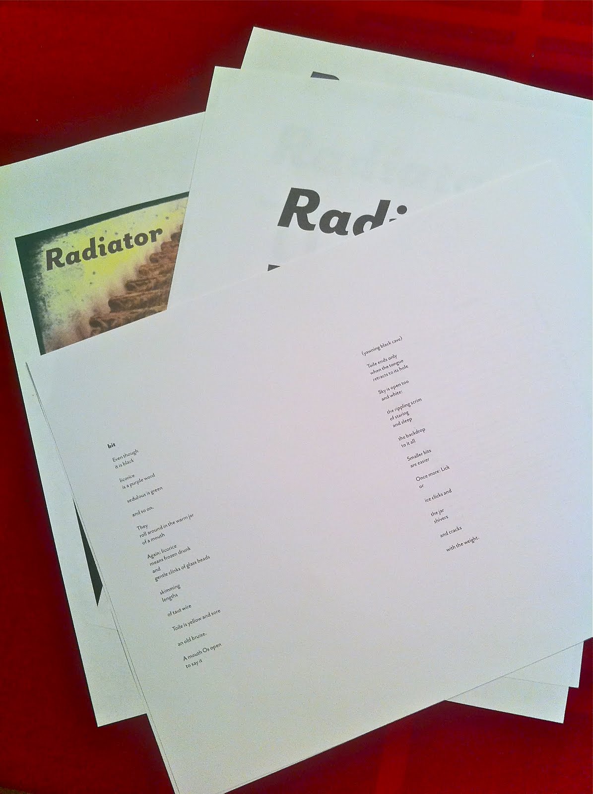
I'm working slowly, too slowly, at designing Nancy's book of poetry, which goes by the title Radiator. Even though the poems in the book are generally narrow, the book itself will be square to accommodate the cover image I want to use, which is a photograph by Nancy. Esthetic decisions are guided by structures we develop for ourselves.
I even bought a typeface for the book because I needed something I really enjoyed, something new, and something that works with the poems themselves. It is, unexpectedly, a sans serif face, but with enough character to carry this light text that bears yet some significant heft. There's beauty in those characters, the tiny bits of flair, the flaring at the ends of some letters, their hands waving.
Just read for the many-eth time the second poem in the book, the first lineated poem, after a little prose poem that sets the stage, one of many that open the sections of this book. It goes by the name "bit." All the titles are one word long, and only a syllable in length, a partial breath to say them. The poem grows into something quite great, but its opening still always stops me:
Even though
it is black
licorice
is a purple word
sedulous is green
and so on.
Setting this text and moving it across the page has caused me to look at it closely again. I bend down into it, my ear cock for its sounds, my eye in the corner of the eyelid watching for any movement.
Maybe tomorrow I can finish this typesetting and lift this book up into the air.
ecr. l'inf.

June 10, 2011
The Two Halves of One Almost Whole
 Radiator, Pine Lake Lodge, Pine Lake, New York (10 June 2011)
Still Point, Caroga Lake, New York
Tomorrow, I will begin designing a book called Radiator. It is not my book but Nancy's. It has seemed to me that poetry should be a cooperative venture, not poems necessarily, but poetry necessarily so. A beast so frail and unattended to requires some joint attention. And I toil at that job a bit, trying to bring attention to the small unlit corners of poetry where those who are my people and I inhabit. But another way is by designing this book for Nancy, a book that will be the receptacle for two dozen of her poems, poems that are quiet yet surprising, even disturbing. Many poems in this book affect me more strongly than almost any poems I have read. I admit, though, that it might be because these are personal beings to me and because I am attuned to the peculiar beauties of her voice. I don't argue here, however, that her poems might not be good. That is not a possibility.
The radiator above is one we have seen many times, during many weekend dinners at the Pine Lake Lodge. A picture Nancy took of this radiator (not this one here, which I took myself) will probably be the cover image for this book of poetry.
Most of the day today I spent at a conference of archivists in Saratoga Springs. This week, my work took me to three conferences, spread across the state: one of records managers, one of county clerks, and one of archivists. And these are my people as well. But while I'm with them I sometimes drift into my other life. Today, for instance, I created many fidgetglyphs as I listened to people discuss issues in archives. My largest creation is the one below.
I like to believe that I have two selves, that there are two halves to me: one the organized archivist and manager, represented by the maniacally bare office I maintain at work; the other a fluid maker of poems, represented by the unbelievably messy office-cum-library-cum-studio I maintain on the third floor of my house.
Of course, I understand that everyone is at least two people. No-one is simple enough to be fewer than two.
 Geof Huth, "The Words Have Eyes" (Saratoga Springs, New York, 10 June 2011)
ecr. l'inf.

June 6, 2011
Why Poets Hate Poetry
Mohonk Mountain House, Room 205, Lake Mohonk, New Paltz, New York
Only poets truly hate poetry because only poets understand the degree to which poetry fails to live up to its hype.
When was the last time a poem loved a poem? When was the last time a poet thought the turns of phrases in a single poem were so good that it would change lives forever? When did a poet ever believe that a poem alone could transform the world? Never.
Sometimes readers of poetry (and, more often, non-readers of poetry) believe that a poem can be, and often is, a transformational piece writing, something that changes not itself but the person reading it or listening to it. No writing, though, changes a thing, makes any difference. Someone likes a poem, notes it, and passes on the thought of liking it, just as someone doesn't like a poem, notes it, and passes on the thought, and (except for the details of that thought) nothing changes. Nothing is made better by a poem, and nothing is made worse.
A poet knows that a poem is never the thing itself, that a poem is never a poem. A poem is, instead, the concept of what a poem can be, and that is a powerful force. People speak dramatically about "poetic" events, calling movies, speeches, books, and essays poetic, but they do not mean by "poetic" that these things are like poems. Instead, they mean that these things resemble what we want poems to be but what they never are.
The poet knows how the poem fails: often and severely. The poet knows that the poem never measures up to the dream of the poem, and that is why so few poems write poems anymore. All they need to do, all they do, is talk about the poems they will write.
And we are captivated by these poems that do not exist, poems that would be abject failures if they actually existed but which are great successes just so long as they never are written.
There is something in each of us that makes us hate a poem, and that same something makes us love what the poem might be, should be.
ecr. l'inf.
June 5, 2011
New-Century Concrete

The Inn at Turning Stone, Room 453, Verona, New York
The international visual poetry issue of the online magazine Peep/Show continues to grow, and this newest installment features the work of Marcelo Sahea, a Brazilian visual poet who is one of the best exemplars of contemporary Brazilian visual poetry.
The Brazilian visual poets know who their ancestors are: the famed Noigandres group, certainly the most famous of all groups of visual poets ever. The members of this groups were some of the major thinkers and poets of the mid-century concrete movement. They coined the term "concrete poetry" independently of Eugen Gomringer and Öyvind Fahlström (who was not really a concrete poet, though he was, strangely enough, born in Brazil). They moved the form forward probably more than any other visual poets of their time, creating asemic but conceptually semantic "process poems" at the end of their reign over concrete poetry.
So through all the Brazilian concrete poets runs the blood of the Noigandres group: Augusto de Campos, Haroldo de Campos, Décio Pignatari, Ronaldo Azeredo, Pedro Xisto, and others. Theirs was a poetics based on the pun (verbal, visual, verbo-visual), but they often used English in their works as well. Significantly, they were broadly interested in language as a concept and the idea of creating visual signs that carried meaning. With that germ they pushed the concrete form of visual poetry farther than anyone else. And, finally, they were a group dedicated to hard-core clean concrete poetry. The beauty they found in written language was in neatness, cleanliness, and order, even if disorder were their message.
And in Marcelo's work all of these genetic markers are still in place, but he's added a greater interest in color as a carrier of meaning, a more extravagant use typography (with more substitutions of letters with images, for instance), and a slightly dirtier, though still almost sparkling clean, overall style.
"ERRARE" (the title of a work whose Latin text translates into "To err is human), has that monumental sense of order evident in even the most playful of the Noigandres poets works. But he puns across languages, turning the final "est" (or "is") of the Latin into the English "best").
In his poem "digitao" (think of all the meanings of "digital"), below, Marcelo literally turns Vladimir Burda's famous poem "ich" upside down. In Burda's poem, the word "ich," meaning "I," printed out, but the tittle on the i is Burda's thumbprint. In "digitao," the dot of the question mark is printed out, but the curving form of the question mark's body is the imprint of a footprint, apparently Marcelo's own. It is a great work of allusional visual poetry, showing the historical knowledge of visual poetry found in Marcelo's work.
I find all of Marcelo Sahea's work interesting. They are clean and simply but deep and muddy with meaning. They give sustenance to the soul (or sole).

ecr. l'inf.

June 4, 2011
mnmlst tpgraphy m(vi) pstrs
I like to exclaim that visual poetry is everywhere, and apparently I am right, having stumbled across a set of minimalist typography movie posters. The play in these virtual movie posters is similar to that of hardcore minimalist visual poetry. Something that I might do, or endwar, and different from the rigid constructions of mid-century concrete.
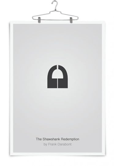
But the goal is different and so is the use of text. In minimalist visual poetry typography is key, but the play is with the word as a source of meaning and meaning-mangling or the play is with the image but non-representationally so. In these truly great little posters, something like a visual pun is at play. Text is used to depict some visual thing, but this is done in a way so restrictive so as to make some of the posters briefly difficult to interpret. The image for The Shawshank Redemption is nothing but two single quotation marks (or two apostrophes) resting upside-down and mirroring one another. They form a lock to represent the incarceration of our two protagonists, who are also represented each as one half of the lock.
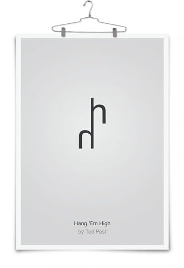
The poster for Hand 'Em High, does have the merest echo of words in it. The two miniscule aitches that make up this poster represent the two major words of the title: "hang" and "high." Yet the most important part of the poster is to represent something from the film, in this case, hanging (of them) high.
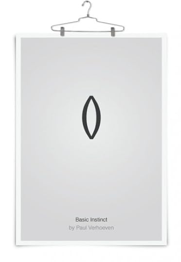 I know, deep in my body somewhere, what the meaning is of these two parentheses resting against each other, resembling a pair of hands in prayer. The film here is Basic Instinct, and I know that parentheses do not play a major role in its plot. Deep inside me, though, I still feel some attraction to this simple image.
I can feel it pulling me into itself.
ecr. l'inf.