
Jason Santa Maria's Blog, page 7
March 29, 2012
Paper by FiftyThree
Paper is a new drawing app for the iPad from FiftyThree. Immediately after watching the video, I downloaded it (free download with paid add-ons) and ordered Cosmonaut and Jot styluses to try out.
As a habitual sketcher, I’ve tried lots of drawing apps before, but this is the most promising one yet. The simplicity and lack of chrome for navigation (not unlike what we’ve seen in Clear for the iPhone) really speaks to me. In the short time I’ve played with it, sans stylus, I already love it.


March 21, 2012
Stamen Maps
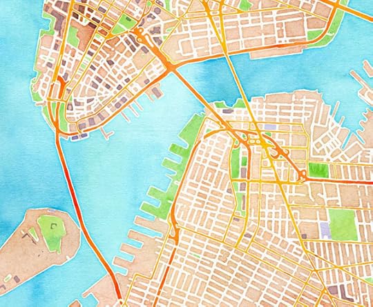
Stamen has released some beautiful alternative takes on map tiles. They’re all free to use wherever you display OpenStreetMap data. All three are great, but the watercolor one is particularly pleasing to the eye, feeling a bit reminiscent of an old pirate treasure map. Maybe we just need to throw some all-caps italic Caslon on top of it.

February 28, 2012
Kickstarter keeps getting better
Kickstarter has quickly become one of my favorite sites around, and not just now, but for as long as I’ve been on the internet. Their goal is so empowering, so noble. Every time I visit the site, there is a very good chance I’ll be parting ways with some cash. Whenever I see someone talking so deeply about something they want to make a reality, and how low the bar is to help them do it, it gets me every time. It’s such a simple concept, but the effect is gargantuan.
Today I read this, Kickstarter Expects To Provide More Funding To The Arts Than NEA:
One of the company’s three co-founders, Yancey Strickler, said that Kickstarter is on track to distribute over $150 million dollars to its users’ projects in 2012, or more than entire fiscal year 2012 budget for the National Endowment of the Arts (NEA), which was $146 million.
Yowza. That’s all at once heartwarming and troubling. It’s troubling how regularly the US stunts arts funding, but it’s also amazing that grassroots efforts like Kickstarter have effectively doubled the money available to artists. Yes, I know, they aren’t the same thing, but it’s a promising development.

January 25, 2012
Our Favorite Typefaces of 2011 at Typographica
One of the best annual wrap-ups returns after a hiatus in 2009-10, Our Favorite Typefaces, from Typographica. Welcome back!
The idea is simple: I invite a group of writers, educators, type makers and type users to look back at 2011 and pick the release that excited them most.
…
This is not a juried contest. The result isn’t necessarily the “best fonts of the year”, or even those most used or ballyhooed. But these 50 selections do capture a pretty accurate snapshot of where type design is now, and where it’s headed.
And the results are spot on. 50 reviews is a lot to digest, and I’m still picking my way through them, but there is a lot to love here. Not only is this a great wrap up of the year, but contributes to a valuable collection of commentary on the state of type.
Some favorite reviews so far are Indra Kupferschmid on Cyrus Highsmith’s Salvo, Aegir Hallmundur on Travis Kochel’s amazing Chartwell, Tim Brown on José Scaglione and Veronika Burian’s Abril, and Caren Litherland on Ludwig Übele’s FF Tundra. It’s great to have a chance to give some typefaces a second look, or discover some that you missed over the course of the year.
I’m also honored to contribute a review to the mix. I chose Nicole Dotin’s beautiful new text face, Elena. It reads like a dream.

January 19, 2012
A List Apart: Issue 342
The latest issue of A List Apart is one of my favorites in recent memory, and has three articles you can’t miss.
In “An Important Time for Design”, Cameron Koczon challenges designers to be all that they can be:
The web is going to increasingly shape our world and consequently our daily lives. We can either sit on the sidelines and submissively assist those who are doing the shaping or we can take a more active role in creating the future we want. This year, thanks to a spike in demand, designers have a chance to actively nudge the world in any direction they like. It’s a huge opportunity with a tiny window. Let’s not let it pass by.
Next, Mark Otto walks us through “Building Twitter Bootstrap”, a fantastically useful bit of web design documentation:
Ultimately this boiled down to one core concept: pairing designers with developers. Constant interaction with developers is what sparked Bootstrap and continues to drive its development over a year later. From whiteboarding ideas to coding rough prototypes, collaborating across disciplines is what made Bootstrap successful for internal use at Twitter. This process informed the development of nearly every feature in Bootstrap and has worked remarkably well over time.
And Scott Kellum closes us out with “A Pixel Identity Crisis” where we learn how our little pixel is growing up and getting all awkward:
When using a phone that you held close, a reference pixel will be smaller on the screen than a projection you view from a distance. If the viewer holds their phone up so it is side-by-side with the projection, the pixel sizes should look identical no matter the resolution or pixel density the devices have. When implemented properly, this new standard will provide unprecedented stability across all designs on all platforms no matter the pixel density or viewing distance.

January 4, 2012
10 New Year’s resolutions for designers
I generally avoid lists and New Year’s resolutions, but Mike Monteiro issues a rallying cry so poignant we all need to listen:
I spent the first 10 years of my career saying things like, “If I could just do this work the way I know it should be done…” and convincing myself that someone else was keeping me from making better choices. I’ll often be reviewing work with another designer and they’ll say, “Well, if I were doing this…” I stare back at them in astonishment until they realise what they’ve said. What is this strange gene that makes designers handicap themselves?
Mike sums things up as only he can and it’s a damn fine way to start off a fresh new year. Do yourself a favor and read this one. It’s a wake up call we could all use.
This year? This year’s gonna be a goddamned golden age. Last year we trained. This year we fight.

December 14, 2011
Tattly in Motion
The fine folks at Made by Hand made a cheery promo video for those lovely designy temporary tattoo people at Tattly. I love it when smart people get together and make great things. And you can’t help but smile while watching this.
I make a cameo appearance about seven seconds into the video. And my Tattly design called Aperture is still available.

December 6, 2011
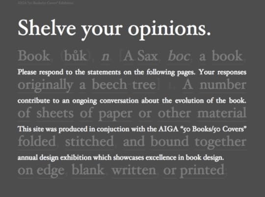
Shelve Your Opinions
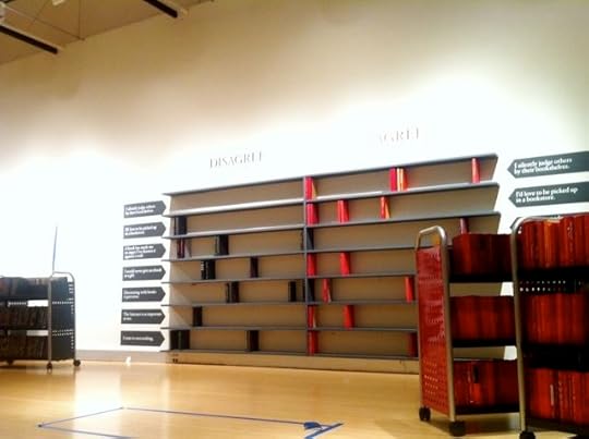
Does our definition of what a book is need to change? Barbara deWilde has been seeking to answer just that as part of her project “What the Book” in my SVA IxD class that also doubles as an installation at the AIGA 50 Books/50 Covers exhibition going up later this week at the AIGA headquarters in NYC. This on the heels of the near cancellation of the competition last year which drew the ire of many designers.
Part of the project is a short survey online that asks you to agree or disagree with such statements as “I would never give an ebook as a gift” and “Decorating with books is perverse”. Those same questions are asked at the exhibit too as an installation that allows viewers to physically shelve books as votes (as seen in the photo above). Very cool.
At the end of the survey, you’re also asked to give your definition of a book. And:
Each day, for the duration of the exhibition, a new definition of the book will be written on the gallery wall at the AIGA National Design Center in New York.
Spend a couple of minutes with the survey, and if you’re in NY between now and the end of February, swing by the exhibit at AIGA.

Jason Santa Maria's Blog

- Jason Santa Maria's profile
- 5 followers

