
Jason Santa Maria's Blog, page 2
December 29, 2014
All the Domains
I register a lot of domain names. Chances are if you’re reading this, you probably have at least a few yourself. Only a handful of mine are in active use. All the others represent a good intention I had to make an awesome website.
The domains all start innocently enough: it could be a funny turn of phrase I hear while out with some friends; an overheard quip from a television in background; a little burning ember of an idea that keeps coming back to me. There was the one where I would interview people about their most prized possession, or the single-serving site about alternatives to using Helvetica. The list goes on and on.
Around this time of year a bunch of my domain names come up for renewal—likely registered after nights out with friends around the holidays. When they came up for renewal this time, I had to stop and think for a minute. What the hell am I doing? Why do I keep renewing these domains when I will probably never get around to doing anything with them.
This is a domain affliction. It feels encoded in any of us working on the web; we register domains at the drop of a hat. Not because we’re looking for a future pay day, but because we’re in constant conflict with the evil domain squatters.
In recent years, the internet has self-corrected the domain squatter problem. There are many viable TLDs available beyond the workhorse .com, from .co, .io, .is, .me, and so many more. But the big change here is that URLs just aren’t that important anymore. It’s still nice to have a short and memorable domain, but the means to get to a site is more important than ever: links. It doesn’t matter how long or weird your URL is, just link someone to it.
Maybe it’s time I got rid of those extra domains.
Years ago I mused that it would be fun to hold a poker game and use domains as the chips. Though, that could actually mean walking away with more domains than you arrived with. Ugh!
More recently I thought it could be fun to have a site (hey, I could get another domain!) where people could list domains for others to claim. But with a catch to keep the domain from just languishing on someone else’s shelf: they’d have a month or so to make a site that uses the domain before it would be transferred to them.
But that seems silly too. Almost like instead of collecting domains I’m collecting ideas to offload domains. Honestly, if I haven’t followed through on the idea behind a domain by now, I’m just wasting money on them. Money that could be going to a charity or at the very least, not down the drain. And some non-domain-squatter might have a better idea for that domain anyway.
I think as my unused domains come up for renewal I’m just going to let them go, or offer them to folks who might use them. There was a time when a domain represented a placeholder for an idea to me. And worse yet, buying the domain gave me a feeling of accomplishment that took the pressure off of having to finish anything more. Now they’ve just become a neglected to-do list (and I have some of those too).
If all those domains went away tomorrow, I would still have the ideas. Those creative impulses can be just a list or a scribble in a sketchbook, until they actually need to be something more. There will be plenty of domains.
This piece originally appeared on The Pastry Box Project.


December 22, 2014
The Sweatpants of Typefaces
I’m a little late to the game, but The Last Word on Helvetica by John Boardley is spot on. It’s well worth a read if you are plagued by the notion of Helvetica being a neutral typeface, or are wondering why some might consider it “the sweatpants of typefaces.” (I do too)
Ostensibly, my only gripe with Helvetica (designed by Max Miedinger & Eduard Hoffmann) is not the typeface itself, but how — and how often — it is pressed into service.
At the real heart of the matter is not only how often Helvetica is used, but how often it’s used a thoughtless default.
What’s your favorite tool? Hammer? screwdriver? chainsaw? The choice of typeface is decided only when one knows the nature of the job. It does not precede it. And sometimes, Helvetica will be one of the tools adequate for the job. Further narrowing down the field: Claw hammer? ball pein? cross and straight pein? club hammer? sledge hammer? soft-face hammer? But never, when it comes to typefaces, can we narrow the field to a single typeface — your typographic soul-mate does not exist in any one typeface. The final selection is a subjective choice made from a field of worthy and appropriate contenders. Never, ever, ever, by a process of elimination, do we arrive at Helvetica. But we might arrive at, say, a typeface with neo-grotesk or grotesk attributes, of which Helvetica is but one example.
I’ll stop there before I just quote the whole article, but a big thank you to John for putting words and reason to this.
The Sweatpants of Typefaces
I’m a little late to the game, but The Last Word on Helvetica by John Boardley is spot on. It’s well worth a read if you are plagued by the notion of Helvetica being a neutral typeface, or are wondering why some might consider it “the sweatpants of typefaces.” (I do too)
Ostensibly, my only gripe with Helvetica (designed by Max Miedinger & Eduard Hoffmann) is not the typeface itself, but how — and how often — it is pressed into service.
At the real heart of the matter is not only how often Helvetica is used, but how often it’s used as a thoughtless default.
What’s your favorite tool? Hammer? screwdriver? chainsaw? The choice of typeface is decided only when one knows the nature of the job. It does not precede it. And sometimes, Helvetica will be one of the tools adequate for the job. Further narrowing down the field: Claw hammer? ball pein? cross and straight pein? club hammer? sledge hammer? soft-face hammer? But never, when it comes to typefaces, can we narrow the field to a single typeface — your typographic soul-mate does not exist in any one typeface. The final selection is a subjective choice made from a field of worthy and appropriate contenders. Never, ever, ever, by a process of elimination, do we arrive at Helvetica. But we might arrive at, say, a typeface with neo-grotesk or grotesk attributes, of which Helvetica is but one example.
I’ll stop there before I just quote the whole article, but a big thank you to John for putting words and reason to this.
December 5, 2014
Responsive Responsibility
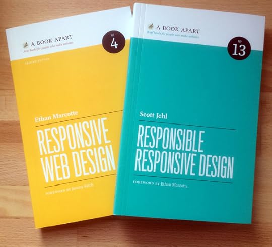
Just over four years ago Ethan Marcotte penned the article “Responsive Web Design”, and a year later we published his book by the same name at A Book Apart. It’s no stretch to say that both have gone on to shape the very way we design websites now.
I think Ethan and his work are brilliant. He’s also as gracious and humble as they come, so he’s the first to highlight the ideas and work that influenced him, notably John Allsopp’s A Dao of Web Design. And this is how the web works best; Ethan builds upon John’s ideas, and then shares with us so that we can build on top of his, and on and on.
And build we did! Responsive design feels like an accepted practice most everywhere you look. With that comes the need to make sure we are doing our best to design responsibly so that our sites are available for every person and every device.
Now, building on Ethan’s book, comes Scott Jehl with a new book, Responsible Responsive Design. Scott’s book comes from the heaps of experience found in his work at Filament Group, and serves as a tactical field guide to making responsive design truly perform. From the book description:
Responsive design has immeasurably improved multi-device, multi-browser visual layout—but it’s only the first step in building responsively. Learn how to turn a critical eye on your designs as you develop for new contexts (what does mobile really mean?) and screen features, speedy and lagging networks, and truly global audiences. Serve the right content across platforms, and tune for performance. Scott Jehl tackles those topics and more, ensuring that the sites and apps you build today last far into the future.
It’s already landed a spot on my desk for frequent reference. And as an added treat, Ethan’s book is now out in a fresh second edition! From an A List Apart interview with Ethan about the new edition:
What changes will readers see in the second edition? The second edition’s changed quite a bit from the first, but the table of contents hasn’t: as in the first edition, the chapters revolve around the three “ingredients” of a responsive design—fluid grids, flexible images, and media queries—and how they work in concert to produce a responsive design. But if you look past the chapter headings, you’ll see a slew of changes. As ALA’s readers probably know, tons of people have written about how to work responsively—whenever possible, tips and resources have been pulled in. (I mean, heck: we now have a responsive images specification, which gets a brief but important mention.) On top of all of that, errors were corrected; broken links fixed; figures updated; questions I’ve received from readers over the years have, whenever possible, been incorporated. I can’t tell you how good it feels to have those edits in—it feels like it’s the book it should’ve been.
Wow! Both Responsible Responsive Design and the second edition of Responsive Web Design are both well worth your time.
I’m excited to be working in such a consistently fertile environment for design, and to be able to benefit from the work of smart people like Scott and Ethan, as well as all the fine folks influenced by them. I hope we never stop pushing things forward and sharing with one another.
December 4, 2014
Alien: Typeset in the Future
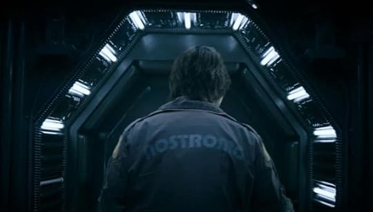
Dave Addey is at it again with another well documented and thoroughly enjoyable piece on the typography from Alien. Typography, sci-fi, film… this touches on all my favorite things.
In her final recorded message before hypersleep, Ripley notes that she is the sole survivor of the Nostromo. What she forgets to mention is that she has not once in the past two hours encountered any Eurostile Bold Extended.
Also, don’t miss Dave’s previous entries on Eurostile, Moon, and 2001: A Space Odyssey. All are highly recommended.
November 19, 2014
Piles of Ideas
I often talk about how sketching is an important step in making something. Whether with pencil and paper, or a keyboard, generating ideas is essential. I struggled with this early on in my career because I felt like putting something down on paper gave it a permanence greater than its value. I thought that by recording something, I was accepting ownership and responsibility for ideas I wasn’t sure of.
Over time, I came to realize that the only way to get to the good ideas was to trudge through all the obvious and bad ones first. Don’t get me wrong: flashes of inspiration happen, but ideas rarely pop out of your head fully formed and ready to go to work. More times that not, ideas are ugly, raw, embarrassing things that you want to slink away from. Most of my ideas never leave this stage.
I want a big sprawling mass of ugly ideas because it helps get past the most obvious ones, and improves the chance for something really interesting to reveal itself. Because the real shape of an idea isn’t an explosion, but evolution. In order for an idea to become something valuable, it needs to be nurtured. It must be molded and fortified into the best version of itself. And that refinement is where our creativity shines. Our ability to combine and link ideas to make them stronger. One small idea opens the door to another. And once you can see that new pathway, it too opens the door to another idea that wasn’t visible from the start.
This piece originally appeared on The Pastry Box Project.

November 12, 2014
Landing on a Comet

Photograph © E.S.A./Rosetta
Humankind is attempting to land a washing-machine-sized bit of science equipment named Philae onto Comet 67P/Churyumov-Gerasimenko today. Think about how awesome that is!
I love space exploration, and this makes me so happy. Not only because we are doing it, but because of how many unknowns there are to do it. You can watch the landing attempt LIVE, view some of the breathtaking photos of the comet beamed back by the Rosetta orbiter, and read all about the mission. Godspeed, Philae!
Update: SCIENCE
Touchdown! My new address: 67P! #CometLanding
— Philae Lander (@Philae2014) November 12, 2014

October 16, 2014
Learning to Run
After 36 years of life, I finally get why people run. I mean, I always understood why people were running in the park or down the street, but this understanding was coupled with internal mockery. “That seems like a painful way to spend time.”
My mockery was probably more jealousy than malice. I grew up as a short and scrawny kid, and I loved to run. I was always running—but only for short distances. I only wanted to get from point A to point B quickly, and only if point A and point B weren’t too far from one another. Even when I ran track in school, I was built for sprinting, but distances eluded me.
Something changed recently. One day I woke up and decided to go run in the park like all those other people. I wouldn’t go to the gym that day, I would enjoy the outdoors and run.
I ran a lap around the park, walked a half lap, and repeated a few times. This equalled out to about three miles total. I felt like absolute death. I was panting and gasping, and long dormant muscles screamed out in pain. I got home and didn’t work out for the rest of the week because it hurt to move my legs.
But here’s the thing. The next day, even as I was groaning in pain, all I could think about was the next time I would be able to run again. And I totally did it again. The next time it didn’t hurt so much. And the time after that it didn’t hurt at all and I ran even farther.
I know this story isn’t going to come as a surprise to any runners out there. But this was huge for me. I love the outdoors, and I love any kind of exercise that doesn’t have me looking at a digital distance counter every two seconds so I can mentally determine when I’m allowed to stop moving.
I’ve been running regularly for well over a month now. I wouldn’t say that any fraction of a marathon is in my future, but somehow distances don’t feel as unsurmountable as they used to.
Maybe I found out how to make running work for me, or maybe I just never really gave it a good honest try. Whatever the case, I absolutely love the times I get to run in our park. I love feeling the little aches in my muscles for the rest of the day, and knowing that my body is alive. It took me over three decades, but I get it now. I get why we run.
This piece originally appeared on The Pastry Box Project.

October 14, 2014
Vintage Halloween Masks
A fantastic photo set of vintage Halloween masks and costumes on Flickr. I could look at these all day. Via Coudal.

October 6, 2014
Pendleton Ward Quits Adventure Time?
Well, sorta. After three years, Pendleton Ward is stepping back to simply be “one of the show’s writers and storyboard artists”. I adore Adventure Time, but also can empathize with him. This is a great interview about what it means to make something and how it can affect you. Reading this left me nodding my head, as I know how I’ve felt from time to time over the last couple of years. Ward’s words certainly ring true:
Dealing with people every day wears on you…
And:
To spend that extra energy and time you don’t have, to make something that’s worth making, to make it awesome, wears you out…
Lastly:
“Whatever the next thing is, I just want my brain to be happy doing it,” he says. “My state of mind is superimportant. I’m so fried, so I have to sort of work within the confines of what my brain can handle.”
He sighs and looks down at his stomach. “It’s nice to just be sleepy and make stuff,” he says. “That’s the root of what I like doing. Make stuff on my own and fall asleep.”
Charming as hell. Whatever comes next, I’m happy for this approach, and that he was able to be so open about it.

Jason Santa Maria's Blog

- Jason Santa Maria's profile
- 5 followers

