
Jason Santa Maria's Blog, page 5
February 18, 2014
Take a breath
Have you ever seen something that someone else made that you just hated? What happened next? Did you rush to Facebook or Twitter to share your disdain with the world?
I know I have.
See, I try to live as a kind and considerate person—so I hate to admit that I have that side to me. And it’s probably always been there. But in the pre-Internet past, it would have only manifested as some silent quips to myself in my head.
I want to be a better person and, just as importantly, I want to be a better member of our community. And I want you to be, too.
So here’s my advice to both of us—to you, and to me: let’s take a breath.
Our pithy remarks can wait at least that long. What’s more, that time might give us a chance to reconsider posting something negative about someone personally or their work just because we weren’t consulted. In other words: let’s not just react. Instead, let’s take a moment to try to understand what’s in front of us, before we speak up. There’s a reason we don’t ask people to create an opinion. We ask them to form an opinion, because that formation takes time and consideration.
An immediate thought that pops into our heads when we first see something is rarely considered, full formed, or hell, even what we really think. It’s often just a reaction to stimuli. That stimulus doesn’t require us to reply with an opinion. Oddly enough, none of us actually need to have an opinion on every occurrence, and certainly not a knee-jerk reaction masquerading as a thoughtful point of view. The Internet has already reached peak snark.
What’s more, critique is not synonymous with “being mean.” It’s not an opportunity to show how smart you are. Thoughtful feedback doesn’t include the words “meh” and “fail,” or begin with “Isn’t in ironic that….”
Critique is about growing. As Leah Reich so thoughtfully wrote in The Uncanny Valley of Earnestness:
Criticism is not negativity. Criticism is not saying you’re bad. Criticism is – it should be – a way of saying: I think you’re good. I know you can do better. I think you can figure out a way how.
I wonder if the speed and accessibility of our social tools can sometimes make us aggressive, even antisocial. Maybe we’re forgetting there are people behind those avatars and usernames. People who work hard and care deeply about what they do. People like you and like me. And as we all know, we’re rarely working under ideal conditions, timelines, or constraints.
The worst part is that this low-level snark falls between the couch cushions of Wheaton’s Law. Most of us aren’t dicks. Most of us aren’t trolls. But there are times when any of us can be sloppy, impatient, or distracted communicators. An inadequate venue for critique, whether in person or in 140 characters, only makes things worse.
There is plenty of room for strong words and tough love in critique, but never for insult or snark. There is a time to appreciate or bemoan work, but it’s usually not the moment just after you’re first exposed to something.
We’ve all probably heard the phrase “haters gonna hate.” We console ourselves and each other with it when the tide turns against us. We wear it like a badge of courage because, well, what’s the alternative? I wish we could throw as much support into an opposite movement. We speak up loudly when we dislike something but don’t always say enough when we love something.
A measure I often use for myself when reflecting on any given day is: did I put more positivity into the world today than negativity?
So, let’s take a breath. And let’s spend a bit more time making well-formed thoughts before speaking our mind. We’re all doing our best out here.
Revised and adapted from my presentation during CreativeMornings’ 5th Birthday celebration.
This piece originally appeared on The Pastry Box Project.


The Winter Olympics Gear Guide
The New York Times has been doing a great job covering the 2014 Winter Olympics, but also a spectacular job of giving the games a bit more context. Their Interactive Stories help explain the details of the events, especially for ones that can feel a bit more cryptic. I also really enjoyed their gear guide that delves into some of the history of the equipment in different sports and compares them with their modern day counterparts. It’s interesting to see how homegrown some of the gear still remains. And look out for the flying squirrel farther down on the page. Lastly, don’t miss The Atlantic’s photo set: Looking Back: Photos From the First 12 Winter Olympics.

January 22, 2014
Discourse in web design
Back in 2007, Speak Up—the web’s town hall for graphic design—asked where were the landmark achievements in web design. Where were web’s design equivalents to Milton Glaser’s Dylan poster, Paula Scher’s Public Theater work, or Massimo Vignelli’s New York subway map?
At the time I felt outrage. Were these graphic designers really throwing the whole of web design on a heap? Did people really not consider what we made real design?
What about Doug Bowman’s monumental work on 2002’s WIRED.com redesign, one of the first sites that showed us all that Web Standards and CSS could happen on something beyond our personal sites? How about Joshua Davis’ Praystation, who revealed complex animated interactions to a static web? Or communities like k10k that helped spread the message of good design and culture to all us practitioners?
None of these fit easily into the mold of a beautifully typeset poster on the side of a building, but these were more than websites or landmarks, they were full blown movements! Why couldn’t they see that?
I didn’t say anything about it at the time because I never felt I could articulate a response—the answers seemed apparent to me. The thoughts never went away, but I opted to just keep trying to make the best work I was able.
A recent tweet from Mark Boulton brought it all back again: “Graphic Design had Emigré. What does web design have?”
Of course! Emigré was the periodical for design culture and discourse. I read it religiously when I was in school and afterwards. The essays they published helped shape the way I thought about design. That kind of critical discourse about design on the web is all but non-existent.
We talk all the time on our personal and periodical sites about the latest techniques for design, but how often do we break down new designs? I mean really discuss them, not just add them to a gallery of notable sites.
Aesthetics are just one lens we can use to look at web design. Culture, time, place, and technology are others. Some websites look and act the way they do because of the state of technology during the time they were made. The landscape of architecture was changed by the invention of steel, just as the landscape of web was change by Flash, CSS, mobile phones, and Retina screens.
What’s more, graphic design critics and teachers constantly use these past landmarks to bring context to history, today’s design, and as a common measuring stick for what’s successful. On the web, we commonly move on to the newest things that displace what came before.
If work like Bowman’s WIRED.com website was so wonderful, does the fact that it isn’t suited to today’s web diminish that fact? We can build websites faster and smarter than we used to, they can respond to being viewed on screens as small as our mobile phone or as large as our televisions, but the work we do today is important for another reason.
We are all standing on the shoulders of the work that came before us—just as Vignelli’s subway poster was influenced by Henry Beck’s 1933 London Underground map, and Glaser’s Dylan poster was influenced by a 1957 self-portrait from Marcel Duchamp. Will new students to web design know of these same connections in their own field, or will the work done before their time always be quaint artifacts of a bizarre, retro internet where aliased type, tables, browser plugins, and slow connections ruled the land? Or worse, will they never know of the work at all?
If we are only able to judge web design through the lens of print design, we’re doomed to never measure up. Web designers know our work has very different parameters and constraints than the printed page. Even though we use many of the same raw materials—imagery, text, color, and grids—the results are very different. Why would you ever judge a website on the same scale as a poster?
A website is its own, singular thing. We know it isn’t a book, a TV show, a film, or a song, but our language is limited to talking about it in those restrictive boxes. A website is a mix of all of those things, and none of those things. It is influenced by place and time. A website changes with age. It can evolve and regress.
It was then I wondered if the problem wasn’t that web design lacked its own Emigré. What if we actually lacked a shared language to critically discuss web design? Art, architecture, and even graphic design, have critics and historians that give context to new work through the lenses of culture and important work from the past.
So where does a common language for discourse start? Not just one for us as web designers, but one that will give structure to others who don’t as deeply understand what we do?
The recent redesign of The New York Times perfectly illustrates the mindset of modern web design. The design itself is exceptional: solid typography, navigation, and further reinforcement to the visual language that makes The Times, well, The Times. While the general response has been positive, it’s bundled with some disappointment that the site didn’t innovate like “Snow Fall” or disrupt some paradigms.
The problem isn’t with The Times. In the last couple years, the site and their editorial design work has been brilliant. The problem is that we don’t have the right words to talk about this stuff, let alone the right context to find common ground for real discussion inside our industry or the folks just outside it. If our eyes are only attuned to the latest shiny thing, we can’t possibly understand anything of influence or consequence.
I realize I’m asking lots of questions, and I still don’t have the answers. I’m not a historian or a critic, I’m a practitioner. And perhaps that’s the key: maybe this needs to come from the outside, from people who can step back, see a larger picture of web design, and understand how it fits into everything else.
This piece originally appeared on The Pastry Box Project.
Afterword
The response to the above piece was really encouraging, thank you! I have a few additional thoughts and reactions:
Jeremy Keith kindly reminded me of his 2007 piece “Design doing” where he questions the same Speak Up article and ensuing discussion. Cennydd Bowles showed me his 2010 “Beauty in web design” series (parts 2 and 3) based where he tries to find the a language for talking about web design through the lens of beauty itself. And in “Perennial Design” (a preview of Issue 4 of The Manual), Wilson Miner wonders where we can find longevity in our designs. All are great and recommended reads.
Some folks responded on Twitter that publications like Offscreen and The Manual may be the web’s Emigré. Both of those publications are wonderful, and though I bring up Emigré as an example, I think that it is a result of a larger scope of discourse rather than the only cause of it. We don’t need our Emigré as much as we need the tools and environment that yields communication like it.
Others folks suggested that the web may be too young for us to really have perspective on its larger roll yet. The web has already gone through bubbles, Arab Springs, wars, elections, natural disasters, assassinations, and more as well as the minutiae of life at the global and local scale. The sites and applications we make have been there beside us the whole time, changing and growing to support and connect us across everything that happens in our daily lives. That we can lose something as important to the story of the web as GeoCities shows that we can’t hide behind the “too young” straw man any longer.
The AIGA is celebrating its centennial this year and is marking the occasion by showcasing the impact of design over the last 100 years. Only a few websites made the grade (including Facebook of all things), despite the web being around for over a fifth of that hundred years. Granted, the AIGA is still very much coming from a traditional graphic design mindset, but this shows that the value and reach of our work is not immediately apparent to designers from other walks.
As I said above, I’m a practitioner and I’m still wrapping my head around this stuff. We may lack answers to these questions, but that doesn’t mean they’re unreachable—just that we have work to do.

September 24, 2013
Don’t be dumb, use smart quotes
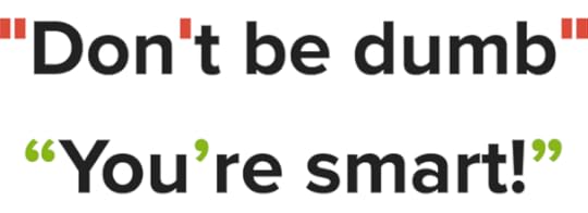
Today is National Punctuation Day (it’s totally a thing). To celebrate, I made Smart Quotes for Smart People, a single-serving site to spread awareness of a horrible vestige in today’s typography: dumb quotes.
Don’t be dumb. Today is the day. Take a moment to check your sites and your type—especially the big headlines—and correct your quotation marks and apostrophes. We’re not perfect, and neither are our systems, but we should strive to do better. And it’s so easy to get this right.
Every time you use a malformed apostrophe or quote, someone consciously decides to use Comic Sans. That’s two wrongs and both are your fault. And I know you’re smarter than that.
Check out Smart Quotes for Smart People today and starting righting typographic wrongs. Special thanks to Stephen Coles, Liz Danzico, and Grant Hutchinson for their keen proofing eyes.

September 15, 2013
Just Enough Research, by Erika Hall
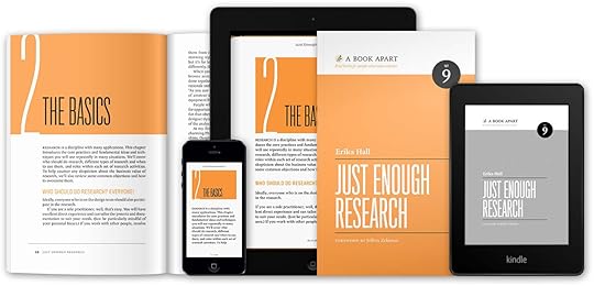
Last week brought another wonderful title to the A Book Apart library, Just Enough Research by Erika Hall:
Design research is a hard slog that takes years to learn and time away from the real work of design, right? Wrong.
Good research is about asking more and better questions, and thinking critically about the answers. It’s something every member of your team can and should do, and which everyone can learn, quickly. And done well, it will save you time and money by reducing unknowns and creating a solid foundation to build the right thing, in the most effective way.
In Just Enough Research, co-founder of Mule Design Erika Hall distills her experience into a brief cookbook of research methods. Learn how to discover your competitive advantages, spot your own blind spots and biases, understand and harness your findings, and why you should never, ever hold a focus group. You’ll start doing good research faster than you can plan your next pitch.
Erika manages to dispel all the excuses people usually make to get out of doing research, and breaks it down to be thoroughly practical and approachable. Do yourself a favor and pick up a copy today!
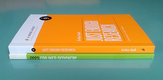
Design and paperback format updates
I’m also excited that Erika’s book marks the first to sport our updated paperback styles and logo. Back when we came out with our first book, I hadn’t entirely thought through how the design system might play out across other titles, and we were mostly concerned with not losing our collective shirt trying to make books. As time went on, I started uncovering some of the shortcomings of the design decisions I made early on. Seemingly small things like having the book title type in both black and white proved to drastically limit the color options available for covers; too light of a color and the white type would disappear, too dark of a color and the black type would do the same.
Similarly, we were finally able to change the spine treatment to include the full title (this was never a mistake on the original books, but a limitation from our original printer). I was able to correct those things and more to give ourselves a lot more flexibility for future titles. We’ve also made lots of other updates to our paper stock, printing, and binding. You can read more about the design updates on the A Book Apart blog here and here.

June 6, 2013
The Space Between the Notes
All signs are pointing to a revamp of iOS being announced at Apple’s WWDC next week, and with it, a lot of speculation around what it might look like.
Will iOS 7 be flat instead of skeuomorphic? Can Apple innovate with software as they’ve done with hardware? Sure, why not, but maybe we’re not asking the right questions. An interface has less to do with what it looks like and more with what it feels like in use (with a nod to Mr. Jobs).
The bright side of skeuomorphism
If skeuomorphism has a bright side, it’s that an interface can take advantage of a user’s existing knowledge. A calendar that looks like a literal calendar—rather than an interface for calendar-like functions—can set users into a familiar mode. The interface needs no time to explain what it does, and the user can get on with the task at hand.
This kind of familiarity may sound like an unnecessary crutch, but remember: it wasn’t that long ago that the idea of an adaptable interface under glass was new to all of us. For folks who aren’t as savvy with technology, the familiarity provided by skeuomorphism can mean more than you know. Of course, as with all things, there needs to be a balance. Apple’s iOS has veered so heavily into skeuomorphism that it often detracts from the experience, and amounts to over-decoration: stitching, leather, torn pages. Blech.
After looking at more heavy-handed skeuomorphic design choices like that, it’s tempting to see “flat” design as a natural counterpoint. But so-called flat design is not the opposite of skeuomorphism—they aren’t even on the same spectrum. That’s because this flat movement isn’t an approach for designing interactions, but aesthetic veneers. Calling someone’s design style “flat” is like saying a musician’s style is “loud.”
And veneer is a good thing! It’s what stuff looks like and aids in the way we perceive an interface. But don’t mistake a flat design for just designing minimally to create the most clear interface possible, which should be the goal for most any design. A good interface can be flat, 3D, photographic, invisible, or anything in between.
Instead, skeuomorphism is a mode of design and a metaphor for function. It’s a spectrum, not a binary between being either “skeuomorphic” or “not skeuomorphic.” This is helpful, since interface design is rarely about black-or-white scenarios. Good interfaces blend the most useful and appropriate pieces along the spectrum, allowing users to build on the familiarity they have with other objects and experiences. It’s absolutely true that minimalist designs can declutter interfaces, which can help solve some interaction and usability problems. But the lack of clutter itself is not the innovation; it’s still the veneer. If innovation does happen, it’s usually in the ideas, language, and interactions that lie beneath that exterior.
The myth of innovation
The word “innovation” gets thrown around so much one might think it’s as easy as applying enough elbow grease. The mere notion of innovation has become some sort of arms race in wowing people with newness. This might be a straw man for our attention-mongering culture, but it’s far from reality. If you think innovation happens by continually introducing things no one has ever seen or dreamed of before, you would make a poor product lead.
What people sometimes mean when they say innovation is actually iteration—continually building on good thinking and assumptions, then, most importantly, believing in the equity of those decisions enough to keep revising upon them. This more pragmatic approach doesn’t get much love, sadly. Maybe that’s because when you break down the stepping stones of iteration, they look and sound decidedly less sexy than a new shiny thing.
How can we be so blind to the fact that companies like Apple have been succeeding because of careful, patient iteration for many years? That they have never really worked in leaps and bounds, but increments? Good ideas don’t pop out of someone’s head pure and fully-formed. They get that way by being tested, questioned, beaten down, and rebuilt. Real innovation means thinking around a problem from a different point of view. Trying to be innovative, just like trying to be cool, usually fails.
Growing up
iOS needs to mature to continue to innovate. When that happens, it probably won’t look entirely new, just like another small step forward. It won’t be flashy, and pundits will cry fail, but that’s also how you’ll know Apple is doing something right.
I want iOS to grow up. I want it to act like it’s been around for 6 years and that it knows the score. Iteration like this can reduce the need for skeuomorphism; when people become more familiar with an interface, it can be pared down aesthetically over time. Not necessarily flat, just less.
But the most important issues aren’t in the aesthetics. For instance, I rarely find myself monotasking with my phone or iPad. I’m looking something up, taking notes, and composing an email. Or retrieving login credentials from 1Password and then jumping over to a browser to sign in (after having already been there to get a login screen before jumping to 1Password). These days, doing anything on my phone isn’t measured by what an app does, but by the space in time I’m navigating between apps—the moments of transition between doing something and doing something else. Over the years, getting to the task at hand, wherever I am, has become the most frequent point of frustration with using a gadget. The app switcher bar in iOS is a bandage that’s well past its usefullness. iOS needs a more elegant way for users to flow from one app to the next to achieve one task.
Claude Debussy said that “music is the space between the notes,” and good interaction design shapes the space between tasks. It’s not as simple as just saying iOS needs “multitasking.” The OS should feel more like an environment for stuff to nebulously happen where and when it’s desired, rather than a series of isolated cells knocking out morse code between the walls.
I don’t know what the solution looks like. Thankfully, that job goes to Jonathan Ive and his team.

February 11, 2013
Editorially
Writing is hard. Just putting that sentence out there is laughable, because it seems so obvious. The fact that we know it doesn’t make it go away, but it does mean there are many opportunities to make it less painful.
A good process means understanding that the nature of writing is more than putting words on a page. It’s about iteration and collaboration — giving the conversation around the text equal weight with the text itself. Our tools need to set the stage for these conversations to happen with as little friction as possible.
The inimitable Mandy Brown — an editor, designer, and colleague of mine from both Typekit and A Book Apart — has had the itch to do something about this for as long as I’ve known her. When she asked me to help her, I signed right up. Before I knew it, we were joined by friends and talented heavyweights, Ethan Marcotte and David Yee. Shortly afterwards we hired Rob Brackett, following his stint at Code for America. I’m humbled to count myself among such an amazing group of folks.
We’re making a new platform for writers and editors called Editorially. Our goal is to make the very best tool for writing — one that helps you collaborate, and so helps you write better.
We’re just getting started, and there are many fun things yet to come, but today we’re ready to start talking about what we’ve been making. You can read more on our blog, catch up with us on Twitter, and most importantly, signup to get access to our forthcoming beta.

December 19, 2012
De-Aparting
Over 7 years and 167 issues later, the time has come for me to step down as creative director for A List Apart.
Jeffrey gave me a shot all those years ago to work with him on some amazing projects. Eventually, this reflected inward and we worked together with Eric Meyer to revamp A List Apart into something worthy of its content.
We concocted a simple system for issues, branding each one with unique colors to mark the event, and articles shepherded with editorial illustrations by Kevin Cornell. And it was all writ large for resolutions as gigantic as 1024 x 768. We introduced a shared identity system for the site and for ALA’s sister organizations: An Event Apart, and the yet to be created, A Book Apart.
A List Apart was a lot of firsts for me: first big community project, first largely editorial website design, first website intended for a screen over 800px wide, and more. None of those things may seem remarkable today, but back then they were, and they still mean a lot to me now.
I’ll miss the ebb and flow of the content stream, helping shape the stories, and working with some seriously smart folks. Working alongside them on ALA helped make me into the designer I am today.
A shiny new version of the site is planned for early next year that’s going to be awesome. Besides, they can’t get rid of me that easily, I’ll be hanging around the new site writing about design and typography. And I’m still full steam ahead on A Book Apart with Mandy, Jeffrey, and the gang. Onward!

November 14, 2012
Saying “No”
CreativeMornings was started by my friend and studiomate Tina Roth-Eisenberg is one of the best speaker series around, bringing in wonderfully insightful people to share their stories over a hot cup of coffee among local creative folk. What started out as a local NY endeavor has since blossomed into a global movement with nearly 40 chapters all over the world.
I had the pleasure of speaking alongside Simon Collison for the New York chapter last month as part of the Kickstarter benefit to create an archive of of every video from every speaker from every chapter.
I spoke on a topic that’s become very near and dear to my heart in the past few years: saying “no”. It might be saying no to a project or job, or even something that you think you can’t say no to, but finding the strength to set your own priorities for what you want is one of the most crucial things you can do in life. Saying no used to make me uncomfortable, and despite making many mistakes on my way there, I’ve learned to feel good about saying it. The talk is just a short 20 minutes, but sums up most everything I’ve learned about the topic in all my years working and living.
Not to be left out, Simon gave a heartfelt talk about striving to feel fulfilled as a designer amidst the speed of career and life. In Simon’s words:
My own talk was a short, sharp and very honest fifteen minutes about being a web designer, managing the weight of learning and noise, turning that noise into signals, communicating with our cousins in print, and more besides.
Thanks to the efforts of Tina, her cadre of helpers, and chapter organizers, CreativeMornings consistently serves as a creative pep talk for people everywhere. I’m so happy that we’ll all have access to an archive of everything soon. Until then, many videos are already available on Vimeo across the chapters.
And I want to say thanks to everyone who helped back the Kickstarter project, especially those of you who came out early to hear Simon and me speak in New York.

November 5, 2012
Content Strategy for Mobile, by Karen McGrane
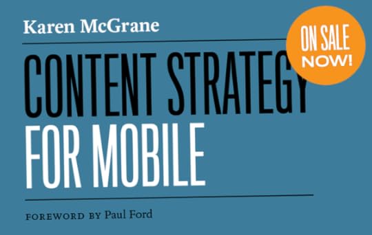
I’m excited to announce another title from A Book Apart, Content Strategy for Mobile by Karen McGrane. Karen is one of my favorite writers, speakers, and teachers. She has the ability to boil down complex information in such a pleasant and reassuring way. And she does just that in her book:
You don’t get to decide which platform or device your customers use to access your content: they do.
Mobile isn’t just smartphones, and it doesn’t necessarily mean you are on the move. It’s a proliferation of devices, platforms, and screensizes — from the tiniest “dumb” phones to the desktop web. How can you be sure that your content will work everywhere, all the time
Karen McGrane will teach you everything you need to get your content onto mobile devices (and more). You’ll first gather data to help you make the case for a mobile strategy, then learn how to publish flexibly to multiple channels. Along the way, you’ll get valuable advice on adapting your workflow to a world of emerging devices, platforms, screen sizes, and resolutions. And all in the less time than it takes you to fly from New York to Chicago.
The mobile landscape is changing at breakneck pace. While technical concerns are important for working on mobile devices, content still sits at the head of the table. Karen will show you how. Pick up a copy of Content Strategy for Mobile today!
Also, A Book Apart is donating 15% of all sales on Monday, November 5th, to the Red Cross to aid the victims of Hurricane Sandy.

Jason Santa Maria's Blog

- Jason Santa Maria's profile
- 5 followers

