
Andrew Winkel's Blog, page 8
September 29, 2011
Stupid, Stupid Word Features
Have you ever inserted an image into Microsoft Word (pick your flavor, Mac or Windows; pick your version, 2011, 2010, 2008, 2007, 2003…) only to discover that the rules of placing an object don't apply to the physics of Word? If you're like me, you remember Color Forms, and you would place a little pizza in the hand of Leonardo, who would hold the pizza until you moved it. Not in Word. Insert a Pizza onto Leonardo and BAM, Leonardo moves. He'll zip away from that pizza faster than if it's magnetized and he's got the wrong end of a magnet loaded in his TMNT Underoos. Then when you try to relocate your picture, clicking and dragging it to a new location…ZAP, it teleports to another page. It's not even on the same screen. In fact, you're not sure if maybe it didn't just borrow a move from Mr. Scott and teleport to another dimension because you can't find it unless you keep scrolling to where it sits in the nether-printing-region between pages. Or another of my favorites: drag the image to a new page and TA-DA, for some reason there's an entire page of blankness hanging out above your image looking for all purposes as though picture was there, but isn't. Here's another one I just dealt with: WordWrap is supposed to make sure the words aren't hidden by the image. I inserted a picture and resized it to fill the entire page then set the WordWrap to top and bottom. You would think, as I did, that since there was no printable area left on the page, that all of the text would simply have wrapped to the next page. No, instead there was a single line of text that was hidden behind the image whose wrapping was set to top and bottom. I even adjusted the wrap area of the picture and expanded it to fill the entire page, but to no avail. I guess WordWrap options aren't settings, they're suggestions.

Yes, those words are inside the borders of the picture despite the wrapping settings.
And don't get me started on anchors. What deviant decided it would make sense to hide anchors unless you can navigate to the Word Preferences (In Office 2011 for Mac, Word menu, Preferences, View, check either Show Object Anchors or All Non-printing Characters), as though it's some kind of rite of passage to discover that the actual place you see the picture and the actual snippet of code that represents the picture are located separately? Is this like storing your soul in a shoe box under your bed so nobody can find it? How can an anchor for a picture be in a different paragraph than the picture?

Note the image and its anchor within waving distance of one another.
You're happily deleting text from a paragraph when a picture somewhere else in the document is destroyed like some kind of cosmic joke. It's happy in its existence, protected from your hungry cursor until, BLIP, the invisible anchor gets deleted and the picture bursts from your RAM without so much as a bleep.
I know, I have complained about Scribus files that joined the Sith and refused to open any longer, but Scribus is an OpenSource program. There are warnings with Scribus to prepare you that the application will vaporize at inopportune moments. Not so with Word. It's the single most popular word processing program in history. It ate WordPerfect so completely that WordPerfect exists as a piece of parsley stuck in Word's molars. (No, I don't mean literally. I realize WordPerfect evolved into something owned by Corel and probably still exists like one of the Ringwraiths, a shallow, craven wight beholden to whatever corporate master has purchased its slightly familiar trademarked name. I meant this statement figuratively. Word has become so ubiquitous that WordPerfect doesn't even earn a footnote in the history of adding footnotes with word processing software.)
Sure, sure, some Word-slinger with his shiny Microsoft certification badge can slide his thumbs beneath his suspenders and lean back to declare that these issues are only related to my ignorance. In the meanwhile, I'm going to learn inDesign.


September 22, 2011
What Not to Expect in Raceboy and Super Qwok Adventures
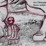
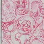
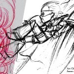
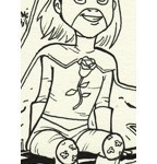
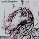
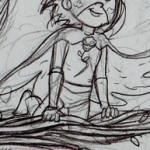
Chris delivered another four illustrations last night, putting the total complete at 31. I haven't posted any previews of his artwork for a while, so I thought it would be fun to show some more of what you won't see in Raceboy and Super Qwok Adventures. Some of these images are designs that didn't make the cut and were revised into new forms. Others are roughs that did make the cut but are presented here cropped differently to allow the final illustration to remain a pleasant surprise.
[image error]
[image error]
[image error]
[image error]


September 18, 2011
eBooks on the Back Burner
I'm going to stop worrying about converting The Disappearance of Ichabod Crane to an epub or mobipocket. Instead I'm going to refocus on getting Raceboy and Super Qwok Adventures in shape for when Chris finishes illustrations. We've spent the last week looking at jetpacks and discussing booster size. He may be able to wrap up by the end of October, which gives me a two month window to have the book prepared by January.
September 7, 2011
Release!
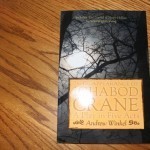
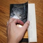
The Disappearance of Ichabod Crane is available through internet booksellers like Amazon.com and BN.com.
Additionally, Hierophantasm.com is no longer in maintenance mode. I thought about working on the site for a while longer, toying with the eShop Add-in, but to be quite honest, the array of considerations about taxes and shipping and then the headache of figuring out a method to accept payments online makes it drop dramatically in my list of things to accomplish right now. Books are my priority, especially converting the title to ebook formats. Amazon's Kindle appears to be a modified Mobipocket format, while both iBook and the Nook appear to use ePub. That means working through two conversions. While both Amazon and Barnes and Noble offer online tools to perform this conversion, I'm not quite there yet. Maybe by this weekend? I shouldn't write that. It's never wise to predict, because that's an invitation for Winkel's luck to come into play.
September 5, 2011
Is It Situational Irony, Or Does It Just Suck?
Two days after I authorized my proof copy and made The Disappearance of Ichabod Crane available for sale, I found out that the Bourbonnais Township Park District will no longer be using their abridged version of my script for their annual Night at Sleepy Hollow event. They added an outdoor stage earlier this year which has led them to move in a new direction, abandoning campfire rings for a more traditionally styled performance.
The Disappearance of Ichabod Crane ran for five years from 2006 to 2010 on weekends each October (weather permitting). Though it was never credited to me, this severely abridged version of my play exposed more people to my writing than anything else I have ever composed.
September 2, 2011
September 2nd Is Some Consolation
No, I didn't make September 1st, but I hit September 2nd,; that's at least something! After the runaround of the last month, the failed print jobs, the tedium of reworking files I'd already created before, I can announce that The Disappearance of Ichabod Crane is now available. I can't tell you where it's available yet because the data will likely need to filter through various databases and it's a holiday weekend. But the printer shows the title as available, and I can place orders for copies.
Things are moving ahead. Finally.
August 21, 2011
Oh, the Irony
After weeks of delays caused by rip errors, I finally received my second proof copy of The Disappearance of Ichabod Crane in the mail yesterday. I examined the newly designed cover, cracked it open to reveal…
It wasn't my book on the inside.
I don't think September 1st is going to happen.
Calculating Grade Level in a Draft
Supposedly Microsoft Word can calculate the grade level for a text. I say supposedly because when I try to do this with the Raceboy and Super Qwok Adventures draft, it doesn't work. Yes, I've gone to the Word menu and selected Preferences. Yes, I've clicked Spelling and Grammar, then checked the box that says "Show readability statistics." I even spell-checked the entire 90,000 word book, only to receive an error message about how Microsoft Word couldn't store that many "Ignore all" choices.
I needed an alternative. I needed something that could calculate the grade level of a manuscript without having to spell check or grammar check the entire thing. I found a freeware Mac application that does just this. It's called Word Counter by Supermagnus software (www.supermagnus.com), but counting words is just the beginning.
Word Counter:
counts overall words (of course);
counts word frequencies (i.e., how many times a specific word is used in the text);
displays readability statistics; and
offers preferences (for example, the program can ignore common words).
The program is ultra simple. Paste a bunch of text into it, and then hit "word count." The results are instantaneous.
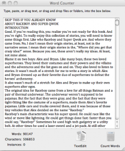 I was more interested in readability, so I clicked "Window: Show Readability Statistics Window." Then I clicked the Calculate button. This option was not so instantaneous, and I noticed that with style formatting from Word, it got hung up. After I eliminated the styles and pasted simple text, this procedure took only a couple of minutes to conclude.
Notice the abundance of readability scores. I've enlarged the following screen print to show the program's assessment of Raceboy and Super Qwok Adventures:
Before criticizing my analysis, which alert readers will have noticed included titles, just know that I wanted to test drive this application and get a sense of where the draft is. I will remove all headings and only analyze the narrative when I do a final analysis.
I noticed that the last update to Word Counter was in February, 2009. While this is a long time for a program to go without revisions, the author, David Hanauer, explains that he considers the program "mature," which means that "It does its job very well and likely meets the needs of the average user." I agree. Sometimes when people create a great tool they get so attached to it that they improve it and add to it and the next thing you know, it's Windows Vista, and you can't figure out why the darn thing won't work. Keep it simple…
Disclaimer: this review is not a substitute for your own good judgement. Make use of this software at your own risk, as I make no guarantees or warrantees about its performance or applicability to your situation.
August 15, 2011
Fourth Time a Charm
After three rip errors, I received notice today that the fourth PDF file was able to process correctly and print. It has shipped. Although I am now two weeks behind where I wanted to be, there is hope to have The Disappearance of Ichabod Crane ready for distribution by September, which gives me time to have it available by October, which would be the best season for it.
Here's what I've learned:
The information I received from the printer was that there was some sort of corruption within the footnotes of the file. I had used the font TeX Gyre Termes for the footnote references. TeX Gyre Termes is an eminently readable font which had lead me to pick it for my main font for Raceboy and Super Qwok Adventures. However, in the test copy, I found that the ligatures would print as a whole word and create unnatural divisions within words ("fly," for example, might look like "fl y"). Given this strange result with ligatures, I decided to remove TeX Gyre Termes from the Ichabod Crane file altogether. In fact, I went one step further and tried to find and replace every instance of formatting a font as Times New Roman also. Doing so led me to a couple lines that I had managed to miss which is frustrating, because I hate being imperfect (despite the nature of the universe, whose main function is to remind me of my imperfections). Somehow, mysteriously, Times New Roman is sort of like a virus. I never could totally eliminate the font from being embedded when the file was converted to a PDF. I guess Times New Roman is sort of in Word's DNA.
Anyway, I replaced TeX Gyre Termes with Linux Libertine, which is another eminently readable font. I had to do this because for some mysterious reason, Word will not use the Advanced Font options in relation to the Footnote Reference style. What I mean is that if you open a Word file on the Mac in Word 2011 and type the characters 1234567890, you may see the bottoms of the digits staggered almost like lower and upper case letters. If you do, it's because the font face you've chosen uses "old-style" numbers. To modify this with the newer Open Type fonts, you can select Format>Font>Advanced Tab. From the Number Forms combo box, pick Lining to modify the style of the characters to line up on the baseline. This formatting trick would not work in the Styles for Footnote Reference. It simply ignored lining the digits, so I had to pick a font that lines the numbers by default.
When all was said and done, I re-created the PDF, re-uploaded it, re-ordered it, and finally, it's on its way.
August 13, 2011
Belated Congratulations to Chris
Chris Brault, the illustrator for Raceboy and Super Qwok Adventures, was one of around 60 artists whose fan art was chosen for display at Conan O'Brien's "Art of the Flaming C" exhibit near this year's San Diego Comicon.
 You can check out the Museum of Conan Art and his actual entry here.
Conan O'Brien created his superhero alter ego during his late night television show. The Flaming C, then, is kindred to Raceboy, Super Qwok, Flowergirl, and Dr. Destructo, since those alter egos were the creations of my children, and all of the heroes are inspired by the comics and cartoons and movies that both generations have encountered while growing up.


![[image error]](http://andrewwinkel.com/wp-content/uploads/2011/08/Readability.png)