Quinn McDonald's Blog, page 72
March 25, 2013
Creativty, Originality, and Good Manners
If you do any creative work, you know that you will have a brilliant idea, fall in love with the idea, polish it, then release it to public view. As soon as you do that, you will see the same idea all over. You get angry. Who stole your idea? The answer is–nobody. There are several reasons this happens.

Parallel Universe from May 8, 2012 edition of the NY Times eXaminer. No photo credit is given.
1. Heightened awareness. Once you begin to concentrate on an idea, and certain words, phrases, images begin to repeat in your head. Your heightened awareness makes you see those words “more often,” when you are really simply more aware of seeing them. This happens when you learn a new word–you suddenly see it three times in a day when you don’t recall seeing it before. This is the same reason that gratitude journals work, but that’s another blog post.
2. Mysterious parallel universes. OK, I made that up. If you were to ask a Russian who invented the telephone it’s unlikely they would credit Alexander Graham Bell. They would mention a Russian who invented the device roughly at the same time. With the increasing speed of knowledge shared through the internet, more people come up with similar ideas more often.

From SquawkFox.com
3. Your grass seed, my lawn. When we talk about our ideas to a friend, the friend often takes the next step with the idea. You talk about creating a journal page using a dictionary page, and suddenly your friend is teaching a class on altering dictionaries. And that’s when things get sticky.
This is the hard part. I know exactly how hard it is, because I just had to go through it. One of my favorite techniques (and the basis for the upcoming book) turned up on another site. Yes, I was angry. Yes, I felt cheated. But I also know that ideas can’t be copyrighted, and that my idea doesn’t belong to me exclusively. What to do? Well, break that list into legal, ethical and generous steps.
Legally, I notified my publisher, so if any of the images I shared or the journal prompts I created and shared appear on another website, the publisher can handle the copyright violation.
Ethically, if my idea is similar to another artists, I have to follow the rules The Ethics Guy uses to judge actions as ethical. (Bruce Weinstein, Ph.D. is the Ethic Guy). This isn’t that complicated:
Do no harm
Make things better
Be respectful
Be fair
Be compassionate
But the items may be hugely difficult to manage. If someone treats you unfairly, you don’t want to treat them (or anyone else) fairly. But you have to. The entire reason the world doesn’t collapse into savaging each other is that most of us want to be fair and even generous.
How do we act fairly and generously? We give credit. It doesn’t detract from our work, it adds to it. Giving other people credit for helping you get to your own idea is a wonderful way to increase your creativity and your peace of mind.
Saying thank you on your blog, in your classes, in your articles, even giving up some of those precious 140 characters in a Tweet to thank someone, is a gift to yourself.
Thanking and crediting others relieves you of guilt, makes you feel generous, expands your creativity. And I’d like to thank my editor, Tonia Jenny, for helping me come to that conclusion.
–-Quinn McDonald keeps a gratitude journal and another one for ideas on change. Sometimes she writes one idea in another, and then alchemy happens.
Filed under: Coaching, The Writing Life Tagged: Creativity, creativity coaching, ethical art, generosity, integrity in ideas, making art


March 24, 2013
The *Other* Five-Minute Rule
 No matter how much I try, for the last few weeks I’ve been late–to client meetings, to hair appointments, to teaching gigs. It’s frustrating because I don’t know why. It wasn’t that I secretly didn’t want to go or was afraid. Just late.
So I kept track of what made me late and found out some surprising things.
1. It takes you longer to get there then Google Maps tells you it does. A GPS system takes you from door to door, not from the time I get in the car, can’t remember if I’ve locked the front door, go back and check (I did), grab a bottle of water, get back in the car and drive. At the client’s, I have to enter the parking garage, find a parking place, walk to the parking lot elevator, and cross half the “campus” to find the right building. All that adds up. None of that is accounted for on Google Maps. Now I add 15 minutes to Google Maps just to get there, and if I have to drive across the Valley, another half hour for traffic delays. I can always take a book or work with me in case the lights line up and I get there early. What I didn’t want to admit is that leaving an extra 45 minutes was needed. I kept trying to do more work in less time.
 2. That “one last email” before you leave takes more time than you think. In my case, finishing up “a few things” was about 20 minutes, not the “can’t be more than five minutes” I originally thought.
3. “Leaving” means out the door, not to the bathroom, stop to put on lipstick, and round up the cats, who are not interested in my schedule.
4. I’m slow in the morning. No matter how I wish I could wake up and get out the door in 20 minutes, it doesn’t work for me. I need at least an hour and 15 minutes to get ready and eat breakfast. So I need to leave that amount of time.
5. If the meeting is in the middle of the day, it often means I have to change clothes or at least shoes. It also means I have to lock up the house, and check to make sure I’m not watering trees or doing laundry. (I learned the hard way never to leave the washer running when you are out of the house.)
When I’m working and busy, I underestimate how much time I need and how much work I have. So I have to figure out when I need to leave and then give myself a ten-minute window to actually get out of the house. At first I felt anxious that I was wasting time. With a long to-do list, though, my idea of wasting time is changing. Trying to do “one more thing” is a bigger waste of time than I had imagined.
—Quinn McDonald wears a wrist watch. It’s an analog watch, because she needs to know what time it isn’t along with what time it is.
Filed under: In My Life, Inner Critic Tagged: late, time management, timers


March 23, 2013
Saturday Creative Stroll
It’s the weekend, so time for a stroll around the internet to give you a creative boost.
Galen Berry is a paper marbler. His work is amazing. He does traditional styles and some wonderful new innovations, like Dragon in the sky, below. See more marbled paper examples on his website.

Galen Berry’s paper marbling.
Quo Vadis is a blog with tools for creative minds. If I haven’t been there for a few months, I can get lost jumping around from ink recommendations to slice of life stories. He tells us about Alexander Wang (the creative director of Balenciaga) and his interest in altering a Habana journal. This is not your run-of-the-mill altering. The journal now has brass edges.
Anna Hawthorne is a bookbinder who does a wonderful job updating books with interesting and inventive bindings.
If you like wine and you like maps, combine you love with these interesting maps of various wine regions. I think they’d make great labels, book covers, or folders for loose-leaf journal pages.
If you are in the Phoenix area, I’ll be teaching One-Sentence Art Journaling at the White Tank Library at 2:30 p.m on Saturday. No charge. Just come and have fun! Address: 20304 W White Tanks Mtn Rd. Waddell, AZ Call 602-352-3000 for question
–Quinn McDonald is a writer and art journaler. She has inky fingers.
Filed under: Creativity, Links, resources, idea boosts Tagged: ceativity coach, galen berry, one-sentence journaling, paper marbling, white tanks library


March 22, 2013
Splash Ink: New Product
This isn’t a review, because I haven’t had these inks long enough to do anything except make a few basic mixes. But with a weekend coming up, there is the possibility you may want to try them, too.
 I went out to buy ink today, because most of my work is done with ink, watercolor paints and pencils. I had gotten a flyer from Arizona Art Supply mentioning that there would be a demo of the new Splash Inks, and it had piqued my interest.
Here’s the premise: Splash Inks come in only four colors–the same four colors that printers use to make hundreds of colors by mixing them in different amounts or different size dots. You may know the colors as CMYK–Cyan, Magenta, Yellow, Black. The K is used to prevent confusion with B for blue, which is called cyan. (Did you take notes? No matter. Read on!)
 The inks are acrylics, and only slightly thicker than ink. They mix incredibly well, and can be used in waterbrushes and in calligraphy pens. (I haven’t tried that yet). I played around with the yellow and blue to make various shades of green, turquoise, and jades. The more water you add, the more transparent the colors become.
Splash ink was developed by Karen Elaine Thomas for Niji and is distributed by Yasutomo.
 The packaging comes with a mixing chart for landscapes, portraits and more. The colors are measured in drops (the bottle tops are designed for this) and water is added to lighten colors and make them transparent. It’s hard not to like the idea.
I’ve tried the most basic mixing with good results. While you are supposed to used these inks on watercolor paper, I think coated stock or Yupo will give a clearer color and less fast absorption, which made it a bit harder for me to mix. This is not a disappointment, it’s simply a new technique and needs some practice. I have fallen in love with the colors you can make, though.

Karen Elaine was at the Mesa (AZ) stamp show, and demo’d an interesting technique using rubber stamps. There is something appealing about resists, and she used it in that way.
I’m eager to try working with these inks. They seem to be versatile and I want to explore them.
Disclosure: I paid for the inks and am not receiving any compensation from anyone to post this blog.
—Quinn McDonald uses ink to work on journal pages.
Filed under: Journal Pages, Product Review Tagged: inks, mixing color, painting with ink, splash inks


March 21, 2013
Feathers and Paint
Carmelo Rivas works in a dry climate. The charms of wallpaper are not a good choice in that climate. The wallpaper paste dries out and the paper shrinks and sheds off walls.
 Carmelo wanted a wallpaper effect on a stucco wall, but wasn’t sure how to achieve it. This was 1994, so Google wasn’t a first choice. Or any choice at all. Carmelo began to talk to people who did renovations and discovered that some people were creating decorative finishes with ostrich feathers. He loved the effect and taught himself how to use a big, curving feather to create an effect that looks a lot like Japanese Unryu paper with grass inclusions.
Over the last 20 years, Carmelo has perfected the technique and gone through a lot of ostrich feathers. The paint can’t soak through the feather, and the finish has to be done with a gentle touch. In order to make the finish look like wallpaper, the pattern has to be evenly spaced, have the same paint distribution and use a blend of colors, and sometimes a glaze.
When I saw Carmelo’s work, I had a lot of questions about techniques. He hasn’t ever been interviewed before, and my questions sounded as if I were trying to pry his secrets out of him. I backed off and just enjoyed the papers.

And here’s a blue wall with cream feathering.

Because I took the photos inside, under fluorescent lights, there was some color distortion, which wasn’t on the wallboard I was holding.
The two more were so subtle that they photograph poorly. Carmelo judges the light in a room and the colors that are outside, but visible from the room and those inside the room before he paints. Sometimes he chooses four of five colors, but the final effect is so well blended that it’s hard to pick out the different colors.

I have a great appreciation for people who choose a creative outlet that inspires them and spend years improving it. If others laugh at them or tell them the work is impossible or silly, they shrug and admit that others have their opinions. But it doesn’t matter as long as their work satisfies their creative itch and improves with practice.
—Quinn McDonald loves discovering people whose creativity is an integral part of their lives.
Filed under: In My Life Tagged: Creativity, faux finishes, ostrich, painting


March 19, 2013
Behavior Modification for the Creative Soul
When you hear “behavior modification” it often seems to be a negative way to get a positive result–stop eating what you love, stop doing some behavior that has become a comforting habit.

The trouble with empty calories is that they are fun and taste good.
I was journaling last night and had a big “Aha!” moment. Two, in fact. One was about the way I’m changing my relationship with food. I’ve finally crossed over from anger and resentment to experimenting with new foods and old foods in different ways. And liking it. (Well, that took only seven months). Yes, I still miss cookies and chocolate and all the things my sweet tooth loved, but it’s been replaced by a satisfaction that I am managing to stay on track. Mostly.
Here’s the more important thing–behavior modification also works with creativity. But you have to look at it in a different way. It’s not stopping what you love doing. It’s doing what you love already in a more supportive way.
It’s easy to want to start 50 projects–pile up your creative plate with the creative equivalent of cookies and cakes–work that tastes delicious, gives you a rush of joy, but doesn’t lead anywhere. It can be loading yourself up with every project you saw in the latest magazine, instead of focusing on one project that supports your creativity but is challenging.
It can be buying a lot of new equipment that does just one thing per machine, requires lots of special, proprietary refills and takes up space.
It can be deciding to learn something new and make that the focus of your creative work, when it’s far away from your main interest. For example, deciding to buy a floor loom and take up weaving if you have done watercolors for years.

Going deep allows you to see new things and learn more.
None of these pursuits is dangerous on its own, but it is scattered behavior that is fueled by the Inner Critic’s insistent whisper: “What you are doing now is not as fun/ flashy/ popular/ money-making as your current creative work.
Focusing on your creative work requires discipline. It is incredibly easy to rationalize–to make what you want seem more important than your creative work that makes meaning but has hit a hard patch. There is nothing wrong with trying out new supplies. But if all you do is buy supplies and never use them, or play with them and then move on to the next new fad, if you never decide if the new thing is worthy of your precious time, energy and money, well, then, your creativity needs some behavior modification.
Running after every fad, trying every new device has the same effect on your creativity that eating a box of cookies has on your attention span. It feels great for a few moments, gives you a spurt of energy, and then your creativity crashes leaving you feeling empty and spent.
Creative behavior modification is a struggle, but after a few months, when your work improves and you move deeper into the work you love, you won’t miss the box of cookies new fad art supplies so much. You’ll value skill and depth of accomplishment. Life is good again.
—Quinn McDonald is learning that behavior modification has advantages from many sides. Some days are harder than others.
Filed under: Coaching, Creativity, Inner Critic Tagged: behavior modification, creative diet, creative work


March 18, 2013
Loose-Leaf Journal Pages Holder
The idea of what constitutes a book has always fascinated me. Now that I’m doing loose-leaf journal pages, the ease of work has made me think of books in a new way. For a long time, I had trouble thinking of wire-bound journals as real books. Then I realized that wire-bound books allowed for more freedom than bound books, and did both.

Earth-rise from Mars. Poured acrylic on Arches Cover and watercolor pencils on watercolor paper
Working on loose-leaf pages allows you to work on several at once, without having to put wax paper between bound pages. You can also turn the page to keep the angle right, without working on a pile of other pages. And the binding becomes a metaphor for the attachment you have to the pages and how much you use them. You bind the books with attention.
Yes, loose-leaf pages could go out of order, but that’s why you put dates on them. And then you can put them in any order–all your red pages, all the collages, in date order, just happy pages, just serious ones. It’s a wonderful freedom.
So this weekend, I indulged in two of my favorite studio pursuits: poured acrylics and making covers for journal page collections. I’d already made the Monsoon Papers last week, conveniently enough. You’d almost think I planned these things.

Poured acrylic and paper mosaic. © Quinn McDonald, 2013. All rights reserved.
Poured acrylics are simple. Or complicated if you want. I push mine a little harder. First I put down some PVA glue (on deli or freezer paper) that dries clear, then instead of acrlyics, I use inks and acrylic glaze, stir them with the back of a paintbrush (or Starbucks stirrer, being careful not to lick the stirrer, again), and let it dry. Here in Phoenix that takes a day or so. Your results may well take a week. Once dry, you peel them off and put them on journal pages.
I like the effect of a paper mosaic with its rigid edges softened by a poured acrylic in the same colors.
Then, the folder to keep them in. Monsoon Papers, again, because it can look like leather or vintage metal. I’ve been pleased with the new technique that gives really deep, rich colors.
Here’s the folder front. I decided to sew this one and use variegated thread.

Monsoon papers, machine sewing. Folder, © Quinn McDonald
Here’s the folder open:

Folder, open showing loose-leaf journal pages.
The folder holds about a dozen loose-leaf pages sewn this way. It can easily be made to hold more by adding a gusset.
And finally, the back:

Back of folder
I made another one with hand-stitching, and a slightly different closure. I love the effect of a group of them. And the fact that I can use them to carry the pages around without bending the corners.
--Quinn McDonald is working on upcoming workshops. She’s solving problems as she goes along.
Filed under: Journal Pages, Links, resources, idea boosts Tagged: loose leaf folders, monsoon papers, poured acrylics, poured ink and acrylic


March 16, 2013
Saturday Creative Round-Up
Cooking Man and I have started to make our own yogurt. It’s way easy, a yogurt  maker is cheap, and the resulting yogurt is exactly what you want. We add vanilla, lemon or orange zest (from our own trees!) or nutmeg. There are eight cups, so we can get a variety of flavors. It’s about half the cost of store-bought yogurt, and carb-friendly and tasty. Proving once more that mixed-media can include the art of cooking and the joy of eating.
Urban Sketchers are on Spring Break, but still posting, and I love to see their page layouts and sketches.
Diane Becka takes a photo a day, and this one, about creating natural art with what you find while you are out on a walk, is both inspiring and satisfying. The post on creation and destruction both puzzled me and didn’t surprise me. But the boy’s action does make you think about what you would have done in the same circumstances–as an onlooker, as a parent.
 I’m a fan of Buddhist Boot Camp, because of the incongruous name as well as the inspiration that works for me. Here’s one I liked this week: “Find something worth dying for, then live for it!” And no, I’m still not religious. So I love this quote from the site: “As the Dalai Lama says, ‘Don’t try to use what you learn from Buddhism to be a Buddhist; use it to be a better whatever-you-already-are.’” When people ask me about religion, sometimes I say, “I’m Buddish”

It took me a long time to start sketching. Because, you know, I was chicken. (Image: ink on watercolor paper, inked papers. © Quinn McDonald, all rights reserved, 2012.
I’ve narrowed down my art choices so I can get better at fewer things. I’ve chosen pen and ink sketching (OK, and hand lettering, using the same pen nibs) and collage (which includes found poetry.) See how it gets out of hand quickly? But if you are a pen and ink sketcher, here’s a good site for choosing nibs for your art.
Today is the deadline to get the download on stenciling tips from Glenda Waterworth’s site, Chocolate Baroque. The offer ends on March 17, 2013. Get the code and link to her site here.
Yesterday, I spent the day re-vamping the way I make Monsoon Papers. I’d wanted to get richer colors faster, and decided that I liked to have the front and back look different. The same color family, but different looks. I spent an entire day doing it, and of course, the Inner Critic showed up to comment and tell me how I was wasting time. But it turns out, he was wrong. I got some great results, was smart enough to take notes. Which means I can teach it. And I will be  teaching it in Mid-May in Minneapolis. The link isn’t up yet, but as soon as it is, I’ll give you more details. But meanwhile, save the date for May 18-19, 2013. (There’s more to the class than Monsoon Papers, but all that information will be up in about 10 days or so.)
Having updated the technique, I’ll also be teaching the new technique at the five-day art and writinf retreat at Madeline Island this July 22 to 26, 2013. (Wonder why I keep adding the year? Because I’ve had people try to register for classes I taught four years ago. Once you’ve got more than 1,600 blog posts, it can be hard to demand people check the dates of the post.)
That’s it for the weekend! See you on Monday!
--Quinn McDonald is a creativity coach, writer, and artist who is creating new classes combining all three and having an excellent time doing it.
Filed under: Food & Recipes, Links, resources, idea boosts Tagged: buddhist boot camp, creativity coach, inner critic, Madeline Island School of the Arts, monsoon papers, Quinn McDonald, yogurt


March 15, 2013
Jill Badonsky: The Muse Is In
 Tonight, Jill Badonsky came to Changing Hands bookstore (Tempe, AZ) and did a book signing for her new book, The Muse Is In. Jill is a creativity coach, artist, writer, funny and genuine speaker, and her book is a huge boost for every creative soul.
“Everyone is creative,” is a statement that every creativity coach knows is true, and so many clients don’t. “It’s not about creativity,” Jill said, “it’s about resistance.” Sure enough, a lot of creative people don’t want the responsibility of being creative. It’s a hard job, and not everyone around you appreciates it. Even if you think it’s easier for you or your colleagues if you “go along to get along” and bury your creativity, you won’t be happy, and your unhappiness will spread to your colleagues. What a loss.

Thousands of things go right for you every single day.
“Talented people aren’t necessarily happy,” Jill said, and that’s another great truth. Somehow, talent is supposed to make you happy. But often, if you are in the wrong job, then your talent doesn’t matter. (How many artists, writers and musicians–especially women–were told to be teachers, secretaries, or nurses and do their art “on the side?”) It takes a lot of strength to create the job that highlights your talents. Yes, I said “create the job.” That’s what a creativity coach is for. To help you tap into your courage and strength to do the work that uses the talent you have. It will bring you satisfaction and it will make the world a better place. A big order, certainly. But why spend your life doing work you don’t like or aren’t suited for?
My favorite tip from Jill this evening was the “credit check,” in which she asked us all to review our day. While we were churning (I’m supposing I wasn’t alone in thinking of unfinished, undone, almost-late work), Jill said, “what did you do that was wonderful, that was a win?” We so often don’t think that way–and it’s such a better way to put the puzzle of a day together.
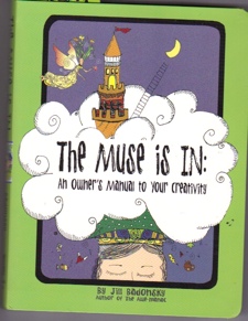
Jill designed, illustrated and wrote the book. Wow!
From the second we wake up in the morning, we start to think of what is undone, late, not right. Giving time to the day to check in on what was completed, done right, and an opportunity to grow can change the day (and your head) around.
It was a positive, interesting happy evening. And while I’ve just spent about an hour with the book, I know I’ll be using it for inspiration for myself and for my clients.
It’s fun to look at, interesting to read, and inspiring to think that Jill wrote, designed and illustrated the book!
--Quinn McDonald enjoys the idea of designing, illustrating and writing a book, and is grateful she didn’t have that responsibility. But she loves being a creativity coach.
Filed under: Book Reviews, Creativity Tagged: creativity coaching, Jill Badonsky, Kaizen Muse


March 14, 2013
Postcard Fabric
I was already on my way to the check-out counter when I saw the fabric. It was straight out of the 70s–polyester, shiny, with a gold gleam, and in colors that made my eyes water 10 feet away–red and orange. And I loved it.
Now, I have a streak of bad taste. Sometimes there is nothing like sequins, shiny fabric, and rhinestones to set the mood. Yes, this is odd for someone whose favorite colors in journaling are sepia and black. Payne’s Gray is way out there for me. But this one looked like a lava flow, a gleaming spill of heat, or, well, a Sonoran Desert sunset.
The fabric was not to wear, it caught my eye because I’m participating in iHanna’s postcard swap. (You have till March 24, 2013 to sign up). I’ve participated before and find it my duty as a Sonoran desert-dweller to make at least three of the cards with an image of a saguaro cactus standing in our red-orange sunsets.
Last year one of the recipients didn’t think it was possible to have a plant that looked like a saguaro, and another one thought I’d sent her a postcard of a pickle in tomato brine, but hey, it’s all good fun.
Here are four of the completed cards:

Polyester fabric, ink on paper.
I still have to stitch around the edges to finish the fabric. The texture of the fabric, and the gold shimmer only shows at a different angle, but you get the idea.

Ink on paper (cactus), marbled paper, dark blue fabric with sparkles.
This postcard is layered–marbled paper, the cactus, and sheer navy fabric with sparkles. This one needs to be edged, too.

Acrylic paint on watercolor, cut out type.
All the postcards are abstracts, and I like the way the paint mixed.

paper collage on inked watercolor, poem.
Another favorite Lorna Crozier poem, “Twilight Angel.” I always wonder what people think when they get a postcard like this.
–Quinn McDonald is working on more than one project at a time.
Filed under: Creativity, Journal Pages, Quotes Tagged: fabric postcards, iHanna, postcard swap, postcards