Quinn McDonald's Blog, page 71
April 5, 2013
Reaching Out for Connection
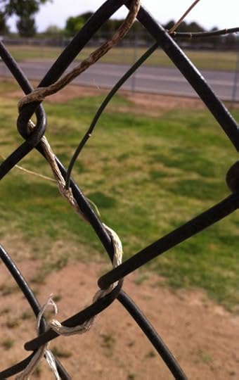
On my walk this morning, I noticed a blooming plant at the top of a chain-link fence. I wondered what was holding it up, and since it was blooming, something was allowing it to not just hang on, but flourish. (There is also a tree behind the plant, but they are not connected; you’ll see it better in the second photo).
 Closer inspection showed that the plant had crawled to the top of the fence on a slender green stem, and was drawing nourishment through about six and a half feet of stem. There were some other stems, too. Either from a prior year or from a prior attempt.
 When I notice something intriguing I always think how it applies to everyday life. I think about people who thrive in unlikely places by building connections that reach what nourishes them, however far away or tenuous. Or how important connections are, that we can’t thrive without them, and they are worth re-building if they fail.
 And I walked on, encouraged to keep going in an unlikely place, connected to the things that nourish me.
--Quinn McDonald is in Sedona, surrounded by red rocks and art.
Filed under: Creativity, In My Life, Nature, Inside and Out Tagged: connctions, natural metaphors

April 4, 2013
The Underpainting
This weekend I’m driving up to Sedona to take a collage class. It’s a type of chine collé in which you create an underpainting, then, following the shades of the colors, collage over the underpainting.
Our homework was to create two underpaintings–one of an apple (so the class will all be working on the same idea) and another underpainting of a different topic.
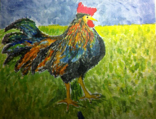
The chicken in an underpainting.
I wanted to do a koi underwater, but the sketch showed me it would require too much detail work and be too difficult. So I did a chicken, instead. I don’t paint with acrylics, and I have no idea how to do a real underpainting. I work with watercolor pencils, watercolor and inks. But I leaped in and tried it anyway. I hesitated only a bit, and then I thought, “This is a class I am taking to step way out of my comfort zone, so I might as well feel weird about it.
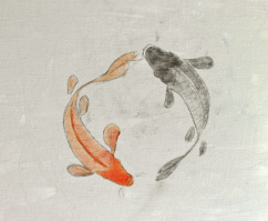
Minimalist koi
I then went back and created a totally minimalist koi drawing. I think the background will be hugely interesting, and I can’t wait to work on it.
While I was working on the underpainting, I thought of what a good idea it was. You put down the shapes and colors you want, and it makes the detail work easier–less filled with instant decisions.
It’s not that different from an outline for writers. A guide that helps you see the big picture. And of course, it’s the same thing as envisioning the future, or a success in life. Once you’ve seen where you are going, it’s easier to take the steps to get there.
So, tomorrow, off to Sedona for a get-away class! And yes, I’m taking the computer because I have work to do at night. No rest for the wicked!
–Quinn McDonald seems to have something about chickens. The one above made her laugh.
Filed under: Journal Pages, Nature, Inside and Out, Recovering Perfectionists Tagged: chicken drawing, creativity coaching, taking a class

April 3, 2013
Journal Page: Inventing an Alphabet
OK, I’m a writer, so I like different alphabets and codes. They also make great additions to a journal page. A new alphabet, a code–it’s a clever journaling piece that adds an easy design element through writing.

Could be someone cheering.
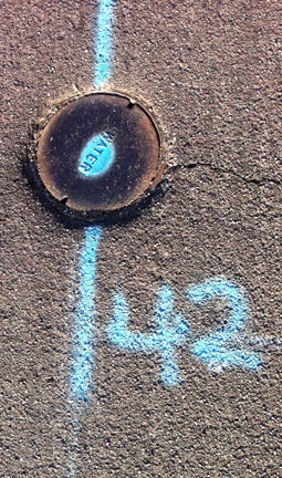
This morning on my walk, I saw interesting writing on the street. My mind went to an interesting story line–what if visitors from another planet came down and took notes on the street on what they saw and learned? What I saw on the street would be a kind of alien journal, written in code. That idea appealed to me, and I took some photos of the “writing.”

Looks like it could be a back-to-back letter.
That idea led to another one: why just use the regular alphabet in your journal? Why not add some new ones? New letter shapes, new designs are all around you. You can use alchemy symbols, the Greek alphabet, numerical symbols.
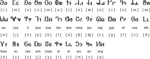
A really interesting one is the Mormon Deseret alphabet (below). When you use shapes from an alphabet, you can invent what they mean to you–what the letter shapes are going to mean in your world. You can translate interesting letters into whole words if you like.
My favorite of the street was the one below–this is definitely the answer to the meaning of life, the universe, and everything:
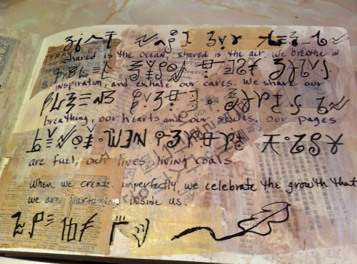
I made a journal page with a new alphabet. First I collaged various shades of white and cream on the page, then I used a brush and wrote quickly, without hesitation, inventing as I went along. And here is what the journal page looks like with a new alphabet:
And if you want to check out a few more different alphabets, this page should get you started.
–Quinn McDonald is a writer, and artist who makes things up as she goes along.
Filed under: Journal Pages, Raw Art Journaling Tagged: 42, alphabets, art journaling, Hitchhikers Guide to the Galaxy, invented alphabets, Journal Pages, journaling, Postaday2011

April 2, 2013
Mind Over Chatter: On the Road to Minneapolis
Minneapolis has an incredible resource called the Minnesota Center for Book Arts. It teaches book structure, printing, marbling, and other book arts skills. And best of all, I’ll be there on the weekend of May 18 and 19, teaching Mind Over Chatter: Confronting Your Inner Critic Through Deep Writing and Mixed Media Journaling. There is also a round-table discussion on Inner Critics on May 17 (Friday) evening.

Loose leaf journal page: gilded, dried leaves, double-exposure film photograph, on painted and stained watercolor paper.
What will the participants do in two days? Deep writing and art journaling–a combination I love teaching because of the incredible results that come from giving yourself time to write what you feel.
Art journaling is often more about art and less about journaling. But deep writing as an intuitive and creative tool transforms your art journals into rich explorations instead of a collection of completed pages. Come explore and experiment with both writing and art techniques and then combine both on loose leaf journal pages. Students will make “Monsoon Papers” — a surface design technique that requires giving up control with astonishing results — and a folio for completed pages.
There will be a good deal of experimentation, and because the pages are loose-leaf, they can be re-worked and then selected and sequenced in various orders with different results.
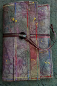
Folder for loose-leaf journal pages. Monsoon papers, stitched.
I don’t teach often in the Midwest, and I’m already looking forward to meeting book contributor T.J. Goerlitz, whose enthusiasm for the Center made the connection for me. What a find! (Both TJ and the Book Arts Center).
You can register on this page, scroll down as the workshops are listed by date, and May 18-19 is closer to the bottom than the top.
There is early-bird pricing and joining the Center will give you a break in the price as well.
I’m so excited about this class.Deep writing, Monsoon Papers and loose-leaf journal pages all in two days–explore your journey, art journaling, and discover yourself in deep writing. I hope to see you in May in Minneapolis!
–Quinn McDonald will be doing a lot of traveling starting in May. There will be more announcements as the workshops develop.
Filed under: Creativity, Quinn's Classes, Raw Art Journaling, Recovering Perfectionists Tagged: creativity coach, Mind Over Chatter, Minneapolis Center for Book Arts, new art journaling workshop

April 1, 2013
Authority Neurosis
This weekend, I was talking to someone for whom I have great understanding–someone with an bit of an attitude about authority. Maybe even an authority neurosis. Someone who doesn’t like being told what to do or how to do it. I know this feeling. What we hate in others is what we hate in ourselves. What we admire in others are our own good qualities. And that gives us a hinge to authority troubles.
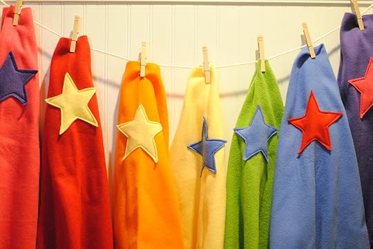 Authority figures show us our own unclaimed power. The part of us that didn’t make it to the top of the heap, the part of us that, our Inner Critic tells us, just doesn’t quite cut it. And we become angry at those in leadership who are not as bright, talented, disciplined as we are, but who made it to the top anyway. They got discovered. They had mentors. And since they don’t deserve respect, we don’t give respect. And that’s where thinking trips over its own shoelaces.
 No one is going to come up and ask to mentor you. No one is waiting to hand you the Crown of Retribution and congratulate you for your leadership. See that cape on the ironing board? The magic is not in the cape. It’s in the story you tell yourself about the cape.
Some people believe what authority figures tell them to believe. A few more believe what their friends tell them. But everyone believes their own story—the one they tell themselves. And once you believe it, you tell it to others and they believe your story, too. The one where you never got the breaks. About being overlooked and under-appreciated. And then others don’t give you breaks, overlook you and under-appreciate you. Because you told them to.
Tell yourself that cape is yours,. Then iron it and put it on. It’s time for you to step up and re-claim the powerful bits of yourself you storied away, hoping people would disagree with you. Being a leader doesn’t mean being given power. It means working with people who believe in you.
Be the person people can believe in, and you’ll have your power. If you believe in it yourself.
—Quinn McDonald is a believer. In herself and in others.
Images from: A Pretty Cool Life.com
Filed under: Coaching, In My Life, Inner Critic, Recovering Perfectionists Tagged: Creativity, creativity coach, leadership


March 31, 2013
Art Journaling Ideas
Yes, I was supposed to finish my taxes, no I didn’t . Instead, I spent a lot of time in the studio, working on art journal pages.
Splash Inks are really very interesting. There are just four of them: cyan, magenta, yellow and black. By mixing various amounts of them, you can create thousand of colors, hues, shades, and tints. Here’s a journal page I did with just yellow, blue and black. True, the background used a tiny drop of magenta, too.
All those green colors just from mixing and adding water for transparency. You can layer really well with this ink. This is a larger image of a succulent I planted this morning–the repetitive leaf shape just charms me.
Most of my journal pages are now free-standing pages with an image on one side and a piece of writing distilled from my journal on the other. It expands the meaning to have the side relate to each other. (I’ve been using this with my coaching clients with some delightful results.)
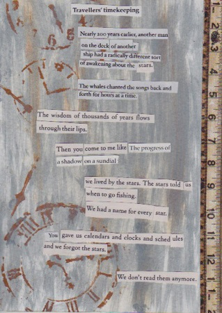
The front of this page (a 5 x 7-inch Strathmore Ready Cut) is colored with Ranger dauber paint in Distressed Wood (light gray) and Vintage Photo (brown), a clock stencil and a piece of paper printed with rulers. Of course, I had to finish it with found poetry.
The found poetry reads:
Traveler’s timekeeping
Nearly 200 years earlier, another man
on the deck of another ship
had a radically different sort
of awakening about the stars.
The whales chanted the songs back and forth
for hours at a time.
The wisdom of thousands of years flows
through their lips.
Then you come to me like the progress of a shadow on a sundial.
We lived by the stars. The stars told us when to go fishing.
We had a name for every star.
You gave us calendars and clocks and schedules and we forgot the stars.
We don’t read them anymore.
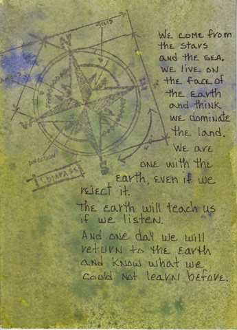
The back of the page has a background of Ranger dauber stain in Moss which I immediately spread with a wet watercolor brush. When it was damp-dry, I sprayed it with purple ink and let it dry. Then I stamped it with a compass, added gold to the compass rose (hard to see, I know) and then wrote on the back.
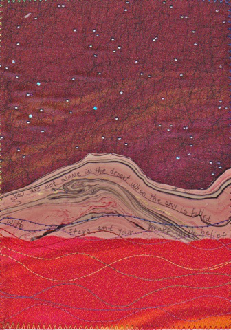
Next, a journal page with two kinds of fabric, stitching, and torn marbled paper. First, the red and orange swirl fabric was ironed on Strathmore Ready-Cut with Pellon fusible webbing. Then the sheer fabric with spangles was put on with MistyFuse (you can see it through the fabric on the scan, less so in real life). I love that the fabric is visible through the sheer fabric.
I then cut the top of the mountain shape and tore along the bottom and glued the mountains onto the fabric. When it was dry, I wrote in the lines of the mountain with one of my new JetPens fountain pens with an extra-fine nib. This is refillable and writes with a thinnest line–the same as an 03 Rapidograph.
Next, I stitched my signature waves over the land portion of the page and then zig-zagged all around the edge to finish the fabric and hold it in place.
OK, now I really have to do my taxes.
Disclaimer: I purchased all the products myself and did not receive any compensation for mentioning the product names.
--Quinn McDonald is taking mixed-media waaay multi.
Filed under: Journal Pages, Poetry, Raw Art Journaling, Tutorials Tagged: creaitivity coaching, fabric journal pages, fabric postcards, mixed media, mixed media journal pages


March 30, 2013
Saturday Creative Roll
Giveaway: The three people who won Dina’s book from the March 27 blog post are Shannon Ganshorn, Annettte Geistfeld, and Ann M. Philli. Congratulations to all of you!
 Julie Fei-Fan Balzer is a multi-talented multi-media artist. I love her lettering and the design of her journal pages. I never draw faces–not in my journal, not in anything. So it’s time I gave you a link to someone who does. Sharon Evans is doing a guest post about faces. The whole idea is interesting, 29 days of face drawing, on Ayala’s blog post. Whew, three amazing artists in one paragraph. A good beginning, for sure.
Joanne Sharpe is a Journal Artist and knows how to produce a huge variety of lettering. Here’s some eye candy of Joanne’s lettering on Pinterest. And here is Joanne’s blog.
Donna Downey fills journal pages with bright, easy colors. Her busy website has a great inspirational blog and video to enjoy.
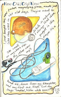
Pocket magnifier as art, the joy of an MP3 player
One of my favorite art journaling blogs is John a-Lookin’ Around. John P. is an engineer who lives in Kansas, and he doesn’t post as often as he used to, but the archives are just sitting there, waiting to be drooled over. I love his elegantly simple page design.
Have a great creative Saturday!
—Quinn McDonald just got a delivery from JetPens. She also has to do her taxes. This is harder than she thought.
Filed under: Journal Pages, Links, resources, idea boosts Tagged: art journaling, hand lettering, Journal Pages


March 29, 2013
Perfectionist Makes a Postcard
Flipping through the completed postcards I’d made for iHanna’s international postcard swap, I decided two of them weren’t good enough. The Inner Critic agreed with me, so I sat down this afternoon to make a few more cards.
While I had fun, nothing turned out well enough to include in a postcard swap. The Splash ink explorations led to experiments, but nothing worth putting on a card. The new paper just in for my class in Sedona is colorful, but the card wasn’t special.
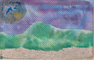 I know that any time in the studio is time well spent, and since tonight was trash take-out night, I cleaned up and picked up the paper towels to throw in the trash. There was a blue and purple one and a green and yellow one from the Splash Inks. And. . . the blue and purple one looked like sky, and the green and yellow one looked like a line of trees on one side.
I tore the paper towels into shapes, added a piece of handmade paper, and made a postcard from them. The poured acrylic from last week, which was nicely dry, became the moon. I sewed over the edge and there was the last of the postcards, ready to send out. No time in the studio is wasted, ever.
–Quinn McDonald is still arm-wrestling with her Inner Critic. He won’t like the new book, either.
Filed under: Creativity, Recovering Perfectionists Tagged: inner critic, paper towel, postcard swap, postcards


March 27, 2013
Art Journal Freedom: Book Review (and Giveaway)
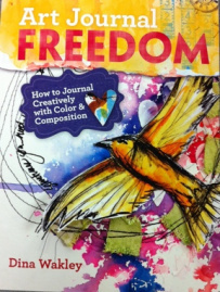 Dina Wakley’s book is great. I could end the review there, but it wouldn’t tempt you enough to buy the book. And this is an art journaling book you should own, whether you are a beginner or an experienced art journaler.
I’ve taken classes from Dina, and I love her dedication to her art, her insistent encouraging to try new things or delight in familiar ones, and her easy way to bring out ideas and share them freely.
A few weeks ago, when I went to her book signing, I asked her just to sign the book (rather than sign it to me specifically) as I was planning on giving it away. But in the course of doing projects to review it, I got a bit enthusiastic, and splashed paint here and there and maybe dribbled a bit of gesso on the pages as well. So the giveaway book will be a fresh new one, but it won’t be here for about 10 days or so. If you are the winner, please be patient.
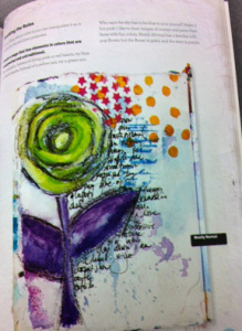 Details of Dina Wakley’s book: Journal Freedom: How to Journal Creativity with Color and Composition.
Publisher: North Light. Paperback, 128 pages long.
Chapters:
Tools and Materials
Symmetry and Asymmetry
White Space, Continuance and Closure
Proximity
Dominance and Repetition
Color Basics
Contrast with Color
Color as a Composition Tool
The Power of Black and White
Putting it All Together
On the table of contents page, there is a QR code that will take you to bonus content from Dina. A nice touch.
What I like about the book: It’s a real how-to, with basic creative art instruction. Many art journalers are self taught, and don’t want to go to school to learn color theory, the rule of thirds and other pedantic necessities. The genius in this book is that Dina teaches all the things you need to know to create beautifully composed pages by doing exercises that are fun and manageable.
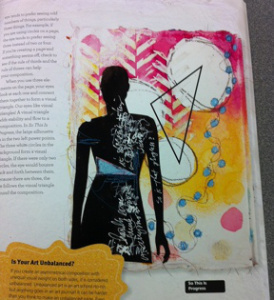 She keeps the tone light and fun, and takes you along in a logical pattern that makes you want to learn. Her signature silhouettes are there, and in addition to seeing several ways to use silhouettes cut from magazines, you learn placement and balance.
I mean this next statement in the best possible way: Dina’s book is all hers. She doesn’t aggregate the work of 20 people, she teaches what she knows. I find it refreshing. Yes, it is nice to see different interpretations of an idea, but in this book having just one artist explain composition and color through her own work is a really good idea. It keeps lessons simple and allow the reader to try out personal ideas without having too many examples to choose from.
What I didn’t like: I kept a list and when I was done, I squinted at it to see if it was my preference, or an objective critique. The things I would have done differently would have made the book not Dina’s. So I am going to be happy that Dina’s fingerprints (colorful ones!) make the book what it is. I’m glad I spilled gesso on it and get to keep it.
This is more than a reference book, this is an enjoyable project and reference book.
Giveaway: If you want to win the book, leave a comment. I’ll be giving it away on Saturday morning, so you have time. And yes, partly that’s a stall to wait for the ordered book to arrive. The rest of it is that I am up to my armpits in paperwork this week.
—Quinn McDonald loves seeing books with so much heart and soul of the artist on every page.
Filed under: Book Reviews, Creativity Tagged: art journaling, creativit coaching, dina wakley, journal composition


March 26, 2013
Luck and Secrets
When people I haven’t seen in a while notice I have lost weight, the inevitable question I get asked is, “What’s your secret.” When I say, truthfully, “There is no secret; I gave up everything I craved and walk three to five miles a day,” I get skeptical looks. “But what is your secret?” they repeat, unable to believe that there is not a smoothie, a pill, garment, or a new exercise behind significant weight loss.
Create your own luck
If I’m feeling brave, I’ll say, “Self discipline. Self control. It’s the hardest thing I’ve ever done so consistently.” That doesn’t work, either. “You have to treat yourself sometime, or you will quit,” they assure me. “It’s not good to have all that discipline.” I try to change the subject. I’m uncomfortable talking about discipline and success. It’s not the answer for everybody. But it has worked consistently for me–not just in changing my relationship with food, but for most things in life that I have relentlessly pursued.
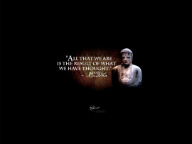
“All that we are is the result of what we have thought.” –The Buddha
It reminds me of how often I was told, after I landed a book contract, that I was “lucky.” Well, perhaps, but it also involved a lot of hard work and, ummm, discipline. I did research, I wrote the book proposal over again at least six times, I changed the idea of the book slightly when it wasn’t focused enough, spent hours doing research to find a publisher who specialized in the kind of book I wanted to write.
The need for “luck” and “secrets” comes because discipline and hard work are not fast and easy. And no one (except the Little Red Hen) wants to say, “I worked really hard for this and I made it work.” It sounds conceited and self-satisfied. But I don’t know anyone who has lost a lot of weight and kept it off who had an easy secret. Same goes for people who have accomplished something big in their lives. They seemed to have given up a lot and worked hard for a long time.
Thomas Edison had it right when he said, “The reason too many people miss opportunity is because is goes around dressed in overalls and looking like work.” Followed by another good quote from Thomas Jefferson, “The harder I work the more luck I seem to have.”
–Quinn McDonald is going to bed. It’s almost 1:30 a.m. and she has to get up to go teach in four hours. She is looking forward to being lazy when she gets back from class tomorrow. No, wait, she wants to do a book review and giveaway on the next blog.
Filed under: In My Life, Inner Critic Tagged: creativity coaching, luck, self-discipline, success


