Rob McClellan's Blog, page 4
March 30, 2013
Amazon's GoodReads Takeover and the Start of ThirdScribe
 I envisioned our first blog post would be about how we
bring authors and readers together
, the pending
launch of our Beta
, and
what we bring
to the book social networking ecosphere. However, life interrupted that plan and I felt that the recent news in literary circles was far too great to not comment.
I envisioned our first blog post would be about how we
bring authors and readers together
, the pending
launch of our Beta
, and
what we bring
to the book social networking ecosphere. However, life interrupted that plan and I felt that the recent news in literary circles was far too great to not comment.In case you haven't heard, late yesterday afternoon, Amazon announced its intention to acquire the leading book based social network Goodreads. Details are a bit hazy right now regarding sales price and terms, but it's obvious from a post by Goodreads founder Otis Chandler and Amazon's own press release that this is a done deal. It's being covered all over the tech sector and beyond on sites such as Wired, The Verge, CNET, TechCrunch, TIPM, GalleyCat, Forbes, Washington Post, Huffington Post, and more. Plus, a great interview with Otis by Laura Owen over on Paid Content. Basically, it's huge.
Go ahead, take your time and check those out of you need to. Then come back and I'll tell you how ThirdScribe can salvage book independence on the internet.
What This Means for Books and Book Lovers
Goodreads wasn't perfect, but it was independent -- famously so, after rejecting Amazon's API terms last year. With over 16 million members, thousands of book clubs in its forums, and umpteen zillion book ratings and reviews, it was the preeminent place for book lovers to come and talk books. It allowed for book advertising, book promotions and giveaways, a plethora of forums on nearly every topic you can imagine, and links to nearly every place on the planet where books are sold.

It was also a service that was free for all, and, as Pinboard's founder Maciej has long opined, free services really only have one true way to turn a profit -- and GoodReads just landed its big payday.
So, what now? What does this mean for the book community?
First, and I don't think this is a stretch to anyone's imagination, just like on Shelfari, I expect that very soon the only sales links on GoodReads will be to Amazon or its subsidiary for used books, AbeBooks. Too bad Nook, Kobo, iBooks, Google, Sony, Books-A-Million, Powells, etc. It's an Amazon world over on GoodReads from now on.
In other words, GoodReads is no longer a place for independent book discussion, as it is now forever shadowed by the spectre of its new owner.
Otis and his team say they are to remain in charge of GoodReads and I'm sure they will. It's just that now they will have a boss, and that boss will want some results. What those are, we don't know exactly, but I'm sure it has much to do with selling books on Amazon and I'm sure they will use the full arsenal to do so. Which means that the personal information and book habits of 16 million people just became the property of the world's largest online retailer and its budding advertising network.
On the plus side, GoodReads users will probably have a lot more options to connect their Amazon usage with their GoodReads usage -- wishlists, reviews, and book lists will probably all be integrated in the next year or so. They might even cross-connect the Book Encyclopedia-ish data from Shelfari to the GoodReads experience. So, there's that.
When we first laid the foundation for ThirdScribe, we never felt that GoodReads was a competitor. On the contrary, we envisioned them as a perfect partner, as we utilize their API as a source of external book reviews to complement our own in-house review system (and will continue to do so). We do the same thing with Amazon as well as others. ThirdScribe is meant to help readers find books to read, and reviews are an essential part of that. We felt there was plenty of room in the book networking environment for all of us.
In reading the hundreds of comments around the web on the GoodReads-Amazon merger, I've seen a majority of the comments centered around the loss of an independent voice -- thousands crying out that they don't want to be a cog in Amazon's sales machine. While we didn't envision that role for ThirdScribe, we do have the infrastructure in place to do so. So I say to everyone reading this, if you're looking for a new literary shelter on the web, we can help.
What the Heck is ThirdScribe?
 ThirdScribe
is a social networking service designed from the ground up to connect authors and their audience. It does this by combining a social stream with forums, book pages, reviews, member profiles, and a blog network to form a giant discussion about books. If it was a Hollywood pitch, it would probably be something like this:
ThirdScribe
is a social networking service designed from the ground up to connect authors and their audience. It does this by combining a social stream with forums, book pages, reviews, member profiles, and a blog network to form a giant discussion about books. If it was a Hollywood pitch, it would probably be something like this: "Picture This: Facebook and WordPress have a baby, it grows up raised by librarians then falls in love with a beautiful web designer, and together they bring literary fulfillment to millions!"
In the next few days we're going to start ramping up our web presence tremendously, so you'll see a lot more information on what ThirdScribe is and how it works very shortly. Feel free to sign up for our Beta or follow us on Facebook, Twitter, or Google+ to get the latest updates. But, before you go, there is one thing I want to make clear: We have a plan to monetize and it is not advertising or affiliate links.
ThirdScribe is a "freemium" service that is member supported. There are no ads here and we do not track personal information. It is free for Members to join, but for authors who want to list their books on the service, as well as take advantage of the many, many other social and marketing services, there is a fee. As our membership grows, we have a roadmap to expand our services to benefit book sellers and publishers, as well.
Why aren't we completely free to everyone like GoodReads, BookLikes, and others? By aligning our revenue with our members we ensure our member's interests are our best interests. In other words, we want to put our effort behind making our members happy instead of selling them to advertisers. It's a little bit of a different paradigm, sure, but in light of this latest merger I'm sure you can see the benefit.
So, please, sign up and stay tuned!


March 6, 2013
Navy Diving Presentation, Part 1
What It’s Like
This is a promo made by the Navy to promote Navy Diving. While it’s not always like this, when it is, it really is…
Photo Presentation
Some diving photos
Leaving Surface
When it’s time to go to work, Navy divers dip beneath the waves…
Swimming to Work
Sometimes you see some pretty cool stuff on the way to work…
Doing the Job
Here I am inspecting a pipeline…
What They’re Doing on the Surface
If we’re doing something under the water, chances are its to support something out of the water. Here is the surface vessel getting ready to pull up the connecting hose to the pipeline…
December 3, 2012
Changing How Readers and Writers Connect
 Took some time to look at my own blog last night and realized I hadn’t made a post in a couple of months. Between new house, new job, swimming, writing, helping RunWiki, and my own little project, my poor blog has been neglected.
Let me show you what I’ve been up to.
To lay a little groundwork, most of my regular readers know I’ve dabbled over the last few years in making comic books, iPhone Apps, and the occasional web design work. During this time I’ve been exposed to a great deal of the digital publishing business. I’ve created, edited, packaged and published both my own stuff and that of others. I’ve built websites, twitter backgrounds, and facebook pages. And I’ve come to a single realization: When it comes to being a writer, the biggest effort isn’t the writing — it’s the marketing.
And that got me thinking…
My Secret Project Revealed
If you go to an author’s Facebook page, chances are you won’t find any links to buy that author’s books. Nor will you find any type of forum or wiki to allow you to explore that book in detail. In all likelihood, the most you’ll ever find about an author’s books on their facebook page is a profile pic or a link in the stream. Twitter is even worse — at best, you’ll find a link to the author’s website or Kindle listing in a post somewhere. And that author website, more often than not, is a generic wordpress.com or blogger.com site which is also not really designed to sell or promote a book.
The tools available are better than nothing, but they aren’t that great. It’s hard enough to connect with fans online, most opting for either short tweets or Facebook pages. But, now a lot more people are shying away from Facebook, not wanting to blend friends and family with fans. And then there’s the whole “promoted posts” thing and the endless encroachment of sponsored posts and blocks of ads. And if you think it’s just limited to Facebook, realize that Twitter is quickly becoming the same.
So, I decided I would make a platform to help fans connect with authors, help authors sell books, improve the digital publishing landscape, and generally make things easier for everybody. It’s called ThirdScribe.
What Is ThirdScribe?
Most book centric “social” networks (and I use that term loosely), are catalogs of books with discussion forums. Shelfari, LibraryThing, even GoodReads all follow a similar template: Members find a book they already own, put it in their library, maybe write a review, and then talk about other topics in a separate discussion forum. Sometimes authors participate, but largely they don’t, other than setting up a page and linking their blog’s RSS feed. The experience ends up being very detached. Much of the activity on these sites goes on without the Author’s knowledge or interaction and so the community takes its own path — usually far from the authors and books that drew them there in the first place. There is very little “Social” activity between authors and readers in any of these networks.
ThirdScribe is not like that. It’s pretty much the exact opposite of that. Instead of a book catalog with discussion forums, its an actual full service social network centered around books. I also chucked the whole bland, busy and ugly layout idea (yeah, I’m looking at you GoodReads!) and went high end with a distinct, human-centered design. I just wanted to take the whole concept to another level and put the focus on connecting rather than collecting, know what I mean?
Key Features
Aside from the stunningly elegant design — and more on that below — what makes ThirdScribe better than the other networks?
First, it is laser focused on creating lasting, intimate connections between author, reader, and book. To do that, we use a social interface with a lot of tools, including book reviews, book specific forums, message, chat, event calendars, and blogs. Think of a ThridScribe Book Page as a Facebook Page hyped up on Vonnegut and double espresso lattes.
Second, it’s fully integrated with the major social networks in a two way feed. That means when you post on Twitter, it shows up on ThirdScribe — and vice versa. Same with Facebook, Google+, LinkedIn, RSS feeds, and Youtube, with more coming. If people are talking about books on ThirdScribe, we want the world to know about it.
Third, there are no ads. You read that right, no ads. Just books. Period. By focusing on members instead of advertisers, we can put a lot more emphasis on helping readers discover new books and authors, and helping authors grow their audience.
Now, here’s some more about that elegant design I was talking about…
Informative Home Page

I wanted a Home Page that actually drew members in and engaged them. To do that, we employed a fairly minimal design with more accent through color than arrows and text. To navigate around the site, there’s a clear, unobstrusive navigation menu along the side panel. User statistics are subtly placed at the top of the page. New books are displayed in a very visual style, emphasizing the cover art with three graphical links underneath for engagement (author’s pic, like, and go-to). A panel showing a continuous site activity stream reinforces that this is a free flowing social network, and the newest members are depicted along the bottom. The intent with the Home Page design was to be informative without being “in your face” about it. The goal here, and it’s echoed throughout the site, is to utilize elegant design techniques that rely on color and placement to draw the eye.
Book Index

This is the template for the full book index, which is a listing of all of the books in the network. Like on the Home page, we went for a clean, clutter-free interface sticking to just the book cover, title, and action links. Those links will take the member to the full book page, which has all of the relevant information and more. There will be another version of this page, which we’re still constructing, which will have more specific listings for each genre (Sci-fi, mystery, young adult, etc). Those pages will be have featured books, newest additions, and most popular in each genre in clustered bands, with, of course, links to more. There isn’t anything else like it on any other book site. We actually took more inspiration from movie, video and music sites than we did other book sites. The effect is really nice, and should do a lot to highlight the books in the network.
Individual Book Pages

Each Book Page is where most of the action is, as this element is really the focus of the network. Unlike other networks where the book is just the commodity to be cataloged or rated, here it is the center of conversation. You can see it is much like a Facebook page or group, with its own social stream and tools. Authors can activate book specific forums, albums, events — the works. We did this because we wanted conversations about the book to be held right there at the book’s page, instead of in a discussion forum elsewhere on the site. And for those who have a series of books and don’t want to manage multiple book group feeds, we have the ability to organize several books under a single series banner. The area just to the right of the cover can hold the full book description blurb, and just under the book cover will be graphical sales links to any store the book is sold. The right sidebar will show the other books in that series, other books the author has written, and similar books readers might like. We’ll also eventually be tying in ratings information from Goodreads, Amazon and Nook. This page is the workhorse of the site.
Profile Pages

Just like any other social site, every member and author will have their own profile page. It will work just like a Facebook page, and functions as a personal hub on the site. The top area, just to the left of the profile pic and below the name is an area where members can write a brief bit about themselves. Just under that is their last update (so it doesn’t get lost in the stream). It will have the ability to add photo albums, store favorites, keep friends, send messages — everything you would expect from a full social network. It even keeps track of the posts you’ve made in the various forums across the site. There are lots of fields in the profile section for likes, dislikes, favorite books, favorite authors, and more. It also has complete privacy control, so members can set whichever level they prefer. And, did I mention there’s no ads on ThirdScribe? You’re info is safe and secure, never to be shared with anyone.
Author Websites

It wouldn’t be a full service system if blogs weren’t an option, and every author using the site can get one. My direction was to have an elegant blog that required as little effort by the user as possible. I think it came out pretty nice. The theme is styled like the main site to enable smooth transitions from blog to book page to activity stream to forum and back. No jarring visuals here! While the author sites are their own entity, fully under the control of the author who operates it, it’s still an integral part of the network. It is able to delve back into the network to gather up all of the author’s book information, so no need for double entry to get book cover images and links to your site — it will just work. Even though its styled to match the main site, that doesn’t mean it’s void of personality! That image just down from the top is the Header image, and can easily be swapped from the dashboard, as can the right side background. Featured images can be attached to each post to help them stand out visually. As a bonus, since everything is connected, when you publish a blog post it automatically posts across the network — and the same thing happens when someone comments on one of your posts.
Next Steps
While the site is nearly completed coding, thanks to the dedicated efforts of Tammie Lister from Logical Binary, we still have a lot of testing to do before we release it, even for the limited Beta. We’ll be doing that testing through December, as well as coding in some remaining functions and fixing the bugs we find. The plan is to go to super top secret Beta in January and, hopefully, open to the public in February. Much to do between now and then.
And did I mention I have to court a whole bunch of authors and publishers to get them onto the site? Yeah, it’s going to be a very busy couple of months. So, don’t be surprised if this blog is radio silent for a while. Wish us luck.
By the way, we’re accepting requests for our Early Beta right now — why not go ahead and sign up? Best get your spot reserved now, the slate is probably going to fill up pretty quickly…
August 13, 2012
Why I Swim
I’ve always been comfortable in the water.
Swimming with FAST!
From a very young age, regardless of what I was doing, or how hairy it got, if I was near water I knew I would be OK. I’m not sure when I started swiming, but a majority of my baby picutres seem to involve water in some way and my earliest memories of childhood take place in the pool. Summers were spent playing at the VFW pool back home, first in the baby pool, but rapidly venturing into deeper and deeper water. My father throwing me through the air in dramatic, spray filled “Blast-offs”; playing Marco-Polo and sharks-and-minnows; doing back flips off the high dive. We would get to the pool early and stay late, our bodies first burned, then tanned by the sun as summer went on. I remember my folks signing me up for swim lessons, but it was almost unnecesary — I took right to it, and soon was more of a helper than a student. The beach? That was meant for body-surfing among the waves, and just like the pool, we hit the surf all day only taking breaks to eat. I don’t think I ever did much with sand castles, if I was at the beach, I was in the water – it was as simple as that.
My Swimming Journey
I loved swimming. That feeling of weightlessness, the unrestricted movement — I imagined that feeling of freedom must be what birds feel in flight. I never tired of it and I was saddened at the end of each summer. When I was in the third grade, my parents thought I would like being on the swim team, and my Mom took me to my first practice with FAST (the Frederick Area Swim Team) in the old YMCA pool. I swam like I never had before and was hooked right away. An hour or more every night for the next 8 years was spent in the pool, and more weekends than I can count sprawled on pool decks around Maryland for swim meets.
At the start of my senior year in High School I stopped competing. My junior year had been a tough one, filled with sickness and performance plateaus. The hard reality was my team mates were getting bigger and taller, and I was not. While I continued to improve my personal times, I was no longer competitive. Swimming favors big arms, big hands, and big feet — and I didn’t have any of those. I left swimming behind to study martial arts for a few years. Instead of pursuing collegiate swimming, I signed up for fencing, eventually making the varsity team at NCSU. I learned to rollerblade, run, play handball and hockey, shoot pistols and archery, and lift weights. It was a great time, but while I appreciated the skills I learned, I never felt the connection with other sports as I had with swimming.

Still in the water 20 years later!
When I joined the Navy, being a strong swimmer came in handy. The endurance portion of the Physical Readiness Test can either be a 1.5 mile run or a 500 yard swim. I was, and continue to be, a crap runner and the time of 8:10 for 1.5 miles to get the maximum score just wasn’t going to happen for me. But to swim 500 yards in less than 8:00 was child’s play for a former competitive swimmer! Eventually, I became a diver and being around the water was my job — who could ask for more?
Unfortunately, as time passed, my access to the water passed as well. Entering the managment realm of my officer career took me off the waterfront and into the staff room. Soon, meetings and email became my routine, with less and less time for working out and swimming. Family and kids also entered into the equation, as few of us have the luxury of a private lap pool. Logistics took it’s toll. Sure, I lifted weights, some spinning and running, P90X, a little boxing. Even the dreaded elliptical. But, while those activities did the trick, my heart was rarely in them and it got pretty hard to maintain the mental discipline. Breaks were frequent, excuses plentiful. Over time, my health declined as did my spirits.
Like Going Home
A few months ago, over 20 years since I left competitive swimming, I returned to regular swimming. As the weather got a bit better in DC, making it to the pool became easier. There was a nice pool about a mile from my work, so at lunch I decided to try an old fashioned run-swim-run — run a mile, swim a mile, run back a mile. The run out there wasn’t too much fun, but the swim was great! So I did it again. And again. And the more I did it, the better I felt. Not just physically — I wasn’t that out of shape — but mentally. It wasn’t the exercise — it was the water. After 20 years, I was “flying” once again.
Soon after this rekindled aquatic life, I moved out to California for a new job and a new start. My family and I looked to this geographic change as a means to really start over. No more DC rat-race, foul commute, office mentality, or “the Joneses”. Out here, we’ve got a great place, great weather, and good work. My children are outdoors every day, my commute is no longer a chore, my wife is running, and I’m at the pool five days a week. I decided to forego the structured workout approach of my youth and just swim — most days I cover 3 miles or more. Just a continuous swim. I’ve gotten so comfortable in the water, I’ve even been swimming with my eyes closed!
Now that I’m in the water every day, I feel better than I have in years. My joints no longer ache, my mind is clear, my body strong, and my spirit renewed. I’m smiling more, laughing more — something I’ve done much too infrequently over the last few years.
A New Challenge
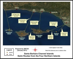
Going the distance, Santa Cruz to Oxnard!
Approaching 40, I’ve been looking for something big for a while. Some type of challenge or test. A test of mind, body and spirit. A way to prove to myself, and the world, that I’m not old yet. Most people considering this type of thing think marathon or Iron Man, but I hate to run. So what is the swimming equivalent? What is a marathon swim?
Out here in SoCal, there is a big swim. The Channel swim. The most common is the Catalina-LA swim, roughly 20 miles between Catalina Island and Los Angeles. But, there are planned routes between each of the Channel Islands and shore. One of them runs from Santa Cruz Island to Oxnard Harbor, and at 19 miles it’s just a short jaunt to the harbor of Port Hueneme, the home of the Seabees. And, in many ways, my home.
So that’s what I’m going to do. I’m going to swim from Santa Cruz Island down into the Harbor at Port Hueneme. Between now and then I’ll do a few other open water swim events, but that swim is the big goal. Shooting for summer of 2013. Wish me luck.
August 4, 2012
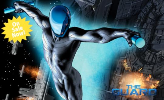
Systems: K’Hor


Learn More


News Feed
K’Hor System
K’Hor is the 3rd planet in orbit around their system’s star. It supports carbon based life at 0.98 standard g. The planet has a stable weather pattern, is largely temperate with a small equatorial band.
The K’Horians evolved from feline stock, and over millions of years developed a bipedal stance and elongated fingers. They are still covered in a light fur of varying colors and retain vestigial claws on their fingers and toes.
K’Horians have long been intensely tribal, each fighting the others for regional dominance. Eventually, their technology allowed their power to reach beyond simply region to region and the planet entered a global conflict. The two most powerful tribes, the D’Ar and the C’ron, fought for 150 years before finally being unified in a political truce, solidified by marriage. That political marriage has yielded a 100 year peace and a powerful monarchy that still reigns.
The K’Hor have an advanced civilization, but have not yet developed hyperdrive or shield technology. They have, however, mastered many other quantum effects, including cold fusion and broadcast power.
The Guard: Defense of Ketarra is a graphic novel and is best displayed on the Kindle Fire
 , Nook Color or other full color tablets.
Praise for The Guard
“Wow! This is visual magnificence!” – Keith Dallas, author of Omega Chase
July 30, 2012
Music Monday: Always Where I Need to Be by The Kooks
With the Olympics in London, it’s got me thinking of British rock bands, so this week’s Music Monday is brought to you by The Kooks!
The Kooks were formed in 2004, and their flavor of rock is definitely a return to the Brit Invasion years with a touch of punk thrown in for good measure. Seeing them live, you can tell front man Luke studied heavily at the school of Mick Jagger, cause While Maroon 5 might sing about Jagger’s Moves, Luke actually has them. With the attitude to match.
Here they are singing one of their hit songs “Always Where I Need to Be”:
July 23, 2012
Monday Music: Sing by My Chemical Romance
My Chemical Romance was formed a week after the September 11th attack when Gerard Way, a writer and Cartoon Network intern, decided he wanted to do more with his life. He formed a band with some friends, took the name from an Irvine Welsh novel, and the rest is history. The band did well, but really took off with their second album “Three Cheers for Sweet Revenge”, and then blew the doors off the music scene with their third album, The Black Parade.
I like this band — they’ve got passion and they’ve got something to say, and I feel that’s terribly important for music. Especially in this world of ridiculously pathetic repetitive lyric pop crap that gets forced on us daily. Sing is from their fourth studio album, Danger Days: The True Lives of the Fabulous Killjoys.
What’s this song about? Speaking out. Be it small things like schoolyard bullies, or large things like corporate greed or political insanity. You got something to say? Gerard Way and his band are telling you to say it — and I agree. Take a listen…
July 9, 2012
Music Monday: Apartment by Young the Giant
Heard this song on XM Radio and downloaded it right away. Great tune by a great band.
Young the Giant is another great band out of California — Irvine, to be specific. They started out as a band called “The Jakes”, but in 2009 changed their name and put aside school to focus on music. A few minor hits later, a couple of shows on Jimmy Kimmel and Jools Holland, and a huge following in Europe later — and here they are.
What do I like about this band? Besides the fact that they actually write intelligent lyrics and have musical talent, the extreme cultural diversity of the band results in a fantastic sound. Even unplugged, which this performance is. Haven’t seen this level of diversity/talent since Vampire Weekend — and they’re just as good, if not better. Go ahead and listen for yourself:
Clean Code is Organized Code!
 A lot of people never look under the hood of their website’s code. It’s just something most people either a) never bothered to learn or b) don’t really want to fool with. However, in the world of budget woes and the proliferation of easy platforms like WordPress, more and more people are adopting a “do-it-myself” view when it comes to their web presence, both personal and business.
However, coders building website templates — even the big ones like StudioPress, WooTheme, and Thesis — code like, well, coders. I think we need to start coding a little bit differently. With more spacing, more comments, and, yes, a little more effort. Here’s what I’m talking about — and, what I’m doing with my own themes:
Tabbing and Spacing
Unlike computers who just see syntax, we actually have to look at and read the code. To do that, some basic formatting is required — not for computers, but for us poor humans. Proper tabbing and spacing is an essential element of that. Here is an example of untabbed code:
#title-area #title {color: #222222; font-size: 42px; font-family: 'Oswald', Arial, Tahoma, Verdana; font-weight: normal; margin:0px 0px 0px 150px; padding: 0 0 0 20px; text-decoration: none; line-height: 48px;}
#title-area #title a {color: #222222; margin: 0; padding: 0; text-decoration: none;}
And here is the same code properly tabbed and spaced:
#title-area #title {
color: #222222;
font-size: 42px;
font-family: 'Oswald', Arial, Tahoma, Verdana;
font-weight: normal;
margin: 0px 0px 0px 150px;
padding: 0 0 0 20px;
text-decoration: none;
line-height: 48px;
}
#title-area #title a {
color: #222222;
margin: 0;
padding: 0;
text-decoration: none;
}
Now, take into consideration even a small website is about a thousand lines of this. Which would you prefer to read? Which do you think is easier to find things in? Thankfully, most of the major template makers code this way — it really is easier all around. If you grab a theme that looks all un-tabbed and messy — do yourself a favor and dump it. Don’t settle for jumbled code!
Comments
Code is pretty much it’s own language, unique from any other. But, you can learn to read it and after a while it is pretty transparent. Much, I assume, like it is when a person is submerged in a foreign culture — you just start picking it up. However, I don’t think that is an excuse to not give a few plain language pointers, notes, and directions here and there. Every little bit helps, and making your code “newbie” friendly is a good idea. That means comments — both plentiful and helpful! Don’t leave people fumbling around in the dark — comment meticulously! So, instead of seeing something like this:
#header ul.nav li a:hover, #header ul.nav li a:active, #header ul.nav .current_page_item a, #header ul.nav .current-cat a, #header ul.nav .current-menu-item a, #header ul.menu li a:hover, #header ul.menu li a:active, #header ul.menu .current_page_item a, #header ul.menu .current-cat a, #header ul.menu .current-menu-item a {
background: #000000;
color: #FFFFFF;
}
Try something like this:
/** Rollover effect and coloration for Header Menu Navigation items **/
#header ul.nav li a:hover, #header ul.nav li a:active, #header ul.nav .current_page_item a, #header ul.nav .current-cat a, #header ul.nav .current-menu-item a, #header ul.menu li a:hover, #header ul.menu li a:active, #header ul.menu .current_page_item a, #header ul.menu .current-cat a, #header ul.menu .current-menu-item a {
background: #000000;
color: #FFFFFF;
}
Organized
By nature, many coders are organized. The problem that those using their code find are that they are organized for efficiency, not for use. When I say this, I mean that if an argument is repetitive, many coders will handle them all at once so that it saves time. That results in code looking like this:
#content #featured-top h2, #content #featured-top h2 a, #content #featured-middle h2, #content #featured-middle h2 a, #content #featured-bottom h2, #content #featured-bottom h2 a {
color: #ffffff;
font-family: 'Oswald', Arial, Georgia, Times New Roman, Trebuchet MS;
font-size: 20px;
line-height: 26px;
font-weight: normal;
margin: 0;
padding: 0;
border: none;
}
The above code dictates the settings for three layers of widgets on a widgetized home page. Normally, these are all the same and so it is more efficient to just group them all together. However, when you start customizing and tweaking, this type of coding is enough to drive you absolutely CRAZY! You may spend hours – literally hours! – trying to find some small CSS variable amidst thousands of lines. This is just a single header code — you’ve got multiple headline options for each widget, not to mention background colors, sheet options, margins, etc, etc. And then there are the page-wide and site-wide characteristics! It gets out of control in a hurry, I assure you.
I recommend keeping all of the relevant code for a given function or section discrete and together. Yes, for those coding, this does mean a lot more work on the front end. You may have to write 15 different lines for what 3 lines would have done using the “efficient” method. But, that time investment will pay itself back in spades whenever you dive back into that code to make a tweak or correction. So, instead of searching all over the entire CSS Stylesheet to customize a particular widget, you just go there and get it done. Here’s an example from this site:
/** Leftmost Widget in the Middle Row on the Home Page **/
/** General shape and colors **/
.featured-middle-left {
background: #222222;
width: 270px;
height: 270px;
float: left;
margin: 10px 10px 10px 10px;
padding: 9px 9px 0 9px;
border: 1px solid #FFFF00;
}
/** Wrap and Widget settings **/
#featured-middle-left .wrap, #featured-middle-left .widget {
margin: 0;
padding: 0;
}
/** Paragraph Settings **/
#featured-middle-left p {
margin: 0;
padding: 0 0 9px 0;
}
/** Image Settings **/
#content #featured-middle-left img, #content #featured-middle-left p img {
max-width: none;
}
/** Headline H2 fonts and colors, both standard and active **/
#content #featured-middle-left h2, #content #featured-middle-left h2 a {
color: #ffffff;
font-family: 'Oswald', Arial, Georgia, Times New Roman, Trebuchet MS;
font-size: 14px;
line-height: 16px;
font-weight: normal;
margin: 0;
padding: 0;
border: none;
}
/** Headline H4 fonts and colors **/
#content #featured-middle-left h4 {
color: #ffff00;
font-size: 20px;
font-family: 'Oswald', Arial, Georgia, Times New Roman, Trebuchet MS;
font-weight: normal;
text-align: left;
margin: 0 0 5px 0;
padding: 0;
}
Now, this is far from efficient as much of the above code could be standardized and compressed, certainly at the widget-row level at the very least. But, that wouldn’t give clear, concise, language to each level and item of the site. Is it more work to write a template this way? Definitely! By an order of magnitude. BUT, once you dive back into that code to tweak it, you’ll be glad you made the investment. In addition, I would posit that writing themes this way makes it much more marketable, as it enables easier customization by inexperienced coders.
Happy coding!
June 13, 2012
Pinterest vs LoveIt in an Epic “Pin-Off”!

The Digital Pinning Challenge!
With Klout comes perks. With perks, comes responsibility. This week’s Klout perk was an advance membership to LoveIt. Being the adventurous soul that I am, I signed up and tried it out.
To give a caveat, I am not yet a member of the great mass of Pinterest Converts. Sure, I’ve had an account for a while, but I haven’t been using it that heavily (my wife, Runwiki, on the other hand, uses hers quite a lot). As such, I don’t face the dread of investing in another system for which I already subscribe. In other words, I’ve got no skin in the game on this one and so am reviewing LoveIt purely on its own merits.
What is it?
LoveIt is a digital pinning app extremely similar to Pinterest. You use it to “pin” images (and the articles they’re connected to) to your own “board” that you can share with others. In almost every functional respect LoveIt and Pinterest are identical — they even look the same!
How Does It Work?
You can sign up through Facebook (definitely the easiest method). Once you’ve got an account, you can add a “LoveIt” button to your browser’s task bar (by far the easiest pinning method), and you’re off to the races. You can subscribe to various topics/services, and create new topical boards to keep everything organized.
It has an incredibly simple interface, and it is those types of details that set it apart from Pinterest.
How is it Different?
As always when a new competitor shows up, the biggest question is: “What new thing are they bringing to the table?” In the case of LoveIt, it doesn’t appear like it’s bringing much new to the “Pinning” game at all — until you start using it.
Pinterest is a cool thing and it is obviously extremely popular. But it has it’s faults. LoveIt goes a long way to correcting many of them, making it much easier to find (and follow) information on the pictures that are pinned. These corrections go a long way, I think, to making it a superior “pinning” platform for both users and marketers. What faults are these and how are they corrected? I’ll explain:
Streamlined Pinning Process
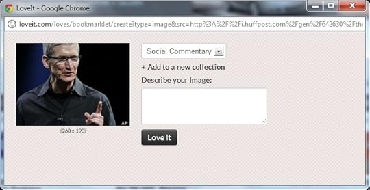
When you are on a website and want to pin an image, for both services the best thing to do is hit that service’s browser button. When you do that in Pinterest, every image on that web page pops up — including those for ads. I’ve seen anywhere from one to over a dozen images pop up. And, further confusing things, often the main image of the page/post is not the first to show. With LoveIt these extra images are filtered out and all you see are the images from the actual page/post. This streamlines the pinning process and ensures the right image is tied to the proper page link.

The LoveIt image algorithm specifically targets the images in the actual post.

Pinterest grabs every image visible on the entire web page.
More Information Up Front
The best way to describe this is to say that LoveIt makes better use of screen real estate than Pinterest, thus reducing friction and increasing the likelihood of being followed.
When you click on an image in a Pinterest Board, what you see is the image itself, and, above that, who pinned it and a small text link to the site it came from. To the right of the main image are sharing links (Like, tweet, embed, email). But, to learn more about the sharer, others who have shared it, etc, you need to scroll down the page. Not so with LoveIt! Instead of using a single column in the center of the screen, LoveIt uses two columns to make the relevant information available without scrolling.

LoveIt’s two column layout allows for more immediate visual access to information and links.

With Pinterest you have to scroll to get to the more useful information and links.
Easier Organization
When you pin a pic using Pinterest, you have a drop down to select which topic you want to pic to be placed in. But what if you need to create a new board on the fly right then and there? You can do it in Pinterest, but you have to scroll down to the bottom of your topic list to reach the option — not very intuitive, most probably won’t find that without really looking. LoveIt has an “Add to New Collection” option right there directly under the Collection drop down menu. Simple, elegant, easy to find and use.
With LoveIt, all of your organizational options are up front and at your fingertips.

Where do I add a new category?
Wrap Up
I find LoveIt to be extremely similar to Pinterest, but more streamlined, accessible, and easier to use. As a new user to digital pinning, I have to admit that I prefer LoveIt to Pinterest.
But, while I am new to digital pinning, digital pinning is not new. LoveIt is just getting started in a field that is utterly dominated by Pinterest — can it break out? The LoveIt site promises an innovative development roadmap, highlighting increased user collaboration and discovery options. That sounds like a pretty good start to me, and will keep me checking back on their service. Pinterest is not resting on its laurels either, and they are also trying to tweak their service to increase user comfort. Unfortunately, so far Pinterest is looking a lot more at aesthetics and less about function (though now you can pin Vimeo videos on Pinterest, so that might go crazy if they can get YouTube on board).
The million dollar question (literally), is can LoveIt’s new energy and refined development approach overcome Pinterest’s massive user base? I don’t know the answer to that. The hundred thousand dollar question is, what exactly are people looking for in a pinning service? Just the pins, or a smooth ability to share those pins?
As for me, I’m going to keep using LoveIt. I like it.