
John Coulthart's Blog, page 320
February 3, 2011
Deutsche Kunst und Dekoration #6

Continuing the delve into back numbers of Deutsche Kunst und Dekoration, the German periodical of art and decoration. Issue 6 covers the period from April to September 1900, and the content is still Art Nouveau all the way, with a dash of Symbolism. Among the contributors in this edition there's Otto Eckmann and more work from Hans Christiansen, both frequent contributors to Jugend magazine There are further examples of stylish Art Nouveau interiors, and of considerable interest to this Exposition Universelle obsessive, a look at the Paris exposition of 1900 from the German side of things. As before, anyone wishing to see these samples in greater detail is advised to download the issue at the Internet Archive. There'll be more DK&D next week.

The ubiquitous peacocks were never far away in 1900.


Franz Metzner was a sculptor with a very distinctive and often grotesque style whose work is featured in this issue. Among the pieces are these two Symbolist ceramics, Sphinx des Lebens and Medusa.


A series of calendar designs by different artists. The two Mucha-styled pieces below are by a Belgian artist and architect, Paul Cauchie.


The Exposition Universelle features begin with some designs from the official German catalogue all 534 pages of which can be downloaded here, if you must. Following that is a great sequence of photographs showing the Bing Pavilion. Siegfried (aka Samuel) Bing was a German art dealer whose Paris gallery, Maison de l'Art Nouveau, played a crucial role in popularising the florid new style in the 1890s. His exposition pavilion is often referred to in accounts of the exposition—and in Art Nouveau histories—but the fair was such a huge event one seldom sees more than a single picture of the Bing exterior. The painted panels were by Georges de Feure and it's a pleasure to see them in such detail.


Previously on { feuilleton }
• Deutsche Kunst und Dekoration #5
• Deutsche Kunst und Dekoration #4
• Deutsche Kunst und Dekoration #2
• Deutsche Kunst und Dekoration #1
• Deutsche Kunst und Dekoration
• Jugend Magazine revisited
• Return to the Exposition Universelle


February 2, 2011
Kenneth Grant, 1924–2011
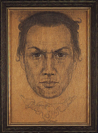
Kenneth Grant by Austin Spare (c. 1951).
Kenneth Grant, writer and occultist, died last month but the event was only announced this week. He'll be remembered for the nine fascinating occult treatises he wrote from 1972 to 2002, and for continuing the work of Aleister Crowley as head of the Ordo Templi Orientis, a position which became fraught in later years as various occult factions disputed his authority. Having collected occult books for much of the 1980s I find his name calls out from the shelves more than many other writers; as well as authoring his own works he edited all the major Crowley texts with Crowley's executor John Symonds, presenting them in authoritative editions for a new readership.
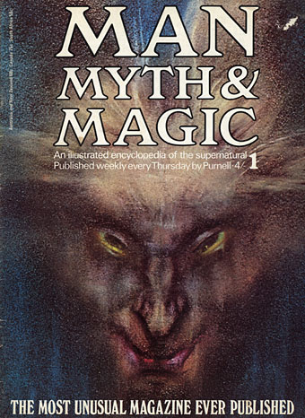
Grant proved a very loyal champion of people he admired, significantly so in the case of Austin Osman Spare whose work he collected, exhibited and republished from the 1950s on. It was Grant's position as one of the many advisors for Man, Myth & Magic in 1970 which resulted in the part-work encyclopedia using one of Spare's stunning drawings as the cover picture for its first issue. That effort alone gave Spare an audience far beyond anything he received during his lifetime, and Grant ensured the magazine featured Spare's work in subsequent issues. Grant's occult works made liberal use of unique illustrations by his wife, Steffi Grant, Austin Spare and others. The books were singular enough even without their pages of curious artwork, a beguiling and sometimes incoherent blend of western occult tradition, tantric sex magick and hints of cosmic horror which were nevertheless always well-written, annotated and crammed with technical detail. Alan Moore in 2002 examined the experience of an immersion in Grant's mythos with a wonderful review he called "Beyond our Ken". He notes there the influence of HP Lovecraft, another of the visionary figures who Grant championed throughout his lifetime.
In Spaces Between from The Great Old Ones (1999).
And speaking of Lovecraft, I've often wondered whether Kenneth Grant ever saw a copy of my Haunter of the Dark collection. For the opening of the Great Old Ones Kabbalah sequence which Alan Moore and I created for the book I added an extra piece of art entitled In Spaces Between, a reference to Coil via an epigraph from Grant's Outside the Circles of Time (1980):
For there are Thrones under ground
And the Monarchs upon them
Reign over Space and Beyond
Invoke Them in Darkness, Outside
The Circles of Time
In Silence, in Sleep, in Conjurations
Of Chaos, the Deep will respond…
Coil aficionados will recognise those words as the origin of some lines from Titan Arch (1991):
There are Thrones under ground
And Monarchs upon them
They walk serene
In spaces between
Grant followed his epigraph with another quote, from Lovecraft's Necronomicon.
In addition to Alan Moore's Grant review, Fulgur have a detailed Kenneth Grant bibliography on their pages. They were also the publishers in 1998 of Zos Speaks! Encounters with Austin Osman Spare by Kenneth and Steffi Grant, a memoir and celebration of Spare's work which revealed this trio of remote astral voyagers to be human beings after all. The book is currently out of print but it's essential for anyone interested in Austin Spare or, for that matter, Mr and Mrs Grant.
Previously on { feuilleton }
• New Austin Spare grimoires
• Austin Spare absinthe
• Austin Spare's Behind the Veil
• Austin Osman Spare
February 1, 2011
The Ambassadors in detail
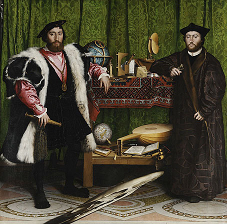
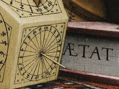
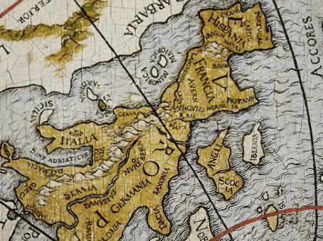
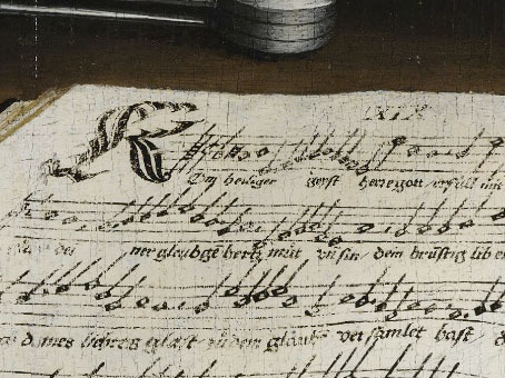
Some revelations courtesy of a new venture, the Google Art Project, in which we're given the opportunity to wander some of the world's great art galleries and examine a selection of paintings in detail. Holbein's 1533 masterpiece, The Ambassadors, is the default work for the collection from the National Gallery, London, and it's a great place to start, being painted in a quite astonishing hyper-realist style. I've seen this work in situ and despite its being a large picture it's difficult to offer it any kind of careful scrutiny. This is partly because the more famous works in that gallery always draw an impatient crowd who are eager for you to get out of their way, but also because the staff there don't like people getting too close to the paintings; I was once reprimanded by a staff member for gesticulating too closely to one of the pictures whilst discussing it with a friend.
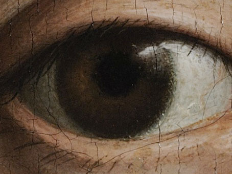
The Ambassadors is celebrated for its anamorphic vanitas skull (gallery visitors usually take turns viewing this from the side of the picture) and its collection of very carefully painted objects and instruments. Thanks to Google we're now able to examine these to a degree we wouldn't have been able to do before unless we worked for the gallery. Holbein astonishes even more when you can see how carefully he rendered so many different materials and textures. And this is only one of the works available from one of the galleries…
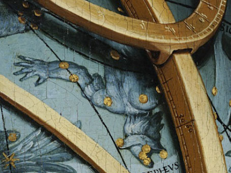
Of the paintings I've looked at so far not all allow such ultra-magnified views but then not all paintings require this. Artists such as Titian and Turner don't benefit from scrutiny with a magnifying glass. An initial gripe would be the lack of any thumbnail view of the paintings on offer but it seems unfair to complain, this is a great development for art lovers. I'm hoping now that the project will evolve the way Google Earth has, with the addition of other galleries and paintings. A few more details follow.
Previously on { feuilleton }
• Magnifying the Prado
• Vanitas paintings
January 31, 2011
The art of Robert Lawson, 1892–1957

Sargasso Sea (no date).
Did I say Sargasso Sea? Blame William Hope Hodgson some of whose sea stories I was re-reading over the weekend. An idle search for Sargasso images turned up this tremendous etching by American author and illustrator Robert Lawson, part of a collection of equally fine work at the Florida State University. There's little information about this picture, unfortunately, it's a numbered print so it's most likely a one-off piece but it would make an ideal cover illustration for a Hodgson collection. It hadn't occurred to me before but the rambling third film in the Pirates of the Caribbean series might have been improved if they'd made use of the old Sargasso-as-oceanic-graveyard legend, it's just the place you'd expect to find Davy Jones and his piscine crew.
Bud Plant has more about Robert Lawson's career and examples of his book illustrations.

Untitled (CityShip) – Manhattan (no date).
Elsewhere on { feuilleton }
• The etching and engraving archive
• The illustrators archive
Previously on { feuilleton }
• Coming soon: Sea Monsters and Cannibals!
• Druillet meets Hodgson
• Davy Jones
January 30, 2011
CthulhuPress

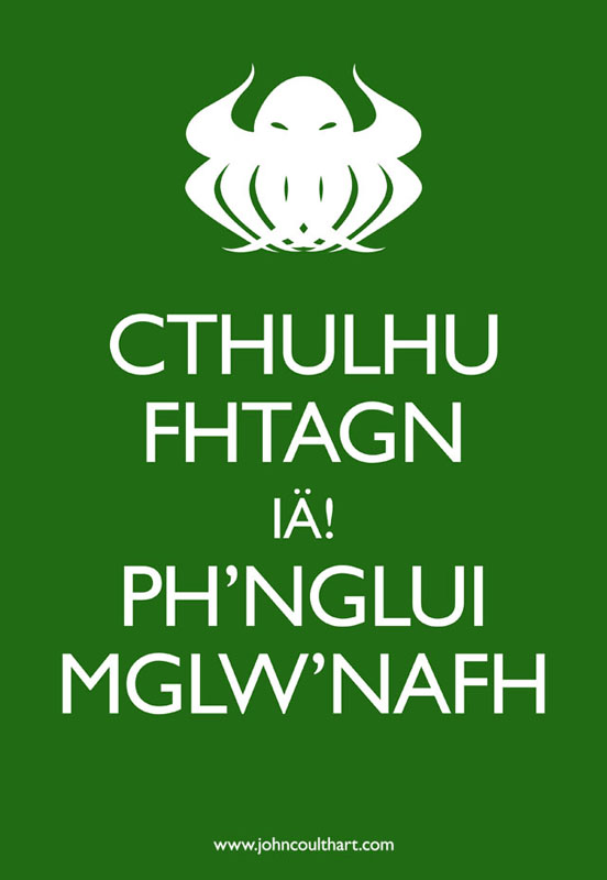
The Twitter consensus yesterday was that CafePress products based on this design were required so here they are. As usual I never know what people want from CafePress so I tend to throw the design on their entire range so long as it fits the requisite size and shape. This piece works better than most since it's simple and direct, my more detailed and pictorial creations look better as prints. I keep feeling that someone must have made a design like this already, these variations on the "Keep Calm" poster have proliferated so much, but searching didn't reveal anything so… The web address doesn't appear on the CafePress things, that's just for the images posted here if and when they drift into Tumblr's Sargasso Sea of uncredited pictures.

The Call of Cthulhu (1987–88).
While we're on the subject of everyone's favourite Great Old One, I may as well take the opportunity to remind those interested that these earlier renderings are also available as various CafePress products. The Call of Cthulhu piece above is the opening page of my comic strip adaptation of the story as seen in The Starry Wisdom anthology from Creation Books and my Haunter of the Dark collection.

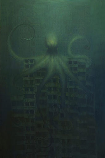
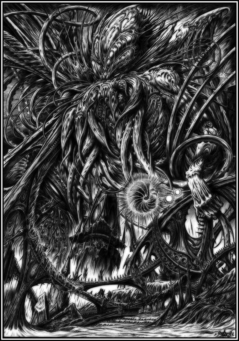
Cthulhu from The Great Old Ones (1999).
The Great Old Ones drawing was one of the plates from the series of the same name I produced with Alan Moore for the Haunter book. And Cthulhu Rising is the cover of that volume, of course, seen here with its Haeckel-derived frame. The Great Old Ones Cthulhu was drawn with a Biro pen then tweaked slightly in Photoshop. I don't think I've ever posted a large version of it so here it is.

Cthulhu Rising (2004).
Previously on { feuilleton }
• Design as virus #8: Keep Calm and Carry On
• Cubist Cthulhu
January 29, 2011
Weekend links

That essential journal of esoteric culture, Strange Attractor, announced a fourth number this week sporting a psychedelic cover which may be the work of Julian House (no credit is given on the SA site). As to the contents:
From Haiti and Hong Kong to the fourth dimension and beyond: discover the secrets of madness in animals; voodoo soul and dub music; ancient peacock deities; Chinese poisoning cults; the history of spider silk weaving; heathen mugwort magic; sentient lightning; Jesuit conspiracy theories; junkie explorers; Dali's Atlantis; the resurgence of Pan (in London's Crouch End); anarchist pirates on Madagascar; an ancient Greek Rip Van Winkle; French anatomical waxworks; Arthur Machen's forgotten tales and Alan Moore's unpublished John Dee opera.
Further details and the means to order a copy can be found here.
• Resonance FM's Weird Tales For Winter has returned beginning with a presentation of The Gateway of the Monster, one of the better Carnaki tales by William Hope Hodgson. The story is read by Moon Wiring Club's Ian Hodgson (no relation) and the musical atmospheres are provided by The Advisory Circle. I ought to have posted this news yesterday since you'll have missed the broadcasting of the first half but the second half will go out at midnight (UK time) on Monday. Details here, and the next release on the Café Kaput label in February will be the soundtrack, Music for Thomas Carnaki (Radiophonic Themes & Abstracts).
• The Keep Calm and Carry On Image Generator lets you work your own variations on the ubiquitous poster. It wouldn't work for me, however, so I rolled up my sleeves and made my own. This may be good as a CafePress design, yes?
• Interplay is an album by John Foxx and The Maths due to be released on March 21st. As with last year's collection of Foxx instrumental pieces, DNA, the package design is by Jonathan Barnbrook. John Foxx first came to prominence as the lead singer in Ultravox (do I need to say "of course"? Okay…"of course") and Ultravox's debut album was part-produced by Brian Eno. It's been painfully obvious recently (and it pains me to say it) that Foxx's DNA was a far more accomplished and engaging work than Eno's recent collection of over-hyped instrumentals. Related: Barnbrook Design's albums of 2010.
• Word Horde 2.0, "a substantial archive of manuscript material, correspondence, and books and printed matter, mostly signed" from the William Burroughs archives can be yours for $260,000. Related: William Burroughs' Wild Boys photos. Also: Rudy Rucker on David Cronenberg's Naked Lunch.
• "Nabokov described how 'a modern taxonomist straddling a Wellsian time machine with the purpose of exploring the Cenozoic era' would encounter the following series of events in the evolution of these butterflies…" The Royal Society confirms that a contentious theory of Vladimir Nabokov's concerning the descent of butterfly populations was accurate.
• The work of Gérald Bertot aka Thomas Owen, a Belgian author of weird fiction, is explored at A Journey Round My Skull.
• The Other Side of the Wind, Orson Welles' unfinished film from 1972, may finally be given a release.
• Jon Savage celebrates Roy Harper and his extraordinary Stormcock album.
• Philip Pullman wants the Tory philistines to leave our libraries alone.
• Rick Poynor takes a dérive through the arcades of Paris.
• Young Savage (1977) by Ultravox | Clicktrack (2010) by John Foxx & Jonathan Barnbrook.
January 28, 2011
The art of Martin Wittfooth
Year of the Carnivore (2009).
There are also peacocks, and the artist has prints for sale. Go thou here. Via the Wunderkammer.
Babylon (2008).
Elsewhere on { feuilleton }
• The fantastic art archive
January 27, 2011
Deutsche Kunst und Dekoration #5

Continuing the delve into back numbers of Deutsche Kunst und Dekoration, the German periodical of art and decoration. Issue 5 covers the period from October 1899 to March 1900, and the Art Nouveau style is in full flower at this point, as it was across most of Europe. This is also the place at which the journal becomes so laden with impressive design work that it's impossible to easily do justice to over 300 pages of contents. Anyone wanting to see more is encouraged to download the whole thing as either page scans or a PDF. As before I've tended to concentrate on the graphic material but this issue also features more lavish interior designs, a range of jewellery, and ponderous monumental architecture including proposals for some of Germany's many Bismark Towers. Examples follow below. There'll be more DK&D next week when we take a trip to the Exposition Universelle in Paris.

Sascha Schneider was Karl May's favourite illustrator and one of the few openly gay artists in Germany at the time. He's represented here with a small feature on his paintings among which there's this depiction of a team of strapping oarsmen.


Bookplates (above and below) by Ephraim Moses Lilien.


A Symbolist sculpture, Sterbende Sphinx, by Cipri Adolf Bermann. There's very little to be found about either the artist or his work on the web so we can't tell whether this work has survived.


Previously on { feuilleton }
• Deutsche Kunst und Dekoration #4
• Deutsche Kunst und Dekoration #2
• Deutsche Kunst und Dekoration #1
• The art of Ephraim Moses Lilien, 1874–1925
• Deutsche Kunst und Dekoration
• Jugend Magazine revisited
• The art of Sascha Schneider, 1870–1927
January 26, 2011
Designs on Kafka
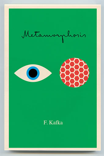
Book covers of the week are a series of new Kafka designs by Peter Mendelsund for Schocken, a set comprising eight paperbacks which will be out this summer in the US. What's notable about these designs aside from their minimal style is the way they dispense with the visual clichés which have accumulated around Kafka's work. So no sombre author photos, ominous shadows or views of Prague, just bold colours and simple shapes to create a beautiful collection. The script typeface is Mister K by Julia Sysmäläinen, a design based on Kafka's handwriting. Peter Mendelsund has the rest of the covers and some words about their design on his blog. Via Coudal.
Elsewhere on { feuilleton }
• The book covers archive
Previously on { feuilleton }
• Kafka's porn unveiled
• A postcard from Doctor Kafka
• Alexandre Alexeieff and Claire Parker
• Hugo Steiner-Prag's Golem
• Steven Soderbergh's Kafka
• Kafka and Kupka
January 25, 2011
À Rebours illustrated

Not a comprehensive post by any means but a few items worthy of note for readers of Joris-Karl Huysmans' Decadent classic. The Vera Bock cover is from a 1937 American edition which turned up here last year. Thanks to Jescie for drawing my attention to the presense of my Haunter of the Dark collection on the same site. Vera Bock is an unusual choice of illustrator for this particular novel, there's more of her work and details of her career at A Journey Round My Skull.

Auguste Leroux's edition (above & below) is from 1920 and can be downloaded at the Internet Archive although the copy there seems to have had many of its full-page plates stolen. The artist produced an illustrated Memoirs of Casanova a few years later and he seems here to have concentrated on the more salacious aspects of Huysmans' story, as with this brothel scene which is missing from the scanned edition. His depiction of Des Esseintes looks too middle-aged for me but the rendering of the unfortunate jewelled tortoise could hardly be bettered.


Browsing the archives at Gallica turned up this extraordinary Art Nouveau edition from 1903 illustrated and embellished on every page by Auguste Lèpere. This would be an excessively lavish treatment for most books but for a story of aesthetic obsession it seems quite appropriate. Gallica also allows the downloading of many of their documents although that function kept failing my attempts. But this volume really does need to be seen in its entirety.
Elsewhere on { feuilleton }
• The illustrators archive
Previously on { feuilleton }
• Arthur Zaidenberg's À Rebours
John Coulthart's Blog

- John Coulthart's profile
- 31 followers

