
John Coulthart's Blog, page 318
February 23, 2011
Deutsche Kunst und Dekoration #9

The Ludwig Habich building, Darmstadt.
Continuing the delve into back numbers of Deutsche Kunst und Dekoration, the German periodical of art and decoration. Volume 9 covers the period from october 1901–March 1902. This edition continues the examination of the Darmstadt Artists' Colony begun in the previous number. Despite the colony being very much an Art Nouveau venture the pictorial content is largely photographic, with many views of the show-homes built by the colony artists. Much of the other content is a disappointment compared to what's gone before, the featured painters being the conservative types who were crowding Jugend magazine at this period with generic depictions of stolid German farmers. Unlike Jugend, however, this isn't the end of the line. As usual, anyone wishing to see these samples in greater detail, or the rest of the edition, is advised to download the entire volume at the Internet Archive. There'll be more DK&D next week.


A electric lamp by artist Rudolf Bosselt.

A painting by Wilhelm Bader who, when he wasn't painting Teutonic peasants, seems to have been another German artist in thrall to Arnold Böcklin.


The Darmstadt house of Hans Christiansen.

The Darmstadt house of Peter Behrens which in this edition receives a special feature, including plans of the rooms and many photographs of the interior.


The volume ends with views of a lavish Art Nouveau theatre designed by August Endell.
Previously on { feuilleton }
• Deutsche Kunst und Dekoration #8
• Deutsche Kunst und Dekoration #7
• Deutsche Kunst und Dekoration #6
• Deutsche Kunst und Dekoration #5
• Deutsche Kunst und Dekoration #4
• Deutsche Kunst und Dekoration #2
• Deutsche Kunst und Dekoration #1
• Deutsche Kunst und Dekoration
• Jugend Magazine revisited


February 22, 2011
Fred Holland Day revisited

St Sebastian with wounded chest (c. 1906).
The work of American photographer Fred Holland Day (1864–1933) has featured here in the past but it's only recently that I came across the at the Library of Congress. Not all the works there are digitised yet, and some are still unavailable for viewing, but the LoC prints one can view are always quality scans. Day would have been a significant photographer whatever his subject but his work has additional interest today for its overt homoerotic dimension; he manages to play the usual evasive games with Biblical themes or Classical mythology whilst maintaining a pictorial quality through soft focus and heavily-grained paper. The mood of some of these shots makes them seem far in advance of other work of the period.

St Sebastian in loincloth, tied to tree with rope, arrows in stomach and side, hands behind back (1906).

Saint Sebastian tied to tree with rope, with arrow in side, elbow raised (1907).

Nude youth with laurel wreath and staff (1906).

Study for Endymion (1970).
Previously on { feuilleton }
• Ecce homo
• The art of Robert Sherer
• The art of Joan Sasgar
• Saint Sebastian in NYC
• Guido Reni's Saint Sebastian
• The art of Takato Yamamoto
• Fred Holland Day
February 21, 2011
Vultures Await

From a Void City to what might be a Vulture City, this is an illustration I produced last September for San Jose psych rock band Vultures Await. I would have mentioned it sooner but the following months were very busy and I was also waiting for the band to make the artwork public. Stylistically, this is another piece of collage Surrealism à la Wilfried Sätty, an illustration approach I'd like to keep developing for a while yet. The forthcoming Thackery T. Lambshead Cabinet of Curiosities will have more Sätty-inspired pieces, although my contributions there tends towards decorative. There is, however, a connection between this piece and the Cephalopod Bride.
Previously on { feuilleton }
• Wilfried Sätty: Artist of the occult
• The Epigenesis by Melechesh
• Nyarlathotep: the Crawling Chaos
February 20, 2011
Void City

Friends & Relations Vol. 3 (1985) by Hawkwind.
Unless you assiduously collect everything you've ever worked on—which I don't—you occasionally have to rely on the web to remind you of something you created years ago. This Hawkwind album is an example of that, being one of the last releases by the band to use a piece of my artwork. (And I'll quickly note that the accompanying type design was nothing to do with me; my suggestions in that area were always ignored, hence a growing frustration at that time with album cover work.) The album itself was the third in a series of odds and ends compilations gathering stray tracks by, yes, friends and relations of Mr Brock and co. Subsequent CD reissues used different packaging so the original vinyl is the only place you'll see this illustration.
The reason I don't have a copy is that the record label never sent me anything so unless Dave Brock put something in the post I had to buy them myself. (This happens more often than you'd expect.) I evidently didn't think this one was worth it even though I much prefer the artwork to many of the earlier things of mine that were used. The drawing was a couple of years old, being inspired by the track Void City on the Choose Your Masques album from 1982. Void City is an atypical piece of electronica which I liked for its resemblance to some of the higher level synth pop and industrial music that was around in the early 1980s. 1982 to '84 was the height of my JG Ballard obsession so Ballard is also a slight influence here. I had in mind his 1981 novel Hello America, which takes place in a post-apocalypse United States. And there's also a trace influence from one of my early pieces of writing, a mercifully unpublished splurge of intense prose influenced by the New Worlds school of speculative fiction in which someone wanders around a vast and almost completely depopulated city. Looking at this drawing now it seems emblematic of my loss of interest in doing any kind of science fiction art; it also no longer seems futuristic. I produced my last album cover for Hawkind, The Chronicle of the Black Sword, in 1985; in January 1986 I started work adapting HP Lovecraft's The Haunter of the Dark. That took me out of the public eye for a few years but it was a more rewarding place to be for many other reasons.
Previously on { feuilleton }
• Hawk things
• The Sonic Assassins
• New things for July
February 19, 2011
Weekend links
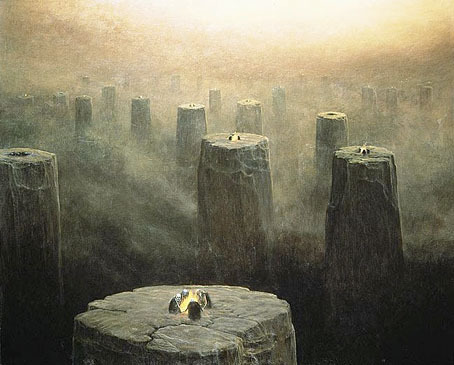
DG-2499 (1975) by the fantastic (in every sense of the word) Zdzislaw Beksinski (1929–2005). See the Dmochowski Gallery for a comprehensive collection of the artist's work. Thanks to BibliOdyssey for the tip.
• More ICA events: From Animism to Zos: Strange Attractor Salon will be "a series of weekly events, consisting of a talk and a film, exploring some lesser-known intersections of culture, history, mind and nature" running from 10 March–12 May, 2011.
• And on May 10, the London Word Festival presents a Dodgem Logic evening with entertainment provided by contributors to that magazine:
Alan Moore's reinvigoration of the underground fanzine, Dodgem Logic, comes alive in the non-conformist surroundings of Hackney's Round Chapel. A night of art, comedy, comment and put-something-back localism. (…) With Robin Ince heading up a colossal stand-up bill, artists Steve Aylett, Savage Pencil, Melinda Gebbie and Kevin O'Neill panel-up to talk about their comic work, while music comes from hyperactive racketeers The Retro Spankees. With an exhibition of artwork from the magazine, and conducted by editor-in-chief Alan Moore.
• Taschen publishes a collection of Dennis Hopper's photographs this week. The Independent has a small selection here. Also new from Tachen, Alex Steinweiss, The Inventor of the Modern Album Cover.
• Bass Notes: The Film Posters of Saul Bass at the Kemistry Gallery, London.

DG-2507 by Zdzislaw Beksinski.
While riding through the bustling streets of London from 1603 to 1621, one was liable to hear the shout "Long live Queen James!" King James I of England and VI of Scotland was so open about his homosexual love affairs that an epigram had been circulated which roused much mirth and nodding of the heads: Rex fuit Elizabeth: nunc est regina Jacobus—"Elizabeth was King: now James is Queen."
There's more about the private life of the man who gave his name to the King James Bible here.
• Addams and Evil, a Tumblr devoted to the great Charles Addams.
• Hannes Bok again at Golden Age Comic Book Stories.
• Caravaggio's crimes exposed in Rome's police files.
• Deserted City, photographs by Kim Høltermand.
• The blue sand dunes of the planet Mars.
• A map of the ghost signs of Chicago.
• The movie title stills collection.
• The pitfalls of e-book buying.
• Life On Mars? (1971) by David Bowie | Uncle Sam's On Mars (1979) by Hawkwind | Eyes On Mars (1980) by Chrome | Cache Coeur Naif (1997) by Mouse on Mars.
February 18, 2011
ICA talks archived
I've linked to the British Library's sound archive before but it was only recently that I had a browse through their collection of talks from the Institute of Contemporary Arts, London. The public discussions cover the period 1981–1994, and while there's a wide range of contributors the lion's share of interviewees are writers. Most of the talks run from 60–90 minutes. The following is a selection from some of the contents:
• JG Ballard and Matthew Hoffman in conversation, 1984. Ballard discussing his latest novel, Empire of the Sun.
• Derek Jarman and Ken Campbell in conversation, 1984. Jarman discussing his autobiography, Dancing Ledge which was also published that year. (A revised edition appeared in 1991.) If Ken Campbell seems an unusual interviewer it should be recalled that he appeared in Jarman's 1979 film, The Tempest.
• Alan Moore and Charles Shaar Murray in conversation, 1987. Mr Moore caught in the year when the world at large became aware of comics in general and his work in particular.
• Whose Fantasy? Hosted by Neil Gaiman (uncredited) with M. John Harrison, Terry Pratchett, Geoff Ryman & Diana Wynne Jones, 1988. One of a series of events examining British genre fiction. Neil Gaiman was the host of each discussion but is uncredited on the site for several of the talks. This one concerns fantasy and science fiction.
• Whose Fantasy? Hosted by Neil Gaiman (uncredited) with Clive Barker, Ramsey Campbell, Roz Kaveney & Garry Kilworth, 1988. The following day's discussion was oriented more towards horror.
• Laurie Anderson and Sarah Kent in conversation, 1990. Laurie Anderson's latest album (and one of hers I like a great deal) Strange Angels is discussed.
February 17, 2011
The art of Ron Rodgers

Century of Progress.
While the web has given many artists a visibility they wouldn't have had in the past, too many artists' sites are blighted by the dreaded "Artist's statement" in which people who express themselves visually are forced to try and articulate for the paying customers what it is they're doing with all this art stuff. Nowhere will you find anyone saying "I don't know what I'm doing" or "I do this because I'm compelled to but don't know why" or even "I do this to make a living". All too often what you get is a rifle through the favourite jargon phrases of the social sciences where the polysyllabic words seem important but are as worn out and redundant as any of the examples George Orwell complained about sixty years ago in 'Politics and the English Language'.
All of which is a very long-winded and polemical way of saying I loved Ron Rodgers' artist's statement:
"That's what his stare has been saying to me all this time:
'At least I galloped – when did you?'"
– Peter Shaffer, from "Equus"
Here's hoping more artists follow his example. There's more of his art at the Glass Garage Gallery. Via Monsieur Thombeau who has a knack for finding good things.

Phoenix.
Previously on { feuilleton }
• Geoffrey Haberman's brass insects
• The art of Arnaldo Pomodoro
• The art of Sergei Aparin
• Sculptural collage: Eduardo Paolozzi
• The art of Igor Mitoraj
February 16, 2011
Deutsche Kunst und Dekoration #8

Continuing the delve into back numbers of Deutsche Kunst und Dekoration, the German periodical of art and decoration. Volume 8 covers the period from April–September 1901 and continues to use the ornamental capitals by Karl Lürtzing featured in the previous volume. In this edition the emphasis is predominately upon the Darmstadt Artists' Colony, a remarkable venture in which many of the artists involved designed and decorated their own houses, the intention being to create living examples of the Jugendstil, or German Art Nouveau, style. This is explored in greater detail in the next volume but for now I've chosen a selection of work by Darmstadt artist Paul Bürck. As usual, anyone wishing to see these samples in greater detail, or the rest of the edition, is advised to download the entire volume at the Internet Archive. There'll be more DK&D next week.

These peacock border designs are uncredited but they show how flexible the ubiquitous fin de siècle bird could be. The last page gives us something unique: an ape in peacock finery.


Paul Bürck's work below includes a variety of Classical scenes, a popular theme in German art of the period; Franz Stuck's work is replete with them, as are the pages of Jugend magazine.


A surprising departure from the work above. Without the credit you wouldn't think these were by the same artist.


Previously on { feuilleton }
• Deutsche Kunst und Dekoration #7
• Deutsche Kunst und Dekoration #6
• Deutsche Kunst und Dekoration #5
• Deutsche Kunst und Dekoration #4
• Deutsche Kunst und Dekoration #2
• Deutsche Kunst und Dekoration #1
• Deutsche Kunst und Dekoration
• Jugend Magazine revisited
February 15, 2011
Leonardo's warrior

Bust of a warrior in profile (c. 1475–80) by Leonardo da Vinci.
A recent interview question reminded me of this splendid Leonardo piece when I was discussing early artistic influences. One crucial influence for me was the example of my mother who'd been an art student during the 1950s specialising in ceramics and textile design. From an early age I was fascinated by her student sketchbooks, and by one drawing in particular, a very careful copy of this work by the young Leonardo. The British Museum has the original, about which they tell us:
The drawing shows Leonardo studying the art of his teacher, Andrea Verrocchio. Giorgio Vasari's biography of Verrocchio in his Lives of the Artists (1550 and 1568) mentions two metal reliefs with profile portraits of Alexander the Great, leader of the Greeks, and Darius, the Persian king. They were sent by Lorenzo 'il Magnifico' ('the Magnificent') de' Medici, ruler of Florence (1469–92), as gifts to the king of Hungary. This drawing is probably based on one of these lost works by Verrocchio.
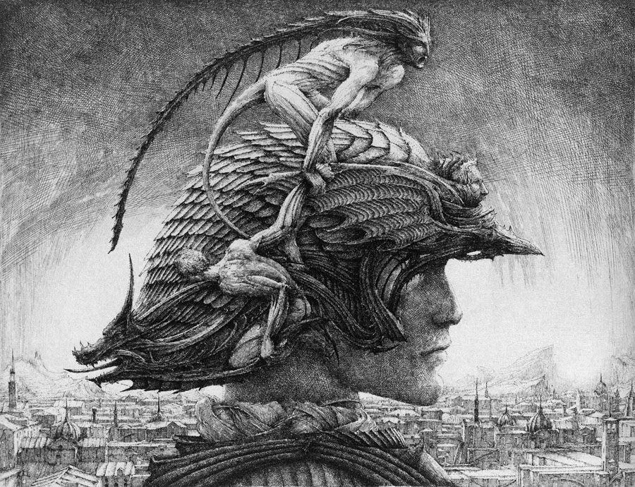
Casque d'apparat (1981) by Erik Desmazières.
Memories of the Leonardo drawing always follow the exaggerated logic of childhood and inflate its splendour and detail; I'd never seen anything like it and for years used to hope that Leonardo had produced many similar works. He hadn't, of course, so it's to other artists we have to turn for more of the same. French artist Erik Desmazières has produced a number of etchings depicting elaborately helmeted figures which are perhaps inspired by Leonardo's warrior. Of the three in Imaginary Places, a 2007 collection of his work, the one above is my favourite. I have a feeling I've seen derivations by other artists but nothing is coming to mind. As usual, if anyone knows of further examples, please leave a comment. Elsewhere there's Leonardo's Diary (1972), a short film by Jan Svankmajer in which the haughty figure is subject to some typical Svankmajerian distortions.
• See also: Erik Desmazières at the Fitch-Febvrel Gallery.
Previously on { feuilleton }
• Les lieux imaginaires d'Erik Desmazières
• Jan Svankmajer: The Complete Short Films
• The art of Erik Desmazières
February 14, 2011
Victorian typography

"Victorian" isn't really the correct term for the products of 19th century America but then "19th century" covers rather a lot of ground. Mr BibliOdyssey's most recent post is a stunning collection of title pages from fire insurance maps of the late 19th and early 20th century. Rather than repost any you ought to go and see them for yourself, they're excellent examples of the best and worst of "Victorian" graphic design, insanely and pointlessly ornate yet often very inventive in their elaborations and stylised letterforms. Being a typophile I'd often feel frustrated when looking at 19th century documents and seeing type designs in use for which there were no contemporary equivalents. There was such a profound reaction against ornamented design in the 20th century that it's only relatively recently that typography of this period has been reappraised and, in some cases, resurrected. The book from which these examples are taken dates from 1897, and it fascinates for putting names to some of those neglected designs. This is a big catalogue of 740 pages so I've been sparing in my selection. Anyone wishing to see more can download the whole thing here.

Despite my affection for curvilinear Art Nouveau, when it comes to typography I'm often drawn to the spikier styles. Atlanta was digitised by P22 in a style they call Victorian Gothic. Their accompanying ornament set replicated that curious shape from Victoria below.


This typeface, or ones which resemble it, is a common one in 19th century newspaper and advertising design but I'd never seen it given a name until now. The catalogue pages have a number of variations which is no doubt an indicator of its popularity. A bold weight of the design was digitised by Scriptorium as a font they call Mephisto.

Rubens is my favourite of all the designs in this catalogue, probably because I always liked the way it looked when it enjoyed a surprising flush of popularity in the 1960s and 1970s. The narrow style made it very useful for book covers (as with the examples here) while those spiky serifs made it popular with art directors looking for a typeface that said "horror". Wooden Type Fonts recently digitised a version of Rubens but their version lacks the elegance of the original. Anyone else want to have a go?

Lastly the catalogue has many pages of clip art figures and decorations including the pointing hands which people always associate with 19th century design. I'd wondered a few times whether these jagged decorations were meant to be electrical or not. Electricity was a new thing in 1897 so these would have seemed distinctly modern.
Previously on { feuilleton }
• Steampunk overloaded!
• Penguin Labyrinths and the Thief's Journal
• Masonic fonts and the designer's dark materials
John Coulthart's Blog

- John Coulthart's profile
- 31 followers

