
John Coulthart's Blog, page 297
September 23, 2011
Soft machines
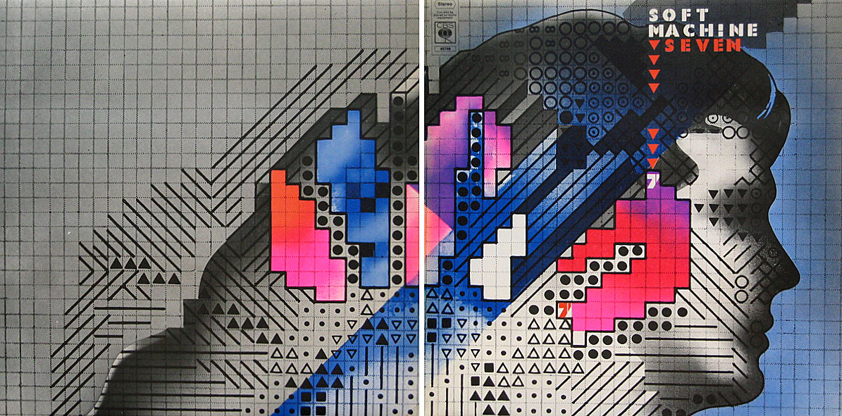
Seven (1973) by Soft Machine. Design by Roslav Szaybo.
You're the great, gray man whose daughter licks policemen's buttons clean,
You're the man who squats behind the man who works the soft machine.
Mick Jagger, Memo From Turner (1968)
By coincidence this month I'd been re-reading some William Burroughs when I picked up a nice box set of five Soft Machine albums, part of a series of reissues that Sony have been doing recently. They're very cheap and sound excellent, and also have the additional benefit of being a card slipcase holding the discs in card sleeves so there's no nasty plastic packaging. The set comprises the Third (1970), Fourth (1971), Fifth (1972), Six (1973), and Seven (1973) albums. I have the band's first two studio albums already so this has been an opportunity to get fully acquainted with the rest of their output up to the point where the machine started to run out of steam.

The Soft Machine (1968) with die-cut sleeve. Design by Byron Goto, Eli Allman, Henry Epstein.
Third and Fourth are freaked-out jazz fusion recorded when Robert Wyatt was still on drums; Fifth, which I had for years on vinyl, is post-Wyatt fusion of a more polite variety, great compositions but it sounds lightweight compared to Miles Davis's On The Corner which was released the same year. Six, which I'd hardly heard at all, is a set of live recordings and four superb studio tracks. Seven is the weakest of the lot but it prompts this post on account of the cover which I always liked the look of when flicking past it in record shops. Seen today it still looks surprisingly advanced for 1973, and the intention behind the design is still mysterious. I used to regard it as vaguely "futuristic" despite knowing that the music was nothing of the sort. The accumulation of abstract symbols contained by a human head implies either a score for some aleatory composition (which again is belied by the short jazzy pieces within), or can perhaps be read as a "soft machine", especially if one considers that the popular idea of electronics at this time involved patch-boards and banks of flashing lights. Ten years later with synthesizers in common use this kind of semi-cybernetic imagery was a lot more topical.

The Soft Machine Volume Two (1969). Design by Byron Goto, Henry Epstein.
The first two Soft Machine albums both showed literal renderings of Burroughs' "soft machine" idea albeit couched in the naked-woman-as-decoration style of the late 60s. Six has a horrible cover making another attempt at a soft machine using an airbrush to create one of those pictures common to the 1970s that you're amazed was approved by band and record company.

V2 by The Vibrators (1978). Design by Roslav Szaybo.
The design for Seven is credited to Roslav Szaybo, an in-house designer at CBS. Looking through Mr Szaybo's other credits there's little that resembles his Soft Machine cover until you arrive at the sleeve for V2, the second album by punk band The Vibrators. This was another cover I always liked, probably for similar graphical reasons to the Soft Machine sleeve; they even share a similar stencil typeface. Musically they're worlds apart, of course, although William Burroughs' influence on music continued into the punk era (another Brit punk band named themselves Dead Fingers Talk) and beyond. It's an influence reaching from the mid-60s with Soft Machine and his appearance on the cover of Sgt Pepper, into the 1990s with the many recordings he collaborated on or inspired from Bill Laswell and others. His influence generally may have fallen off since his death in 1997 but it's a remarkable achievement for someone who never seemed to care much for music beyond the popular tunes he heard as a boy.
Previously on { feuilleton }
• Burroughs The Movie
• William S Burroughs: A Man Within
• The Final Academy
• William Burroughs book covers
• Towers Open Fire


September 22, 2011
Labyrinths

The Breamore Miz-Maze, Hampshire. Photo by Jim Champion.
As part of the work-related research this week I was looking for designs of old turf labyrinths. It turns out I have two pages of the things in a book I'd earlier considered dropping into Oxfam so that particular volume may have gained a reprieve. Before I went to the bookshelves I'd been browsing the rather wonderful Labyrinthos site which is just the kind of detailed resource you hope to find in these circumstances. There we find an explanation for the difference between a maze and a labyrinth (the general rule being that a maze has more than one choice of route), and a wealth of examples from ancient history to the present day. I've long been fascinated by the labyrinths found in churches and cathedrals, of which the most famous example is the one in Chartres Cathedral. They're a rare incidence of a symbolic device in Christian architecture which is near-universal, and which has clear antecedents in the labyrinths and mazes found in ancient temples. Labyrinthos has a guide to some of the surviving examples to be found in England. As to England's turf labyrinths, there's a page devoted to those here with a number of photos.
Previously on { feuilleton }
• Jeppe Hein's mirror labyrinth
September 21, 2011
Maxfield Parrish's Arabian Nights

Despite spending years tracking down the work of various illustrators I've never been as familiar with the major works of Maxfield Parrish as I might. I've seen a couple of the plates from this 1909 edition before but the majority are new discoveries. They're as lucious as you'd expect from Parrish, and for once the paper and inks haven't been spoiled by age. See all the pages or download the entire book here.


Elsewhere on { feuilleton }
• The illustrators archive
Previously on { feuilleton }
• Thomas Mackenzie's Aladdin
• More Arabian Nights
• Edward William Lane's Arabian Nights Entertainments
September 20, 2011
Index, fist or manicule?

Third revised specimen book and price list of printing material (1887), Palmer & Rey, San Francisco.
Browsing through old type foundry catalogues recently reminded me of a question posed by Callum James a few years ago over at Front Free Endpaper, namely: what is the official description of those pointing hands favoured by pre-20th century typesetters? Writer Mark Valentine in a follow-up post mentions a term invented by William H Sherman—"manicules"—since Sherman also believed that the pointing hands were nameless. That's not quite the case, however, as these pages show, with two descriptors being used: "indexes" and "fists". Just to confuse matters both terms are used on different pages of the same catalogue which implies that the names may have been a convenience term to avoid having to repeatedly discuss "those pointing hand things" with customers. "Manicule" seems a better choice since "index" already has a standard meaning in printing, while "fist" doesn't suit at all.
These catalogues contain many pages of similar type decorations and embellishments. All can be downloaded at the Internet Archive. Follow the links.

Third revised specimen book and price list of printing material (1887), Palmer & Rey, San Francisco.

Catalogue and book of specimens of type faces and printing material and machinery (1895), Cleveland Type Foundry.

Copper alloy type book (1901), Pettingill & Co., Boston.

Copper alloy type book (1901), Pettingill & Co., Boston.
Previously on { feuilleton }
• Victorian typography
September 19, 2011
The art of Robert Venosa, 1936–2011
A few years back, while experimenting with the hallucinogens, I experienced visions of a dynamic energy in constant high-velocity motion, crystallizing and manifesting in a form which could only be described as angelic. Potential energy, crystallizing energy and structured energy were all visible in the same instant…time and space transcended. These visions, and a new-found awareness of spirit brought about through worship and meditation, were too powerful not to be expressed: a translation had to be attempted.
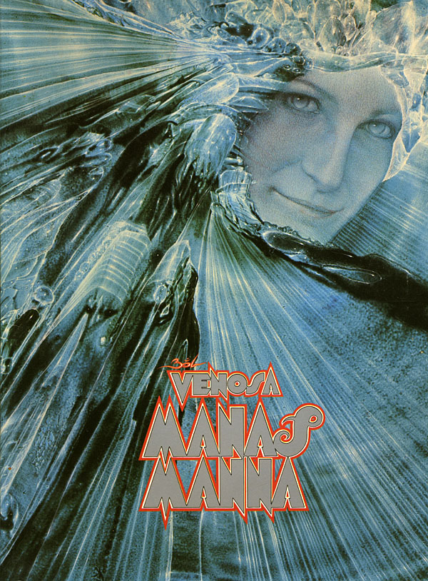
Robert Venosa, Manas Manna, 1978.
I only discovered a few days ago that American artist Robert Venosa had died last month. As with the late Sibylle Ruppert there's the inevitable wish for some wider acknowledgement of the passing of these unique talents.

Millions of people have seen one of Venosa's creations without being aware of it: in 1970 he designed the logo/title for Santana's Abraxas album (the one with the amazing Mati Klarwein cover), a design which is still in use today. But it's as a painter that he ought to be remembered. Manas Manna was the first collection of Venosa's art published by Peter Ledeboer's Big O imprint in 1978, and could be found on bookshelves that year with a pair of equally remarkable auto-monographs: Mati Klarwein's God Jokes and the first English edition of HR Giger's Necronomicon. All three artists were aware of each other (Venosa was friends with the other two), and all had managed the difficult feat of having their work sold in art galleries whilst also being visible to a much larger audience on album covers. All three books were eagerly plundered that year by the art team of OMNI magazine whose early issues made heavy use of paintings by Klarwein, Giger, Venosa, De Es Schwertberger and others. Of this Venosa has said:
OMNI was the first to give the artist equal credit with the author…something that to this day is still not seen in any other newsstand magazine. OMNI also put Fantastic Realism, Surrealism, Visionary, and every other type of 'Fantasy' art, square into the public's eye. I and my colleagues owe OMNI a large measure of gratitude for its uncompromising stance and visionary concepts.
Venosa had been an art director at Columbia Records in the 1960s, a job he abandoned after he met Mati Klarwein and decided he'd rather devote his time to painting. Despite describing Klarwein in his book as his painting master, only a couple of his pictures are reminiscent of Klarwein's distinctive style. Many of Venosa's works are more loose and abstract than Klarwein's tableaux, extending the processes of decalcomania which Max Ernst refined in works such as Europe After the Rain (1942) and The Eye of Silence (1944) to create stunning views of cosmic eruptions and vistas of crystalline beings rendered in a meticulous, hyper-realist manner. Many of his pictures could serve as illustrations for the later chapters of JG Ballard's The Crystal World.
If the lazy definition of psychedelic art refers merely to shapeless forms and bright, clashing colours, Venosa's art is psychedelic in the truest sense, an attempt to fix with paint and brush something revealed by a profound interior experience. This was deeply unfashionable by 1978, of course, but he carried on working anyway, and there are further book collections for those interested in his paintings. The Venosa website has a small selection of his extraordinary pictures although they really need to be seen at a larger size.
Elsewhere on { feuilleton }
• The fantastic art archive
September 18, 2011
Science Friction by Stan VanDerBeek

Ubuweb seems to have the best collection of films by experimental filmmaker Stan VanDerBeek (1927–1984) but not the one I was looking for, unfortunately, an abstract thing entitled Moirage. Searching around turned up Science Friction (1959), one of a number of collage animations VanDerBeek made in the 1950s. The juxtapositions of collage have always been good for comedy, and here they're put to satirical effect in a comment on the Space Race and the tensions of the Cold War. When viewed today it's impossible to ignore the resemblance to the later collage animation of Terry Gilliam. VanDerBeek wasn't the only person doing this at the time—Walerian Borowczyk and Harry Smith also made collage films—but VanDerBeek's sense of humour seems close enough to Gilliam's to have given him ideas.
For more about the director there's also Project Stan VanDerBeek.
Previously on { feuilleton }
• Heaven and Earth Magic by Harry Smith
• Gilliam's shaver and Bovril by electrocution
• Short films by Walerian Borowczyk
September 17, 2011
Weekend links

Despite appearances I'm still doing bits of design and layout work for various musicians. In the past week I've been trying to reorganise this sprawling website a little so it's easier to add new work quickly and easily. One recent job was more layout than design, a CD and vinyl package for a Roly Porter collection of instrumentals entitled Aftertime. Each track on the album is named after a different planet from Frank Herbert's Dune books although the music isn't as illustrative as that implies. Porter's use of an Ondes Martenot and various acoustic instruments which he subjects to degrees of distortion is just the kind of thing I like hearing. One track can be heard at FACT where Porter is interviewed about his work. Aftertime is released this month on the Subtext label.
It is a rollicking saga that involves all sorts of things not normally associated with think tanks – chickens, pirate radio, retired colonels, Jean-Paul Sartre, Screaming Lord Sutch, and at its heart is a dramatic and brutal killing committed by one of the very men who helped bring about the resurgence of the free market in Britain.
Adam Curtis on the strange history of Britain's think tanks and their hidden agendas.
• Other assorted music business: Getting down to the Cabinessence: "This is the first of what may become an intermittent series of observations about Smile, and how Brian Wilson tried to put his dream on this planet." | After The Flood: Talk Talk's Laughing Stock 20-Years On: a lengthy and detailed Quietus piece on one of the best albums of the 1990s. | Jonathan Barnbrook uses an old analogue video synth to create a visual accompaniment for Interplay by John Foxx & The Maths. The HD version is an eye-searing delight.
• Meredith Yayanos favours the sister instrument of the Ondes Martenot, the theremin, which she uses to provide a spooky score for a new film, Empty Rooms. There's more spectral ambience at her SoundCloud page.

A Jules Verne cover by Carlo Giovani for Editora Ática.
• Sculptor and writer Josiah McElheny transforms the Whitechapel Gallery into a hall of mirrors.
• Jacob's Lament, an animated collaboration between illustrator Ian Miller and Stijn Windig.
• Pornographic Poem (1967) by John Giorno.
• Oscar Wilde grandson scorns "new" play.
• Manhattan in marble by Yutaka Sone.
• Paul Atreides pt. 1 (1978) by Richard Pinhas | Harkonnen (1979) by Zed (Bernard Szajner) | Prophecy Theme (1984) by Brian Eno.
September 16, 2011
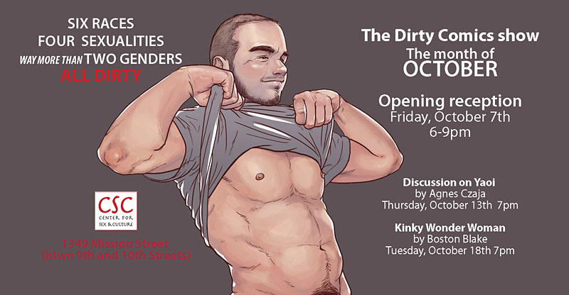
Dirty Comics

Dirty Comics, subtitled An Exhibition of Erotic Comic Art, opens at the Center for Sex and Culture in San Francisco next month, and I'm very pleased to say that I'll have a piece of new work in the show. Jon Macy has been mentioned here a couple of times for his comic strip adaptation of Teleny, the notorious (and very erotic) gay porn novel attributed to Oscar Wilde, so he's the ideal person to curate the exhibition. With Dame Darcy and Patrick Fillion among the contributors there promises to be a high standard of work. I'm looking forward to seeing what everyone else has done. My contribution is a standalone piece rather than a comic page which I'll unveil here closer to the opening day.
September 15, 2011
The paper architecture of Brodsky and Utkin

A Hill with a Hole.
Searching around for Kafka images yesterday turned up a reminder of the etchings of Alexander Brodsky and Ilya Utkin, a pair of Russian "Paper Architects" who channelled their frustration with the intransigence of Soviet authorities in the 1980s into a series of remarkable drawings. As with much architectural fantasy, these are part unrealistic exaggeration and part serious proposal, with the viewer left to decide whether the world really needs a hill with a hole.
Princeton Architectural Press published Brodsky & Utkin: The Complete Works by Lois Nesbitt in 2003 which is no doubt the source of the available scans. Of those, there's a small Flickr collection here, while the late, lamented Nonist had a post about the book which repeats some of the same imagery. For more about Russia's other paper architects see Russian Utopia.
Elsewhere on { feuilleton }
• The etching and engraving archive
Previously on { feuilleton }
• The art of François Schuiten
• Hugh Ferriss and The Metropolis of Tomorrow
September 14, 2011
Screening Kafka

Kafka (1991).
This week I completed the interior design for a new anthology from Tachyon, Kafkaesque, edited by John Kessel and James Patrick Kelly. It's a collection of short stories inspired by Franz Kafka with a high calibre of contributions from writers including JG Ballard, Jorge Luis Borges, Carol Emshwiller, Jeffrey Ford, Jonathan Lethem and Philip Roth, and also the comic strip adaptation of The Hunger Artist by Robert Crumb. When I knew this was incoming I rewatched a few favourite Kafka-inspired film and TV works, and belatedly realised I have something of a predilection for these things. What follows is a list of some favourites from the Kafkaesque dramas I've seen to date. IMDB lists 72 titles crediting Kafka as the original writer so there's still a lot more to see.

The Trial (1962), dir: Orson Welles.
Orson Welles in one of his Peter Bogdanovich interviews describes how producer Alexander Salkind gave him a list of literary classics to which he owned the rights and asked him to pick one. Given a choice of Kafka titles Welles says he would have chosen The Castle but The Trial was the only one on the list so it's this which became the first major adaptation of a Kafka novel. Welles always took some liberties with adaptations—even Shakespeare wasn't sacred—and he does so here. I'm not really concerned whether this is completely faithful to the book, however, it's a first-class work of cinema which shows Welles' genius for improvisation in the use of the semi-derelict Gare d'Orsay in Paris as the main setting. (Welles had commissioned set designs but the money to pay for those disappeared at the last minute.) As well as scenes in Paris the film mixes other scenes shot in Rome and Zagreb with Anthony Perkins' Josef K frequently jumping across Europe in a single cut. The resulting blend of 19th-century architecture, industrial ruin and Modernist offices which Welles called "Jules Verne modernism" continues to be a big inspiration for me when thinking about invented cities. Kafka has been fortunate in having many great actors drawn to his work; here with Perkins there's Welles himself as the booming and hilarious Advocate, together with Jeanne Moreau, Romy Schneider and Akim Tamiroff.

Brazil (1985), dir: Terry Gilliam.
Having watched Brazil again recently I was struck by how much it resembles the popular view of Kafka's worlds rather than the Orwellian nightmare which Terry Gilliam first intended. The story is powered by a bureaucratic error caused by a crushed insect, after all, and Gilliam follows Welles in mashing up the styles and motifs of an authoritarian century to create a hybrid world he described as being "on the Belfast/Los Angeles border". Tom Stoppard had a hand in the screenplay, and there's another great cast with Jonathan Pryce, Katherine Helmond and Ian Holm. Also a nod to an Orson Welles role with the character named Harvey Lime.

The Insurance Man: Daniel Day Lewis, Robert Hines & Jim Broadbent.
The Insurance Man (1986), dir: Richard Eyre.
Jim Broadbent played a plastic surgeon in Brazil; here he's a clerk in the offices of the Worker's Accident Insurance Institute in Prague. Writer Alan Bennett was preoccupied with Kafka in the mid-1980s: his stage play, Kafka's Dick (the title does indeed refer to the writer's penis), was staged the same year as this TV film directed by Richard Eyre, a 70-minute drama which sees a young factory worker trying to find a cure for an industrial illness at the Insurance Institute where one "Doctor Kafka" is employed. Needless to say, his quest for health and some measure of justice becomes Kafkaesque. Kafka here is portrayed by Daniel Day Lewis in a typically enthralling performance which is never mannered but makes him seem a stranger creature (and a more sympathetic clerk) than his fellow workers. Most of this was filmed in Liverpool in some wonderful old office buildings using a sombre blue/grey palette. As with all Bennett's dramas the dialogue is a treat. The film is now available on DVD in the Alan Bennett at the BBC collection.

Tim Roth as Gregor Samsa.
Metamorphosis (1987), dir: Jim Goddard.
Another TV drama based on one of Steven Berkoff's three stage adaptations of Kafka in which he also plays the part of Mr Samsa. Berkoff's preference for physical theatre means there are no insect suits or special effects here, Gregor Samsa's insectile nature is conveyed entirely through Tim Roth's energetic performance, with shrieks, twisted limbs, and a climbing frame for when he needs to scuttle up the wall or hang from the ceiling. Not available on DVD but it's scattered around YouTube if you can be bothered.

The Trial (1991), dir: Steven Berkoff.
Another Berkoff adaptation which is available on DVD from his own company. As with his Salome, this is a filmed stage performance and highly recommended for its fidelity to the book, although of the two I prefer the Oscar Wilde play. Berkoff's great innovation is the bare stage where the only props are a couple of chairs and a number of tall metal frames, one for each performer, which the actors use to create doors, windows, picture frames and even a series of moving corridors. Berkoff himself plays Titorelli the painter as a hyperactive Dalí type.

Kafka (1991), dir: Steven Soderbergh.
A cult film of mine which I've written about before so there's no need to go into great detail. It's a shame that Daniel Day Lewis couldn't have played Kafka in this one instead of Jeremy Irons who does a decent job but always seems slightly wrong for the part. Ian Holm in Brazil had a role named after Terry Gilliam's MAD magazine mentor Harvey Kurtzmann; here Holm is named after one of the great silent film directors in the role of the enigmatic Doctor Murnau. Shot on location in Prague.

Franz Kafka (1992), dir: Piotr Dumala.
After all the fake Kafkas, something which is at least close to genuine article in a short and wordless animated film by Piotr Dumala. Can be watched in its entirety here.

Zoetrope (1999), dir: Charlie Deaux.
Kafka's In the Penal Colony is moved from its sun-blasted location to what looks like the interior of a power station in Charlie Deaux's frenetic adaptation. The emphasis is very much on the industrial with the film nodding as much to David Lynch as Franz K. (And whatever happened to David Lynch's proposed adaptation of The Metamorphosis?) The rumbling, clanging soundtrack by Lustmord provides the requisite Alan Splet-like atmospherics. Available on DVD from .
Previously on { feuilleton }
• Die Andere Seite by Alfred Kubin
• Designs on Kafka
• The Hour-Glass Sanatorium by Wojciech Has
• Kafka's porn unveiled
• A postcard from Doctor Kafka
• Alexandre Alexeieff and Claire Parker
• Hugo Steiner-Prag's Golem
• Steven Soderbergh's Kafka
• Kafka and Kupka
John Coulthart's Blog

- John Coulthart's profile
- 31 followers

