
John Coulthart's Blog, page 295
October 13, 2011
Virgil Finlay's Salomé

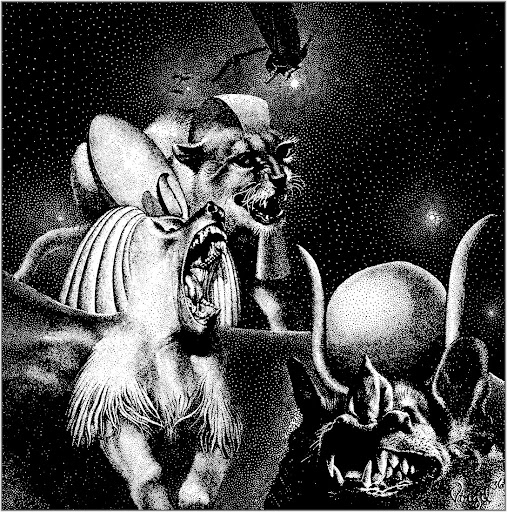
While chasing down Virgil Finlay's illustration for Lovecraft's The Colour Out of Space earlier this week I came across another Finlay drawing I'd not noticed before in a book I've owned for years. Makes me wonder what else is lurking on the shelves. Finlay's depiction of Salomé was an illustration for Waxworks, a story by Robert Bloch published in Weird Tales for January 1939. I've never read much of Bloch's fiction, this story included, so can't say anything about it, but Finlay's drawing impresses for the solid black night sky, and the peculiar flaming headdress, the kind of unique detail he often added to his pictures.
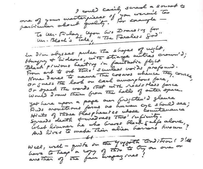
Bloch and Finlay had a memorable encounter a couple of years years before when Finlay illustrated The Faceless God, another Weird Tales piece which so impressed HP Lovecraft that it inspired a poem, To Mr. Finlay, Upon His Drawing for Mr. Bloch's Tale, 'The Faceless God'. Lovecraft's handwritten draft can be seen (but not necessarily read) here.
Previously on { feuilleton }
• Wilhelm Volz's Salomé
• Valenti Angelo's Salomé
• Dalí's Salomé
• Wild Salomés
• The Salomé paintings of Caroline Smith
• Mossa's Salomés
• The art of Marcus Behmer, 1879–1958
• Several Salomés
• Julius Klinger's Salomé
• John Vassos's Salomé
• René Bull's Salomé
• Steven Berkoff's Salomé
• Manuel Orazi's Salomé
• Salome's Last Dance
• Salomé posters
• Salomé scored
• Beardsley's Salomé
• Peter Reed and Salomé After Dark
• Alla Nazimova's Salomé


October 12, 2011
Malicious Damage
I was going to title this post "Fucked by Monty" but thought that might give the wrong impression. The phrase was one of several titles added to the cover of The Collected Plays of Emelyn Williams by Joe Orton and Kenneth Halliwell when they were happily defacing the books of Islington Library, London, in the early 1960s. Despite the outrage of the librarians at the vandalism, most of the defaced books were put aside and are now prized items in Islington's collection. This week the library announced an exhibition of the books, Malicious Damage: The crimes of Joe Orton and Kenneth Halliwell. The Guardian has a gallery of the covers here (and there's more at Joe Orton central), rare examples of what might be called "guerilla collage".
In addition to tarting up boring cover designs, Orton and Halliwell also typed their own descriptions of some the books' contents. Gollancz volumes were apparently good for this since the publisher left the inside of their famous yellow dust jackets blank. John Lahr in Prick Up Your Ears gives an example added to a Dorothy L Sayers novel which is also read out in the film of Lahr's book:
When little Betty Macdree says that she has been interfered with, her mother at first laughs. It is only something the kiddy has picked up off television. But when sorting through the laundry, Mrs. Macdree discovers that a new pair of knickers are missing she thinks again. On being questioned, Betty bursts into tears. Mrs. Macdree takes her to the police station and to everyone's surprise the little girl identifies P.C. Brenda Coolidge as her attacker. Brenda, a new recruit, denies the charge. A search is made of the Women's Police Barracks. What is found there is a seven inch phallus and a pair of knickers of the kind used by Betty. All looks black for kindly P.C. Coolidge…. What can she do? This is one of the most enthralling stories ever written by Miss Sayers.
It is the only one in which the murder weapon is concealed, not for reasons of fear but for reasons of decency!
READ THIS BEHIND CLOSED DOORS. And have a good shit while you are reading!
Alan Bennett wrote the screenplay of Prick Up Your Ears and that line about "It is only something the kiddy has picked up off television" could well have been one of his own. Orton said that when the pair ended up in court the greatest outrage was shown not towards their obscene amendments but to simple bits of Surrealism such as the adding of a monkey's face to Collins Guide to Roses. Schoolboy humour is understandable but don't dare do something that makes no apparent sense.
Malicious Damage is a free exhibition and runs until January.
Previously on { feuilleton }
• Joe Orton Online
• Joe Orton
October 11, 2011
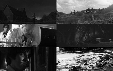
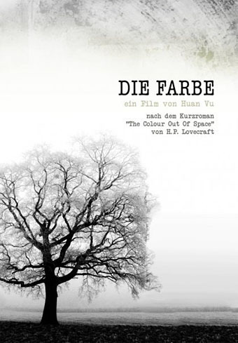
Die Farbe and The Colour Out of Space
Die Farbe (2010).
The colour, which resembled some of the bands in the meteor's strange spectrum, was almost impossible to describe; and it was only by analogy that they called it colour at all. Its texture was glossy, and upon tapping it appeared to promise both brittleness and hollowness.
The Colour Out of Space (1927).
Die Farbe (The Colour) is a German feature film by Huan Vu based on HP Lovecraft's tremendous short story The Colour Out of Space. Vu's film was completed last year, and has been well-received at film festivals and by Lovecraft aficionados but I've been rather tardy in hearing about it. Better late than never.
Having adapted two-and-a-half stories, I tend to take a more than cursory interest in works based on Lovecraft's fiction. One of the reasons I tackled his works in the first place was out of frustration at the apparent inability of film producers and comic artists to treat the stories as they'd been written. The Colour Out of Space is one of the masterpieces of Lovecraft's mature period, and was the favourite of his own stories, a skilful blending of horror and science fiction in the tale of a fallen meteorite infecting a farm with an inexplicable process of decay and physical mutation. The mysterious colour is the product of some unearthly substance inside the meteorite which corresponds to no known part of the visible spectrum. This wasn't the first story of Lovecraft's that I read—I'd earlier found The White Ship in a ghost story anthology—but it was the first that made a serious impression when I came across it in another anthology at age 12 or 13. Since then, whenever people ask me which Lovecraft stories to read first The Colour Out of Space is always one I recommend.
The story has been filmed before, twice as it happens, although I've only seen the first attempt, a lamentable AIP production from 1965 with the ludicrous title of Die, Monster, Die. This was jobbed out on the back of Roger Corman's Poe films, with Boris Karloff in the lead and Corman's production designer, Daniel Haller, directing. (Haller later directed the slightly better adaptation of The Dunwich Horror.) The story was shifted to England for no other reason than that's where AIP had been making films in the past year. In place of the alien weirdness you get Boris breeding outsize vegetables then going mad at the end with an axe. If you must, this DVD site has some screen shots while over at the Groovy Age of Horror they have a comic book based on the film—an adaptation of an adaptation. "Astounding! Strange! Weird!" No, no and no. Not having seen The Curse (1987), I can't comment on its quality or veracity although if it was any good I imagine we'd have been told about it by now.
Judging from the trailer, Die Farbe looks a lot better than most Lovecraft adaptations to date, never mind versions of this particular story. Anyone in or near Brighton (UK) can find out for themselves this week when Huan Vu's film is screened on Thursday (the 13th) at the latest Outer Church event at Komedia. For the rest of us, the film is now available on DVD and Blu-ray.

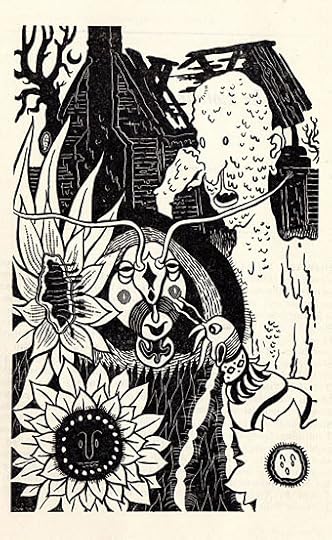
Lastly, I can't mention The Colour Out of Space without giving a nod to two of the story's first illustrators. The great Virgil Finlay created this marvellous piece for a 1941 reprint in Famous Fantastic Mysteries. Below there's a drawing by the most idiosyncratic of the early Lovecraft illustrators, Lee Brown Coye, part of a series of illustrations for a 1947 anthology, The Night Side, edited by August Derleth.
Previously on { feuilleton }
• Cthulhu under glass
• Lovecraft's favourite artists revisited
• The monstrous tome
October 10, 2011
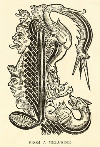
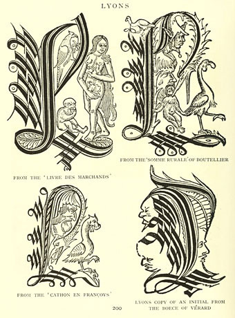
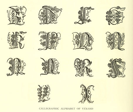
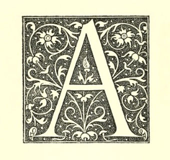
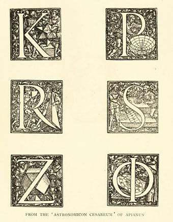
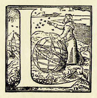
Early woodcut initials
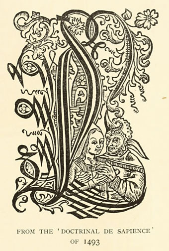
More decorated initials, these being from Early Woodcut Initials (1908), a collection by Oscar Jennings of ornamental letters from books of the fifteenth and sixteenth centuries. By way of contrast with yesterday's examples, not all of these feature the religious or mythological figures one would expect, some show early mathematical and astronomical devices.
Previously on { feuilleton }
• Paulini's mythological alphabet
• Joseph Balthazar Silvestre's Alphabet-album
• Johann Theodor de Bry's Neiw Kunstliches Alphabet
•
• Paul Franck's calligraphy
• Gramato-graphices
• John Bickham's Fables and other short poems
• Letters and Lettering
• Studies in Pen Art
• Flourishes
October 9, 2011
Paulini's mythological alphabet
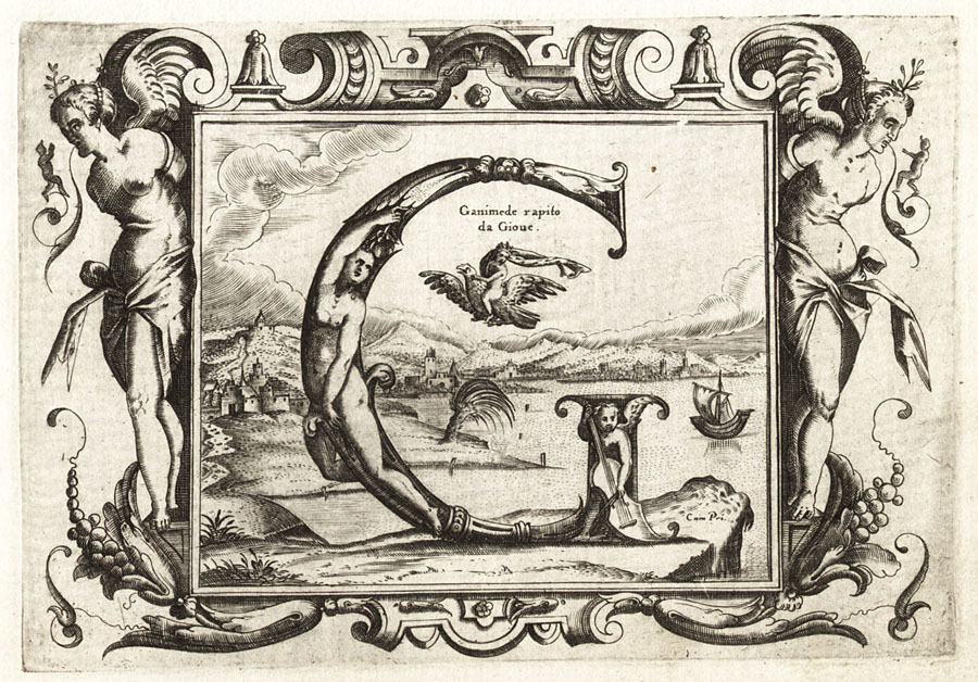
Whoever I. Paulini was, no one seems to know his (or, indeed, her) first name. Even the Metropolitan Museum of Art, NYC, which owns a copy of these plates, doesn't elaborate. The copies here are scans from a Getty edition of Alphabeto, part of the collection of Getty Institute volumes at the Internet Archive. The book is usually dated 1570 but a note states that "The watermarks … suggest a printing date closer to the end of the 16th century than to 1570, the conjectural date of first publication."
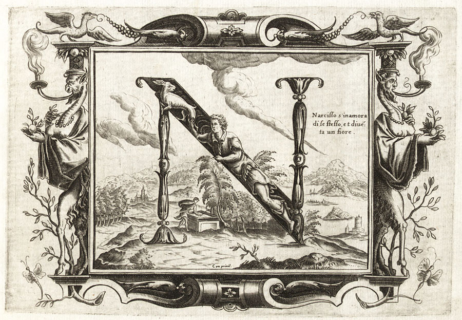
Paulini gives use twenty engraved plates each showing an ornamented letter of the Roman alphabet with a background depicting a scene from Greek and Roman mythology; each letter is tied to a different character or scene, so here we have G for Ganymede, and N for Narcissus. Mister Aitch at the late, lamented Giornale Nuovo was a great enthusiast for these kinds of alphabets, and for engravings in general. He pursued his own researches into the Paulini mystery back in 2006 when copies of the complete set of letters were difficult to find.
Elsewhere on { feuilleton }
• The etching and engraving archive
October 8, 2011
Weekend links
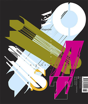
Neville Brody creates a cover design for an issue of the V&A magazine tied to the museum's current exhibition, Postmodernism: Style and Subversion 1970–1990. Brody's comment amused me for the way he smartly explained the thinking behind the design whilst also distancing himself from its theme:
For me, Post Modernism felt like a kind of facade built to cover over the cracks of a divided world, a surface of plucked effects and stylistic devices emptied of meaning, an extrusion of hollow traces and flat outlines forcing 2D into apparent depth. I was never a Post Modernist, rather a Modernist exploring humanist lines of enquiry in the collapsing world behind a wall of decoration.
• It's a common thing today to give images from the past a queer reappraisal, finding homoerotic qualities in pictures which, when they were made, would have seemed free of any sexual subtext. This post finds such a subtext in recruitment posters for US armed forces although none of the examples are as overt as this wartime magazine ad. Over at Front Free Endpaper Callum notes that many vintage photos which people regard today as evidence of gay relationships are unlikely to be quite that. The photo he posts, however, really does appear to show a pair of men who were more than just good friends.
• A play by Ororo Productions of HP Lovecraft's The Dunwich Horror will be staged at the London Horror Festival from October 25th. Related: Horror Made Delightful: The Strange Stories of Sheridan Le Fanu, MR James, and Robert Aickman. "Aickman never spells out his meaning," says Greer Mansfield, "His stories end abruptly and inconclusively, and in fact the 'meaning' is less important than the utter mysteriousness of what happens." Which is just what some of us enjoy.
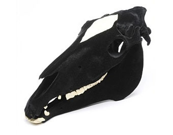
Black Beauty, a decorated horse skull by Julia deVille.
• "Jackpot is a comedic short film about a 14-year-old gay boy in 1994 who sets off on a quest to find a stash of gay porn and get it home before anyone finds out." Director Adam Baran is requesting completion funds at Kickstarter.
• Gendai Shogyo Bijutsu Zenshu (The Complete Commercial Artist), published in Tokyo from 1927 to 1930.
• Ishac Bertran tries some analogue sampling by chopping up vinyl discs with a laser cutter.
• Steve Jobs does LSD and The Residents pay tribute to Steve Jobs.
• A rare post at Ballardian: Outpost 13: The Atrocity Exhibition.
• It's all fun and games until Charles Manson turns up…again.
• The Edgar Allan Poe Portfolio (1976) by Berni Wrightson.
• RIP David Bedford and Bert Jansch.
• John Waters: Roles of a Lifetime.
• Homocomix.
• Poison (1969) by Bert Jansch | Pentangle at the BBC (1970): Train Song | House Carpenter | Hunting Song | Light Flight
October 7, 2011
Somnium by Steve Moore
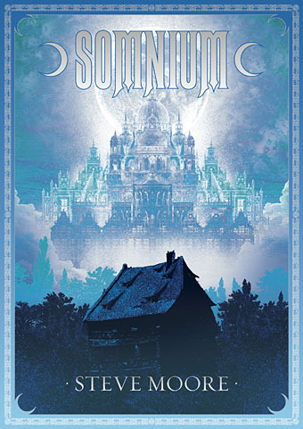
Another new piece of illustration and design. Somnium is an occult novel by Steve Moore being published this month by Strange Attractor. Some readers here may know Steve's work as a comics writer, ex-editor of Fortean Times and also the subject of Alan Moore's recent Unearthing text and recording. I've not seen the book yet but it comes laden with praise from Michael Moorcock and Iain Sinclair, and features an afterword by Alan Moore:
Written in the early years of the 21st century, when the author was engaged in dream-explorations and mystical practices centred on the Greek moon-goddess Selene, Somnium is an intensely personal and highly-embroidered fictional tapestry that weaves together numerous historical and stylistic variations on the enduring myth of Selene and Endymion. Ranging through the 16th to 21st centuries, it combines mediæval, Elizabethan, Gothic and Decadent elements in a fantastic romance of rare imagination.
With its delirious and heartbroken text spiralling out from the classical myth of Endymion and the Greek lunar goddess Selene, Somnium is an extraordinary odyssey through love and loss and lunacy, illuminated by the silvery moonlight of its exquisite language.
The printed version should incorporate metallic silver ink on the title and border, something you can never quite replicate on a web image, hence the gradient on the title lettering. Somnium is available in a range of signed or unsigned editions and can be purchased direct from the Strange Attractor Shoppe.
Previously on { feuilleton }
• Dodgem Logic again
• Of Moons and Serpents
October 6, 2011
Seminal art and design
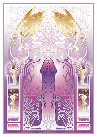
Fountain (2011) by John Coulthart.
seminal, a. and n.
A. adj. Of or pertaining to seed; of the nature of seed.
1. a. Of or pertaining to the seed or semen of men and animals (applied Phys. and Anat. to structures adapted to contain or convey semen); of the nature of semen.
Oxford English Dictionary
The Dirty Comics exhibition curated by Jon Macy opens today in San Francisco so here at last is my non-comics contribution to Jon's erotic art show. This is something I'd had in mind for a while so it was good to have the opportunity to actually tackle the thing and also have an outlet for it apart from this website. Below I explore some of the intent and inspiration which led to the piece.
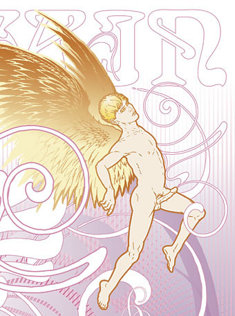
Creating some sort of gay erotica was an idea I'd had in mind for a while but it suffered from the usual syndrome whereby work with no immediate outlet gets shunted aside by the pressure of paid commissions and ongoing personal projects. It's also the case that pieces of work I create for myself I tend to want to sell or see reproduced via a service such as CafePress. The trouble is that most of those services are based in the US which means they're subject to that tiresome puritan attitude towards sexual content: anything other than "artistic" nudity is forbidden at CafePress, and the same applies to many other self-publishing services. There are outlets for gay erotica but I've not had chance to explore the best options. If anyone has any tips then please leave a comment.
This angel figure was something I'd drawn back to 2008 when I'd made a start on a similar work which fell by the wayside. One of the great things about computer graphics is being able to work on part of something which can then be picked up later and dropped into a new composition.
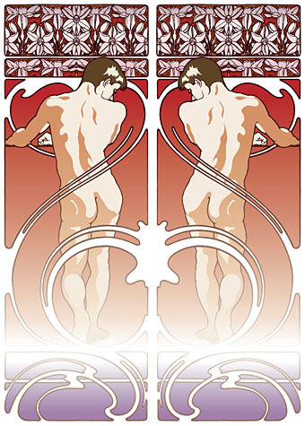
So the intention was to produce a follow-up to the Dodgem Logic cover I created last year which presented a same-sex take on various Art Nouveau stylisations. The figures above are from one of the early drafts which takes a border design from Alphonse Mucha's Documents Decoratifs (below), a series of sample borders and frames he published for the use of artists and designers.
Documents Decoratifs (1902) by Alphonse Mucha.
The obvious difference is, of course, the substitution of the ubiquitous decorative females of the Art Nouveau style for some decorative males. Much Art Nouveau design verges on soft porn, as the examples here from Mucha and Privat-Livemont demonstrate. Mucha and Privat-Livemont were both popular poster artists so my idea evolved into the production of a pornographic advertising poster with an ejaculating penis as the object being promoted.
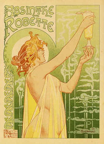
Absinthe Robette (1896) by Henri Privat-Livemont.
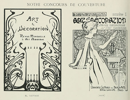
Art et Décoration (1897).
The florid frame is something I swiped from this prospective cover design for a French Art Nouveau journal. I've no idea who H. Sauvage is but they'd no doubt be appalled to see how their design has been used by one of those terrible people from the future. It took a lot of work to turn a low-grade scan into a smooth vector shape.
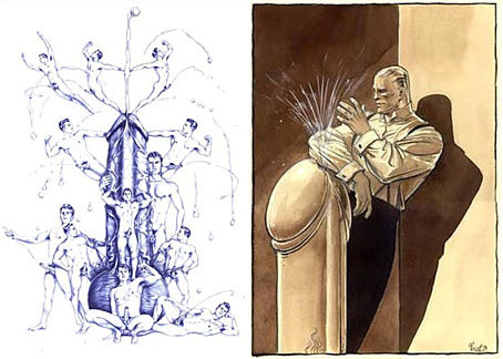
Fountain (2004) by Cary Kwok; The Fountain of Youth by Benoit Prévot.
As to the title of the piece, I had in mind Benoit Prévot's Fountain of Youth but I discovered only a couple of days ago that there's an earlier example of the same idea by artist Cary Kwok who has a wonderful series of drawings of ejaculating males. There's even some similarity between our compositions although he goes for more of a Busby Berkeley effect with his figures.
A poster needs a title which means choosing a typeface. I'm generally wary of using Arnold Böcklin, an Art Nouveau typeface designed by Otto Weisert in 1904 which was used far too often in the 1970s. But my layout has something of the 1970s in it—the colouring and the rounded corners, for instance—so it seemed like the ideal choice. The decision was confirmed after I'd finished everything and found this 70s book cover in an online gallery. I've no idea who the artist is but they're better than the average for this period.
Dirty Comics runs throughout October at the Center for Sex & Culture, 1349 Mission Street, San Francisco. In addition to the show itself, the Center will be staging two related events: A Discussion of Yaoi with Agnes Czaja on October 13th, and Kinky Wonder Woman with Boston Blake on October 18th. See the Center website for further details.
Elsewhere on { feuilleton }
• The gay artists archive
Previously on { feuilleton }
• Phallic casts
• Return of the Triumphant Phallus
• The Choise of Valentines, Or the Merie Ballad of Nash His Dildo
• Dodgem Logic #4
• The fascinating phallus
• The Triumph of the Phallus
• Le Phallus phénoménal
• The art of Benoit Prévot
• Phallic bibelots
• The New Love Poetry
• Phallic worship
• The art of ejaculation
October 5, 2011
Crafting steampunk illustrations
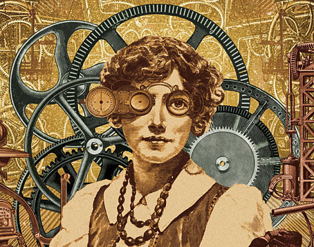
Today's post is another guest piece at Tor.com where I talk a little about using collage to create steampunk illustrations and designs. The post is part of their Steampunk Week, and I take the opportunity to acknowledge the influence of some artists who have become familiar points of reference here, namely Max Ernst and Wilfried Sätty.
Meanwhile, in light of this news, I should say that I don't own an iPod, iPad or iPhone but there are four Apple computers of various vintage in this place, all of which have been used to create the art and design work I've been producing since the late 1990s. Apple machines and Adobe software literally changed my life by allowing me to get involved in graphic design and create artwork that would have been impossible to produce using pencil, ink and paint. Many thanks, then, to Steve Jobs. And RIP.
Previously on { feuilleton }
• Initiations in the Abyss: A Surrealist Apocalypse
• SteamPunk Magazine
• Morlocks, airships and curious cabinets
• The Steampunk Bible
• Vultures Await
• Steampunk Reloaded
• Wilfried Sätty: Artist of the occult
• Illustrating Poe #4: Wilfried Sätty
• Steampunk overloaded!
• More Steampunk and the Crawling Chaos
• Steampunk Redux
• Steampunk framed
• Steampunk Horror Shortcuts
October 4, 2011
Abysmal creatures
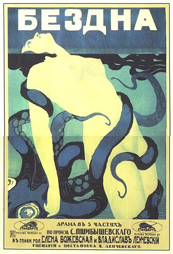
Bezdna (Abyss).
A couple of film posters from a time when poster artists weren't prevented from treating their subject in a symbolic manner. Both these designs are the work of one M. Kalmanson (and I'm assuming here that the scant information is accurate), and both are for Russian films produced in 1917. Beautiful Century alerted me to the work above which Japonisme had spotted a couple of years ago when gathering the more familiar images of women menaced by those pesky cephalopods. Searching around produced the poster below which confirms that the artist had tentacles on the brain that year, creating a picture that looks like a collaboration between Edmund Dulac and HG Wells. There's little information anywhere about the films themselves but that's not too surprising when so much of the silent era has been lost forever. As with The Isle of Lost Ships, it's a good bet that the cinematic reality was a lot less interesting than the promise of the poster design.
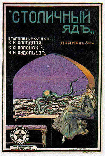
Poison of the Big City. (Maybe… I can't find this title confirmed in separate sources.)
Previously on { feuilleton }
• Fascinating tentacula
• Jewelled butterflies and cephalopods
• The art of Rune Olsen
• Octopulps
• The art of NoBeast
• Coming soon: Sea Monsters and Cannibals!
John Coulthart's Blog

- John Coulthart's profile
- 31 followers

