
Todd Klein's Blog, page 345
May 11, 2011
And Then I Read: CHILDREN OF THE LAMP, THE AKHENATEN ADVENTURE

© P.B. Kerr, cover illustration not credited.
This is the first book in a series, one of many hopping onto the Harry Potter bandwagon I suspect, but not really very much like Harry Potter, and a good read. Kerr tells a story of djinn (or as they were once named, genies), the kind with impressive magical powers, that turn into smoke and can reside in places like oil lamps. There have been many such stories, inspired by the original tale of Aladdin and his Magic Lamp from The 1,001 Nights. What Kerr does that's original, and it's a fine idea, is flip the usual story on its head. Rather than a human finding and using the djinn's power for his own gain, we follow John and Philippa Gaunt as they gradually discover that they themselves are djinn, their powers dormant as they grew. then suddenly emerging, to the alarm of their parents (their mother was a djinn herself but gave up the use of her powers), and to the delight of their uncle Nimrod, a full-fledged djinn, who invites them to stay with him in London so he can begin to train them in their new abilities.
Of course things don't always go smoothly, especially once the children, Nimrod, and his aides travel to Egypt. There the author unveils a whole djinn history and cosmology that is quite well developed and interesting, with four djinn clans in an eternal contest to control the luck of humanity, two on the side of Good, two on the side of Evil. It seems the Evil side has a new goal: finding 70 lost djinn, once under the control of an Egyptian Pharaoh named Akhenaten, whose lost tomb may have been recently uncovered in an earthquake. Nimrod and the children are soon also on the hunt for the lost djinn, for who ever finds and releases them will have gained a great advantage in the djinn struggles.
Kerr writes well, keeping things moving, using a good mix of humor and suspense, his characters well-developed and his plot ingenious. One thing that surprised me a bit was that Kerr takes lots of pot-shots at groups of various kinds: the French, the Egyptians, even the English, in a way that might annoy some in those groups. Not very politically correct, but it does make for entertaining reading. I'll be looking for more of this series, this one is recommended.


May 10, 2011
Any more WSB pledges?
Next Saturday is our big day, when Ellen and I will join the "Cape May Century Run" team for this year's fundraiser, spending about 14 hours trying to count as many bird species as possible in one day. In addition to our own pledges, I'd love to have one from you. Pledges are made on the number of species seen by the team. Our team total is likely to fall between 140 and 150, and you can pledge as little as 10 cents per species, which would result in a monetary pledge of $14 to $15. Or, if you're feeling generous and want to really help us raise money for conservation efforts, you could pledge $1 per species, as have the very generous
SHAWN GALDEEN
and
CARL RIGNEY
I can't tell you how cheering those pledges were, guys! Thanks so much!
Any pledge amount will be gratefully accepted, though, and there are incentives as well:
A pledge of 10-25 cents per species will get you a signed recent comic I've lettered (my choice) and a signed bookmark.
A pledge of 30-50 cents per species will get you a signed trade paperback of something I've lettered (my choice) plus bookmark.
A pledge of 55-75 cents will get you two signed comics AND a signed trade paperback plus bookmark.
A pledge of 80 cents to $1 or more per species will get you your choice of any of my signed prints personalized to you (or my as yet unreleased next one), plus bookmark, and my gratitude! Or if you'd rather, two trade paperbacks of my choice, signed.
If you'd like to pledge, CONTACT ME at that link. Thanks for considering our favorite charity event!
May 9, 2011
And Then I Read: WARRIORS THREE 1-4

Images © Marvel Characters, Inc.
It took me a while to get all four of these, and then another while to read them, but when I did I had a good time. I always liked the Warriors Three back in the day when they were appearing in THOR written by Stan Lee. Kind of the Norse equivalent of The Three Musketeers, not exactly Thor sidekicks, but often played for humor. Writer Bill Willingham is someone I've worked with a lot, so I was curious to see how familiar the writing style would be on this Marvel book, and it did have some themes that reminded me of FABLES (particularly the use of a giant wolf), but there were plenty of new things going on here as well. The boasting and banter among the Three is well handled and entertaining. The setting is a bit puzzling to me, not having followed THOR for many years, as Asgard appears to be in the American midwest here, though that could well be a temporary storyline thing. The narrator, who we don't see for quite a while, is an agent of A.I.M., the sort of dark version of S.H.I.E.L.D., and that lends some confusion to the storytelling, but the main narrative is full of sharp action and good character development, so that didn't harm the overall read very much. The Fenris Wolf is pretty cool as a force of vast destruction, and things roll along nicely throughout.

The art by Neil Edwards and Scott Hanna is well done in general, though some pages have too much going on, and too much attention paid to the small details, which drags on the storytelling. In general it's fine, though. The use of an uncial style font for the Asgardians is sometimes a bit distracting, and the lettering is not always well-placed in the balloon shapes, leaving too much space in some, not enough in others. The approach is, I think, meant to mimic that of John Workman, but not done as well.
Minor complaints aside, I did enjoy this, and it's recommended. If you're a Willingham fan, I'd say it's worth seeking out.
May 8, 2011
Links of Interest

Well, of interest to me, and perhaps to you as well. From time to time folks who have ordered my signed prints send me pictures of them framed and hanging in their home. I love seeing that. Fritz Park went one better — he has them on display at a local bookstore along with other parts of his collection, as seen on the Robot 6 blog's feature "Shelf Porn." (Like the feature, don't care for the name.) Very cool, and what makes it even more interesting is, this bookstore is in Seoul, Korea! Thanks, Fritz.
Speaking of prints, I've been remiss in not mentioning this sooner. Over on Cat Mihos' NEVERWEAR site you can find a print of the poem "In Relig Oran" written by Neil Gaiman, art by Michael Zulli, lettering and design by me. Both signed and unsigned copies are available. In this case, I used one of my fonts to letter the body of the poem, and a commercial font for the titles (except for the decorative capital, which is hand-drawn). The design work involved making that fit on the art, and adding the top and bottom banners. I think it turned out well, and the print is 11 by 17 inches, the same as mine, so would make a nice companion to them. Lots of other cool stuff there, too, especially if you're a Neil Gaiman fan.
May 7, 2011
Work VS. Life
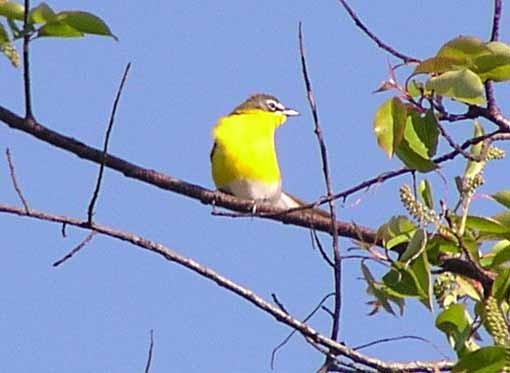
It's a constant balancing act in the freelancing world. Today, like yesterday, is a gorgeous spring day, sunny and pleasant. It's also the best time of the year for birdwatching here. You can easily see great birds like the Yellow-breasted Chat I found at Higbee Beach yesterday…
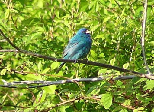
…or this equally cool Indigo Bunting. Plus lots of warblers, orioles, tanagers, etc. I should be out there looking, but have been stuck inside so far all day doing chores and lettering work. It never fails, at this time of year, I'm swamped with work at the moment. Urgently needed work that can't wait. So, I've been a good freelancer and stuck to it for about 6 hours, but now it's time to go out into the world and enjoy spring for an hour or two. Back later.
May 6, 2011
And Then I Read: LEGION OF SUPER-HEROES 9

Images © DC Comics, Inc.
First off, I think this cover is one of the most successful in the "giant symbol" series from DC. It helps that the Legion symbol is long-used and well-established. And it's a cool symbol, simple yet stylish.
This issue might have been called, "The Trouble With Durlans," as the shape-shifting species that gave the Legion Chameleon Boy (as well as Legion founder R.J. Brande) is still the focus of trouble on Earth. Chameleon Boy and Brainiac 5 are visiting Durla to try to find out more about the assassins, and they get a hostile reception that somehow reminded me of Americans trying to negotiate with The Taliban, but maybe that's just me. Back on Earth, the Legion is trying to help protect the United Planets councilors, but when assassins can take any shape of any size, it's pretty tough. Meanwhile, Dawnstar is still critically ill, and the focus of both the Legion and the Science Police, who need her tracking skills. Tellus tries to help by entering the unconscious mind of Dawnstar, with interesting results.

The art by Cinar and Faucher is quite good, a strong support to the writing of Paul Levitz, and the fact that the Legion is largely off in its own corner of the DC Universe makes this and ADVENTURE more fun to read than some of the other DC books I follow. Sure, the cast is huge, but the stories are easy to follow and go to interesting places, both physically and intellectually.
Recommended.
May 4, 2011
And Then I Read: B.P.R.D. THE BLACK FLAME

Images © Mike Mignola.
I'm behind in my reading of this series, reviewing the collection above published in 2006. The cast of characters in the Hellboy spinoff is a good one, from oddities like Roger the homunculus, a sort of living stone creature, to Abe Sapien, some kind of alien fishlike fellow, to the ghost in a spacesuit, Johann Kraus, to the more human characters Liz Sherman, the fire-starter, Dr. Kate Corrigan their own science wiz, and fairly new commander Captain Daimio, a disfigured warrior returned from the dead. With a cast like that you have a lot to work with, and writers Mike Mignola and John Arcudi are pitting them against an otherworldly infestation of giant froglike beings, apparently being fostered by a business tycoon who fancies himself a world conqueror. Lots of action, thrills and tense turns for our cast, with one of them meeting a dire fate.

The art by Guy Davis is certainly atmospheric, captures the tension and mood, and tells the story well. I have to admit I've never been a fan of his work, I think because his human faces are all too similar, and contain a collection of features I don't find appealing, particularly the wide thick-lipped mouths which are usually turned down at the ends. I'm sure this is a matter of personal taste, but at times the characters are a bit hard to tell apart, particularly in mid-distance group shots. At least the non-human characters are no problem there! And I have to give him props for drawing some genuinely creepy and disturbing monsters:

Overall this is a fine series, and one I'll be reading more of soon. Recommended.
May 3, 2011
And Then I Read: THOR GODSTORM

Images © Marvel Characters, Inc.
I missed this when it came out in 2001, so I was delighted to get this new hardcover collecting the three issue series, with some very short Tales of Asgard stories by Tom DeFalco and Mike Mignola rounding out the package. The book is larger than comics size, about 10 to 15% I'd guess, and printed on glossy stock. More about the reproduction later.
At the beginning of this tale, which takes place on the coast of the North Sea in 912 AD, two boys are scolded by a white-bearded elder, who vows to correct their foolishness with tales of great deeds by the god Thor, revolving around a mysterious stone worn by their tribe's leader. We soon find out that the Godstorm of the title is an actual thunderstorm which dares to rebel and disobey Thor, incited by Loki of course, and it continues to plague the thunder god through the centuries, with each issue focusing on a different time period, including our own time in the final issue.
Writer Kurt Busiek begins very much in the style of Stan Lee, and artist Steve Rude very much in the style of Jack Kirby in the "Tales of Asgard" stories by those two legends. The writing is fine, but to my taste doesn't really come alive fully until Kurt starts to stretch and breathe a little, loosening up as the tales unfold, adding more modern writing tropes and dialogue, especially in the final present-day issue. The wrap-up goes back to Stan Lee's somewhat over-the-top style, but by then we've been through enough with the characters that it still works fine.

The art by Steve Rude looks great overall, and I love Steve's work, so this was a pleasure to see. While he does draw heavily on Kirby, Steve's own style shows through more and more as the story progresses, and Rude has always declared his debt to Kirby, so it makes sense for him to use a lot of that style, especially here. I have to say Rude's women are a lot cuter than Kirby's, too, which is not a bad thing. The only thing I didn't like about this book is the reproduction of the art on the Rude pages. You have to look close to see it, but when you do look close, the lines are jaggy, meaning the scan resolution was not set high enough. Here's a close look at one of the balloons—the black lettering on white is where it's most noticeable:
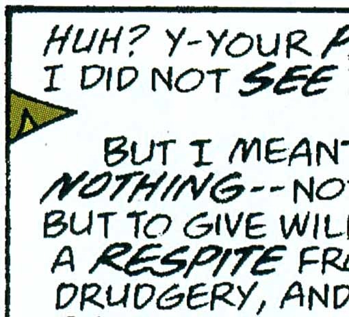
See how the lines aren't smooth, but instead broken into little jagged edges? This could have been avoided if the original scans were made at a higher resolution. I'm being picky here, and there's a good chance many readers might not even notice, but I did, so I thought I should point it out. And, on the original comics it would have been less noticeable. Making the art larger only serves to make this issue more visible.
It's a minor flaw on an otherwise fine package, though, and I had a fine time reading the book. The Mignola shorts aren't bad, though mostly I was looking at how Mike's art style has changed since they were done.
Highly recommended.
May 2, 2011
A Bookplate Commission

Images © Todd Klein.
I rarely accept commissions because I rarely have time to do any. This week, for instance, I have over 100 pages of lettering waiting to be done, and would turn down any commission request in a second. A few weeks ago, though, I was caught up with most of my work, and accepted a request from Dean Stell to design a bookplate for him. We emailed back a forth about what he might want, and he was open to whatever I came up with. Here's the pencil version I sent him with the name large in calligraphy style, the topline smaller and italic, and a pattern of moon, comet and stars, very stylized.

I also sent this negative version, suggesting it would look good with the elements in white on black, though I told him if we went for this idea, I'd make the design elements solid white, not outlines. He thought that was a fine idea, and his only other request was that I include my signature somewhere, which I had planned to do anyway. I actually like the way the pencil textures look on the name here, like a scratchboard work, but I planned to make them solid. Might use that idea somewhere else someday.

I inked the piece using my size 2 Castell TG1 pen on all the outlines, and filling in the centers with a Sharpie waterproof marker. There were a few little edge flaws that I took off in Photoshop after scanning it. Note that, if this were meant to be a realistic sky, no stars would be in the center of the crescent moon, but since it's a fantasy design, I thought it was okay to balance the blacks this way.

Here's the finished bookplate art ready for printing. I added the thin outline in Photoshop because I thought it needed a small edge detail to make the signature more integrated. Dean seems pleased — I emailed him the printer file and mailed the original as well.
May 1, 2011
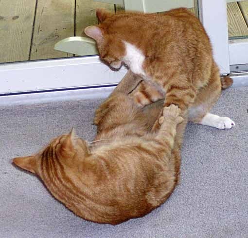
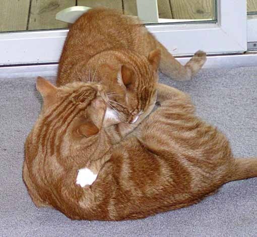
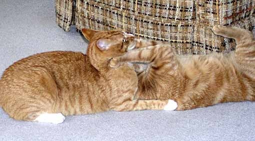
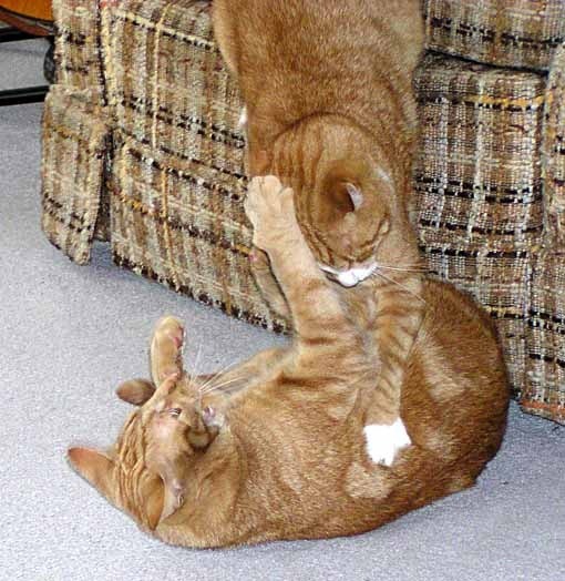
Cat Wrestling
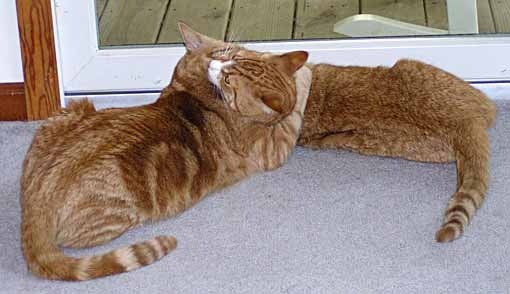
For those of you who come to this blog for cat pictures (and I know there are some!) here are Tigger and Leo wrestling this morning. It was nearly lunch time, and they were impatient for it, so as often happens, a friendly hug turned into a tussle. Leo usually gets things going by biting Tigger's neck.
Oh, bite my neck, willya? I'll nip your legs, then!
The grapple and kick.
Over by the chair now, Leo seems ready to flip Tigger over his head, though it didn't happen that way.
Instead, Tigger did the chair leap and grab!

Now I've got you cornered, you rascal!
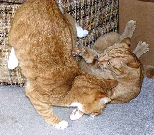
This time Leo did flip Tigger! And so it went for about five minutes, until…
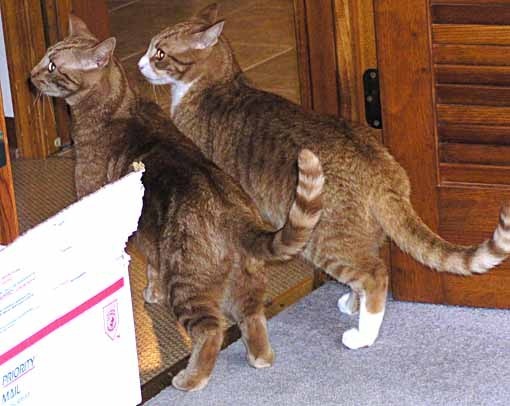
Did someone say LUNCH?
Todd Klein's Blog

- Todd Klein's profile
- 28 followers

