
Todd Klein's Blog, page 343
June 2, 2011
And Then I Read: ADVENTURE 523

Images © DC Comics, Inc.
With this issue the focus changes to the Legion Academy, the group's training center on Long Island, with writer Paul Levitz and artists Phil Jimenez and Andy Lanning on the School Board. Despite the futuristic setting, I have to say this reminds me a bit of Marvel's NEW MUTANTS back when it started, and that's not a bad thing. Essentially we have a group of young characters with some kind of power or ability who think they know it all, and some experienced LSH members as instructors who manage (usually) to stay one step ahead of them. All those handy character labels make it easy to tag the newbies and teachers alike. That really is a great idea for a team book.

The art looks great, and the story reads well. In addition, it's kind of a nice change for a Legion book to be out of worldwide and interplanetary events here in what is essentially a school story, keeping things local and personal, at least so far. Mix "Glee" and "Harry Potter" with super-heroes, and you have the idea.
Recommended.


June 1, 2011
And Then I Read: THE LITTLE ENDLESS STORYBOOKS


Images © DC Comics, Inc.
I've never much liked the idea of baby versions of comics characters. Superboy was okay, but Superbaby was silly. Likewise Wonder Tot. So, when Neil Gaiman and Jill Thompson created infant versions of Death and Dream in SANDMAN #40 as a brief episode, I laughed, but didn't find them that appealing. Apparently lots of fans disagreed, and kept asking for more, so in 2004 Jill wrote and drew the first of these storybooks, very much in children's picture-book style, and expanding the cast to include all of the Endless, as well as supporting characters, especially Delirium's dog Barnabas. I love Jill's art, and it looked pretty cute, but I still wasn't convinced enough to try it.
Recently DC sent me both books (the second, DELIRIUM'S PARTY is new) and I looked through them, loved the art, and before I knew it, I'd read them, too. The stories are fairly simple, funny and entertaining, never straying very far from cute, but not bad. The art is terrific, though I'm still not loving the baby thing.
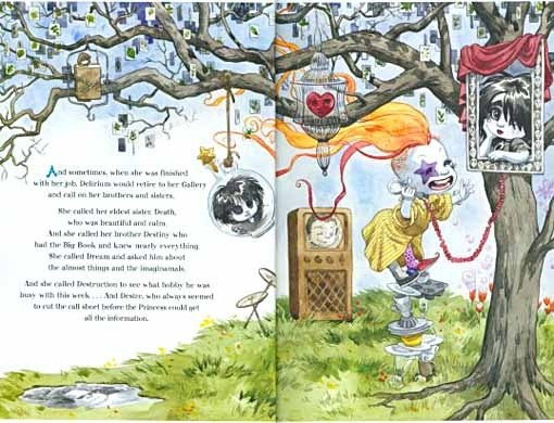
To make the art more appealing to comics fans like me, though, Jill packs her pages with delightful creative details that I'm sure young readers will find equally engrossing. Here's Delirium's Gallery, a tree with fun contact points to her siblings, and instead of leaves on the tree…
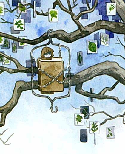
…little cards with pictures of leaves on them, just the sort of wacky thing Delirium might think of, if we can call her process thinking…! On the same page there are other nice touches like a precarious pile of dishes she's standing on, and some tulips giving off soap bubbles, for instance. This kind of playful exuberance tips the balance for me, making these books worth savoring. And all the more if you're already a SANDMAN fan. I can only wonder, though, what a child given these might think when they first discover the real series.
Recommended!
May 31, 2011
Hope print NOW ON SALE!

Image © Steve Rude and Todd Klein, all rights reserved.
I had planned to put this, my new print, on sale tomorrow morning, but an unexpected family matter will take me away from home for the morning and some of the afternoon, so I decided to put it up now. You'll find the print for sale on my BUY STUFF page, and elsewhere on my website. Any orders that come in while I'm gone tomorrow will be confirmed as soon as I return home. Thanks for your patience, and hope to hear from you!
May 30, 2011
What, Me on Facebook?

Alfred E. Neuman @ Mad Magazine.
That's about what I've always said when someone asked, or wanted to Friend me. Along with, "I don't have time for another social site, I'm already on a few message boards, and my own Blog." But it's been niggling at me for some time, those links from Facebook on my blog stats. Can't see who they're from, because I'm not on it. So, for some reason I chose today to take the plunge, despite having a busy day already. We have family visiting, there's some work I should be doing, and there was a Phillies afternoon game on TV. All those activities suffered for my attention while I tried to set up my page, and instantly began getting messages and "Friend" requests, some from actual friends, some from folks I work with or know in the comics business, and some from total strangers who like my work. It was kind of exciting, but also a bit terrifying.
Several seasoned Facebookers suggested I set up a separate fan page for anyone who likes my work, and that I suggest folks I don't actually know personally might "Like" that page, increasing my presence without overfilling my "Friends" list. This seemed like a good idea, and I acted on it. Too bad you can't "Friend" that page, but you can "Like" it, and follow me there. I don't know how much I'll be on Facebook yet, but I'll certainly be mentioning my signed prints, con appearances, and posts here, as well as answering any questions.
You can find my fan page, "Todd Klein, artist," HERE
And my main page is HERE. Not sure if that link works if you're not on Facebook already. Again, unless I know you personally, I probably won't accept a Friend request there, but you're welcome to read along at either page. And, as I begin to figure things out on Facebook, maybe there'll be more new stuff there, too, if I can find the time.
May 29, 2011
And Then I Read: THE OUTCASTS OF 19 SCHUYLER PLACE

Image and book © E.L. Konigsburg.
I've read several books by Konigsburg over the years, beginning with her first big hit and Newbery Medal winner, "From the Mixed-Up Files of Mrs. Basil E. Frankweiler," which came out, and which I read in 1967. All of her books focus on people, both the young people that are the protagonists, and others. Her perception of human nature is vast, and she's particularly good at narrators who are very smart, but perhaps don't tell the reader all the details, allowing those details to come together as the book progresses. This may sound a bit frustrating, but in fact Konigsburg's fine writing makes it all the more intriguing. There are always mysteries to be explored, and the journey is fascinating.
Margaret Rose Kane is 12, and at a difficult point in her life. It's summer, her parents are away in South America on an expedition, and her beloved bachelor uncles who usually take her in whenever needed, don't seem to want her either this time, so she's sent off to camp. There she has a miserable time, housed with a group of friends who torment the newcomer, and all the more when Margaret Rose puts up a strong campaign of passive resistance, not only to the other girls, but to everyone in camp, including the director. Unable to cope, Mrs. Kaplan, the camp director, calls one of the girl's uncles, who comes and rescues her. The man who drives them home, the maintenance man for the camp, turns out to be a much more interesting person away from camp, and he's invited in for dinner. He's an artist, and becomes a friend.
Margaret's uncles, Morris and Alexander, have three very unusual structures in their yard, three massive towers they built and decorated with wild paint colors and dangling prisms and glass pieces. These towers have been their lifelong project for the last 45 years, but they no longer fit in with their now upscale neighbors, mostly lawyers, who have put a plan to tear the towers down through the city council. When Margaret finds out about this, she begins a fierce campaign to save the structures she loves, helped by her friend from the camp, and other old friends from the neighborhood. It's a brilliant campaign, but it seems to be failing…or is it?
Konigsburg not only writes well, she writes about things that matter, such as personal freedom, artistic freedom, and doing what's right even if it goes against the rules, all without being even slightly preachy. Highly recommended.
May 28, 2011
Spring Gardening

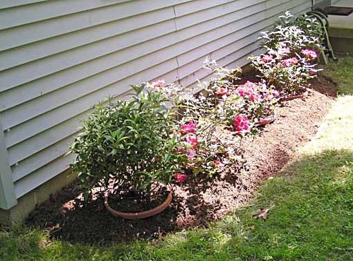
Usually Memorial Day Weekend is when I spend a lot of time getting the spring annuals planted and the rest of the yard into shape, but I'm happy to say it's already finished! I started last weekend, and thanks to good weather all week and a lighter than usual workload, I did some each weekday and finished yesterday. Plus I had some help. Above is the front garden bed. On the left of the path it's mostly perennials that are still coming up. To the right is the area where I put annual Impatiens, after weeding and prepping the bed. We bought some new shrubs at a local garden center this year, and the young man who sold them to us heard me complain about not being able to get anyone to do some landscaping with them, and offered to do it for us for a quite reasonable fee. I agreed quickly, and he came over Tuesday, and in addition to putting the shrubs in, prepped and planted these impatiens.

Here's the other end of the walk where it curves to meet the driveway. Glenn did an okay job, I had to move a few plants and redo the bed edge, but he saved me a lot of time.
This is the main job I wanted help with, though. This area in the front of the house next to the porch has always been a problem. When I plant things in the ground here, the voles, which seem to love this area, always eat the roots and kill them. So, when Ellen said we need to do something here, I had an idea: plant shrubs in large plastic pots in holes dug for them so the rims would just stick out an inch or two. That would protect the plants from the voles and give the bed a nice look, I thought. We already had one Knock Out Rose in a pot here, bought three years ago, and doing well, so we got two more of the same kind, and at each end put in Butterfly Bushes (Buddleia). Again, I had to move some of them to get the plants lined up nicely, and work on the edge, but Glenn did the hardest part, digging the holes and prepping the bed. We're very happy with the way it looks, and hope the plants will do well.

On the front walk I have two Mandevilla flowering vines again, they've done well there the last two years. I put strings for them to climb up the porch posts.
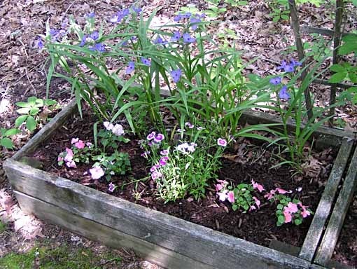
Around the sides and back of the yard are planters with a mix of perennials and annuals, like these Spiderworts behind Dianthus and Impatiens…

…and smaller pots as well. I did all the planting for these, and mulching on everything. The pots and planters keep the voles out, though the large planters are full of tree roots. I get some out, but can't get them all.
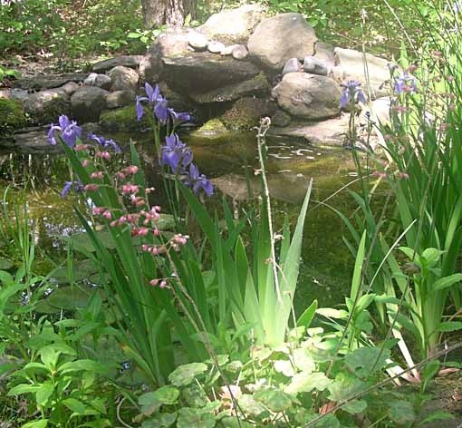
Around the pond the pink Coral Bells are blooming, and in the pond, at the edge are Blue Irises. Other things like Azaleas, Lilacs and Rhododendrons are either finished or fading, but soon other perennials will be flowering, and the annuals should be flowering all year until first frost. The spring gardening is done, except for some weeding now and then, and mowing the lawn. Yay!
May 27, 2011
And Then I Read: B.P.R.D. The Universal Machine

Images © Mike Mignola.
This sixth collection of B.P.R.D. came out in 2007, I'm still catching up. This continues some plotlines from the 5th collection, "The Black Flame," which I reviewed recently, mainly the destruction of Roger and what they might do about it. Liz Sherman is investigating a lead in France on a very old Marquis who might have a book telling how Roger was made, and therefore how to remake him. Of course, things are never that simple. Liz soon finds herself a hostage of this evil fellow who, it turns out, wants a lot more than Liz is willing to bargain with.
Meanwhile, back at B.P.R.D. headquarters, the rest of the team swap stories about their own backgrounds, all of which are quite entertaining, illuminating and/or scary. This deepens the characters nicely, and these sort of stories within the story are a nice break from the cataclysmic action of the previous collection. The main story is well plotted, with some surprising twists and turns for Liz and the Marquis, making this an excellent read.

I'm getting more used to Guy Davis's figures. I have the same problems with them: too similar, especially the mouths and facial expressions, but the writing by Arcudi and Mignola is strong enough that I'm not noticing as much. And Guy does a fine job with the action and horror.
Highly recommended.
May 26, 2011
And Then I Read: GREEN LANTERN CORPS 57

Images © DC Comics, Inc.
This issue is mostly fighting, with interludes of talking about fighting. It's a Brightest Day tie-in, which kind of explains why Firestorm is here, though his presence is somewhat gratuitous. Then you have The Weaponer and his gang, the Green Lantern Corps, and Sinestro and his gang, all mixing it up in varying amounts. Did I mention we're on Qward, the Weaponer's home in the anti-universe? That hardly matters, though, one battlefield looks much like another.

The art by Tyler Kirkham and Batt is fine. They do action quite well, and in those brief moments when the characters are allowed to express some other emotion than anger, they handle that well, too. There's not a whole lot to engage me here, though. And next issue: more war.
Mildly recommended.
May 25, 2011
Creating HOPE Part 2
Images © Steve Rude and Todd Klein, all rights reserved.
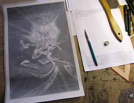
Having received Steve's okay on the art as I planned to use it, I placed the art in an Illustrator file, positioned correctly with extra space at the bottom of the 11 by 17 inch page for signatures, and gave it clean edges with slightly rounded corners using a white masking frame. I printed this on my 11 by 17 capable Xerox printer and taped a sheet of translucent vellum over the art, then using my original layout as reference, I pencilled in the lettering at the top and bottom, using my Ames lettering guide to create horizontal guidelines in different sizes as needed.
Here's the top text with the art folded up out of the way so you can see it better. The text is all upper case italic in what I hope is a graceful, flowing style with many extended strokes, some joining letters together. There is an Art Nouveau flavor to the letterforms, using lots of curves and rounded shapes, something I've always liked that seemed right for this project. In keeping with that approach, most of the strokes vary in thickness, usually thinnest at the ends.
Here's the inking in progress. I used a number 2 Castell TG1 technical drawing pen, and on these relatively large letters, I employed oval and circle templates for some of the forms. For the gradual curves of the large H I used a French curve.
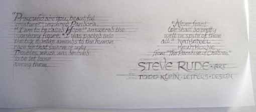
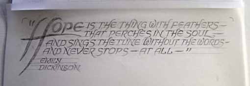
Here's the bottom half pencilled. The text from the Nathaniel Hawthorne story is upper and lower case, also italic, but a slightly different style, though I used the top style for all the capital letters. The main difference in the small letters is that the lines are even in width, lettered with a single stroke of my tech pen, while the capitals gain that varying weight from multiple strokes as I fill in the wider parts.
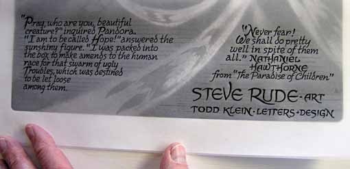
Here's the bottom half inked. There are a few spacing and size problems, such as overcrowding of "Nathaniel Hawthorne" and the line below it that I would fix later on the computer.
 Here's the finished lettering with the pencil lines erased, ready for scanning. Since the lettering is done at printed size, I followed my usual process of painstaking touch-ups on the scans in Photoshop to get everything looking as clean and correct as possible.
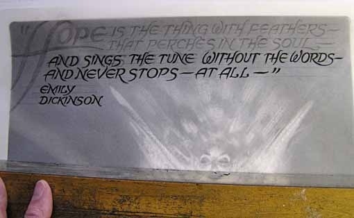
Here's a section of the raw scan. You can see the multiple strokes in the large H, and there are plenty of tiny flaws along the edges of all the letters.
Here's the same section after clean-up, and with the scan in bitmap format to eliminate anything that's not either white or black. This process usually takes about four times or more longer than the actual lettering! What can I say, I'm a perfectionist and the computer allows me to be one.
When the lettering was ready, it needed to be placed over the art file, but with an added twist in this case. Since the areas the lettering will go in are all dark, I reversed the black areas to white so they would knock out white spaces on the art.

Here's the lettering in position after lots of tiny adjustments to get everything just where I wanted it. One later adjustment: I felt pure white was a little distracting so I added a very light gray tint to the lettering, allowing it to blend in better with the art. The only parts of the lettering I kept pure white were the two examples of "Hope," which I planned to paint in a spot color. After this composite was finalized, I placed it in the Illustrator file and there added the copyright/printing info in tiny type using one of my own Art Nouveau fonts that's similar to the lettering style.
I printed some samples on the cream-colored Wausau paper I'd chosen, the same one I've used on several other prints, because the slight yellow color adds some warmth back into the grays of the art, like those Steve put there in his original painting, but which couldn't be reproduced on my black-ink-only laser printer. I knew I wanted a pale spot color, as anything brighter or heavier would be distracting I felt, and I tried these three tints. The yellow seemed to go best.
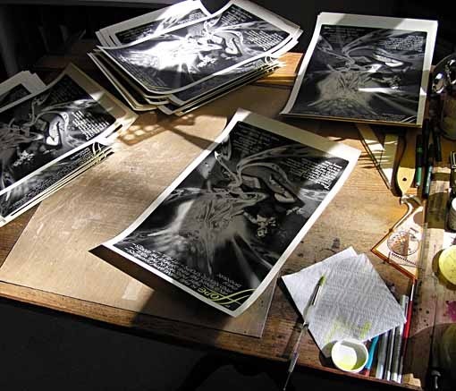
Then it was time to print the entire run of 500 copies and get to work painting the spot colors. It went fairly quickly on this print, partly because of the pale color which allowed some leeway in how accurately I followed the shapes, and partly because the black toner tends to repel the watercolor, making it pretty simple to keep the paint in the white shapes. I spent a number of weekday evenings, and two Saturday afternoons at my drawing board painting away until they were done. The final thing for me was the sign them all, then I packed the prints carefully and Fedexed them to Steve for him to sign.

About two weeks later (this past Friday), they came back artfully signed by Steve, and completely finished and ready to sell. Steve and I are both pleased with the way it came out, and we hope you'll like it, too. PART 1 of this story, plus information about ordering can be found, along with lots more about my other prints, on my SIGNED PRINTS page, or on my BUY STUFF page, once the print goes on sale. (Ordering info for this print won't show up in either place until then.) Thanks for reading, hoping to hear from you on or after June 1st, the on-sale date!
May 24, 2011
Creating HOPE Part 1
Images © Steve Rude and Todd Klein, all rights reserved.
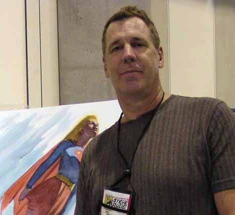
In June of 2010 I was making plans for future prints in my alphabet series, having just released the sixth one, "F the Enchanted Letter." There were several artists I thought might be interested in doing one with me, artists I'd see at the San Diego con in July, so I tried to come up with ideas they might like. I thought about subjects for the letter H, and eventually came to the idea of Hope, from the Greek legend of Pandora. I've been a fan of Steve Rude's work since discovering NEXUS in the early 1980s, and I've worked with Steve as a letterer several times, most recently on his self-published issues of NEXUS, which was challenging but also a thrill to do. Steve's work has always seemed to me to have a classical feel in the figure work, so I thought he might enjoy depicting Pandora and Hope. I asked Steve, above, when we met in San Diego, and though he was hesitant at first, he was intrigued by the subject, and finally agreed to do a print with me. I told him I'd put together a written proposal and a layout for him and get in touch.
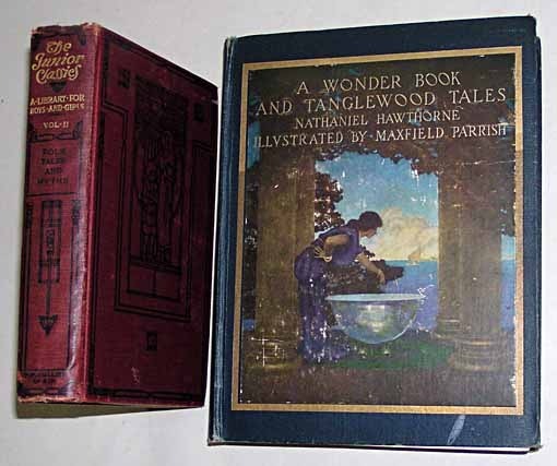
Back home I took out my favorite version of the Pandora tale, adapted by Nathaniel Hawthorne. The story appeared in Volume II of "The Junior Classics," a multi-volume set I had as a kid, and where I first read it. Later I picked up the source, as illustrated by Maxfield Parrish, on the right. Hawthorne's versions of the Greek myths are somewhat syrupy by today's standards, but as a child I didn't notice that, and I loved his friendly, engaging writing style. My favorite of the stories is the one about Pegasus and Bellerophon, but Pandora is one I liked also.

Incidentally, both the books above included this Maxfield Parrish illustration of Pandora and the mysterious box, probably the most famous depiction to date, though there's one by Dante Gabriel Rossetti that's well-known, too:

While these illustrations were not something I referred to for this project, it's always interesting to see how artists from different eras depict a figure from classical mythology. They usually add plenty of contemporary styles and influences from their own time. As you'll see below, I think Steve Rude did the same.
So, I reread the Hawthorne story, entitled "The Paradise of Children," which you can download from Project Gutenberg at THIS site and read if you like. There were a lot of things about it I'd forgotten, such as the other main character, the boy Epimetheus, who was the actual owner of the mysterious box that Pandora so wanted to see inside of. The dynamic between the boy and girl is a lot like that of Adam and Eve in the Bible, and in fact the Pandora myth is rather similar to that of Eve and the Serpent. I found the crucial passage involving Pandora opening the box to be the one I wanted to focus on. The entire episode covers several pages, and was too long for my purposes, so I had to narrow it down to a few sentences that I could use on my print. I left Epimetheus out of it, as I felt he wasn't important to this scene, allowing just Pandora and Hope to take the stage, along with some nebulous "Troubles," which Hawthorne describes as a swarm of winged creatures that sting and pinch the children, and says they represent evil Passions, Cares, Sorrows, Diseases and other kinds of Naughtiness. That's Hawthorne trying to keep his child readers from getting any shocking mental pictures, I think!
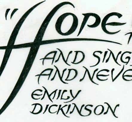
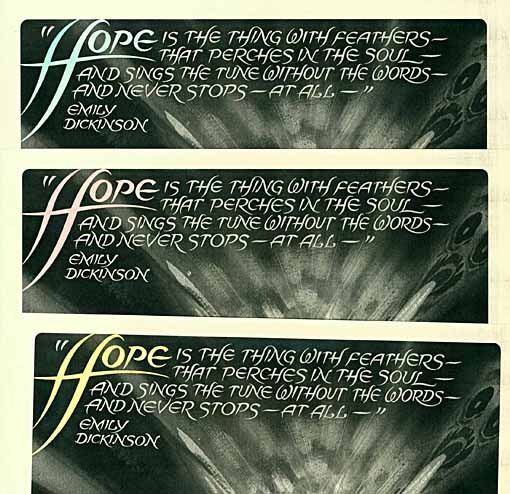
Another famous literary reference to Hope is in a poem by Emily Dickinson that I like, too. Here's the entire poem:
"Hope" is the thing with feathers—
That perches in the soul—
And sings the tune without the words—
And never stops—at all—
And sweetest—in the Gale—is heard—
And sore must be the storm—
That could abash the little Bird
That kept so many warm—
I've heard it in the chillest land—
And on the strangest Sea—
Yet, never, in Extremity,
It asked a crumb—of Me.
Dickinson describes Hope as a singing spiritual bird dwelling inside us, and while I didn't see any way to tie that visually to the Pandora myth, I like it well enough to want to include part of it on the print, and chose the first verse. That gave me a good reason to have the word "Hope" at the upper left of the print, and a large H, continuing my alphabetical theme. I'm hoping the poem's description, which doesn't match the image, won't create any visual confusion!

It took me a while to get my thoughts together, but in January of this year I emailed Steve my ideas for the print, the two literary works, and this layout with the quotes at top and bottom. I said, "Between would be your art, portraying Pandora and Hope in any way you'd like. I think the youthful female figure of Pandora looking up in wonder at the fairy-like Hope should be the main focus, with the light source being a glow of white radiance coming from Hope. If you'd like, and have room, you could portray some of the Troubles around the shadowy edges."
Steve thought that sounded fine, and promised a sketch in a few weeks.

And in February, Steve emailed me his sketch, which I thought looked terrific. I had wondered how he might approach Pandora and Hope visually, and here was the answer: Pandora is a grown woman, though a young one, and Hope, while a nebulous spirit, is also a woman. While getting away from the childlike Pandora of Hawthorne, I had no problem with this, and since Steve draws attractive women, I thought it a fine idea. If you look at the Rosetti depiction above, you can see he went in the same direction.The broken box and emerging menacing vaporous spirits, which Steve notes as "Evils" were also fine with me; not the insects of Hawthorne, but I think a fine alternative that matches the ethereal spirit of Hope. The entire image is full of drama, too, something I hoped for from Steve, and he delivered it in a big way. By showing the broken box, on it's side, and Pandora's fallen figure and amazed expression, plus the fallen flowers and broken sandal, Steve has conveyed more of the conflict in his image than I had room to cover in my lettering, which I think works perfectly. I told Steve to go ahead with a final painting whenever he had the time.

In late March Steve sent a high resolution scan of his finished painting, and as you can see, it followed the sketch in almost every detail. I loved it! I did see some challenges in placing my lettering over the art, though, as I didn't want to cover any of those cool Troubles. I also didn't want my upper text to impinge too much on the glow around Hope's head. After thinking about this and making some rough layouts, it occurred to me that flopping the art, flipping it right to left, might give me the spaces I needed. Here's how that looked:

This version gave me a larger area to letter in at the top left (and I added a small amount to the art across the top using the cloning tool in Photoshop to get to the exact proportions needed for my print.) At the bottom I felt I could fit in the text by dividing it into two smaller sections with the central Trouble between. I also preserved the signature from the first version so I wouldn't appear backwards. I sent this back to Steve, a little nervous about how he might feel about me messing with his art, but Steve thought it was fine. Relieved, I started working on the actual lettering, and I'll discuss that in Part 2, next.
More information about all my signed prints can be found on the SIGNED PRINTS page of my blog.
Todd Klein's Blog

- Todd Klein's profile
- 28 followers

