
Todd Klein's Blog, page 348
April 8, 2011
And Then I Read: GREEN LANTERN CORPS 56

Images © DC Comics, Inc.
This is one of those giant symbol and pinup art covers from DC that I like. Of course, I don't know what the symbol is supposed to represent, but then probably no one but Sinestro does, and he's not telling. (Or if he has, I missed it.)
Sinestro is the focus of the issue, as he finally decides to respond to The Weaponer's challenge and face him on Qward, where The Weaponer has a group of Green Lanterns held prisoner, including Sinestro's daughter. Sinestro is careful to point out, though, that it's not about Sora, it's about his honor, a much more important thing. And that's why we love to hate him, isn't it?
The GLs on Qward face a dilemma. They don't want to help The Weaponer, and they don't want to fight the Sinestro Corps, since there's a declared truce between the yellows and greens, but in the battle that ensues, they end up doing both. What will the consequences be? Who's going to triumph in this three-way contest? Writer Tony Bedard keeps us guessing.

The art by penciller Tyler Kirkham and two inkers looks good. I continue to be impressed by the level of craft seen in the DC books I'm reading these days. All the GL books have very professional art that is full of detail, yet well-based in solid fundamentals. And no lack of imagination, either!
Recommended.


Back in the running…
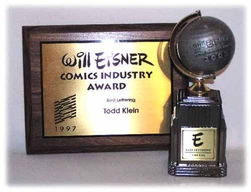
While I was happy to see others winning the Best Lettering Eisner the last two years, I have to admit it feels good to be back in the running this year. Despite over a dozen intances of being proved wrong, I never think I'm going to win, but it's great to be on the ballot and part of the whole Eisner experience once more. A second nomination for Best Publication Design for RETURN OF THE DAPPER MEN from Archaia was quite a surprise, and a nice one. The book got five nominations overall. Glad the judges liked it, I know everyone involved put ton of work into the project. Now we'll see what the voters think. Thanks in advance to any of you who might send votes my way!
April 7, 2011
Locust Moon, a reminder…
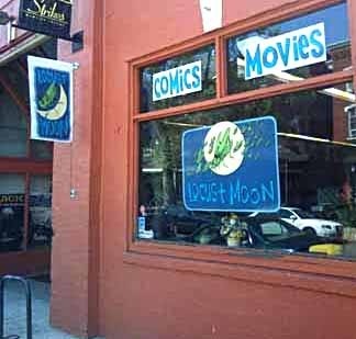
I'll be at Locust Moon Comics and Movies in Philadelphia tomorrow evening, come join the party if you can, starting around 7:30. In addition to my signed prints, I'm bringing a few other surprises like original comics art and a preview of my next print. If you ask, I might letter a little something for you in markers, in addition to signing anything I've worked on. See you then?
Rereading: SINBAD AND ME

Not long ago I reviewed "The Blue Man" by Kin Platt, and reading that book prompted me to reread my favorite by the author. There are quite a few books written for younger readers by Platt I haven't read, but it's hard to imagine there are any out there that can top this one, it's a gem.
Steve Forrester, a teenager living in the small, historic town of Hampton, Long Island is the viewpoint character of the story, and he gives almost equal time to his pet bulldog Sinbad, who seems pretty smart for a dog, though perhaps not as smart as Steve claims, but that's part of the fun of his narration, as Steve projects some of his own thoughts and ideas onto Sinbad, and they do make a good team. Steve is home for the summer taking a make-up course. Steve is a great narrator with some unusual interests: architecture and the history of the houses in town, for instance. Mrs. Teska, a feisty old lady with a small store where he helps out, for another. His parents are away visiting family, and have allowed Steve and Sinbad to stay home on their own. It's a small town, everyone knows everyone, what could happen?
Quite a lot! And it begins when some thugs visit Mrs. Teska looking for something she doesn't want to give them. Sinbad scares them off the first time, but they come back when he's not there and wreck the place. There's a mystery brewing, and Steve and Sinbad are on the case. It leads them to the story of a gambling boat sunk just offshore a few decades earlier, perhaps with lots of money on board, another possible treasure amassed by a real pirate whose house sits abandoned on the same rocky coast, a series of clues and puzzles that seem to be leading somewhere, a cave with a dangerous entrance only open at low tide, and with a skull and coded message inside, a girl who seems to have some of the answers, a newspaperman who's also on the trail of the treasures, a number of strangers around town doing odd things, and lots more intrigue and adventure in this corking good yarn! And don't forget about those thugs, they're always on Steve and Sinbad's trail, making trouble for him and Mrs. Teska, who has some surprising secrets of her own.
If you like mysteries with treasure involved, this is fine one. It's like a Hardy Boys story done really, really well, with codes and puzzles, and lots of action, and wonderful characters. A nice leavening of humor in Steve's narration, too. The Mystery Writers of America liked it, they gave it one of their "Edgar" awards. It's a pretty long children's book, my copy is close to 300 pages, but it's the kind of book where, once you get into it, you keep checking to see how much is left, not because you want to finish it, but because you don't want it to end! Needless to say, this book is highly recommended if you can find it. Sadly, it's out of print, and the listings on Amazon are absurdly high, so I'm not even going to link to that. Keep an eye out in used book outlets, though!
April 6, 2011
Logo Study: KA-ZAR (1997)
Images © Marvel Characters, Inc.
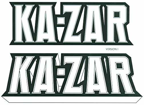
In 1996 I was asked by then Marvel editor Matt Idelson to submit designs for a new Ka-Zar ongoing series by writer Mark Waid and artist Andy Kubert, one which I'd also be lettering. I always liked the character when he appeared in the X-Men books, even though he's similar to Tarzan (or maybe because of that), and I was happy to get the assignment. All the logo ideas I submitted were done on my Apple computer. These two started with a block-letter font I designed, adding a gray outline above and bevelled facets below, inside a heavy black outline to pull the letters together. Version 2 tilted the letters a little, with the top tilted away, and added a telescoping drop shadow, open for color.
I did two more versions of 2 with a larger Z, which is an attractive letter that doesn't often appear in logos, and is therefore fun to play with. In this case I hoped they might let me have it larger even though it's in the middle of the name.
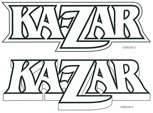
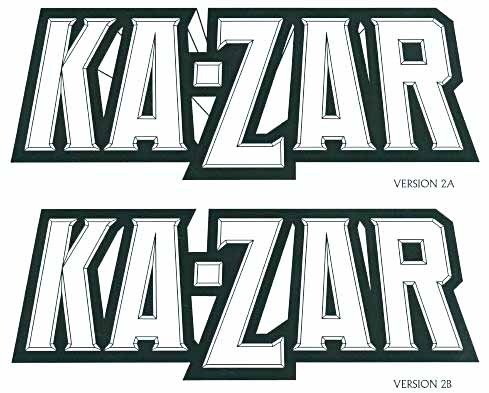
These versions continued the large Z theme, pushing it further, using the commercial font Benguiat Bold as the starting point. The upper one was head-on with an open outline around everything, the lower one followed a similar plan to the ones above, with slanted letters and telescoping. One small difference in the telescoping: it doesn't recede in perspective but goes straight down. I still like this version a lot. For me it has the elegance of TARZAN married with strong, wide verticals. In fact, it might have been a little too close to the Tarzan logo for Marvel.
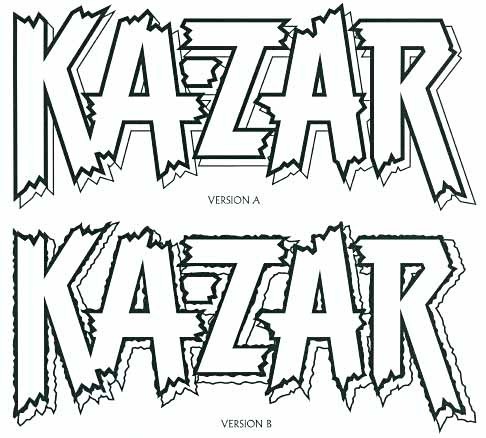
Unfortunately, Marvel didn't go for any of those designs, and Matt asked for something rougher. I don't recall if my SPIDER-MAN logo was mentioned as a direction to go, but it may have been.
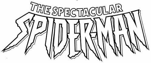
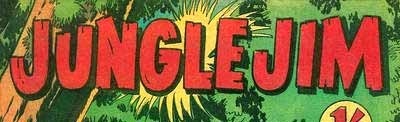
In any case, I thought of some jungle comics logos or story titles I'd seen in the past where the ends of the strokes were jagged like broken wood, like this one from 1955:
and I took that approach as a starting point for this version. One problem was that the two A forms left a lot of room at the top, so I extended the top stroke of the Z to fill that space, tucking the hyphen in the opening below it, which kept the letters as close together as possible. A thick outline added strength and readability, and an open drop shadow would make a place for a second color, and help pop the logo off the cover art.
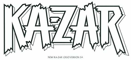
Marvel liked the approach, preferring the less rough version, but some changes were asked for. The Z extension was removed, and I filled the space by increasing the angle of the diagonal stroke. Instead of all equal stroke weights, the horizontal strokes were narrowed a bit. Not sure whose idea that was, it might have been mine or theirs.
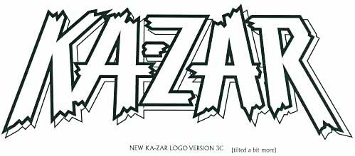
In this version the perspective plan of the earlier styles was followed by simply stretching the bottom edge of the entire shape on the computer. (Version 3B was similar but stretched less.) One good thing about this was it gave the Z a more balanced shape by slightly widening the bottom stroke and narrowing the top stroke. Marvel liked this version, and it became the final logo.

Here it is on the first cover of the 20-issue run beginning in 1997. Marvel staffers made one final addition: a large oval shape behind the logo. This masked all the small openings so cover art didn't show through, which they felt helped it read better, and I couldn't argue with that, though if I had done it I might have made the oval less tall. Overall I think it worked well, though, and I was happy with the end result. Too bad the book didn't last longer!
April 5, 2011
And Then I Read: GREEN LANTERN 62

Images ©DC Comics, Inc.
Man, that is one crowded cover, both with characters and with banner, type and logos. The issue is pretty crowded, too, having to incorporate The Justice League, the rainbow coalition of Lanterns, the powerful Entities like Parallax, and all of them apparently no match for one little blue guy, the former Guardian named Krona. He's the one who created so many problems by trying to see back in time to the very creation of everything. He's been around for many billions of years, though apparently he just recently got free of a prison the Guardians put him in, and he seems quite mad, which is not surprising. Talk about doing long time! He's the mysterious hooded figure that's been pulling strings behind the scenes for some time now, and I find him an interesting character. Much more so than the Guardians. Geoff Johns is doing a good job writing him on the knife edge of sanity, and sounding plausibly like a very old mind indeed. Where the story goes next is previewed at the end of the issue, and it's another war. Oh, joy. Well, we'll see how much fun that brings.

The art by Doug Mahnke and a trio of inkers is quite good. I like the range of subtle and not-so-subtle expressions on the characters' faces, and it all looks quite cool. Great coloring and fine lettering by Randy Mayor and Steve Wands respectively, too.
Recommended.
April 4, 2011
And Then I Read: ADVENTURE COMICS 522

Images © DC Comics, Inc.
This issue's cover represents a company-wide look for one month, using large symbols instead of a logo. Some work better than others. I like the Legion symbol on this one, and the art is attractive, but it's a pin-up, and has nothing to do with the story, if that matters.
The Science Police have their dangerous enemy Saturn Queen captive on a ship heading for a prison planet, but she's not without resources, apparently. Another dangerous super-powered foe shows up to rescue her, and his super-hot sun-energy is too much for the police and the one Legion member on escort duty. Things look bad until Mon-El shows up, though even with the added help from a Green Lantern ring, he has a tough time making headway in this situation. Other sub-plots are advanced slightly, and the issue is a good one overall.

The art by Geraldo Borges and Marlo Alquiza is quite good. There are a lot of new Spanish-sounding artist names showing up on this and other DC titles. I can't help wondering if there's a new off-shore art farm team, like the one DC set up in the Phillippines in the 1970s, but I haven't heard anything about it, if so. Maybe it's just a reflection of the high proportion of Spanish-speaking folks in the US now.
Recommended.
April 3, 2011
Phillies: two up, 160 to go!

We missed watching the opening day game because of a mislabeled cable channel recording, but enjoyed last night's game. The much touted four ace pitchers, above, Halladay, Oswalt, Hamels and Lee, are off to a good start. We'll be watching as often as we can, and hope to get to at least one game this year. Go Phillies!
April 2, 2011
And Then I Read: MENNYMS IN THE WILDERNESS

© Sylvia Waugh, illustration not credited.
When I read and reviewed the first book in this series, "The Mennyms," I had to grudgingly admit I enjoyed reading it, though I found the concept off-putting: a family of life-size rag dolls that have come to life inexplicably, and are just managing to keep their true nature a secret from the humans living all around their own house. I'm not fond of dolls, and life-size ones seem even creepier than regular ones. Plus I felt cheated by the fact that nothing on the cover or flaps of the book indicated what these characters really were.
I bought this second Mennyms book at the same time as the first one. At least this time I knew what I was in for, and I found that I enjoyed this book even more than the first. The characters all come to life in the writing, full of quirks and personality, and after a while their doll-ness seems much less important. In this story, they have to take a real person into their confidence, the nephew of their deceased creator, because they need help. It seems a new highway is planned to go right through their neighborhood, and it looks like the Mennyms will have to move.
Albert, the human, has been alerted to the weird world he's about to enter by the ghost of his Aunt, but nothing can really prepare him for it, and at first he's in a kind of shock, but like me, after a while he gets used to the dolls and begins treating them very much like people. Albert and the Mennyms make plans, and Albert takes them off to a large but decaying family estate he owns, where they try very hard to start a new life. Things don't go very well, though, and soon everyone is struggling to keep their spirits up. More trouble emerges when some local kids happen onto their secret.
While I would never have begun this series if I'd known its true nature (and still feel a bit cheated by misleading covers; the front of this one is just as bad, though it does at least call them dolls on the back cover), I now have to admire author Sylvia Waugh for making me care about her creations.
Recommended.
April 1, 2011
And Then I Read: KNIGHT AND SQUIRE 4

Images © DC Comics, Inc.
Issue 4 of this six-parter tones down the comedy and turns up the character development, which is a nice change of pace. We get some background on Knight's fall and rise, with the help of his young Squire, as told to Beryl's new boyfriend, another super-powered young man with a rather hot-headed attitude, making for an awkward first date. Meanwhile, Knight's armor has taken on a life of its own, and due to some incorrect programming, tries to mix it up with our heroes.

The art by Jimmy Broxton and Staz Johnson looks great, as always, and for me this issue gets back on track, though I do kind of miss the jokes. There are still a few, as on this page, where one of the books the armor is knocking down, along with a vase, is titled "Ming Vases, Repair and Restoration." Oh, and the butler with the sort-of southern/western US accent is a nice touch. Not sure I like the boyfriend character much, but otherwise this was a good read and recommended.
Todd Klein's Blog

- Todd Klein's profile
- 28 followers

