
Todd Klein's Blog, page 336
August 4, 2011
And Then I Read: ALAN MOORE'S THE COURTYARD

Images © Alan Moore and Avatar Press.
I missed this when it came out a few years ago, probably passing on it since it's not Moore's script, but an adaptation of a short story by him scripted by Antony Johnson. Too bad, as it would have informed my reading of Alan's NEONOMICON four-issue series, which is sort of a sequel.
The protagonist, Aldo Sax is an FBI agent with a talent for matching up obscure facts to make a new lead, and he's been handed three murder cases which have some similarities but no obvious motive. He's investigating under cover in the Red Hook section of Brooklyn where a drug dealer named Johnny Carcosa is selling something that seems fairly harmless on the surface, but is connected to the similar killings. As the story develops we find out there's another level to this "Aklo" that no one has recognized yet, and it involves a very strange and guttural language with words like "r'lyeh" and "cthulhu." Anyone familiar with the work of writer H.P. Lovecraft will already realize this is all about that man's writings, and there are plenty of other references and clues throughout. But, as usual, Alan manages to present new aspects and ideas of his own that make the story even more interesting than the usual Lovecraftian horror pastiche.
Aldo Sax also appears in NEONOMICON, so reading this story first would have been better, but I don't think it spoils anything to read this one after, except that we know Sax will fall under the dark spell of what he's investigating. That's not terribly surprising, though.

The art by Jacen Burrows, the same man who illustrated NEONOMICON, is good, though I found the figure work a little stiffer and less accomplished. I think he's improved since doing this book. The visual horror and gore is more subtle in this one, too, which I actually prefer personally.
Recommended, but not for children or anyone easily offended by strong language.


August 3, 2011
Howard Ferguson, letterer

Perhaps it's because of the recent Captain America film, but I've been seeing a lot of things online relating to Cap lately, including several about letterer Howard Ferguson, who worked in the studio of Joe Simon and Jack Kirby in their early days when they were producing the original run of CAPTAIN AMERICA comics, among others. Here's what Joe Simon says about him in his book "Joe Simon, My Life in Comics":
In 1939 … we brought in a letterer, too. The letterer's name was Howard Ferguson, and he was the best ever in the business. Howard was from Detroit. His wife had left him, and he came to New York with his daughter Elsie, who was his pride and joy. She was maybe eight or nine years old at the time. Howard's mother was an "America Firster," one of the people who pressured the government not to get involved with World War II. The group had been organized by a Yale student. Its ranks included future President Gerald Ford and Sargent Shriver, the man who founded the Peace Corps. Howard didn't agree with the Firsters, so he had a lot of heated arguments with his mother, and held a lifelong grudge against her.
Howard was a chain smoker who drank coffee all day. When we got his pages, there were always coffee stains and cigarette burns on them. But he was unlike any other letterer in the business. One time I brought Will Eisner in to see for himself. He came up to the studio.
"Will, look at this," I said. Howard was working on a page, and usually when you letter, you do penciled guide lines first, so your lettering can fit neatly within the lines. But Howard didn't bother with this extra step.
"Wow," Eisner said. "I've never seen anybody do that before." The lettering was straight as can be. I mean, Ben Oda was great, but nobody could do the work that Howard Ferguson did."
Now, at the time the bar for comics lettering was pretty low. Many artists did their own lettering, at least at first, and when they could afford to hire an assistant, that person often did it. The quality of lettering throughout comics in the early 1940s covered a wide range from barely readable to pretty good by today's standards, but rarely great. In an article on the Simon & Kirby Museum website blog by Harry Mendryk, he discusses and shows early Simon and Kirby lettering by both of those artists, and also the work of Ferguson. You can read the articles HERE. (One caveat, I'm not sure all the examples for Ferguson are by him, I think there's another hand in there.)
By any standard Ferguson's work was miles better than what either Simon or Kirby did themselves, and really is quite nice, though I wouldn't put it in the category of "great" myself. And that trick of lettering without guidelines? I'm sure it was a time saver, and handy skill, but that in itself did not make the lettering any better or worse. On the Digital Webbing message board, and in private messages to me, George E Warner had this to say about Ferguson:
"Howard Ferguson (Captain America's original letterer) was one of Timely/Marvel Comics best letterers in my humble opinion. At the time he was active in the industry no one but Howard could dress up a comic like he did. He also may have been one of the few African Americans working steadily in the industry as a letterer during his lifetime."
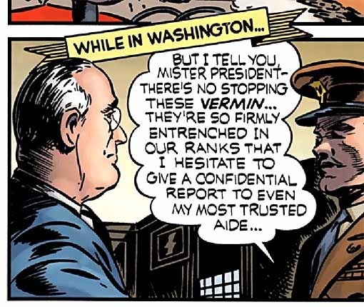
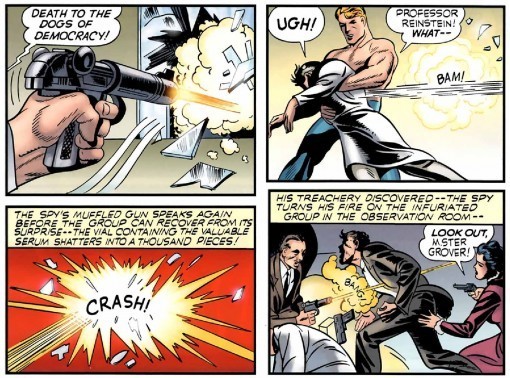
Okay, Ferguson has his fans, so let's look at some of his work on CAPTAIN AMERICA #1, cover dated March, 1941. I put the contents page at the top of this post, and it's quite good, with a variety of styles that work together well, and solid, handsome regular lettering. A fine start to the issue and the work of Ferguson.
 Here's the title page to Cap's origin story. Let's remember that everyone involved was still pretty new to comics, and as always, the story was done quickly to meet a deadline. In those terms it's fine, if a little rough around the edges. The first caption has much larger lettering than the rest, perhaps to draw us into the story, or just to fill the space left there by Kirby in his pencils, but it looks a little odd, and I don't like the backward-angled initial A. The titles are nice, though would probably look better without the horizontal line shading.
Here's a closer look at a panel from page two, where we can see some of Howard's balloon lettering: very even, with consistent straight strokes and almost perfectly rounded curved strokes, very easy to read and pleasant to look at. His rounded G has a small, high serif, and there's another small vertical downstroke at the top of the C, two letterforms that help identify his work. He also had a distinctive J that you can see on the Simon & Kirby museum link above, but that letter does not show up in any of my closer examples, though there is one in the first balloon on page 1 above. Angling the place caption is not a great idea, but it does allow him to fit it into this crowded panel better. Note that the balloon lettering is done with a wedge-tipped pen to give it a calligraphic line that varies from thick to thin depending on the angle, while the caption uses a regular pen point with one consistent weight, slightly heavier on average.
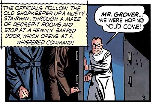
Three things that caught my eye on this final panel of page three. First, the unusual wavy outline to the caption box, with the lines extending beyond the corners. I like that look, though I think it would be more appropriate on a horror story. On the other hand, it's a moment of tension in the tale, so perhaps an okay choice. Second, the lettering style for this caption has changed pens to the calligraphic wedge-tipped one. Third and most important: why is it over the heads of the two characters? That's a really bad idea! Could Ferguson have just been following Kirby's pencils and lettering indications? If so, it's Kirby's bad choice. No way to know at this point, but if I were there at the time I would have suggested running the caption along the top of the entire panel, moving the balloon down to the bottom right, and making sure the characters' heads were in the shot.
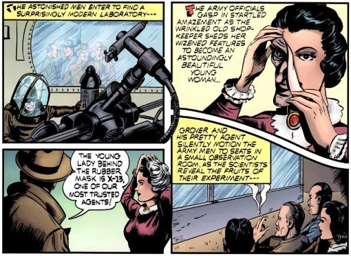
This unusual panel layout from page 4 works well, and shows Kirby's love of machinery. The only thing I don't like about the lettering is the initial capitals in the first two captions. First, they both lean away to the left, second, each is in a different style.
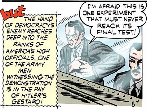
On the final panel of page 5 we have another wavy caption border, and again for a tense moment, so Ferguson was being somewhat consistent. Not sure I like the large BUT at the beginning. Another identifying letterform by Ferguson seen on this page is the letter S where the bottom stroke is shorter than the center stroke. He didn't always do it that way, but often enough to make it distinctive. (Note: this is a recolored version of the story, which is why the line art is airbrushed out on the figures seen through glass, it wouldn't have been that way originally.)
So, we've seen Ferguson doing open lettering earlier in the story, but here his sound effects are solid letters without much character, and I think quite weak, not supporting the art well. At the time sound effects often weren't open letters, but even in size these are disappointing.

On page 7 Howard goes to town on those newspaper headlines, and makes it all work beautifully. I'm not sure why he went with a wavy edge to the open lettering, but he seems fond of that approach. It's okay here, and I know from experience that when you're doing open lettering freehand, without any pencilled guidelines, any sort of variation to the edge works to hide inconsistencies in the letter shapes, so that may be why he did it.
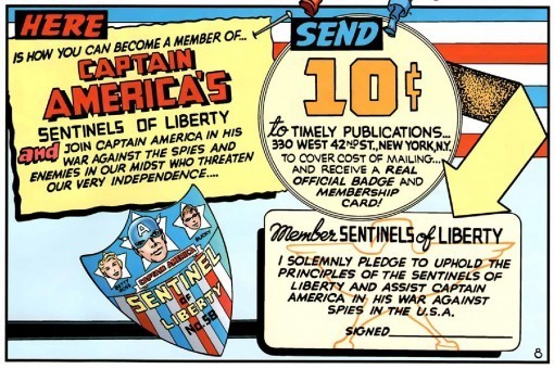
At the end of the story is another large panel giving Ferguson a chance to shine with a variety of styles in this house ad (and early marketing ploy!) I like this a lot except for the texture on the arrow, which may not be him anyway.

One final house ad, which is probably from a later issue. A nice variety of styles, but again I'm not crazy about the wavy outlines on the open lettering at the top. The large initial S is a little strange too, and the word BEWARE has an interesting reverse effect but the B is missing the upper opening. (And that could just be the reproduction here.)
To sum up, Howard Ferguson was a fine letterer, and identifying him as the main one for the work of Simon and Kirby from the late 30s to about 1953 (the latest credit I can find) is a great addition to my own knowledge of early letterers, and hopefully yours as well. I wouldn't put him in the top level of lettering masters, but certainly he did professional and consistent work that any letterer could be proud of. And now you know who Captain America's first letter was!
Thanks to George E Warner for supplying these images.
August 2, 2011
Two more from San Diego

Image © Mark Wheatley.
Two more items given to me at the con. Last year Mark had several examples of his fine digital paintings available as prints. This year there's an entire 8-by-10-inch collection, and it's delightful. Mark uses the digital medium to add softness and a painterly quality I've not seen in his work before. At times reminds me of N.C. Wyeth. At other times he goes for more detail in places, allowing the image to blur in others, focusing the eye on key details without allowing the entire image to become too photographic. There's a wide variety of subjects here, from Wheatley's own creations to those of Edgar Rice Burroughs, pulp characters, and even Captain Action. It's a nice showcase, and is available from Mark for $20. If you can't catch up to him at a con, contact him on Facebook or through Insight Studios.

Image © Flesk Publications and the respective artists.
FLESK PRIME is a sampler of the work of five artists published by John Fleskes, and it goes without saying it's a handsome book on top quality paper in a nice 8.5-by-11-inch hardcover format. Flesk's production values are top notch, and the artists featured are each given a bio page with photo and a gallery of 11 pages showcasing their work. I'm familiar with and already love the art of Gary Gianni, Mark Schultz and William Stout, but the paintings of Craig Elliott and Petar Meseldzija are new to me, and both are equally appealing. I was familiar with nearly all the work of Gianni included, but found many new visual delights in the sections of Stout and Schultz. This is a great showcase, and a nice art book that would grace anyone's shelf. It's available from Flesk Publications for $24.95 on their website.
August 1, 2011
Abe Kanegson, letterer
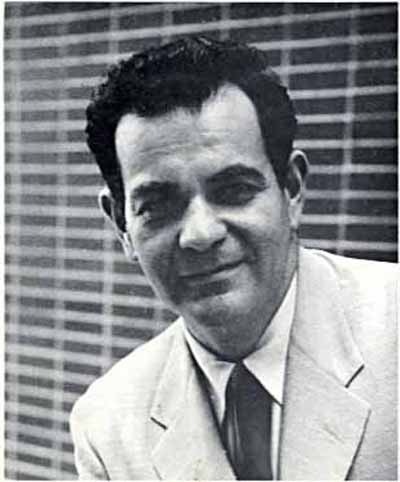
Photo from Kanegson's one folk music album, posthumous, courtesy of Michael T. Gilbert. All other images © The Will Eisner estate.
Throughout the twelve year run of Will Eisner's THE SPIRIT, which appeared in a special comics supplement in some papers once a week, Eisner employed a number of assistants in various capacities, including letterers like Martin De Muth, Sam Rosen, Sam Schwartz and Ben Oda, but there was one man who worked on the strip mainly as a letterer from 1947 to 1951 who Eisner called "one of the great letterers of all time. I credit Abe [Kanegson] for an awful lot of what was turned out in THE SPIRIT."
While often spoken highly of by Eisner and others who worked with him, like Jules Feiffer, not much was known about Kanegson until recently, when writer/artist Michael T. Gilbert unveiled some fine detective work in the pages of ALTER EGO 101-103 (TwoMorrows). Michael was kind enough to send me his three-part article in digital form, and in it I learned a lot about this man whose work I had long admired without knowing who had created it. As was common practice at the time, letterers were not given credit, and I had always assumed the work was all by Will Eisner himself, the only name on the stories.

I highly recommend the articles to anyone interested in lettering. In them you'll find out about this quirky, independent character who knocked around the country doing all sorts of jobs before landing in the Eisner studio. His other great love was music, developed as a way to overcome a bad stutter. Like other singers, Kanegson was able to sing clearly without stuttering, and his chosen interest was folk music. I haven't heard the one recording released after his death, but Gilbert reports it's quite good, and Eisner remembers Kanegson bringing his guitar to the studio and entertaining the artists during breaks. Above is some of the great balloon lettering of Abe, no doubt laid out by Eisner in his pencils, but clearly enhanced greatly by the pen of Kanegson. I've always thought of this as Eisner's own style because, after Kanegson left the studio over a pay dispute in 1951, Eisner was able to mimic it well himself, and used it throughout much of his later career, including on his own graphic novels.

Another style Kanegson used often was this serif upper and lower case one employed for poetry, newspaper articles, typewritten captions, and so forth. It became a staple of THE SPIRIT. Eisner remembers, "I had this idea for a comic only in poetry, you know, the entire [story] was in verse. And Abe said, 'You can't do regular comic book lettering. Let me work up a lettering style.' " And like all great artists, once Eisner saw the kind of creative options Kanegson could give him, he made good use of his abilities, and Kanegson's lettering continued to enhance a wide variety of story types and styles.

Here's another upper and lower case one with uncial letterforms that I love. And there were many more, a great variety of them.
 Eisner's SPIRIT splash pages also benefitted greatly from Kanegson's work, as seen on this one from a 1948 story. I'm sure Eisner laid out the title in pencil, but the panache of the execution is glorious.

And on this splash page, which is entirely comprised of lettering, you can see how Kanegson's work became the soundtrack for Eisner's ideas in a partnership that has seldom been achieved in comics.
Sadly, after Kanegson left the Eisner studio in 1951/52, he vanished from comics, and Eisner was unable to find him again, despite many attempts. It wasn't until Michael T. Gilbert's research uncovered an album of folk music recorded by Abe and released in 1969, four years after Kanegson's death from leukemia, that the rest of his story began to come to light. I'll point you to those articles for more details, and add this from Gilbert: "After those were written and sent in I was able to contact and interview Abe's son Ben, brother Lou, sister Rita and even his widow Liz. So now I have lots of first-hand info and even art by Abe! Those will appear in ALTER EGO 105-106."
Can't wait to read them!
July 31, 2011
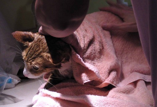
Cats' Bath Day
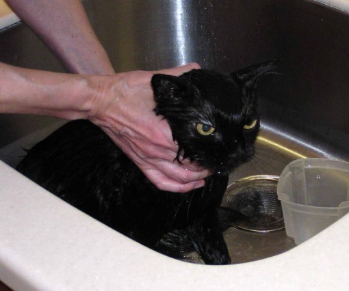
Once a year whether they like it or not (and believe me, they do NOT like it!) our three cats get a bath. Ellen always does it this time of year, when the weather is warm to avoid the chance of a chill causing illness, and before our summer beach visitors arrive, some of whom are allergic to cats. Bathing them helps cut down on the allergy symptoms. Katie, our long-haired black cat looks the funniest when wet.
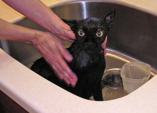
Here she is fully soaked, looking like a disgruntled black Chihuahua.
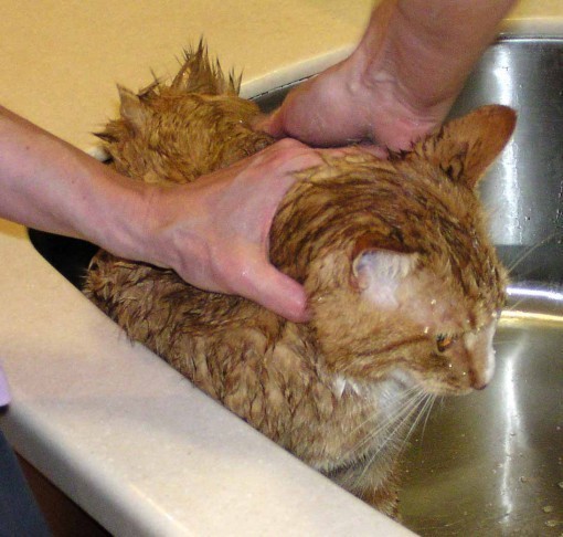
Tigger is next, he wasn't too bad this year.
Although he did make a couple of attempts to break and run, foiled by Ellen.

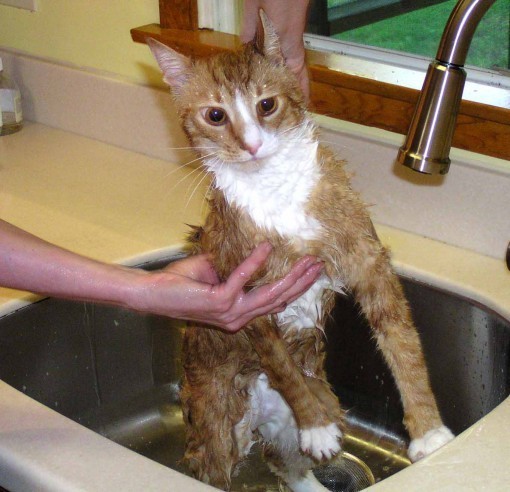
"What are you DOING to my brother?" Leo wants to know.
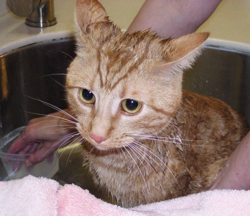
"Oh, why did I ever ask…?"
Each cat gets a good toweling-off, and then will spend the next few hours licking. By this evening they'll all be dry, fluffy and oh-so-soft. And probably much happier.
July 30, 2011
And Then I Read: BLACKOUT

© Connie Willis.
This is a two-part novel, the second half being "All Clear." I waited until I had both in hand before reading this one, and I'll be reading the second half next.
Connie Willis seems to specialize in exasperating characters, ones you wish you could reach into the story and give a good shake. The setting of the story is World War Two England, but the main characters are from a future time, the year 2060, when time travel has made it possible for "historians" to go back to key periods in history to observe. At least, observe is what they're supposed to do, though often they get dragged right into events, like historian Mike in this tale, who planned to study the British hero in Dover as a fleet of small civilian boats brought the English army off the the shore of France at Dunkirk, where they were pinned down by the Germans. Instead, Mike finds himself shanghaied and right in the thick of things at Dunkirk, and in mortal danger. Other historians in London during the Blitz are not much better off, in grave danger of being killed by bombs Hitler's planes are dropping daily.
What makes the characters so exasperating, though, is not their plunges into danger, but their unwillingness to admit to themselves something has gone terribly wrong with the whole time-travel process. Each of them is long past due to return to 2060, but their "drop sites" aren't working. Each keeps making up excuses for why this might be, never willing to face the facts. It's exasperating, I tell you! But Willis is such a good writer that we still sympathize with each of them: Eileen in her home for refugees in the north, then in London, Polly working as a sales clerk in the thick of the bombings, and Mike, with a badly injured foot from Dunkirk hobbling around London too. And there are a few other historians who make shorter appearances, no doubt to return in the second half.
Some of the other characters are annoying in another way; without necessarily even realizing it they make our historians' lives difficult or even miserable. Life in wartime Britain is hard on everyone, but some Brits take ignoring the danger to extremes, or selfishly monopolize the time of others for their own benefit. It's a wonder Eileen, Polly and Mike manage to survive as long as they do, and as the book ends, at least they've found each other.
Great read for history buffs as well as science fiction fans, quite well researched and believable in every detail. Highly recommended, though of course it's only half a story.
July 29, 2011
Three from San Diego

Image © Gary Gianni.
I walk around the Exhibit Hall in San Diego for three and a half days, meeting old friends and making new acquaintances, and sometimes people give me things. Here are three shorter ones. MYSTERIOUS ISLANDS is a sampler of Gary Gianni's work with a one-page introductory story of sorts. In addition to older work, there are samples from two new projects, one with Ray Bradbury, the other an illustrated edition of H.P. Lovecraft's "The Call of Cthulhu." There are 1000 signed and numbered copies, and they're available from Flesk Publications for $10. Gary's work is a favorite of mine, this is a nice introduction to it.

Image © Zander Cannon.
In addition to more ambitious works like the SMAX miniseries and TOP 10, Zander does humorous mini-comics like this one. If you know what Feng Shui is, and imagine it handled like Kung Fu, you've got the idea. I don't know what Zander asks for these, but you can contact him at his website. Funny stuff!

Image © Fábio Moon and Gabriel Bá.
These twin brothers from Brazil have been a great success in America, and just won an Eisner for Best Limited Series for their Vertigo book DAYTRIPPER. I talked to Gabriel (at least I think it was Gabriel) at his booth, where they were giving out these very nice 40-page booklets that are largely wordless examples of their art and storytelling, with a few descriptions of what they do in four languages. Gabriel told me they hand them out wherever they go, especially in places where comics are not well known, to give the curious an idea of what the medium is all about. It does that quite well, and is a fine showcase for their work. Not sure how you can get one, but try contacting them at their blog.
I'll have more of this sort of thing in the days to come.
July 28, 2011
Watching CAPTAIN AMERICA

Image © Marvel Comics/Paramount.
I have to admit I've read very little of the Golden Age CAPTAIN AMERICA comics, probably only his first origin story. I know the character from his rebirth in the Marvel Comics of the 1960s and beyond. Still, I feel I have some knowledge of the character and his origins, and I found this film version handled them quite well. By necessity, it's a condensed version, but the main characters and story points are there, as far as I can recall, though with some additions and changes. Chris Evans is good as Steve Rogers/Captain America, and plays it with a nice balance of emotions: brave and confident at times, unsure and vulnerable at others, especially around women. The female lead, Hayley Atwell playing Peggy Carter is one I don't know from the comics, she may be a new character, but she makes a good foil and contrast to all the men in the story, and holds her own well. Tommy Lee Jones is great as the army colonel, and Hugo Weaving is excellent as the Red Skull, both in the red skull costume and out of it. The plot point that gives him an origin similar to that of Captain America is new, I think, but it gave the plot a nice symmetry, and also gave the two a personal reason to clash that made sense. Other Marvel characters had good supporting roles: Howard Stark (father of Tony Stark, Iron Man I assume), and Sgt. Fury and his Howling Commandos. The latter weren't named, and while I recognized most of them, I kept looking for Sgt. Fury. Finally I remembered him being played by Samuel Jackson in one of the other films ("Iron Man"?), and there he was all along. I can understand the reason for the casting, but visually it's a stretch I didn't make for a while.
Perhaps the oddest visual effect of the film was in the body and physique of Steve Rogers. He's shown in the opening as a small, thin weakling, and I bought that completely. Then, after his transformation into Captain America by the magic serum, he's built like a wrestler or weight-lifter for the rest of the film. One of those things had to be an effect, and I can only assume the early version was someone else's body with the actor's head digitally attached. If so, it was quite convincing.
Stan Lee has his usual cameo, and it's a good one-liner. The World War Two setting, costumes and acting were all successful, and there's even a cheesy musical number that manages to fit in well. The evolution of the character and costume are also well done, if differently from the comics, and the payoff at the end that brings the story into the present day worked for me, but only because I know it's leading toward the next film, "The Avengers." Otherwise it's rather an abrupt ending. It was nice to see Joe Simon and Jack Kirby get their rightful creator credit at the end, too. And I love the fact that the movie logo is derived almost completely from the logo of the very first comic:

Well done, Marvel!
In all, I liked the film a lot, and recommend it.
July 27, 2011
A FABLES page from pencils to print

Images © Bill Willingham and DC Comics, Inc., art by Mark Buckingham and Steve Leialoha, colors by Lee Loughridge, letters by Todd Klein.
At the San Diego con this year, inker Steve Leialoha showed me some of the original art for FABLES, and I found it intriguing for several reasons. First, Bucky is working almost at printed size instead of the usual larger art board size, about 150% of printed size. This shows Bucky's great control of his linework. I've only known two other artists who worked at or close to printed size: Linda Medley on CASTLE WAITING, and Trevor Von Eeden back in the 1980s on THRILLER, among others. (A few artists like Gene Ha work at a size somewhere between art board and printed size, but not usually this small.) Note that this is the central portion of page 9, FABLES 108, not page 8, as Bucky has written at the top, so either he added a page after this one was finished, or counted wrong. As in all the FABLES art Bucky does, the narrow side panels are put in later, and are often repeated, with a particular pair for each setting or scene.

Here's the other intriguing aspect of the art on these pages. Before sending the pencils to Steve Leialoha, Bucky paints gray washes over them, as seen here, sometimes doing a bit of the inking as well. Here he's inked Bufkin's eyes in the last panel, and I think a bit of linework on Bungle, the glass cat, as well as the panel borders. He's also added shrubbery in mostly darker watercolor grays where there was nothing in the pencils. This is what Steve received from Bucky, and I don't know if I've ever seen art done quite this way before: doing gray tones over pencils. Steve told me it's not a problem for him to ink them, though it takes him longer than the standard way and size, and if anything doesn't come out quite right he fixes it on the computer after scanning his finished inks. Frankly I don't think there are many inkers who would be able to handle this as well as Steve, who is a fine artist in his own right.

Here's the page with Steve's great inks, and also with the side panel art added, which is entirely by Bucky. How Bucky can add the gray tones and have them come out so perfectly in tune with the inks is truly a mystery to me. It means he sees the inks in his head, I guess! This is what comes to me for lettering.

And here's the page with the lettering, which I do using my own fonts in Adobe Illustrator. The green guideline shows where the page will be trimmed, and the red one shows the safe area for lettering. As usual, Bucky's panels are well within that.

Colorist Lee Loughridge gets the inked art file at the same time I do, and he's working on the coloring while I'm working on the lettering. Lee declines to discuss his process coloring over the gray washes, but the result sure is gorgeous! And I think when things are running late, he begins his coloring over the pencils. I have no idea how that can possibly work…! One thing that saves Lee some time, as it does Steve, is the repeated side panels. They only have to ink and color those once.

And here's an approximation of what the printed page will look like, though the colors may not be as bright on paper as they are here, and a small edge will be trimmed off the side panels at each side.
Hope you've enjoyed a look into this unique FABLES art process!
July 26, 2011
And Then I Read: THE PENDERWICKS AT POINT MOUETTE

© Jeanne Birdsall, jacket art © David Frankland.
I am far from the target audience for this recent series, of which this is the third book. That would most likely be girls of all ages, but especially young girls and their mothers, I would guess. It's a family story of a type one rarely sees now, but popular when I was a child in such series as Elizabeth Enright's Melendy Family books, my favorite of this type. The Penderwick family is upper middle class, and each of the four girls in it has some particular strength or talent, though all seem intelligent and full of personality. In the first book, simply The Penderwicks, they had a summer vacation adventure where they befriended Jeffrey, a lonely boy in the adjoining estate who adds a new interest to their group: music.
This time three of the sisters are again going away on summer vacation to Maine with their favorite Aunt Claire, while the oldest sister gets her own separate vacation with a friend, and is largely out of the story. Their parents will also be away in England, so that puts a heavy burden on next-oldest sister Skye, making her the OAP, or Oldest Available Penderwick. The sisters and aunt are soon in a lovely seaside cottage in Maine, and are joined by Jeffrey, making everyone happy, but before long things get complicated. Aunt Claire falls and sprains an ankle, taking her out of much of the activity. Jeffrey and youngest sister Batty become friends with a man in the next house who is a musician, right up Jeffrey's alley, while the other sister, Jane, gets into the most trouble, falling down a rocky bank and nearly breaking her nose while trying to wave at a cute boy. Jane is exploring the idea of love, and has a crush on Dominic, the skateboarding wiz of the town, but that soon leads to more trouble for her, as she experiences both the highs and lows of young romance.
The adventures of the family are entertaining, but what makes the series great reading is the interactions between the children, each with a unique voice and approach to life. And while much of the plot is fairly lightweight, toward the end it gets serious for one of them. The big plot development for Jeffrey leans heavily on coincidence, but in a way that's been a standard ploy in fiction forever, at least since classical Greek times, so I didn't have a hard time forgiving that. I didn't find a lot of things here that young boys might be attracted to, but I liked this story as much as the others, and found it good summer reading. And much more fun than what's often the plot mover in family stories these days: tragedy or injustice of one sort or another.
Recommended.
Todd Klein's Blog

- Todd Klein's profile
- 28 followers

