
Todd Klein's Blog, page 332
September 18, 2011
How To: Famous Artists Course on Lettering

Images © Famous Artists Cartoon Course, Inc. except as noted.
Someone on the Digital Webbing lettering forum recently posted a link to a PDF of interest to anyone who is a student of comics lettering, as I am. The Famous Artists School was begun in the 1940s by commercial illustrator Albert Dorne. If you're a long-time comics reader you probably remember their ads in the comics, like this one:

Now, I have to admit that, while I did like to draw, when I was young it never occurred to me to send in for information about this mail-order art course. I can't say why, maybe I just felt I was better off doing my own thing, but if I had subscribed to their Cartooning course, I'm sure I would have learned a lot from it, and maybe even become a comics artist. Possibly.
If I had persevered through the course to lesson 18, it would have taught me a lot about lettering for comics, too, and information about that was hard to come by when I was trying to get into comics in the mid 1970s. I did find and buy a small mini-comic how-to that included lettering published by Charlton Comics:

Image © Charlton Comics or the respective copyright holder.
It was written by Nicola Cuti, and had lettering tips and demos by Frank Bravo, and was quite helpful. Wish I knew where my copy went, I haven't seen it in years. That was about all the information available in print at that point, as far as I knew, and I had to wait until I got on staff at DC Comics in their Production Department to learn more.
Back to the FACC lesson, it doesn't say who wrote this Lettering how-to, but a number of popular comic strip artists were on the staff list—Rube Goldberg, Milton Caniff and Al Capp are still well-known names—and examples of their work and others are included. The perspective is very much geared toward newspaper strip artists, as you might expect.

Page two of the lesson shows pictures of a number of different dip pen points and lettering that could be made with them, a great idea! Now, when I started I was using Speedball dip pens, but mostly for larger lettering. For balloon lettering I followed the example of my first lettering teacher John Workman and used technical drawing pens. I don't know if they were on the market when this lesson was written in the mid 1950s, but if so, they weren't yet considered a lettering tool by the writer.
The course begins with a fine introduction outlining the importance of lettering as part of telling a story in cartooning. It also divides lettering into two main categories: balloon lettering and display lettering, with the latter being anything other than regular dialogue balloons and captions. I concur! But here's something else in the text that I find interesting:
"It's true that most successful comic strip men have an assistant to do their lettering. But, it is also true that each and every one of the men at the top is perfectly able to do his own lettering. The assistant merely saves him valuable time. If you are lucky enough to get a crack at being an established cartoonist's assistant, you must be able to letter as well as the boss, preferably better."
Now, there's a window into an inviting world! And probably one that's mostly passed us by now, but in the 1970s, if I'd read that, I'd have been itching to try to get into it! Ah, the days when comic strips paid really well, and each strip had it's own staff of assistants…the few strip artists I know do it all themselves, and either letter it on a computer or have someone do that part for them.
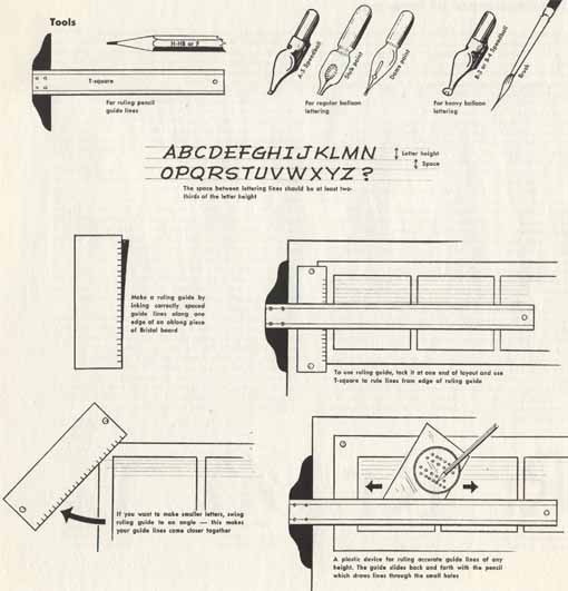
As the course gets down to the practicalities of balloon lettering, they again show some dip pen points. I've used Speedball B-series points for larger balloon and display lettering, the others I don't think I've used. Some I haven't seen. For drawing guidelines they show a simple method of using a marked-out paper guide, as well as the plastic Ames Lettering Guide at lower right, though used incorrectly! I did a one-sheet lettering guide myself many years ago that has the correct position, you can find it HERE. I'm guessing the artist had never used it himself.
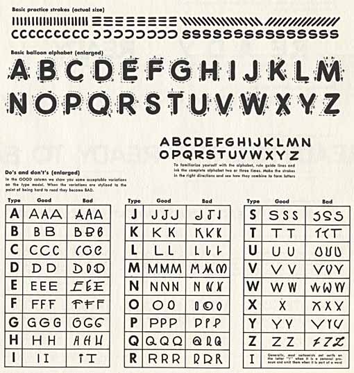
This practice stroke and letter shape guide is on firm ground, though the letterforms are not really what most cartoonists followed, rather they're idealized type-like forms. Still, it's not a bad starting point. And the examples below that of Bad Lettering are entertaining!
Here's another amusing group of bad lettering samples. In general, the how-to's in this lesson are fine, though.
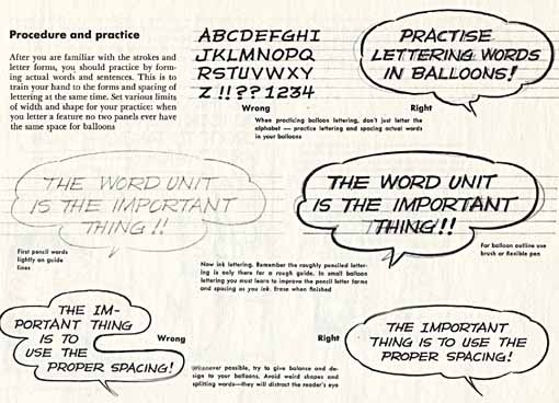
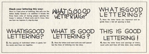
Finally we get to putting lettering into balloon shapes. Whoever did these samples has a style with some nice bounce that would look fine on a humorous comic strip. Interesting that he chose a spelling of the word practice (practise) that is much more common in England than here. Also, he did not follow the advice for the letter I with crossbars from the previous diagram of Good and Bad Lettering, where it says, "Generally, most cartoonists put serifs on the letter "I" when it is a personal pronoun and omit them when it is a part of a word." Something I've been saying for many years, and nice to see it reinforced here.
In all, this course is well done, and could have gotten anyone on the right track with hand-lettering. The Cartoon course was discontinued in the 1980s, perhaps due to the shrinking market for comics and comic strip artists, but not before serving some artists like Bernie Wrightson well — he cites it as a major learning tool. Just as well, they didn't have to even consider computer lettering…! I believe the Famous Artists School still offers courses on drawing and painting, though. You can visit their WEBSITE for more information.


September 17, 2011
And Then I Read: HAL JORDAN, ABIN SUR Movie Prequels

Images © DC Comics, Inc.
The film has come and gone in the theaters, and I think is out on DVD, but the prequel comics are still coming, I just got another one this month (Sinestro). These two have been out for a while. Kind of strange that they weren't all out BEFORE the film, but in a way I can see why doing it this way works to keep the film on people's radar longer. And I like these new stories much better than a simple adaptation of the film.
Abin Sur is a character that never had much play in the comics, as he was simply the dying GL who gave Hal Jordan his ring. His role has been filled in a lot more in both the film and comics like this one, but he's still not a particularly memorable character. I did enjoy this story of Sur coming to Earth in secret to try to retrieve some alien technology that landed there accidentally. Perhaps the biggest surprise of the book was the role of a young Amanda Waller (who also appears in the film I believe). Considering she was created decades after Hal Jordan, it's interesting to see her being retrofitted into his story, but it works for me.

The art by Patrick Gleason and Tony Shasteen is okay, but it doesn't really capture the look of the actor on the cover. Still solid comics work, though.

Hal Jordan is not front and center in his own book, surprisingly, but is the subject of a discussion/argument between Sinestro and Tomar-Re about whether he deserves a GL ring. This isn't a bad idea, as we see flashbacks of Jordan's life while the two argue pro and con, but it's not exactly action-packed. Then there's what seems to be a random GL Corps backup feature which seems to be here mainly to fill out the issue.

The best thing about this book, and perhaps the best thing in any of them, is the terrific art of Jerry Ordway on the main story. No one else has come close to matching his take on the movie characters, and Jerry's dramatic lighting and layouts make even talky pages work great. Why Ordway does not have a regular series at DC to keep him busy is a mystery to me, his work is solid and appealing in every way.
Recommended.
September 16, 2011
And Then I Read: FLASHPOINT 5

Images © DC Comics, Inc.
Geoff Johns has already shown in the pages of his FLASH series that he knows how to tell a good time travel story. Turns out FLASHPOINT is another one, I just didn't see it until reading this issue. In fact, it's closely related to the issue of FLASH that focused on the life of Eobard Thawne, the Reverse-Flash. Here the consequences of some things that happened there are played out in a way I never expected, making this a great wrap-up to this miniseries. Yes, as you'd expect, the alternate Earth seen in it is not going to continue, but neither will things return to the previous status quo, as this story leads into the launch of the New 52, DC's revamp of their entire superhero comics line. That part didn't move me particularly, but I did really like the way the lives of Thawne and Barry Allen, not to mention some supporting cast, are portrayed here, and there's also a nice aftermath moment with Batman.

Andy Kubert's art has been terrific throughout, and he's helped by two inkers this time, Sandra Hope and Jesse Delperdang. Everything looks great, the characters "act" beautifully, the action scenes are impressive, and Andy's character designs are all fun. No complaints and recommended!
September 15, 2011
And Then I Read: FLASHPOINT 4

Images © DC Comics, Inc.
The first half of this issue has The Flash and this world's Batman trying to build consensus among superheroes to attempt to stop the brewing battle between armies led by Wonder Woman and Aquaman. Flash is more concerned with overturning the fractured history created by the Reverse-Flash that brought this entire reality into being, but no one has any good idea how to do that. Some new characters are explored, then a group heads for the big battle site in England, where the realities of war are soon made plain, and Barry Allen finally gets to face his nemesis.

The art by Kubert and Hope continues to be wonderful. At upper left you see one of the new characters, Element Woman, sort of a female Metamorpho. Her personality is cutesy with a touch of madness. It may be hard to see, but her word balloon has some pink shapes along the edge that I at first thought were hearts.
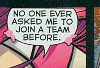
Actually they're paired circles, perhaps meant to represent Mandlebrot set shapes, or just bubbles, but neither explanation seems to fit her powers particularly. Maybe pink was a bad color choice, as they do look like hearts until you examine them, and I continued to read her dialogue as very lovey-dovey because of that, which I'm not sure was the intention.
At any rate, this storyline is moving quickly, at least, and will wrap up next issue. Recommended.
September 14, 2011
Incoming: BACK ISSUE 51

© TwoMorrows Publishing and the respective copyright holders.
My digital version of this arrived, and the contents look good. Interviews with Steve Englehart, John Ostrander, Adrienne Roy (her final one), and several Pro2Pro columns: Erik Larsen and Walter Simonson, Len Wein and Doug Moench, and one that combines separate interviews with letterers Janice Chiang and myself into one. Great to see some comments and answers from Janice, I'm looking forward to reading that. My answers are all pretty old hat, but perhaps new to some folks. Well done, Michael Eury, lots to read here!
September 13, 2011
And Then I Read: FLASHPOINT 3

Images © DC Comics, Inc.
As you can see from the cover, Barry Allen is back in action as The Flash in this issue, after quite a struggle to regain his powers. It always seems a little strange to me when superhero origins that were simple in the Silver Age become so traumatic in today's comics, but he does get there eventually. The other main storyline has this alternate reality's Batman and Cyborg joining Barry to uncover what became of the baby alien whose spaceship crashed many years ago, as the cover also shows. A very different Superman, and perhaps the most original alternate character so far in this series. Naturally there are forces who don't want any of that revealed, leading to the issue's action scenes.

Again, great art by Kubert and Hope, great colors by Sinclair, and it's always fun to see old characters in new places, as here. Note the appearance of WildStorm's Grifter in this horrific team along with Kirby's Demon.
Recommended.
September 12, 2011
And Then I Read: FLASHPOINT 2

Images © DC Comics, Inc.
I wasn't real impressed with the first issue of this series, but decided to continue because I like the writer and the artist. If you've ever seen that "Star Trek" episode with the alternate universe evil versions of the Enterprise crew, you have the basic idea here. Familiar DC heroes and villains in unfamiliar roles, often switched around in the good vs. evil positions, with Barry Allen from the familiar DC universe thrown into the middle of things and trying to figure out what happened. Except he has a pretty good idea before long that the Reverse-Flash is behind things, having changed the past in major ways. As the issue opens, Barry is powerless and trying to make at least one ally in a hostile world, while elsewhere various meta-battles go on in a dystopian setting. At least Barry has a plan, and he begins to work on it here. That kept my interest.

Yup, there's evil Aquaman for you. The art by Andy Kubert and Sandra Hope is great, with the support of terrific coloring by Alex Sinclair, and nice lettering by Nick Napolitano. All around, a pretty good read and recommended.
September 11, 2011
9/11 from a distance
I'm not a fan of disaster remembrances, so I've mostly avoided the ones flooding the media today, but I have read a few personal stories on Facebook that brought back memories of my own, so if you're not sick of the subject yet, here are mine.
That day in 2001 I was working at my computer, as usual, and watching the Today show when hosts Matt Lauer and Katie Couric started getting word of the planes hitting the towers. The ordinary light-hearted news and schmooze program quickly became deadly serious, and video feeds began to show the towers pretty quickly. Ellen was getting ready to leave for work, but we both watched for a while, stunned and shaken. Once the towers came down, we both decided we needed to get on with our day, and she left for work while I got back to mine. I was working on relettering CASTLE WAITING: THE CURSE OF BRAMBLY HEDGE for Linda Medley, digitally replacing her typeset with the fonts I was using in the regular series, and it was a pretty tough job because I had to do a fair amount of art extension as well to fill in spots where my lettering and balloons were smaller. I kept the TV on all day as the disaster and its repercussions expanded, feeling numb and sad. I got in touch with my Mom in North Jersey, and she'd heard from my brother Doug and his wife, who worked in New York, that they were okay. I don't remember if I had any contact with DC editors that day or not, but I knew DC was not close to the event.
My mind kept returning to the previous year when my entire family had been inside the World Trade Center. My brother Doug got married in the Brooklyn Botanical Gardens, not far from the south end of Manhattan, and family members had stayed at a hotel inside the WTC that night, then we'd all met at the restaurant at the top for brunch the next day. It was my only visit to that amazing restaurant where you could look all the way down the dizzying height to the street so far below, and I think only my second visit to the WTC, but it was so fresh in all our minds because of that.
Here, far away in South Jersey, it was a gorgeous day: sunny, pleasant temperatures, low humidity, not much wind. And that day, and the next few, it was even quieter than usual: no airplane or traffic noise. We don't get a lot of that, but it was still noticeable.
Later in the fall I visited the DC offices, going up to Manhattan by bus, and as the bus entered the Lincoln Tunnel you could see the site still smoking even then, and the skyline forever changed. Luckily I didn't know anyone who worked there or was among the rescuers who were injured or killed, but of course we felt for all those who were impacted directly and indirectly. While at DC I met former editor Andy Helfer who lived near the site and he had some chilling stories to tell. And we heard lots more through the media in the days and weeks and months following.
Perhaps the most lasting effect for many is the waves of war and American fighting in the Middle East that followed, violence begetting more violence, as it often does. And who knows when and where it might end, if ever? A sad day indeed, and one I'd prefer not to remember, if that were possible.
September 10, 2011
Alex Jay's THOR logo creation on his new blog

Image © Marvel Characters, Inc.
My all-time favorite THOR logo is the one designed by Alex Jay in 1983. And I say that having designed a later version myself! Alex has just begun a NEW BLOG, and is detailing the creation of that logo there. Three parts are up so far, so keep checking back for the full story.
September 9, 2011
And Then I Read: DARK HORSE PRESENTS 1

Images © the respective copyright holders.
This newly revamped Dark Horse anthology title was a must-buy for me because of the new "Concrete" story by Paul Chadwick alone, and when I began to read it I realized how much I'd missed him. "The Human Dilemma" storyline and trade paperback was the last one I bought, and that came out in 2006. If there have been any others since, I don't know about them. As usual this short story and the stone-like character are full of wisdom and humanity at its best and worst, and it manages to tell an action-filled crime story along the way.

And I completely forgot about the "baby" Concrete from that 2006 story. Sure hope there will be more!
The rest of the anthology is pretty solid stuff, though of course I liked some entries better than others. Howard Chaykin tells a typically jaundiced crime and con-men tale with good characters, though I found the art style less appealing this time than in other recent work. I'm not sure why, but the technique he's using on the faces gives them a smudgy, dirty look that at times is distracting.
Neal Adams' feature is titled "Blood," and there's a good deal of it, but the title character hasn't really shown up yet. Mostly we get one of his friends being tortured by a rival criminal gang. I imagine Adams was given free rein to do whatever he liked for this book, and his choice of story and character doesn't appeal to me very much. The somewhat cartoony distortions in the figures are similar to what he's been doing in other recent work like his Batman series, and while it's strong work, I can't say I love it.
Carla Speed McNeil has a "Finder" short story, the first work by her I've read. It's amusing if highly improbable, even for a futuristic fantasy. It does work on a social satire level, though.
Michael T. Gilbert's "Mr. Monster" is always a hoot, and his tale here is not exception. It's target is those Marvel monster stories that predated the superhero successes of the early 60s, with a dose of Harvey Kurtzman as well, and it's great fun. Gilbert's style is frenetic to the max, and is colored with garish abandon, so too much of it is tiring to my eyes, but in a short story length it's great.
Next there's an interview with Frank Miller about his upcoming "Xerxes" project, with some sample pages. This is sort of a follow-up to "300," which I liked, so I'm willing to give it a try when it comes out, but the interview didn't do much to make the project more appealing to me.
A prose short story by Harlan Ellison is always a joy, and it's been way too long since I read one. "How Interesting: A Tiny Man" is quite short, but packs a lot in, and comes with two alternate endings, both of which I rather liked. Another wise exploration of human nature.
Richard Corben's "Murky World" took me right back to his underground comics stories of the sixties. Like those, the storyline doesn't make a lot of sense, but is wackily entertaining anyway, and the art is quirky and appealing.
Next we have an excerpt from a new "Star Wars" storyline written by Randy Stradley, with great art by Paul Gulacy. I haven't read a Star Wars comic in many years, but this one looks pretty fine.
Finally there's a light-weight but good short fantasy by David Chelsea, and a two one-pagers by Patrick Alexander that aren't bad.
Anthologies tend to have a few choice items and a lot of filler, but that's not the case with this one, it's all pretty good stuff, and there's bound to be a few things you'll love. Recommended.
Todd Klein's Blog

- Todd Klein's profile
- 28 followers

