
Todd Klein's Blog, page 331
October 1, 2011
Blue Ridge Parkway to Great Smokies
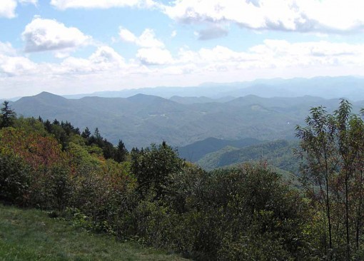
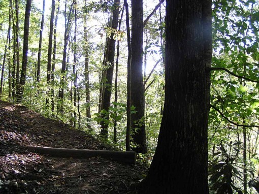
Thursday we drove along the Blue Ridge Parkway from Asheville, NC to Cherokee, on the edge of Great Smoky Mountains National Park, where we'd be staying a few days, the far point of our trip. The Parkway drive is slow due to many curves and up and down hills, but easy driving and fun for sightseeing. There are many viewpoint pullouts, this being a typical view.
The southern Appalachian Mountains are often hazy blue even on clear days due to pollution and also chemicals given off by the conifers, hence the blue ridge name.

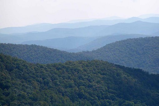
While many of the trees are still green, some fall colors were apparent here and there at higher elevations, as in this small high valley.

We did a short trail walk there to see this waterfall.
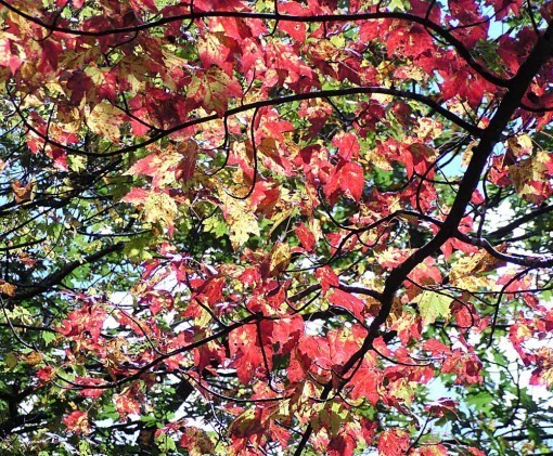
This maple was one of the more colorful trees.

The most common flowers this time of year are lavender Asters and Goldenrod.
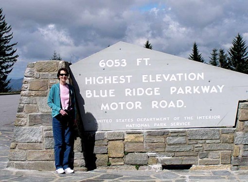
Here's the inevitable tourist shot at the highest point on the Parkway. Pretty far up for the eastern half of the country!

We arrived at our motel in Cherokee (inside the Cherokee Indian Reservation) mid-afternoon, and after getting settled, went to the park Visitor Center to scope out what we might do with the rest of our afternoon. After advice gathered there, we drove a bit west to Deep Cove to walk on the Loop Trail there. In the park info, this sounded like one of the easier trail hikes, and on the map it looked easy, a simple triangle along two creeks and across between them. At the trail head the marker said two miles, which seemed okay. This small waterfall was on the first leg, a fairly straight and level walk along one stream.
Ah, but then things got much harder. A more realistic description of this trail would be: an easy two miles along the first stream, very pleasant. Then an abrupt and long climb up a ridge that seemed endless, especially to us, who are used to flat walking at home! This must have been at least a mile uphill, and with no great vistas as reward, just lots of trees.We did hear some Pileated Woodpeckers calling, but didn't see them. Not a lot of birds around, no animals other than squirrels.

Then an equally long and endless walk downhill through almost tunnels in the thick Mountain Laurel and fir trees, at last reaching the second stream and easier walking along that. Then back to the main trail. Total walking time for us, about three hours, distance traveled on Ellen's pedometer, over four miles. In all about twice the distance and three times the effort we expected! Needless to say, we won't be trusting any other trail info in the park. We had a fine dinner in the town of Bryson City, and headed back to Cherokee for bed. More here next time.


September 30, 2011
Asheville, NC and the Biltmore Estate
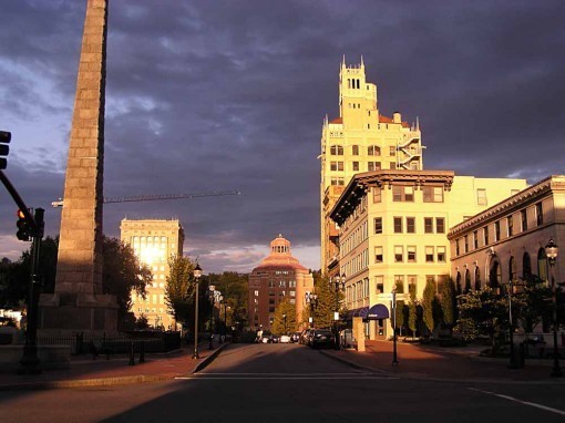
The next stop on our vacation is as above. Here's downtown Asheville in the late afternoon sun. My friend Tom drove up from Atlanta to meet us here, and he drove us into town for a pleasant walk around this artsy town (with a couple good bookstores), and a fine dinner at Tupelo Honey, an excellent restaurant.
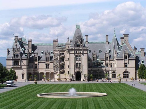
Our main sightseeing goal of this area was the nearby Biltmore Estate, the largest private home in America, built by George Vanderbilt in the last years of the 19th century, and finished in 1900. It is truly spectacular in every way, and made even more beautiful by the lovely weather we'd finally been given. The main house itself occupies about four acres of land, and the grounds are so large it's about five miles from the front gate to the house!

Here's the main entrance closer. the style is a mix of French chateau and Victorian with plenty of unique touches, designed and crafted by the very best at the time.
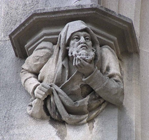
The outside had hundreds of masterful stone carvings like this one…

…and this charming dragon gargoyle. As you can imagine, the inside is equally amazing, but of course pictures are not allowed, so you'll just have to go see for yourself.
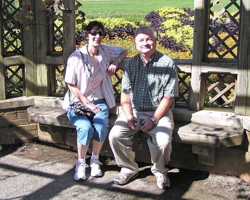
After we toured the house, we spent some time in the garden. Here's Ellen with Tom there. The gardens are quite large, and we only saw some of them.

Even for fall the flowers were lovely, and in the greenhouse were many more beauties like these orchids.
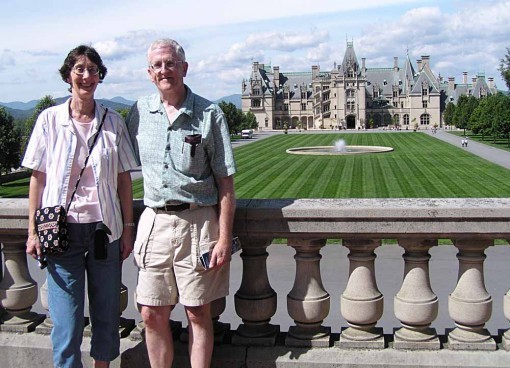
Tom took this picture of us before we drove more miles through the grounds to the Antler Hill Village and Winery, where we toured a fine exhibit of Tiffany lamps (and one large mural) and had lunch. Then Tom had to head back to Atlanta, but it was great to see him again.
It was mid-afternoon, so we decided to go back to the main house and go through it again, this time using their audio tour via headphones. It was quite good, with actors playing the parts of family and friends, and some actual family members speaking as well. It brought the house to life in a way just reading the signs did not.
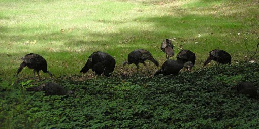
We had seen very few birds around the house, even in the open eating area by the restaurant. I probably don't want to know how they did that. But on the road we passed this flock of female and young turkeys.
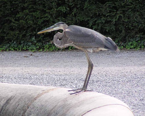
Outside again we visited the Italian Garden, which we had passed by earlier. This had large pools for water plants, and a Great Blue Heron was there looking for goldfish.
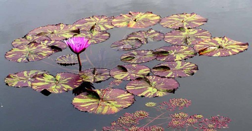
There were many beautiful and unusual water plants like this water lily.
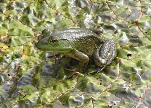
And a bullfrog sat on a very different sort of lily pad, probably keeping an eye on the heron.
We loved the Biltmore experience, and recommend it highly. Wear comfortable shoes, though, we walked over 5 miles and didn't see it all. After another night in Asheville we headed west along the Blue Ridge Parkway to Great Smoky Mountains National Park. More on that next.
September 27, 2011
Lakeside visit
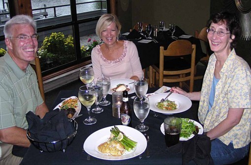
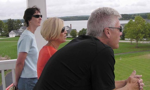
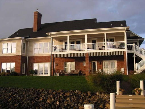
We've just had a delightful visit with Bev and Bill Daly. Bev is my cousin, and she and her husband Bill have retired to a beautiful home on the shore of Smith Mountain Lake about an hour east of Roanoke, Virginia. We went out for a delicious dinner with them the first evening.
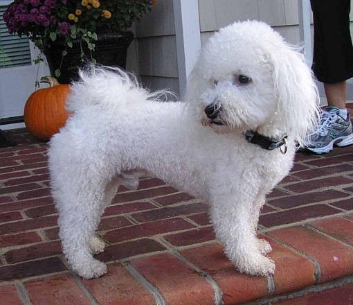
The other member of the household is Conan, their Bichon/Poodle mix, about two years old. He's a fun dog, very friendly and playful. About the name, Bill said such a poofy little dog should have a macho name!
The weather was cloudy, windy and sometimes stormy, but fortunately we again avoided any rain when we were out, as on this walk around their neighborhood.
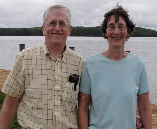
Here's proof that I actually AM on this trip!

Bill took us out for an enjoyable long ride around part of the lake on his boat. It's too big to cover it all in a few hours, but we enjoyed what we saw.
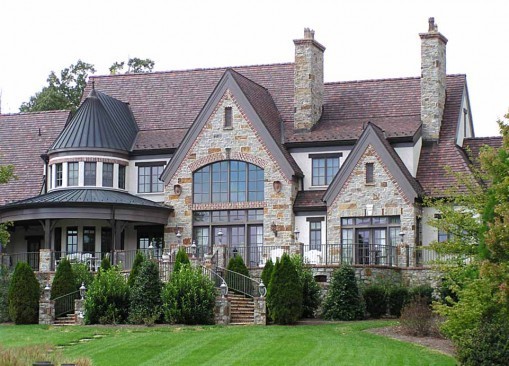
There are some amazing mansions, as well as lots of typical houses and even trailers and camps. There's also a preserved section, a state park.
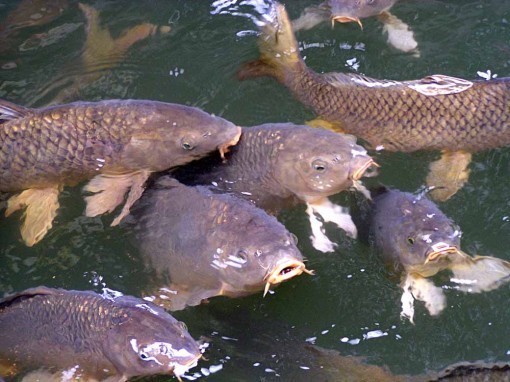
At one stop we saw these giant carp that are loose in the lake, but gather here because people feed them bread.
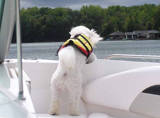
Conan likes to man the prow, and has his own life jacket, just in case.

On our final morning here the sun finally emerged after one last thunderstorm.
We were sad to leave behind the Daly's and their lovely home, great guest room and home cooking, but it was time to move on to our next stop, Asheville, NC. More on that next.
September 26, 2011
Visiting with Thomas Jefferson
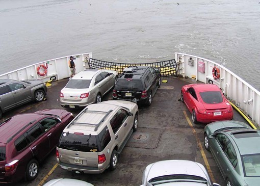
Ellen and I are on vacation, and we began our trip on the Cape May NJ to Lewes DE ferry, crossing the mouth of the Delaware River. It's about 13 miles, and takes 70 minutes, but a pleasant way to begin any trip, though this voyage was under dark, cloudy skies and through misty waters, but at least no rain.
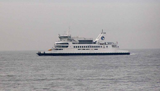
Here's one of the other ferries making the return trip. We always man the deck looking for birds on such trips, but didn't see many this time. And we had more rain and fog on our drive west through Delaware and Maryland and into Virginia, where we skirted Washington DC and headed southwest to Charlottesville for our first stop.

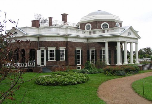
We stayed near the University of Virginia, a school founded by Thomas Jefferson, and one where he was the architect of its earliest campus, including this handsome Greco-Roman Rotunda. Note that the capitals on the columns are covered in black material, perhaps being treated or worked on. On either side you can see covered walkways connecting the original dorms and classrooms, which also has a walk on top of it.
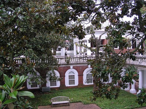
We walked around these, looking down into enclosed courtyards with huge Magnolia trees inside, as well as grass, brick walks and benches. Not sure if these were designed by Jefferson himself, but they're quite old and beautiful.
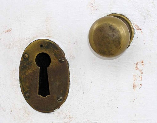
We arrived too late to go inside the Rotunda, but I liked the giant keyhole in the upper doors, looking like something out of Alice in Wonderland.

Ellen had a peek inside, where she saw a statue.

On Sunday morning we drove a short distance to Monticello, Thomas Jefferson's famous home and estate on a hilltop nearby. In the visitor center is this life-size bronze statue of Jefferson where I'm sure nearly every visitor wants a photo with the Prez. Ellen did! Jefferson was quite tall for his time, when people were shorter on average than they are now. He must have cut quite a figure in Washington.
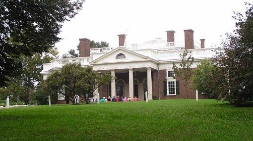
Taking the shuttle bus up the hill to the house itself, we waited out front for our guided tour to begin, looking around some of the front garden. While the sky was threatening, thankfully it didn't rain while we were here.
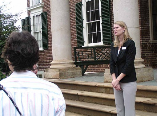
Our tour guide, Kelly, was very good, and we enjoyed our half-hour tour inside the house, though unfortunately photos are not allowed. If you ever get the chance to visit, I highly recommend it. Jefferson was not only a talented architect, he was well ahead of his time in many ways, and the results are evident everywhere inside.
Outside again, the back of the house is even more attractive than the front, and the gardens are lovely. We did a tour of them as well. Raised walkways extend out at either side, similar to those at the Rotunda, and beneath them are all the working areas of the house: kitchens, storerooms, washrooms, an ice house, and so on. The house itself is meeting rooms, dining rooms and bedrooms.
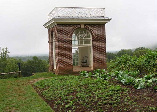
This small building in the vegetable garden, where Jefferson used to sit and oversee work on his grounds, is delightful, and views all around are wonderful, though they were not so good this day because of the low clouds and mist. We greatly enjoyed our visit to Monticello. Now we're visiting my cousin Bev, and her husband Bill further south in Virginia. More on that soon.
September 24, 2011
In transit
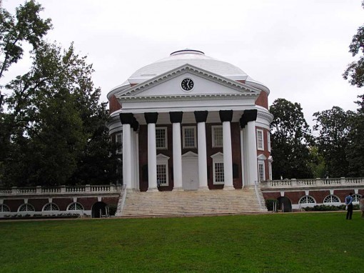
Just a quick post to say that Ellen and I are traveling, so posts will be infrequent and probably mostly travel pics for a while. We were at the University of Virginia in Charlottesville today, here's their Rotunda, designed by Thomas Jefferson. More pics soon, when I have time. Monticello tomorrow.
September 23, 2011
And Then I Read: SINESTRO

Images © DC Comics, Inc.
I imagine this is the last of these, as all the main characters except perhaps Carol Ferris seem to have been covered. As a tie in to the film it's okay, as a comic it's not impressive. There are two stories, the main one starts with Sinestro learning of the death of Abin Sur, then we see him in flashback taking part in a people's revolution of sorts on his own world of Korugar years ago, and suddenly finding a Green Lantern ring on his finger. As in the film, he is then transported to Oa where Abin Sur is ready to instruct him in all things GLCorps, but Sinestro would rather just go right home and settle a few scores. Back in the present, Sinestro is remembering this as a valuable life lesson from Abin Sur as the story ends. You know, I always thought the name Sinestro was an unfortunate choice, drawing on the word Sinister (which in itself originally meant left-handed!). Hard to take a hero seriously with a name like that, we all know where it's going …
The backup story is a simplified primer on Oa and the Guardians which might inform anyone new to the Corps, but is a yawn for those already fans.

There are three artists listed in the credits, I think the beginning of the story is by Harvey Tolibao, seen above. The art is rather confusing to look at: too much going on, not enough clarity in the layout and pieces of figures. The faces of Sinestro are not particularly good either in my opinion.

As I read the story I came to a different art style that gave me the feeling of sudden clarity, as if I'd been reading without my glasses, and now put them on. Great figure work, clear layouts, expressive "acting," great detail work and lighting. Of course, it's Jerry Ordway, filling in again on this title, and doing it so very well! 'Nuff said.
Mildly recommended.
September 22, 2011
And Then I Read: THE SPIRIT 17

Images © Will Eisner Studios, Inc.
I was not a fan of the lead stories in this Spirit series, but I did like a number of the backups in black and white (along the lines of the "Batman Black and White" series). First, the stories were short, like Eisner's. Second, the writers and artists were all interesting choices, though of course some were a better fit for the feature than others. For the final issue they've skipped the lead story and run three of those Black and White backups, and what a stellar lineup of talent creating them!

First up is writer Howard Chaykin with artist Brian Bolland. Getting Bolland to draw any story is a rare feat, and it's great to see him enjoying the characters here. Chaykin's story is a murder mystery with a film noir feel, but also some black humor, and the banter between Dolan and The Spirit is great stuff. Bolland's style is almost too realistic for the feature, but he does get some cartoony exaggeration in there in his own way, and the story is a delight.

Next we have writer Paul Levitz and artist Jose Luis Garcia-Lopez, who I think comes closest to Eisner in approach and feel, and his gray wash inking adds wonderful depth and appeal to this wintery story. A small-time crime tale about a newsstand owner and the crook that forces him into selling phony lottery tickets is just the kind of thing Eisner would probably have written himself, and Paul does a fine job with it. The one thing I didn't like was what happens to the newsstand owner. Eisner would have given him more justice, I feel.

Finally we have a story written by Will Pfeifer and illustrated by P. Craig Russell. This one takes place in an art museum, and cleverly runs on parallel tracks. One track has two janitors talking about the artwork, while the other has The Spirit in a hearty fistfight with a would-be art thief. The two tracks intersect and cleverly comment on each other in a way that's quite creative, making this the best -written story here in my opinion, and Russell's art is wonderful, as always, with a light-hearted approach that mirrors the humor in the story. His Spirit might look the least like Eisner's, but I'm sure Will would have loved this tale.
What an amazingly choice group of creators this comic has, and I note that all but Pfeifer have been active in comics since the 1970s, and I'm sure knew Will and his work for decades. If the entire run of this title had been as strong, it would have not only survived, but probably swept the awards. Let's be grateful for what we have here. Highly recommended!
September 21, 2011
And Then I Read: JUSTICE LEAGUE 1

Images © DC Comics, Inc.
Here it is, the first of the 52 new titles and relaunches from DC. Naturally they put their heavy hitters on it, writer Geoff Johns, and artists Jim Lee and Scott Williams. And it does start over from the beginning with these characters, as they begin to meet for the first time: Batman and Green Lantern first, joining forces somewhat reluctantly to deal with an extraterrestrial robot of some sort. A new scene introduces Vic Stone, who does not seem to have become the Cyborg character seen on the cover yet, and finally one more key hero appears at the end. The other members of the cover team appear only in ads and costume design sketches. This might seem a cheat, but I thought it gave the story some room to develop more naturally this way. Geoff Johns continues to write heroes well, and a few hints are dropped about what sort of world those heroes are finding themselves in. One that is afraid of all superpowers, for instance. And that villain? He drops the name Darkseid before exiting the scene. A good start, I thought, it made me want to see more.

The art by Lee and Williams looks great, full of energy and style, and with lots of action handled well. The character moments are also nicely drawn. All the costumes have been redesigned, but most in subtle ways that take a little extra examination to notice. At a glance, all the heroes seem familiar, but the tailoring and arrangement of colors and materials have changes. I found nothing wrong with any of that, it all worked for me.
Recommended!
September 20, 2011
And Then I Read: NEW TEEN TITANS, GAMES

Images © DC Comics, Inc.
Over twenty years in the making, as they say, this project began in 1988 and was always intended as a separate stand-alone graphic novel about the then very popular teen super-group. Writer Marv Wolfman and artist George Pérez came up with a plot, then George started drawing, but at a much larger size than usual, as he wanted this to be full of the detail his work is known for, and expected the deluxe format would show that off well. The art is not standard proportions, so I'm not sure if it was originally intended to print at the present 8 by 10.75 inch size, but it sure looks good, and George is aided by fine inking from Mike Perkins and Al Vey (as well as some of his own) and great coloring by Hi-Fi. The lettering by Travis Lanham is also good.
George worked on, getting well into the story, which Marv would dialogue when it was all finished, but at some point felt he needed to move on from the Titans to new projects. The book sat unfinished for years, though George did work on it some more occasionally, but it wasn't until recently that the art was all completed. By that time both Marv and George had forgotten the details of their original plot, and some things needed to change with the times, so they worked out a new storyline that incorporated nearly all of the completed art, and here it is.

If you were a Titans fan in the eighties, as I was, you will certainly want to have this. Even if you weren't, it's a great read. The plot is complex, the character list is long, as it incorporates not only all the Titans but also many of their friends and family. The storytelling is excellent, and of course the art is wonderful. If you were to make a film of it, it would come out something like "Mission Impossible" with superheroes. There's government agencies, dirty tricks, a dozen or so villains with powers and/or bombs, and a chess-like plot to essentially destroy New York City. Despite the setting, this didn't echo 9/11 for me, it was too different in approach. I'd forgotten some of the relationships and interplay between the characters, but Marv and George bring it all to life, and soon I was back in the Titans world and loving every moment of it. There's plenty of action, suspense, and real danger. One character does not survive. Others are badly hurt. Yet the team dynamic and the camaraderie bring it all home quite well.
Highly recommended!
September 19, 2011
How To: Charlton's Lettering Guide

Images © Charlton Comics or the respective copyright holders.
Yesterday I wrote about the Famous Artists lesson on lettering and showed this mini-comic cover, mentioning it contained the only information I could find on comics lettering when I was trying to get into the business in the mid 70s. I got it then, and I believe I still have it somewhere, but haven't seen my copy in many years. Several readers sent me the entire booklet in PDF form, so I thought I'd write about what it contains on comics lettering, a mere four pages out of 36, but it was enlightening to me then, and is still somewhat useful now for anyone interested in hand-lettering.


I'm putting the first and last of the four pages together because they contain continuous text, with the pages between having drawn instructions and samples. So, let's look at what's written here. Everything is short and to the point.
A. TOOLS: Speedball B-6 is what many letterers were using when I started at DC, but for regular balloon lettering they usually filed down the sides of the point to make a thinner line, a tricky job that I never really mastered. I did nearly all my balloon lettering with technical drawing pens instead for my first few years. When I tried dip pens again, I used a C-6 wedge-tipped point instead of the rounded B-6. Also note that the name of the plastic lettering guide is misspelled, it's "Ames." Most of this is covered better in the drawing below.
B. YOU BEGIN TO LETTER: The one thing I highly disagree with here is the last sentence, "Some letterers prefer to underline emphasized words." Maybe someone at Charlton did that, though I don't recall seeing it, but at DC and Marvel, no one did that. I tried it occasionally when the script called for a hand-written note, and was once reprimanded by Julie Schwartz for it. "Nothing in comics is underlined!" he told me. (I still do it for hand-written notes…)
D. BALLOONS: The description and differences between Dialogue and Thought balloon shapes point out one of the problems with the older style of dialogue balloons, which where shaped with large, wide scallops (see the examples below). When you do that, there's less to set them apart from thought balloons which also have scallops, though smaller and more of them. Of course these days thought balloons are rare, so it's not much of an issue, but the movement to mostly oval and round speech balloons can be seen as a way to keep them separate from thought balloons visually.
E. PANELS: I kind of miss inking panel borders, one of the letterer's jobs for the vast majority of comics art when I started, and until computer lettering took over. A few artists insisted on inking their own borders, but most were happy to have the letterer do it. Now it's often the inker's job, and the inker also has to completely ink all the art even where the lettering will cover it, where with hand-lettering part of each panel was already accounted for. No wonder inkers hate computer lettering!
G. SWIPES: I never really had this, just a large comics collection. When I was on staff at DC, of course, the world's greatest swipe file was right in the Production Room, rows of file cabinets with all kinds of reference: logos, panels clipped from old comics art, cover photostats, piles of original cover lettering by Gaspar Saladino and others. And mine, too, after I was there a while.

Here's the first of two hand-lettered pages by Frank Bravo, dated 1973. I don't know the name, but Charlton didn't always give lettering credits, so that's not surprising. As a letterer he wasn't really that good. His basic alphabets are okay, but some of the other work on the open title here and the display lettering on the next page is barely of professional quality. Perhaps he was a staffer who pitched in on lettering when needed. And remember, Charlton was kind of the low end of the comics business, pay wise, so perhaps their standards were lower. I know on some Charlton books they did lettering with a kind of giant typewriter (credited as A. Machine), and some of their artists like Joe Staton and Jim Aparo did their own lettering. That aside, all the advice and examples given above are perfectly fine for a beginner, and the information about the Ames Lettering Guide (spelled right here) is what put me in the know on that subject, and very similar to MY OWN instructions for new letterers. I never used the angled edge of the guide for italic guidelines, though, I just winged it, as did other letterers I learned from.

Here's where Frank Bravo goes off the rails a bit, some of this is pretty dubious, though it does get the idea across. But, looking at these examples when I was trying to letter samples to show to the comics companies, I was already thinking, "I can do better than that!" I might have been wrong then, but once I got rolling it was true, at least. And remember, this booklet was all the help available to someone outside the business at the time, so really, I owe a lot to Charlton for it! They used to give these away with a subscription to any of their titles, and I bet they got a lot of subscriptions that way.
Todd Klein's Blog

- Todd Klein's profile
- 28 followers

