
Todd Klein's Blog, page 338
July 15, 2011
San Diego Prep
Getting ready for this year's biggest con, where I'll be for the 19th consecutive year. I'll be arriving Thursday afternoon, staying through Sunday, going home Monday. As usual, I won't be at a table or booth, just wandering around. My primary activity is chatting up friends and workmates, but I'll also do a bit of shopping, take pictures for my blog reports, and appear on the FABLES panel Saturday evening. I'm hoping to have daily blogs from the con. I usually write them up in the morning before going to the convention center for the day. This year I have an iPhone and am on Facebook, so I might drop a few pics on there beforehand.
So, the most important preparation is getting caught up with work. On Wednesday I received the last two books I needed to letter before the con, as far as I know. I finished THE UNWRITTEN 28 yesterday, and half of FABLES 108 today. I'll complete that over the weekend, along with a logo job. There will be corrections to do next week as well, I'm sure, and probably at least one frantic last-minute thing of some kind.
Other prep work: I've broken in a new pair of walking shoes. I've gathered all my reservations, dinner invites, plane tickets, hotel info, and other paperwork. I've gotten my plastic bag of liquid toiletries ready. (Such a pain!) Had my hair cut. Made sure all my clothes needed for the trip are clean. I'm not bringing any signed prints this year. I had some last year, and sold a few, but have decided it's not worth carrying around that extra weight. So, if you want them, order them from my website.
Looking forward to the con. It's always exhausting, but I wouldn't miss it!


July 14, 2011
And Then I Read: KILOWOG 1

Images © DC Comics, Inc.
This is one of several movie tie-in books put out for the Green Lantern movie. Kilowog has a fairly long history in the comics, having been introduced by writer Steve Englehart and artist Joe Staton in 1986, and he's portrayed in the film much as in recent GREEN LANTERN comics, as a sort of drill instructor for the Green Lantern Corps, with a gruff personality to match.
So, writer Peter Tomasi's task in this book was to tell an entertaining story about Kilowog that takes place right before the film's story, a "prequel," and he does that quite well. We see Kilowog in action as a trainer of new GL Corps recruits, telling them how things are in no uncertain terms, and leading them in battle against an attack by the Spider Guild. (Since I co-created the Spider Guild with Dave Gibbons, I particularly enjoyed that part!) A second minor storyline involves a GL Corps member with precognition trying to alert the Guardians that big trouble is on the way. And, of course, they don't want to listen. At the end, another long-time GL, Tomar Re shows up with bad news for Kilowog that leads right into the film plot. In all, a good read, and a nice look at life on Oa for new GLs in training.

The art by Carlos Ferreira and Silvio Spotti is pretty good, though I don't think it's quite up to the standard seen in the regular GL books. The team does a nice job creating a variety of new alien GLs, but I felt did not do so well with Kilowog, though that may be just my not liking the visuals of the film version as much as the Kilowog seen in the comics pre-film.
Recommended.
July 13, 2011
And Then I Read: NEONOMICON 4

Images © Avatar Press and Alan Moore, art by Jacen Burrows.
First, I should point out that this comic contains scenes of graphic violence (well, look at that cover, for example), sexual themes and adult language, so anyone easily offended by such things should probably read something else.
The final issue of this new Lovecraftian horror series by Moore and Burrows wraps up the storyline and provides some answers as to the fate of agent Merril, as the FBI descend on the scene of her kidnapping and destroy the creature they find there. The rest of the issue is aftermath, but is perhaps the most interesting part of the story, as Merril explores what happened to her with new insight that only she, among all the people of the world, can have. I'll leave it there for you to read yourself if you're so inclined. A collected version should be out soon.

This is one of the few pages I feel I can show here on what I'd like to think is an all-ages friendly site, with Merril talking in Lovecraftian guttural language to Aldo Sax, who I've just realized was in a previous connected story, "The Courtyard," which I haven't read. I believe both stories will be in the new collected edition. The art by Burrows is quite good, and does not shrink away from anything Alan asks for, so be warned, though this issue is not as graphic as the last two.
In the most recent PREVIEWS, Avatar published a short interview/article with Alan Moore where he discusses what he was attempting to do with this story. In particular, what it might mean to introduce a female protagonist into Lovecraft's mythos, where none had gone before. It's illuminating, worth a look if you can find it. As always, Alan put a lot of thought into what he wrote here, and it's certainly thought-provoking, though I have to admit the ending did remind me of a certain horror film from the 1960s. You'll get that if you read the story.
Recommended for those who like Moore at his most horrific!
July 12, 2011
And Then I Read: THE FLASH 11 & 12

Images © DC Comics, Inc.
As FLASH races toward FLASHPOINT, issue 11 brings the Flash friends and family together for an intervention with Barry Allen. Apparently he's been so busy saving the world he's neglecting those who care most about him. It's an interesting idea, though it doesn't get too far before another super-speedster appears to make trouble. Isn't it always the way? And the big reveal at the end uncovers the true villain of the series at last.

While I enjoyed the story, I can't say the same about the art by Scott Kolins. I'm afraid I just don't like his art, I find his figures badly proportioned, stiff, and poorly drawn. Yes, he does toned art like Francis Manapul, but the comparison stops there.

In the final issue of this FLASH run, I believe, the struggle between the speedsters comes to a crackling conclusion. One of them will die, but once again the real villain escapes, no doubt to resurface shortly in FLASHPOINT. This issue has lots of action, and I enjoyed it.

And best of all, the last four pages have art by Francis Manapul, a breath of fresh air and a welcome return. Don't know where his art will appear next, but I'll be looking for it. I really like his tonal style.
Recommended more for the story than the art otherwise.
Today's Garden Pics
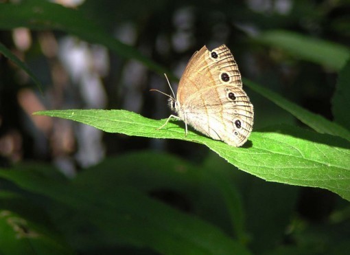
A Little Wood-Satyr butterfly. Cool name for a bland creature, though the eye spots are appealing. A bird must have nipped one.
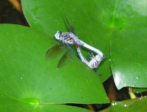
Dragonflies mating on a lily pad in the pond. We had the same type last year, but I don't recall the name and don't have time to look it up. Afterwards the female seemed to be dropping eggs in the water.
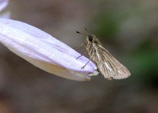
Skipper butterfly on a Hosta flower. There are dozens of Skipper species, don't know which one this is. They're hard to identify, and even more bland!

An Eastern Box Turtle in the compost pile. I think this is a female, judging by smaller size and drabber colors than the male I showed here last month.
July 11, 2011
A Print Testimonial and Suggestion

Image © Mark Buckingham and Todd Klein, all rights reserved.
One of my regular customers just ordered another copy of this print. He's bought several. This time he wrote, "FYI — Each Beast is a a GREAT new baby gift – its a huge hit every time I give it. Might be a good way to promote the item!"
Thanks for the suggestion, Jeremy, consider it done! Have a new baby in your circle of friends and family? Here's a unique gift that might be just the thing. $20 plus shipping HERE.
End of plug, Mark and I thank you for your consideration!
And Then I Read: MARIEL OF REDWALL

© Estate of Brian Jacques, illustration by Tom Canty.
It's taken me a few weeks to get through the fourth lengthy novel in this fantasy series, due to distractions like a new iPhone, but I think I enjoyed it the most of the three I've read so far. This book once again introduces a new group of characters from a different time period in the history of the anthropomorphic animal-inhabited Redwall Abbey, and they're all entertaining, though the dialect of some is a bit thick and hard to get through, particularly the moles and hedgehogs. There are certain familiar scenes that reappear in each book like comfort food; in fact eating is one of them, as the animals of the Abbey feast continuously on rich and intriguing dishes, but there are enough new ideas in this volume to keep it interesting. For one thing, the villains are searats, the pirates of this world, so we have a lot more traveling on water than before, across a large ocean to and from the island of the searats, and along a river to Redwall, not to mention traversing a treacherous swamp.
The plot is complex and melodramatic at times, almost Dickensian, with exciting battles, and individual deeds both dastardly and heroic, but there is also plenty of time for humor, pathos, wisdom and even romance here and there. Jacques really seems to have hit his stride with this book. And the thing that took me out of the story the most in the previous three, the fact that warrior mice could thrash creatures much, much larger than themselves in hand-to-hand combat, is largely avoided this time, with the contests seeming more equal.
It's not The Lord of the Rings, or Wind in the Willows, either in content or quality, but there are some elements of each in this series, and it makes for enjoyable, entertaining reading. Great for the summer, and recommended.
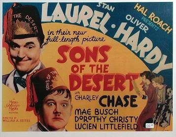
July 10, 2011
Logo Study: LAUREL & HARDY

It's been quite a while since I wrote anything about logos, and my time is short now, so here's a brief one.
Like many Hollywood stars, comedians Stan Laurel and Oliver Hardy appeared in the comics, probably through a licensing deal with their agent, though that's only a guess. Surprisingly, their first few comics came from St. John, a small publisher. The logo was a fairly typical humor approach. In their films, there was no standard logo for the team that I can find, a variety of different ones were used, some mere standard type, some more like this one.
On lobby cards, a similar approach was common, like this for one of their better features. Showcard lettering was mostly hand-lettered at the time, just like comics, and probably by some of the same people.

Back to the comics, the third and final issue of this first St. John series is signed Reuben Timmins. I haven't been able to find out anything further about these issues, the Grand Comics Database has nothing on the contents.

In 1955-56 St. John reprinted their three issues with a redrawn but very similar logo, again in typical humor comics style.

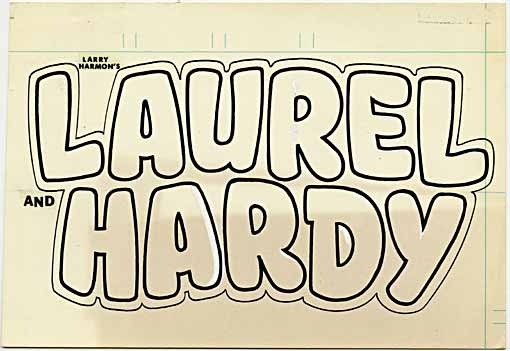
In 1962 Dell Comics, purveyor of many film-related properties, began a four issue series on the comedy duo. Here, for the first time, Larry Harmon is listed at the top. Harmon was best known for playing "Bozo the Clown," a property he bought the rights to, and marketed heavily in the 50s and 60s. I can only guess that he bought the licensing rights to Laurel and Hardy and tried to do the same with them. It's doubtful that he drew the comics, but again I have no information on who did, nor does the GCD. As is typical with Dell comics of the time, the logo is type-based rather than hand-drawn, though Harmon's name looks like it might be hand-drawn. The art deco font chosen for the character names is not a bad choice, echoing the period of their film success, but the layout is a poor one and doesn't really evoke the films at all.

Here's the cover of the final Dell issue from 1963. Nothing much to say about it, really.

In 1967 Gold Key put out two issues featuring the pair. I suspect these were reprints of the Dell material, though again I have no information on the contents. Gold Key inherited many of the properties and staff of Dell, and this cover design is typical of their line at the time. The logo is again type-based, more lively this time, and using a font that is very 1960s, but still quite appropriate for the characters, I think. And the addition of pictures of the actual movie stars is not a bad idea. Laurel and Hardy comedies were a staple of daytime TV programming for kids when I was young, and I think many children would have recognized them. That doesn't seem to have made the comics sell well enough to do more, though.

In 1972 one final Laurel and Hardy comic was published by DC, where the comedy pair seemed like a good fit with other DC movie characters like Jerry Lewis. There had been many more such comics from DC in the past, but by 1972 those series were fading, and perhaps it was too late for the comedy duo to succeed with DC comics fans, who had shifted much of their interest to horror, war and superheroes rather than humor. For the first time I can report the artists on both cover and inside art: Mike Sekowsky and Henry Scarpelli.
Here's the original logo from the DC files. The character names look like the work of Gaspar Saladino to me, though the addition of "LARRY HARMON" and "AND" in press-down type suggests that the entire thing might have been done by someone on staff at DC. Either way, it has a nice, humourous bounce, perfect for a funny comic, and similar to others of the time. It's a more rounded look than any of the previous logos, which seems appropriate to me.
That's all I know about this one! Other logo studies can be found on my LOGO LINKS page.
July 8, 2011
And Then I Read: BRIGHTEST DAY 24

Images © DC Comics, Inc.
The final issue of BRIGHTEST DAY is mostly about Swamp Thing, as you can see on the cover. Something of a surprise, as he's not been part of the story until last issue, but perhaps if I were paying more attention to the strange forest that sprang up earlier I might have guessed it. Not only this Black Lantern Swamp Thing, there's another one fighting for Earth and for The Green, so it comes down to the clash of these two elemental figures in the end.
Like BLACKEST NIGHT, there's a big surprise reveal where a character long dead comes back to life. I won't say who to prevent spoilers, but it was a nice moment, even though it came amidst a flurry of explanations about how he wasn't quite the same as before. But compared to BLACKEST NIGHT, it's not as momentous. There's the climactic battle, in which that damned white lantern is still pushing everyone around, and then the aftermath, in which some storylines are wrapped up, while others will no doubt continue to develop.

Here's that lantern messing everyone around. Even the bad guys are forced to do things they don't want to do! Nice art on this book, and in the entire series.
Not a bad wrap up I suppose, but I'm happy to put this overblown epic behind me. Mildly recommended.
July 7, 2011
And Then I Read: BRIGHTEST DAY 23

Images © DC Comics, Inc.
It's taken 23 issues, but I think I just realized what's been bothering me about the storyline in this series. I've been saying it's plot driven, meaning that the story does not flow naturally from the characters and their personal motivations, but is directed by the writers to meet certain goals they have planned. But, in this series, the driver is even more obvious and blatant than usual: it's that damned white lantern. The voice of the white lantern keeps telling characters what to do, and it's almost always things they don't WANT to do, and when they resist, it makes them to those things anyway! Talk about "deus ex machina," this book has it front and center throughout. Now, I can understand that this sort of event needs to be somewhat plot driven, that's the point: to create at least the appearance of major changes in the lives of the characters, who will generally not be happy about those changes. After all, it's our nature to resist change. But this level of plot control makes the characters seem mere puppets.

Here's that white lantern jerking everyone around, as it does on nearly every page of this issue. Forcing four of the characters to take on the aspects of the four classical elements, for example, to combat the black lantern version of Swamp Thing. It all seems very mechanical and contrived. Sure, cool fights, if that's what you're after, and the art looks fine, but characters you can identify with and care about? Characters that act like real people and make decisions based on their personal beliefs and moral compass? Thin on the ground.
Can't recommend this issue.
Todd Klein's Blog

- Todd Klein's profile
- 28 followers

