
Todd Klein's Blog, page 119
September 10, 2019
Pulled From My Files #98: DC Inside Cover Art
 This and all images © DC Comics.
In my first few years on staff at DC Comics I was given all kinds of odd jobs, and I enjoyed the challenges and variety. Here are a few that I kept, and which I will have for sale at the Baltimore Comic-Con this Oct. 18-20. Above is the inside front cover of the Legion of Super-Heroes Tabloid, official title ALL-NEW COLLECTORS’ EDITION VOL. 7 #C-55, 1978. For this essay probably written by Paul Levitz about the origins of the LSH, I made an open book against a starry background with decorative title and initial capital “I.”

I had even more fun with the biographies on the inside back cover, creating a space scene with small starships. I hand-lettered the note at top left from Joe Orlando (and got him to sign it), and the creator names. I also ordered the type on these and pasted it into the layout, probably drawing around it after it was pasted.

For ADVENTURE COMICS #459, Sept.-Oct. 1978, I created this layout for the inside front cover. The background, which looks like a type of zipatone, is actually all drawn with a very small-point technical drawing pen. (Hey, I had the time and energy then.) The text is hand-lettered.

Here’s how it appeared in print with Gaspar Saladino’s logo and display lettering added with drawn push-pins and shadows probably by me. A gray tone was added over the background pattern. This layout was used for a number of the following issues.

I saved this one from issue #462, where new editor Ross Andru had some introductory words to say. Again, I got him to sign it. Sadly, the contents are mostly done in type rather than lettered. On this one I found the gray tone in the background was zipatone, which I hadn’t remembered adding.

Here’s one I had a lot of fun doing, a rare example of figure art from me, not something I’m good at. The gray shadows were painted with gray paint with the idea that they would be screened with a fancy half-tone pattern, since the grays would not reproduce otherwise in the system then in use for inside covers.

Here’s a sample of that halftone process. Rather than the usual dot screen, this one gave the impression of cross-hatching. I thought it was pretty effective.

Sadly, this is what it looked like in print on the inside back cover of the tabloid comic LIMITED COLLECTORS’ EDITION #C-59: BATMAN’S STRANGEST CASES, 1978. My eerie Batman head was not deemed appropriate, and another one clipped from a cover or other source was pasted over it. Not sure who the artist is, but it might be Jim Aparo. I was still allowed to sign the piece, but it was an early example of not always getting to do things the way I might have wanted, and a reminder that comics are a team effort led by an editor, who gets the final say.

One more that’s not from an inside cover, this map of Paradise Island I drew appeared in WONDER WOMAN SPECTACULAR, DC SPECIAL SERIES #9, 1978. Larry Hama was the editor, and I worked from someone’s rough layout and notes. I don’t know who did that, but my guess would be E. Nelson Bridwell, the DC history authority on staff at the time.

On the facing page was this legend describing all the numbered items on the map. It’s all pasted except the words “The MAP of” which I lettered. I enjoyed doing this map using the isometric projection method, and would have done more if the opportunity came up.
That’s all for now, if you’re going to the Baltimore Con you can see the originals at my table, unless they’re already sold by the time you come by.


September 8, 2019
And Then I Read: TEHANU by Ursula K. Le Guin

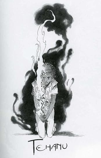 From “The Books of Earthsea” with color paintings and black and white
illustrations by Charles Vess.
Continuing my reading of the complete Earthsea in one new hardcover edition, the fourth novel was published in 1990, eighteen years after the third one, “The Farthest Shore,” but in the story it follows almost immediately after that book. The viewpoint character is Tenar, as in book two, “The Tombs of Atuan,” now a much older woman living on a farm on the island of Gont. She had been brought here by Ged after they escaped the Tombs and returned with the Ring of Peace to Havnor. For a while she lived with Ged’s old master, the wizard Ogion, but as she grew to womanhood she decided she wanted a more normal life. She moved down from Ogion’s cliff house to Middle Valley, where she met and married a farmer, Flint. He has died, but she continues to manage the farm with help from a few farm workers. As the story begins, Tenar is brought to see a terrible thing, a young girl who has been thrown into a campfire. One side of her face and one arm are badly burned, but somehow she’s alive. Tenar takes her in and nurses her back to health, but the girl, Tehanu as she comes to be named later, is as emotionally scarred as she is physically, and the occasional presence of her torturers, a group of two men and a woman (her mother) living rough in the woods, keeps Tehanu terrified. To escape this, Tenar and Tehanu flee to Ogion’s house and take up residence there, but soon another threat surfaces nearby, a wizard who works for the local landowner who seems to wish both of them harm.
While at Ogion’s house, the dragon Kalessin arrives with the barely alive Ged, back from his harrowing journey through the land of death, as seen in “The Farthest Shore.” Tenar and Tehanu gradually nurse him back to health, but he has lost all his magic. When the new king of Earthsea, Ged’s companion in the land of the dead, sends some of his men to find the former Archmage Ged, he flees into the mountains, unwilling to be found. To escape the malice of the local wizard, Tenar and Tehanu return to the farm in Middle Valley, but more trouble finds them there. Will Tehanu’s growing power and courage be enough to protect them?
This book is very different from the first three. It’s written for Le Guin’s adult audience, not necessarily just for young adults, and includes difficult issues like rape and torture, as well as mistreatment of women as a theme. At times we feel the powerlessness and terror of the main characters. Like the first three books, the writing is superb, and perhaps the maturity of the author gives it more depth. There is magic here, and dragons in unexpected places, but much of the story focuses on the characters and their struggles in a difficult time. Highly recommended.
September 6, 2019
And Then I Read: PLANET OF THE NERDS #5
 Image © Paul Constant, Alex Robinson & Ahoy Comics.
As editor Tom Peyer points out in this issue, writer Paul Constant has done something unlikely in this series, of which it’s the final issue: made us root for the bullies. Steve, Drew and Chad bullied classmate inventor Alvin, so when they entered his cryogenic freezing machine in the 1980s, he did nothing to help them. Thirty years later when they somehow came back to life, he didn’t even know about it at first. When he found out, Alvin was very happy to see them because he was now the CEO of a tech startup company about to launch cryogenic freezing for the masses. There’s just one problem with his plan…it won’t work.
I liked how this story resolved, and particularly the fate of the three bullies. In the backup story we see things from Alvin’s point of view, also interesting. Yes, nearly everyone in this story has moral flaws and bad deeds behind them, but it works all the same.
Recommended.
September 5, 2019
Pulled From My Files #97: DC PROMO BROCHURES
 This and all images © DC Comics.
When I started working on staff at DC Comics in New York in 1977, there were copies of this brochure from the previous year around, and I took a few home at some point. Dollar Comics were still being published at the time. The brochure is 8.5 by 11 inches and printed in red and black. The art is by Neal Adams, probably inked by Dick Giordano. The display lettering is probably by Gaspar Saladino.

Inside is a promotional comic spread again by Adams and Giordano, with pencil studies of two Independent News bosses by Adams. Superman and Wonder Woman appear. The lettering might be by John Workman, I’m not sure.

The back cover has more art by Adams and Giordano, I believe, without looking up those issues.

Here’s another more elaborate and expensive promo brochure from 1979. I might have worked on this one, but don’t recall it, so probably not. It’s on glossy card stock in four colors with fancy die cuts on each page. Some of the art inside is by Jose Luis Garcia-Lopez, not sure about the cover image.

As you can see, the die cut is shape of Superman on one side, with a square window that reveals the image on the last page.

The design of this brochure suggests to me it was not done by any DC staffer, but by someone brought in, perhaps from an ad agency. That’s just a guess.

The final page shows retailers some of the display spinner racks and stands they can get for comics. This seems to be aimed more at traditional newsstands than the direct market, which was just getting started then.
I’m putting my copies of these up on eBay next week if anyone is interested.
September 4, 2019
My Comics Life-List 1982
 Image © DC Comics.
This is the fifth in my ongoing series of articles listing where and when I first worked with other creators, mostly on inside pages, in chronological order based on cover dates of the comics. You can find the previous entries on the COMICS CREATION page of this blog.
Ground rules: I worked on staff at DC from July 1977 to August 1987, and in that time worked with every staffer and many freelancers in some capacity, and did art and lettering corrections on a host of comics. I can’t count those. Some of the things I did in comics did not usually involve working directly with artists and writers: logo design, house ads, cover lettering and production work of various kinds. Another thing I won’t count are relettering foreign stories, as I did for HEAVY METAL early on. To be added to my comics life-list, I thought I should be part of the creative team making stories. That means I was the letterer (in most cases), occasionally the writer, and rarely the artist or colorist. Of course this lists only the first time I worked with someone, so anyone from the previous year lists will not be here. Entries are tagged as a writer (w), artist or penciller-inker (a), penciller (p), or inker (i). I did not often interact with colorists (c) in pre-digital days, as my work was finished before theirs began, but I’m including them as an important part of the creative team. My credit is for lettering unless otherwise noted.
Scott Shaw! (p) NEW TEEN TITANS #16, Feb. 1982, Captain Carrot and his Amazing Zoo Crew 16-page preview
Ross Andru (p) NEW TEEN TITANS #16, Feb. 1982, Captain Carrot and his Amazing Zoo Crew 16-page preview
On this project, Ross did the Superman figures, Scott did the rest. I worked with Ross and knew him well at DC when he was on staff. Scott I only know from his panels at the San Diego Comic-Con, though we probably met at DC. I also lettered the first issue of the series, out the following month.
Pablo Marcos (i) BATMAN #345, March 1982
Pablo was a fine penciller, here he was inking a Catwoman backup story. A few years later I worked with Pablo when I was a writer on THE OMEGA MEN. We met in the DC offices, and he was kind and friendly, but I didn’t know him well.
Jan Duursema (a) WARLORD #55, March 1982, Arion, Lord of Atlantis backup
Jan was a wonderful, warm person who I got to know in her many visits to the DC offices, a rare female artist at DC at the time. I loved her art on ARION, and she’s still doing fine work today. We also worked together on the Arion logo.
Ron Randall (p) WEIRD WAR TALES #109, March 1982
Gerry Talaoc (i) WEIRD WAR TALES #109, March 1982
I know Ron from talking to him many times at the DC offices and later at conventions. I never met Talaoc. This was a two-page story early in Ron’s career.
Mike deCarlo (i) GREEN LANTERN #153, June 1982
I met Mike at the DC offices, but I don’t remember talking to him very often.
Pat Broderick (p) THE FURY OF FIRESTORM #2, July 1982
I don’t recall meeting Pat, though I may have.
Stephen DeStefano (a) HOUSE OF MYSTERY #306, July 1982
Stephen spent a lot of time hanging out in the DC offices in the early 1980s. In comics, he’s best remembered for ‘MAZING MAN, but for this title he did some one-page “I…Baby Vampire” stories that were great. Stephen was as fun and as funny as his art, and today he’s working in animation and teaching.
Jerry Ordway (i) WONDER WOMAN #295, Sept. 1982
Before Jerry became one of DC’s best superhero pencillers, he was getting work as an inker, here on a Huntress backup story. I talked to him many times as we worked together over the coming years.
Lou Manna (p) HOUSE OF MYSTERY #309, Oct. 1982
Sam Grainger (i) HOUSE OF MYSTERY #309, Oct. 1982
Nansi Hoolahan (c) HOUSE OF MYSTERY #309, Oct. 1982
These creators were all on a four page story, “Through a Lens, Darkly” that I wrote and lettered. I don’t remember Lou or Sam well, I think we met at the DC offices, and Lou has recently gotten back in touch on Facebook. Nansi was on staff with me, another production artist.
Gene Colan (p) NIGHT FORCE #4, Nov. 1982
I remember Gene from meeting him at the DC offices. We worked together a number of times, but this series was a highlight for me. I appreciate his art more now than I did then.
Sam de la Rosa (i) WORLD’S FINEST #285, Nov. 1982
I believe I met Sam, but do not remember him well.
September 3, 2019
And Then I Read: GREEN LANTERN #10
 Image © DC Comics. Written by Grant Morrison, art by Liam Sharp,
 colors by Steve Oliff, letters by Tom Orzechowski.
My favorite thing about this title is when writer Grant Morrison makes up new characters. In this one we have a group of Green Lanterns from wildly different parallel universes. One is a hippy, one a Batman type, one a dark sorceress, and like that. Their moments are charming, funny and wonderful. As the story cuts ever faster between universes, and the horrible villain is revealed, the story becomes more confusing and less fun, but it still has some nice moments. Liam Sharp rises beautifully to every challenge in the script, and his layouts and design work are delightful. This is truly a fun thrill ride.
Recommended.
September 2, 2019
The Danny Crespi Files Part 19
 This and all images © Marvel.
Continuing my look through a set of photocopied cover lettering and related material from the files of Marvel letterer Danny Crespi compiled by his friend, work-mate and fellow letterer Phil Felix. This time covering pages 73-76. Page 73, above, is all by Danny except perhaps the “Subscribe” banner. Sources I could find are below.
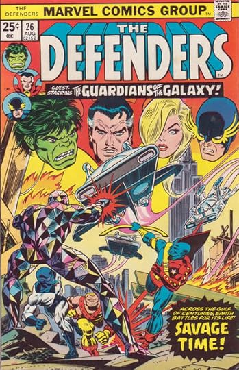
“Guardians of the Galaxy” is from DEFENDERS #26, Aug. 1975. The colors have been reversed from what was lettered, a common practice, done by making a negative photostat of the original lettering.
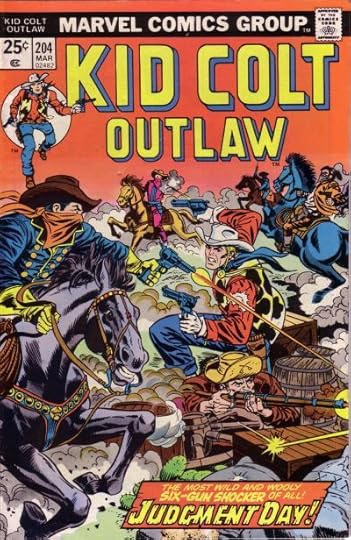
“Judgment Day” from KID COLT OUTLAW #204, March 1976. The added texture to the open letters works well to my eyes.
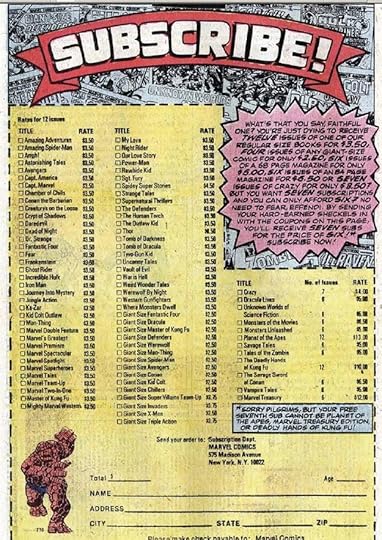
“Subscribe” appeared in a subscription house ad in mid 1975 titles, as supplied by Mike Adkins. Looking at the rest of the lettering on it, I now think it was probably all done by Danny Crespi, as the burst balloon shape is very much his style, and the lettering in it looks like his too.
I can’t find the other small blurbs or titles. “Battle of the Behemoths” is the story title of FANTASTIC FOUR #112, but this version is not used on that issue’s cover or splash page, nor as a next issue blurb on issue #111, OR on the first reprint of the story in 1980 in MARVEL’S GREATEST COMICS #92.

The Crespi Files page 74. All by Danny Crespi except “Rocket Racers,” which is by Gaspar Saladino. Sources below.
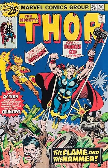
“Flame and Hammer” from THOR #247, May 1976. Nice work on the flame effect.
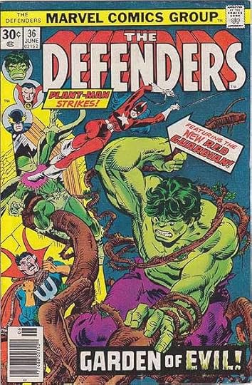
“Garden of Evil” from DEFENDERS #36, June 1976. Here the black fill around the letters gives Evil a dirty look, but that works well.
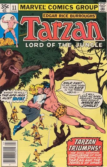
“Tarzan Triumphs” and the balloon at lower right from TARZAN #11, April 1978. After pasting a photostat of the caption at lower right on the cover, someone has made the outline thicker. Not sure why, it was fine before.
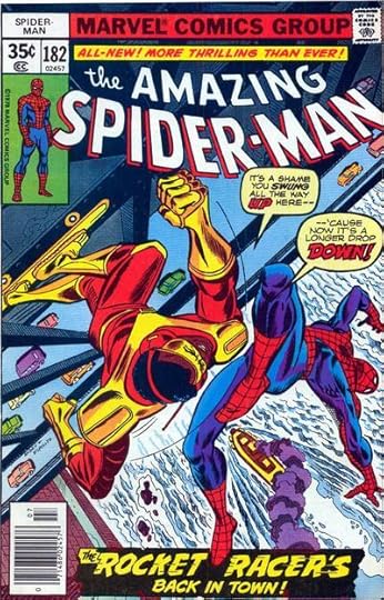
“Rocket Racers” and the line above it, both by Gaspar Saladino, from AMAZING SPIDER-MAN #182, July 1978. Note the upper and lower case THE, which Gaspar got from Ira Schnapp, and the thin outline on the open letters, plus the variable width of the caption border. Those parts are lost in the black fill of the caption box.
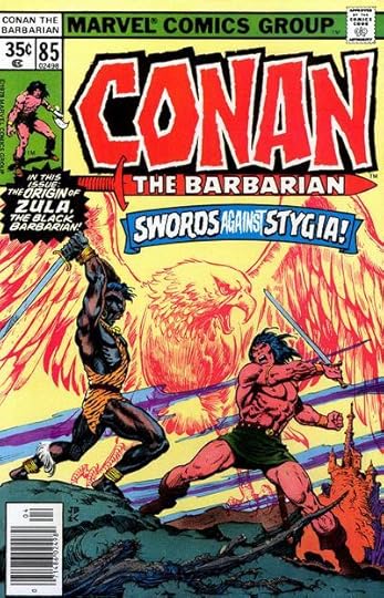
“Origin of Zula” from CONAN #85, April 1978.

Doomsday from THE HUMAN FLY #9 July 1978. Nearly all the lettering on this page has been reversed, white letters on black. Perhaps that idea was done too often at Marvel at the time.

Page 75, most by Crespi. Sources below, with help from Michael Styborski.
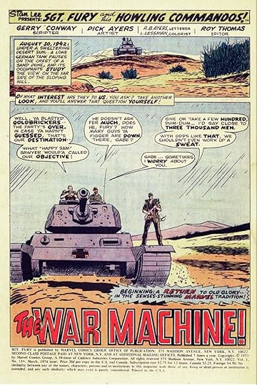
“The War Machine” is from the title page of SGT. FURY #118, March 1974. The story lettering credit is R.B. Ayers, meaning it was lettered by artist Dick Ayers himself, something I don’t recall seeing before, but then I wasn’t a regular reader of the book.
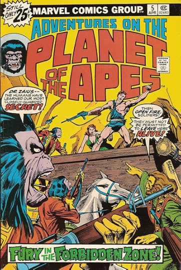
“Forbidden Zone” from ADVENTURES ON THE PLANET OF THE APES #5, April 1976.

“Murder Agency” from MASTER OF KUNG-FU #40, May 1976.
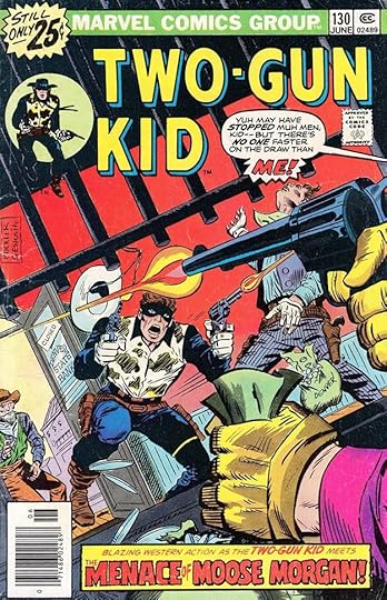
“Menace of Moose Morgan” from TWO-GUN KID #130, June 1976.
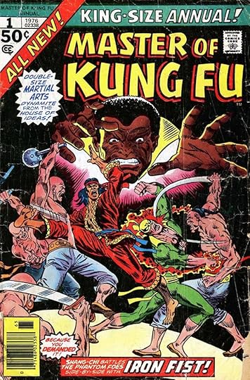
‘Fortress of Savage Fear’ is likely from MASTER OF KUNG-FU ANNUAL #1 April, 1976, but it wasn’t used either on the cover or the inside splash page. Michael Styborski reports, “On the cover we have Shang Chi, Iron Fist, and The Phantom Foes. Inside we have a fortress reference, plus a “popular demand” blurb arrow. All signs point to this issue as the target for the piece.

Page 76. This time, three by John Costanza, one by Danny Crespi. Details below.
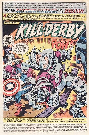
“Kill-Derby” by Costanza from CAPTAIN AMERICA #196, April 1976, page one splash. The lettering on the rest of the story is by D. Bruce Berry, but page one is clearly by John Costanza. His rounded cartoony open letters are distinctive, as is his lettering style.
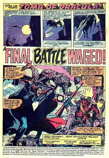
“A Final Battle Waged” by Costanza from TOMB OF DRACULA #42, March 1976, page one splash. this time Costanza lettered the entire story. BATTLE shows the influence of Gaspar Saladino to my eyes.

“The Rage of the Red Ghost” by Costanza from INVINCIBLE IRON MAN #83, Feb. 1976, page one splash. Again, John lettered the entire story. John’s title is very loose, picking up on the ghost theme. Why these story titles were saved in Danny’s files is a puzzle. For that to happen, they must have been lettered separately from the actual pages. Perhaps the story titles were not decided when the rest of the pages were lettered.
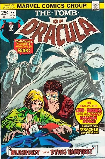
“Bloodlust for a Dying Vampire” by Danny Crespi from the cover of TOMB OF DRACULA #38, Nov. 1975. This title is rather weak for a cover, perhaps a rush job by Danny.
That’s all this time, more when I can get to them. Previous parts of this series can be found under the “Crespi Files” category in the right column of this page.
September 1, 2019
Letterer Appreciation Day 2019

Today is the third annual Letterer Appreciation Day, on the birthday of MY favorite letterer, the late Gaspar Saladino. Many letterers are probably working today, as I am, because deadlines don’t wait while you have a nice weekend, and somehow things are always late by the time they get to us. If you know a letterer, or more importantly, if you work with letterers, let them know you appreciate them today. Thanks to Nate Piekos for the fine image.
August 29, 2019
Rereading: THE FARTHEST SHORE by Ursula K. Le Guin
 Illustrations by Charles Vess from the new Earthsea collected edition hardcover.
In the third Earthsea novel, first published in 1972, Le Guin skips ahead over twenty years. Ged is now the Archmage of Roke, and resides there as a teacher and guardian, but reports are coming to him of failing magic and mass forgetting of all kinds of knowledge from the distant border islands of Earthsea. When Arren, the young crown prince of the island Enlad comes to him with a similar story, and a pledge of service to Ged himself, Ged decides that he and Arren must set sail alone to the southernmost islands to try to find out what’s happening.
In those islands, they discover an evil presence that appears to people in their dreams, especially wizards and those with skills and knowledge, tempting them with the promise of eternal life if they will only follow him into the dark lands of the dead. Eventually Ged discovers it’s a wizard he once defeated, Cob, who is behind it. He has opened a hole between life and death through which all the good things of life in Earthsea are draining away. Ged and Arren continue their journey to find Cob, but Ged is badly wounded in the process. It will take a dragon to lead them to Cob, and even the dragons are losing their powers and their language.
This book is closer in subject and approach to “A Wizard of Earthsea” than to the previous one, “The Tombs of Atuan,” but Ged’s battle with evil goes to much darker and more damaging places, and leaves him forever changed. It’s a harrowing but gripping journey. Highly recommended.
August 27, 2019
And Then I Read: THE DREAMING #11
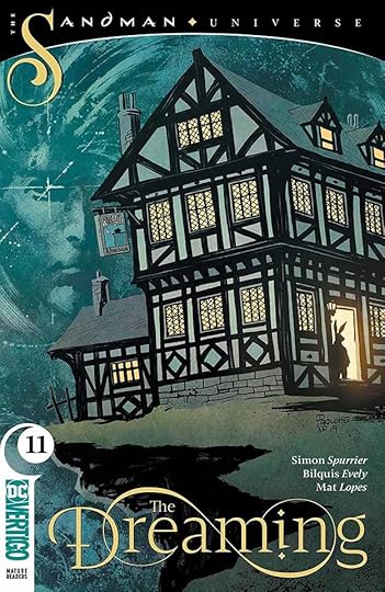 Written by Simon Spurrier, art by Bilquis Evely, colors by Mat Lopes, letters by Simon Bowland, cover by Yanick Paquette & Nathan Fairbairn.
Dora is trying to find Dream, and his trail leads to the World’s End pub, where stories are the currency, as seen in the World’s End story arc of the original Sandman series. Writer Simon Spurrier has shown he’s not afraid to take on the characters and settings of Neil Gaiman and make them his own, and this issue is a good example. The setting is the same, but not the same: the World’s End pub is actually on fire, but none of the many creatures in the bar are paying attention to that, so wrapped up are they in an intertwined story being told by three masked entities. Each storyteller’s part is completely different from the others, even though they connect, and each story is in a different art and fictional style: primitive culture, film noir crime, and science fiction, all handled deftly by artist Bilquis Evely, colorist Mat Lopes and letterer Simon Bowland. Back in the pub itself, Dora finds a new friend and admirer who seems to be the only one aware of the fire. He asks her to help put it out, but that task seems hopelessly beyond them…until Dora has an idea.
Great issue, recommended.
Todd Klein's Blog

- Todd Klein's profile
- 28 followers

