
Todd Klein's Blog, page 116
November 14, 2019
Pulled From My Files #99: A DC check stub from 1977
 This and all images © DC Comics.
Something different this time, one of many DC Comics check stubs I saved from my years of freelance work for the company beginning in July, 1977. This one is not the earliest, but it’s the earliest one I could find today. There were two kinds of freelance checks at the time, regular freelance work like lettering and coloring had wider stubs, the width of a check, and those have no date on the stub, so it’s harder to find an “early” example. This short stub that tore off the side of a check was for other kinds of work, generally classified as special projects. It’s for work that didn’t fit into the general income flow of producing monthly comic books.

This check stub, dated Aug. 10, 1977, is for three freelance jobs. The first is labeled DRAWINGS FOR SUPERMAN SEARCH A WORD SHAPES, and the payment was $192. The book they appeared in is above, a paperback from Tempo Books published in 1977. Sol Harrison was in charge of projects like this, and assigned freelance work for them among DC’s production department staffers. DC’s staff pay rate was low, so almost everyone there did some kind of freelance. I started working there in early July, 1977 as best I can recall, and I was not yet practiced enough to be doing freelance lettering, I was still learning that on staff doing lettering corrections and practicing at home, but Sol provided other kinds of freelance work that helped me pay my bills. These puzzle books used clip art from the comics for the figures, it was most likely just simple backgrounds and puzzle shapes that I was doing. I don’t have this actual book, I found the image online, but if I looked through it, that’s where I’d find my work. I have no idea what my page rate would have been. My guess would be something like $8 a page. If that’s right, and I did 24 pages, that would be $192. I don’t think the rate could have been less than that. Whatever the deal, this is work I did at home in the evenings and on weekends, and the money was appreciated. Sol was famous for handing out work like this on a Friday afternoon and saying he wanted it back Monday. “You’ve got 48 hours,” he’d joke. I was happy to get it. This was not the earliest of these I worked on, I have a record of doing similar work on a Superman Mazes book with payment dated July 13, 1977. That is probably right after I started working there.
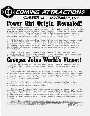
The second item on the check stub is payment of $35 for COMING ATTRACTIONS #12, image above found online. (You can find anything online these days!) This was DC’s promotional flyer at the time given out to comics retailers to supply news for buyers of the current and near future offerings of the company. It was very low tech and low budget, probably 4 to 8 pages like this, 8.5 by 11 inches, center stapled if it was more than 4 pages. It was an actual company publication, though, as evidenced by the indicia at the bottom of this image. My job as a freelancer would have been to take all the elements: the logo, indicia, cover images if any, headlines (made on the DC in-house Varityper Headliner machine), and copy typed up by Mike Gold, or whoever was doing that at the time, and to paste it together at home to make printer-ready mechanicals as they were called. It probably took me an hour or three, and again, the $35 was well appreciated.

The last item was one or more pages of art extensions for the well-known tabloid-size comic SUPERMAN VS. MUHAMMAD ALI. I was doing production work on this on staff, and working with Neal Adams artwork was amazing, but Neal had drawn most of the pages at the wrong dimensions. He and production manager Jack Adler argued about it, somewhat good-naturedly, but it was my job to make everything fit the correct proportions for the tabloid size, a little different from regular comic art proportions. In those days before digital scans, the art itself had to fit an exact template to be photographed by the separators, so physically changing the art was the only way to go. In the example above, you can see the lettering in the top two panels had to be photostatted and moved down, some of the original lettering is behind the tape at the top edge. In some cases I had to trim off about a quarter inch of Neal’s art on one edge. I remember Adler gleefully handing Adams a handful of these trimmed strips one day, telling Neal he was returning his original art. Other pages needed to have the art extended slightly, and that’s the freelance work I did at home. I couldn’t tell you now which pages those were, or how many, but I was paid $109 total for the extensions. Was it $15 for one, two or three pages? I can’t recall. Maybe the rate varied depending on how much work it was, I don’t know. One thing that early production task did for me was to force me to get over making changes on wonderful art. Even when I hated to do it, it was part of the job. Today this kind of thing can be handled digitally, leaving the original art alone.
That’s all the information I can gather from this small piece of paper.


November 13, 2019
And Then I Read: ONCE & FUTURE #1
 Written & © by Kieron Gillen, art by Dan Mora,
 colors by Tamra Bonvillain, letters by Ed Dukeshire.
As a long-time fan of Arthurian legends, I knew this was a new version of them by the title, derived from the prophecy about King Arthur that he would someday return to rule England. Kieron Gillen’s take is refreshingly different, and the art by Dan Mora is excellent. At the site of an archaeological dig in Cornwall, an ancient scabbard has been unearthed. A woman and three tough guys show up to take it by force. As the story hits the TV news, a tough older woman named Bridgette is troubled by this, and goes off on her own. Her grandson Duncan is on a date when he gets a call from the home, then from his Gran: she needs his help. When Duncan arrives at Gran’s side, he begins to find out about a very different aspect of her that she’s kept well hidden. Weapons are involved, and knowledge about mythical beasts and legends that may be more real than Duncan could ever imagine. One of them is in his face.
This is a fun idea well done. Recommended.
November 12, 2019
And Then I Read: JIMMY OLSEN #4
 Image © DC Comics. Written by Matt Fraction, art by Steve Lieber,
 colors by Nathan Fairbairn, letters by Clayton Cowles.
I don’t think Jimmy has ever been funnier than in the opening page of this issue where he’s doing an awful livestream as “Timmy” Olsen that pranks superheroes and politicians. Meanwhile, Lois Lane has joined Jimmy in Gotham City as he tries to explain just what a mess he’s in and why. As in previous issues, this one is broken up into shorter segments, and I’m not even sure they’re in chronological order, but it’s probably funnier if they’re not. This run of JO has very entertaining writing by Matt Fraction that at times reminds me of Deadpool, what little I’ve seen of that, and his Jimmy is really whacko, especially compared to the grounded and serious Lois. Despite that, some of Jimmy’s story is beginning to make more sense to me, crazy as it sounds. Steve Lieber’s art is just as entertaining and creative.
Fun stuff, recommended.
November 7, 2019
And Then I Read: NOBODY’S FOOL by Bill Griffith

I’ve seen Bill Griffith’s syndicated comic strip “Zippy the Pinhead,” but have never read it regularly. In the strip, Zippy is a strange character whose utterances don’t make a lot of sense, but do somehow have memorable resonance. One of his catch phrases, “Are we having fun yet?” has entered common usage.
This book by Griffith is not about Zippy, it’s about the real person who inspired him. Schlitzie was a microcephalic child, characterized by a very small brain area and a skull that came to a point, a condition cruelly nicknamed “pinhead” at the time of his birth around 1901. His actual origins are not known for sure, Bill Griffith places his birthplace in The Bronx. Schlitzie’s intelligence level never grew beyond that of a four-year-old, and his parents were poor, so his future did not look promising. It was likely he would have eventually been institutionalized. Instead, his parents sold him to a sideshow manager, and he remained a sideshow attraction, working under many different names, for most of his seventy year life. Sideshows were collections of people considered freaks of nature, those with physical handicaps or odd anatomy, or sometimes people with unusual abilities like sword-swallowers or strongmen. They were a popular sideline for circuses at the time, and also existed on their own at places like Coney Island.
Griffith’s biography of Schlitzie is both fascinating and surprising. Though the boy and man went through some difficult times occasionally, mostly he seems to have enjoyed his life and enjoyed performing, and he often found friends and workmates that cared for him, and kept him out of trouble, including one manager that made him part of the family. Schlitzie’s biggest fame came from his appearance in the 1932 horror film “Freaks,” directed by Tod Browning, where much of the cast were actual sideshow freaks, though Schlitzie had only a small role.
Is this book a sort of apology? Possibly. Griffith clearly put a lot of time and effort into it, and does not shy away from his own role in the story, though it’s a minor one. Well worth your time, and recommended.
November 6, 2019
The Danny Crespi Files Part 20
 This and all images © Marvel.
We’ve reached the final part of this series, showing the last three pages that include cover lettering, and one bonus page. About 20 more pages came with the original photocopies from letterer Phil Felix, a friend and workmate of Danny’s, but they contain mostly logos by other people and I won’t be covering them here. (If I knew for sure which of them were by Danny I would cover those, but none are credited, and it’s a lot harder to guess styles with logos than with cover lettering.) This collection was compiled by Phil while he was on staff at Marvel, and it represents a great resource for people like me who are interested in who lettered Marvel covers, something Danny did a lot of from about 1974-1979. Above is page 77 which is all lettered by Danny. Sources follow.

“Kid Colt and the Rawhide Kid” is the page 1 top blurb from KID COLT #229, April 1979. These were pasted onto finished stories at the same time as the indicia, seen at the bottom of the page. The trick was to make them easily readable, which Crespi succeeded with here.

“Shocking Mystery Super-Villain” from WEREWOLF BY NIGHT #25, Jan. 1975. The first line is white, reversed out of the red and yellow printing plates by the color separators.

“Triumph of the Toad” from INCREDIBLE HULK #191, Sept. 1975. Here the words “of the” are reversed out of the blue and yellow printing plates. Note on the original lettering the way Danny extended the lines at the corners of the caption box. He liked to do that so they formed a sharp corner when they were cut and pasted onto the cover art. Danny is the only cover letterer I know of who did that regularly.

“The Deadly Space Turnip” had to be lettered as the last page bottom blurb for HOWARD THE DUCK #1, Jan. 1976, but the only image I have for that page has a different version. It looks like Danny’s original blurb was too tall and it was redone to better fit the space. Next issue blurbs were done by the story letterer when they were in the script, but in cases like this, the title probably wasn’t decided yet when the rest of the page was lettered.

Page 78, three cover blurbs by Danny. Sources below.

“Mister Morgan’s Monster” from WEIRD WONDER TALES #10, June 1975. By filling the background of the caption black, some of Danny’s line work on MONSTER is lost, and the entire caption has been made very small to fit the available space, which is a shame. Note “A Shocker!” has been added above, perhaps right on the cover art..

“Death in White” from WEREWOLF BY NIGHT #31, July 1975. This caption, in contrast, is larger and more effective.

“The Totem Strikes” from WEIRD WONDER TALES #13, Dec. 1975.

Page 79, the last one showing cover lettering. I believe these are all by Danny Crespi. I don’t have a source for the top section “Vampires?” etc., but it looks like it’s for a house ad. “The Black Panther” is a page 1 topline blurb, but I can’t find it in a printed comic. Sources for the rest below, thanks to Michael Styborski for his help.

“2nd Startling Issue” from SPIDER-WOMAN #2 dated May 1978. I like the idea that this round blurb has some ribbon ends at the bottom, suggesting a medallion you might award to a horse at a horse show, but I doubt many readers noticed that.

“Chariot of the Fire Stallions” is from RED SONJA #9, May 1978. The flames add that extra touch that makes it more than an average bit of open lettering.

“A House There Was” is from MARVEL’S GREATEST COMICS #70, May 1977. A great title nicely lettered.

The bottom banner and “Man-Dragons” are from CONAN #83, Feb. 1978. Here the filling of the “Man-Dragons” caption box with black works better. And that wraps up the cover lettering pages in this series.

One bonus page, here are parts of photocopies of Danny’s standard block letters, something he made so that Marvel production artists could cut and paste them into new cover blurbs as needed, perhaps when there wasn’t time to have one lettered fresh, or if a minor addition was required. While block letters such as these were pretty standard in comics, every letterer gave them his or her own minor tweaks. When you look at Marvel covers from the mid 1970s on, you might find them in use.
Hope you’ve enjoyed this series as much as I have. Thanks again to Phil Felix for providing me with the photocopies of his Crespi lettering collection.
November 5, 2019
And Then I Read: THE SECRET COMMONWEALTH by Philip Pullman
 Cover art © Chris Wormell
The first part of Philip Pullman’s new trilogy, “The Book of Dust Volume One: La Belle Sauvage,” was the best book I read in 2017, and I’ve been looking forward to this one ever since. While not as thrilling as the first book, it did not disappoint.
Pullman began writing about the world and characters herein in 1995 with a prior trilogy with the overall title “His Dark Materials.” The first book, “The Golden Compass” in the U.S., “Northern Lights” elsewhere, introduced the character Lyra, a young girl living at a college in Oxford, essentially on her own, but cared for by the entire college staff. This was an Oxford in a parallel world with many differences, the most striking being that every person has a sort of animal familiar that is both a separate being and part of the person at the same time. In childhood, the companion is changeable, trying out different animal forms, eventually becoming settled on one by the time the person reaches adulthood. The companion animals often represent or echo the personalities of their humans in some way. They talk to and provide company for each human, but can also talk to other companion animals and humans. Their lives are closely tied to their humans, but also somewhat separate. Lyra’s companion, a marten named Pantalaimon, is an important part of the first trilogy, the plot of which includes people being separated from their companions with devastating results for both, and Lyra’s attempt to stop it. That takes Lyra to other parallel worlds, including one where she must separate herself from Pantalaimon, something both found horrible.
“La Belle Sauvage” takes place twelve years before “His Dark Materials,” when Lyra was an infant, and focuses on a boy, Malcolm Polstead, and his attempts to protect baby Lyra from those who want to imprison and use her for their own ends. The book’s second half is an epic journey through a flooded England in Malcolm’s canoe (the name of which is the book title) with Malcolm’s friend Alice and baby Lyra pursued by a villainous man, Gerard Bonneville.
Surprisingly, “The Secret Commonwealth” opens about twenty years later, and about ten years after the events told in “His Dark Materials.” Lyra is now a student at Jordan College, where she grew up, but she knows nothing about the events of “La Belle Sauvage.” Malcolm is a teacher at the college, but has not told her their history, nor has Alice, who also works at the college. Sadly, relations between Lyra and her animal companion Pantalaimon are strained and unhappy. The two can’t seem to get along anymore, always arguing and fighting over ideas Lyra has come to embrace about magic and animal companions. Nor has Pantalaimon ever quite forgiven her for their brief separation. Because of it, Pantalaiman and Lyra can spend time apart, and while out one night alone, Pantalaimon witnesses a murder near the college. He and Lyra retrieve information hidden by the murdered man which leads to trouble and danger for both of them. While they are in hiding at Malcolm’s parents’ inn, they have their worst fight ever, and Pantalaiman leaves Lyra to head off on his own. Lyra is soon on a journey as well, away from those who would arrest her in Oxford toward a mysterious place in the middle east. Malcolm is also soon headed that way, as is Pantalaimon. The separate journeys of the three, and the growing unrest and violence in that part of the world over, of all things, oil made from roses, make up the majority of the book.
The only bad thing about this novel is that, like many middle trilogy books, it takes us deep into trouble without delivering much resolution. That must come from the third book of the trilogy, which will probably arrive no sooner than another two years. Otherwise, this was an excellent read, and is highly recommended. Now I want to reread “His Dark Materials” to see what further connections I might find there to this story. If you haven’t done that in a while, it might be a good idea to reread those first before this one.
November 2, 2019
And Then I Read: THE GHOST, THE OWL by Franco & Sara Richard
 Image © Franco & Sara Richard. Lettering by Marshall Dillon.
In appearance this large but slim hardcover seems to be a picture book for young children, but inside is a 48-page comic with themes that young children might not understand or find frightening.
An owl becomes friends with the ghost of a girl child. Other birds tell the owl to ignore her, but he decides to speak to her instead. The ghost does not remember her origin or even understand that she is a ghost, and together they try to find out more of her history. The search takes them to the home of a young woman who is being threatened by an imposing, angry man who wishes to hurt her for rejecting him. The ghost and the owl try to help the woman, each in their own way.
Not a bad story, but I had an issue with the art. The owl and other birds are depicted very realistically while the ghost seems rather cartoony and manga-like, making their interactions seem strange and not very convincing. The adult man and woman are somewhere between the two.
Mildly recommended.
October 31, 2019
And Then I Read: THE DREAMING #14
 Image © DC Comics. Written by Simon Spurrier, art & colors by Matías Bergara, letters by Simon Bowland, cover by Yanick Paquette & Nathan Fairbairn.
Dora is playing a dangerous game. Actually several. She has summoned a demon and challenged it to a game call The Keening. This is a war game played in Hell with various kinds of demons and demonic creatures on each side, matched against each other in a checkerboard war. It combines elements of chess with hellish dungeons and dragons. To get the demon Flauros to play, Dora offers the soul of her companion Balam the Rhymer, a demoted demon of another sort. How the game is played, and how Dora plays it is a story worth reading, as is what Dora learns next. I don’t think I’ve seen the art of Matías Bergara before, but I like it quite a lot. The writing by Spurrier continues to be clever and interesting, and even moving at times, though this issue is plot-driven.
Recommended.
October 29, 2019
And Then I Read: THE BRIDGE by Peter J. Tomasi & Sara Duvall
 Colors by Gabriel Eltaeb & John Kalisz, letters by Rob Leigh.
Image © Sarah DuVall.
Abrams Comicarts under the direction of Charles Kochman, proves once again that comics can be about real people and real events that are just as interesting and compelling as fiction.
The Roebling family and their manufacturing and construction company were known first for their wire cables and then for the suspension bridges built with them. Father John Roebling had long hoped to build a suspension bridge between Lower Manhattan and Brooklyn, and at the time this story begins in 1852, has begun to draw up plans. His young son Washington wants to help, but John is a stern father and sterner taskmaster, sending his son to study at Renssalaer Institute before taking his place in the family business. The Civil War sends Washington in another direction when he enlists, and Washington’s skills as a bridge builder are soon in use for the Union Army. While on leave in Washington DC, young Roebling falls in love with Emily Warren, the sister of General Warren. Once Washington is home from the war and he and Emily are married, constructing the Brooklyn Bridge becomes the family’s focus. There are many challenges to overcome. John Roebling’s plans include new ways of constructing stone towers on the bed of the East River using compressed air to keep the river out. This is a highly dangerous process, one that will take a high toll on workers and the Roebling family alike. While the original plan called for the bridge to be built in a few years, challenges and setbacks make it a much longer task, and one in which even Emily must take an important role.
This is a fine book, the writing and art are clear and engaging, and the story is one any reader will enjoy. Highly recommended.
October 27, 2019
IRA SCHNAPP IN HIGH SCHOOL

I’ve written a lot about Ira Schnapp on my blog. He was a letterer and logo designer for DC Comics from 1940 until about 1968, and he died in 1969. From about 1949 to 1967, Ira set the style for the company, creating many of their house ads and logos and lettering hundreds of covers and thousands of story pages. I wrote a detailed series of articles gathering all the information I could find about Ira beginning HERE, with the help of fellow logo designer and comics historian Alex Jay, whose research has been invaluable. One thing I didn’t cover, because I didn’t yet know it, was Ira’s time in high school. Alex has found out more about that since those articles were written, and here it is.

The Schnapp Family’s first home in Manhattan was at 86 Ludlow Street on the Lower East Side. They were living there while Ira went to high school. The first clue to the high school Ira attended came from a book or pamphlet Alex found online: Department of Education, The City of New York, Fifteenth Annual Report of the City Superintendent of Schools for the Year Ending July 31, 1913
That source listed the top 200 students in each county who graduated with “College Entrance Diplomas.” In other words, they were qualified to apply for college, though Ira never did as far as we know. Ira is on the page above in the listings for New York County. He was #146 out of 200 with a score of 75.5, and he graduated from Stuyvesant High School.

Stuyvesant was founded in 1904 as New York City’s second college preparatory school with free tuition for students who qualified for entrance. At first it was part of an existing school, but in 1907 it moved to its own new building on 15th Street west of First Avenue. As shown above, this was about a mile, or a 25-minute walk from the Schnapp home on Ludlow Street. Wikipedia reports: At first, the school provided a core curriculum of “English, Latin, modern languages, history, mathematics, physics, chemistry, [and] music”, as well as a physical education program and a more specialized track of “woodworking, metalworking, mechanical drawing, [and] freehand drawing”.[14]:5 However, in June 1908, Maxwell announced that the trade school curriculum would be separated from the core curriculum, and a discrete trade school would operate in the Stuyvesant building during the evening.[14]:5[18] Thereafter, Stuyvesant became renowned for excellence in math and science. In 1909, eighty percent of the school’s alumni went to college, compared to other schools, which only sent 25% to 50% of their graduates to college.[1
Ira’s artistic talent must have been nurtured here, and even though the focus of the school was on math and science, the trade school track of mechanical and freehand drawing would have been right up his alley.

Having found the school, we searched for their yearbooks. I found this one for the 1912 year and bought it, but was disappointed to find no reference to Ira inside. However, there was a club that seemed a likely one for Ira.

Although there was no list of members, later research revealed that Ira is the young man in the back row third from the left. The handsome Art Nouveau title is by Gus Rohde, who did a lot of similar art for this yearbook. I believe graduating seniors were given the chance to showcase their work in this way.

A few weeks ago the 1913 yearbook showed up on eBay, and Alex bought it. This time we hit the jackpot. It was Ira’s senior year, and he was given a number of illustration assignments in the book, which also includes his senior photo (at the top of this article). It’s the first photo we’ve found of young Ira, and one of only a few we have of him at all.

The first example of Ira’s work is on this page, a title for “The Caliper,” a school newspaper. As you can see, Ira was already skilled at classic letter forms, and some of these have an Art Nouveau flair.

Ira’s lettering turns up next on this title for the Art Turning Society. Turning in this case means carving wood on a rotating spindle, such as for chairs or staircases.

The largest piece by Ira appears at the beginning of the senior class Individual Records section. Note this is the class of June 1913. The school graduated two classes each year, apparently. Ira’s title uses the old Roman V instead of U, and his signature is more elaborate than elsewhere. His drawing of graduates signing a record book is pretty good if not great.

Here is Ira’s own listing at the top of this page. He was known for his artistic temperament, and in addition to the Sketch Club, he was in the Chess and Checker Club, the Architectural Society and the Civics Club. In later years, Ira often talked about his work as part of a team creating the huge inscriptions on the outside of the Farley Post Office, which I’ve written about HERE. This must have happened, or at least begun, while he was in high school. Perhaps the teachers of the Sketch Club or the Architectural Club were recruiting students to work on these projects, but that’s just a guess.
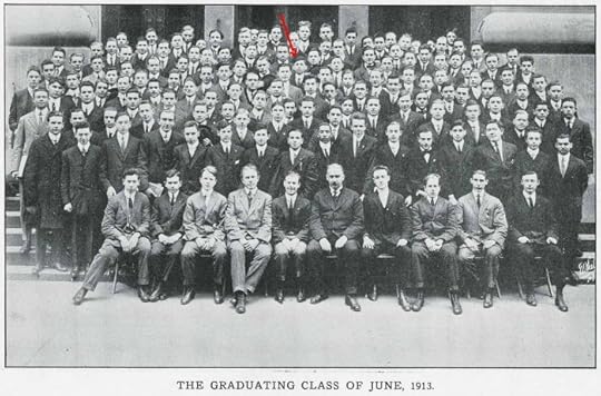
Finally, here’s Ira in the class photo, indicated by the red arrow. Some in the front may be teachers, but it looks like the class was about 60-70 people. Small enough to allow teachers to work closely with students.
By the 1915 New York State Census, the Schnapp family had moved north to 170th Street in The Bronx. Ira was still with them, and his occupation was listed as Salesman. By 1917, when Ira filled out his World War One draft card, he was working for the W. T. Slide Company probably lettering titles for silent movies. Ira had begun an art career that would support him and later his own family for the rest of his life. I imagine the education and skills he learned in high school were a major part of his success.
More articles about Ira and his work can be found on the COMICS CREATION and LOGO LINKS pages of my blog, as well as on Alex Jay’s Blog. Thanks to Alex for his help with this one!
Todd Klein's Blog

- Todd Klein's profile
- 28 followers

