
Todd Klein's Blog, page 118
September 27, 2019
Making Logo Sketch Cards
 This and all logo images © DC and Marvel comics appropriately.
Recently I wrote here about my new idea for something to sell at the Baltimore Comic-Con on Oct. 18-20: Logo Sketch Cards. The popularity of “sketch covers,” comics with an alternate cover having only the logo and trade dress printed, leaving the rest blank for a unique artist sketch, gave me the idea of doing the same sort of thing, but with marker sketches of comics and character logos on Strathmore drawing paper cut to the size of a comic, as above. I’m not sure how well they will sell (my asking price at the Con is $30 each), but I’m having a lot of fun making them. I’m enjoying revisiting many old friends in logo form, and it’s giving me a good reason to spend a lot more time at my drawing board than I have in years. I like that, too. I thought I’d show how I’m making them here.
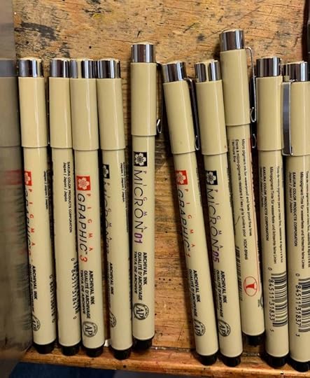
For markers, I researched ones that are waterproof, non-bleed, acid free, fade resistant and long lasting. I came up with a short list of brands, and went to my local Michaels art and craft supply store to see if they had any of them. They had two choices: Pigma Micron, above, the one I went with, was a little cheaper than Pitt. I bought a variety pack of sizes and also some extras of the ones I thought I would use most.
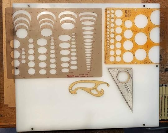
Here are the other drawing tools I’m using. Oval and circle templates, a small french curve, a small triangle, and a light box. I’ve had all these for decades. I used them when drawing logos by hand, and since then when drawing logo marker sketches for new logo assignments. The main differences between using pen and ink, as I did when drawing logos by hand, and using markers, is A) ink makes more precise lines and B) markers are easier to use, no struggling with ink flow and blobs. From normal reading distance, marker lines look fine, it’s only when you look very close that the uneven marker ink edges are visible. That’s not an issue with sketches, only with work that needs to be printed.

For paper, I’m using Strathmore Series 400 or 300 drawing paper, 9 by 12 inches, in pads. At right is a page torn from the pad and marked in pencil is the size of the sketch card. At first I used a printed comic to set the size, but then I got some new comics size backing boards and bags to put finished ones in, and since then I’ve been using a backing board as my size template. When I finish a sketch, I cut the paper on the pencilled lines. At left is a logo set up on my computer at the correct size and printed out on copy paper. I will use it as my guide for the sketch, taping it to the back of the drawing paper in the correct spot.

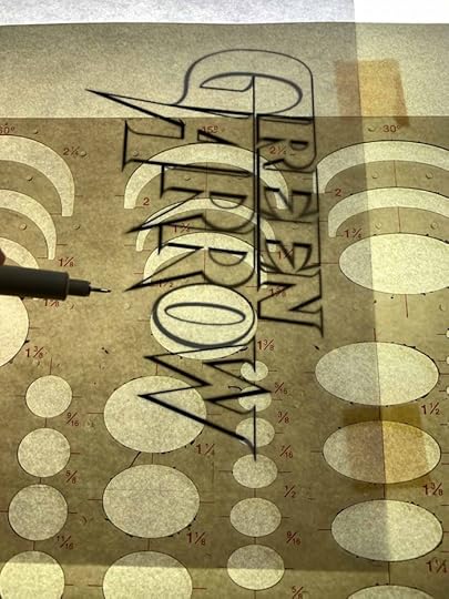
Here’s that process completed, on the light box with the light on. The drawing paper and copy paper are thin enough that I can see the printed logo well. Using my tools and markers, I will trace it.
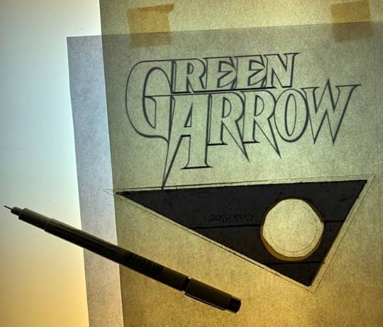
This is my own Green Arrow logo from 1993, drawn by hand. More about that process is here. A logo like this is made up primarily of precise straight lines, ovals, and curved serif points. Sometimes when doing these sketches I start with the ovals or curves, but this time I chose to begin with the straight lines, using a size 03 marker. You can’t see what I’ve done with the light box on…
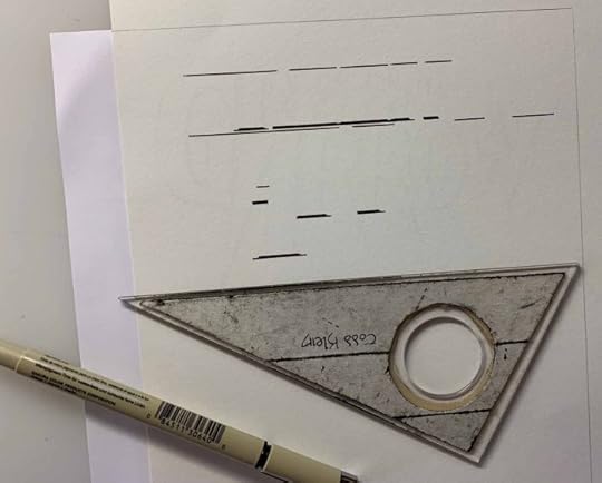
…but with it off, the lines drawn are visible. Incidentally, the drafting tape on the triangle, which I applied and cut to size with an exacto knife, gives a slight lift to the edges so they aren’t touching the paper. This is not a big issue with markers, though it can be annoying if your marker leaves ink on the triangle that then gets on your fingers. The lifted edge is more important with pen and ink because if the edge you’re drawing with is touching the paper, the ink tends to flow under it, making a blobby mess.

Here’s the sketch with most of the straight line work done. I always miss a few.
Next I worked on the ovals. It rarely happens that the oval shape you want is matched exactly on the oval template. Usually with a character like the O, the sides are drawn with part of one oval and the ends with another. Here I’ve lined up the template oval for one side of the O. This template has small bumps of plastic on the underside to lift the edges of the ovals off the paper a little, but the template itself is much thinner than the triangle, and it’s still tricky getting your marker (or ink pen) to follow the curve of an oval smoothly. If I get it wrong, I try to fix the uneven edge by hand or with another go of the template.

With the sides of the O drawn, I’m lining up another oval for the bottom edge here. Sometimes it’s safer not to try to connect the different parts with the template, but to do that by hand. Smaller curves, like the ones at the corners of the serifs on the W (the pointed ends of the strokes), are best done by hand.
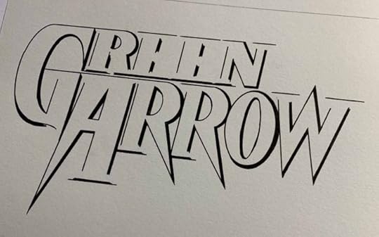
Here’s the sketch with all the large ovals drawn using the oval template. For logos with perfectly round letters, I would use the circle template instead. I think I used that in a few spots here, like the curved part of the top R. From experience, I know what works best.
Here some of the smaller curves on REEN are inked in by hand using either the same size marker, or a smaller size 01, which makes a better pointed end.
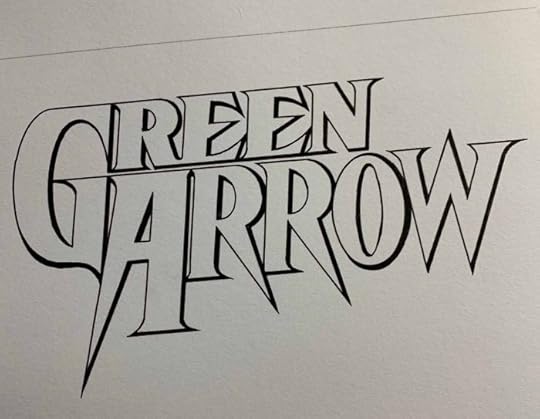
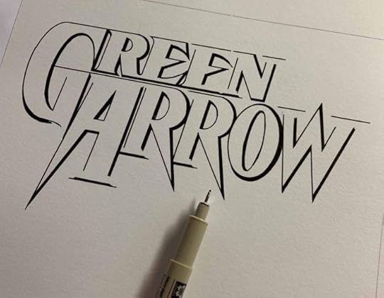
The finished logo sketch, needing just my signature and ©DC. What happens if I make a mistake and put ink where I don’t want it? Well, I try really hard not to do that, but it does happen occasionally. This paper is thick enough that I can carefully scrape off excess ink with an exacto knife. The scraped area is a little roughened, but it’s not obvious. It might show up more if the area is colored with markers or watercolor, but that’s the trade off, and it’s my best solution. When drawing with pen and ink for a printed logo, I can use white paint to cover errors, but that would stand out too much on these sketches.
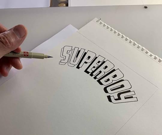
The french curve is used for very wide curves like the ones on this Ira Schnapp Superboy logo. Ira would have used a compass to set them up when he designed the logo. Since I only have to trace small segments of the larger arcs, the french curve works fine. On the Green Arrow logo, above, there was a narrow drop shadow that I filled in black as I went along. On this Superboy logo, I filled in the larger black areas with a larger marker, in this case a brush point Pigma.

Some logos, like this Hulk one designed by Sol Brodsky and Artie Simek, require no tools at all, I was able to freehand trace the entire thing. Those tend to go more quickly.
The idea, of course, is that if you buy one of these Logo Sketch Cards, you would take it to a favorite artist at the Con and have them do a character sketch appropriate to the logo on the rest of the paper. I hope to see a few of these by the end of the Con at Baltimore. Logo Sketch Cards I don’t sell there will eventually be offered on my website’s BUY STUFF page, so you will find them there by late October.
Hope you’ve enjoyed this look at my process, and if you’re coming to Baltimore, stop by for a look at the finished cards, as well as my prints and other things I’ll have for sale.


September 25, 2019
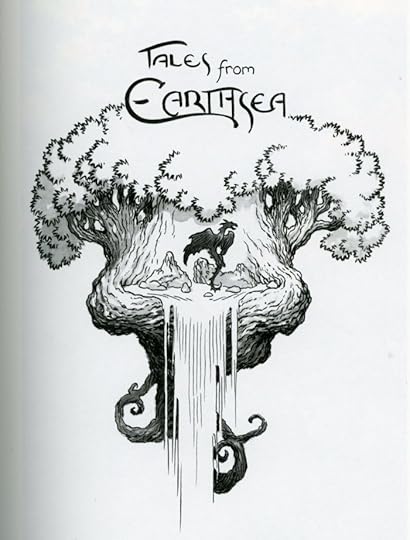
Rereading: THE OTHER WIND by Ursula K. Le Guin
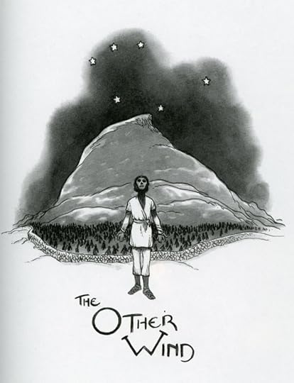
 From the illustrations by Charles Vess.
Concluding my coverage of “The Books of Earthsea,” the recent omnibus edition of all Le Guin’s Earthsea material beautifully illustrated by Charles Vess in color and black and white.
“The Other Wind,” published in 2001, is the sixth and final long book. Not only does it continue some of the stories from the earlier books, it tackles a major problem in the structure of the imaginary world itself: the fate of those who die. In previous books we’ve learned that they are relegated to wandering a gray, dry, barren land beyond a wall of stones, unable to recognize or interact with those they knew in life, unable to rest or find any solace. This was always a grim fate dealt to the people of Earthsea’s island kingdoms, though some on the fringes thought they had another path. Ged, the main character of the series, made a harrowing journey through the land of the dead, and was stripped of his magic there in “The Farthest Shore.”
As “The Other Wind” begins, a village sorcerer, Alder, is being tormented by dreams about his dead wife in the land of the dead. He is repeatedly drawn to the stone wall at the edge of it while the dead reach for him, asking to be set free. Alder seeks out Ged, in his retirement on the island of Gont, and Ged sends Alder on to Havnor to tell his story to the king, Lebannen, Ged’s companion on that journey through the land of the dead. When Alder arrives, he finds the kingdom already threatened by dragons who are attacking from their strongholds in the west, even the western shore of Havnor. Ged’s adopted daughter, Tehanu, part dragon herself, goes with the king and his troops to confront the dragons, and what she she learns there brings everyone to a meeting on the island of Roke, the heart of Earthsea’s wizardry. Great changes are coming, and Earthsea will never be the same.
I found this novel much more satisfying in this reading after having gone through all that came before it recently. I salute Le Guin for taking on this rethinking of her classic world-building and making it all work extremely well.
Beyond the last novel are some shorter pieces. “A Description of Earthsea” lays out the entire history and structure of the world in a long essay. There’s not much new in it, but it’s interesting all the same.
“The Word of Unbinding” and “The Rule of Names” are early stories written before Le Guin had solidified her ideas about Earthsea. Interesting but not of major import.
“The Daughter of Odren” is a sort of ghost story about a family blessed by wealth then cursed by wizardry. It’s well told, but again not of great importance.
“Firelight,” on the other hand, is important because it tells of the last days of Ged. Though short, it’s exquisitely written by an author who had reached an age herself where she understood old age perfectly.
Finally, “Earthsea Revisioned” is a lecture given by Le Guin in 1992 when she had finished “Tehanu,” and she explains the changes she is making to her world.
I certainly gained a great deal of pleasure from reading this new edition of the Earthsea stories, and the illustrations by Vess make it even better. Highly recommended.
September 23, 2019
And Then I Read: JIMMY OLSEN #3
 Image © DC Comics. Written by Matt Fraction, art by Steve Lieber,
colors by Nathan Fairbairn, letters by Clayton Cowles.
The story being told here is chopped into short vignettes of two to six pages. It covers a lot of ground, from ancestors of Jimmy Olsen and Lex Luthor in the frontier town that would become Metropolis, to Luthor and Lois Lane in the present, to friends of Jimmy facing death and more. Each vignette starts with an overblown caption in the style of the old comics, but laced with absurdity and humor. The vignettes themselves tend to be more serious, especially for Jimmy himself, though there is certainly a funny side to them. Metamorpho and Jimmy bringing the above seen Decoy Corpse into Jim’s apartment, for instance, and what happens immediately after. There are elements of farce and parody, but Jimmy takes it all quite seriously, as he must to make it funny. I don’t always get the jokes, I suspect, but I’m enjoying the ride all the same.
Recommended.
September 21, 2019
And Then I Read: THE LIGHT FANTASTIC by Terry Pratchett
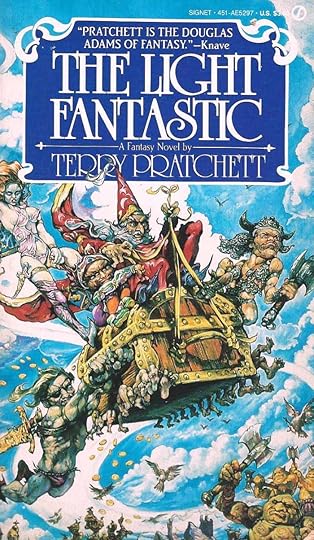
The second Discworld novel continues right on from the first, in fact they are essentially one long story. The main characters, the failed wizard Rincewind, who is acting as a tour guide to TwoFlower and his magical Luggage, had fallen off the edge of Discworld at the end of “The Colour of Magic,” and are saved by the Octavo, a powerful book of eight spells because of the those spells has lodged itself in Rincewind’s brain. The Octavo changes reality to return them to the center of Discworld, where they continue to get into all kinds of trouble. Now even more groups are after the two, because they want the spell, or the Luggage (which can, at times be full of gold). Meanwhile, Discworld itself is in danger from a star that is approaching it, threatening cataclysmic destruction.
While amusing at times, this book felt like something of a retread of the first one, and I did not enjoy it as much. Perhaps Pratchett rushed to capitalize on the success of the first one, I don’t know, but later Discworld books I’ve read have more and better ideas. Mildly recommended.
September 19, 2019
And Then I Read: THE DREAMING #12
 Image © DC Comics. Written by Simon Spurrier, art by Bilquis Evely, colors by Mat Lopes, letters by Simon Bowland, cover by Yanick Paquette & Nathan Fairbairn
Comics today are written in story arcs that can be neatly published in standard-size collections. This issue finishes the second story arc of the title. As a continuing series, a story arc should appear to have a beginning and an end allowing closure, but leave room and teasers for more issues. The arc has focused on the search for Dream (Daniel), who went to the waking world, had an affair that ended badly, and then on to other realms such as Faery and Hell. The characters Dora and Matthew the raven have been tasked with finding him, using Dora’s innate ability to travel to any realm. They were given the task by the current ruler of The Dreaming, a strangely moth-like being who is also said to be a machine intelligence.
Sensing change and a vacuum of power, emissaries of other realms have gathered at the gates of Dream, where Abel and the moth creature must deal with them. Some of them would take The Dreaming for their own, by force if necessary. Meanwhile, Lucien has been brought back to The Dreaming, but is very ill, and Dora and Matthew have returned with their report. Elsewhere, men who have brought about the current situation are scheming.
Not a bad issue, some things of interest happen, but I don’t think the illusion of closure is very well served by Spurrier’s script this time. It was not satisfying on that level. Still, recommended.
September 17, 2019
And Then I Read: BRINGING THE BOY HOME by N.A. Nelson
 Cover art by Tim Jessell
A story of the Amazon and its primitive remote tribes, this book follows two boys of the Takunami tribe. Tirio was born with a bad foot, making him lame. When he is six years old, his mother sets him adrift down the river, essentially he has been ejected from the tribe. Tirio is found by a white research worker who brings Tirio home to Florida with her, and adopts him. Tirio is grateful, and works hard to overcome his disability, learn English, and fit in with his new surroundings, but he can’t forget the jungle, his tribe, and their ways.
Luka is about to turn thirteen, the age at which he must undergo a trial and test to become a man of the tribe. His mother trains him and tests him relentlessly, while neglecting the rest of the family. Why is this so important to her, Luka wonders? Does it have to do with his mysterious father, who he has not been allowed to meet?
Back in Florida, as Tirio’s thirteenth birthday approaches, he feels ever more strongly that he needs to return to his tribe to take part in his own test of manhood. To reinforce this, he seems to be getting mental images and messages from his father encouraging him to come. Tirio and his new mother Sara plan a return to the Amazon where she will take up her research again. Tirio has not told her his plan to return to his tribe because he knows she won’t allow it. Yet, it’s something he has to do. The trials of these two boys are intertwined in surprising ways as they encounter all the dangers of the Amazon river and jungle, from caymans and jaguars on the hunt to hunger and fierce thunderstorms. It’s a well-told story of adventure and discovery.
Recommended.
September 16, 2019
And Then I Read: HASHTAG: DANGER #5
 Image © Ahoy Comics. Main story written by Tom Peyer, art by Chris Ciarrusso.
 Backup written by Paul Constant, art by Fred Harper.
Of all the Ahoy comics, I think this is the funniest, and it’s funny in a way that appeals to the comics fan in me. First, once again, the cover has nothing to do with the contents, but is quite good. Next, the story is broken into chapters like the early Fantastic Four issues, with equally over-the-top titles. Third, the comic is chock full of action and slapstick and sound effects, but the best moments come from the main characters’ bickering. The Snelson backup is a different kind of funny, very modern and sarcastic, but equally entertaining, as we see the struggling comic trying to survive with a lame livestreamed chat room for his fans.
Recommended.
September 15, 2019
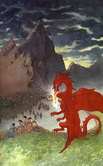
Rereading: TALES FROM EARTHSEA by Ursula K. Le Guin
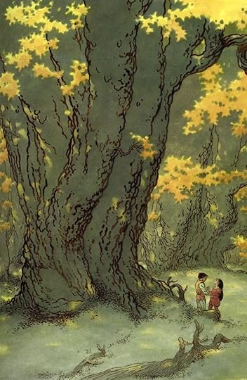 Part of The Books of Earthsea beautifully illustrated by Charles Vess.
The fifth book in the Earthsea series is a collection of five stories, two of them long ones, filling in some of the history and use of magic on Earthsea. Le Guin, in her afterword, says, “It would have simplified things for my publishers and me if the fifth book of Earthsea had been a novel, but it wasn’t.”
The first story, “The Finder,” takes place 600 years before the main storyline. It tells of Otter, a young boat builder who has great innate powers of magic. He wants only to use them to improve the boats he and his family build, but when his power is noticed by the wizard Losen, employed by the local King, he is captured and brought to a mining camp where he is coerced into becoming a finder of mercury ore, the prize sought by Losen. At the time, wizards were all out for themselves, and generally employed by the rich and powerful. Otter wants to escape, and he meets a young woman with even greater innate magic. The two of them manage to bury Losen deep in the ground and leave the mine on foot, heading to a refuge in the mountains. Eventually Otter becomes a catalyst in the founding of the school of wizards on Roke that many years later will be the seat of magic power and influence in Earthsea, but Otter’s own story is a tangled one. This is the longest story.
“Darkrose and Diamond” is a love story about a boy who loves both music and magic. His father wants him to follow in his trade, but Diamond wants to play music with his sweetheart, Rose and her friends. Diamond is sent to study magic with an older wizard, and learns that to be one himself he must be celibate, something very far from what he wants.
“The Bones of the Earth” takes place on Gont some years before the main storyline, and tells of the earthquake that nearly destroyed the island’s main city and harbor, and how the power of two magicians prevented that at great cost to themselves.
“On the High Marsh” tells of a poor family who takes in a wandering mage who is only comfortable with animals. He finds a place in their village helping with a disease killing local cattle, but the people he comes in contact with fear his quick anger, and want him gone. Another mage we know well arrives to help.
“Dragonfly” tells of a young woman, on the island of Way whose family has fallen into poverty because of her father’s drinking and quarrels. A local magician from the school on Roke, Ivory, becomes enamored of her and tells her she has magical powers that should be trained. He convinces Dragonfly to come with him to Roke. His plan is to disguise her with magic as a young man so she can be trained, but the wizards of Roke soon see through her disguise. She is sent to the Immanent Grove, where she finds a home while the chief wizards decide what to do with her. Her power turns out to be something much stronger than they expect. This is the other long story.
This is a fine book, and I enjoyed rereading it. It builds on Earthsea history in interesting ways, as Le Guin turned the course of that history in a new direction.
Recommended.
September 14, 2019
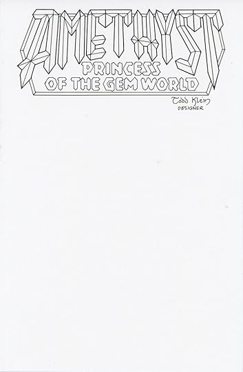
For Sale: LOGO SKETCH CARDS
 Images © DC Comics and Marvel Comics respectively.
 Here’s something new I’m trying: LOGO SKETCH CARDS. Sketch covers are popular now, comics with a blank cover except for the printed logo and trade dress that artists do marker sketches on at conventions. I thought, why not do marker sketches of logos on cover size art paper that people could buy and use to get sketches from artists? Each card is on Strathmore 400 Series drawing paper cut to cover size. The logos are drawn with Sakura Pigma markers which use waterproof, chemical resistant, fade proof, bleed free black ink. Both paper and ink are pH neutral, acid free. Logos are all black line work except for Batman, which has a gray india ink wash. If you’re getting a color sketch from an artist, the open areas can be colored by them. If you’re getting simply a marker sketch, the logo matches, and the entire card is original art, nothing printed. Each Logo Sketch card will come on an acid free backing board in a crystal clear comics bag. I’ll be at the Baltimore ComicCon this October 18-20 as a guest, and plan to have them for sale there for $30 each. If you’re going to the con and would like to commission a particular logo, message me on Facebook or email me and we’ll work out the details. Let me know if you like this idea! Thanks. More below.


September 12, 2019
And Then I Read: JIMMY OLSEN #2
 Image © DC Comics. Written by Matt Fraction, art by Steve Lieber,
 colors by Nathan Fairbairn, letters by Clayton Cowles.
Comics have changed a lot since my childhood. When reading a Jimmy Olsen comic back then, the story was completely linear and followed its own inner logic from start to finish, even if that logic was strange at times. This new JIMMY OLSEN is more like a series of vignettes, snapshots and fragments of stories. Just as much fun, and perhaps freer. We see Jimmy with Superman clowning around. When was the last time you saw a light-hearted and goofy Superman? We get snapshots of Jim’s many odd adventures. And we see the current situation of the reporter: in Gotham City, where things are not going well. Elsewhere, Lex Luthor and another Olsen discuss the city mascot destroyed in the first issue, Lois Lane is on a case, and we have another brief glimpse of Jimmy and Lex’s ancestors.
I don’t get all of it, but I like it. Recommended.
Todd Klein's Blog

- Todd Klein's profile
- 28 followers

