
Andrea Offermann's Blog, page 2
November 7, 2019
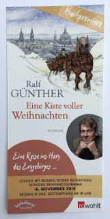
Buchpremiere von "Eine Kiste voller Weihnachten"
Endlich ist es soweit, am 8.11. wird auf Schloss Reinhardtsgrimma die Buchpremiere von "Eine Kiste voller Weihnachten" gefeiert, und ich freue mich riesig, dass ich dabei sein darf!
 Die Einladung zur Buchpremiere

Es wird ein wunderschönes Programm geben, natürlich mit einer Lesung aus dem Buch, aber auch mit musikalischem Rahmenprogramm und einem kleinen Einblick in die Arbeit an den Illustrationen. Ich werde auch einige Originale mitbringen.
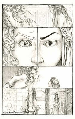
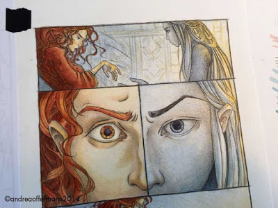
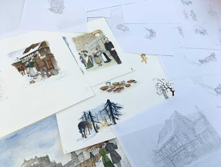 Einige der Skizzen und Originalarbeiten werde ich zur Ansicht mitbringen...
Inzwischen habe ich das Buch auch schon in den Buchhandlungen entdeckt:
 Das neue Weihnachtsbuch hier bei Thalia auf dem Weihnachtstisch
Es ist immer wieder etwas Besonderes für mich, wenn ich ein Buch, das ich illustriert habe, in den Buchhandlungen sehe.
Ich hoffe, wir sehen uns morgen im Erzgebirge!
 Die Einladung zur Buchpremiere

Es wird ein wunderschönes Programm geben, natürlich mit einer Lesung aus dem Buch, aber auch mit musikalischem Rahmenprogramm und einem kleinen Einblick in die Arbeit an den Illustrationen. Ich werde auch einige Originale mitbringen.
 Einige der Skizzen und Originalarbeiten werde ich zur Ansicht mitbringen...
Inzwischen habe ich das Buch auch schon in den Buchhandlungen entdeckt:
 Das neue Weihnachtsbuch hier bei Thalia auf dem Weihnachtstisch
Es ist immer wieder etwas Besonderes für mich, wenn ich ein Buch, das ich illustriert habe, in den Buchhandlungen sehe.
Ich hoffe, wir sehen uns morgen im Erzgebirge!


November 5, 2019
It's book birthday! SOME SNOW IS... in stores now, and author book tour dates!
 The illustrator copies arrived!
Happy book birthday to Some Snow Is... ! I received my illustrator copies just in time and I am so happy I can share more images from the book with everybody:
 The title page for "Some Snow is..."
 Some Snow is First Snow...
 Some Snow is Fluff Snow...
The author Ellen Yeomans is planning a book tour in November, here are the dates :
Nov 22, Syracuse, NY Official Book Launch: 7PM, Downtown Writer’s Center, at the YMCA of Central New York, 340 Montgomery St, Syracuse, NY 13202
Nov 24, Liverpool, NY, 12-3PM, Barnes & Noble, 3956 NY-31, Liverpool, NY 13090, book signing
Dec 1, Brooklyn, NY, 10:30AM, Stories Bookshop & Storytelling Lab, 458 Bergen St, Brooklyn, NY 11217
Dec 4, Philadelphia, PA, 6:30 PM, Head House Books, 619 S 2nd St, Philadelphia, PA 19147, United States
Dec 15, Prague, Czech Republic, The Globe Bookstore, Pštrossova 1925/6, 110 00 Nové Město
 Some Snow is Snow Day Snow...
 Some Snow is Spring Snow...
A huge thank you to Cecilia Yung, Susan Kochan, and everybody at G.P.Putnam's Sons, and of course to Ellen Yeomans for taking me on this wonderful winter adventure with you!
I will go celebrate with some hot cocoa now, happy Tuesday to everybody!
October 31, 2019
Some Snow Is... coming to a book store near you next week!

I can't believe it's almost November and "Some Snow Is..." will be in stores in a little under a week! This book has been a part of my life for the past three years and it's been such a pleasure to work on. I signed the contract to illustrate this beautiful poem by Ellen Yeomans in October of 2016, while I was still working on "The Yin Yang Sisters and the Dragon Frightful". I knew I would not be able to start working on it until a year later, but I was so excited about it and so happy that Penguin was able to wait.
 "Some Snow is fluff snow..."
Let me start by sharing the synopsis of the book from the publisher:
Lyrical poetry and stunning paintings showcase the surprise, the fun, and the beauty of everyone’s favorite winter adventure: snow!
Some snow is First Snow,
we’ve waited for so long snow.
Is it really snow snow
or only heavy rain?
Starting with the thrill and excitement over the first flakes falling from the sky, we follow three young neighbors enjoying all types of snow through the season. From sleet and fluff snow that isn’t good for anything to angel snow, snowball snow, driveway snow (which can lead to the best forts), tracking snow, sledding snow, snow day snow, and all the way to the last snow which is exciting in its own way:
Soon, soon, all gone snow.
We’ve waited for so long snow.
Please, please, no more snow.
Our bikes are whispering.
Beautiful verse and evocative energetic illustrations perfectly hit all the right exciting and cozy notes that children will savor every winter!
 Soon it will be spring snow...
Ellen describes the progress of winter and the different kinds of snow with so much knowledge, love, and wit. I remember reading the manuscript for the first time on a cold and rainy October day and feeling like the kids in the story, impatiently waiting for all this rain and sleet to stop and for the "real" snow to come!
The book already got a nice review from Kirkus, calling it “A perceptive, three-season-ish celebration of snow perfect for a snuggly read."
 Some snow is snow day snow...
I hope you will enjoy this winter poem as much as I did!
October 8, 2019
Eine Kiste voller Weihnachten - das neue Weihnachtsbuch erscheint am 15.10.
 Lisbeth und Herr Storch verlassen Dresden
Dieses Jahr hatte ich die große Freude, ein weiteres Buch in der wunderschönen Kindler Weihnachtsbuchreihe zu illustrieren. Nachdem im letzten Buch "Das Weihnachtsmarktwunder" der Junge Martin eine abenteuerliche Reise vom Erzgebirge nach Dresden erlebte, müssen in diesem Buch zwei neue Figuren am Weihnachtsabend trotz Dunkelheit und Schneetreibens unbedingt noch ins Erzgebirge. Hier ist eine kleine Einführung in die Geschichte:
 In der Molkerei fragt Lisbeth nach dem Weg zurück ins Erzgebirge
Dresden, um 1890. Vinzent Storch stellt die berühmten "Dresdner Pappen" her – Figuren aus Papier, die als Christbaumschmuck sehr beliebt sind. Am Vormittag von Heiligabend entdeckt er zu seinem Entsetzen eine Kiste, deren Lieferung versäumt worden ist. Schnell macht er sich mit dem Pferdewagen auf in Richtung Zinnwald, um die Ware rechtzeitig zu überbringen.
Unterwegs bittet ein Mädchen darum, mitgenommen zu werden, doch Storch lehnt ab. Dass Lisbeth heimlich auf seinen Wagen steigt, bekommt er nicht mit. Erst als ein heftiger Schneesturm einsetzt und er vom Weg abkommt, gibt sich das Mädchen zu erkennen. Sie behauptet, den Weg zu wissen. Wenn Storch Zinnwald rechtzeitig erreichen will, muss er Lisbeth vertrauen.
Auf der Fahrt erfährt er, welch tragische Geschichte das Mädchen nach Dresden geführt hat. Da öffnet er sein Herz, und aus zwei traurigen Seelen werden Freunde.
Eine herzerwärmende Geschichte, die den Erfolg von Ralf Günthers Dauerseller "Das Weihnachtsmarktwunder" fortschreibt.
 Die Rast im Wald
Ralf Günther wird an drei Terminen aus dem Buch lesen:
am 8.11. um 19 Uhr in Glashütte
Buchpremiere mit musikalischer Begleitung
Schloss Reinhardtsgrimma
Schlossgasse 2
01768 Glashütte
am 9.11. um 19 Uhr in Coswig
Buchhandlung Ernst Tharandt
Bahnhofstr. 3
01640 Coswig
am 7.12. um 19 Uhr in Bad Schandau
Hotel Albergo Toscana
Rudolf-Sendig-Str. 17
01814 Bad Schandau
Nähere Informationen zu den Lesungen gibt es hier. Bei der Buchpremiere am 8.11. in Glashütte werde ich dabei sein, ich freue mich schon sehr darauf!
 Lisbeth versteckt sich im Wagen von Herrn Storch
June 27, 2018
New Picture Book coming soon: "The Yin Yang Sisters and the Dragon Frightful"
 the book cover
I am so excited to share that I got to illustrate this wonderful picture book, "The YinYang Sisters and the Dragon Frightful", by the amazing Nancy Tupper Ling! The book will be published on September 18 by G.P. Putnam's Sons Books for Young Readers, and I am so honored that Peter Reynolds hosted the cover reveal on his twitter account!
Here is a brief synopsis of the story:
When a fearsome dragon takes over their village bridge, twin sisters Mei and Wei have opposing views of how to fix the problem. Wei wants nothing more than to confront that stinky old dragon head on, but Mei favors a more thoughtful approach... an empowering sibling story about celebrating differences and working together.
 The Dragon Frightful gets comfortable on the village bridge.
It was especially fun to work on this story of opposite twin sisters Mei and Wei, not only because there is a frightful dragon in the mix who in the end might not be so frightful after all (and I am definitely a fan of those kinds of dragons), but also because they reminded me so much of my twin nieces! Despite their very different characters, they always find creative ways to play and solve problems together. This was so inspiring when working on ideas for the book. I cannot wait to read it to them!
 Wei loves Kung Fu, Mei prefers to read...
I will share a little bit more about working on this book soon!
Ab 18. September 2018 im Buchhandel:
Wei und Mei sind sehr unterschiedliche Zwillingsschwestern. Wei liebt Kung Fu und bietet Problemen mutig die Stirn. Mei liest lieber Bücher und erfindet hilfreiche Werkzeuge. Als ein furchtbarer Drache sich mitten auf der Brücke in ihrem Dorf niederlässt, müssen Wei und Mei zusammen eine Lösung finden...
 "CHOOOOOOOOOOOOOOOO!" Frightful sneezed.
Es hat riesigen Spass gemacht, dieses Buch, geschrieben von Nancy Tupper Ling, für G.P.Putnams Sons zu illustrieren. Zum einen natürlich, weil ein furchtbarer Drache darin vorkommt, der am Ende vielleicht doch gar nicht so furchtbar ist, wie er scheint (und für solche Drachen habe ich ja eine besondere Schwäche)... zum anderen, weil Wei und Mei so wunderbare, sehr unterschiedliche, aber starke und mutige Charaktere sind, die mich zusätzlich noch an meine beiden sehr unterschiedlichen Zwillingsnichten erinnert haben. Ich freue mich schon sehr darauf, ihnen das Buch vorzulesen!
Ich melde mich bald zurück mit mehr Einblicken in die Arbeit an diesem Buch!
April 3, 2017
Yvain Release Celebration Post # 3!
Hello again! So, the dummy is done, the character and location design is approved, we are ready to go to
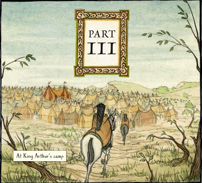 opening view of part 3 of Yvain
Part 3: Final Art for Yvain
Step 1: Testing drawing and painting styles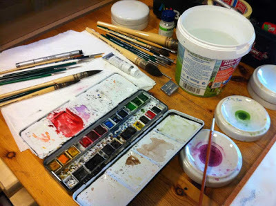 Getting my tools ready...
Before diving into finished art, I wanted to do a couple of tests to see how different styles and media would work for the story. There were several things I had to keep in mind when doing these test pages:
1. Of course, the style had to fit the feel I wanted create for the story. I wanted something that allowed for depth and subtlety, but also some hard lines. The story has all the romantic notions of a typical knight’s tale but underneath there is sharp irony and the rockhard resolve of the characters. I wanted that to be reflected in the art.
2. The speech bubbles would not be done by me but by the art director, in close communication with me. This is unusual for graphic novels and it meant that I had to figure out a way of putting the pages together that allowed me to still make adjustments when the speech bubbles were put in place.
3. Lastly, I needed to keep a close eye on the amount of time I had to plan for each page and find a middle ground between creating beautiful art and staying within my schedule.
I started out by trying different media for the line work. I have always admired the beautiful brush work that artists like Craig Thompson use for their graphic novels. Even though I knew it would take lots and lots of practice to get a beautiful line using brushes, I wanted to try it out to see if it might work for the story: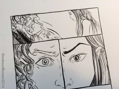 Trying ink brush...
As much as I love this style, I immediately felt that this was not right for what I had in mind. This kind of line tends to create a flat look and the line itself conveys the atmosphere and the emotion. Also, it creates a beautiful flow, and this did not feel right for the story either. I was looking for line work that allowed for more detail and depth to build up the atmosphere more slowly. Also, rather than flow, I wanted the line work to be very steady, to almost give the impression that it was edged in stone.
So next, I tried pencil. Working in pencil there are lots of possibilities for subtlety and gradation and I could easily vary between hard and soft lines. I liked how the test page turned out, especially the dimension I was able to give the characters through shading.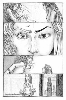 …pencil...
The third medium I tried out was fine liner. I tend to use either pencil or fine liner in my work so I feel very comfortable with both. I liked the outcome with this medium as well, it had a harder quality to it, almost chiseled, which I liked very much for what I was hoping to convey in my art. This medium is not as forgiving though as pencil, if I made a mistake it would be much more difficult to rectify than with pencil.
 … and fine liner for final line work.
I decided to go to color in both the pencil and the fine liner art and see how it would work. These days I usually work with watercolor when I go to color in my art. For the pencil art work I could not use watercolor because it does not stick on pencil, so I worked with glazing, which I love to use for my fine art:
 Work in progress on color glazes for the pencil version...
This gave me a beautiful luminous effect and vibrant colors. It was extremely time consuming though because I had to allow for drying time and build up the colors very slowly.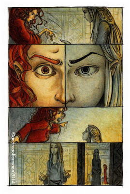 … and the final result.
Next I worked with watercolor on my fine liner version. This was nice to work with, I had great control over the colors and compared to the glazing I could work quite a bit faster.
 The final result for fine liner and watercolor.
As a third option I tried digital coloring. This would definitely be a practical choice because I would not have to scan the artwork in again and it would be easier to make adjustments to the art. I liked how it developed, but felt that it might be too clean or cold for what I wanted for the story:
 Digital color for the pencil version of the page.
Finally, I compared the finished art. I felt that after all the pencil art was too soft and gave a misty impression. I did not want that. This knight’s story was crisp and rough and M.T. Anderson’s retelling of it highlighted the ironic tone. I did not want to soften that, but compliment it. On the other hand, the digital coloring I felt put too much of a distance between the artwork and the reader. I wanted there to be a tactile quality that pulled the reader into this world. So I decided to go with the version using fine liner and watercolors, that transported the same crispness and roughness I heard in Anderson’s tone but also offered a tangible quality through the style of coloring.
 The finalized test page that I sent to the publisher.
Step 2: Working „in order“
After approval from the author and art director I set out to paint the remaining 128 pages of the book. I put up the concept sketches next to my desk to make sure that I had a clear idea of the colors and the design at all times: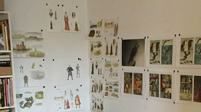 The color studies up on my studio wall. Depending on what scene I was painting I would pull down the corresponding color studies and put them right next to my work to have them in view at all times (that's why there are empty spaces where a page of the color studies is missing.)
On the other side went a schedule of the work I had to do:
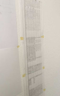 My work schedule, getting close to finishing...
When talking to other artists who had worked on a project of this scale many had advised me not to work start to finish. They said that this can show in the book in several different ways: either the style changes from start to finish as the artist becomes familiar with the characters and the world he paints and so the beginning of the book might look completely different from the end. This might happen too if the artist gets rushed towards the end and is forced to adjust the style to make the deadline. I wanted to avoid both scenarios so I decided to paint „scene by scene“ or „location by location“ if you will. This way I was hoping to keep a consistency in the art and present a book realized to the best of my potential in the end.
This meant that, for example, I painted all the storm scenes together: The storm on pages 14/15 and on pages 114-117
Or the scene of Yvain with the demon family:
 Yvain meets the master of the sweat shop castle with his demon sons
For some scenes I also had specific lighting planned, for example the scene of Lunette and Laudine sparring. I used a fireplace here as a single light source because I wanted there to be a strong contrast between the two figures. Laudine is illuminated by fire, while Lunette's face is hidden in shadow the entire time. This way I wanted to suggest the opposite colors of chess players or opposing teams. To make sure that I stayed consistent with the lighting and the colors I painted the pages of this scene all together: The scene of Lunette and Laudine lit by the fireplace
Step 3: Combining Art and Text
As I said before, this graphic novel project was unusual in that the speech bubbles were done by the art director. To make sure that we would have as much freedom as possible to adjust the art and the placement of speech bubbles, I decided to paint the pages containing dialogue frame by frame so we could move each of them around: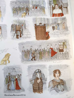 Painting each frame separately to allow for adjustments later on when the speech bubbles are put in place...
This proved very helpful when working on the final layout with the wonderful art director for this project, Sherry Fatla. She sent me the page with the suggested placement of the speech bubbles. I was able to comment and make suggestions but also to move the art in each frame to compliment her placement: …the first version of the page with speech bubbles in place...
 …and the final version. Now the change of placement of the first speech bubble on the page clarifies the order in which the bubbles should read. Also, the art in the middle frame on the bottom has moved to allow more space for the speech bubbles without too much image information being lost.
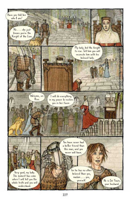
This was a time-consuming process that involved a lot of discussion and weighing of options together with the art director and the author. But it was definitely worth it and made for a much more beautiful and successful book in the end: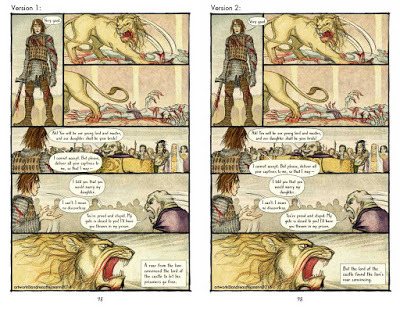 On the left is the first version, on the right the final version of the page: By moving the first bubble to the right it now becomes clear that the lion reacts to Yvain's speech. Also, now the slave master's speech bubble is cutting into Yvain's bubble in frame 5. This visually underlines the fact that he is cutting off Yvain's speech.
It was also a great experience getting to understand where each artist was coming from, the designer, the author and the illustrator, and thinking outside of ones’ own box.
The Finish Line Pages and pages of final art...
Finally, the artwork was done and sent to the art director, and the placement of the speech bubbles discussed and finalized. Now I got to sit back and see how Sherry put together the beautiful book design. A huge thank you to her for putting so much love and care into each detail of the book! Just an example: we were discussing the font to use for the book and had found one, "Southern Belle“, that we all liked: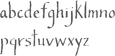 The font "Southern Belle" by designer Angie Baldelomar
However, not every font is ideal to be placed in speech bubbles, and this font proved tricky because of the long ascenders and descenders. Sherry actually contacted the designer of the font to ask if she would allow us to make adjustments, and the designer was kind enough to allow it: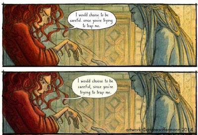 In the lower, adjusted version the ascenders and descenders (for example the t and h, the y and g) are shortened slightly. This way the leading can be smaller, the text can be slightly larger in the speech bubble and the type can be placed more easily within the round shape of the bubble.
Then, it was time for presents:
Present #1: The color proofs arrived, and were absolutely beautiful! There were only small details to clean up and everything was good to go to print: the color proofs for interior art and cover art
Present #2: In december I received a copy of the advance reading copy with a disclaimer that because of the paper quality the colors would be very muted. Still, it was so exciting to hold the first bound copy of the book in my hands and leaf through it!
Present #3: The timing was just perfect: On Christmas Day I received the first bound copy of the finished book! I am so happy with how it turned out: The cover of the ARC (left) and the final book (right)...
 …and interior pages of ARC (left) and final book (right).
Present # 4: On top of wonderful reviews, today I received a letter from the Junior Library Guild informing me that Yvain is part of their selection for spring 2017: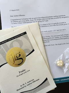 The letter and certificate from the Junior Library Guild
I am so happy and grateful!
This book was three years in the making and I am so proud of the end result. A huge thank you to everyone in my vicinity for bearing with me during the process of making this book, especially my family! A lot can happen in three years, and so it did with us. In that time I moved my studio space twice, my husband and I moved to a new home, and we welcomed our daughter, so Yvain actually has a „production baby“: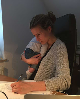 Working on Yvain while baby is taking a nap...
I am excited that after this period of intense work the book is out now for all of you to read, I hope you will enjoy it. Thank you for reading my little recap and see you again soon with more news on new projects!
 This was a fantastic project… now on to new things!
 opening view of part 3 of Yvain
Part 3: Final Art for Yvain
Step 1: Testing drawing and painting styles
 Getting my tools ready...
Before diving into finished art, I wanted to do a couple of tests to see how different styles and media would work for the story. There were several things I had to keep in mind when doing these test pages:
1. Of course, the style had to fit the feel I wanted create for the story. I wanted something that allowed for depth and subtlety, but also some hard lines. The story has all the romantic notions of a typical knight’s tale but underneath there is sharp irony and the rockhard resolve of the characters. I wanted that to be reflected in the art.
2. The speech bubbles would not be done by me but by the art director, in close communication with me. This is unusual for graphic novels and it meant that I had to figure out a way of putting the pages together that allowed me to still make adjustments when the speech bubbles were put in place.
3. Lastly, I needed to keep a close eye on the amount of time I had to plan for each page and find a middle ground between creating beautiful art and staying within my schedule.
I started out by trying different media for the line work. I have always admired the beautiful brush work that artists like Craig Thompson use for their graphic novels. Even though I knew it would take lots and lots of practice to get a beautiful line using brushes, I wanted to try it out to see if it might work for the story:
 Trying ink brush...
As much as I love this style, I immediately felt that this was not right for what I had in mind. This kind of line tends to create a flat look and the line itself conveys the atmosphere and the emotion. Also, it creates a beautiful flow, and this did not feel right for the story either. I was looking for line work that allowed for more detail and depth to build up the atmosphere more slowly. Also, rather than flow, I wanted the line work to be very steady, to almost give the impression that it was edged in stone.
So next, I tried pencil. Working in pencil there are lots of possibilities for subtlety and gradation and I could easily vary between hard and soft lines. I liked how the test page turned out, especially the dimension I was able to give the characters through shading.
 …pencil...
The third medium I tried out was fine liner. I tend to use either pencil or fine liner in my work so I feel very comfortable with both. I liked the outcome with this medium as well, it had a harder quality to it, almost chiseled, which I liked very much for what I was hoping to convey in my art. This medium is not as forgiving though as pencil, if I made a mistake it would be much more difficult to rectify than with pencil.
 … and fine liner for final line work.
I decided to go to color in both the pencil and the fine liner art and see how it would work. These days I usually work with watercolor when I go to color in my art. For the pencil art work I could not use watercolor because it does not stick on pencil, so I worked with glazing, which I love to use for my fine art:
 Work in progress on color glazes for the pencil version...
This gave me a beautiful luminous effect and vibrant colors. It was extremely time consuming though because I had to allow for drying time and build up the colors very slowly.
 … and the final result.
 Next I worked with watercolor on my fine liner version. This was nice to work with, I had great control over the colors and compared to the glazing I could work quite a bit faster.
 The final result for fine liner and watercolor.
As a third option I tried digital coloring. This would definitely be a practical choice because I would not have to scan the artwork in again and it would be easier to make adjustments to the art. I liked how it developed, but felt that it might be too clean or cold for what I wanted for the story:
 Digital color for the pencil version of the page.
Finally, I compared the finished art. I felt that after all the pencil art was too soft and gave a misty impression. I did not want that. This knight’s story was crisp and rough and M.T. Anderson’s retelling of it highlighted the ironic tone. I did not want to soften that, but compliment it. On the other hand, the digital coloring I felt put too much of a distance between the artwork and the reader. I wanted there to be a tactile quality that pulled the reader into this world. So I decided to go with the version using fine liner and watercolors, that transported the same crispness and roughness I heard in Anderson’s tone but also offered a tangible quality through the style of coloring.
 The finalized test page that I sent to the publisher.
Step 2: Working „in order“
After approval from the author and art director I set out to paint the remaining 128 pages of the book. I put up the concept sketches next to my desk to make sure that I had a clear idea of the colors and the design at all times:
 The color studies up on my studio wall. Depending on what scene I was painting I would pull down the corresponding color studies and put them right next to my work to have them in view at all times (that's why there are empty spaces where a page of the color studies is missing.)
On the other side went a schedule of the work I had to do:
 My work schedule, getting close to finishing...
When talking to other artists who had worked on a project of this scale many had advised me not to work start to finish. They said that this can show in the book in several different ways: either the style changes from start to finish as the artist becomes familiar with the characters and the world he paints and so the beginning of the book might look completely different from the end. This might happen too if the artist gets rushed towards the end and is forced to adjust the style to make the deadline. I wanted to avoid both scenarios so I decided to paint „scene by scene“ or „location by location“ if you will. This way I was hoping to keep a consistency in the art and present a book realized to the best of my potential in the end.
This meant that, for example, I painted all the storm scenes together:
 The storm on pages 14/15 and on pages 114-117
Or the scene of Yvain with the demon family:
 Yvain meets the master of the sweat shop castle with his demon sons
For some scenes I also had specific lighting planned, for example the scene of Lunette and Laudine sparring. I used a fireplace here as a single light source because I wanted there to be a strong contrast between the two figures. Laudine is illuminated by fire, while Lunette's face is hidden in shadow the entire time. This way I wanted to suggest the opposite colors of chess players or opposing teams. To make sure that I stayed consistent with the lighting and the colors I painted the pages of this scene all together:
 The scene of Lunette and Laudine lit by the fireplace
 Step 3: Combining Art and Text
As I said before, this graphic novel project was unusual in that the speech bubbles were done by the art director. To make sure that we would have as much freedom as possible to adjust the art and the placement of speech bubbles, I decided to paint the pages containing dialogue frame by frame so we could move each of them around:
 Painting each frame separately to allow for adjustments later on when the speech bubbles are put in place...
This proved very helpful when working on the final layout with the wonderful art director for this project, Sherry Fatla. She sent me the page with the suggested placement of the speech bubbles. I was able to comment and make suggestions but also to move the art in each frame to compliment her placement:
 …the first version of the page with speech bubbles in place...
 …and the final version. Now the change of placement of the first speech bubble on the page clarifies the order in which the bubbles should read. Also, the art in the middle frame on the bottom has moved to allow more space for the speech bubbles without too much image information being lost.
 This was a time-consuming process that involved a lot of discussion and weighing of options together with the art director and the author. But it was definitely worth it and made for a much more beautiful and successful book in the end:
 On the left is the first version, on the right the final version of the page: By moving the first bubble to the right it now becomes clear that the lion reacts to Yvain's speech. Also, now the slave master's speech bubble is cutting into Yvain's bubble in frame 5. This visually underlines the fact that he is cutting off Yvain's speech.
It was also a great experience getting to understand where each artist was coming from, the designer, the author and the illustrator, and thinking outside of ones’ own box.
The Finish Line
 Pages and pages of final art...
Finally, the artwork was done and sent to the art director, and the placement of the speech bubbles discussed and finalized. Now I got to sit back and see how Sherry put together the beautiful book design. A huge thank you to her for putting so much love and care into each detail of the book! Just an example: we were discussing the font to use for the book and had found one, "Southern Belle“, that we all liked:
 The font "Southern Belle" by designer Angie Baldelomar
However, not every font is ideal to be placed in speech bubbles, and this font proved tricky because of the long ascenders and descenders. Sherry actually contacted the designer of the font to ask if she would allow us to make adjustments, and the designer was kind enough to allow it:
 In the lower, adjusted version the ascenders and descenders (for example the t and h, the y and g) are shortened slightly. This way the leading can be smaller, the text can be slightly larger in the speech bubble and the type can be placed more easily within the round shape of the bubble.
Then, it was time for presents:
Present #1: The color proofs arrived, and were absolutely beautiful! There were only small details to clean up and everything was good to go to print:
 the color proofs for interior art and cover art
Present #2: In december I received a copy of the advance reading copy with a disclaimer that because of the paper quality the colors would be very muted. Still, it was so exciting to hold the first bound copy of the book in my hands and leaf through it!
Present #3: The timing was just perfect: On Christmas Day I received the first bound copy of the finished book! I am so happy with how it turned out:
 The cover of the ARC (left) and the final book (right)...
 …and interior pages of ARC (left) and final book (right).
Present # 4: On top of wonderful reviews, today I received a letter from the Junior Library Guild informing me that Yvain is part of their selection for spring 2017:
 The letter and certificate from the Junior Library Guild
I am so happy and grateful!
This book was three years in the making and I am so proud of the end result. A huge thank you to everyone in my vicinity for bearing with me during the process of making this book, especially my family! A lot can happen in three years, and so it did with us. In that time I moved my studio space twice, my husband and I moved to a new home, and we welcomed our daughter, so Yvain actually has a „production baby“:
 Working on Yvain while baby is taking a nap...
I am excited that after this period of intense work the book is out now for all of you to read, I hope you will enjoy it. Thank you for reading my little recap and see you again soon with more news on new projects!
 This was a fantastic project… now on to new things!
March 25, 2017
Petra Oelker liest aus "Zwei Schwestern"
 Mein erstes Vorabexemplar des Buches
Am 29.03. erscheint "Zwei Schwestern", das neue Buch von Petra Oelker. Es war mir eine grosse Ehre, dieses Buch illustrieren zu dürfen, und nach der wunderbaren Zusammenarbeit an "3 Wünsche" vor einigen Jahren wieder eine grosse Freude, eng mit der Autorin zusammenzuarbeiten. Petra Oelker hat einen unglaublichen Wissensfundus, und jedes Mal, wenn ich an einem ihrer Bücher arbeite, lerne ich so viel über Hamburg und über historische Ereignisse dazu! Diese Geschichte gibt einen Einblick in die neuen Lebensumstände zweier Schwestern während der Reformationszeit. Hier ist eine kleine Zusammenfassung:
Martin Luther hat zur Reformation aufgerufen, die Hamburger sind ihm gefolgt - eine neue Zeit bricht an. Das gilt auch für Reimare Hogenstraat: Sie war Nonne, jetzt ist sie nur noch eine Jungfer ohne den Schutz des Ordens, ohne den vertrauten Halt ihrer Gemeinschaft, ohne das Reglement des alten Glaubens. All ihrer Aufgaben beraubt, muss sie ihr Leben neu ordnen, einen neuen Sinn finden. Ist eine Heirat die Lösung?
Die wohlhabende Witwe Anna Bünnfeld unterstützt ihre jüngere Schwester nach Kräften. Auch sie sucht ihren Weg in dieser unsicheren Zeit. Ein Testament muss geschrieben, ihr Vermögen neu geordnet werden - gilt es, selbst darin neuen Werten zu folgen?
Beide Schwestern stehen vor der Entscheidung ihres Lebens …
 Für den Vorsatz habe ich diesmal ein Panorama Hamburgs aus dem Jahre 1530 gemalt.
Die Autorin wird an drei Terminen aus dem Buch lesen, zunächst dieses Wochenende in Leipzig in Zusammenhang mit der Buchmesse:
25.03.2017 19.00 Uhr in Leipzig
Lesung zusammen mit Tilman RöhrigNikolaikircheNikolaikirchhof 304109 Leipzig
und nächste Woche an zwei Terminen in Hamburg:
29.03.2017 19.30 Uhr in Hamburg
Lesung ”Zwei Schwestern”Literaturzentrum im Literaturhaus
Schwanenwik 38
22087 Hamburg
31.03.2017 19.30 Uhr in HamburgLesung "Zwei Schwestern und Emmas Reise"Veranstalter:
Bücherstube am Krohnstieg
Tangstedter Landstr. 49-51
22415 Hamburg
Veranstaltungsort:
Gemeindehaus der Ansgar-Kirche Langenhorn
Wördenmoorweg 22
22415 Hamburg
 Neben der Reformation spielen auch die heilsame Wirkung von Pflanzen und der Aberglaube, der mit ihnen verbunden wurde, eine Rolle. Hier ist der Baldrian zu sehen, der bösen Zauber vertreiben sollte.
Bei den Lesungen in Hamburg werde ich auf jeden Fall anwesend sein, ich freue mich schon sehr darauf!
March 23, 2017
Yvain Release Celebration Post # 2!
 Welcome back! (detail from Yvain)
I left off last week with sending the first dummy of the entire graphic novel to the publisher. Along with this dummy, I sent a package of concept sketches for the main „cast“ of characters and locations to show how I envisioned the rough thumbnail sketches of the book to come to life. Let's dive into that today:
 opening view of part 2 of YvainPart 2: Concept and Color for Yvain
While I was enjoying the script and working on first ideas for the pages of the book, in my sketch book I was taking notes about the characters and who I thought they were. I also did a lot of research about the medieval world and the concept of the "Minne" and what courteous behavior and relationships were supposed to be like. This helped me to understand the characters better and to figure out how I wanted to represent them:
 Taking lots of notes about the characters and their world...
 … then noting down possibilities to distinguish them through forms of layout, design and color scheme...
In connection to that I worked on the main locations and what they should convey, based on the characters that lived there and the scenes that took place there.
 …at the same time working on location ideas: experimenting with different tree shapes for different locations (left), and first ideas for Laudine's castle (right)
Both location and character design evolved together and one influenced the other. But to try to get some order into this post let me talk about one at a time:
Part 1: Characters - Using the theory of "The four Temperaments"
 a line up of all important characters in the story
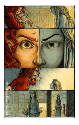
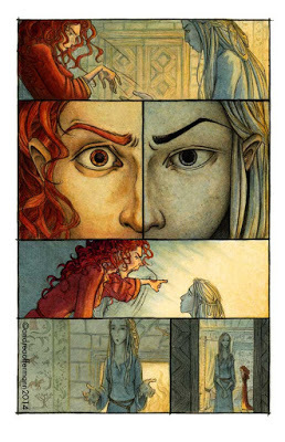
To build the cast of characters I started out with Yvain, for obvious reasons, and pretty much instantly added Lunette and Laudine to the group of main characters. Both of them are essential characters in Yvain’s world and shape his journey. Lunette appears to me almost like a secret main character even because she is pulling the strings in Yvain’s and Laudine’s story and she is fully aware of it.
 Lunette is manipulating Laudine – detail from Yvain
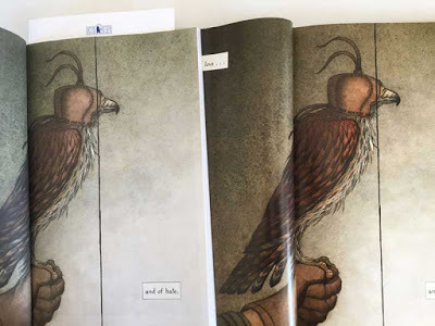
I later added Gawain as Yvain’s best friend. Gawain is not as present as any of the three others, but he plays an important role in the book as a mirror to Yvain. In the beginning they both live the same life and have the same goals. Gawain shapes Yvain’s journey by reminding him of the rules he has to follow to be seen as a successful and brave knight.
 Gawain is reminding Yvain of his duties as a knight – detail from Yvain
Gawain is also important towards the end, when we see how Yvain has changed through his journey, while Gawain has stayed the same:
 At the end of the story, Gawain is still the same – carefree and enjoying the feast – while Yvain is introspective and thoughtful – he has changed and now knows what is important to him. (detail from Yvain)
So I had a foursome of main figures that I wanted to have in the center of my cast and build the rest around. Now once again – as with the slightly awe-inspiring thought that I would now have to come up with sketches for a 128-graphic novel – I was searching for something to help me put order to my thoughts and get started with designing the characters. For this classic tale I thought it would be very fitting to look at a classic theory that was all the rage in medieval times: The theory of the 4 temperaments that had been developed based on Hippocrates' theory of the four humors:
 a rough summary of the theory of the four humors (source)
This theory had been used by writers starting in ancient Greece to develop and distinguish characters (and if you look for it, you can still find it in more modern ensembles, think of The Fantastic Four, The A-Team, or The Three Musceteers (plus Dartagnon) for example). I wanted to try and use this theory as a starting point to develop my characters:
Yvain and Gawain:
Yvain and Gawain start out very similar as knights with the sole aim to find adventure and fame. They seem carefree and unconcerned with the consequences of their actions. This fit very well with the profile of the sanguine character. So I started out by designing two more or less flighty characters, with upbeat positive and even slightly ignorant demeanor.
Gawain I thought of as a sunny boy, a little reminiscent of the cliché of the surfer dude. He’s always looking to catch the next perfect wave, translate to catching the next epic fight:
 first notes and sketches for Gawain
Yvain at first goes along with this picture, but from the beginning there is an introspective side to him. I desiged him thinner, not as muscly as Gawain, and with very rigid hair and clothes at first. He is following the rules of his world and not quite clear yet about who he is:
He then looses Laudine and goes through a time of madness, which pulls him down to earth and forces him to face the results his actions have brought:
This fit very well with the profile of the melancholic character. His face gains character in the process of his journey. His clothes and hair become more individual due to the fact that they are selfmade/selfcut from now on:
 First color studies for Yvain before and after his madness...
 … and the final color studies for Yvain put together in one concept page.
Laudine and Lunette:
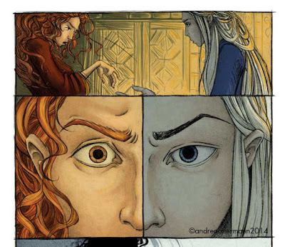
Laudine and Lunette are contrasting characters from the beginning, but they both show the ability to cope with loss, recognize their responsibilites and the choices they have to make to protect them. They both use the powers at their disposal to achieve these goals.
 early sketches for Laudine in different moods and for different parts of the story
Laudine carries her heart on her sleeve. She is very passionate and outspoken about her grief in the beginning of the story, and again in her rage towards the end. I wanted to underline this fiery character with color and attributes such as her unruly hair and expressive face. Like Yvain she changes throughout the story, guided (or forced) by Lunette's intrigues to recognize that she needs to curb her temper and make pragmatic and sometimes heartbreaking choices to rule her land and keep her people safe. I showed this transformation by her change of clothes with a veil completely covering her head and neck. Also her demeanor after coming to the decision to marry Yvain changes. She becomes very reserved and does not show her emotions freely again until the very end.
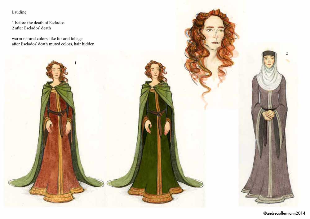 color studies for Laudine before and after Esclados' death
Lunette is the enigma in this story, a sort of mentor who guides and manipulates Yvain and Laudine, and never quite reveals her own desires and intentions. She reminds me of the Puck in English mythology (a famous example would be Puck in „AMidsummernight’s Dream“), a sprite or fairy that is using her powers to cause mischief or help, depending on her mood.
 First sketches and notes for Lunette...
I think it’s apparent that she wants well for Yvain and Laudine. But it’s never quite clear why. She seems to like Yvain for herself. But she willingly maneuvres to help him marry Laudine. There seem to be political motives as well as personal ones, and lots of clever planning in the background.
 ...followed by color studies...
To suggest Lunettes character I wanted to work with blue shades in contrast to Laudines red ones. This color scheme also suggests water, and night sky, hidden depths and fluidity. I gave her hair intricate loops to suggest the puzzle of her thoughts. Like Gawain, Lunette doesn’t change throughout the story. But unlike him she is aware of every aspect of it and of how her actions influence it.
 … and the final design of Lunette in the book - detail from Yvain
Overall the theory of the four temperaments served well as a starting point. Of course, not everything was a fit for my characters, and I completely ignored the body types that were suggested along with the dispositions. But it was interesting to have this theory to go from and figure out where it worked for me and where I had to move in a different direction.
Once I had these four main characters built up, I added the supporting characters and developed them to be distinctive from the main four yet compliment and contrast with the characters they interacted with:
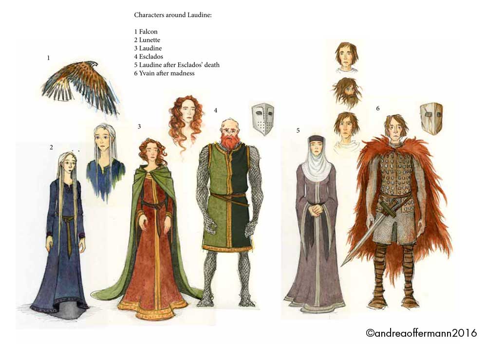 Showing Laudine next to Lunette, Esclados and Yvain, to see how they would all work together.
I am not going into detail on researching and designing clothes and armor here, for more information on that check out the illustrator's note at the end of the book.
Part 2: Locations - With some help from Animation Wisdom
In 2010 I went back to school and took a one year intensive class in animation. One thought from my animation teacher stayed with me especially: If you want the pose of a character to read instantly, the silhouette has to read first. I wanted to use this idea (once again, another starting point) for the main locations of Yvain. For each of the castles I wanted a distinctive silhouette that lay underneath the design and instantly communicated the atmosphere.
For example, for the Castle of Carlysle that Calogrenant rides towards in the beginning of the story I wanted a rectangular shape, sitting solidly in the landscape, to suggest a calm, happy and safe place Calogrenant returns to after his misadventure. I had the idea of a sturdy steamship calmly parting the rolling waves, and went from there to design the sprawling castle sitting in rolling prosperous fields.
 A first sketch of the castle Carlysle: a square shape reminiscent of a steam ship parting the seas...
 ...the color sketch for Carlysle...
 … and Carlysle in the graphic novel - detail from Yvain
I found some beautiful reference for this castle in Britain, here are two examples:
 Conwy Castle in Wales...
 … and Beaumaris Castle on the island of Anglesey.
For Laudine’s Castle, I wanted to take into account the magic that is a part of her world. The weather stone brings unimaginable storms to her forest and her castle on a regular basis. So she and her people need to be protected as well as they can. Her castle sits high on a cliff peak jutting out of the forest like a lighthouse, a beacon of hope:
 The concept sketches for Laudine's castle.
The landscape with the flat dense forest and the sudden stone cliffs peaking out seems not from this world. A few incredible places I had had the chance to visit came together in my mind here:
The dense forests and sudden stone cliffs of Saxon Switzerland inspired the landscape:
 A beautiful view of Saxony Switzerland (source)
When thinking of the houses built into the sides of the cliffs, I was thinking of dwellings such as the ones in Canyon de Chelly in Arizona
 White House Ruin at Canyon de Chelly (source)
or a more modern version in Setenil, Spain:
 Houses built into the side of the mountain in Setenil, Spain (source)
The Castle in the Woods is more reminiscent of a sturdy farmhouse than a castle, suggesting the rural farming community that lives here. The people are protected by the surrounding forrest, and not used to have to protect their land.
 The color study for the castle in the woods...
 … and an example of a farm house I had in mind when starting with the design (source).
I wanted the Sweat Shop Castle to have a forbidding and dangerous first impression. I had images from Ayers Rock in Australia in mind to show the strong and impenetrable quality:
 Ayers Rock in Australia (source)
At the same time I was thinking of a bear trap or a venus fly trap to hint at the danger hidden inside the castle:
 Example of a bear trap… (source)
 ...and a Venus Fly Trap (source)
During my research I found pictures of medieval castle dwellings, that were built in a circle. These were on a much smaller scale than the castle I designed, but the shape was perfect for what I had in mind for this location in the story:
 a first color study of the sweatshop castle
Part 3: Pulling characters and locations together into one world
 Working on color ideas for characters and location on the same page, to see how they would work together.
As these first ideas came together slowly an overall picture of what the world would look like began to take shape. By deciding on the different moods and atmospheres I wanted to achieve for each location, and the different character traits I wanted to show on each character, colors and details suggested themselves. Slowly, I developed a whole living situation for different locations and used that background information to design details such as coats of arms, colors and decoration details.
For example, at Laudine’s castle there are dwellings carved and built everywhere into the stone to afford the people protection from the storms. Because of the wild forest and the magic forces regularly wreaking hawoc, I decided that these people lived off of the hunt and what the forest had to offer them. I showed this in the colors they wear as well as the coat of arms and details of decoration:
 The color concept for Laudine's castle, showing the impact of the storm as well as detail for decoration, armor, interiors etc.
Another example is the sweatshop castle: Here I wanted to contrast the grey swamp like landscape and the ominous forbidding castle with the lavishness of the demon families' living quarters within. I also wanted to distinguish the colors of this place from all the others in the book, to suggest how removed from reality the family in this castle is:
 The concept for Sweatshop Castle including lineup of characters, interior and exterior design of the castle, decoration details and details on the garden. The purple and gold hues are very different from the more natural colors used throughout the book.
When putting together these concepts I included the characters as well to see how their designs and colors would fit with the surroundings I intended for them.
Of course, during this process of developing the characters and their homes, many ideas I was working on fell to the wayside. For example, in my early sketches i experimented with designs and shapes that were much more stylized. Below is a sketch of tree shapes that I worked on which suggested the pillars of a gothic cathedral or angular shapes echoing stone walls:
 Experimenting with more stylized tree shapes for each location.
This thought came from researching art and artifacts from the 12th century. I loved how the art was very stylized, formulaic even in depicting items or locations, so they were easily recognizable:
 Studying the Bayeux Tapetry: note the stylized tree shape in the middle of the page
However, as my ideas for color and design came together I realized that I wanted the reader to feel as close as possible to the characters and their world. More stylized designs would not have helped here, they would have broadened the gap that was already looming through the fact that this ballad is centuries old. I wanted this story to touch the reader in the here and now, and at the same time keep some of the qualities of the beautiful medieval art I had seen. Therefore I focused on conveying the atmosphere of the places through more realistic and natural shapes and colors, but tried to keep the rich and intricate nature of the tapestries and illuminated scripts in my mind when going to final art (more on that in Post 3):
 Color studies for the most important forest locations.
But, as I already mentioned, the process of sketching for the pages of the graphic novel and working on the design for characters and places went hand in hand. So ideas I had for one side of the process sometimes resurfaced in different form on another side of the process. One example is the idea of the tapestries:
While I was sketching the thumbnails for the pages of the graphic novel I found three scenes where a character tells a story within the story. There are endless possibilities to show this in graphic novels, for example a different type of frame, or color scheme, or drawing style … . I wanted the reader to stay with the characters though, and found that tapestries would be the perfect way to visualize the telling of the story without leaving the character that is talking. The reader feels like he is in the room with the characters, listening to the story being told. This, I felt, even added to the realistic feel of the rest of the graphic novel and allowed me to pay homage to the beautiful art from that time:
 The master of the castle in the woods tells the story of Harpin. The images on the tapestries behind him visualize the same story.
 The slave girls weave and stitch their own story of being abducted to work for the demons.(For more information about tapestries and how they were used in the middle ages, check out the illustrator's note at the end of the graphic novel.)
Finally, I had the dummy for the graphic novel and an accompanying package of first designs for characters and locations put together. Time to send everything off to the art director and start a conversation about where the graphic novel was developing. Now there was a period of going back and forth, discussing, adjusting and fine-tuning, until finally we were ready to go to
Part 3: The Final Art
…but more on that next week!
 See you next week! (detail from Yvain)
March 14, 2017
Yvain Release Celebration Post # 1!
 Yvain is in stores today - time to celebrate!
Yvain is being published today! To celebrate its’ release I have put together a series of posts about the different stages of my work on the book. Today, I'll start with sketching and layout, next week I will share how I came up with the concepts and colors for the world of Yvain, and in week three I will talk about going to final art. In the posts I will share some sneak peeks and talk about different scenes of the graphic novel, so I wanted to warn you that there might be some spoilers here. I will try not to give too many details away. OK, let's get started with
Working on Yvain - Part 1: Sketching and Layout
Step 1: How to sketch for an entire graphic novel
Until I got the manuscript for Yvain I had illustrated picture books and MG/YA books, and created two graphic novel short stories of my own:
 two graphic short stories I wrote and illustrated for the "Flight" Anthologies
So I was wondering how to start sketching for a 40-page manuscript that was supposed to turn into a 128-page graphic novel. First I wanted to let the story sink in, so I read and re-read the manuscript, just enjoying it. I took notes and jotted down some first thumbnail sketches in the margins to hold on to ideas that struck me immediately while reading:
 reading the manuscript and making some first notes
At the same time I read a wide variety of graphic novels, from classic ones that were close to the subject matter like "Prince Valiant" by Hal Foster to more recent and experimental ones like "Dans mes yeux" by Bastien Vivès. I wanted to immerse myself in this art form and study design, pacing and storytelling through sequential imagery (and of course also just enjoy reading them!).
 just a few of the graphic novels I read while working on YvainThen, I decided to start out with some simple math. I had heard that for movie scripts a page of script averages a certain amount of screen time, so I tried a similar approach here: if I had 40 pages of manuscript and 128 pages of graphic novel, for each page of manuscript I would have 3-4 pages of graphic novel space to work with. This was a great help to get me started with thumbnails. I would take the page of the script and have my certain number of pages allowed. With that in mind I started laying out the design of the page, sketching the sequence of frames and roughly jotting in what would happen in each frame and which dialogue would go where:
 sketching the first thumbnails and planning the page layouts
From the first readings of the manuscript I had already noted spots where I wanted to achieve certain things, for example a surprise, a density of events, or a climax. For example, when Yvain first sees the lion and the dragon fighting, I knew I wanted Yvain to look off the bottom of the page towards the page turn...
 Yvain looking off to the right at the bottom of the page...
… and then the page turn to reveal the dragon and lion fighting in a full spread.
 …towards the lion and the dragon fighting.
I wanted Yvain to see the dragon and lion just a split second before the reader sees what he sees, and I wanted that image to have a big impact. So it was clear to me that I needed a spread for that. I had to take this into account when planning out my 128 pages.
So, of course the math was just a starting point that helped me to sketch a very rough outline of the entire story and stay fairly close to the page count.
Step 2: Experimenting with Layout Solutions
 Experimenting with different layouts for pages 4 and 5 of Yvain...
One thing I love about comics is that every part of the art serves to tell the story. The way the frames are designed and put together, the choice of what is shown in the frames and what the reader will have to add in his imagination, the magic that happens when the eye moves from one frame to the next and the brain fills in the information of what happens in that gap, the way the dialogue is integrated into the art and carefully placed to suggest passage of time, all of that comes together to create a facetted experience of the story in the readers mind. I wanted to make sure to use all of these elements to tell the story of Yvain.
 … and the first rough layout of pages 4 and 5 put together.
In terms of the layout of the pages, I wanted to make sure to use it to create the atmosphere I felt a particular part of the story needed. For example, When Yvain talks to an imprisoned Lunette through a wall, I wanted to come up with a page design that hinted at the pattern of a brick wall, but showed both characters during their dialogue. I came up with a series of frames all the same size, alternating Yvain on the outside and a glimpse at Lunette trapped in the dark behind the wall:
 Yvain is talking to the imprisoned Lunette through a wall.
This way I wanted to enhance the state of mind the characters are in, Yvain oblivious and focused on his own problems outside, meanwhile Lunette desperate and losing hope in the darkness of her prison.
Another example is one of the fight scenes. In this particlar scene, the lion has been trapped to keep him from joining the fight. We see Yvain fighting his opponents, and struggling more and more. At the same time the lion is struggling to get out of his prison to run to Yvain's aid. To enhance this trapped feeling and the increasing pressure, I let the frames get smaller and smaller and interlocked them, interchanging scenes of the lion with scenes from Yvain’s fight, so towards the bottom right corner of the page the action gets tighter and tighter, until the reader turns the page and the tension is released on the next page.
 Yvain is struggling while the lion is desperately trying to escape to help him.
These are just two examples, if you are curious about a specific scene please don’t hesitate to ask via email or in the comments below and I will do my best to answer your question.
Step 3: Checking Rhythm and Flow of the Story
This is something I usually do with books I illustrate and it turned out very useful here too. When I had these first ideas set down I put together a rough dummy of the entire graphic novel. I first read through it like reading a book, turning pages and taking notes on how the story flowed. Then I put everything up on a wall to take a look:
 The first dummy of the entire graphic novel up on my studio wall.
Reading through this dummy on the wall gave me yet another perspective of the story arc and how it was achieved in the images. Using both these approaches I changed scenes around, moved dialogue and images from one page to another, gave an action of a character more space and time etc. At the same time I edged closer to adjusting the page count so it was correct.
Finally, I took my thumbnail page layouts and started sketching in more detail:
 Planning the fight scene between Gawain and Yvain with thumbnail sketches ...
I had been working on character and location sketches parallel to the thumbnails (more on that in Process Post 2) and used those now to finetune my ideas for each frame and sketch the characters with detailed body language and expression:
 … refining the body movements and action in the larger sketches…
 …and finally dropping the more detailed sketches into the layout.
Finetuning the pages still included adjusting the layout, space and placement of dialogue. When all this was done, the dummy was ready to be sent to art director and author for a first review and discussion.
 The composed dummy ready to be sent to the art director.
This concludes my first post about working on Yvain. Next week I will write about creating the world of Yvain. Have a nice week and happy release day!
March 9, 2017
Interviews with Illustrator and Author of Yvain
 Arthur and his knights ride for adventure - detail from Yvain
To get you even more excited about the release of "Yvain", Candlewick has put together two short films of me and the author discussing Yvain: First of all, M.T. Anderson introduces you to the story of Yvain and what inspired him to adapt this medieval French ballad into a graphic novel. He actually visited the forrest of Broceliande and poured water on the weather stone! To find out what happened see below:
And here is me talking a little bit about the process of working on this graphic novel and my approach to illustrating a medieval story for todays' reader (and giving you a peek at my studio space):
Have fun watching!
Andrea Offermann's Blog

- Andrea Offermann's profile
- 14 followers
Andrea Offermann isn't a Goodreads Author
(yet),
but they
do have a blog,
so here are some recent posts imported from
their feed.

