
Brian Clegg's Blog, page 36
July 21, 2018
The Phantom Horseman of Lady Lane
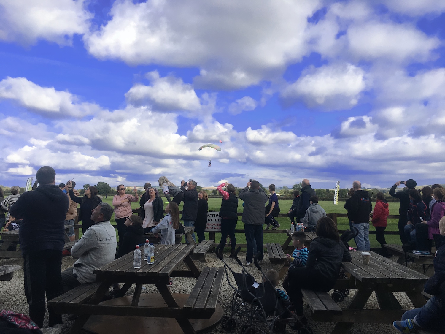
 Lady Lane is a rather spooky back road in Swindon, which has been closed to traffic for a number of years and is being gradually taken over by nature. I recently discovered there what appears to be the very large mark of a horseshoe (see photo - size 9 foot for scale). There is something odd about this horseshoe print.
The mark is at 90 degrees to the roadway. It has to be a rear hoof, as it's too close to the edge of the road behind it to be a front one. But one step forward would take a cart horse into the high hedge in front of it. But what if it's something very different? The other side of the hedge, straight in the direction in which the horse appears to have been heading, is the ruin of Blunsdon Abbey. The old house burned down around the end of the nineteenth century.
So a picture starts to emerge. Back when an abbey that was later converted into a house was still a religious site, chances are they would have had some heavy horses for agricultural work. Could it be that the ghost of a monk from the abbey rides towards the site of the burning building, into his ghostly future of the nineteenth century to then leave a mark in the present? In the monk's time there would have been no hedge. Perhaps the ghost was on a futile mission to save the inhabitants of the burning building.
In reality, I don't believe in ghosts - but I am fascinated by the psychology and sociology of ghost stories and alleged hauntings. And my suspicion is that many ghost stories emerge from small oddities, coincidences and cherry picking of evidence. Walking down spooky Lady Lane in the dusk, it wouldn't be too hard to put the pieces together as I did in the previous paragraph and perhaps to imagine a ghostly presence associated with this mark.
In reality, my story is full of holes. It's true that the position of the mark is odd, but only if it really is a horseshoe print. It's a reasonably horseshoe-like shape, but it may well not be that (it seems a bit thin to me for such a big shoe). Our brains are superb pattern recognition engines which interpret shapes given only a vague approximation to reality - the effect is known as pareidolia. As far as I'm aware, no one perished when Blunsdon Abbey burned down. And most significantly, unlike many manor houses with the 'abbey' name which were converted from old abbeys, Blunsdon Abbey was a fraud. It was a Victorian house whose occupants tried to give it a touch of class by making it sound older than it was. It never was an abbey. (Wikipedia suggests there was an earlier monastic structure somewhere in the vicinity, but the history document in the local church denies this.)
I'll leave you with the closest thing, perhaps, there is to a real ghost of Lady Lane: my old dog Goldie, no longer with us, walking down the deserted roadway.


May 30, 2018
Review - Cork Dork - Bianca Bosker
 In a friendly, personal way, Cork Dork takes the reader into the very strange world of the American sommelier (I'll come back to the A word a little later). The author, Bianca Bosker gives up her job to investigate this bizarre sub-culture as an immersive journalist, only to end up becoming part of it.
Like many, I enjoy wine (though I prefer a good real ale with a meal), but find the whole business of flowery, pretentious descriptions and ludicrously inflated prices for the better bottles off-putting and something that feels like either a con or self-deception. Bosker promises to transform our views.
The book certainly made me think a little more about the whole business - and her exploration of strange people and their obsessions makes for an excellent read - but I can't say it's changed my viewpoint. While it's clear that you can train yourself to distinguish more in taste and smell than most of us do - and the sommeliers do this to extreme - that doesn't really help the rest of us or explain why we should consider paying £100 or more for a bottle of wine. And it's very clear from what Bosker uncovers that the whole business is extremely subjective and involves a lot of self-deception.
This comes across in a number of ways. For example, she points out that in tests, the experts quite often rate the same wine totally differently - for example an identical wine in different bottles being described at the same event both as undrinkable and gold medal quality. And, to Bosker's frustration, the sommeliers persist in believing the totally discredited tongue map model of taste. All the way through there's a sense of being pulled in two directions. Yes, there's a remarkable achievement in being able to blind taste a wine and identify its grape, origin and vintage... but most of the descriptions they give convey no information and are pointless, while despite caring about what's good in wine, sommeliers are, in the end, in the business of extracting as much money from their customers as they can, so can't really be trusted.
Some of the most interesting parts of the book are where she moves away from the sommeliers and takes in other aspects of the wine industry. I found particularly fascinating just how industrial the US basic wine industry is. I know even the top notch producers these days make use of plenty of tech, but I hadn't realised how much cheap wines can be chemically manipulated for taste, odour and colour.
There are some problems with the book. It's about one third too long, repeating similar observations about sommeliers and their views too many times. It is also very US-oriented - the whole setting feels alien from a UK viewpoint and it doesn't give any idea of what the equivalent situation is here. Perhaps worst of all, there is no real acknowledgement of the increasing medical evidence of the damage caused by anything more than very moderate alcohol drinking. At one point, Bosker suggest we only drink, say, Chardonnay for a week to get a feel for it. That somehow doesn't feel like the recommended alcohol intake level. The book is, in some ways, a celebration of self-destruction without acknowledging it.
I'm very glad I read it, though - and will think slightly differently next time I'm faced with a wine list, perhaps even daring to ask the wine waiter (I don't really like the 's' word) for advice. But given what she reveals, I find Bosker's Damascene conversion from journalist to sommelier baffling.
Cork Dork is available from Amazon.co.uk and Amazon.com.
April 22, 2018
Is it the EHRC or the Observer that's telling fibs?
 In today's Observer I read 'Tories in new race row over identity checks for elections.' The article tells us that a leaked letter from the Equality and Human Rights Commission to Cabinet Office minister David Liddington raises concerns that identity checks to vote will deter immigrants and others from participating in the democratic process. Jeremy Corbyn, of course gets his views in, using this to bash the government. But is it true?
Apparently the crux of the letter is that under new rules, being trialled in several local authorities at the 3 May local elections, 'people will be asked at polling stations to produce documents proving their identity - such as a passport or driving licence - before casting their vote.'
But here's the thing. I happen to live in one of those trial authorities (Swindon). And it's just not true that you are asked to bring a passport or driving licence. The polling card quite clearly asks you to bring... the polling card. Nothing else.
Surely either the EHRC or the Observer couldn't be trying to mislead us for political reasons?
April 20, 2018
He's Gone - Alex Clare - review
 I'm always on the look out for good new British crime fiction and someone recommended He's Gone by Alex Clare. To be honest, this meant I bought it without looking at too much of the detail, and my first reaction on taking a closer look was one of disappointment.
The reason for this negative reaction is that it has become such a cliché for police officers in crime novels to have a personal problem - and the protagonist here, DI Robyn Bailley, looked likely to be exactly such a cliché. But I am pleased to say I couldn't have been more wrong.
Firstly, He's Gone works superbly as a police procedural. It's always difficult to get the balance between giving too much detail (because in the end, most police procedure is boring) and making the whole thing trivially easy. The crimes - a missing toddler, a 3-year-old murder and a series of burglaries - are handled by Clare in a way that simply keeps the interest throughout. It's an excellent book on that level alone.
But then there's the personal problem. Because Robyn Bailley was DI Roger Bailley a couple of weeks early and is beginning the transition. It's hard to imagine any job where it would be harder to be transgender, and this is made doubly so when the first case causes the investigating team themselves to be under the media spotlight. Just for once, this feels like a personal problem that isn't thrust on the main character to tick a box - it's a major part of the narrative, and like the police procedural aspect, Clare handles it beautifully.
The only negative I'd say is that while many of the characters are well rounded, the mother of the missing toddler is a two-dimensional, cardboard cutout of a nasty person with no saving graces, which is a shame.
Overall, though, Clare's book is the best crime fiction discovery of the year for me and I'm rushing out to buy the sequel.
He's Gone is available from Amazon.co.uk and Amazon.com.
April 6, 2018
Review - Landscape Pro Studio
Like most people these days I take a lot of photographs on my phone, and the quality can be excellent - but particularly with landscapes it's easy to get a result that's disappointing. On the other hand, I don't have time to spend hours touching up each photo - I want something that will enhance a landscape photo quickly and easily.
It was a pleasure, then, to try out Landscape Pro , as it does some heavy duty work, but with relatively little effort.
As a test, I used this image of the Mitchell Library in Glasgow, where I gave a talk a few weeks ago:

It's a gorgeous building (not helped, obviously, by the scaffolding), but my photo did not do it justice.
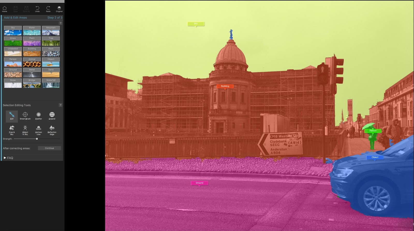
First step on loading the photo into the program is to identify key areas, which can be handled as one. This is done by dropping markers on them, then adjusting the coloured area to cover the edges. This a simple dragging mechanism, which copes with most boundaries well, though occasionally you may need to go with a more fine detail tool. Here I'm just completing identifying the building with the statue on the dome still to be included:

Then it's a matter of adjusting presets and sliders to enhance your selected areas. You can also, for example change the lighting on an area. The main changes I made were to improve the dull-looking sky, brighten up the building (and give it a subtle touch of sunlight on the top left of the dome), and to play around with the appearance of the car slightly (though I eventually left it much as it was):

Photo significantly improved in five minutes. Of course, I could have done far more (for example, in my hurry I failed to spot I'd lost the pyramidal glass roofs on the two sides of the building). But for me, the importance of this kind of software to someone who isn't a pro is what you can do quickly - and I was very impressed.
Another image I had a go at was to be used as a backdrop of the header of the website:

I wanted to put white text on top of the image, so I needed to darken the sky. I tried this in Pixelmator, my image editor of choice, but I couldn't get the border between the people's heads and the sky clean enough. It was alway very obviously edited. But five minutes with Landscape Pro Studio and it became the perfect backdrop. The sky colour looks a little unnatural, but it's what I wanted for the purpose:

There are a number of tutorial videos to help you get started, but I found it mostly easy enough to simply play with it and find out how to use it. If there's one things I would have liked included that isn't there, it's a facility to remove unwanted objects, such as the horrible street sign in the Glasgow image. I can do that separately with Pixelmator, but it would have been nice to have the facility here. Photoshop users can get the combined effect as there is a plug-in for the software.
Overall, Landscape Pro does what it's supposed to do, very well and a reasonable price, running on both Windows and Mac. You can pay up to £99.95 for the Studio Max version, but for all I need, the basic version at £29.95 does the job just fine. See the website for more details.
It was a pleasure, then, to try out Landscape Pro , as it does some heavy duty work, but with relatively little effort.
As a test, I used this image of the Mitchell Library in Glasgow, where I gave a talk a few weeks ago:
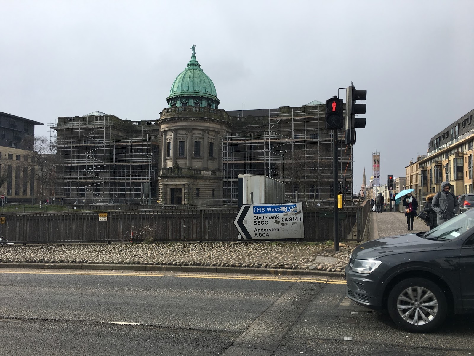
It's a gorgeous building (not helped, obviously, by the scaffolding), but my photo did not do it justice.
First step on loading the photo into the program is to identify key areas, which can be handled as one. This is done by dropping markers on them, then adjusting the coloured area to cover the edges. This a simple dragging mechanism, which copes with most boundaries well, though occasionally you may need to go with a more fine detail tool. Here I'm just completing identifying the building with the statue on the dome still to be included:
Then it's a matter of adjusting presets and sliders to enhance your selected areas. You can also, for example change the lighting on an area. The main changes I made were to improve the dull-looking sky, brighten up the building (and give it a subtle touch of sunlight on the top left of the dome), and to play around with the appearance of the car slightly (though I eventually left it much as it was):
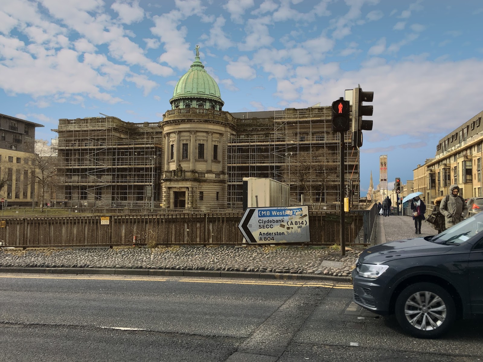
Photo significantly improved in five minutes. Of course, I could have done far more (for example, in my hurry I failed to spot I'd lost the pyramidal glass roofs on the two sides of the building). But for me, the importance of this kind of software to someone who isn't a pro is what you can do quickly - and I was very impressed.
Another image I had a go at was to be used as a backdrop of the header of the website:

I wanted to put white text on top of the image, so I needed to darken the sky. I tried this in Pixelmator, my image editor of choice, but I couldn't get the border between the people's heads and the sky clean enough. It was alway very obviously edited. But five minutes with Landscape Pro Studio and it became the perfect backdrop. The sky colour looks a little unnatural, but it's what I wanted for the purpose:
There are a number of tutorial videos to help you get started, but I found it mostly easy enough to simply play with it and find out how to use it. If there's one things I would have liked included that isn't there, it's a facility to remove unwanted objects, such as the horrible street sign in the Glasgow image. I can do that separately with Pixelmator, but it would have been nice to have the facility here. Photoshop users can get the combined effect as there is a plug-in for the software.
Overall, Landscape Pro does what it's supposed to do, very well and a reasonable price, running on both Windows and Mac. You can pay up to £99.95 for the Studio Max version, but for all I need, the basic version at £29.95 does the job just fine. See the website for more details.
March 15, 2018
Review - A Night in the Lonesome October - Roger Zelazny *****
 If you're wondering why I review less here, my SF reviews are now all on www.popularscience.co.uk - but this one is fantasy.
Roger Zelazny has always been one of my favourite authors, so it was a delight to discover his last novel, which I'd never read. It sounds like an unlikely topic to be successful. The book is narrated by Jack the Ripper's talking dog, Snuff. It tells of the preparations for a strange Game played out when Halloween falls on a full moon - featuring some familiar fantasy characters (full marks if you spot who Larry Talbot is before it's revealed) and Lovecraftian dark forces. If this sounds an unlikely plot, Zelazny is the master of taking the unlikely and making it entertaining. And he does it here to the maximum.
Although some of Zelazny's work was science fiction - the excellent Doorways in the Sand , for example - he's best known for his wisecracking fantasy series set in Amber. However, the style in A Night in Lonesome October is very different. In fact, if you were given a copy of this book with no idea of the author, you'd be more likely to guess at Neil Gaiman - it's hard to believe Gaiman, particularly in his short stories, wasn't influenced by it.
There's also a touch of Bradbury about the combination of wistfulness and playfulness in much of what happens. It's not high art, but if you like this kind of thing, it's altogether a little gem of a book. Full marks to Farrago Books for bringing back this previously out-of-print classic.
Available on Amazon.co.uk and Amazon.com
March 10, 2018
MPs in their cups
 Image from WikipediaIt's interesting that many who have spent a lot of time arguing that MPs must make more decisions suddenly don't like it when they come up with an answer that doesn't apparently fit with the zeitgeist. The matter in question was whether or not to apply a 25p charge on disposable coffee cups, as used by all those coffee shops you can't avoid these days. The MPs said 'No.' And they were right.
The problem is often compared with the success of the 5p charge on supermarket carrier bags. But it's a very different problem. Not only is it very easy to carry an empty shopping bag, we are much less likely to go supermarket shopping on a whim. And the 5p bag is an optional charge - I can choose whether or not to buy a bag. I can take away my purchase without one. I often do with a small shop. Try taking away your coffee without a cup.
More to the point, the solution is simply economic madness. According to a Cardiff University study, applying a charge would result in 3.4% fewer disposable cups being used. Leaving aside that this is a pathetic percentage, we have to look at what is being done by imposing a tax. We would be replacing the cost of disposing of those 3.4% of cups responsibly - hard to see how that can amount to more than £2-3 million a year - with at tax on 100% of cups - which would cost the consumer over £600 million a year.
This is a classic case of greenwash, where being seen to do the right thing is considered more important that actually sorting things out. A coffee cup tax would not work, and parliament should be congratulated for spotting this. It would be far better if they made it easier to recycle coffee cups - helped, perhaps by encouraging the use of this kind of cup.
This has been a Green Heretic publication.
February 25, 2018
Does it matter if organ donor opt out doesn't work?
 Image from NHSI saw an article this weekend bemoaning Westminster's decision to make organ donation opt-out rather than opt-in in England. Tim Worstall, writing on the Adam Smith Institute's blog, suggested that it was madness to take this step. And at first glance, his argument was quite strong.
Many government decisions are, frankly, guesswork. There is no good data to back up whether a change will be beneficial or not. But in this case there was some interesting data to consider. Because Wales made this decision earlier, and we now have two years of data on the outcome. According to the BMJ, 'Welsh opt-out law fails to increase organ donations.' There has been no significant increase in donation as a result of the change from opt-in to opt-out.
When you think about it (and I suspect few have), this is not totally surprising - because it's relatively rare that a death will result in organs being available and suitable for transplant. It pretty much requires the donor to be relatively young and healthy, which typically implies being in accident, as a result of which they die in hospital, so the organs can be harvested quickly.
However, I think in terms of social benefit, the opt-out system may well be worthwhile even if it doesn't do a lot to increase the number of donated organs. It says that we, as a society, care for each other. Politically, I'm a little to the right of centre, but I certainly don't subscribe to the kind of Ayn Rand view of 'All I care about is direct benefit for me'. There is little doubt that social attitudes can be changed by this kind of measure.
Is this 'doing the same thing over and over and expecting different results' as the blog post suggests? Apparently Einstein said insanity was indicated when this happened - but there's a lot of difference between a controlled physics experiment (and Einstein, of course was no experimentalist) and a large scale social experiment. Especially when we're trying to compare an outcome for a country with a population of 3 million with one of 55 million. I doubt if the Adam Smith Institute would consider the economy of Wales a good model for that of England, and it's equally not an ideal model in this case. Over those two years, we are only talking order of 100 cases in Wales, so this is a very small sample on which to draw any conclusions. We really need significantly more data to be able to draw useful conclusions.
Overall, then, I think rather than decrying it, we probably should see this as a worthwhile step.
February 16, 2018
Story arcs are great - but don't lose the single episode show
 Many great TV shows have been based on single episode shows. So each week you would get a new story with a resolution at the end of the show. (Occasionally a 'to be continued' would be used to extend this to a double episode.) This didn't stop there being story arcs, where something ran in the background through a series of shows, dominating occasionally - but most individual shows still had a satisfying narrative in their own right. For me, the master of the balance between arc and individual show was Joss Whedon. (Please come back, Joss - your TV shows were far more innovative than your movies.)
Of late though - I don't know if it's the influence of Scandi Noir - there's been a tendency to let the arc dominate to the extent that each episode has no standalone narrative whatsoever. They just become chunks of a vast film. And I honestly think that, in many cases, this has been a negative step. Two good examples are Suits and Star Trek. The early seasons of Suits had great single episode storylines, but the last few entirely failed in this respect. And though there were some good things about the Netflix Star Trek reboot Discovery (especially the very final scene), again I pined for the single, occasionally double, episode approach of the classic series. As for the X-Files reboot, I've given up on it, so depressing is its unrelenting arc. (Also it's rubbish.)
Please, show runners, don't lose the power of the single episode narrative. An arc should support and enhance, not dominate. It's fine for single thread dramas like House of Cards. But the more open structures of the likes of Suits and Star Trek have the opportunity to do something more interesting. Don't give it up.
February 12, 2018
Waving, not drowning
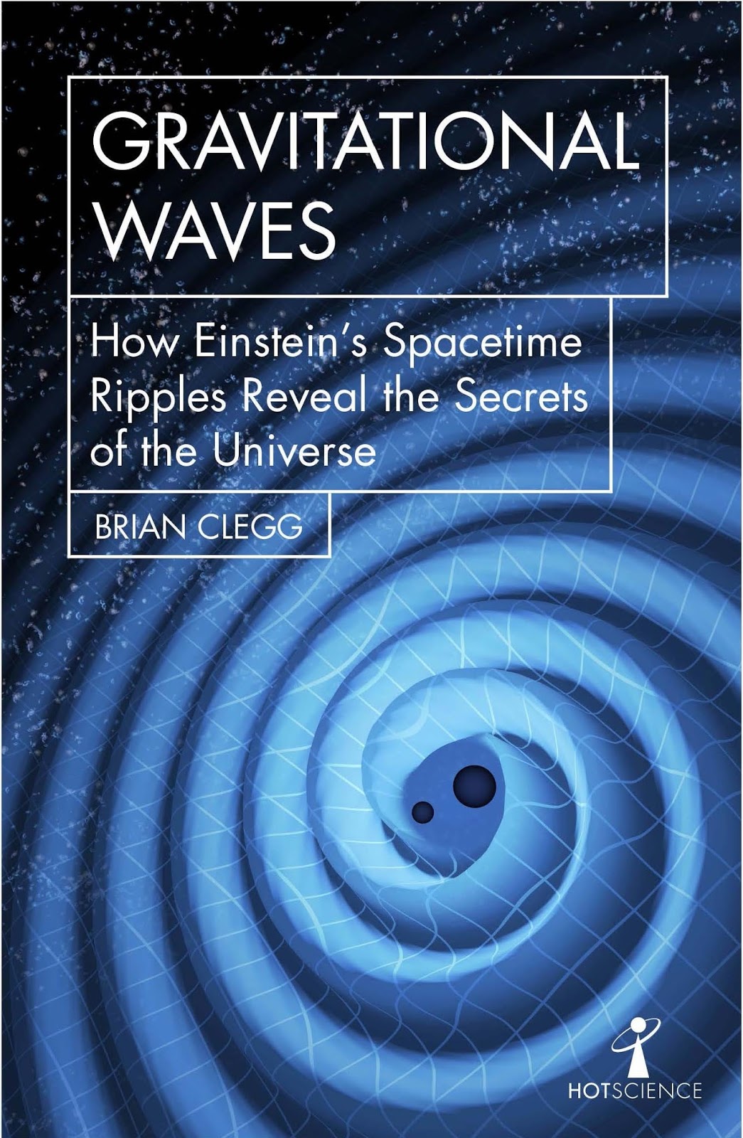 My latest book in the Icon Hot Science series is
Gravitational Waves
. All too often, this remarkable phenomenon get labelled in the media as if 'proving Einstein right' was its main role. There are two problems with this. In some ways gravitational waves prove Einstein wrong (he said they were so weak, they would never be detected)... and they're far more important than that.
My latest book in the Icon Hot Science series is
Gravitational Waves
. All too often, this remarkable phenomenon get labelled in the media as if 'proving Einstein right' was its main role. There are two problems with this. In some ways gravitational waves prove Einstein wrong (he said they were so weak, they would never be detected)... and they're far more important than that.To give a flavour of why, here's the opening of Gravitational Waves:
There are times when those working on a major science project receive public accolades. Typically, it’s when the data from a live science run is released, and what has been an intense period of private work becomes public property, to be dissected by the researchers’ scientific peers and celebrated by the world’s press. But on 14 September 2015, the huge team working on LIGO – more formally, the Laser Interferometer Gravitational Wave Observatory – had no such expectations. No one realised that 50 years of fruitless work was about to be rewarded in an unexpected fashion.
The immense LIGO experiment, covering two sprawling sites in the US and supported by over 1,000 scientists working around the world, was undergoing an engineering run. This was routine technical testing before the gravitational wave observatory would go live a few days later. It was the eighth and final cycle of fine-tuning before things might get interesting. Yet around 7.00am Eastern Standard Time – midday in the UK – a first email was sent out to interested parties that signalled the beginning of the biggest change to astronomy since the introduction of telescopes.
On that day, our understanding of the universe took a leap forward.
[..]
For over 50 years, scientists had been looking for the tiny distortions in space and time caused by a distant cosmic event that would add a new, powerful approach to the astronomer’s armoury. They had never achieved a single result. Some even suggested that gravitational waves would be impossible to detect unless we could take the leap of building an observatory in space, as the tiniest local tremor was enough to confuse the incredibly delicate instruments. But for now, these worries were put to one side. No careers were at risk of yet another failed detection of these elusive waves on this run. It was simply a matter of ensuring that the technology behaved as it should.
However, just because this was an engineering run did not mean that the observatory was inactive. Unlike the dome of a traditional telescope, with shutters to prevent light coming in, there is nothing that can stop gravity getting through. Gravitational waves may be incredibly weak and difficult to detect, but nothing can hinder their progress across the universe. And the 14 September email told the members of the LIGO collaboration that an unexpected event had occurred.
[..]
Over the next two days, excitement grew. The event seemed more and more likely not only to be a real one, but also to provide a very significant discovery. No one had expected gravitational waves to be obvious in the data stream, but these were clear, visible signals – so strong that, were this a real detection, they had both found gravitational waves and made the first-ever direct observation of black holes. In which case, the team was surely looking at a Nobel Prize. More than that, their work – which some still believed was pointless, because they thought that LIGO wasn’t sensitive enough – would have been the first step into accessing the mysteries of the universe in a way that had never been possible before. They were genuinely at the frontier of science. Yet it would be many months before the details could be made public. Months during which the teams had to lie to colleagues and repeatedly try to quash the rumours that began to fly around the scientific community. The countdown to gravitational wave astronomy had begun.
Read more in the book...


