
Kirk Demarais's Blog, page 12
July 22, 2012
CUSTOM BUILT POLARIS NUCLEAR SUB
[image error]
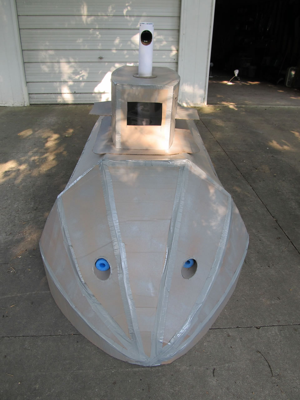
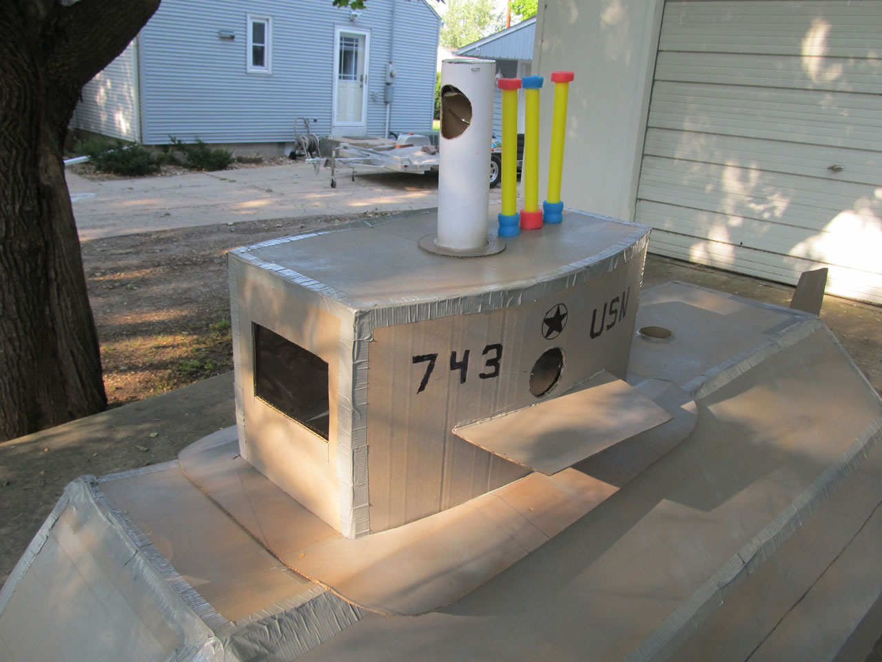
The comic book ad for the Polaris Nuclear Sub left a lasting impression on countless readers and collectors, myself included. Now Fun Blog reader Bryon Stump has built one himself and improved upon the actual product (which I've covered before). Here it is...

Bryon, who wanted the sub as a kid, but never got one says,
"...a friend asked me if I thought I could construct a cardboard submarine like the one in the ad. The more I thought about it, the more I thought it might be a fun project. I decided that I would try to make it at least look like the one pictured in the ad and I thought I could at least make it do the things advertised.
This summer, after a few weeks of work, I built my submarine. It was fun and at least I amused my neighbors. It really is over 7 ft long and can comfortably seat two children (or one adult). It fires torpedoes and nuclear missiles (with rubber bands just like the original). It has a working periscope, portholes, and light up control panels."


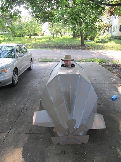
Thanks Bryon for sharing your cool creation with all of us, and my hat's off to you for showing us what could have been. For more info you can contact Bryon here.

The comic book ad for the Polaris Nuclear Sub left a lasting impression on countless readers and collectors, myself included. Now Fun Blog reader Bryon Stump has built one himself and improved upon the actual product (which I've covered before). Here it is...

Bryon, who wanted the sub as a kid, but never got one says,
"...a friend asked me if I thought I could construct a cardboard submarine like the one in the ad. The more I thought about it, the more I thought it might be a fun project. I decided that I would try to make it at least look like the one pictured in the ad and I thought I could at least make it do the things advertised.
This summer, after a few weeks of work, I built my submarine. It was fun and at least I amused my neighbors. It really is over 7 ft long and can comfortably seat two children (or one adult). It fires torpedoes and nuclear missiles (with rubber bands just like the original). It has a working periscope, portholes, and light up control panels."


Thanks Bryon for sharing your cool creation with all of us, and my hat's off to you for showing us what could have been. For more info you can contact Bryon here.


RETURN OF THE GALAXY LASER TEAM
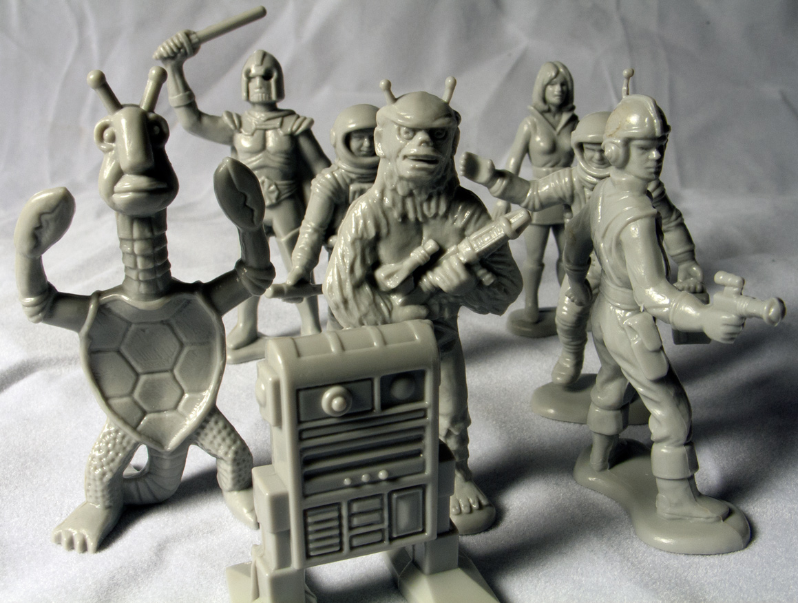
One of the first things I ever blogged about is an assortment of mysterious vintage plastic space figures I bought at a grocery store when I was a kid.
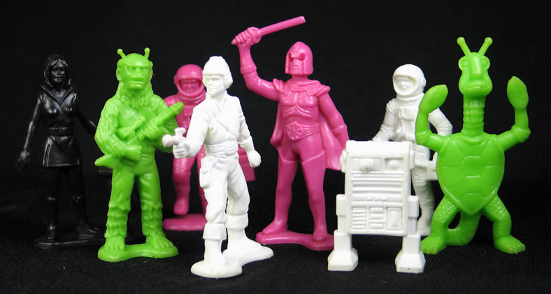
Since then, clues about the series have popped up around the web, and now they are commonly known as the Galaxy Laser Team (except for the time they were packaged as Star Patrol.) They were initially produced at the Processed Plastic Factory in Illinois and sold by Tim-Mee toys in 1978. Five-inch jumbo versions of the characters showed up in 1979, and later they became a product of Mexico. The set combined the fun of classic, plastic soldiers with our unquenchable craving for all things Star Wars, thus, during the handful of years that they were available they generated countless fond memories in young brains around the globe.
The supply of GLTs on ebay doesn't always match the demand, but now folks seeking a little outer space action have another option. The entire set has been reissued by Tim-Mee Toys and they are produced from the original molds.

The new 48 figure (and 2 starship) sets are available on Amazon for $12.50. The neon green and fuchsia color combos are gone in favor of the more logical black and gray. Unlike the seemingly random assortments in the sets of yore, each modern bag includes six of each figure design, three in both colors which means that the forces are finally equally matched and countless skirmishes among friends and brothers can be avoided.
Here's a look at one of each of them...

And here's an up-close comparison. The new one is on the right...

The new sculpts seem to be identical to the vintage figures with the slight exception of the robot and the turtle-crab guy. The robot's back is hollowed out and the turtle's shell is a bit flatter with a pattern of different proportions...

Thanks to a Fun Blog commenter named Gustavo from Buenos Aires we also know that these characters made an appearance in Argentinan Children's magazine called "Anteojito" in 1980. They had their own monthly supplemental story line called "Ekaton, The People Lost In Space." Here are a few panels...


The full stories are available here...
Episode 1: http://www.mediafire.com/view/?3g2on5...
Episode 2: http://www.mediafire.com/view/?qpxa9c...
Episode 3: http://www.mediafire.com/view/?mbut5d...
Episode 4: http://www.mediafire.com/view/?osy8p6...
It's not clear whether or not the story was designed to promote the toys, or if it's the product of a resourceful storyteller who was inspired by them. Regardless, I think it's thrilling to see artist's interpretation and watch the team in action. Hollywood take note, the world is ready for a Galaxy Laser Team motion picture!

July 12, 2012
50 AMERICAN TRAVEL SOUVENIRS
When it comes to preserving precious vacation memories, travelers are faced with few options. The human brain is unreliable, and photos are for suckers, so the only viable choice is commercially produced souvenirs. I've been patronizing souvenir shops for most of my life and figure it's time to share a hefty sample with the internet. Most of these were bought on location, even some of the vintage ones, like the time the Seattle Space Needle put out some old World's Fair store stock in time for my visit.
Several of the experiences these represent deserve their own lengthy blog posts like my honeymoon at Niagara Falls, my fateful stay at South of the Border, and my visit to House on the Rock, my favorite of all roadside attractions. I have already written about a couple of them like Rock City and South Dakota. However, I've reserved my souvenir pennant collection for future bloggery.
This is my technique when it comes to souvenir hunting:
Seek out the most outmoded shops and the most outdated inventory. Check behind merchandise for older stuff. I love it that most tourist meccas have at least one shop that hasn't changed for decades.Try to sample the various souvenir subcategories, i.e. ceramic thimbles, tiny spoons, postcards, plates, shot glasses, patches, magnets, pennants, etc. While abroad, check local flea markets and antique shops for vintage souvenirs. And now let the journey BEGIN...
 Empire State Building with King Kong replica- New York City, NY
 Plastic Statue of Liberty and Empire State Building- New York, NY
 Decorative Dish from the 1964-65 New York World's Fair- New York City, NY
 Bluff Dwellers Cave decorative thimble- Noel, MO
 California sewing kit
 Plastic Capitol Building- Washington, DC
 Key to the City thermometer- Washington, DC
 Colorado book mark
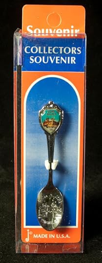 Collectible spoon from Corn Palace- Mitchell, SD

South Dakota metal cup Stuffed Cozy Dogs from Cozy Dog Drive-In- Springfield, IL
 Disneyland decorative plate- Anaheim, CA
 Disneyland paperweight- Anaheim, CA
 Dogpatch U.S.A ticket- Harrison, AR

Wall Drug glass container- Wall, SD

Flocked Jack-a-lope from Wall Drug- Wall, SD
 Flocked Donkey Salt and Pepper shaker- Branson, MO

Bonus photo of three flocked animal friends
 Drake Well patch- Titusville, PA
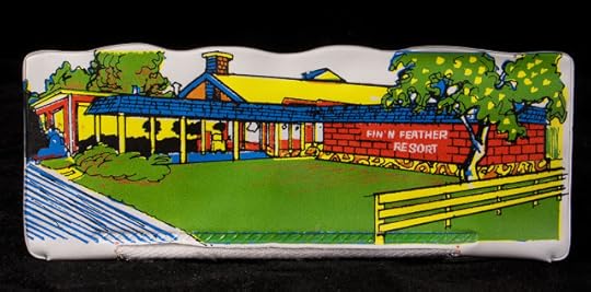 Fin and Feather pencil case- Gore, OK
(blogged about HERE)
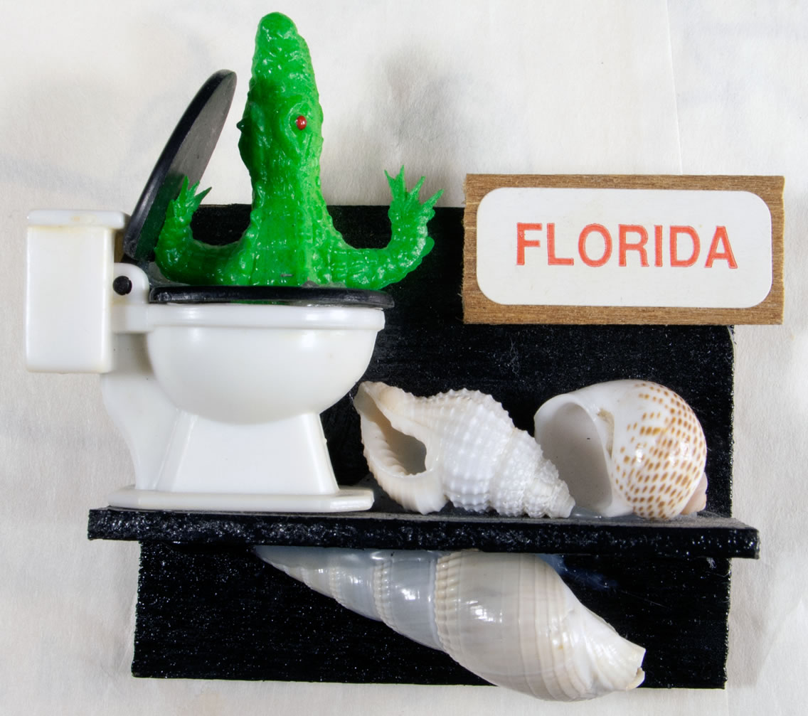
 Florida alligator in toilet with shells magnet- Orlando, FL
 Orange purse from Florida
 Oloha from Hawaii ceramic bank
 Salt and Pepper shakers from Hawaii
 House on the Rock serving tray- Spring Green, WI
 House on the Rock coaster- Spring Green, WI
 Mt. Rushmore souvenir photo booklet- Keystone, SD
 Christ of the Ozarks mini-statue- Eureka Springs, AR
 Niagara Falls ashtray
 Niagara Falls jumbo cigar
 Niagara Falls ship's wheel frame
 El Rancho Motel mini-soap- Reno, NV
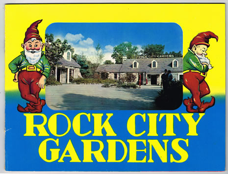 Rock City Gardens souvenir booklet- Chattanooga, TN
 Rock City Gardens pan flute- Chattanooga, TN
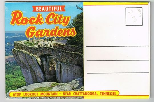 Rock City Gardens postcard book- Chattanooga, TN
 Rock City snow globe- Chattanooga, TN
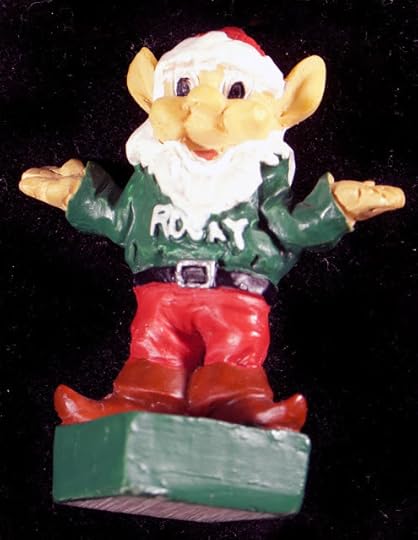 Rocky the Gnome mini figure- Chattanooga, TN
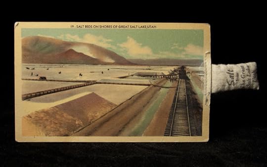 Postcard with attached bag of salt from Salt Lake, UT
 Mold-O-Rama Gorilla- San Antonio, TX
 San Francisco snow dome
 Seattle World's Fair flexi-disc
 Wisconsin Dells souvenir photo booklet
 South of the Border ashtray- Dillon, SD
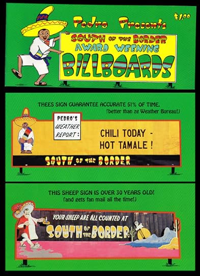
South of the Border billboard booklet- Dillon, SC
 South of the Border glitter dome- Dillon, SC
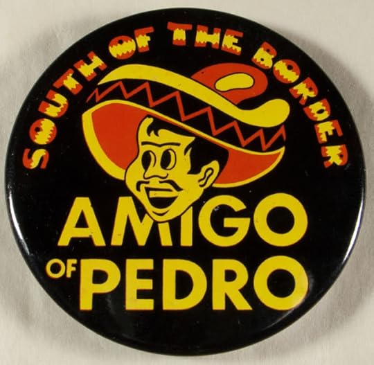 South of the Border pinback button- Dillon, SC
 Penny in a bottle Denver Mint- Denver, CO
 Winchester Mystery House patch- San Jose, CA
 Various faux currency
 Various squished pennies
 Various matchbooks
Several of the experiences these represent deserve their own lengthy blog posts like my honeymoon at Niagara Falls, my fateful stay at South of the Border, and my visit to House on the Rock, my favorite of all roadside attractions. I have already written about a couple of them like Rock City and South Dakota. However, I've reserved my souvenir pennant collection for future bloggery.
This is my technique when it comes to souvenir hunting:
Seek out the most outmoded shops and the most outdated inventory. Check behind merchandise for older stuff. I love it that most tourist meccas have at least one shop that hasn't changed for decades.Try to sample the various souvenir subcategories, i.e. ceramic thimbles, tiny spoons, postcards, plates, shot glasses, patches, magnets, pennants, etc. While abroad, check local flea markets and antique shops for vintage souvenirs. And now let the journey BEGIN...
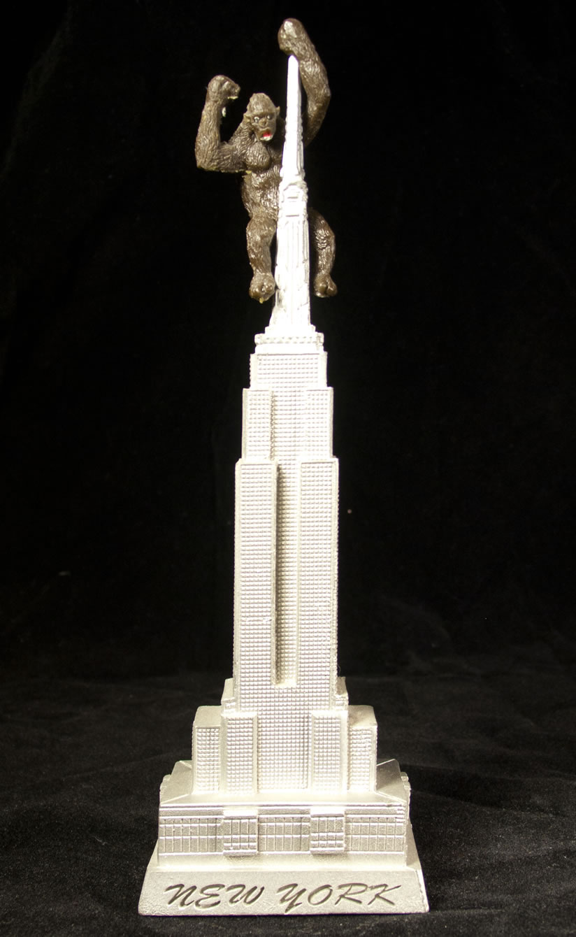 Empire State Building with King Kong replica- New York City, NY
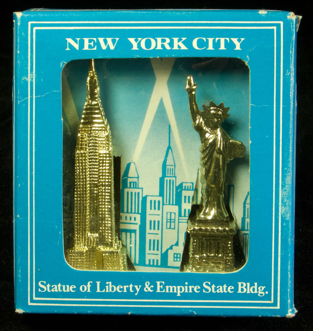 Plastic Statue of Liberty and Empire State Building- New York, NY
 Decorative Dish from the 1964-65 New York World's Fair- New York City, NY
 Bluff Dwellers Cave decorative thimble- Noel, MO
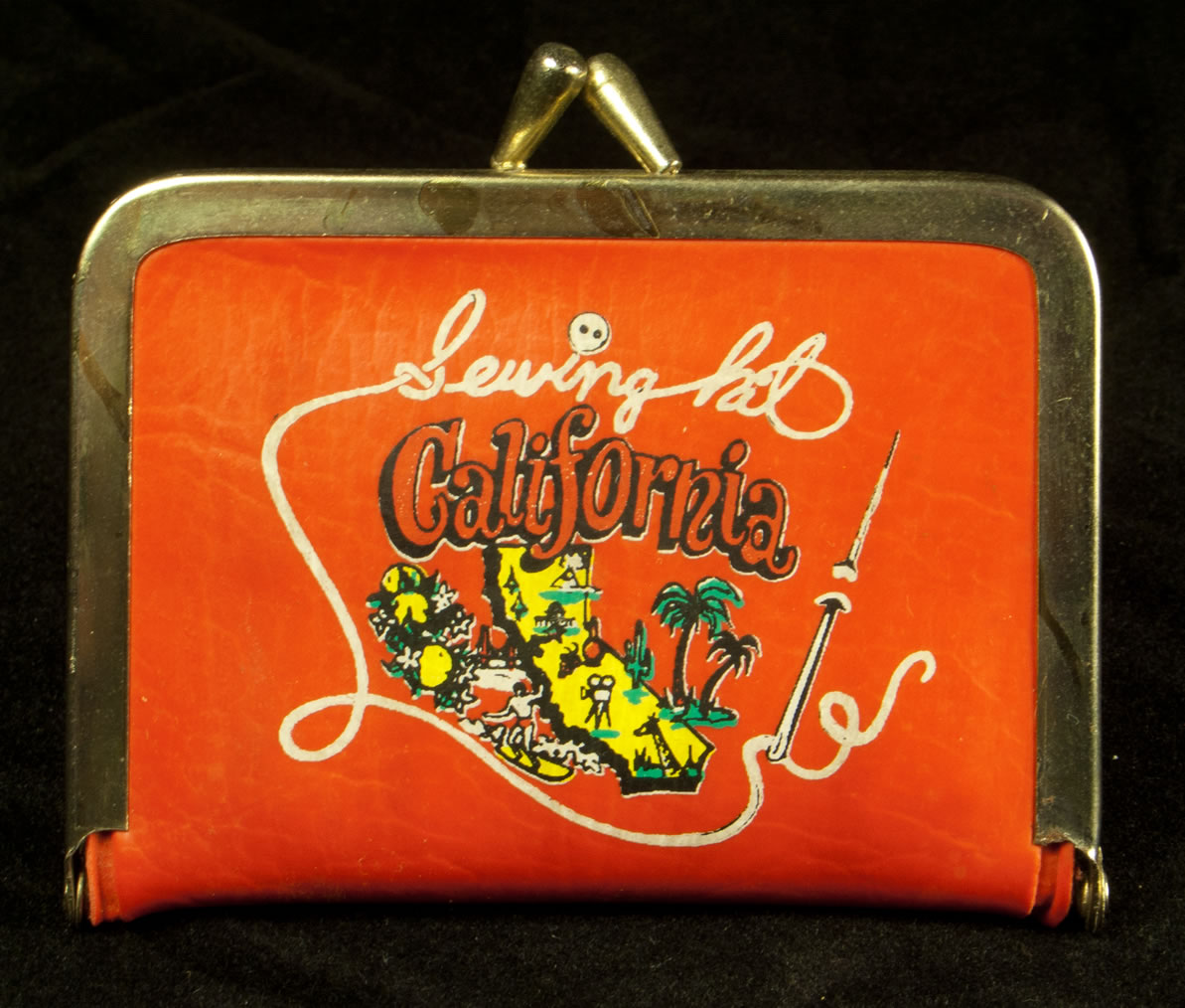 California sewing kit
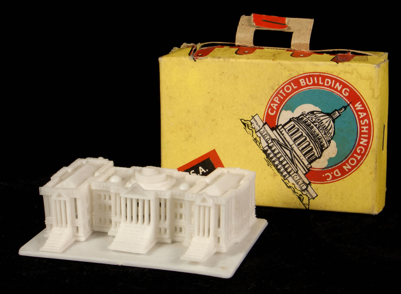 Plastic Capitol Building- Washington, DC
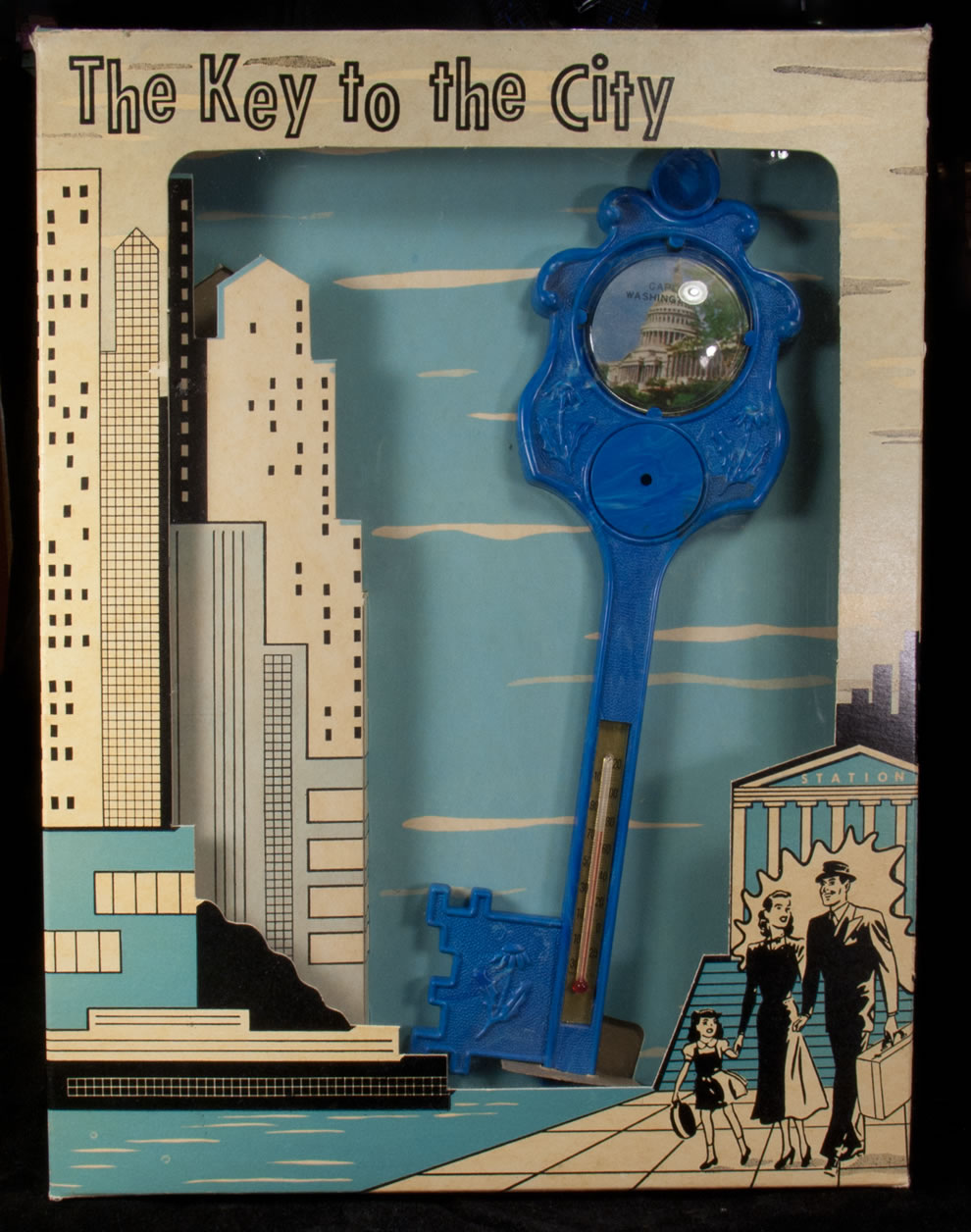 Key to the City thermometer- Washington, DC
 Colorado book mark
 Collectible spoon from Corn Palace- Mitchell, SD
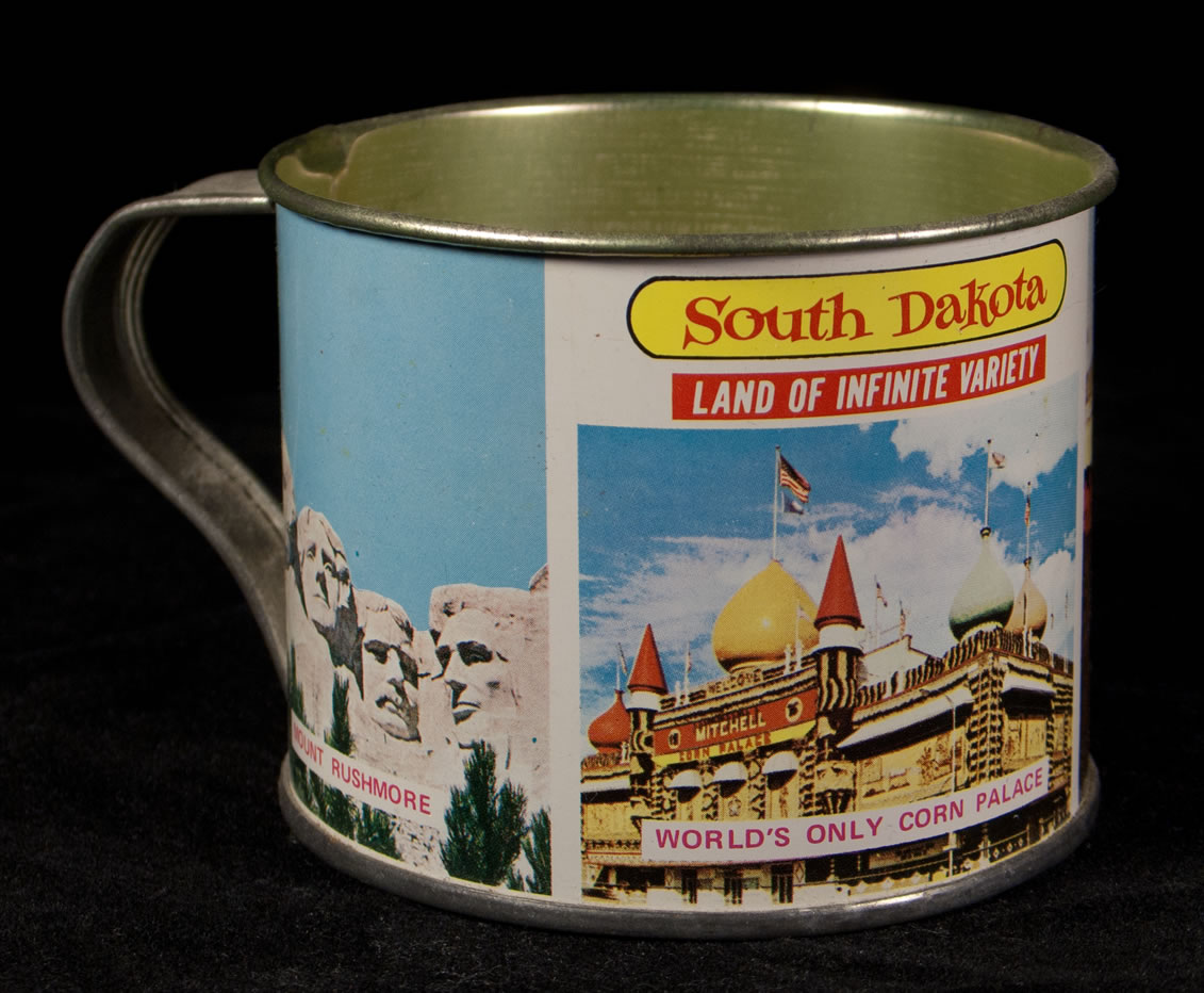
South Dakota metal cup
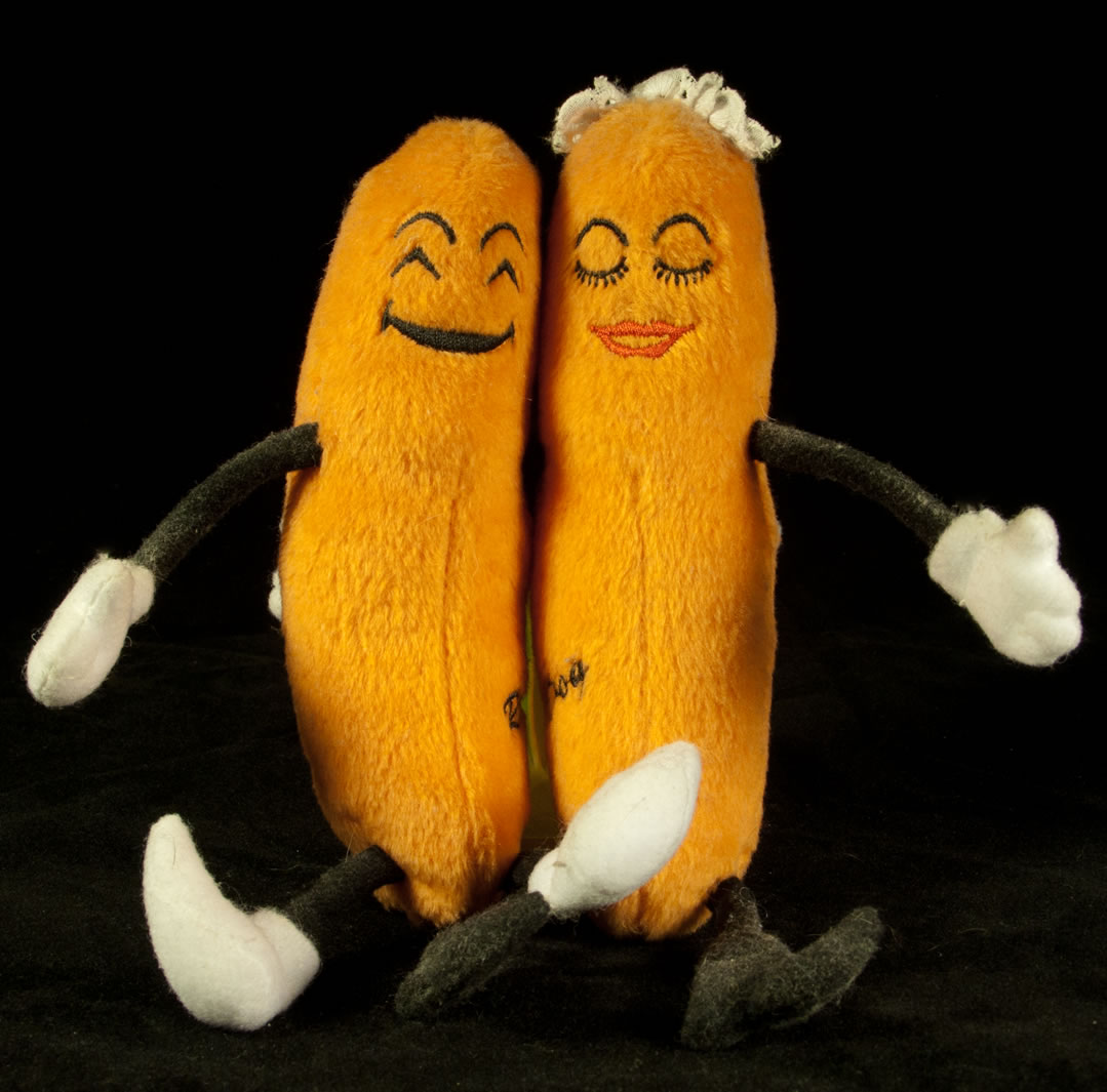 Stuffed Cozy Dogs from Cozy Dog Drive-In- Springfield, IL
 Disneyland decorative plate- Anaheim, CA
 Disneyland paperweight- Anaheim, CA
 Dogpatch U.S.A ticket- Harrison, AR
Wall Drug glass container- Wall, SD

Flocked Jack-a-lope from Wall Drug- Wall, SD
 Flocked Donkey Salt and Pepper shaker- Branson, MO

Bonus photo of three flocked animal friends
 Drake Well patch- Titusville, PA
 Fin and Feather pencil case- Gore, OK
(blogged about HERE)
 Florida alligator in toilet with shells magnet- Orlando, FL
 Orange purse from Florida
 Oloha from Hawaii ceramic bank
 Salt and Pepper shakers from Hawaii
 House on the Rock serving tray- Spring Green, WI
 House on the Rock coaster- Spring Green, WI
 Mt. Rushmore souvenir photo booklet- Keystone, SD
 Christ of the Ozarks mini-statue- Eureka Springs, AR
 Niagara Falls ashtray
 Niagara Falls jumbo cigar
 Niagara Falls ship's wheel frame
 El Rancho Motel mini-soap- Reno, NV
 Rock City Gardens souvenir booklet- Chattanooga, TN
 Rock City Gardens pan flute- Chattanooga, TN
 Rock City Gardens postcard book- Chattanooga, TN
 Rock City snow globe- Chattanooga, TN
 Rocky the Gnome mini figure- Chattanooga, TN
 Postcard with attached bag of salt from Salt Lake, UT
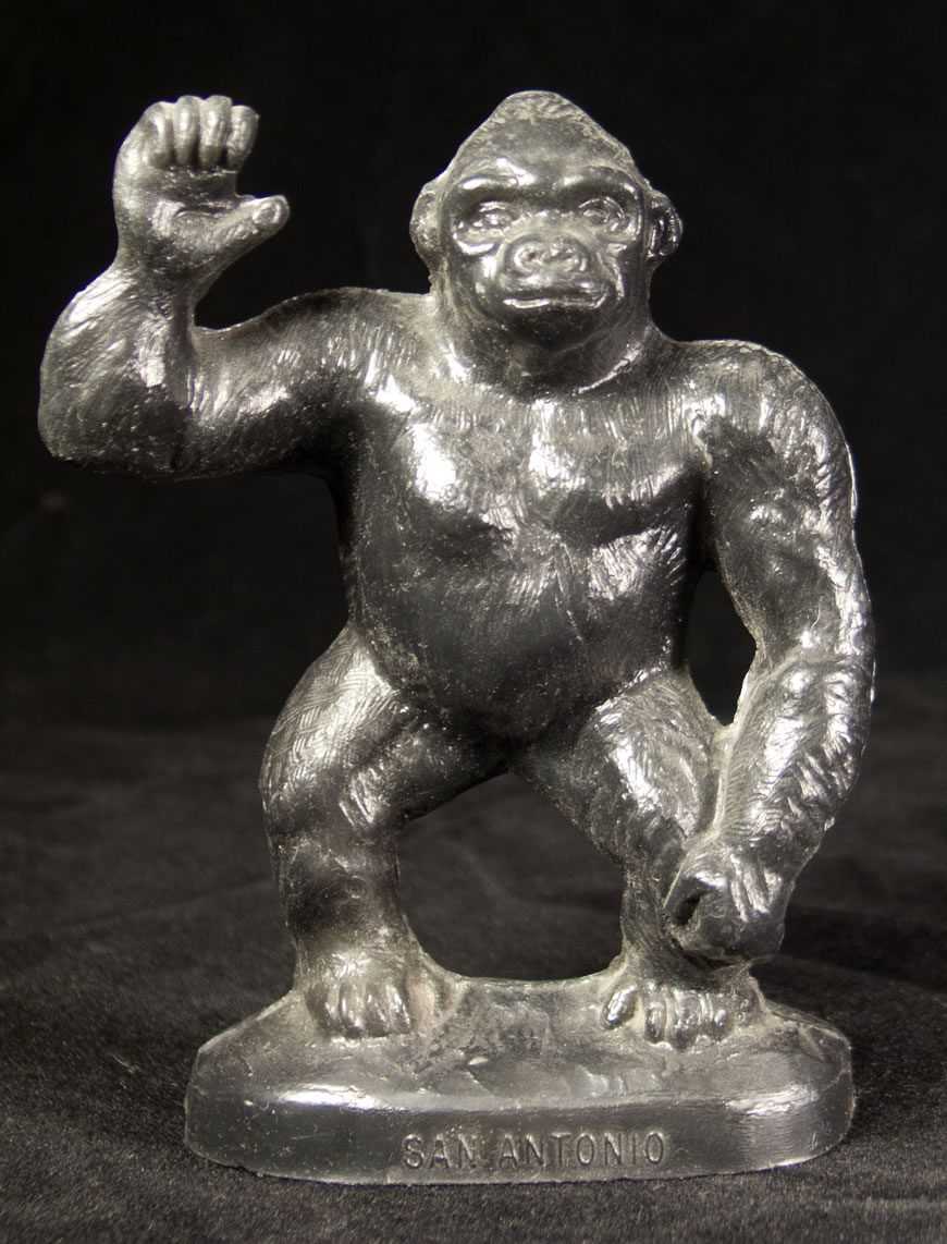 Mold-O-Rama Gorilla- San Antonio, TX
 San Francisco snow dome
 Seattle World's Fair flexi-disc
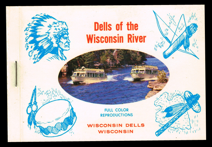 Wisconsin Dells souvenir photo booklet
 South of the Border ashtray- Dillon, SD
South of the Border billboard booklet- Dillon, SC
 South of the Border glitter dome- Dillon, SC
 South of the Border pinback button- Dillon, SC
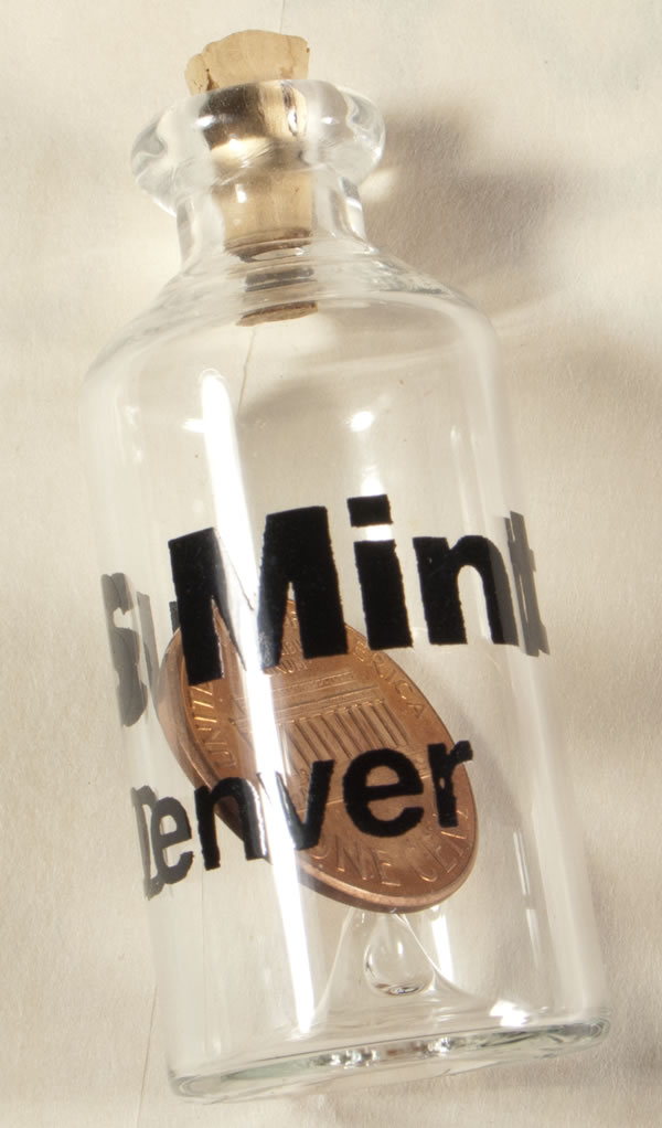 Penny in a bottle Denver Mint- Denver, CO
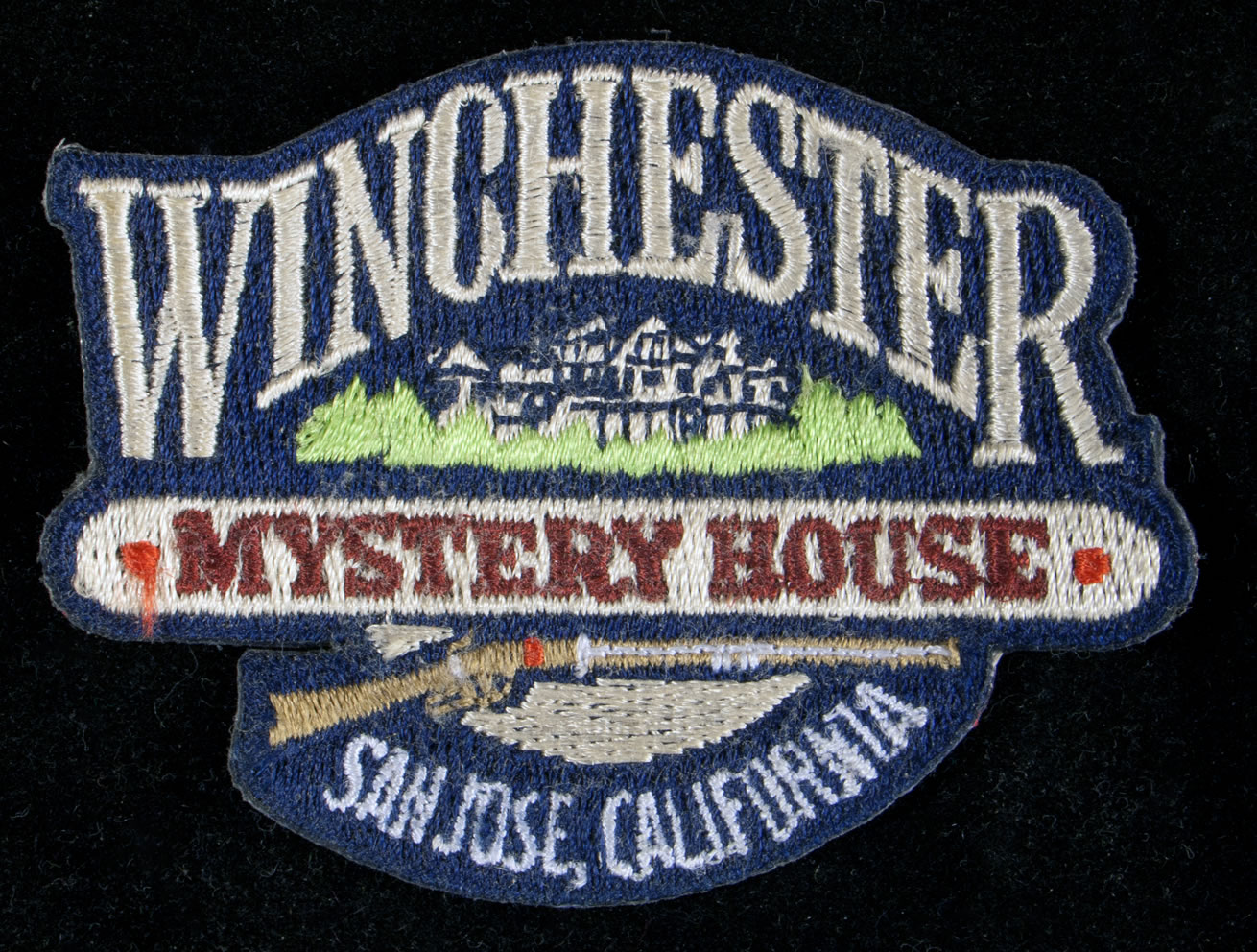 Winchester Mystery House patch- San Jose, CA
 Various faux currency
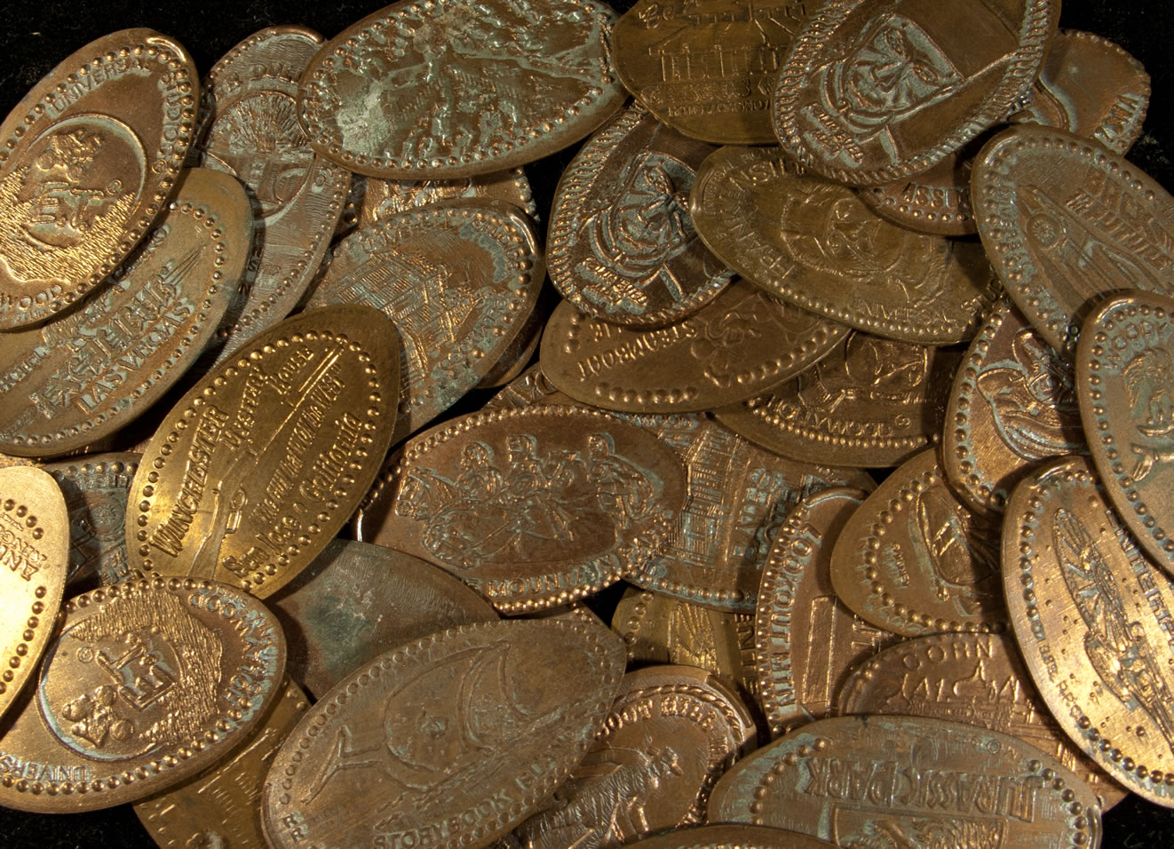 Various squished pennies
 Various matchbooks
July 6, 2012
1989 CONVENTION SWAG
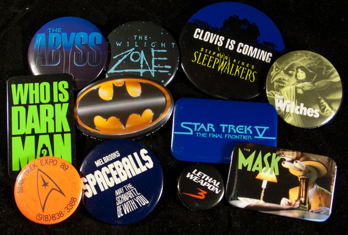
The first convention I ever attended was the Star Trek Expo '89 in Tulsa, Oklahoma. It blew me away. I was expecting a pure Trek event, but I walked into an enormous building brimming with every facet of geek culture. The fun started before I ever set foot on the vendor floor. The ticket line ran past tables of freebies including flyers, posters, bags and my favorite, pinback buttons. Naturally, I picked up one of each (well, two Batmans) and twenty three years later I took pictures of them, which I uploaded right here...


(Having date-checked a few, I realize I must have grabbed a couple of these at later conventions, and some were being recycled from previous events. They must have received a ton because they were still giving out a lot of these the following year.)
In those pre-internet days this table was good as six months worth of Slashfilm or Aint It Cool News. The existence of all but a few of these films was revealed to me in this single promotional blitz. In a marketing sense it was almost a level playing field. There was an equal chance that my next favorite movie could be The Abyss or Free Willy. Speaking of which, I couldn't wait to see a movie about flying killer whales.
All I really had to judge each production by was the graphic design. Actually, this book-by-its-cover approach was somewhat valid. There is a strong correlation between the level of artistry behind both the movie and the button for I Come In Peace. I'm also fond of the ones that seem to pre-date the film's style guide like Hamlet, which turned out to be the Mel Gibson version, and "The Dude With The 'Tude" which refers to Arachnophobia.
The most misleading piece of marketing here is for Robotjox which got me quite excited because it looked like Transformers: The Movie was going to arrive twenty years early. I was confused when it showed up at my local video store having skipped the cinemas entirely.
For some additional pleasure, here are some relevant trailers...
VINTAGE CONVENTION SWAG
The first convention I ever attended was the Star Trek Expo '89 in Tulsa, Oklahoma. It blew me away. I was expecting a pure Trek event, but I walked into an enormous building brimming with every facet of geek culture. The fun started before I ever set foot on the vendor floor. The ticket line ran past tables of freebies including flyers, posters, bags and my favorite, pinback buttons. Naturally, I picked up one of each (well, two Batmans) and twenty three years later I took pictures of them, which I uploaded to my blog...
Having date-checked a few, I realize I must have grabbed a couple of these at later conventions, and some were being recycled from previous events. They must have received a ton because they were still giving out a lot of these the following year.
In those pre-internet days this table was good as six months worth of Slashfilm or Aint It Cool News. The existence of all but a few of these films was revealed to me in this single promotional blitz. In a marketing sense it was almost a level playing field. There was an equal chance that my next favorite movie could be The Abyss or Free Willy. Speaking of which, I couldn't wait to see a movie about flying killer whales.
All I really had to judge each production by was the graphic design. Actually, this book-by-its-cover approach was somewhat valid. There is a strong correlation between the level of artistry behind both the movie and the button for I Come In Peace. I'm also fond of the ones that seem to pre-date the film's style guide like Hamlet, which turned out to be the Mel Gibson version, and "The Dude With The 'Tude" which refers to Arachnophobia.
The most misleading piece of marketing here is for Robotjox which got me quite excited because it looked like Transformers: The Movie was going to arrive twenty years early. I was confused when it showed up at my local video store having skipped the cinemas entirely.
For some additional pleasure, here are some relevant trailers...
June 22, 2012
PRESS JUNKET
 Recently I've had a lot of fun being a part of some other web sites...
I had an enjoyable talk with Lisa Hix of Collector's Weekly about my book, my other projects, and the value of growing up in a small town.I wrote a short essay for Boing Boing about my "mind-blowing movie" of choice, Poltergeist.I had a lengthy live chat with the "two dudes" on the Adventure Club Podcast about dime store toys, Mail-Order Mysteries, and lots of other geeky stuff. I also read aloud the introduction to my book in a very NPR-esque segment.Lastly, I was quoted in The New York Times Magazine in regards to my views on national politics— I mean whoopee cushions.

June 14, 2012
SPOOK TRANSPLANT

Several of the original gags from the defunct Phantasmagoria dark ride of Tulsa, Oklahoma (which I have covered extensively) have been reinstalled at Trimper's Haunted House in Ocean City, Maryland! Both dark rides were designed by the legendary Bill Tracy so they couldn't have found a better home. The entire renovation process is lovingly detailed on the Ocean City Haunted House web site (warning: graphic images). The care, enthusiasm and investment behind this project is the reason Trimper's Haunted House is among the best dark rides in the nation.


June 13, 2012
THE BEAUTY OF PEGBOARD
Not so long ago an online commercial for a service called Dollar Shave Club popped up and captured the affection of the internet. To date, it's been seen over four point seven million times, and at least a dozen of those views are mine because I keep going back to look at the cool office in the beginning.
Here's the commercial if you haven't seen it...
The opening shot is brimming with three of my favorite decorative elements: wood paneling, pegboard and vintage toys. For the benefit of humanity I've taken some high-res screenshots (click them to enlarge)...
 The first things I noticed were the Flintstones figurines and the Bam-Bam and Monchichi bubble bath bottles, but soon it became apparent that it's not just toys, and it's not just old stuff. There's a package of decorative tile and even a personal breathalyzer (in that steering wheel package.) It's a mishmash of unrelated items, some playthings, some utilitarian, and it proves a universal truth: anything looks cool hanging on old pegboard.
 Another angle and we see stuff like poker dice, a disposable camera, Mario, chip clips, a Record Vacuum, a magic marker book with cassette, and a plastic, uh, is that Deputy Dawg at the end? EDIT: Nope! Thanks to Calamity Jon we know it's Ricochet Rabbit!

These are the things I would like to know...
1. Was this office set up like this before the shoot, or was there a genius set designer involved?
2. If they found it that way, then what sort of business is it? A distributor? Do they sell a raw material that wound up in each of those products? Do they offer packaging solutions or something? Or does the office just belong to a frequent flea market shopper?
The entire warehouse looks pretty wonderful. Pale green metal machines are such a pleasure to look at.
Anyway, I've been trying to pinpoint why I find this so appealing and I think it goes back to my grandfather. Grandpa's home office was a magical place. For starters, it was the only room in the house with an air conditioning unit in the window, so after returning from a sweaty tractor ride to the local gas station for candy I'd burst in and stick my face up to the vent for a blast of glorious freon-scented cold.
Grandpa was a salesman for Newton MFG, an outfit that sells business promotional items. They can put your name on anything from ink pens to wooden nickels to fly swatters. Hiding all around Grandpa's room were fun, plastic samples that changed with every visit. A toy car on his desk, a box of stress balls on the floor, or a sales kit of sample key chains (or "fobs," as he called them) were wonderful discoveries in an otherwise toyless household. Best of all, we often got to take home these treasures. So packaged doodads and offices have been married in my mind since boyhood. (I so wish I'd taken a picture of that room. Thankfully I did get to keep the ever-present plaster eagle and paint-by-number Jesus from his wall after he passed away.)
While I'm on the topic, here are a few more pegboard related items. First, a shot of my own wall display of dime store toys (taken from an old Mr. Toast photo session) The pegboard came from a defunct shoe store...

Speaking of Mr. Toast, his creator Dan Goodsell sent me this amazing photo of the Joseph Cossman Co. booth at the 1965 New York World's Fair chock full of products on pale-aqua pegboard. Cossman was the novelty business king behind the Ant Farm and the Spud Gun.

Here's a shot of one of my favorite places, Dicks 5&10 in Branson, MO. They have a pegboard wall in the back set aside for gadgets that you rarely see anymore like pocket protectors, fizz-preserving soda bottle lids, suction soap holders and push-button "handy adders."

My favorite wall of sample products in the world had to be the one I saw at the S.S. Adams factory in Neptune, NJ in 2005. This dusty display had been hanging up in the second floor since the 1960s...

I tried to recapture some of that magic with this pegboard spinner rack in my own home office...

So there. I must say I've surprised myself with the number of relevant photos I found on my computer. Oh, and if you're wondering, this is not a paid endorsement for the Dollar Shave Club. Being a work-at-home designer guy, I hardly ever shave.
Here's the commercial if you haven't seen it...
The opening shot is brimming with three of my favorite decorative elements: wood paneling, pegboard and vintage toys. For the benefit of humanity I've taken some high-res screenshots (click them to enlarge)...
 The first things I noticed were the Flintstones figurines and the Bam-Bam and Monchichi bubble bath bottles, but soon it became apparent that it's not just toys, and it's not just old stuff. There's a package of decorative tile and even a personal breathalyzer (in that steering wheel package.) It's a mishmash of unrelated items, some playthings, some utilitarian, and it proves a universal truth: anything looks cool hanging on old pegboard.
  Another angle and we see stuff like poker dice, a disposable camera, Mario, chip clips, a Record Vacuum, a magic marker book with cassette, and a plastic, uh, is that Deputy Dawg at the end? EDIT: Nope! Thanks to Calamity Jon we know it's Ricochet Rabbit!
These are the things I would like to know...
1. Was this office set up like this before the shoot, or was there a genius set designer involved?
2. If they found it that way, then what sort of business is it? A distributor? Do they sell a raw material that wound up in each of those products? Do they offer packaging solutions or something? Or does the office just belong to a frequent flea market shopper?
The entire warehouse looks pretty wonderful. Pale green metal machines are such a pleasure to look at.
Anyway, I've been trying to pinpoint why I find this so appealing and I think it goes back to my grandfather. Grandpa's home office was a magical place. For starters, it was the only room in the house with an air conditioning unit in the window, so after returning from a sweaty tractor ride to the local gas station for candy I'd burst in and stick my face up to the vent for a blast of glorious freon-scented cold.
Grandpa was a salesman for Newton MFG, an outfit that sells business promotional items. They can put your name on anything from ink pens to wooden nickels to fly swatters. Hiding all around Grandpa's room were fun, plastic samples that changed with every visit. A toy car on his desk, a box of stress balls on the floor, or a sales kit of sample key chains (or "fobs," as he called them) were wonderful discoveries in an otherwise toyless household. Best of all, we often got to take home these treasures. So packaged doodads and offices have been married in my mind since boyhood. (I so wish I'd taken a picture of that room. Thankfully I did get to keep the ever-present plaster eagle and paint-by-number Jesus from his wall after he passed away.)
While I'm on the topic, here are a few more pegboard related items. First, a shot of my own wall display of dime store toys (taken from an old Mr. Toast photo session) The pegboard came from a defunct shoe store...

Speaking of Mr. Toast, his creator Dan Goodsell sent me this amazing photo of the Joseph Cossman Co. booth at the 1965 New York World's Fair chock full of products on pale-aqua pegboard. Cossman was the novelty business king behind the Ant Farm and the Spud Gun.

Here's a shot of one of my favorite places, Dicks 5&10 in Branson, MO. They have a pegboard wall in the back set aside for gadgets that you rarely see anymore like pocket protectors, fizz-preserving soda bottle lids, suction soap holders and push-button "handy adders."

My favorite wall of sample products in the world had to be the one I saw at the S.S. Adams factory in Neptune, NJ in 2005. This dusty display had been hanging up in the second floor since the 1960s...

I tried to recapture some of that magic with this pegboard spinner rack in my own home office...

So there. I must say I've surprised myself with the number of relevant photos I found on my computer. Oh, and if you're wondering, this is not a paid endorsement for the Dollar Shave Club. Being a work-at-home designer guy, I hardly ever shave.
June 12, 2012
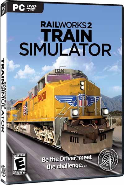
IN DEFENSE OF 'TRAIN SIMULATOR'
A couple years ago I noticed that a PC train simulator called Railworks (which has since been renamed Train Simulator 2012) had become a popular laughingstock among the members of the Reddit gaming community. I understood why after I found a few gameplay videos like this one...
Compared to the hyperactive cyberworlds that we've come to expect, Railworks is a snoozefest. There are no enemies or obstacles. Of course you're literally on rails, so steering isn't required. Primary controls are limited to forward, reverse, throttle— oh, and a there's a windshield wiper on/off switch.
Your in-game character lacks any super powers, or a sword, or even a keychain container of mace. You don't sport body armor, or even a leather jacket. In fact, this is you...

The missions occur in real-time so in some levels once you set your train on course you can actually leave the controls to go play X-box for an hour or more before your locomotive needs further attention.
Naturally, the low stakes anti-action invites this sort of send-up...
Actually, the mockery wrought by Railworks is nothing compared to their street cleaner simulator. I'm serious. Gamespot's tongue-in-cheek seventeen minute tribute is one example...
Railworks most joked-about feature is the additional downloadable content that's available for it. The core game runs about thirty-five bucks and comes with a variety of engines and routes, but if you wish to add to your collection you are faced with dozens of expansions that range from five to twenty dollars. And if you want all of the extras? Unless you wait for a sale, that will literally cost you $2027.97! (The DLC is key to their business strategy to the extent that the publisher issued free version 3 upgrades to owners of Railworks 2.)
So I laughed along with my fellow "hardcore" gamers. I took time from my own pointless geekery to scoff at the lesser dweebs who are so easily placated with sub-par graphics and pricy, new CG train models. But at some point it became a fascination with me, as these things often do. I found myself looking up sincere in-game footage and visiting Railworks message boards, on which a fair amount of time is spent defending their interest from the heckling trolls at large.
My mind kept returning to the Railworks enthusiasts, and I started seeing things through their eyes. Of course it's mundane, the goal is realism, and real conductors could not sustain decades-long careers if they faced daily warfare or alien invasions. And the developers don't expect anyone to purchase all the downloadable content any more than a hobby shop expects you to buy one of every model train that they sell. Speaking of which, model train collecting can be even more expensive and they only go in circles.
My respect for the Railworks community began to grow as it occurred to me that their passion does not require thrills, instead they are contented by life's subtleties. Their fantasies don't rely upon adrenaline or destruction, they just wish to peacefully command a Class 47 Triple Grey all the way from Oxford to Paddington. They bask in the sights of the uninterrupted countryside. Their serenity is found in the rhythmic valley echos of rumbling tracks. Hobbies are supposed to be relaxing, right? Most of my video gaming ends up driving me to internet walkthoughs in fits of frustration.
It wasn't just the Railworks state of mind that I envied, I also fantasized about having enough spare hours to leisurely delve into each sauntering level, gazing at my monitor blissfully, pausing only to adjust the camera angle every few minutes, or turn on the windshield wipers.
By the time Railworks 2 went on sale for eight bucks I was primed to join the ranks of the noble virtual conductors. I proudly bought a copy.
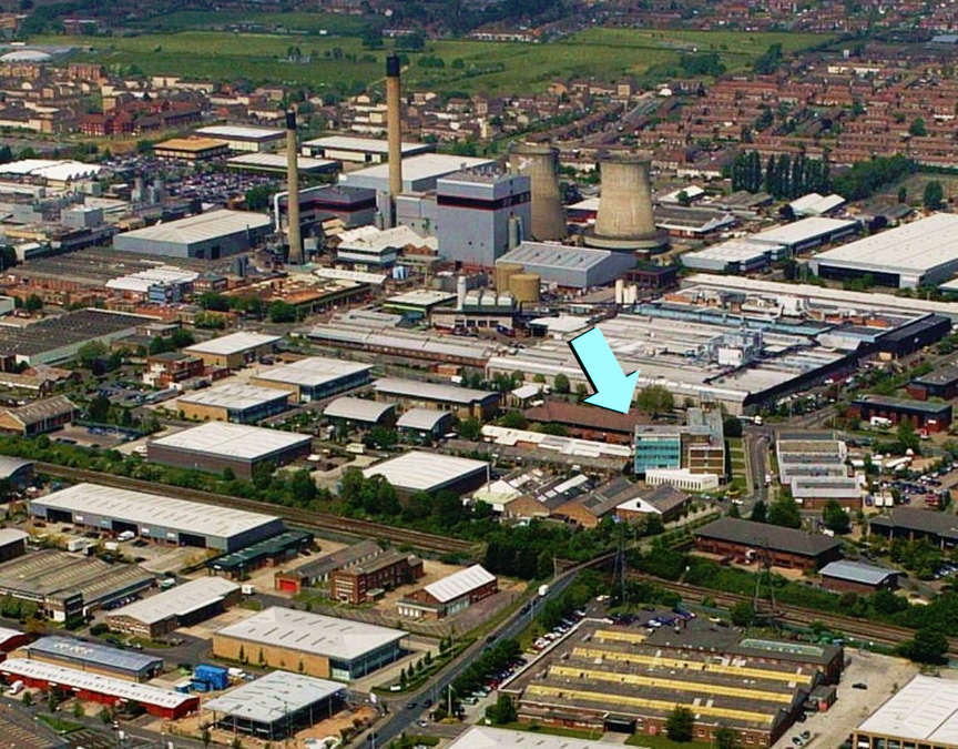
The cross-country journeys were as soothing as anticipated and I even felt like I was getting a pixelated glimpse into the United Kingdom where most of the missions take place. The environment is said to be pretty accurate. I decided to put this to the test when I noticed one of my routes passed through the city of Slough which is known to me as the setting of the original British version of The Office.
Here's an actual photo of the city with the fictional Wernham Hogg building highlighted (otherwise known as Crossbow House at 40 Liverpool Road.) Notice it's just a block from the railroad...
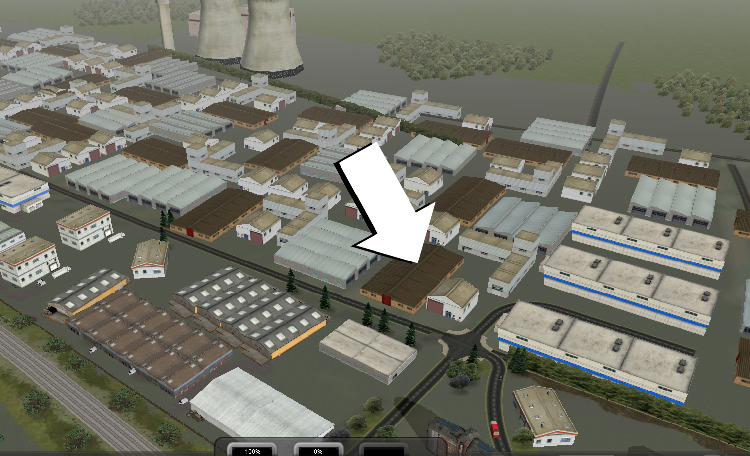
And here's the in-game neighborhood with an approximation of where the building would be...
Such simple pleasures go a long way, but the truth is I can't say that I've been able to become one of them. I've played for twenty plus hours, but I rarely complete a level without acting on the urge to derail. I have little to contribute to the message boards, nor can I share in the excitement over the announcement of the latest downloadable train.
I even purchased a downloadable content package. Trains versus Zombies for $5 seemed impossible to pass up, but it turns out the zombies are just the regular passengers with green-tinted skin. They never rush the train, they just stand at the stations checking their watches.
I'm sure I'll continue to revisit the game from time to time, but what gets me excited is the thought of future editions when the landscape will eventually resemble a true virtual reality. As soon as I retire my first task will be to upgrade my copy to Train Simulator 2038.

May 30, 2012
GAMES YOU CAN'T WIN OR LOSE
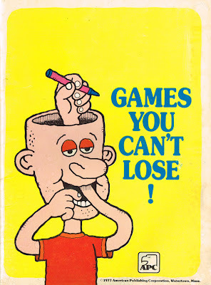
One of my favorite aspects of being a collector is reclaiming relics from childhood that somehow got away, especially the obscure ones. One of my latest recoveries is Games You Can't Lose! (1977), a 48-page made-to-be-a-gift booklet, thus the authors were uncredited. (For the record they are Herbert Kavet, Paul Deboer, and illustrator, Martin Riskin.) It's one of many transitory titles produced by the American Publishing Company, which may be the same outfit that put out a series of jigsaw puzzles-in-a-can, Presto Magix sets, and a vintage Party Survival Kit that I got last year.
My dad bought the book as a gift for a colleague, but upon closer inspection he decided it was a bit too risqué to pass along; a wise move considering his very conservative social circle. So it found a home under a pile of unpaid bills on my father's bureau, but such an eye catching cover could not go unnoticed by a seven-year-old such as myself, so I took a gander.
Actually, I was completely unaware of the few objectionable bits which include a KKK gag (that the internet has already found) as well as a word my dad had scribbled out beyond recognition in an early attempt to salvage the gift. He had replaced it with "Director of Student Life," presumably the job title of the would-be receiver.
But for me the book didn't need vulgarities to have shock value. The concept alone seemed impossible, defying every children's activity book on my bedroom floor. The parody factor went beyond Mad Magazine because this was a fully developed product, like a Wacky Packages come to life, forever mocking the stack of Highlights for Kids in my doctors office. The fact that it was designed for sophisticated adults only added to the appeal.
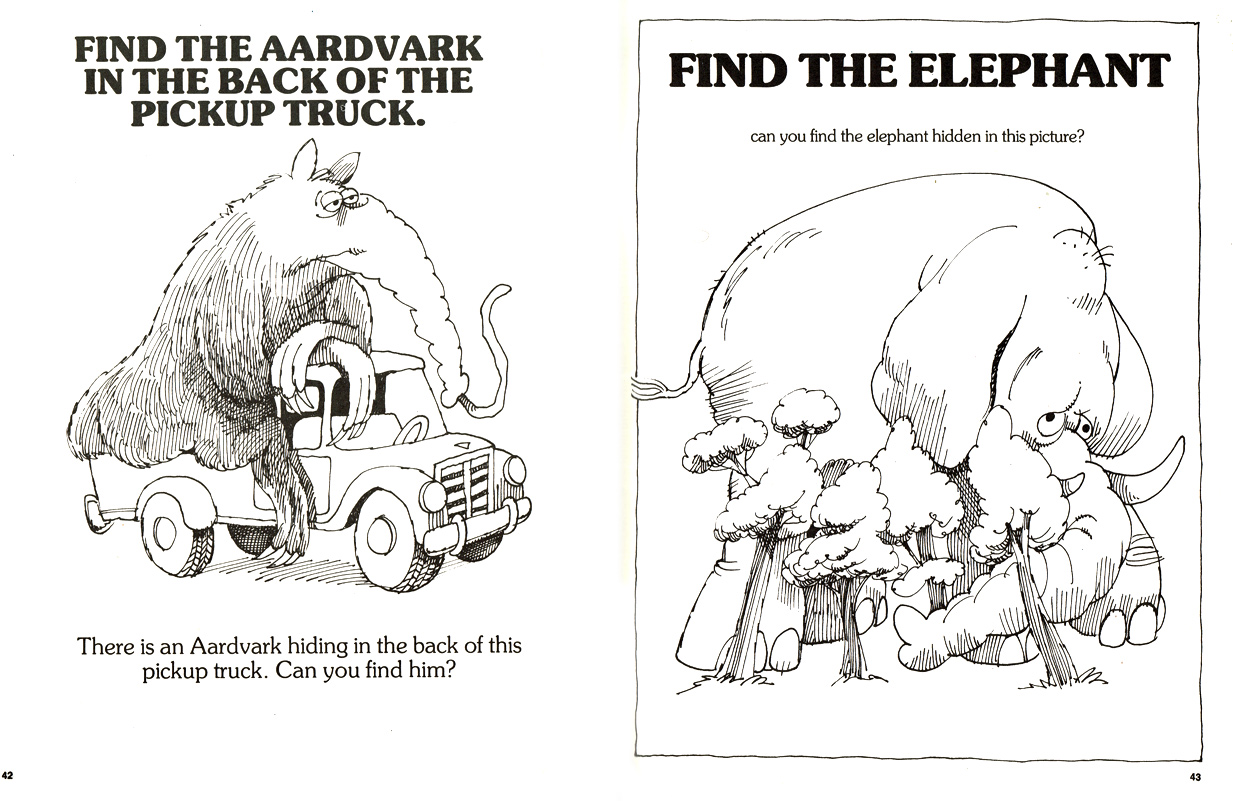
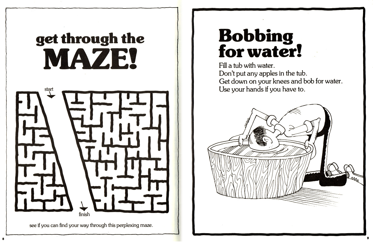
I felt empowered as I breezed through the puzzles, several of which can be seen here...


Years later I was tagging along with my mom on an afternoon of errands that took us to a drug store called Collier's in a neighboring city. Unlike most of mom's stops, this place had an ample selection of interesting products like party favors, gifts, and even better, gag gifts. In a cruel twist of fate it wasn't until I was exiting the shop when I noticed this at the top of a spinner rack...

I gasped. The mysterious, mind-expanding publication had a sequel! I pleaded with mom to go back, but she announced that our next lame destination would be closing soon. I never even got to open the book— until recently when I finally bought it online.


While the revelation could never match my initial childhood discovery, I took great pleasure in finally quenching my curiosity. I especially like that a number of the pages have an opposite counterpart in the other book.
Truth is, I didn't have to wait decades to see more from the APC collection, a few years after Games entered my life, A Get Well Book For _____ (1979) showed up in my household. This time my dad was on the receiving end.

It was certainly worthy of its place next to the copy of Games You Can't Lose in the top of my dad's closet. Though it lacks the "high concept" of the other books, it still has the endearing artwork of Martin "Marty" Riskin.
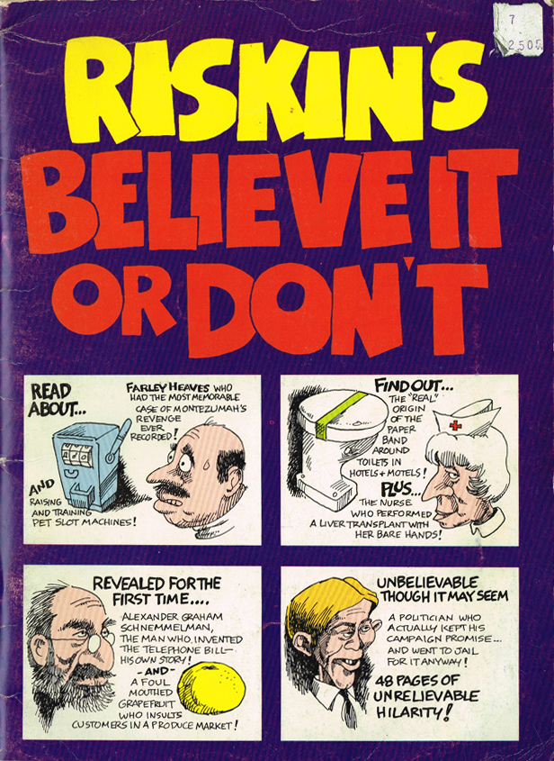
A recent googling lifted away the shroud of mystery on this prolific artist. Marty Riskin's web site showcases many of the 250 books he's illustrated, most of which include the words sex, beer, or fart in the title. Marty is obviously a fixture of the American gag culture, and there's no telling what sort of influence he's had on my own mind and output. I've made it a point to further explore his work, most recently by way of this second hand copy of Riskin's Believe It Or Don't (1979).
When I was in junior high I asked my dad if I could adopt his two APC titles into my own book collection. He handed me the get well book, but informed me that at some point he'd gotten rid of the other one. I was obviously disappointed, but with hopes of some consolation I asked, "Do you remember the word that you crossed out of Games You Can't Lose?"
"Yeah," he replied. "I think it was 'necrophiliac.'"
And that's how I first learned the meaning of the term 'necrophiliac.' Thanks Marty.

Kirk Demarais's Blog

- Kirk Demarais's profile
- 8 followers
Kirk Demarais isn't a Goodreads Author
(yet),
but they
do have a blog,
so here are some recent posts imported from
their feed.

