
Jeremy Keith's Blog, page 83
February 14, 2017
Teaching in Porto, day two
The second day in this week-long masterclass was focused on CSS. But before we could get stuck into that, there were some diversions and tangents brought on by left-over questions from day one.
This was not a problem. Far from it! The questions were really good. Like, how does a web server know that someone has permission to carry out actions via a POST request? What a perfect opportunity to talk about state! Cue a little history lesson on the web’s beginning as a deliberately stateless medium, followed by the introduction of cookies …for good and ill.
We also had a digression about performance, file sizes, and loading times���something I’m always more than happy to discuss. But by mid-morning, we were back on track and ready to tackle CSS.
As with the first day, I wanted to take a “long zoom” look at design and the web. So instead of diving straight into stylesheets, we first looked at the history of visual design: cave paintings, hieroglyphs, illuminated manuscripts, the printing press, the Swiss school …all of them examples of media where the designer knows where the “edges” of the canvas lie. Not so with the web.
So to tackle visual design on the web, I suggested separating layout from all the other aspects of visual design: colour, typography, contrast, negative space, and so on.
At this point we were ready to start thinking in CSS. I started by pointing out that all CSS boils down to one pattern:
selector {
property: value;
}
The trick, then, is to convert what you want into that pattern. So “I want the body of the page to be off-white with dark grey text” in English is translated into the CSS:
body {
background-color: rgb(225,225,255);
color: rgb(51,51,51);
}
…and so one for type, contrast, hierarchy, and more.
We started applying styles to the content we had collectively marked up with post-it notes on day one. Then the students split into groups of two to create an HTML document each. Tomorrow they’ll be styling that document.
There were two important links that come up over the course of day two:
A Dao Of Web Design by John Allsopp, and
The CSS Zen Garden.
If all goes according to plan, we’ll be tackling the third layer of the web technology stack tomorrow: JavaScript.


February 13, 2017
Teaching in Porto, day one
Today was the first day of the week long “masterclass” I’m leading here at The New Digital School in Porto.
When I was putting together my stab-in-the-dark attempt to provide an outline for the week, I labelled day one as “How the web works” and gave this synopsis:
The internet and the web; how browsers work; a history of visual design on the web; the evolution of HTML and CSS.
There ended up being less about the history of visual design and CSS (we’ll cover that tomorrow) and more about the infrastructure that the web sits upon. Before diving into the way the web works, I thought it would be good to talk about how the internet works, which led me back to the history of communication networks in general. So the day started from cave drawings and smoke signals, leading to trade networks, then the postal system, before getting to the telegraph, and then telephone networks, the ARPANET, and eventually the internet. By lunch time we had just arrived at the birth of the World Wide Web at CERN.
It wasn’t all talk though. To demonstrate a hub-and-spoke network architecture I had everyone write down someone else’s name on a post-it note, then stand in a circle around me, and pass me (the hub) those messages to relay to their intended receiver. Later we repeated this exercise but with a packet-switching model: everyone could pass a note to their left or to their right. The hub-and-spoke system took almost a minute to relay all six messages; the packet-switching version took less than 10 seconds.
Over the course of the day, three different laws came up that were relevant to the history of the internet and the web:
Metcalfe’s Law
The value of a network is proportional to the square of the number of users.
Postel’s Law
Be conservative in what you send, be liberal in what you accept.
Sturgeon’s Law
Ninety percent of everything is crap.
There were also references to the giants of hypertext: Ted Nelson, Vannevar Bush, and Douglas Engelbart���for a while, I had the mother of all demos playing silently in the background.
After a most-excellent lunch in a nearby local restaurant (where I can highly recommend the tripe), we started on the building blocks of the web: HTTP, URLs, and HTML. I pulled up the first ever web page so that we could examine its markup and dive into the wonder of the A element. That led us to the first version of HTML which gave us enough vocabulary to start marking up documents: p, h1-h6, ol, ul, li, and a few others. We went around the room looking at posters and other documents pinned to the wall, and starting marking them up by slapping on post-it notes with opening and closing tags on them.
At this point we had covered the anatomy of an HTML element (opening tags, closing tags, attribute names and attribute values) as well as some of the history of HTML’s expanding vocabulary, including elements added in HTML5 like section, article, and nav. But so far everything was to do with marking up static content in a document. Stepping back a bit, we returned to HTTP, and talked about difference between GET and POST requests. That led in to ways of sending data to a server, which led to form fields and the many types of inputs at our disposal: text, password, radio, checkbox, email, url, tel, datetime, color, range, and more.
With that, the day drew to a close. I feel pretty good about what we covered. There was a lot of groundwork, and plenty of history, but also plenty of practical information about how browsers interpret HTML.
With the structural building blocks of the web in place, tomorrow is going to focus more on the design side of things.
February 12, 2017
From New York to Porto
February is shaping up to be a busy travel month. I’ve just come back from spending a week in New York as part of a ten-strong Clearleft expedition to this year’s Interaction conference.
There were some really good talks at the event, but alas, the muti-track format made it difficult to see all of them. Continuous partial FOMO was the order of the day. Still, getting to see Christina Xu and Brenda Laurel made it all worthwhile.
To be honest, the conference was only part of the motivation for the trip. Spending a week in New York with a gaggle of Clearlefties was its own reward. We timed it pretty well, being there for the Superb Owl, and for a seasonal snowstorm. A winter trip to New York just wouldn’t be complete without a snowball fight in Central Park.
Funnily enough, I’m going to back in New York in just three weeks’ time for AMP conf at the start of March. I’ve been invited along to be the voice of dissent on a panel���a brave move by the AMP team. I wonder if they know what they’re letting themselves in for.
Before that though, I’m off to Porto for a week. I’ll be teaching at the New Digital School, running a masterclass in progressive enhancement:
In this masterclass we’ll dive into progressive enhancement, a layered approach to building for the web that ensures access for all. Content, structure, presentation, and behaviour are each added in a careful, well-thought out way that makes the end result more resilient to the inherent variability of the web.
I must admit I’ve got a serious case of imposter syndrome about this. A full week of teaching���I mean, who am I to teach anything? I’m hoping that my worries and nervousness will fall by the wayside once I start geeking out with the students about all things web. I’ve sorta kinda got an outline of what I want to cover during the week, but for the most part, I’m winging it.
I’ll try to document the week as it progresses. And you can certainly expect plenty of pictures of seafood and port wine.
February 7, 2017
Audio book
I’ve recorded each chapter of Resilient Web Design as MP3 files that I’ve been releasing once a week. The final chapter is recorded and released so my audio work is done here.
If you want subscribe to the podcast, pop this RSS feed into your podcast software of choice. Or use one of these links:
Subscribe in Podcasts app
Subscribe in Overcast
Subscribe in Downcast
Subscribe in Instacast
Subscribe in iTunes
Subscribe in Stitcher
Or if you can have it as one single MP3 file to listen to as an audio book. It’s two hours long.
So, for those keeping count, the book is now available as HTML, PDF, EPUB, MOBI, and MP3.
January 23, 2017
Charlotte
Over the eleven-year (and counting) lifespan of Clearleft, people have come and gone���great people like Nat, Andy, Paul and many more. It���s always a bittersweet feeling. On the one hand, I know I���ll miss having them around, but on the other hand, I totally get why they���d want to try their hand at something different.
It was Charlotte���s last day at Clearleft last Friday. Her husband Tom is being relocated to work in Sydney, which is quite the exciting opportunity for both of them. Charlotte���s already set up with a job at Atlassian���they���re very lucky to have her.
So once again there���s the excitement if seeing someone set out on a new adventure. But this one feels particularly bittersweet to me. Charlotte wasn���t just a co-worker. For a while there, I was her teacher ���or coach ���or mentor ���I’m not really sure what to call it. I wrote about the first year of learning and how it wasn���t just a learning experience for Charlotte, it was very much a learning experience for me.
For the last year though, there���s been less and less of that direct transfer of skills and knowledge. Charlotte is definitely not a ���junior” developer any more (whatever that means), which is really good but it���s left a bit of a gap for me when it comes to finding fulfilment.
Just last week I was checking in with Charlotte at the end of a long day she had spent tirelessly working on the new Clearleft site. Mostly I was making sure that she was going to go home and not stay late (something that had happened the week before which I wanted to nip in the bud���that���s not how we do things ���round here). She was working on a particularly gnarly cross-browser issue and I ended up sitting with her, trying to help work through it. At the end, I remember thinking ���I’ve missed this.���
It hasn���t been all about HTML, CSS, and JavaScript. Charlotte really pushed herself to become a public speaker. I did everything I could to support that���offering advice, giving feedback and encouragement���but in the end, it was all down to her.
I can���t describe the immense swell of pride I felt when Charlotte spoke on stage. Watching her deliver her talk at Dot York was one my highlights of the year.
Thinking about it, this is probably the perfect time for Charlotte to leave the Clearleft nest. After all, I���m not sure there���s anything more I can teach her. But this feels like a particularly sad parting, maybe because she���s going all the way to Australia and not, y���know, starting a new job in London.
In our final one-to-one, my stiff upper lip may have had a slight wobble as I told Charlotte what I thought was her greatest strength. It wasn���t her work ethic (which is incredibly strong), and it wasn���t her CSS skills (���though she is now an absolute wizard). No, her greatest strength, in my opinion, is her kindness.
I saw her kindness in how she behaved with her colleagues, her peers, and of course in all the fantastic work she���s done at Codebar Brighton.
January 19, 2017
Looking beyond launch
It���s all go, go, go at Clearleft while we���re working on a new version of our website ���accompanied by a brand new identity. It���s an exciting time in the studio, tinged with the slight stress that comes with any kind of unveiling like this.
I think it���s good to remember that this is the web. I keep telling myself that we���re not unveiling something carved in stone. Even after the launch we can keep making the site better. In fact, if we wait until everything is perfect before we launch, we���ll probably never launch at all.
On the other hand, you only get one chance to make a first impression, right? So it���s got to be good ���but it doesn���t have to be done. A website is never done.
I���ve got to get comfortable with that. There���s lots of things that I���d like to be done in time for launch, but realistically it���s fine if those things are completed in the subsequent days or weeks.
Adding a service worker and making a nice offline experience? I really want to do that ���but it can wait.
What about other performance tweaks? Yes, we���ll to try have every asset���images, fonts���optimised ���but maybe not from day one.
Making sure that each page has good metadata���Open Graph? Twitter Cards? Microformats? Maybe even AMP? Sure ���but not just yet.
Having gorgeous animations? Again, I really want to have them but as Val rightly points out, animations are an enhancement���a really, really great enhancement.
If anything, putting the site live before doing all these things acts as an incentive to make sure they get done.
So when you see the new site, if you view source or run it through Web Page Test and spot areas for improvement, rest assured we���re on it.
January 11, 2017
Making Resilient Web Design work offline
I’ve written before about taking an online book offline, documenting the process behind the web version of HTML5 For Web Designers. A book is quite a static thing so it’s safe to take a fairly aggressive offline-first approach. In fact, a static unchanging book is one of the few situations that AppCache works for. Of course a service worker is better, but until AppCache is removed from browsers (and until service worker is supported across the board), I’m using both. I wouldn’t recommend that for most sites though���for most sites, use a service worker to enhance it, and avoid AppCache like the plague.
For Resilient Web Design, I took a similar approach to HTML5 For Web Designers but I knew that there was a good chance that some of the content would be getting tweaked at least for a while. So while the approach is still cache-first, I decided to keep the cache fairly fresh.
Here’s my service worker. It starts with the usual stuff: when the service worker is installed, there’s a list of static assets to cache. In this case, that list is literally everything; all the HTML, CSS, JavaScript, and images for the whole site. Again, this is a pattern that works well for a book, but wouldn’t be right for other kinds of websites.
The real heavy lifting happens with the fetch event. This is where the logic sits for what the service worker should do everytime there’s a request for a resource. I’ve documented the logic with comments:
// Look in the cache first, fall back to the network
// CACHE
// Did we find the file in the cache?
// If so, fetch a fresh copy from the network in the background
// NETWORK
// Stash the fresh copy in the cache
// NETWORK
// If the file wasn't in the cache, make a network request
// Stash a fresh copy in the cache in the background
// OFFLINE
// If the request is for an image, show an offline placeholder
// If the request is for a page, show an offline message
So my order of preference is:
Try the cache first,
Try the network second,
Fallback to a placeholder as a last resort.
Leaving aside that third part, regardless of whether the response is served straight from the cache or from the network, the cache gets a top-up. If the response is being served from the cache, there’s an additional network request made to get a fresh copy of the resource that was just served. This means that the user might be seeing a slightly stale version of a file, but they’ll get the fresher version next time round.
Again, I think this acceptable for a book where the tweaks and changes should be fairly minor, but I definitely wouldn’t want to do it on a more dynamic site where the freshness matters more.
Here’s what it usually likes like when a file is served up from the cache:
caches.match(request)
.then( responseFromCache => {
// Did we find the file in the cache?
if (responseFromCache) {
return responseFromCache;
}
I’ve introduced an extra step where the fresher version is fetched from the network. This is where the code can look a bit confusing: the network request is happening in the background after the cached file has already been returned, but the code appears before the return statement:
caches.match(request)
.then( responseFromCache => {
// Did we find the file in the cache?
if (responseFromCache) {
// If so, fetch a fresh copy from the network in the background
event.waitUntil(
// NETWORK
fetch(request)
.then( responseFromFetch => {
// Stash the fresh copy in the cache
caches.open(staticCacheName)
.then( cache => {
cache.put(request, responseFromFetch);
});
})
);
return responseFromCache;
}
It’s asynchronous, see? So even though all that network code appears before the return statement, it’s pretty much guaranteed to complete after the cache response has been returned. You can verify this by putting in some console.log statements:
caches.match(request)
.then( responseFromCache => {
if (responseFromCache) {
event.waitUntil(
fetch(request)
.then( responseFromFetch => {
console.log('Got a response from the network.');
caches.open(staticCacheName)
.then( cache => {
cache.put(request, responseFromFetch);
});
})
);
console.log('Got a response from the cache.');
return responseFromCache;
}
Those log statements will appear in this order:
Got a response from the cache.
Got a response from the network.
That’s the opposite order in which they appear in the code. Everything inside the event.waitUntil part is asynchronous.
Here’s the catch: this kind of asynchronous waitUntil hasn’t landed in all the browsers yet. The code I’ve written will fail.
But never fear! Jake has written a polyfill. All I need to do is include that at the start of my serviceworker.js file and I’m good to go:
// Import Jake's polyfill for async waitUntil
importScripts('/js/async-waituntil.js');
I’m also using it when a file isn’t found in the cache, and is returned from the network instead. Here’s what the usual network code looks like:
fetch(request)
.then( responseFromFetch => {
return responseFromFetch;
})
I want to also store that response in the cache, but I want to do it asynchronously���I don’t care how long it takes to put the file in the cache as long as the user gets the response straight away.
Technically, I’m not putting the response in the cache; I’m putting a copy of the response in the cache (it’s a stream, so I need to clone it if I want to do more than one thing with it).
fetch(request)
.then( responseFromFetch => {
// Stash a fresh copy in the cache in the background
let responseCopy = responseFromFetch.clone();
event.waitUntil(
caches.open(staticCacheName)
.then( cache => {
cache.put(request, responseCopy);
})
);
return responseFromFetch;
})
That all seems to be working well in browsers that support service workers. For legacy browsers, like Mobile Safari, there’s the much blunter caveman logic of an AppCache manifest.
Here’s the JavaScript that decides whether a browser gets the service worker or the AppCache:
if ('serviceWorker' in navigator) {
// If service workers are supported
navigator.serviceWorker.register('/serviceworker.js');
} else if ('applicationCache' in window) {
// Otherwise inject an iframe to use appcache
var iframe = document.createElement('iframe');
iframe.setAttribute('src', '/appcache.html');
iframe.setAttribute('style', 'width: 0; height: 0; border: 0');
document.querySelector('footer').appendChild(iframe);
}
Either way, people are making full use of the offline nature of the book and that makes me very happy indeed.
And I've been reading this book on the subway, offline. Because Service Workers. \o/
— Jen Simmons (@jensimmons) December 13, 2016
Read @adactio���s latest book for free on any device you own. It���s installable as a #PWA too (naturally). https://resilientwebdesign.com/
— Aaron Gustafson (@AaronGustafson) December 14, 2016
Upside of winter weather: Getting time to read @adactio���s beautiful new book ���Resilient Web Design��� on commute home https://resilientwebdesign.com/
— Craig Saila (@saila) December 14, 2016
Reached the end of a chapter while underground, saw the link to next chapter and thought ���wait, what if���?���
— S��bastien Cevey (@theefer) December 15, 2016
*clicked*
Got the next page. ����
@adactio I've been reading it in the wifi-deadzone of our kitchen in the sunshine - offline first ftw.
— Al Power (@alpower) December 17, 2016
Thank you @adactio for making the resilient web design book and offline experience. It's drastically improving my ill-prepared train journey
— Glynn Phillips (@GlynnPhillips) December 20, 2016
We moved, and I'll be sans-internet for weeks. Luckily, @adactio's book is magic, and the whole thing was cached! https://resilientwebdesign.com/
— Evan Payne (@evanfuture) December 26, 2016
App success:
— Florens Verschelde (@fvsch) December 28, 2016
- https://resilientwebdesign.com working offline out of the box, which let me read a few chapters on the train with no internet.
@DNAtkinson that’s a good read. Did the whole thing on my 28 bus journey from Brighton to Lewes. Glad @adactio made it #offlinefirst :)
��� Matt (@bupk_es) January 10, 2017
@bupk_es @adactio Yes! I was perched in @Ground_Coffee Lewes���no wi������thought I���d only be able to read 1 chapter: v grati���ed I cd read it all.
��� David N Atkinson (@DNAtkinson) January 10, 2017
January 5, 2017
Going rogue
As soon as tickets were available for the Brighton premiere of Rogue One, I grabbed some���two front-row seats for one minute past midnight on December 15th. No problem. That was the night after the Clearleft end-of-year party on December 14th.
Then I realised how dates work. One minute past midnight on December 15th is the same night as December 14th. I had double-booked myself.
It���s a nice dilemma to have; party or Star Wars? I decided to absolve myself of the decision by buying additional tickets for an evening showing on December 15th. That way, I wouldn���t feel like I had to run out of the Clearleft party before midnight, like some geek Cinderella.
In the end though, I did end up running out of the Clearleft party. I had danced and quaffed my fill, things were starting to get messy, and frankly, I was itching to immerse myself in the newest Star Wars film ever since Graham strapped a VR headset on me earlier in the day and let me fly a virtual X-wing.

So, somewhat tired and slightly inebriated, I strapped in for the midnight screening of Rogue One: A Star Wars Story.
I thought it was okay. Some of the fan service scenes really stuck out, and not in a good way. On the whole, I just wasn���t that gripped by the story. Ah, well.
Still, the next evening, I had those extra tickets I had bought as psychological insurance. ���Why not?��� I thought, and popped along to see it again.
This time, I loved it. It wasn���t just me either. Jessica was equally indifferent the first time ���round, and she also enjoyed it way more the second time.
I can���t recall having such a dramatic swing in my appraisal of a film from one viewing to the next. I���m not quite sure why it didn���t resonate the first time. Maybe I was just too tired. Maybe I was overthinking it too much, unable to let myself get caught up in the story because I was over-analysing it as a new Star Wars film. Anyway, I���m glad that I like it now.
Much has been made of its similarity to classic World War Two films, which I thought worked really well. But the aspect of the film that I found most thought-provoking was the story of Galen Erso. It���s the classic tale of an apparently good person reluctantly working in service to evil ends.
This reminded me of Mother Night, perhaps my favourite Kurt Vonnegut book (although, let���s face it, many of his books are interchangeable���you could put one down halfway through, and pick another one up, and just keep reading). Mother Night gives the backstory of Howard W. Campbell, who appears as a character in Slaughterhouse Five. In the introduction, Vonnegut states that it���s the one story of his with a moral:
We are what we pretend to be, so we must be careful about what we pretend to be.
If Galen Erso is pretending to work for the Empire, is there any difference to actually working for the Empire? In this case, there���s a get-out clause for this moral dilemma: by sabotaging the work (albeit very, very subtly) Galen���s soul appears to be absolved of sin. That���s the conclusion of the excellent post on the Sci-fi Policy blog, Rogue One: an ���Engineering Ethics��� Story:
What Galen Erso does is not simply watch a system be built and then whistleblow; he actively shaped the design from its earliest stages considering its ultimate societal impacts. These early design decisions are proactive rather than reactive, which is part of the broader engineering ethics lesson of Rogue One.
I know I���m Godwinning myself with the WWII comparisons, but there are some obvious historical precedents for Erso���s dilemma. The New York Review of Books has an in-depth look at Werner Heisenberg and his ���did he/didn���t he?��� legacy with Germany���s stalled atom bomb project. One generous reading of his actions is that he kept the project going in order to keep scientists from being sent to the front, but made sure that the project was never ambitious enough to actually achieve destructive ends:
What the letters reveal are glimpses of Heisenberg���s inner life, like the depth of his relief after the meeting with Speer, reassured that things could safely tick along as they were; his deep unhappiness over his failure to explain to Bohr how the German scientists were trying to keep young physicists out of the army while still limiting uranium research work to a reactor, while not pursuing a fission bomb; his care in deciding who among friends and acquaintances could be trusted.
Speaking of Albert Speer, are his hands are clean or dirty? And in the case of either answer, is it because of moral judgement or sheer ignorance? The New Atlantis dives deep into this question in Roger Forsgren���s article The Architecture of Evil:
Speer indeed asserted that his real crime was ambition ��� that he did what almost any other architect would have done in his place. He also admitted some responsibility, noting, for example, that he had opposed the use of forced labor only when it seemed tactically unsound, and that ���it added to my culpability that I had raised no humane and ethical considerations in these cases.��� His contrition helped to distance himself from the crude and unrepentant Nazis standing trial with him, and this along with his contrasting personal charm permitted him to be known as the ���good Nazi��� in the Western press. While many other Nazi officials were hanged for their crimes, the court favorably viewed Speer���s initiative to prevent Hitler���s scorched-earth policy and sentenced him to twenty years��� imprisonment.
I wish that these kinds of questions only applied to the past, but they are all-too relevant today.
Software engineers in the United Stares are signing a pledge not to participate in the building of a Muslim registry:
We refuse to participate in the creation of databases of identifying information for the United States government to target individuals based on race, religion, or national origin.
That���s all well and good, but it might be that a dedicated registry won���t be necessary if those same engineers are happily contributing their talents to organisations whose business models are based on the ability to track and target people.
But now we���re into slippery slopes and glass houses. One person might draw the line at creating a Muslim registry. Someone else might draw the line at including any kind of invasive tracking script on a website. Someone else again might decide that the line is crossed by including Google Analytics. It���s moral relativism all the way down. But that doesn���t mean we shouldn���t draw lines. Of course it���s hard to live in an ideal state of ethical purity���from the clothes we wear to the food we eat to the electricity we use���but a muddy battleground is still capable of having a line drawn through it.
The question facing the fictional characters Galen Erso and Howard W. Campbell (and the historical figures of Werner Heisenberg and Albert Speer) is this: can I accomplish less evil by working within a morally repugnant system than being outside of it? I���m sure it���s the same question that talented designers ask themselves before taking a job at Facebook.
At one point in Rogue One, Galen Erso explicitly invokes the justification that they���d find someone else to do this work anyway. It sounds a lot like Tim Cook���s memo to Apple staff justifying his presence at a roundtable gathering that legitimised the election of a misogynist bigot to the highest office in the land. I���m sure that Tim Cook, Elon Musk, Jeff Bezos, and Sheryl Sandberg all think they are playing the part of Galen Erso but I wonder if they���ll soon find themselves indistinguishable from Orson Krennic.
January 4, 2017
Contact
I left the office one evening a few weeks back, and while I was walking up the street, James Box cycled past, waving a hearty good evening to me. I didn’t see him at first. I was in a state of maximum distraction. For one thing, there was someone walking down the street with a magnificent Irish wolfhound. If that weren’t enough to dominate my brain, I also had headphones in my ears through which I was listening to an audio version of a TED talk by Donald Hoffman called Do we really see reality as it is?
It’s fascinating���if mind-bending���stuff. It sounds like the kind of thing that’s used to justify Deepak Chopra style adventures in la-la land, but Hoffman is deliberately taking a rigorous approach. He knows his claims are outrageous, but he welcomes all attempts to falsify his hypotheses.
I’m not noticing this just from a short TED talk. It’s been one of those strange examples of synchronicity where his work has been popping up on my radar multiple times. There’s an article in Quanta magazine that was also republished in The Atlantic. And there’s a really good interview on the You Are Not So Smart podcast that I huffduffed a while back.
But the most unexpected place that Hoffman popped up was when I was diving down a SETI (or METI) rabbit hole. There I was reading about the Cosmic Call project and Lincos when I came across this article: Why ‘Arrival’ Is Wrong About the Possibility of Talking with Space Aliens, with its subtitle “Human efforts to communicate with extraterrestrials are doomed to failure, expert says.” The expert in question pulling apart the numbers in the Drake equation turned out to be none other than Donald Hoffmann.
A few years ago, at a SETI Institute conference on interstellar communication, Hoffman appeared on the bill after a presentation by radio astronomer Frank Drake, who pioneered the search for alien civilizations in 1960. Drake showed the audience dozens of images that had been launched into space aboard NASA���s Voyager probes in the 1970s. Each picture was carefully chosen to be clearly and easily understood by other intelligent beings, he told the crowd.
After Drake spoke, Hoffman took the stage and ���politely explained how every one of the images would be infinitely ambiguous to extraterrestrials,��� he recalls.
I’m sure he’s quite right. But let’s face it, the Voyager golden record was never really about communicating with an alien intelligence …it was about how we present ourself.
January 3, 2017
Vertical limit
When I was first styling Resilient Web Design, I made heavy use of vh units. The vertical spacing between elements���headings, paragraphs, images���was all proportional to the overall viewport height. It looked great!
Then I tested it on real devices.
Here���s the problem: when a page loads up in a mobile browser���like, say, Chrome on an Android device���the URL bar is at the top of the screen. The height of that piece of the browser interface isn���t taken into account for the viewport height. That makes sense: the viewport height is the amount of screen real estate available for the content. The content doesn���t extend into the URL bar, therefore the height of the URL bar shouldn���t be part of the viewport height.
But then if you start scrolling down, the URL bar scrolls away off the top of the screen. So now it���s behaving as though it is part of the content rather than part of the browser interface. At this point, the value of the viewport height changes: now it���s the previous value plus the height of the URL bar that was previously there but which has now disappeared.
I totally understand why the URL bar is squirrelled away once the user starts scrolling���it frees up some valuable vertical space. But because that necessarily means recalculating the viewport height, it effectively makes the vh unit in CSS very, very limited in scope.
In my initial implementation of Resilient Web Design, the one where I was styling almost everything with vh, the site was unusable. Every time you started scrolling, things would jump around. I had to go back to the drawing board and remove almost all instances of vh from the styles.
I���ve left it in for one use case and I think it���s the most common use of vh: making an element take up exactly the height of the viewport. The front page of the web book uses min-height: 100vh for the title.
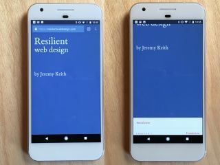
But as soon as you scroll down from there, that element changes height. The content below it suddenly moves.
Let���s say the overall height of the browser window is 600 pixels, of which 50 pixels are taken up by the URL bar. When the page loads, 100vh is 550 pixels. But as soon as you scroll down and the URL bar floats away, the value of 100vh becomes 600 pixels.
(This also causes problems if you���re using vertical media queries. If you choose the wrong vertical breakpoint, then the media query won���t kick in when the page loads but will kick in once the user starts scrolling ���or vice-versa.)
There���s a mixed message here. On the one hand, the browser is declaring that the URL bar is part of its interface; that the space is off-limits for content. But then, once scrolling starts, that is invalidated. Now the URL bar is behaving as though it is part of the content scrolling off the top of the viewport.
The result of this messiness is that the vh unit is practically useless for real-world situations with real-world devices. It works great for desktop browsers if you���re grabbing the browser window and resizing, but that���s not exactly a common scenario for anyone other than web developers.
I���m sure there���s a way of solving it with JavaScript but that feels like using an atomic bomb to crack a walnut���the whole point of having this in CSS is that we don���t need to use JavaScript for something related to styling.
It���s such a shame. A piece of CSS that���s great in theory, and is really well supported, just falls apart where it matters most.
Update: There���s a two-year old bug report on this for Chrome, and it looks like it might actually get fixed in February.
Jeremy Keith's Blog

- Jeremy Keith's profile
- 55 followers

