Roz Morris's Blog, page 105
October 10, 2011
Three curmudgeons from my school days: guest post at For Books' Sake
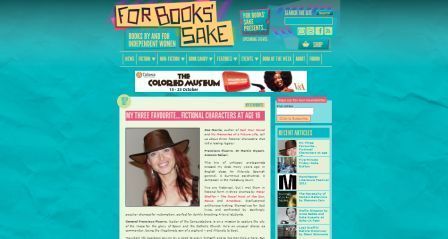 I'm glad I wore my hat to meet these folks. They host live literary events around the UK, one of which was the recent Mad Hatter's Tea Party in Manchester, which featured on BBC Radio. Other writerly shindigs have made it to Channel 4′s TV Book Club, the pages of Company, Woman & Home and The Bookseller. One reviewer has described them as 'blowing the cobwebs away from the literary world and infusing it with colour and life'. If you want to clasp them to your bosom already, skip the rest of this spiel and go there now.
They are For Books' Sake, an online community that showcases classic and contemporary writing by women writers past and present. They rather like the look of My Memories of a Future Life and have asked me over to write about three characters who blew my own literary cobwebs away. So I whirled time back to my school days and picked out three fellas I'm glad I met between the pages and not in real life. Don a mad hat and come on over.


October 9, 2011
2 misconceptions of new writers
 People often ask me what advice I'd give new writers. Here are the two misconceptions I find myself tackling most frequently
1 Rules give you cookie-cutter books
On Facebook the other day, an indie author asked me for feedback on her back cover (bear with me, this is about writing, not covers or indie publishing). Having recently designed my own back cover I'd figured out what worked and what didn't, so I could see quite a lot that wasn't right about her back cover. After offering specific pointers, one of the things I recommended she did was look at books that would potentially be her shelf-mates in her genre and follow their style. She replied: 'I feel my book shouldn't be a cookie-cutter version of all the others… you know?'
I do indeed know. You are absolutely right that your book is not part of a set of tablemats. It is its own thing, written with heartfelt sincerity and mined from your perceptions and experiences. You have delved deep to make it individual and true to itself. It is not meant to fit in. It was written to stand out.
But if you throw all the rules away and try to reinvent what a back cover should look like, from scratch, unless you're a genius you're likely to end up with a mess.
And so it is with writing. This is the age-old problem for creatives everywhere. We don't want rules. Of course we don't. We make our books from nothing but the ideas in our very individual grey matter. We want to make something beyond rules. But many of the stories I see that don't work because of the same generic problems.
Writing rules don't fetter you. They are observations of what works. Think of them not as templates and strictures, but as the results of experiments, on millions of readers. Knowing the rules means you can use your material to write, more effectively, a great book.
You'll have characters that readers care about. A story that unfolds at a pace that keeps their interest. A reason why the story has to be as long as it is, rather than a plot that seems contrived to fill pages. Surprises that are astonishing but play fair. An ending that feels satisfying and perhaps leaves the reader with a tear in the eye.
All because you did what other writers did.
2 The book is finished when you type The End
The first draft is just a first draft. But I can't count the number of times I've heard this: 'I'm five chapters away from the end of my book, then I can send it out.' Please: no.
Writers often think that because their sentences are careful and fluent, their novel is ready. But a novel isn't an essay or a blog post. Under the words, there's a whole machine that needs to run right.
So much of the valuable work on a novel can only be done once you have a full manuscript. Themes will take shape, plotlines will need to be destruction tested. Pacing and flow need to be assessed. Inconsistencies need to be sorted out, timelines unwarped. Characters may have developed their own agendas and you may need to revise the way you set them up. Motivations and developments that only revealed themselves to you in the course of the writing may now change the entire flavour of the book. When you finish the first draft, hard as that is, the real work starts. (There's a lot more on this in my book Nail Your Novel.)
Repeat after me: your first draft is not your final draft.
 Quick, but not insignificant announcement: I'm teaming up with Joanna Penn of The Creative Penn to produce a webinar series starting in November. How to write a novel will be three in-depth, interactive sessions from bestselling me and bestselling her. Cost $99. Find more details and sign up here.
 And My Memories of a Future Life is now available in full, undivided form on Kindle (US and UK) and also in print (and Amazon.com have knocked USD$4 off the price so grab it now). If you're my side of the Atlantic you can now get the print version from Amazon UK and save on postage. The price of the individual episodes will stay at the launch offer of 0.99c until 15 October, and will then go to their full price of USD$2.99. They'll always be available, but if you want to get them at the launch price, hop over to your Amazon of choice (UK, DE, rest of world) now. You can also listen to or download a free audio of the first 4 chapters over on the red blog.
Okay, back to the post. First of all, thanks Toucanradio for the pic. And here's my question: If you've got a bit of writing experience under your belt, tell me – what writers' misconceptions would you tackle?
[image error]


 [image error]


October 5, 2011
Should you serialise your novel on Kindle… like I did? The results of my launch experiment
 About a month ago, I launched My Memories of a Future Life on Kindle in 4 parts. A Dickensian adventure in serialisation, rekindled for the ebook generation.
I had great fun and plenty of hair-tearing. For instance, it was never clear exactly how long the Kindle store would take to make the episodes live, so I had to publish days in advance and keep them quiet until the witching hour. (Some of you still seemed to find them…) My computer was starting to look like a duplication hallucination with multiple covers, textfiles and whatnot.
But was it a good idea? If you're releasing an ebook, should you serialise too? Today Jane Friedman has invited me to her blog to tell all.
Not that Jane?
 Jane is a former publisher at Writer's Digest and a prolific and respected speaker on writing, publishing, and the future of media, including South by Southwest, BookExpo America, and the Association of Writers and Writing Programs. Her expertise has been featured by sources such as NPR's Morning Edition, Publishers Weekly, GalleyCat, PBS, The Huffington Post, and Mr. Media. She has consulted with a range of nonprofits, businesses, and creative professionals, including the National Endowment for the Arts, the Creative Work Fund, and the Contemporary Arts Center in Cincinnati. It says it all that one of her nicknames is 'Not-that Jane'.
Before I started, I wondered in a blog post if serialising my novel would be genius or plain dumb. Come to Jane's blog, where I confess all…
3 ways to try My Memories of a Future Life: Read a sample on Kindle, or on Bookbuzzr - or I can read it to you


October 2, 2011
Four tips for writing good prose
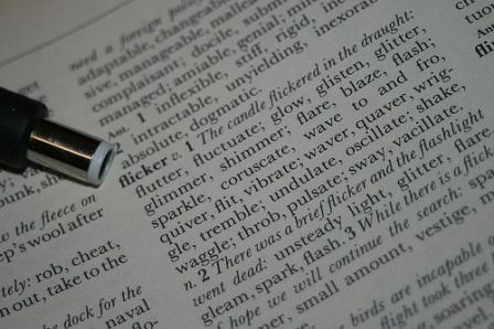 Last week I was interviewed by Joanna Penn of The Creative Penn, and one of the questions that attracted the most discussion is how to develop our use of language in our novels. It was the hardest question to answer in a short time, so I thought I'd give it more space here.
First of all, what is good language?
I see many writers who seem in thrall to their school English teachers, as if they are on a sponsored exercise to use the thesaurus as often as possible. We've all seen writing that waxes far too lyrical, and looks self-conscious and overdone – the dreaded purple prose.
But at least these writers have understood there's an aesthetic involved. And I want to applaud them for trying to unpeel what's in their hearts. Worse is the writer who goes for tortuous obfuscation (sorry), as if they want to scare the reader into feeling dumb. Just for a giggle, look at The Philosophy and Literature Bad Writing Contest. Here's a taster, from an English professor:
'If, for a while, the ruse of desire is calculable for the uses of discipline soon the repetition of guilt, justification, pseudo-scientific theories, superstition, spurious authorities, and classifications can be seen as the desperate effort to "normalize" formally the disturbance of a discourse of splitting that violates the rational, enlightened claims of its enunciatory modality.'
Now that's criticism (as far as I can tell), not fiction, but I sense this writer imagines he is being profound and much more clever than his readers. This kind of writing is an act of superiority, not communication.
Tip 1: Be clear
Good prose doesn't try to put up barriers. It might make interesting word choices and deploy an image stylishly, but it wants to be understood – deeply and completely.
So before we write a good sentence we need clarity ourselves. What do we want the reader to feel?
Let's take an example – describing characters. These are probably some of the most complex descriptions we might attempt as writers. Try these:
'Someone advanced from the sea of faces, someone tall and gaunt, dressed in deep black, whose prominent cheekbones and great, hollow eyes gave her a skull's face…' Daphne du Maurier
'He was a snub-nosed, flat-browed, common-faced boy enough, and as dirty a juvenile as one would wish to see, but he had about him all the airs and manners of a man.' Charles Dickens
There is not a difficult word in either of those descriptions; the effectiveness comes from the writer knowing first what he wants to say.
Tip 2: Develop an ear
Note also that those two examples are long sentences, but easy to read. The writer has a sense for how the words beat in the reader's mind.
By contrast, here's a famous sentence by Edward Bulwer-Lytton that strangles itself, quoted, funnily enough, on Wikipedia's Purple Prose entry:
'It was a dark and stormy night; the rain fell in torrents—except at occasional intervals, when it was checked by a violent gust of wind which swept up the streets (for it is in London that our scene lies), rattling along the housetops, and fiercely agitating the scanty flame of the lamps that struggled against the darkness.'
It's not a bad concept but the writing is full of tripwires:
'Except at occasional intervals' destroys the storyteller's spell by wresting the reader's attention away and sounding like a news bulletin.
'When it was checked by' is another leaden construction, and indirect for no good reason.
'Fiercely agitating the scanty….. blah' – there is too much going on here for me to stay with the thread. 'Scanty flame of the lamps…' does it even matter if the flames are scanty, fat or orange (which he forgot to put but I didn't mind)? And do we need to derail the reader by pointing out that life is hard for the lamps? Only if it adds to the experience, which this doesn't.
As I said, there's nothing wrong with the concept of the sentence, following the wind and rain through the streets. But the writer's thinking is cluttered, clogged and complicated.
Tip 3: Suit the material
The language dictates the way a story is experienced. It's the filter over the lens, the music on the soundtrack, the way the shots linger or race across the screen. For instance, thriller writers would like you to be gripped by a pacy beat.
More than that, the language operates other senses. Patrick Suskind's Perfume begins with a description of Paris purely through its smells. Russell Hoban's Riddley Walker is told in its own post-apocalyptic pidgen English to connect you deeply to the narrator's mind.
Both these choices of language are deliberate and serve the material.
Tip 4: Using notebooks
In my interview with Joanna, we discussed how to develop our sense of language and an individual style, especially making notes as we read. One commenter afterwards said he used to feel self-conscious about what he wrote down, but now it's part of his normal process of reading. Joanna says she's got heaps of notebooks, which she doubts she'll look at again. I don't make physical notes but often find myself trapped by a marvellous phrase and reread it over and over, trying to decode the magic.
Thanks for the pic, StephenMitchell on flickr
How do you develop your literary ear? Do you keep notebooks? Do you ever look at them again? Does that matter? Share in the comments
My Memories of a Future Life is now available in full, undivided form on Kindle (US and UK) and also in print (and Amazon have knocked USD$4 off the price so grab it now). The price of the individual episodes will stay at the launch offer of 0.99c until 15 October, and will then go to their full price of USD$2.99. They'll always be available, but if you want to get them at the launch price, hie on over to your Amazon of choice (UK, DE, rest of world) now. You can also listen to or download a free audio of the first 4 chapters over on the red blog.


September 30, 2011
Writing literary fiction – podcast and video interview with Joanna Penn
 Today – roughly 24 hours ahead of schedule if you saw the note on the red blog – I'm at Joanna Penn's online home, The Creative Penn. Joanna's one of my favourite podcasters and her interviewees run the gamut of book marketing specialists to fiction authors to creativity consultants to anyone else you never knew you needed to know. A recent podcast of hers is on how to write fight scenes – which is cued up on my Creative Muvo to accompany my ru
 n today. (If you meet me, don't get in my way.)
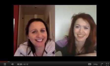
Earlier this year, when she was writing her best-selling religious thriller Pentecost, she interviewed me about my book Nail Your Novel. Now she's invited me back to quiz me about writing My Memories of a Future Life – and we discuss the differences between literary and genre fiction, developing characters, using research and honing prose style. We also laughed rather a lot.
You can read a text summary, listen to a podcast, or even watch us on video. Whatever your pleasure, come and join us for a jolly discussion.


September 27, 2011
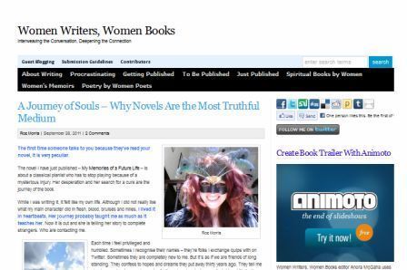
Novels tell the deepest truth – guest post at Women Writers
 When I ghostwrite, it's a collaboration. The editor, the 'author' and various other parties will be involved with it from birth. Together we hammer out the plot. I go to them first with my research questions. We chat about how it's going. Of course the majority of the work is mine, but by the time I deliver the manuscript it's as though it's been written in public.
Writing my own novels is not like that at all.
The first time an agent talked to me about My Memories of a Future Life, it was a surreal experience. I met her in a cafe in Covent Garden, on a freezing cold February evening. We sat outside in the penumbra of a gas heater. As people scurried past on their ordinary way home, a person I had never met before was talking to me, in great detail, about regression to the future. The tangled dynamic between four people. Music and its ghostly role in the book's world. It wasn't like any other book I'd written, it was more like a long and elaborate secret I'd been keeping. It was so bizarre I was struck monosyllabic. I still haven't quite got used to it.
I'm over at Women Writers today, talking about the curious and special relationship writers and readers have with novels. Do join me.


September 25, 2011
Plot is linear, story doesn't have to be
 I put a tweet up this morning that's been causing trouble. I was summarising a point from Ingrid Sundberg's series on plots.
In my tweet I summarised a paragraph I thought made a great point: 'Plot is always linear, but story doesn't have to be.' And so the tweet-storm began, showing that such a point can't be adequately explored in a space the size of a bird's chirrup.
Eh?
First a few definitions. In the nature of a self-taught craft, we all mean slightly different things by our writing terminology. Indeed sometimes I've used 'linear' to mean a predictable plot with no twists and surprises (as in Nail Your Novel). Here, I'm using linear to mean, as Ingrid did, A, then B, then C… and so on – possibly (hopefully) with surprises, reversals etc. In other words, the timeline of the characters' lives in chronological order. What they saw as the clock ticked through each day and night. That's linear.
Spice it up
But storytellers don't have to stick to that order.
We cut away to another story – a sub-plot, a parallel plot. Maybe slip in some back story. And if we have a scene that ends on tenterhooks, we shuffle a few cards in from a different pack to keep the reader tingling a little longer. That's the storytelling part of the job – what you do with the material.
You could cut the deck and put it together in a different order, like Pulp Fiction. You could tell it backwards like Martin Amis's Time's Arrow, or Daniel Wallace's Ray In Reverse.
Use the shuffling as an integral part of the story and you end up with the time-hops of The Time Traveller's Wife by Audrey Niffenegger – although that novel has both because the main character's life unfolds chronologically and everyone else's timeline jumps around.
On Twitter, Marc vun Kannon leaped on my tweet to point out: 'Plot is not always linear. It's easier to synopsize if it is, though.'
Good point. And one of the reasons I wanted to talk about this at greater length is that I see manuscripts where the writer has attempted something daring with structure, but has got themselves confused. I know it not just from the text, but from the shiver of horror when I ask 'just tell me, chronologically, this character's life in the book'. It's incredibly easy to confuse a reader, especially if you're making it up as you go along.
Do it in order first
If you're timebending or rewinding or flashbacking or Groundhog-daying or getting surreal or showing a series of vignettes that add up to a whole or chopping around like the film Memento, you the writer need to know what the simple order is. In some cases, it might be better to write it like that first, then mix it up later. If you do it that way, you can also experiment with the best possible order.
Be deliberate
Good storytelling is about doing only what's necessary. Some novice writers seem to do it without any clear artistic reason. You shouldn't do it just because you can. Check that your fiddling and shuffling does actually add something. Again, taking Memento as an example, on the DVD you can watch it in chronological order and you can see that version is not nearly as interesting.
In my novel Life Form 3 I decided my most interesting hook came a quarter of the way through. So I lopped off the first section – but instead of consigning it to back story I made it into a mystery, which the character had to unlock. This gave the story far more tension and momentum.
If your novel is exploring themes, you might find you can reinforce these by the way you cut between different sets of characters. Shakespeare is fond of this – in King Lear he has the scene where Lear splits his kingdom and Cordelia refuses to play ball, then shortly afterwards we see the sub-plot characters talking about legitimate and illegitimate offspring. This creates the sense of a universe where the usual laws of family are going to be bent and upset.
Okay, I've run out of examples for now. Give me yours in the comments!
My Memories of a Future Life is now available in full, undivided form on Kindle (US and UK) and is now also available in glorious, doormat-thumping, cat-scaring print. The price of the individual episodes will stay at the launch offer of 0.99c until 15 October, and will then go to their full price of USD$2.99. They'll always be available, but if you want to get them at the launch price, hie on over to your Amazon of choice (UK, DE, rest of world) now. You can also listen to or download a free audio of the first 4 chapters over on the red blog.


September 22, 2011
The power of suggestion – what can you leave the reader to fill in? (With help from Victoria Mixon)
 If you read this blog regularly you'll be familiar with my friend, the writer and editor Victoria Mixon. Her book, The Art & Craft of Fiction – A Practitioner's Manual, is a favourite of mine. If friends utter the words 'I think I'll write a novel', they soon find themselves armed with a copy because of the way it deftly bridges the gap between good reading and good writing. Victoria is about to release the follow-up, The Art &Craft of Story, and asked me to contribute a blurb. While reading it I came across a stand-out passage that I wanted to make into a post of its own.
It's the tale of how she and husband Jeff created a logo for their publishing company (as well as an editor, Victoria is also a graphic designer). She wanted to use an icon of her childhood, an antique advertisement which features a young woman in an enormous feathered hat with elegant gloves and a dreamy expression. But when she and her husband scanned it, there was too much shading and detail for it to work as a logo. So they started reworking it in Photoshop.
Here's the story, in Victoria's words.
She needed enough big dark elements to be recognizable at a casual glance—even tiny—but she also needed her itsy-bitsy little facial features to show up with their soulful gaze . We blacked in her hat and gloves (although the gloves have wonderful highlighted wrinkles in the soft leather) and exaggerated her eyes and mouth. We erased all of her from chin to gloves and then went back, meticulously re-creating only those lines absolutely necessary to give her definition. She has a lot of ruffles around her face, which looked weird when they disappeared. We had to get just enough of them in to remove the weird without competing with her more important elements.
The pièce de résistance turned out to be not even a part of her, but the shadow her cardboard cut-out cast on the wall when she was photographed. It's only behind one arm (the light came from an angle), but it's a lovely calligraphic line that thins and thickens as it goes around the curves of her sleeve. We sharpened it up. Then we looked at her other arm, which has no such line. We paused.
We were going to flip the line and use its opposite on the other side.
But then I remembered a fascinating fact about stylized images : what the eye knows should be there it will see even when it's not there.
And this is something all writers must remember—what the reader knows should be there they'll supply even when it's not.
Not only that, but that simple act of the reader supplying the essential last detail is what engages them, sucks them in, pins them down, makes them part of the story.
When we look at our favorite logos, our eye doesn't keep going back to them because it's found every single speck of information it needs. It goes back because there's something missing, and our eye knows what it is. We feel the satisfaction of supplying the missing piece, the sense of completion, the instant of epiphany .
In the book, Victoria uses this anecdote to delve into the way storytelling works in terms of structure, characterisation and description. But as I was reading I was thinking it could apply just as well to revising a novel.
Revision
As you might know from reading Nail Your Novel, I believe in messy first drafts. Pile everything in, then prune. This stage is the work of deep imagination – where I make the story come alive after so long constructing it at a distance with broad strokes. The first draft is where I immerse to let the imaginative juices flow. Description, characters, events, back story – all the detail tumbles out of my head and goes into that draft.
Then I come back to my senses and it's time to edit. To decide, ruthlessly, what detail isn't needed and what is. It's exacting, brutal and transformative.
In particular, I have to take what erupted from the imaginative blunderbuss and make it serve the story. And often that means difficult sacrifices.
Only what's needed
You'll see that the picture Victoria started with was lovely in its own right, but now it had to do a job.
This is one of the deepest secrets of good writing – or writing that makes effortless reading, which is the same thing. To take something that is good in its own right – a rich scene or a description or a character – and be able to see what part of it your book needs.
Like Victoria with her cherished but too-detailed lady, I examine whether the ruffles are telling details or discardable darlings. Whether the sensually rippled leather gloves are too distracting. And what I need to make each adapted part fit seamlessly together. If you do this stage of the editing right, every letter of your prose works as hard as it can.
The power of suggestion
Although novels build their worlds though telling details, there is only so much a reader can absorb. Too much and you have a muddle; too little and the reader isn't immersed. While real life is a broadband activity, reading is like dial-up – we can handle only limited input at once, so writers have to be selective about what we focus on.
This applies not just to descriptions of physical objects, people or scenes, but to emotional states, reactions, textual resonances. Sophisticated writers develop a feel for what they can show and what they can suggest.
When you do it right, you invite the reader to fill in the rest.
And, as Victoria says, that makes them feel very good. It's as if the book is having a conversation with the reader. It creates fiction that feels profound and resonant; stories that linger in the mind and the heart long after the book is closed.
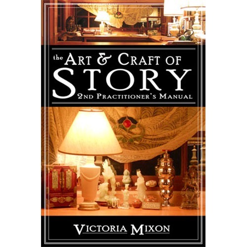 (Excerpt from The Art & Craft of Story used with permission)
Anyway, this has deviated a little from Victoria's original argument, and that's definitely worth a read. You can find it in her book, available on Amazon from September 30
My Memories of a Future Life is now available in full, undivided form on Kindle (US and UK) and is now also available in glorious, doormat-thumping, cat-scaring print. The price of the individual episodes will stay at the launch offer of 0.99c until 15 October, and will then go to their full price of USD$2.99. They'll always be available, but if you want to get them at the launch price, hie on over to your Amazon of choice (UK, DE, rest of world) now. You can also listen to or download a free audio of the first 4 chapters over on the red blog.


September 20, 2011
How to write the right blurb for your novel – guest post at Do Authors Dream of Electric Books?
 Ooh, a TARDIS. Because a novel is like one, which you realise when you have to condense its loveliness into a 150-word blurb. From the inside, it's enormous, labyrinthine. From the outside – a virtual bookshelf, a description to a prospective agent or publisher, or a casual chat at a dinner party – it's got to look manageable.
Today, at Do Authors Dream of Electric Books, I'm explaining how I squeezed my novel's multiple dimensions into a convenient, transportable box.


September 19, 2011
The making of My Memories of a Future Life – interview at Victoria Mixon's
 You remember Victoria? Possibly the world's maddest, funniest, warmest, wisest book doctor. Earlier this year we had a mighty time goofing around writerly subjects and talking about our long years of experience honing fiction. Her blog was rightly voted one of the top 10 writing sites in the Write To Done awards this year (in which Nail Your Novel was a runner-up). She's the author of The Art & Craft of Fiction, A Practitioner's Manual, which is a book I buy for every friend who ventures to say they might one day pen a novel. She's also about to release its follow-up, The Art & Craft of Story, which you'll be able to get at Amazon sometime soon.
Anyway, she's given me a good grilling about My Memories of a Future Life. Was I ever hypnotised? Who were the characters based on? What does it all mean, without spoilers? Come to the other side and see me struggle to explain myself.
For those of you who find the four-episode format too much of a faff, I'm releasing a Kindle edition of the full novel in the next few days. The price of the individual episodes will stay at the launch offer of 0.99c until 15 October, and will then go to their full price of USD$2.99. They'll always be available, but if you want to get them at the launch price, hie on over to your Amazon of choice (UK, DE, rest of world) now.


