
L. Jagi Lamplighter's Blog, page 35
April 21, 2014
Caption This Winner!

Lots of good ones, but the winner is:
"PEEP"
subtitles -
Look out that big scaly monster is coming to eat us and look he already got Uncle Peepers!
- subtitles
Special mention to:
Midway through his rampage, Godzilla remembered that Peeps are disgusting. :)


April 18, 2014
So very grateful!
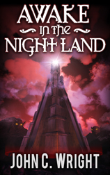
This is just so cool! Nothing John or I have written previously ever made it onto the top 100 of any list on Amazon. AWAKE IN THE NIGHTLAND is still #2 on Hot New Dark Fantasy Horror and #5 in all Dark Fantasy.
Latest review:
5.0 out of 5 stars jack, April 17, 2014 …
By jack – See all my reviewsVerified Purchase(What's this?)
This review is from: Awake in the Night Land (Kindle Edition)
Finished it today. If it's not the best book I've ever read it's so close to the top as to be no difference.
Dark, yes, scary, very, uplifting and a monument to the human spirit, most certainly. I could not recommend this book more if I tried.
Five stars are simply not enough. It's composed of four novellas that are linked thru the book and thru an immense amount of time. It will take you to depths of despair through the actions and thoughts and fears of the characters and cause a cheer for their courage in the face of ultimate and irresistible evil. By all means read this thing.
April 17, 2014
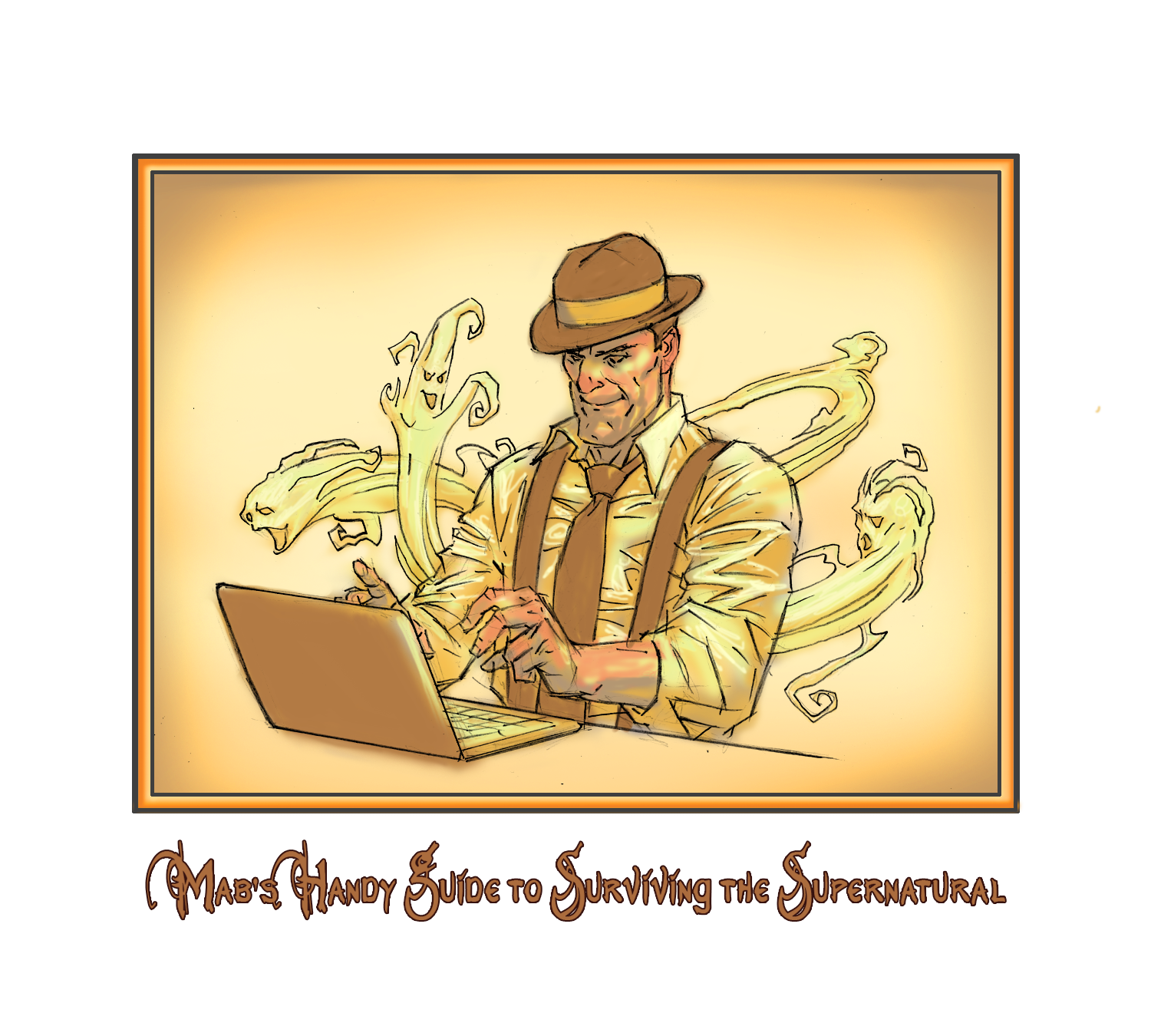
Mab’s Handy Guide to Surviving the Supernatural
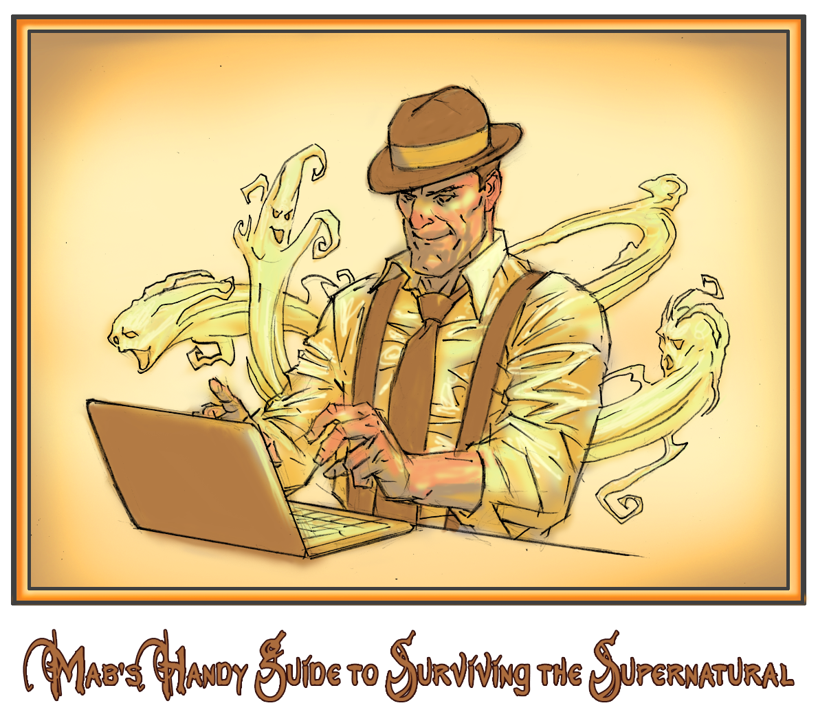
Mab here, Prospero Inc. company gumshoe.
As part of my campaign to protect you woefully-uninformed humans from your own folly—in hopes of saving even one of you from an elf-induced death, or worse—here is some of my gathered wisdom concerning the supernatural world.
Read. Pay attention. And maybe you’ll live.
For those of you who are just coming in, we’ve started with Tsukumogami, Japanese household objects that wake up after their 100th birthday and become animate.
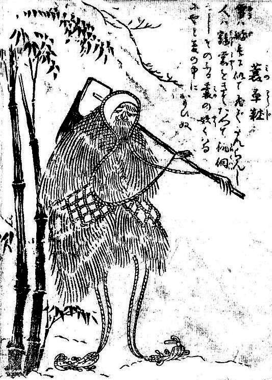
Name: Minowaraji
Description: Animated farm tools being carried around by an old fashion Mino—a Japanese straw coat. The thing thinks and acts like a rural farmer. Kind of like all the farmers’ sense and nonsense got absorbed by his stuff.
Where To Find It: Farms and tool sheds.
Frequency: Occasionally
Danger Level: It’s carrying a hoe. Hoes have sharp edges. Keep away!
Mab’s Eye View: These minowaraji are very, very touchy. Generally, they are benign to human beings, but hurt their feelings and, whoa Nellie!, do they go for you! I had—you’d call it a cousin—once who accidentally insulted one by calling it a Kosode no Te. Thing swung his hoe and separated my—you’d call it a cousin’s head from his body.
Luckily, his head being attached to his body was optional. But that would not be the case for you!
And one more. LOL
This one…from a comment on the Publisher's blog…made me laugh:
Just a warning: If you read this book, be prepared to have a positive feeling about life in general. Also watch out for a feeling of love and brotherhood and hope.
I was not ready for this, expecting a miserable depressing nihilistic lovecratian trip through pain and madness, instead I got something that made me feel like I can persevere through anything.
Dammit.
The Wonderful Reviews of AWAKE IN THE NIGHTLAND by John C. Wright
5.0 out of 5 stars One story by itself is worth the price April 11, 2014
By Adam G.
Verified Purchase
"The Last of All Suns" may be the best SF novella I have ever read. I am not kidding.
Four independent stories, but each story subtly builds on what has come before.
They grip you. I spent the weekend thinking about them. I dreamed about them at night.
I don't usually give books five stars even if they are very, very good. But sometimes I have to make exceptions.
 ?
?Review Two:
5.0 out of 5 stars One of the genuinely creative geniuses of our time. Writing with a soul., April 16, 2014
By
Amazon Customer "Sensei" (Huntsville, AL USA) – See all my reviews
Verified Purchase(What's this?)
This review is from: Awake in the Night Land (Kindle Edition)
Doomed humanity lives out its numbered days in a beleaguered fortress on a dying planet, post-sun, while more-than-Lovecraftian horrors manifest in the outer darkness, encroaching over the centuries, gloating over their inevitable victory.
I will leave it to the reader, and read this you should, to discover if and how there can be any hope-beyond-hope to be snatched from the silently screaming, many-jawed face of inexorable despair.
This is not just sci-fi or sci-fi horror. It has a soul.
It transcends its genre to become timeless.
For once I can think of no criticisms, constructive or otherwise. This time I was spellbound at the mercy of the story teller, along for the ride. For me, it was a journey well worth making. I advise you to make the trip as well, but take care, lest you lose the master-word, and your humanity with it.
April 16, 2014
Wright’s Writing Corner: Beware the Sneer of Reader X! or Don’t Skimp on the Cover Art!
Beware, fair reader! Be not slain by the baneful sneer of Reader X, The Condemner of Covers!
So who is Reader X? And why does he condemn books with less-than-professional-looking covers? If you would keep yourself—and your book—from so dire a fate, read on!
I have a great many friends who are published by small publishing companies or who self-publish their own books. Once upon a time, I handed a small press book written by a friend to another friend whom, for the sake of this article, we shall call: Reader X.

Reader X — is he preparing to read? Or to sneer?
(We call him Reader X because of the X shaped mask he wears to hide his identity from the characters in the books he’s reading. Actually, Reader X as he appears here is an amalgamation of more than one friend, but we will treat him as one person for the purposes of this article.)
Reader X hated the book.
This happened twice, maybe three times. Reader X no longer wants to read books written by friends of mine. In fact, he is now suspicious of all small press books.
What’s more, Reader X has the keen eye of an eagle. He can pick out small press books at a hundred paces.
After a little while, I realized that I, too, could pick out small press books instantly…because they just didn’t look as good at “real” books. They looked low-quality.
When I myself decided to become a small press author, I found myself asking: what is it that makes these books stand out to me? What could I do better, so that my book does not scream low quality and make the Reader Xs of the world instantly sneer?
And, worse than sneer, refuse to buy!
The first and most obvious answer is: bad cover art.
Your cover is your introduction, your invitation to the author to come into the world of your story. If the cover art looks bad, cheesy, or awkward, readers like Reader X are never going to give the book a chance. Other readers might not care, but why eliminate the Reader X’s of the world from our audience, when a little care and effort can keep them in our fold.
Reader X buys a lot of books.
The first thing that screams not a profession book is bad cover art. So, the first step is to find a good cover image. This can be done a number of ways:
1) Old paintings – all old paintings are in the public domain. That means you can use their image for your cover. If an old painting or artistic image fits your book, you have an instant classic look that, in and of itself, will not frighten away Reader X.
[Correction: some old paintings are owned by museums. But prints of them from public domain books are not. Still, worth checking if you wish to use an old painting. ]
2) Photographs – there are many stock sights where you can buy photos. There are also fantasy photo designers who will design a photo. Some I spoke to cost around $500…but there are probably cheaper ones. There are many, many sources of such people. You can Google them. Goodreads has many people who do covers, etc.
Also there are many sites that offer photos for free. Here, for instance, is a link to the photography info on a website called Savvy Writers and e-books. If you page down, there are several articles that include lists of places to look for free photos:
http://savvybookwriters.wordpress.com/category/photography/
3) Commission a cover painting – this is an idea option for many books…but you have to be careful. Bad paintings look worse than anything else, except perhaps bad photoshopping. In particular, human figures that are distorted or not in proper proportion can be really off-putting. So, if you are going to go to the trouble of having a real cover painting, make certain that the artist you pick can produce a pleasing human image.
This last point cannot be stressed too strongly. Human images out of perspective and photoshopping that doesn't trick the eye are worse–much much worse–than a simple solid cover with lettering on it. Do not pick a cover image that will turn away more readers than it draws!
So…Now, you have a decent cover image. Everything is great, right?
Not quite.
At first, I thought cover art was the key. Good art, good cover, right?
Wrong.
How do I know this? Let us return to Reader X. One day, Reader X and I were at the bookstore. There was a mix of big house and small press books presented on the shelf before us. Reader X was perusing the big house books and sneering disdainfully at the small press books. (Reader X is actually far too kind to sneer, but sneering gets the point across more quickly that looking slightly uncomfortable and shuffling quickly away.)
Reader X sneered with infinite disdain at a small press book with dull, flat cover art. Then he picked up a second book.
To my surprised, I noted that the cover art on the second book was just as dull and flat as the first one. It may have been the least interesting cover art I’ve ever seen on a big house book. And yet, despite the dullness of the art, this second book did not scream LOW QUALITY.
I gaped at it: Why was that?
An artist friend was the one who gave me the first clue. He complained about the font on a friend’s book.
Fonts. Titles. Revelation arrived. It was not the art that had been screaming LOW QUALITY at us in the bookstore.
It was the lettering.
At first, I thought it was just which font was used. But the problem with that is you can find big house books with widely varying fonts. They still look like high quality books.
So it was not just the font.
What was I missing?
The second clue came from my cover artist, Dan Lawlis. When not painting covers for my books, he is a commercial artist. He also used to draw for Marvel and DC. He taught me the rule: Don’t let the lettering touch the art.
Now, I know what you are thinking. (I’m using my new brain-power magnifier to read thoughts in the future.) You are thinking: I can hardly afford a bag of tea. How, in creation, do you expect me to pay to invent anti-grav to make my letters hover over my cover art?
To which I will reply: That’s not what I meant.
It is not that the lettering cannot be on any part of the picture, but that it should not cover the main images.
Why?
Because subconsciously, our eye knows the difference between order and sloppiness. Think of how you feel when you see a poster where the words squished against one side. You know it wasn’t planned. The person ran out of room. You eye, your mind, immediately knows that was not a properly done job.
Keeping the lettering from covering the important images in the art gives readers, such as Reader X, an impression of order and good planning.
High quality book covers do this.
Notice how much better it looks when the T is not touching the finger.
(I mean the lettering, not the blue vs. purpleness of the print. ;-)
So, now we have good art and good letter placement. Yet still, something wasn’t right. I could find small press books that would cause an instant Reader X sneer, and yet both the images and the placement was fine.
What was the final missing link?
It was the good folks at Castalia House who found the final key.
Contrast.
The number one thing that small press and self-published books do wrong—the number one difference between them and big house covers—is lack of contrast.
This is what made it so that Reader X tossed his disdainful sneer in the direction of one dull cover and not the other: Lettering Contrast.
Same font (on top). Same image.
Yet, note how much cleaner the cover looks with the stronger contrast.
The number one thing that the big house art departments do that the smaller ones don’t is: make sure the lettering on the cover is legible.
Because, you know, you might want the reader to be able to read the title of the book.
Just because.
Contrast…both of the lettering and the image itself…is one of the number one things that small-press covers do wrong. The first thing Reader X’s eye picks up in the bookstore is the contrast or lack thereof of the book and lettering.
The lower the contrast, the greater the sneer.
There is a trick for checking if your contrast is good. Attach the cover art to an email and send it to yourself. Then, look at the thumbnail that gmail (or whatever your email service) offers. This is the size that your book cover will be on many websites.
Can you read the title clearly and easily?
If so, you’re good.
If not, those looking at your book online won’t be able to read it either.
And Reader X won’t buy it.
In conclusion, there are three things you need to do if you want to avoid the condemning sneer of Reader X and possibly hook him in as a reader with your snazzy book cover:
1) Good Clean Art
It doesn’t have to be fancy, but it should be properly proportioned and not look too drab or fakey.
2) Wise Placement of Lettering.
Don’t just slaver the letters all over the cover like jam on a crumpet. Make sure they look as if they were meant to go with the images in the art.
3) Strong Contrast.
The lettering should be clear and easy to see. The art image also should be clear and easy to see.
Do these three things and even a simple cover will win the approval, and maybe even the dollars, of Reader X!
April 14, 2014
Caption This!
In honor of Easter…
Caption This Winner!
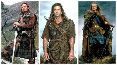
Winner:
Inverness Fashion Week.
Runner-Up:
Gotta Catch 'Em All!

April 10, 2014
Mab’s Handy Guide to Surviving the Supernatural
Mab here, Prospero Inc. company gumshoe.
As part of my campaign to protect you woefully-uninformed humans from your own folly—in hopes of saving even one of you from an elf-induced death, or worse—here is some of my gathered wisdom concerning the supernatural world.
Read. Pay attention. And maybe you’ll live.
For those of you who are just coming in, we’ve started with Tsukumogami, Japanese household objects that wake up after their 100th birthday and become animate.
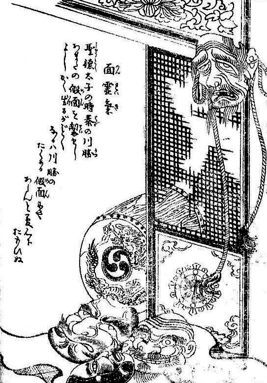
Name: Menreiki
Description: Once upon a time, back in the Sixth Century, a guy named Prince Shotoku made a bunch of Gigaku masks—that’s mask used in some defunct Japanese drama-dance art form—for a nigh-legendary guy named Hata no Kawakatsu. This Hata no Kawakatsu invented some Shinto dance form or other.
Apparently, this prince created sixty-six masks. Then, like the incompetant mortal that he was, he went and died, leaving the masks just lying around.
Of course, they came to life! Even a frog could have predicted that.
Where To Find It: Theaters, dark allies, your worst nightmares.
Frequency: There’s only one of ‘em. How common could they be?
Danger Level: Frankly, I have no idea what a mask…even sixty-six of ‘em…can do to you, but stay away, just to be safe. Whatever it is they do, it can’t be good.
Mab’s Eye View: Huh? Good grief. Give me a break. Masks? What will mortals think of next?


