
Susan M. Weinschenk's Blog, page 35
November 20, 2013
365 Ways To Persuade And Motivate: #11 Identify The Operating Self-Story

Someone knocks on your door. You recognize him as a kid from your neighborhood. He’s selling popcorn as a fundraiser for a club he belongs to at school. The club is trying to go to the state convention. How do you react?
It depends on the story, or persona, you have of yourself when it comes to topics such as school, fundraising, and your relationship to your neighborhood.
Here’s one story you might relate to:
“I’m a very busy person. When I’m at home I want to relax, not get bombarded with people at the door selling things. I don’t like it when people bother me at home with these fundraising schemes. The schools should pay for these trips and not make us buy this overpriced popcorn. This poor kid isn’t to blame, but I’m not going to buy the popcorn because it just perpetuates this behavior. Someone has got to act right on this. I’m the kind of person who does what is right on principle. I’m going to say no nicely, but firmly.”
Or maybe you can relate to this story:
“Oh, isn’t that great that the kids are going to the state convention. I remember when I went on a similar trip when I was in high school. It was really fun. Maybe not all that educational, but definitely fun! I’m the kind of person who encourages students to have lots of experiences outside of our own neighborhood. I am the kind of person who supports the school. I’ll buy some popcorn and help this kid out.”
Or maybe you can relate to this story:
“It kind of annoys me that there are always these kids selling things. But this is part of being a good neighbor. I’m part of the community. I am a good citizen of our neighborhood. I’ll buy the popcorn because that’s what a good community member would do.”
We all have stories we tell ourselves about who we are and why we do what we do. These stories are critical in our behavior. If you want people to change their behavior, one of the most powerful things you can do is get them to first change their self-story. This, in turn, will lead to behavior change. In subsequent posts I’ll explain how this works in more detail.
The first step is to understand what is the current operating self-story. Once you’ve identified that, then you are ready to help the person craft and different story that will lead to different behavior.
What do you think? Are you aware of your own self-stories that affect your behavior? What about the self stories and behavior of people whose behavior you want to change? Friends? Family? Customers? Hav e you done your research so you know what the current operating self-story is?
The book on the power of stories to change behavior is Redirect, by Timothy Wilson.
To learn more check out our 1 day seminar on The Science of Persuasion.


November 15, 2013
365 Ways To Persuade And Motivate: #10 Pitch When People Feel Regret
 Of all the situations and feelings that motivate people to take action, regret is one of the most powerful. People don’t like to feel regret and will do a lot to avoid it. That’s not surprising, but you might be surprised to find out that the more opportunity people feel they have, the more regret they tend to feel about a situation. If people feel that they could have done something differently, the more regret they feel with their action or decision. If they feel that they had no choice in their decision or action, then they feel less regret.
Related to this is the idea of whether there is a clear corrective action that could have been taken. If people feel they had a choice, and if they feel they had a clear, corrective action, and yet they don’t take that action, that is when they feel the most regret.
For example, let’s say you’re choosing a restaurant for an upcoming special event. You have three great restaurants that are available on the date you want. You choose one of the three and negotiate the menu with the restaurant staff. At the last minute the restaurant calls and changes the menu you had planned. You resist initially, but eventually give up. You’re not at all happy with the food they provide during the event. You could have taken corrective action (insisted they stick with the menu), or picked a different restaurant to start with, or switched to one of the other restaurants. But you didn’t do any of those things. So you had opportunity and you had clear corrective actions. In this situation you’ll feel a lot of regret, dissatisfaction, and disappointment.
If there’s only one restaurant available on the date you want to hold the event, and it only offers one set of menu choices, then you have little choice. Even though you might rate the food as good or as bad as in the first example, you’ll feel less regret, less disappointment, and less dissatisfaction.
Regret Inspires Action – Because people don’t like feeling regret, and because they feel the most regret about things they can fix, regret is actually a motivator for action. If people feel regret, then that’s when they are highly likely to take action. And people will often take an action to avoid regret before it happens.
What do you think? Are you willing point out to people the likelihood that if they don’t take the action you want them to take, or buy the product NOW that you want them to buy that they will regret the action later? If you “play the regret” card you are more likely to get them to take an action. Are you willing to do that or does that seem too manipulative?
To learn more check out our 1 day seminar on The Science of Persuasion.
November 13, 2013
365 Ways To Persuade And Motivate: #9 Give Feedback Without Praise
 During this series on 365 Ways To Persuade and Motivate I’ve had a few posts about rewards and also some about the desire for mastery. One way to reward people is to give them praise (“Wow, you did a great job on that report”). And because we want to motivate people, and we think praise is a reward, we may tend to use it a lot. But if you are trying to stimulate someone’s internal desire for mastery, then using praise is actually counter-productive.
Rewards are a type of extrinsic motivation. The motivation is coming from outside the person. It’s external, hence “extrinsic”. Praise is extrinsic. But if you have decided to use the desire of mastery to motivate people, instead of using rewards, you are using intrinsic motivation. The motivation is coming from inside the person. And the interesting thing is that extrinsic praise tends to dampen intrinsic motivation coming from the desire for mastery.
In a previous post I talked about how important feedback is if you are trying to stimulate the desire for mastery. You need to give lots of feedback to people on how they are doing in order to keep that intrinsic motivation going. BUT it’s important to note that research by Mark Lepper shows that if you give a reward when people do something it dampens their desire to do it for intrinsic reasons.
Valerie Shute analyzed hundreds of research studies on the use of feedback, and she reports that the best feedback separates objective feedback from praise. This makes sense in thinking about Mark Lepper’s research too. People don’t need your praise to keep going,and switching to praise takes the focus off of intrinsic motivation and puts it on extrinsic motivation. This may actually decrease the desire for mastery.
Combining feedback on what the person did incorrectly and what needs to change with praise can be confusing to the person receiving the feedback. Here’s an example. Let’s say Jerome is teaching Kathleen how to be a barista in a coffee shop. He has her try making a cup of coffee. Then he gives her feedback: “You didn’t clean out the filter thoroughly enough. All the residue needs to be flushed out. Let’s give that another try.”
His feedback was objective and did not include praise. What if Jerome had said, “You didn’t clean out the filter thoroughly enough. All the residue needs to be flushed out. Great job, though, for your first time. You’re really getting the hang of it! Let’s give that another try.”
The second way combines feedback and praise. It might make Jerome feel better, but it probably confuses Kathleen. Did she do the cleaning correctly or not?
You are going to have to decide whether to use the desire for mastery to motivate a particular person in a particular situation, or a reward. The desire for mastery is more powerful, so if possible try that first. And don’t mix in rewards with desire for mastery techniques. If you are going for the desire for mastery then keep your feedback objective and free of praise.
What do you think? Have you tried different kinds of feedback?
Here are the Shute and Lepper references:
Shute, Valerie. 2007. Focus on Formative Feedback. http://www.ets.org/Media/ Research/pdf/RR-07-11.pdf.
Lepper, Mark, David Greene, and Richard Nisbett. 1973. “Undermining children’s intrinsic interest with extrinsic reward: A test of the ‘overjustification’ hypothesis.” Journal of Personality and Social Psychology 28(1): 129–37.
To learn more check out our 1 day seminar on The Science of Persuasion.
October 28, 2013
365 Ways to Persuade And Motivate: #8 Use The Right Reward
 Since starting to write the last few blog posts on rewards I’ve had some questions on what is a reward. So I thought I’d take this blog to write about what makes a reward a reward and how to pick the “right” one.
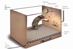
When B.F. Skinner researched rewards he didn’t call them rewards. He called them “reinforcers”. In his research an effective reinforcer is anything that, when you give it, results in an increase in the desired behavior. Which means that what is an effective reward depends on what a particular person feels is an effective reward. The list of possible rewards or reinforcers is infinite. What is it that a person might want? Here are some common reinforcers:
Money
Discounts
Food
Sex
Attention
Praise
Love
Fun
And on and on. In order to pick an effective reward, ideally you know your audience and you know what they want. If you haven’t done that research, then you will be using trial and error to figure out what an effective reward is for your audience. I suggest you do some research ahead of time so you know what to use as a reward for your particular audience and situation.
What do you think? How do you go about picking what is the best reward?
To learn more check out our 1 day seminar on The Science of Persuasion.
October 27, 2013
365 Ways To Persuade And Motivate: #7 Give Rewards Unpredictably To Sustain A Behavior
 In the last blog post I wrote about using a continuous reinforcement schedule when you want to establish a new behavior. And I hinted that you should change that schedule after the behavior is established.
One of the reward “schedules” that BF Skinner researched is called a variable ratio schedule. It’s called “variable” because you don’t reward the behavior every time. You vary how often the person gets a reward when they do the target behavior. And it’s called “ratio” because you give a reward based on the number of times a person has done the behavior (rather than, for example, rewarding someone based on time – for example giving a reward the first time the person does the behavior after 5 minutes has elapsed).
In a variable ratio schedule you may decide that you are going to reward the behavior, on average, every 5 times the person does the behavior, but you vary it, so sometimes you give the reward the third time they do the behavior, sometimes the 7th time, sometimes the 2nd time, etc. It averages out to every 5 times.
Let’s take the example of trying to get your employee to turn in expense reports on time. At first you would reward them every time they turn in the expense report on time (as we discussed in the previous blog post on continuous reinforcement).
Once the behavior is established, however, you would then switch to only rewarding them every 3 or 5 or 7 times on average. This is the variable ratio schedule.
Skinner found that variable ratio schedules have two benefits:
a) they result in the most instances of the behavior than any of the other schedules (i.e., people will keep handing in the expense report on time), and
b) they result in behaviors that Skinner said were “hard to extinguish”, which is “psychology speak” for the idea that the behavior persists over time, even when rewards aren’t being given any more.
If you want to see another example of a variable ratio schedule, go to a casino. Slot machines are a very effective example of a variable ratio schedule. The casinos have studied the science of rewards and they use them to get people to play and keep playing.
Can you think of any more variable ratio schedule examples that you’ve experienced or tried?
To learn more check out our 1 day seminar on The Science of Persuasion.
October 25, 2013
365 Ways To Persuade And Motivate: #6 Reward Every Time To Establish A New Behavior
 Rewards are one of the most common ways that people think of to get other people to do stuff. In the talks that I give on the topic I tell people that rewards are actually one of the least effective ways to get people to do stuff! Rewards are one of the seven ways I cover in my book How To Get People To Do Stuff. And almost all of the other 6 are more powerful than using rewards.
But, having given that caveat, people are used to giving and receiving rewards. So if you are going to use rewards to motivate people, you’d better know the science behind rewards. There are effective ways to use rewards and ineffective ways.
in the 1950′s B.F. Skinner researched rewards — when to give them and how often to give them. He described reward “schedules” and the effect of using different schedules. For example, should you reward someone every time they do the behavior you are looking for? Or just sometimes?
In this post I want to tackle the question of what schedule to use if you are trying to establish a new behavior. In future posts I’ll cover what kind of reward schedule to use after the behavior is established.
Let’s say that you have an employee that doesn’t turn in his expense reports on time. You decide to try out using rewards to encourage him to get the expense reports in. Since he currently doesn’t ‘do this behavior, you are trying to establish a new behavior. In this situation the best thing to do is to reward him every time he turns his expense report in on time.
Or, in another example, let’s say that you want your customers to use a new feature of your software that you provide as an online app. It’s new, so they aren’t used to using it. It hasn’t become part of their usual way of using your product. You should reward them (for example, with points, or a credit towards next month’s bill) every time that they use the feature.
These are examples of “continuous reinforcement schedules” — you reward every time the behavior occurs. In the next blog post I’ll explain what you should do after the new behavior is established. So stay tuned!
What do you think? Have you tried using rewards to get people to do stuff? Have you tried using a continuous reinforcement schedule to establish new behavior?
To learn more check out our 1 day seminar on The Science of Persuasion.
October 22, 2013
365 Ways to Persuade And Motivate: #5 Point Out How People Are Connected
 When people feel connected to each other then they are more motivated to work together. Even pointing out how people are connected in small ways affects behavior.
Gregory Walton is a professor at Stanford who has studied the effects of belonging on behavior. In one of his experiments, Walton found that when college students believed they shared a birthday with another student, they were more motivated to complete a task with that student and performed better on the task. He found the same effect with four and five year olds.
In another study Walton put two people in a room. One was a study participant and the other was part of the experiment. Walton told the participant that they had the same birthday as the other person in the room. When the other person jogged in place and raised his or her heart rate the participant’s heart rate went up too, even though he or she was not jogging in place, as long as Walton had established a connection (i.e., the same birthday). Walton concluded that it’s easy for people to take on the goals, motivations, emotions, and even physical reactions of people whom they feel even minimally connected to.
In other research Walton found that when people feel they are working with others as a team to reach a goal, they are more motivated to achieve the goal, even without any extrinsic reward, than if they are working alone. They work harder and longer at the task, become more absorbed and perform better.
You can persuade people to work harder and to work together if you have them interact with other people and point out to them two things: that they are connected to the other people and how they are connected.
What do you think? Have you found this to be true?
Here’s a reference for the Gregory Walton studies:
Walton, Gregory M., Geoffrey Cohen, David Cwir, and Steven Spencer. 2012. “Mere belonging: The power of social connections.” Journal of Personality and Social Psychology 102(3): 513–32. doi: 10.1037/a0025731.
To learn more check out our 1 day seminar on The Science of Persuasion.
October 17, 2013
365 Ways To Persuade And Motivate: #4 Give People Autonomy
 In the previous blog post in this series I wrote that one of the best ways to motivate people is to stimulate a desire for mastery – and that breaking things into small pieces and showing progress through the pieces encourages the desire for mastery.
Another tip for stimulating the desire for mastery is to give people autonomy. When people feel that they have some control over what they are doing and how they do it then their desire for mastery increases. They will then be motivated to continue and keep learning.
If people feel that they don’t have any control or autonomy then they lose the desire to learn and do more – they lose the desire to master whatever task you are asking them to do.
Here’s an example: Let’s say that you have created a language learning app. The desire for mastery will be automatically in play if the person wants to learn a language. However, if you want people to continue using the app, and use it frequently and often, then you need to do more than just present lessons in the app. One way to further stimulate the desire for mastery, is to give them some control over how they use the app. You can provide different types of exercises and interactions, such as listening, writing, or speaking the language, and let them choose which exercises and activities they need or want, and in what order to do them. If they feel they have control over how quickly they go through the lessons, which ones they repeat, which activities to engage in, and in what order, then they will be more motivated to keep learning.
What do you think? Have you used tried giving autonomy to keep people motivated?
To learn more check out our 1 day seminar on The Science of Persuasion.
October 16, 2013
365 Ways To Persuade And Motivate: #3 Small Steps
 One of the best ways to motivate people is to stimulate a desire for mastery. People are naturally curious and this curiosity helps people master their environment. People want to learn, improve, and master skills and knowledge.
One of the things you can do to stimulate this sense of mastery is to break things into small steps. Why is that important? Because it makes it easy for people to see their progress, and seeing progress makes people want to keep going.
If you’ve ever used one of the exercising applications, for example “Couch to 5k” or the “10k runner” you will know what I mean. These are apps that you use on your smartphone. They map out an exercise period. You turn on the app as you start your exercise session and the app tells you what to do along the way. At the beginning a voice says for you to walk for 5 minutes to warm up. After that the voice tells you to start running. Two minutes later the voice prompts you to slow down and walk. During the exercise session your screen shows your progress. (See the picture at the top of this blog post). You can see how much time you have been exercising, how much time you have left in the session, and how much time is left in the particular part of this session (for example, you have 30 seconds left to run before it’s time to walk again).
You also get feedback on where you are in the entire 9 week program, for example, you are on Day 2 in the 3rd week. By breaking the entire 9 weeks, and each particular session into small steps, the app can always be showing progress, and that constant feedback on progress towards the goal is very motivating.
You can apply this principle to anything that you want people to do and/or keep doing. Other examples are having people learn a language, or master the steps to be a barista at a coffee shop. Or keeping your audience’s attention and engagement while you are teaching a seminar.
What do you think? Have you used this technique of breaking things into small pieces and showing progress to keep people motivated?
To learn more check out our 1 day seminar on The Science of Persuasion.
October 15, 2013
365 Ways To Persuade & Motivate: #2 Use The Word “Because”
 In the first blog post of this new “365″ series I cited new research on eye contact. But sometimes I think it’s important to go back to “foundational” (i.e. old!) research. So #2 in the series comes from research conducted in 1978. Ellen Langer (Professor of Psychology at Harvard) published a research study about the power of the word “because”.
Langer had people request to break in on a line of people waiting to use a busy copy machine on a college campus. (Remember that this is in the 1970′s — there weren’t computers and printers. People did a lot more copying back then, so there were often lines waiting to use a copy machine). The researchers had the people use three different, carefully worded requests to break in line:
“Excuse me, I have 5 pages. May I use the xerox machine?”
“Excuse me, I have 5 pages. May I use the xerox machine, because I have to make copies?”
“Excuse me, I have 5 pages. May I use the xerox machine, because I’m in a rush?”
Did the wording effect whether people let them break in line? Here are the results:
“Excuse me, I have 5 pages. May I use the xerox machine?” [60% compliance]
“Excuse me, I have 5 pages. May I use the xerox machine, because I have to make copies?”[93% compliance]
“Excuse me, I have 5 pages. May I use the xerox machine, because I’m in a rush?” [94% compliance]
Using the word “because” and giving a reason resulted in significantly more compliance. This was true even when the reason was not very compelling (“because I have to make copies”). The researchers hypothesize that people go on “automatic” behavior or “mindlessness” as a form of a heuristic, or short-cut. And hearing the word “because” followed by a reason (no matter how lame the reason is), causes us to comply.
They also repeated the experiment for a request to copy 20 pages rather than five. In that case, only the “because I’m in a rush” reason resulted in compliance.
So what does this all mean?:
When the stakes are low people will engage in automatic behavior. If your request is small then follow the request with the word “because” and give any reason.
If the stakes are high, then there is a little more resistance, but still not too much. Use the word “because” and try to come up with at least a slightly more compelling reason.
What do you think? Has this worked for you?
Here’s the research citation:
Langer, E., Blank, A., & Chanowitz, B. (1978). The mindlessness of Ostensibly Thoughtful Action: The Role of “Placebic” Information in Interpersonal Interaction. Journal of Personality and Social Psychology, 36(6), 635-642.
To learn more check out our 1 day seminar on The Science of Persuasion.


