Bruce Clay's Blog, page 36
December 17, 2014
6 Mobile-Friendly Navigation Best Practices
6 Mobile-Friendly Navigation Best Practices was originally published on BruceClay.com, home of expert search engine optimization tips.
A story problem:
Joe is in a taxi trying to buy a Christmas present for his favorite second aunt twice removed. He’s on your website. The car is moving 31 miles per hour. How can you help him find the perfect gift?
Answer:
Create a touchscreen-friendly mobile navigation that makes it easy for your personas (including Joe) to find what they need on the go.
Excellent! We’re on the right track. Now… how does one do that?
This blog post introduces six mobile-friendly navigation best practices that can help you make life easier for Joe and your other mobile customers. Note that all of the mobile navigation tips mentioned in this article are equally applicable to separate mobile sites, responsive designs and sites that dynamically serves web pages. (Not sure what that means, or which mobile platform is best for you? Read A Cheat Sheet for Mobile Design: Responsive Design, Dynamic Serving and Mobile Sites.)
6 Mobile-Friendly Navigation Best Practices
1. List Your Most Important Pages First
Joe doesn’t have a lot of time — or patience. How can you help him get to the right place faster?
Before you can kick-off step one you’ll need to do some mobile site soul searching. What are your most important pages? What are the top category pages outlined in your siloing strategy? What are the most common actions your mobile users take? What pages of your website most effectively satisfy your user’s mobile needs?
When it comes to mobile users, quicker is always better. Listing your most important content categories and mobile calls to action first helps improve user experience by giving the user a more direct path to what they need.
2. Keep Mobile Navigation Short and Sweet
Joe’s iPhone 6 is only 750 pixels wide in portrait mode.
Designing mobile navigation means designing for a small screen size. With limited above-the-fold real estate available, there’s limited room for clutter. Get right to the point then cut the fat.
Ask yourself, what links need to be included to help your user complete priority tasks? What elements from the desktop navigation aren’t relevant in the mobile environment?
To save your user from decision paralysis, we recommend you aim to limit your mobile navigation to 4-8 items. Your mobile navigation is not the place to link to every page in your site.
To keep it short and sweet, you may even consider adding a top-of-page logo that navigates to the homepage and leaving the Home button out of your navigation all together.
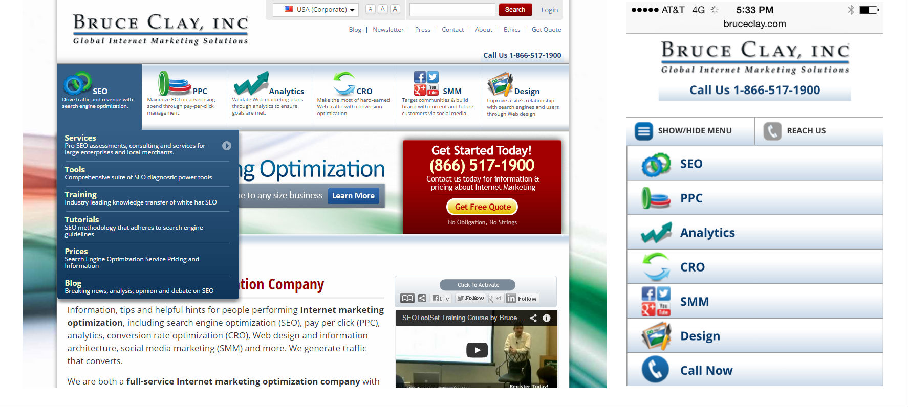
Bruce Clay, Inc. simplifies a complex multi-tier desktop navigation for mobile.
Some mobile navigations require multi-level navigation to aid user experience. This is more common with ecommerce websites. If you must go there, keep it as simple as possible and never add more than two levels of dropdown functionality.
If your navigation is very short and sweet, consider using a static navigation that runs across the top of your design, like we see on the GameStop mobile site:
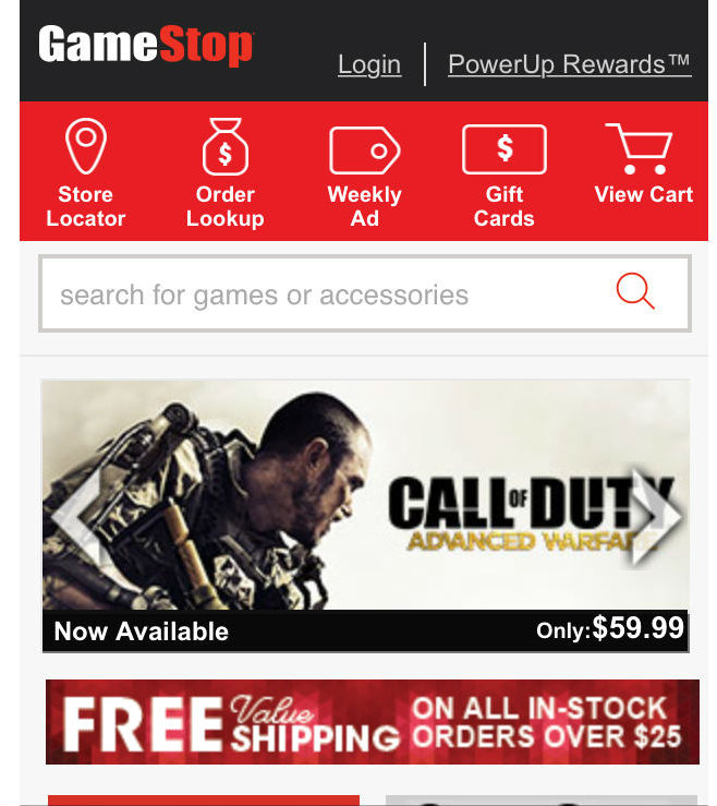
GameStop uses a static navigation that runs across the top of their mobile site.
If your navigation must include more items, an off-screen toggle menu that reveals a vertically-oriented navigation is the best option. A navigation that requires horizontal scrolling is a big mobile-friendly no-no.
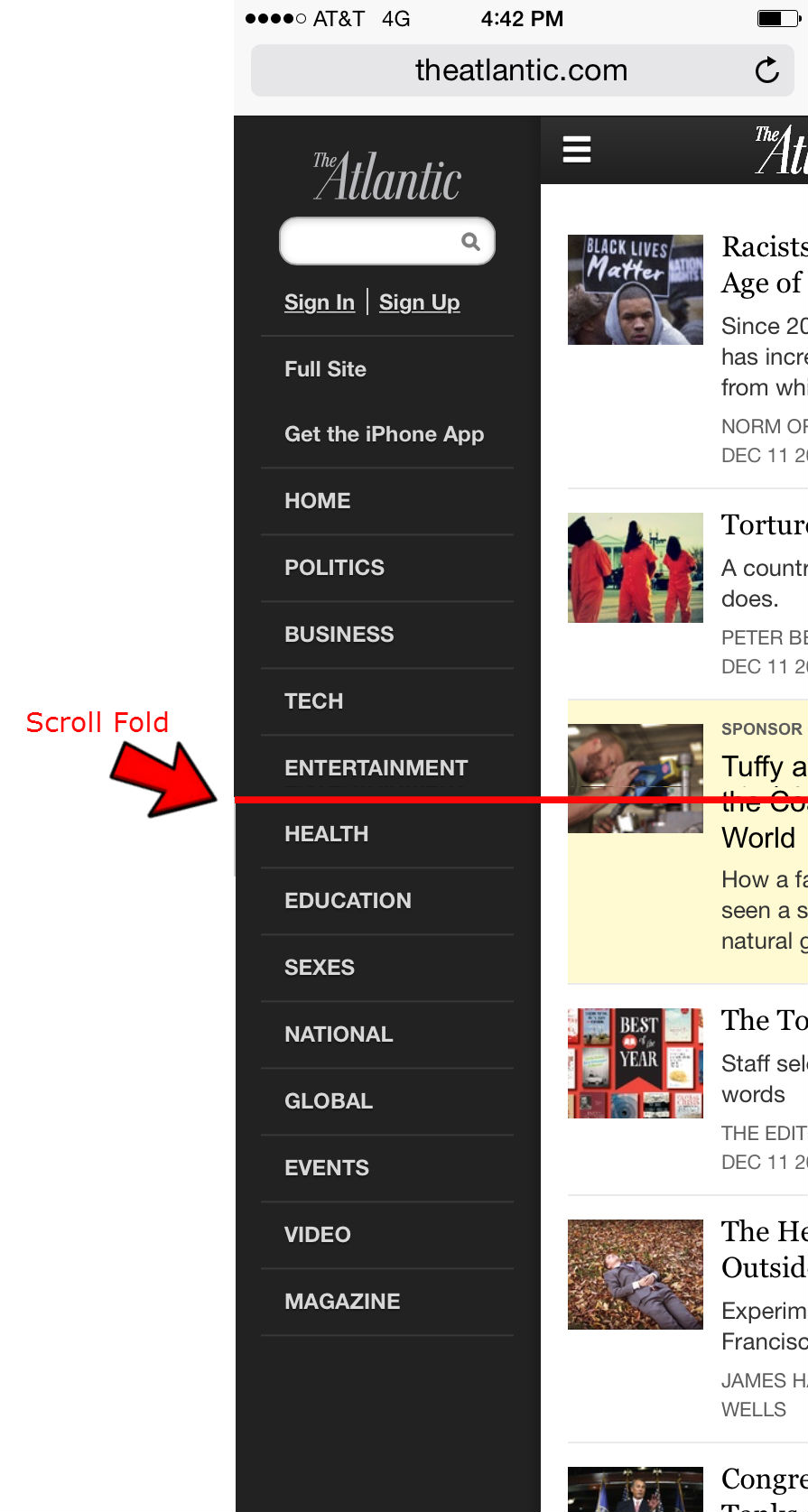
To best serve its users, The Atlantic offers a long toggle menu that requires vertical scrolling. The red line indicates what you can see above-the-fold (before scrolling).
3. Make your Navigation Intuitive
Joe works hard enough; your navigation should not be work.
To make your navigation intuitive, menu language should always be written in a way that lets the user know what to expect. It should be clear what the item does if it’s a dropdown, and exactly where it goes if it’s a link.
If you are using symbols to convey information to your users, make sure they are clear, conventional symbols. For instance, if your menu items dropdown, use an intuitive symbol like a plus sign (+) or an arrow ( >) to let your user know a click will reveal more options. Another example would be to use a magnifying glass to indicate a search feature.
If you are using an off-screen toggle menu, use three stacked lines – as seen in the example below – to help the user locate and access your menu.
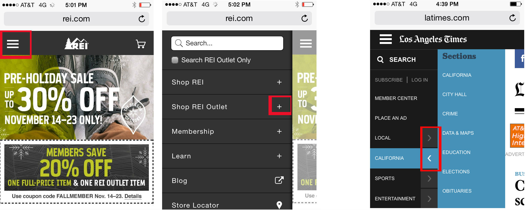
REI (left) and the Los Angeles Times (far right) use clear, conventional symbols to indicate toggle menus and dropdowns within multi-tier navigation.
The goal here is for your navigation to make life easier by limiting thinking, scrolling, clicking.
4. Be Thoughtful About Fonts and Contrast
Joe shouldn’t have to zoom to read any of the text on your mobile website, including the text within your navigation. Tiny text that requires zooming creates a poor user experience and both Joe and his friends Google and Bing really don’t like poor user experiences.
All of the text on your mobile site needs to be large enough to be read on a variety of devices without zooming. This principal needs to be a top mobile-friendly priority.
To make your navigation text easy to read, choose a taller font that naturally adds a little extra space between letters. Some common fonts that device manufacturers and users approve of include Arial, Helvetica, Courier, Georgia, Times New Roman, and Trebuchet MS.
Your font size and style will depend on your brand’s style guide and what works best for your unique demographic. For instance, millennials may not struggle with smaller, condensed fonts as much as an older demographic would. For this one there isn’t a one-size-fits-all recommendation. What’s important is that every word on your mobile site can be read easily without zooming. If you want to take the technical route, Google recommends you use a base font of 16 CSS pixels that scales across various devices. Another option is to perform user testing to see first-hand whether your font is tripping up users.
Not sure if your text is easy to read? Run your site through Google’s Mobile Friendly Test Tool.
5. Design for Touch
Joe is self-conscious enough; don’t design a navigation that makes his fingers feel fat.
Your tablet and smartphone users rely on touchscreens to get them around websites. While a pointy mouse arrow allows users to precisely select items in tight spaces, the average finger requires about 44 pixels, left to right and up and down. This is because of the size of the finger tip, as well as the less-than-perfect precision that comes with touchscreen selection (many users don’t hit the button exactly where they are aiming).
Build navigation buttons with a target smaller than 40 pixels and your user experience plummets as visitors end up slop navigating to the category above or below the one they want.
Since users are so very bad at hitting their tap mark much of the time, it can also help to incorporate touch feedback into your navigation. Your feedback could be a color change, a blink of color, a font change, or another visual cue. Even if it’s subtle, this feedback can improve user experience by helping to reassure users that they’ve selected the right item.
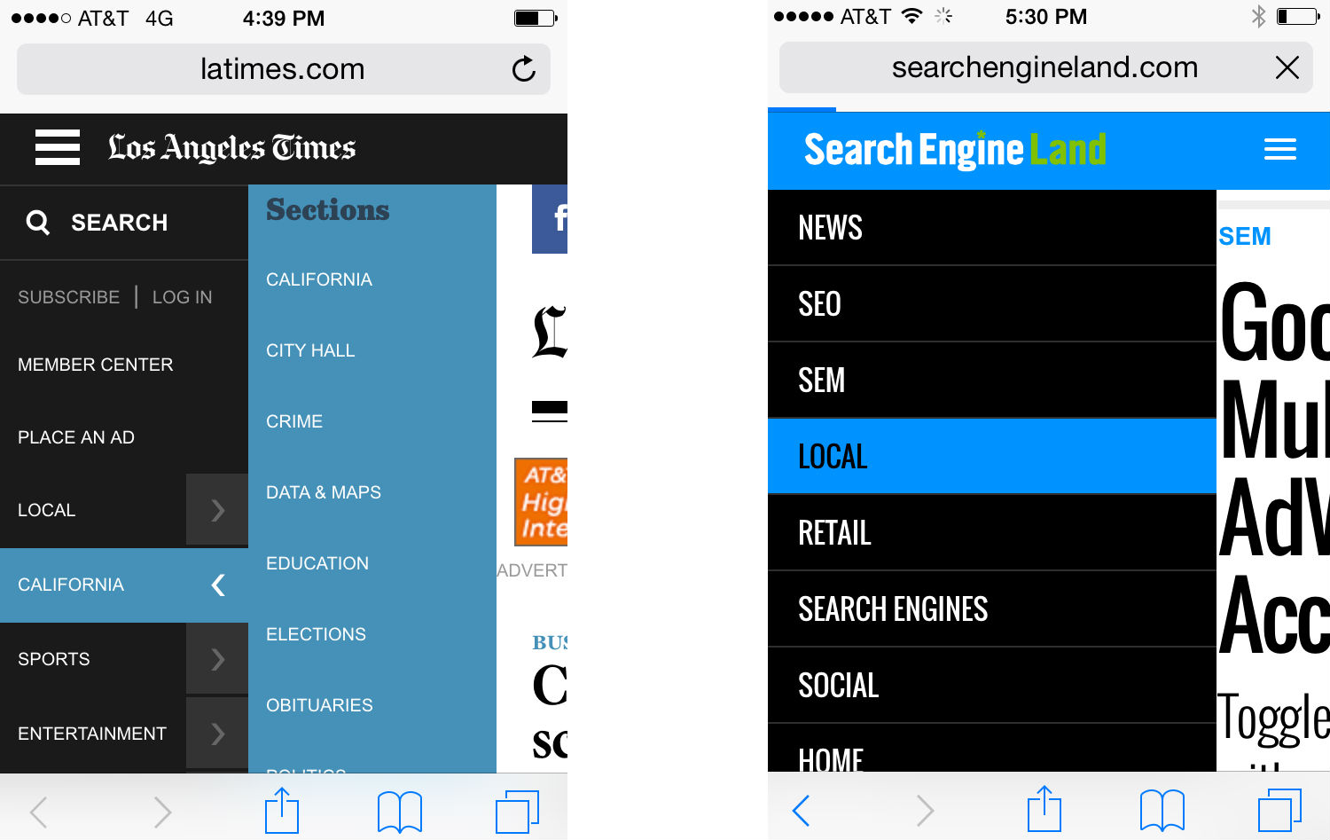
Both the Los Angeles Times (left) and Search Engine Land (right) incorporate color-change touch feedback into their mobile navigation.
If you are using multi-tier navigation, it’s also important that you make sure your dropdowns are touch to activate – not mouse over. Clearly, hover navigations work just fine in the desktop experience where hovering is a possibility, but it will leave mobile users stuck.
Another touch-friendly option is to design a supplementary navigation that uses images and exaggerated graphic buttons. This type of navigation can be a great homepage asset that gets your visitor headed in the right direction quickly. It’s important to note that this should only be a supplemental option used alongside a toggle navigation or a static top navigation. You need to have a consistent navigation that the user can access at the top of every page. While you may be able to include this graphic navigation at the bottom of your mobile pages, it’s not optimal or practical to use these big graphic buttons as your primary navigation.
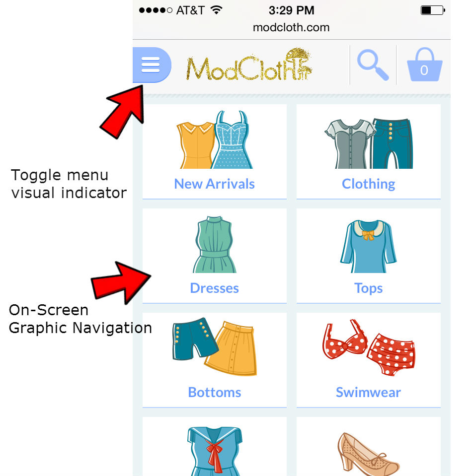
In addition to a toggle menu, ModCloth uses a graphic navigation on their mobile homepage.
6. Design for the Multi-Screen Mobile User
Chances are good Joe has — or will — visit your website using multiple devices over a short period of time. To help him feel confident he’s in the right place it’s smart to give your mobile and desktop sites a consistent visual theme, but your mobile navigation and your desktop navigation do not have to be — and usually should not be — identical twins.
While the colors, fonts and themes you use for your mobile and desktop navigation should remain consistent, the similarity may end there.
Your mobile navigation needs to help users navigate around your website and accomplish tasks. Consider the content your smartphone users need and the tasks they are looking to accomplish then build your mobile navigation specifically for your mobile user.
What mobile-specific calls to action need to be built into your navigation to aid user experience? Does it make sense to include a Call button or a store locator?
Remember: space is limited, mobile needs are unique, and on-the-go patience is minimal.
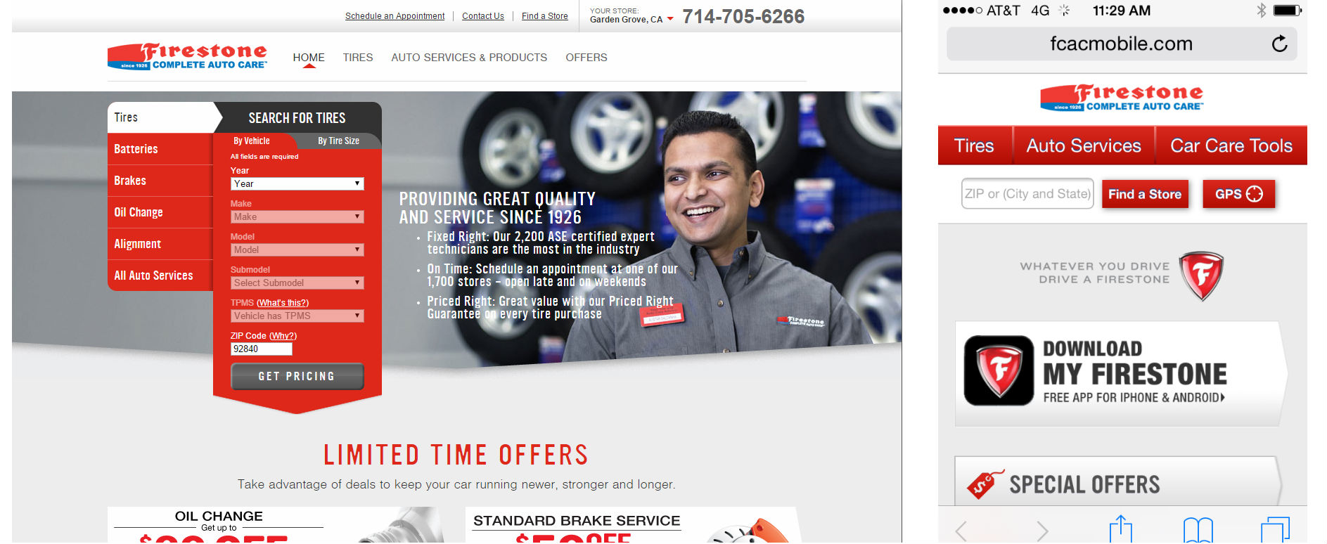
Firestone uses a mobile-user specific navigation that is not identical to their desktop navigation.
Mobile-Friendly is Customer-Friendly
Creating a mobile-friendly navigation means creating a customer-friendly navigation that gets your personas moving in the right direction right away. Build an intuitive navigation that is easy to use and Joe will be headed toward conversion happiness in no time; build a navigation that is frustrating or confusing and he’ll be headed back to the search results and straight toward someone else’s website.
To keep Joe and the rest of your inbound traffic smiling, make your mobile-friendly navigation:
✔ Short and sweet whenever possible
✔ Easy to read
✔ Task-oriented
✔ Prioritized with what’s most important listed first
✔ Accessible and placed consistently across all pages
✔ Clear, straightforward and expected
✔ Vertical if scrolling is required (never use horizontal scrolling!)
✔ Easy on the eyes
✔ Finger-friendly

Just getting started with mobile design? Read the All-In-One Mobile SEO & Design Checklist to get your mobile site headed in the right direction.


December 11, 2014
How the FTC’s New Disclosure Ruling Affects Social Media Marketers & Influencer Marketing Strategies
How the FTC’s New Disclosure Ruling Affects Social Media Marketers & Influencer Marketing Strategies was originally published on BruceClay.com, home of expert search engine optimization tips.
Reaching out to influencers is a public relations tactic as old as time. But a whole boutique marketing industry has cropped up in the last few years as more people gain niche Internet celebrity status, opening opportunities for agencies and brands to get endorsements from online social influencers. Who is and isn’t an advertiser used to be pretty black and white, but these days, understanding who is compensated for their endorsements requires an eye for shades of gray. The FTC wants to remove that ambiguity.

A new sheriff in social media: The FTC is enforcing full disclosure on promotional tweets in Twitter.
As reported on Marketing Land last week, the Federal Trade Commission settled charges against ad agency Deutsch LA for Twitter use that violated disclosure-in-advertising rules. It’s the first such case the FTC has settled, so it’s groundbreaking news for social media marketers.
Here’s a summary: An account manager at Deutsch LA sent an email encouraging employees to tweet about a client’s product, the Sony PlayStation Vita; employees did so, and the FTC found this to be a misleading promotion of that product. In the settlement, the FTC barred the agency from misrepresenting the endorser of a product as an ordinary consumer.
Moral of the story: If there’s some financial arrangement compensating the person posting an ad, whether that’s a paycheck from an employer or specific payment for the endorsement, the FTC wants it disclosed. And they’re willing to enforce it.
The FTC’s guidelines revised as of March 2013 require marketers to follow the same rules for short-form ads in social media as they do in traditional media advertising. And we’re talking regular posts, not sponsored ads here. In Twitter, this means that even within the limited 140-character space of a tweet, your ad must disclose in a “clear and conspicuous” way a financial relationship with what you’re endorsing. Failing to do so might result in prosecution and penalties for your company.
Effect on Influencer Marketing
Even before the FTC started flashing its sheriff’s badge, companies could get in PR hot water for failing to disclose a financial deal behind a promotion. A famous example of an influencer marketing campaign soiled by non-disclosure was Wal-Marting Across America. Ordinary couple Jim and Laura planned to take an RV trip, staying for free in Wal-Mart parking lots. When the company’s PR firm heard about it, Wal-Mart offered to sponsor their trip. So the couple extended the trip across the country and blogged upbeat stories about loyal store employees they met along the way. However, nowhere on their highly promotional blog was it disclosed that the company had paid for the gas, the RV, and the blog. This campaign created more negative than positive PR when the truth came out.
Influencer marketing at its best.
Image credit: Oprah.com
In the purest form of influencer marketing, a well-known person happens to discover a product and then talks about it to their vast audience — just because they like it, not because they’re compensated. A modern example is Oprah’s Book Club, which talk show host Oprah Winfrey began in 1996 simply to share her love of good books. Book publishers soon learned that being selected meant massively increased print runs and sales.
With such a potential jackpot available, it’s no wonder that companies try to manufacture the influencer marketing effect. Before the FTC’s recent crackdown, the difference between sharing and promoting was pretty blurred in social media. After all, how significant could a single tweet be, a mere 140 characters in a sea of Twitter streams? Social media platforms in general seem a lot looser than traditional media; people converse quickly, casually, and without much thought to rules. Marketers’ concern lies far more with what will work than with following rules. But that may have to change in light of the FTC’s disclosure enforcement.
How should marketers react?
A few in the Internet marketing community have already started meaningful conversations about how to apply the FTC ruling.
In Google+, Eli Fennell observed: “This no doubt casts many social media marketing strategies revolving around social ‘influencers’ in doubt, especially in cases where the influencer is hired by the marketing company on a theory akin to the darkest form of Native Advertising: where the content effectively serves as an advertisement but makes no indication of such.”
Eric Schwartzman took it further in his article for Convince and Convert: “Basically, if you have received anything of value from a person or organization and then you post about them on a social network, you’re required to disclose your relationship or anything of value you received.”
What about using personal accounts to promote your employer’s client?
The particular offense cited in the Deutsch LA ruling was employees tweeting about a product on behalf of a client of their employer. So it’s pretty clear that having employees promote a client’s products as if they were just a non-interested consumer violates the FTC guidelines. To avoid this, the tweet or post has to mention the connection.
What about using your personal account to promote your own employer?
A grayer area involves employees posting on behalf of their employer. For example, I tweeted and posted on Facebook about the new SEO Tutorial released last week — partly because I think it’s excellent, partly because I helped create it and feel a sense of pride in sharing it with the world. In this case, I didn’t hide the fact that Bruce Clay, Inc. is my employer.
That seems to be the crux of the issue: Do not hide the fact that you work for or get compensated by the company you’re promoting. But the FTC probably would not come down as hard on employees talking about their own brand. Here’s what others had to say (emphasis mine).
Fennell: “… using your own employees to promote the brand on social media may be more complex than some marketing strategists believe. Promoting their own employers may be fine, and it may even be acceptable to promote brands you carry or serve, unless those brands are paying your company to do so. Even the most harmlessly intended promotion of the client by employees, in fact, may be grounds for a fine.”
Schwartzman: “… the FTC wants to make sure people know if you’re affiliated with an organization or product you may be tweeting about. And your affiliation can be professional or personal.”
How to Disclose the Financial Relationships
The FTC guidelines say it must be “clear and conspicuous” at the location where someone reads the ad — so having your affiliation only on your Twitter profile page probably isn’t enough. They recommend using a hashtag such as #client or #sponsored, or prefixing your tweet with “Ad:” or some other clarifier. Common sense should be applied, though; consider the context and append those tweets that truly advertise a product or would lead someone to be misled into making a purchase based on your promotion.
Last Thoughts
Transparency is an often-stated goal in today’s marketing environment. Social media enables both individuals and brands to be known more than ever before. It’s now a marketing best practice to allow employees to represent a brand by posting as themselves on Twitter and elsewhere — humanizing a brand with actual names and faces builds customer relationships and brand trust. Companies are embracing this idea more and more, as they should. The FTC ruling should not throw a wrench in that progress; nevertheless, it should serve as a caution to disclose the employer-employee relationship. Of course, employers cannot and should not expect employees to endorse products as if they were actual consumers or to hide their affiliation.
The ruling also serves as a wake-up call that social media is not the Wild West it once was. There are rules and there are sheriffs to enforce them.
December 9, 2014
The Social Media Wish List: A Community Manager’s Top 10 Pet Peeves
The Social Media Wish List: A Community Manager’s Top 10 Pet Peeves was originally published on BruceClay.com, home of expert search engine optimization tips.
When it comes to social media marketing and community management, it’s not always sunshine and hashtags. When you post daily, ad infinitum, there are little things that just can’t help but get on your nerves — especially when you encounter them multiple times a day, everyday. So, in the spirit of sharing, I’ve decided to share even this: a social media wish list that enumerates all the small things I wish would change about managing social media. Can you relate?

The Social Media Wish List
Hey Facebook. You’re great and all, but wouldn’t it be awesome if a brand could tag an individual?
Ah, the secret Pinterest board. Why can’t we change a secret board to public and a public board to secret? Pinners, amiright?
Speaking of Pinterest, can we get some keyword data somewhere someway somehow? I want to know what the people are searching for and optimize my pins accordingly.
It would be #instaperfect if Instagram could implement the ability to add a link in a post.
When posting as a company on LinkedIn, imagine if we could issue a hard return in the three lines of space we’re given! I know I’d be appreciative. It would also be great if we could tag anyone – individual or company.
When someone requests to join your network on LinkedIn and write you a custom message, that message disappears when you accept the request. The workaround, of course, is to find the notification in your actual email, but as far as LinkedIn is concerned, the message permanently vanishes.
While we’re on the subject of LinkedIn, why does Klout (leading social authority scoring entity) disconnect your LinkedIn profile every couple of months? What gives?
Posting on Google+ is always an adventure. Why, WHY does the posting box have to be so ferociously small? It’s like Google+ is trying to make it difficult. Moreover, when you hashtag something, you cannot hit the backspace key to edit it – Google+ automatically deletes the entire word.
TweetDeck is an amazing social management platform, but this list wouldn’t be complete without mentioning “collections.” Collections, or custom timelines as they used to be called, are columns you can customize endlessly. Drag and drop whatever tweets you want into them and create an appealing, embeddable timeline. It’s a beautiful thing, really. But once you create a timeline, you can’t get rid of – if you delete a collection, it breaks in whatever blog post you embedded it in … which means you’ve got to keep that collection in your TweetDeck forever.
You know when you’re on Buffer and you’re posting messages way in advance? And maybe that promo for the Digital Marketing Conference Calendar can be exactly the same on Dec. 20 and Jan. 20? And you hit copy and paste? And then Buffer says “Whoops, it looks like you you’ve posted that one recently. Unfortunately, we’re not able to post the same thing again so soon!” Sigh. This is annoying and unnecessary.
What would YOU add to the social media wish list? Kvetch in the comments.
December 3, 2014
New SEO Tutorial Encourages Active Learning
New SEO Tutorial Encourages Active Learning was originally published on BruceClay.com, home of expert search engine optimization tips.
 Imagine you show up to work one fine Monday and Bruce Clay is sitting in the desk next to yours with one item on his agenda: teach you the foundations of SEO from the ground up. The lesson plan includes everything you need to get your website ranking, from how to do keyword research, to technical optimization, designing for mobile-friendliness and semantic markup. To help you hit the ground running, Bruce has brought with him 10 free SEO tools to make each of your lessons active; not only are you learning about keyword research, you’re actually doing keyword research. You’re not just learning about the importance of a natural inbound link profile, you’re actually using tools to learn more about your own inbound link profile as well as the profile of your competition.
So you’re getting world-class training and access to hands-on tools straight from Bruce Clay — all at your own desk.
Sounds expensive.
Now, return to real life. Ready for the good news? With the new online SEO tutorial from Bruce Clay, Inc. you can essentially have the learning experience mentioned above for free. While Bruce won’t physically be in the office with you, you will have a step-by-step course that walks you through his methodologies with 10 free tools at your disposal.
What’s Included in the Free SEO Tutorial
The new-and-improved SEO tutorial is an online training course to help marketers understand and apply industry best practices, grounded from principles of ethical SEO to stay clear of search engine penalties.
 At 19,982 words, the course is deliberately thorough. Those new to search engine optimization are invited to read from beginning to end for an all-in-one ramp up. For those with more optimization experience, we’ve split the course up into 18 steps on individual pages to make it easy to navigate to the section most relevant to your needs.
New to this version of the tutorial are expanded lessons on structured data markup, mobile SEO, and UX optimization.
10 Free Embedded Tools Make Learning Active
We believe in active learning and retention through engagement.
To close the gap between education and application, throughout this course we’ve included 10 free tools that help you immediately put the skills you are learning into action.
18 sections is a lot of training; why wait until you’re done with the tutorial to start applying the skills you’re learning? Instead, this training system allows you to get hands-on while the ideas are still fresh, with light versions of our tools embedded at each appropriate step of the tutorial.
Throughout this course look for free tools that allow you to:
Perform keyword research (See step one and step four)
Discover top-ranked websites by keyword (See step two)
Discover the keywords your competitors are using (See step three)
Determine how much content your competitors have indexed (See step seven)
Make your Meta tags more competitive by exploring the tags your competitors are using (see step seven)
Analyze your keyword distribution and content reading level (See step seven)
Uncover any technical issues that may be preventing your site from appearing in search results (See step eight)
Evaluate your backlink profile (See step 13)
Evaluate your competitor’s backlink profile (See step 13)
See how many pages search engines have indexed for your site domain (See step 13)
Check your site to identify cloaking issues (See step 16)
Get Started Strengthening Your SEO Core!
The Bruce Clay, Inc. SEO tutorial is live now. To get started with this foundations course, choose a chapter from the list below and jump in feet first.
Step 1: Keyword Research – How to Select Keywords
Step 2: Competitive Research – Who’s Your SEO Competition?
Step 3: SEO Competitive Analysis – Spy on Your Competition
Step 4: Choosing Keywords for SEO Relevance
Step 5: Key Considerations when Writing Content
Step 6: How to Use Keywords in Content
Step 7: How to Optimize Website Content for SEO
Step 8: How to Submit a Website to Search Engines
Step 9: Sitemaps – How to Create a Sitemap
Step 10: Using Rich Media to Engage Your Site Visitors
Step 11: How to Optimize Multimedia Content for SEO
Step 12: Siloing – How to Structure Your Website
Step 13: Link Building – How to Attract Quality Links
Step 14: Avoiding Google Penalties
Step 15: Monitoring Backlinks and Link Pruning
Step 16: Technical SEO Tips
Step 17: Mobile SEO and UX Optimization
Step 18: How to Monitor Search Engine Rankings & SEO Progress
Conclusion: Repeat – SEO: The Job That’s Never Done
Tell Us What You Think
We hope you enjoy this course as much as we’ve enjoyed making it. Please tell us what you think in the comments below.
November 24, 2014
The Digital Marketing Conference Calendar: 100+ Events Across the Globe, Updated for 2015
The Digital Marketing Conference Calendar: 100+ Events Across the Globe, Updated for 2015 was originally published on BruceClay.com, home of expert search engine optimization tips.
Throughout the year, Internet marketing conferences are held all over the world, from Los Angeles to Paris and everywhere in between. The thousands of SEOs, SEMs, content marketers, social media strategists and business owners who attend these conferences do so for the whirlwind of information, education and networking. Where else but an Internet marketing conference can you learn from the likes of Danny Sullivan, Chris Brogan, John Mueller and Bruce Clay all in a single day? 2015 holds more than 100 digital marketing conferences and events and we’ve updated our Internet Marketing Conference Calendar to help you view them all to start planning your year ahead.
The Digital Marketing Conference Calendar
The Internet Marketing Conference Calendar showcases SEO, SEM and SMM conferences across the world in one easy-to-access calendar, which you can view below or in a larger format here. You can also view or add the calendar in your personal Google Calendar by clicking the “+Google Calendar” icon in the bottom right.
SAVE on Digital Marketing Conferences: Plan Now, Spend Less
Everyone likes a good deal, and the easiest way to save on a digital marketing conference is to book early. You can save up to hundreds of dollars when you take advantage early bird rates. Plan early and save big! Map out your conference attendance with the Digital Marketing Conference Calendar — it’s your exclusive guide for 100+ Internet marketing conferences of 2015 and beyond, including:
• ad:tech
• Content Marketing World
• Search Marketing Expo (SMX)
• An Event Apart
• Digital Summit
• SEOToolSet Training
• Bend WEBCAM
• Intelligent Content Conference
• SXSW Interactive
• ClickZ Live
• Pubcon
• and many more!
Where will you go?
Maybe you’ll head off to SMX Paris? Bon voyage!

Or perhaps you’ll head to New York City for ClickZ Live …

Is Pubcon New Orleans calling?

You don’t want to miss SEO training with Bruce Clay in SoCal!

Photo by Shinya Suzuki | C.C. by -ND 2.0
Internet Marketing Conference Fast Facts
There are more than 100 digital marketing conferences in 2015.
March is the busiest conference month.
San Francisco is the epicenter of Internet marketing conferences — more conferences take place there than in any other city.
The longest digital marketing conference of 2015 is the Digimarcon Cruise. That’s right — digital marketers will set off on a cruise that departs from Orlando, Florida in April for an entire week of seafaring, sunshine and digital marketing education in Jamaica, Haiti, the Cayman Islands and Mexico.
Add Your Event: Digital Marketing Conference Calendar Submissions
If you know of an event that you think should be included on this calendar, we want to hear about it! The Internet Marketing Conference Calendar is open to any conference associated with Internet marketing, including search engine optimization, search engine marketing, social media marketing, digital marketing, Internet technology, B2B and B2C. Meetups will not be included on this calendar. If you’d like to submit a conference or event for inclusion on the calendar, please email Social-BC[at]BruceClay[dot]com with the name and dates of the conference, and a link to the conference website.
What Internet marketing conferences are you most looking forward to in 2014? Share with us in the comments.
November 20, 2014
‘Adapt or Lose’ and Other SEO Advice from This Google+ HOA
‘Adapt or Lose’ and Other SEO Advice from This Google+ HOA was originally published on BruceClay.com, home of expert search engine optimization tips.
“In our industry, if you can’t adapt, you lose.” Bruce Clay was the guest on an HOA yesterday that one commenter called “Absolutely the best HOA I have heard all year about #SEO.” That link will bring you to our recap and top takeaways from Bruce’s video chat with Ben Fisher and Stephan Hovnanian.
Replay the HOA on YouTube, and click through for a time-stamped play-by-play in the description provided by the Google Plus Business Spotlight show host.
Some highlights for me:
What will drive AI development? “We’re going to see speech interaction drive artificial intelligence, not the other way around.”
On the complexity of Internet marketing today: “One person could be your Internet marketing department 10 years ago. You did the Google thing. Bought some pay per click. Social wasn’t a big deal. Now social is an industry. SEO is more technical day-to-day. Pay per click — you can no longer have a human manage your bids. As a result, Internet marketing can’t be managed by one person any more.”
On the interdependence of digital marketing disciplines: “Internet marketing, which is all of the main disciplines — there’s six of them — all are becoming far more technical deeper. They’re going down, far more technically. And they’re broadening and becoming interdependent upon each other, all at the same time that all this technical information is becoming dependent upon core marketing knowledge.”
And one more nugget of wisdom plucked by Paula Allen:
November 13, 2014
Is SEO Worth It? 7 ‘Bruce-isms’ to Make the Case to Management
Is SEO Worth It? 7 ‘Bruce-isms’ to Make the Case to Management was originally published on BruceClay.com, home of expert search engine optimization tips.
Bruce Clay is the president of Bruce Clay, Inc., an industry leader and SEO lifetime achievement award recipient. In his nearly two-decade SEO career, he’s advised thousands of businesses on how to take their a web presence to the next level with SEO. With clients ranging from small business owners to Fortune 500 executives, Bruce has had a firsthand view of what it takes to double, triple and quadruple web traffic and conversions for business in every industry. Bruce is also a generally quotable guy. Ever heard this one?
“It is not the job of search engine optimization to make a pig fly. It is the job of SEO to genetically re-engineer the website so that it becomes an eagle.” Yep, that’s Bruce! (Tweet This!)
When Bruce is presenting on SEO at an industry conference or education event, I can tell you there’s a rush of gold nuggets on Twitter attributed to him. I recently picked his brain to get some tips for in-house SEOs looking gain buy-in for growing SEO resources. As expected, we’ve captured some keepers. If you’re an in-house SEO and any of this sounds familiar to you, feel free to pin and tweet some classic Bruce Clay quotables.
What the C-Suite Needs to Know About SEO
What are the chief factors that management should know about SEO? Bruce wants CMOs and CEOs across the board to consider the following as they move on an SEO initiative:
SEO is an Investment
Choose an SEO Firm Wisely
An SEO Agency Can Be a Powerful Ally
SEO is a Marathon, Not a Dash
Cross-Train Marketing and IT Departments on SEO Initiatives
SEO, PPC and SMM Should Join Forces
Lack of SEO is a Bug
1. SEO is an Investment
 Understanding the value of SEO is the first step in deciding if SEO is worth it for your business.
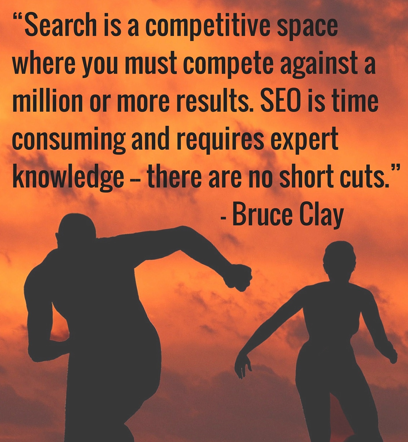
“SEO generates traffic and branding within the organic search results on Google, Bing and Yahoo! SEO takes effort, energy and focus. It’s a competitive space where a company must compete against a million or more results. SEO is time consuming and requires expert knowledge — there are no short cuts,” Bruce says. [Tweet this!]
2. What to Look for When Choosing an SEO Firm
Bruce recommends that SEO companies be selected based on impressive track records of successful projects. They should have longevity in the industry and support or sponsor industry events. They should have seasoned consultants on staff that are recognized leaders, whether its published authors or conference speakers. An SEO firm’s results and word-of-mouth reputation should speak for themselves. [Tweet this!]
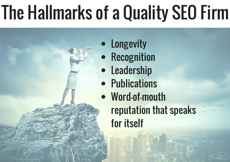
“Furthermore, the best SEO companies have never had penalties. They’ve never purchased links or taken short cuts. When selecting an SEO company, research them and make sure they’re not violating any search engine terms of service. If you hire an SEO firm that engages in unethical practices, they can burn your site to the ground and cause irreparable damage to traffic from search,” Bruce warns. [Tweet this!]
3. An SEO Agency is a Powerful Ally for the In-house SEO
Bruce recommends that, ideally, businesses should have an in-house SEO as well as a consultant from an outside SEO firm. Moving the needle can be a difficult task, and the additional knowledge and support an SEO agency can provide an in-house SEO is invaluable. The additional power can fuel the the current SEO efforts, with the in-house SEO orchestrating the website changes that the consultant advises. Search engines are constantly evolving. What worked two years ago and was able to generate traffic is today’s penalty.
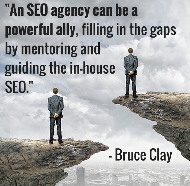
“It’s crucial to stay current with the latest SEO methodology – that’s very time-consuming, though. It requires several hours a day that a solo in-house SEO probably doesn’t have. An SEO agency or consultant can be a powerful ally, filling in the gaps by mentoring and guiding an in-house SEO,” Bruce advised. “Get the best of both worlds with an in-house SEO manager AND an SEO consultant.” [Tweet this!]
4. Set Expectations: SEO is a Marathon, Not a Dash
Set expectations from the start (and throughout) by making it known that search engine optimization takes time. Be prepared to prove ROI, and remember that success doesn’t happen overnight — SEO is an investment. The reward for that investment is usually major.

“Our clients’ budgets vary between $3,000 and $40,000 per month. The return on those investments are generally massive, though not immediate. It can take five to seven months to see the full benefit of SEO, as there is a lot of work to be done and changes to be made,” Bruce explained. “SEO is a marathon, not a dash.” [Tweet this!]
5. Cross-Train Marketing and IT Departments on SEO Initiatives
In most companies, the IT team is separate from the marketing team. When it comes to SEO, however, both departments should be trained on SEO at the same time. Each needs to understand what’s at stake and know what will hold back SEO if it’s not done correctly.

“As a result, both departments will understand why changes need to be made and understand how to implement them together,” Bruce says. “It’s the job of an SEO to evangelize to both departments and get them to understand that the SEO initiatives will help everyone.” [Tweet this!]
6. Create a Unified Front: SEO, PPC and SMM Join Forces
SEO, paid search and social media marketing are all valuable sources of traffic. Bruce points out that of the three, SEO is often the most economical, but it’s also very technical to implement – and it takes longer to see results.
Paid search, on the other hand, usually operates with a massive budget and offers nearly instantaneous traffic. Social media marketing drives awareness and can result in increased search activity. Social media posts often function as miniature press releases that spur both traffic to your site and searches for your keywords.
“Together, all three synergistically create a united digital marketing front that reaches multiple audiences, builds your brand and drives traffic to your website. That being said … it is still the job of the website to make your visitors convert,” Bruce says. [Tweet this!]
7. Lack of SEO is a Bug on Your Site
It’s important to understand that SEO is not just an option — it’s a necessity. Frame the conversation so that the C-Suite and the IT team think of a site without SEO as a site with a bug.
“SEO is not simply ‘nice to have.’ Lack of SEO is a bug on your site,” Bruce asserts. “SEO deficiencies cost you traffic. If you can get management and IT to consider lack of SEO a bug, it will become an increased priority.” [Tweet this!]
Is SEO Worth It?
Search Engine Optimization (SEO) is one of the best investments a business can make. Eighty percent of web traffic is derived from organic placement; that’s a powerful fact to remember when making the case for a bigger SEO budget or additional resources. Organic traffic — and the conversions and sales that come with it — is up for grabs. If you’re considering implementing or strengthening an SEO initiative at your company, consider the above seven recommendations when choosing an SEO.
Is SEO worth it? You tell us. Tell us about the challenges you face when making the case, and what’s worked for you in getting executive and inter-department buy-in in the comments!
November 5, 2014
New Mac OS Allows Seamless Cross-Device Internet Experience; Just Another Reason to Shift to Entity SEO
New Mac OS Allows Seamless Cross-Device Internet Experience; Just Another Reason to Shift to Entity SEO was originally published on BruceClay.com, home of expert search engine optimization tips.

It’s been just over a year since Google updated its algorithm with Hummingbird, making it better equipped to serve conversational search queries.
The day is coming when the majority of searches will be conducted with natural language; most queries will be long-tail; and optimizing for a set of short keyword phrases won’t be sufficient. Some have been saying this same thing for a long time now. But have we all been listening?
New technology released by Apple in October is bringing us another step closer to device agnostic user experience. For search marketers, this is yet another reason to optimize for concepts over keywords. Here I’ll describe that technology, and also share some recent stats on voice search to help us shift our thinking toward entity SEO, optimization geared for semantic search.
New Apple Features Allow Seamless Cross-Device Internet Use
With the release of new operating systems for Macs and its i-devices (iPads and iPhones), Apple has created a seamless experience for Internet use (texts, emails and phone calls) with a feature-set called Continuity. One feature, Handoff, allows you to start and stop a task on one device, be it iPad, iPhone, or Mac computer, and then restart on another Apple device.
Start typing an email on your phone then realize it would be easier to add attachments from your laptop? Handoff lets your laptop pick up right where your phone left off, provided both devices are near each other and on the same network. In the email example I used, when you look at your laptop you’ll see an icon representing the email you were just writing on your phone; clicking on it brings up the email right where you left off.
Through Continuity, you can take phone calls on your laptop, or send and receive text messages from your laptop. Plus, all of the text messages on your iPhone appear on your laptop. So you can click on a phone number pretty much anywhere on your Mac and send an SMS or iMessage.
Climbing Voice Search Stats
While I haven’t found any statistics on how many people currently perform voice searches on desktop versus on a mobile phone, I did discover Google’s own study showing how many teens use voice search, compared to adults. Some highlights:
More than half of the teens surveyed use voice search daily.
41% of the adults said they “talk to their phones every day.”
How Cross-Device User Behavior and Voice Search Affects SEO
Prediction 1: Device tracking becomes obsolete.
I expect we’ll be moving away from a distinction between mobile vs. desktop search as new technologies gray the line; new technologies like phablets and wearables occupy a confusing middle ground. Sure, analytics can track what types of devices are visiting pages, and we as an industry can parse apart how users are accessing our websites. But Apple’s Continuity moves user behavior towards the device agnostic, which will naturally affect how people search.
Prediction 2: SEO strategy will evolve for semantic search technology. Here’s three ways:
Entity SEO emerges. Optimize for complete coverage of concepts, sometimes called entities, over keywords. It’s already been well established that someone performing a voice search on their phone tends to use conversational language, and focuses less on keywords. Semantic search, natural-language queries, and the underlying need to understand the connection between online concepts is exactly the basis of Google’s big Hummingbird Update last year.
More than ever, understand your audience. In the midst of optimizing Meta tags, checking page load times, and monitoring backlinks, don’t forget good market research, developing well-informed user personas, and maybe run a survey.
Answer questions, don’t rank for queries. In “Google Hummingbird & The Keyword” published last November, Jim Yu explains that previously SEO sought to answer the question “How do I rank for this query?” SEO today must solve the problem, “How do I best answer the questions my users have?” He says that if you’ve been staying up to date with trends in SEO, Hummingbird only reinforced the work you’d been doing.
Of course, that’s a pretty big if. And I think that a lot of SEOs fall outside that if, as do a lot of site owners. The transition from keywords to concepts is happening, and this latest move from Apple is the next clarion call that mobile is taking over. More than ever, it’s time to optimize for concepts rather than keywords. A unified user experience between desktop, laptop, tablet, and phone is the latest advance with major potential to shift how people interact with their gadgets, and ultimately, how they search.
October 31, 2014
Happy Halloween! Bruce Clay, Inc. Is in the Spirit!
Happy Halloween! Bruce Clay, Inc. Is in the Spirit! was originally published on BruceClay.com, home of expert search engine optimization tips.
Bruce Clay, Inc. Goes All Out for Halloween

Happy Halloween from Bruce Clay, Inc.! It’s that time of year again, and the Bruce Clay team is dressed to the nines, as per usual. Bruce Clay came dressed as an authentic German, complete with Lederhosen, and was flocked by a diverse cast of characters, including:
Jaws
Flo from Progressive
a leprechaun with Lucky Charms
the Queen of Hearts
Minnie Mouse
Vanna White
an Ebola doctor
the Cheshire Cat
Queen Bee
Poison Ivy
Willy Wonka
The Penguin
Run–D.M.C.
Dwight Shrute from “The Office”
Tom Cruise from “Risky Business”
Hunter S. Thompson from “Fear and Loathing in Las Vegas”

Bruce Clay in authentic German garb!
As is tradition, the entire company ate a delicious Italian lunch at nearby Viva La Pasta, where the official votes were tallied for the costume contest.
Best Costume Overall: Virginia Nussey as The Queen of Hearts
Scariest Costume: Maryann Robbins as a Headless Horseman
Funniest Costume: Michelle Scharf as Jaws
Most Original Costume: Micah Albert as a Wild Thing

“Off with her head!” Costume contest winners Virginia Nussey and Maryann Robbins.

Micah Albert as a “Wild Thing.”

Michelle Sharf as Jaws!
Check out all the pictures!
October 29, 2014
The All-In-One Mobile SEO & Design Checklist
The All-In-One Mobile SEO & Design Checklist was originally published on BruceClay.com, home of expert search engine optimization tips.
 On the Google Developers website, Google calls mobile optimization “a critical part of website management,” and dedicates an entire in-depth section of the site to helping webmasters build smartphone-optimized websites.
Mobile matters.
And if Google calls it a “critical part of website management,” it’s safe to say it really matters.
Consider this checklist a mobile SEO good-to-great resource.
If you’re already on-board and optimizing for mobile, jump to the section that best suits your good-to-great needs. If you’re new to the game, start from the beginning and use this checklist as a start-to-finish guide.
Table of contents:
Choose a Mobile Platform
Get Technical: Optimize Mobile Sites for Crawling and Indexing
Optimize for Page Load Speed
Optimize Design for the Mobile UX
Track Activity: Implement Analytics to Track Mobile Conversion Goals
Optimize Your Content for the Mobile Experience
Test Mobile Sites Often to Analyze and Optimize User Experience
1. Choose a Platform: Responsive Design, Dynamic Serving, Separate Mobile Site or Some Combination of the 3
In both desktop and mobile environments Google is looking to rank web pages that show high relevance, trust, and great user experience. Remember, to rank for a target query Google needs to deem your web page the most relevant and “least imperfect” option for that query. While your desktop-optimized web pages may be incredibly relevant, if your code does not allow for your content to be dynamically altered to fit the smartphone experience, Google recognizes this as a poor user experience. A poor user experience means your website gets further from “least imperfect” and your rank drops further from the SERP top three.
Since ranking high in mobile search results needs to be a priority, building a dynamic or separate mobile platform for your content needs to be a priority as well.
You have four mobile platform options: Responsive design; dynamic serving; a separate mobile site; or a combination of the three.
The platform – or combination of platforms – that’s right for you will depend on many factors including development resources, conversion goals, mobile keyword research versus desktop keyword research, and persona behavior.
To figure out which mobile optimization strategy is best for you, we recommend reading:
A Cheat Sheet for Mobile Design: Responsive Design, Dynamic Serving and Mobile Sites – an article that compares and contrasts the three technical options.
The Building Smartphone-Optimized Websites portion of the Google Developers website.
Chapters one and two of Building Your Mobile-Friendly Site: The Distilled Best Practice Guide.
2. Get Technical: Optimize for Crawling and Indexing
When optimizing your mobile platform, don’t forget about your technical SEO best practices. If you skip the technical SEO on your mobile site, search spiders may have a hard time discerning mobile-specific content from desktop-specific content, which can create a bad user experience in both the mobile and the desktop experience. Also remember the basics: search engine spiders need to be able to discover, crawl and index your web pages in order for them to rank. In other words, if your technical SEO does not allow a search spider to find your site, that means your technical SEO does not allow your site to rank.
To help search bots crawl, index and differentiate your mobile-site pages, make sure you:
Create a mobile XML sitemap with a declaration after each URL listing.
Submit your mobile site and your mobile XML sitemap to Google Webmaster tools.
Never design your mobile site using pop-up windows or lightboxes that cannot be discovered through a sitemap crawl.
Make sure to implement rel=canonical, rel=alternate media and Vary: User-Agent HTTP Header tags as needed to tell Google when it should deliver a desktop version of your web page and when it should deliver a mobile version.
Make sure to allow the Googlebot-Mobile user-agent to access your site.
3. Optimize for Page Load Speed
This is very important to both the user and the search spider!
According to the PageSpeed Insights portion of the Google Developers help site, Google prefers above the fold content to render in under a second on a mobile network. Anything longer than a second, they say, can result in a poor user experience. The idea is to get users interacting with the page as soon as possible.
On the user experience end: According to Google and Strangeloop, 85% of mobile users expect sites to load at least as fast as desktop sites. So, if conversion is a goal (as it should be) mobile site speed needs to be a goal as well.
To help get your mobile sites loading faster make sure you:
Watch the Mobile Site Optimizer video from Strangeloop to learn, high level, why sites load slower on mobile.
Focus on mobile image optimization to reduce load times.
Follow the page speed optimization recommendations outlined in the Mobile Analysis portion of the Google Developers PageSpeed Insights page.
Use front-end optimization strategies, such as mobile-optimized caching, to address mobile performance issues and get mobile pages loading faster.
Regularly check your page speed using the Google PageSpeed analyzer tool.
4. Optimize Design for the Mobile UX
In the context of mobile optimization, design describes the elements of the web page the end-user sees, and user experience (or UX) describes the experience that design creates for the user, how they interact with elements on the page, how the elements on the page make them feel, whether the site is easy to use or frustrating, etc.
Google wants happy, satisfied searchers, so user experience is a huge priority for the search engine. Create a bad above-the-fold user experience and expect your site to rank somewhere far from page one.
To really send the importance of mobile design and UX home, consider this: when Barry Schwartz, reporting for Search Engine Land, asked a Google representative why mobile UX matters, the rep said:
“According to our studies, 61% of users are unlikely to return to a mobile site that they had trouble accessing from their phone. That includes sites that use fonts which are illegible on mobile, or sites where users have to zoom in or pan around excessively.”
Straight from Google. More than half of your inbound traffic is unlikely to return to your mobile site if they are met with a poor user experience. This means serious loss in conversion, as well as loss of mobile rank.
To get your web pages designed and optimized for UX, we recommend starting with these considerations:
Read Google’s 25 Principles of Mobile Site Design to learn what Google considers “mobile site design best practices.”
Consider: How do your buttons look, feel and function?
Are you using Click to Call buttons?
Is your logo a button that makes it easy to get back to your home page?
Are your buttons finger friendly?
Have you placed your most important CTA button above the mobile fold?
How’s the UX of your mobile site search?
Is the site search visible above the fold in your mobile design?
Can you add filter elements to make searching your site on a mobile device easier?
Did you make sure it’s impossible for search filters to return zero results?
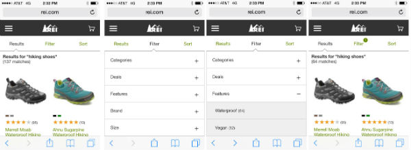
The REI mobile site makes it easy to filter search results.
Is you mobile experience optimized for task completion?
Can your forms be simplified?
Can login requirements be simplified? Can users purchase as a guest?
Are your menus working for the user? Can you simplify them? Would your pulldown menu work better as toggle menu?
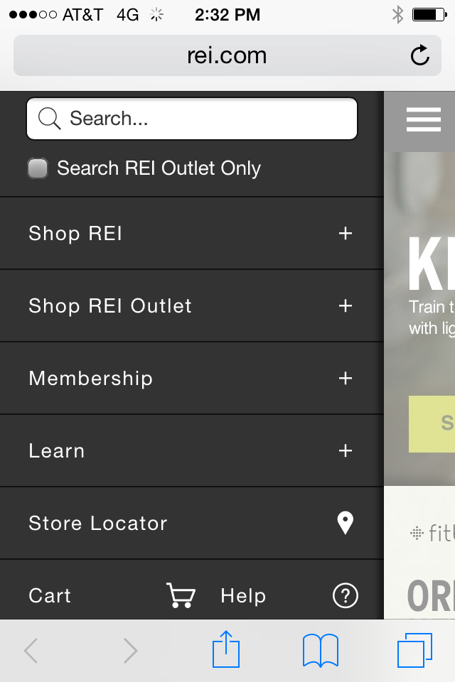
An example of a mobile toggle menu.
Would a third-party payment service make paying with a mobile device easier for your end user?
Do any of your forms or other windows open in a pop-up window or lightbox? If yes, fix this. Pop-up windows and lightboxes are bad for UX and SEO.
Does your user have to pinch, scroll side to side or zoom out to see your web pages? If yes, fix this. The Google representative quoted above specifically referenced a user having to “zoom in or pan around excessively” as an example of bad user experience. Your mobile platform should deliver web content that is sized to fit mobile devices.
5. Track Activity: Implement Analytics to Track Mobile Conversion Goals
It’s not a new concept: how can you understand where your web pages are succeeding and failing if you’re not tracking activity with analytics? Don’t overlook this important step on your mobile platform, especially if you have a C-Suite that needs to be shown ROI in exchange for buy-in and budget.
Make sure to:
Implement analytics across your mobile site.
Develop intelligent mobile- and conversion-centric metrics that give insight into how your personas are interacting with your web pages. Remember to look at micro-conversions and device-specific bounce rate.
When possible, define your mobile goals early then build mobile web pages with a task flow that makes conversion easier for the user.
Remember desktop rank and mobile rank can differ greatly. Page one in mobile SERPs tends to include significantly fewer organic results than desktop SERPs, and the keywords your personas are using to search for you in the desktop experience are not necessarily the words they’re using in mobile. Make sure your mobile stats are coming from true analysis of mobile SERP activity.
Make reporting easier by setting up a custom mobile campaign dashboard.
Monitor mobile site speed in Google Analytics by navigating to Content > Site Speed.
6. Optimize Your Content for the Mobile Experience
I won’t say “content is king” one more time, but I will say content really matters. Content is the means by which your users get to know you, your products and your services. Thoughtful content is truly key to conversion. Plus, without strategic content you can’t optimize your web pages for keywords, which means your web pages can’t rank in the desktop or mobile experience.
When approaching content creation with an eye toward mobile optimization think:
Is your content resonating with mobile users? Don’t set it and forget it. Instead, keep on adding and testing content types and measuring the corresponding mobile tracking variables.
All mobile content is not created equally. What works and reads well on one device type might not work at all on another (think smartphone experience versus tablet experience).
Is your content easily read without excessive scrolling or zooming? Are your digital assets – images, videos, navigation, etc. – easy to see without scrolling or zooming?
Are you calls to action front and center? Can you place a call to action above the fold?
Can your content be optimized for local? For instance, can you include the stock of product available nearby like REI does?
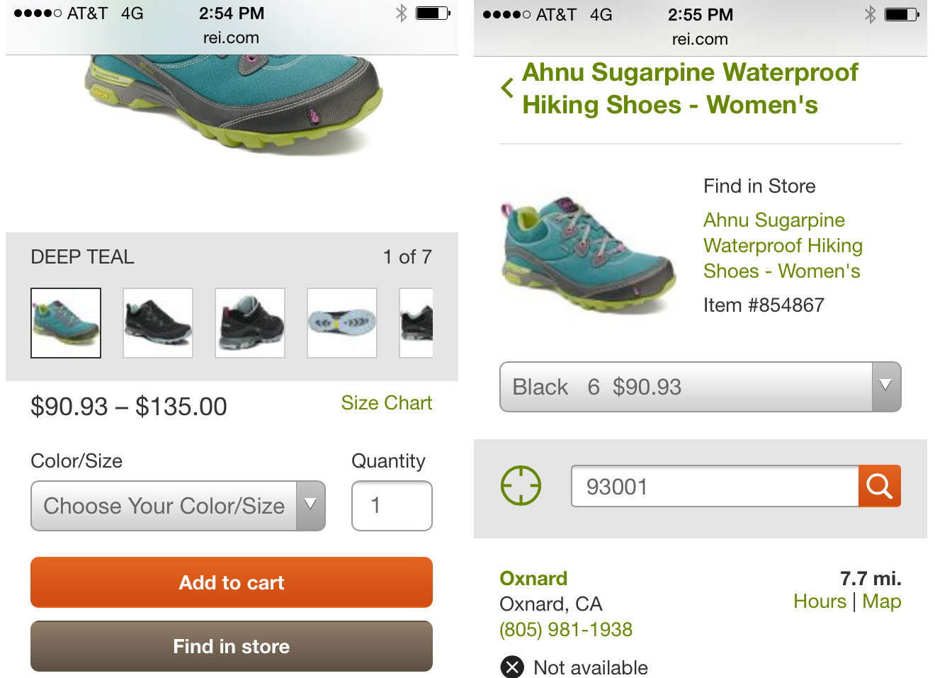
Here, the REI mobile site uses a “Find in store” button to optimize for local UX.
62% of keywords have different ranks between desktop and mobile. Have you done mobile-specific keyword research? Are your mobile users using search phrases that are very different from the phrases your desktop searchers are using? If yes, consider using dynamic serving to deliver mobile-optimized content to your mobile users.
Are your Meta tags optimized? When appropriate or necessary, are they optimized specifically for mobile?
Social content is mobile content. Are you integrating your search, social and mobile campaigns?
7. Test Mobile Sites Often to Analyze and Optimize User Experience
So you picked a mobile platform, designed your mobile experience with user experience in mind, and created mobile-optimized content. Great! Now… is it working? Does it look like you intended it to look? Is Google seeing it how you think Google should be seeing it? Are all the usability features you built into your web pages actually working for your users?
Don’t set it and forget it. Mobile optimization is all about testing and re-testing over and over again. While this is the final step in our checklist, remember that testing isn’t like putting a fork in it and calling it done. As an optimizer your work is never done, instead you should consider it “done for now until it’s time to test again.”
When testing and re-resting your mobile web efforts make sure to consider these factors:
Have you tested on a range of devices using an emulator, or a series of actual devices?
With each website release, the configuration needs to be checked.
Are you testing your UX using real people that represent your personas? Have your friends and family test your site.
Have you recently run your mobile-optimized website through the Google PageSpeed Insights tool to glean insights about user experience and site speed? (Don’t miss the User Experience section of the SiteSpeed Insights tool!)
Google will add snippets to mobile SERPs warning searchers when the website they see listed may yield a sub-optimal user experience. Warnings include “Uses Flash” and “May not work on your device.” Have you checked to see whether your site is being amended with Google warnings in mobile SERPs?
Use the W3C MobileOK Checker to test your website’s true mobile-friendliness.
Anything Worth Doing Is Worth Doing Right
Hunter S. Thompson wasn’t thinking of mobile website optimization when he said “anything worth doing is worth doing right” but I can’t think of a better way than this quote to emphasize not only the importance of mobile SEO, but more so the importance of effective mobile SEO; of not just optimizing for mobile, but optimizing the right way for mobile. The fact of the matter is that times are changing and the way that people use and access the Internet is changing, so we as marketers need to be changing the way we think, analyze, create, package and deliver content. In other words, in 2014 and beyond mobile matters! How are you optimizing your web pages to make sure they are mobile ready?