6 Mobile-Friendly Navigation Best Practices
6 Mobile-Friendly Navigation Best Practices was originally published on BruceClay.com, home of expert search engine optimization tips.
A story problem:
Joe is in a taxi trying to buy a Christmas present for his favorite second aunt twice removed. He’s on your website. The car is moving 31 miles per hour. How can you help him find the perfect gift?
Answer:
Create a touchscreen-friendly mobile navigation that makes it easy for your personas (including Joe) to find what they need on the go.
Excellent! We’re on the right track. Now… how does one do that?
This blog post introduces six mobile-friendly navigation best practices that can help you make life easier for Joe and your other mobile customers. Note that all of the mobile navigation tips mentioned in this article are equally applicable to separate mobile sites, responsive designs and sites that dynamically serves web pages. (Not sure what that means, or which mobile platform is best for you? Read A Cheat Sheet for Mobile Design: Responsive Design, Dynamic Serving and Mobile Sites.)
6 Mobile-Friendly Navigation Best Practices
1. List Your Most Important Pages First
Joe doesn’t have a lot of time — or patience. How can you help him get to the right place faster?
Before you can kick-off step one you’ll need to do some mobile site soul searching. What are your most important pages? What are the top category pages outlined in your siloing strategy? What are the most common actions your mobile users take? What pages of your website most effectively satisfy your user’s mobile needs?
When it comes to mobile users, quicker is always better. Listing your most important content categories and mobile calls to action first helps improve user experience by giving the user a more direct path to what they need.
2. Keep Mobile Navigation Short and Sweet
Joe’s iPhone 6 is only 750 pixels wide in portrait mode.
Designing mobile navigation means designing for a small screen size. With limited above-the-fold real estate available, there’s limited room for clutter. Get right to the point then cut the fat.
Ask yourself, what links need to be included to help your user complete priority tasks? What elements from the desktop navigation aren’t relevant in the mobile environment?
To save your user from decision paralysis, we recommend you aim to limit your mobile navigation to 4-8 items. Your mobile navigation is not the place to link to every page in your site.
To keep it short and sweet, you may even consider adding a top-of-page logo that navigates to the homepage and leaving the Home button out of your navigation all together.

Bruce Clay, Inc. simplifies a complex multi-tier desktop navigation for mobile.
Some mobile navigations require multi-level navigation to aid user experience. This is more common with ecommerce websites. If you must go there, keep it as simple as possible and never add more than two levels of dropdown functionality.
If your navigation is very short and sweet, consider using a static navigation that runs across the top of your design, like we see on the GameStop mobile site:
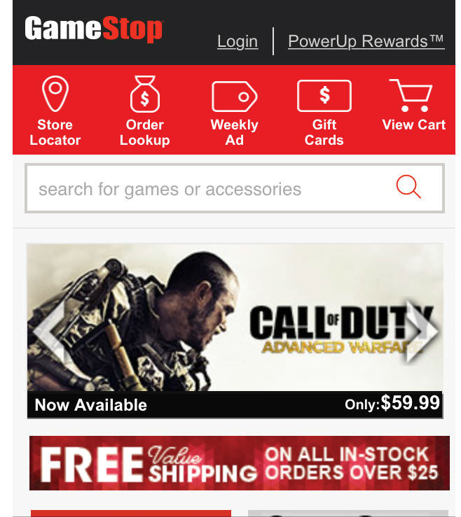
GameStop uses a static navigation that runs across the top of their mobile site.
If your navigation must include more items, an off-screen toggle menu that reveals a vertically-oriented navigation is the best option. A navigation that requires horizontal scrolling is a big mobile-friendly no-no.
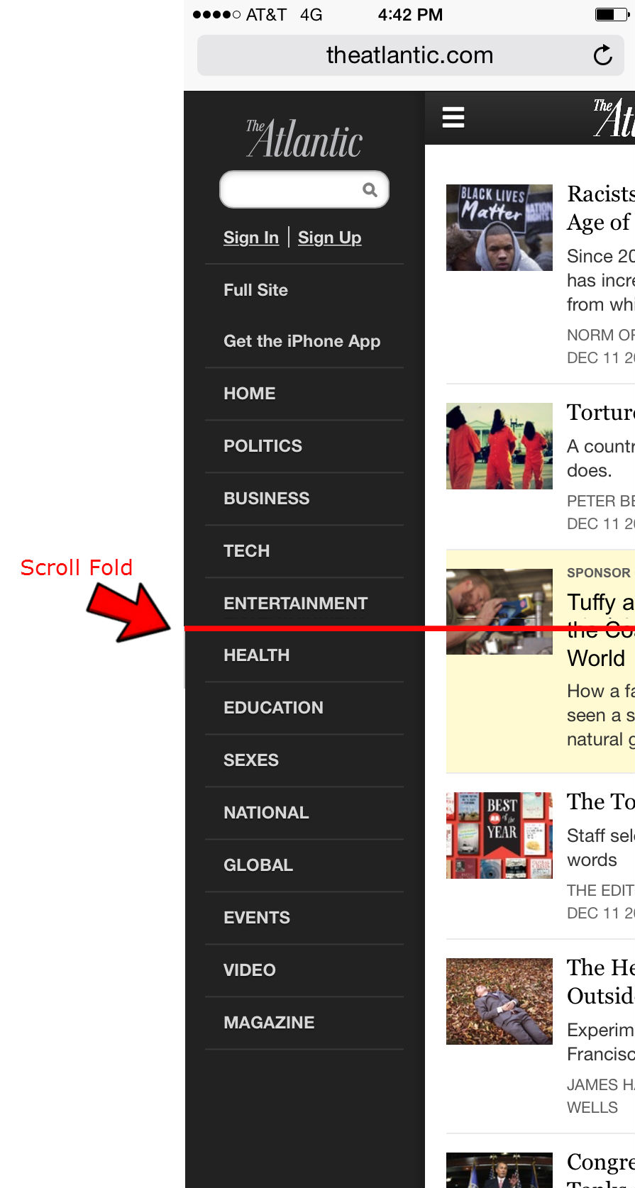
To best serve its users, The Atlantic offers a long toggle menu that requires vertical scrolling. The red line indicates what you can see above-the-fold (before scrolling).
3. Make your Navigation Intuitive
Joe works hard enough; your navigation should not be work.
To make your navigation intuitive, menu language should always be written in a way that lets the user know what to expect. It should be clear what the item does if it’s a dropdown, and exactly where it goes if it’s a link.
If you are using symbols to convey information to your users, make sure they are clear, conventional symbols. For instance, if your menu items dropdown, use an intuitive symbol like a plus sign (+) or an arrow ( >) to let your user know a click will reveal more options. Another example would be to use a magnifying glass to indicate a search feature.
If you are using an off-screen toggle menu, use three stacked lines – as seen in the example below – to help the user locate and access your menu.
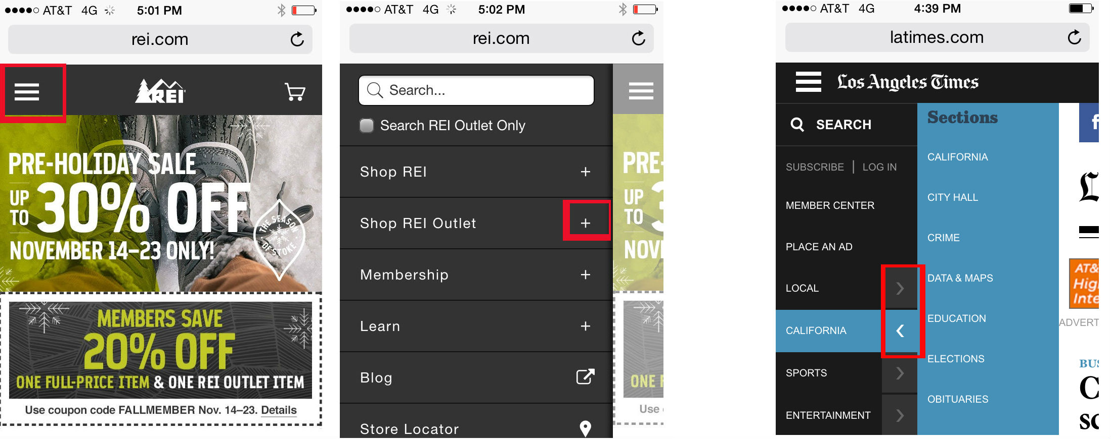
REI (left) and the Los Angeles Times (far right) use clear, conventional symbols to indicate toggle menus and dropdowns within multi-tier navigation.
The goal here is for your navigation to make life easier by limiting thinking, scrolling, clicking.
4. Be Thoughtful About Fonts and Contrast
Joe shouldn’t have to zoom to read any of the text on your mobile website, including the text within your navigation. Tiny text that requires zooming creates a poor user experience and both Joe and his friends Google and Bing really don’t like poor user experiences.
All of the text on your mobile site needs to be large enough to be read on a variety of devices without zooming. This principal needs to be a top mobile-friendly priority.
To make your navigation text easy to read, choose a taller font that naturally adds a little extra space between letters. Some common fonts that device manufacturers and users approve of include Arial, Helvetica, Courier, Georgia, Times New Roman, and Trebuchet MS.
Your font size and style will depend on your brand’s style guide and what works best for your unique demographic. For instance, millennials may not struggle with smaller, condensed fonts as much as an older demographic would. For this one there isn’t a one-size-fits-all recommendation. What’s important is that every word on your mobile site can be read easily without zooming. If you want to take the technical route, Google recommends you use a base font of 16 CSS pixels that scales across various devices. Another option is to perform user testing to see first-hand whether your font is tripping up users.
Not sure if your text is easy to read? Run your site through Google’s Mobile Friendly Test Tool.
5. Design for Touch
Joe is self-conscious enough; don’t design a navigation that makes his fingers feel fat.
Your tablet and smartphone users rely on touchscreens to get them around websites. While a pointy mouse arrow allows users to precisely select items in tight spaces, the average finger requires about 44 pixels, left to right and up and down. This is because of the size of the finger tip, as well as the less-than-perfect precision that comes with touchscreen selection (many users don’t hit the button exactly where they are aiming).
Build navigation buttons with a target smaller than 40 pixels and your user experience plummets as visitors end up slop navigating to the category above or below the one they want.
Since users are so very bad at hitting their tap mark much of the time, it can also help to incorporate touch feedback into your navigation. Your feedback could be a color change, a blink of color, a font change, or another visual cue. Even if it’s subtle, this feedback can improve user experience by helping to reassure users that they’ve selected the right item.
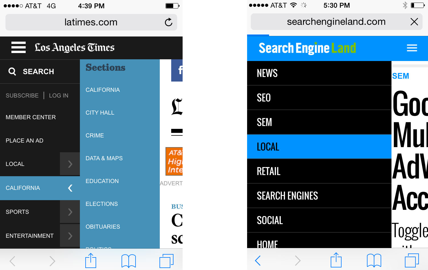
Both the Los Angeles Times (left) and Search Engine Land (right) incorporate color-change touch feedback into their mobile navigation.
If you are using multi-tier navigation, it’s also important that you make sure your dropdowns are touch to activate – not mouse over. Clearly, hover navigations work just fine in the desktop experience where hovering is a possibility, but it will leave mobile users stuck.
Another touch-friendly option is to design a supplementary navigation that uses images and exaggerated graphic buttons. This type of navigation can be a great homepage asset that gets your visitor headed in the right direction quickly. It’s important to note that this should only be a supplemental option used alongside a toggle navigation or a static top navigation. You need to have a consistent navigation that the user can access at the top of every page. While you may be able to include this graphic navigation at the bottom of your mobile pages, it’s not optimal or practical to use these big graphic buttons as your primary navigation.
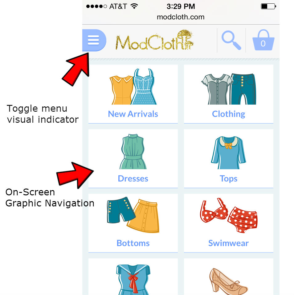
In addition to a toggle menu, ModCloth uses a graphic navigation on their mobile homepage.
6. Design for the Multi-Screen Mobile User
Chances are good Joe has — or will — visit your website using multiple devices over a short period of time. To help him feel confident he’s in the right place it’s smart to give your mobile and desktop sites a consistent visual theme, but your mobile navigation and your desktop navigation do not have to be — and usually should not be — identical twins.
While the colors, fonts and themes you use for your mobile and desktop navigation should remain consistent, the similarity may end there.
Your mobile navigation needs to help users navigate around your website and accomplish tasks. Consider the content your smartphone users need and the tasks they are looking to accomplish then build your mobile navigation specifically for your mobile user.
What mobile-specific calls to action need to be built into your navigation to aid user experience? Does it make sense to include a Call button or a store locator?
Remember: space is limited, mobile needs are unique, and on-the-go patience is minimal.
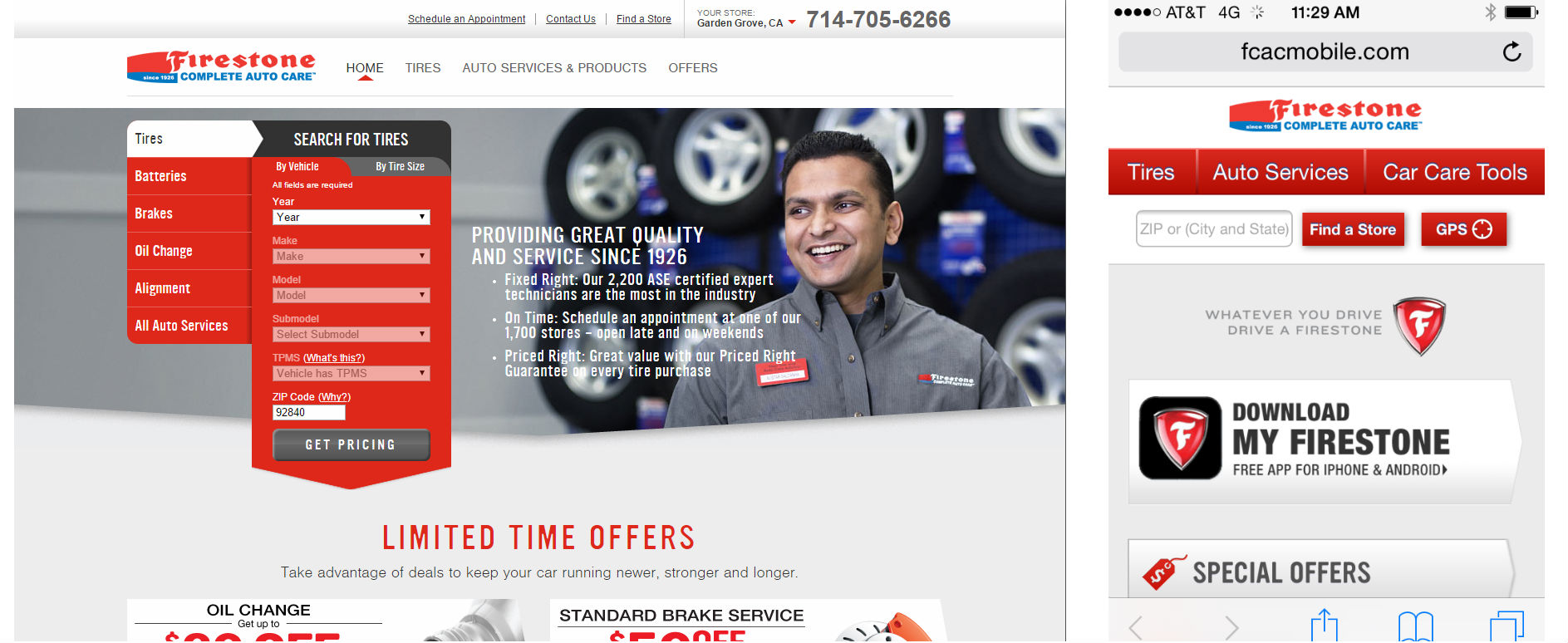
Firestone uses a mobile-user specific navigation that is not identical to their desktop navigation.
Mobile-Friendly is Customer-Friendly
Creating a mobile-friendly navigation means creating a customer-friendly navigation that gets your personas moving in the right direction right away. Build an intuitive navigation that is easy to use and Joe will be headed toward conversion happiness in no time; build a navigation that is frustrating or confusing and he’ll be headed back to the search results and straight toward someone else’s website.
To keep Joe and the rest of your inbound traffic smiling, make your mobile-friendly navigation:
✔ Short and sweet whenever possible
✔ Easy to read
✔ Task-oriented
✔ Prioritized with what’s most important listed first
✔ Accessible and placed consistently across all pages
✔ Clear, straightforward and expected
✔ Vertical if scrolling is required (never use horizontal scrolling!)
✔ Easy on the eyes
✔ Finger-friendly

Just getting started with mobile design? Read the All-In-One Mobile SEO & Design Checklist to get your mobile site headed in the right direction.