
Chris Gavaler's Blog, page 55
March 7, 2016
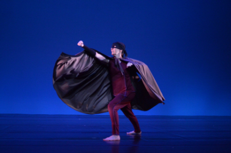
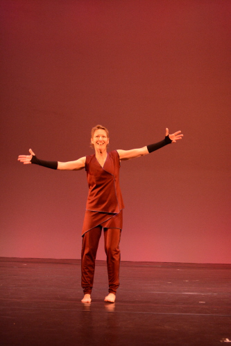
Captain Equilibrium!

Text: Jeff Fiske with Joan Gavaler
Movement: Joan Gavaler
Dramaturgy: Chris Gavaler
Movement/Vocal Coach: Elizabeth Wiley
Click here for a video of the October 20, 2015 dress rehearsal for “Captain Equilibrium” at William and Mary University.
(Coat rack DL. Run across. Stride in. Run off. Return with some sign of tiredness.)
I am – Captain Equilibrium.
(power lunge)
I fix imbalances in society.
Crime.
Accidents.
Impending disasters.
Wherever life is out of balance …
I restore balance.
Neighborhood arguments.
Returning lost toys to small children.
Even the occasional cat stuck in a tree.
Wherever you find imbalance, you’ll find me.
(run in a box to solve problems.)
Which means I work all the time.
(More and more tired.)
There is always some mugging to prevent.
Some fire to put out.
Some falling person to catch.
It becomes almost impossible to stop.
I used to have a life, a whole other identity.
Captain Equilibrium used to be my secret identity, and now it’s my only identity.
(remove mask.)
I don’t even know why I bother with this thing.
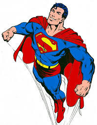
You know, Superman never wears a mask.
He hangs out with the same people in both of his identities, but do they ever notice that Superman and — the other guy — are the same?
His own friends never notice that the guy in the glasses is Superman because they never expect much from him.
They don’t really look at him, even though they see him every day.
We can’t see a hero if we’re not looking.
Folks talk to Captain Equilibrium face to face,
(put on mask)
and an hour later talk to me, and never make the connection.
Nobody believes that I could be Captain Equilibrium.
They don’t see it as a 2 possibility, and now I don’t see it as a possibility either.
(remove mask.)
So I spend all my time as the Captain.
(hang up mask.)
People’s expectations — lack of expectations — is all the mask I need.
Besides, that mask gets really hot.
Sweat pours into my eyes.
It blocks my vision.
I get rashes along here…
(Run reverse path in a box to solve problems. Tangle in cape.)
I want to keep restoring balance, but it seems my abilities have been fading.
For many, losing strength and resilience is an inconvenience.
But for me, this is endangering my livelihood; endangering my LIFE!
I am Captain Equilibrium!
I was afraid of losing my superhero status, so I became a member of the Justice Union.
East Coast Branch.
I was so excited.
I thought that working with other superheroes would give us all greater opportunities to do greater good.
I thought that being part of an elite team, I could be a top superhero again.
You know what happened?
I have been given the job of managing the budgets.
You know, “Let Captain Equilibrium balance the books.”
My most challenging foes aren’t bank robbers or natural disasters or even supervillains.
My greatest foes are
(remove cape. Hang up.)
tax audits, missing receipts, computer glitches.
(playful arc of movement.)
You laugh, but you know what’s really funny?
I am an accountant!
That’s the work I do in my real identity.
And, I’m really, really good at it.
I love helping people correct their financial missteps.
Help them get their lives in order.
Balance their dreams and realities.
You have to be honest with them, take off the kid gloves.
(Push down gauntlets.)
Help them see things clearly.
No blinders.
No cover-ups.
(Pull one gauntlet back up.)
They don’t need Captain Equilibrium for that.
(Power lunge. Tired.)
It’s been so long since I’ve stretched out on the hammock.
Read a good book.
Taken a trip.
Even just a walk around the neighborhood.
Brushed the cat.
Or had a real talk with a friend, face to face.
(pull other gauntlet halfway up. Pause. Remove gauntlets.)
I’m saying goodbye to the Captain for a while.
(hang up gauntlets.)
I’m going to let my real identity be … real.
Unmasked.
Even super.
(circular path.)
That is our equilibrium.
(sway.)


February 29, 2016
Entrepreneurial Supervillainy
I first met Shreya Durvasula in 2008 when she wandered into my office looking for a professor willing to teach an honors course on superheroes. I said yes. That course has since resulted in a half dozen essays, a book, and this blog, which is now in its fifth year. So it’s my particular pleasure to invite Shreya up to the virtual podium:
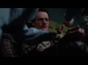
Walter White: Ultimate Supervillain or Misunderstood Entrepreneur?
Guest blogger, Shreya Durvasula
Since their creation less than a hundred years ago, superheroes have effortlessly captured our imagination. Studios seem incapable of making non-superhero movies and television executives are following suit. As the superhero genre expands past the pages of the pulpy comic book, it has to evolve and grow. A great example of this growth is the show Breaking Bad, particularly in its depiction of the character Walter White. A close look at Breaking Bad will reveal its underlying superhero DNA and how Vince Gilligan, the show’s creator, used the superhero genre to expound on his hypothesis.
First, a brief history of the origin of the superhero figure. The modern American superhero is derived from hundreds of years of hero figures. The superhero genre has its roots in myths, with figures such as Odysseus or Robin Hood linking the notion of heroism and bravery to justice and fairness. In the era directly preceding what would come to be known as the “Golden Age” of superheroes, figures such as Doc Savage, Tarzan, and the Phantom laid the foundation by contributing certain genre elements such as a double identity, masked costumes, and superhuman strengths. Arguably, one of the direct ancestors is the Scarlet Pimpernel, the dashing protagonist of Baroness Emma Orczy’s same titled play and subsequent novels. Each iteration brought us closer to what is undeniably the first superhero; Superman. Adorning the iconic cover of Action Comics #1, Superman ushered in a new age and helped establish a new literary genre. Batman and Wonder Woman followed suit and helped codify the genre. The genre has grown by leaps and bounds, no pun intended. A new generation of writers, artists, and creators pushed the boundaries of the established classification in the Silver Age of Comics, with figures such as the Hulk, Spider-Man, and the Flash redefining the genre.
Delving deeper into the specifics, let’s look at the definition and the various elements that comprise a superhero figure.
A double Identity
Mission
Powers
Costume
Sidekick
When we meet the mild-mannered Walter White with his alliterative alter-ego sounding name, he is working two jobs to make ends meet. His life is bleak, and it gets bleaker when he finds out he has cancer. Walt undergoes chemotherapy and pumps toxic chemicals into his body to fight the tumorous lung cells. As the chemicals course through his veins, Walt has to resort to increasingly desperate measures to pay for his treatment.
Historically, chemicals/ chemistry as an agent of change is a common trope in comic books, especially in the Silver Age of Comic Books. A radioactive spider bite mutates Peter Parker’s DNA, gamma radiation transforms Bruce Banner into the Hulk. And the anti-carcinogen chemicals used in chemotherapy allow for the creation of Walt’s alter-ego, Heisenberg. As Walt starts cooking methamphetamine to make money for his family, he gets pulled deeper into the drug world. Initially just a pseudonym to protect his identity, Heisenberg ultimately becomes the persona Walt uses in that world. This development happens over the course of the first season, culminating in an explosive scene where Heisenberg has ostensibly bested his first arch-nemesis, Tuco.
Heisenberg Intro CLIP
This is arguably the first appearance of Walt’s alter-ego, Heisenberg. Unlike Walter, Heisenberg is self-assured and confident. He is able to hold his own against an aggressive and unstable drug dealer and he only grows stronger.
The reason Walter White continues to make methamphetamine despite the danger is for the money. Well, not just the money.
While solid, hard cash pays for his treatment, it also then serves as a nest egg and a protection of sorts for Walt’s family- his wife, Skyler, his son Walt Jr (immediately a properly sympathetic character), and his as yet unborn daughter. Walt’s prowess at organic chemistry, even for a brilliant student from the California Institute of Technology, border on the fantastical. He is able to make an incredibly pure thus potent version of meth, “Blue Sky” which even addicts recognize as being superior. Early in the first season, Walt destroys the evidence of a murder using the dissolving powers of hydrofluoric acid to destroy a human body. He creates a mini-bomb from fulminated mercury which he uses to destroy Tuco. In season 2’s episode “4 Days Out”, Walt constructs a mercury battery using chemicals, coins, and galvanized metal for the chargeless RV, rescuing Jesse and himself from dire straits making MacGyver proud. Walt may have the goods, but Heisenberg is able to deliver them.
Any respectable superhero must have a sidekick, and Walt would be bereft without Jesse Pinkman, or Cap’n Crunch as he’s known in the meth head circle. Walt chances upon Jesse escaping during a DEA ride along, and convinces him to help Walt cook and sell meth. Jesse is Walt’s sidekick, helping him navigate the seedy world of drug dealing, while providing a skewed moral compass. They even have either own version of the Batmobile, the RV. It can’t fly, but it does allow them to cook in undisturbed peace and a place to store their equipment. Despite his complicity in Walt’s dealings, Jesse remains an innocent figure, even by the end of season 5.
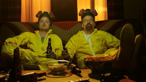
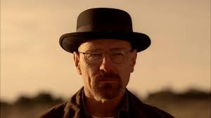
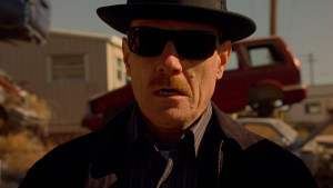
Finally, what would a superhero be without a costume? Naked, unrecognizable. Heisenberg’s iconic porkpie hat elevates his status to measley high school teacher to drug lord. By Season 3, Heisenberg has accumulated a reputation for himself and is known by his pork pie hat.
But is Walter White a superhero or a supervillain?
In Peter Coogan’s book, “Superhero: The Secret Origin of a Genre”, he outlines 5 main types of supervillains; the monster, the enemy commander, the mad scientist, the criminal mastermind and the inverted superhero-supervillain. While Walter definitely displays aspects of the mad scientist and the criminal mastermind, he is a great representation of the last type of supervillain; the inverted superhero-supervillain. Walter clearly views himself as a “good guy”, a man kept down by the fates but his actions are those of a self-interested and selfish man. Season 2, Episode 12 “Phoenix” marks an important turning point in Walt’s character. Walt and Jesse are on the outs, and Walt is holding Jesse’s share of the drug money hostage until Jesse can prove his sobriety. Their relationship is being further threatened by Jesse’s girlfriend, Jane’s interference. Walt arrives to confront Jesse and notices both Jesse and Jane in a deep drug-induced stupor. He inadvertently rolls Jane over on her back and she subsequently chokes to death on her own vomit, while Walt looks on, horrified but unwilling to intervene. His desire to be rid of Jane’s involvement combined with his callousness towards an innocent life are classic supervillain traits.
Walt displays other traits typical of a supervillain. In season 5, Walt is given the opportunity to sell his share of the methylamine to a competitor and receive $5 million. He refuses to take the money and leave the meth business. This mania about needing to be the best and creating a drug empire is typical supervillain behavior. “You asked me if I was in the meth business or the money business. Neither. I’m in the empire business.” While he seems to have some remorse about the vile product he’s creating, it is fleeting at best. Any guilt Walt feels is overshadowed by this pride in the purity of the product. This pride in his criminal artistry is another one of the characteristics of a villain.
One major attribute of a supervillain is “the wound”. Many supervillains suffer from an original incident that leads them to battle the superhero. This wound, real or perceived, is essential to the identity of the supervillain, the core of what drives them to do ill. Walter believes what he has—not just the physical resources of supplies and equipment he possesses but more fundamentally, his native resources of intelligence and invention—is of infinite and absolute worth. He is not going to stop until he’s been fairly compensated for them, which means he’s never going to stop.
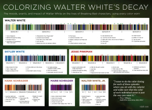
It’s not just the character of Walter White that draws inspiration from the superhero world. From the colorization to the cinematography, elements of graphic novels and comic books are evident in the look and feel of Breaking Bad. When comics were printed on pulpy, rough paper, they had to be brightly colored to sell. Superheroes had to recognizable when someone was scanning the newsstand. Vince Gilligan similarly colorized his characters through costuming. Walt’s sister-in-law Marie’s obsession with the color purple was treated as a joke, but it becomes her signature color. This meticulously prepared chart shows the color of each outfit the characters worse throughout the series. Delving a little deeper in the colors, we see that Walt starts off in neutral, bland earth tones. His obsession with money is reflected in the light greens. As he becomes Heisenberg, the colors get darker and muddier.
Skyler is usually dressed in blues and whites, indicating her innocence and purity. In season 3, as she gets increasingly drawn into her husband’s web of lies and deceit, her clothes get darker. When she is fully immersed in a scheme to launder Walt’s drug money, Skyler is shown as wearing black and dark browns. She is once again depicted in lighter colors as she tries to extricate herself and her family from Walt’s drug empire. This type of color analysis can be done for Hank, Jesse, and Walt Jr. as well. Gilligan’s meticulous eye for colors and costuming reinforce who the characters are and the world they inhabit.
Gilligan’s careful consideration of color is evident in the cinematography and visual design of the show. In an interview with Creative Cow, Director of Photography Michael Slovis says about the show’s look:
One trademark in the show that’s terrific and that Vince and I talk about and exploit is that we often don’t see the faces of the main characters. Vince says that everyone knows who these people are so we really don’t need to see their faces…If I can tell the story in a pitch-black room with the face totally in silhouette, that’s what we do. It’s expressionistic. We represent reality, we don’t reproduce it. Another example of that are those colors in New Mexico. Those goldn, orangey, yellowy colors don’t exist in real life… We take a very, very representational, emotionally based, expressionistic approach. The same thing goes with those wacky POV shots we do… nobody sees things from those angles but they serve the story.
As Slovis mentions, the show doesn’t aim to reproduce reality, just represent it. An example of Gilligan playing with representing reality is the color of Walt’s meth- Blue Sky. Using the chemicals Walt used meth should either be clear or tinged a slight yellow color. Gilligan makes the artistic choice to make it blue, a sky blue that reflects WW’s limitless pride, greed, and lust for a power. An example of the colors that Slovis mentions as well as the expressionistic approach Gilligan and crew take is clearly reflected in the cold open of Season 3. The introduction of the cousins, Season 3’s big bad can be imagined easily in large columns of a graphic novel or a comic book.
Gilligan frequently uses canted and unique Point of View shots to establish WW’s looming presence. Whether using a camera mounted on the Roomba during a party scene or the shovel head when burying treasure, these POV shots firmly establish that this is an alternate reality. TV Worth Watching, a pop culture blog, compiled all the unique shots in Breaking Bad. This perspective of the characters is not typical of a drama since it is not from the point of view of the audience or another character. Despite dealing in real life situations, with blood, gore and violence, the cinematography indicates that Breaking Bad exists in an alternate reality. WW’s Albuquerque is Batman’s Gotham- a universe that is grimmer and grittier than the real world.
What does this reading of BB through the lens of the superhero genre award us? The very nature of comic books is that they are episodic and contain ongoing stories. Batman may defeat the Joker in this issue, but wouldn’t you believe it, the Joker returns. Marriages and even deaths are not permanent, and reboots offer a new creative team the chance of a fresh start and clean slate. Breaking Bad ran 5 seasons and had a clear narrative arc running through it. It is the story of how Walter White becomes Heisenberg and his subsequent downfall and redemption. While Walter’s story may have ended, the larger themes of addiction, search for power, and insatiable greed live on. The drug trade will continue to flourish without Heisenberg, people will buy, sell, create, barter, use, and abuse methamphetamine. Gilligan underscores the futility of the war on drugs by using elements of a genre that does not provide easy resolution. The players may change, new opponents rise and fall, but the story continues.
References
Coogan, Peter M., and Dennis O’Neil. Superhero: The Secret Origin of a Genre. Austin, TX: MonkeyBrain, 2006. Print.
Gilligan, Vince. “No Mas” Breaking Bad. AMC. 21 Mar. 2010. Television.
Hutchinson, Gennifer. “Cornered'” Breaking Bad. AMC. 21 Aug. 2011. Television.
LaRue, John. “Infographic: Colorizing Walter White’s Decay.” TDYLF. N.p., 11 Aug. 2013. Web. 25 Jan. 2016. <http://tdylf.com/2013/08/11/infographic-colorizing-walter-whites-decay/>.
Mastras, George. “Crazy Handful of Nothin'” Breaking Bad. AMC. 2 Mar. 2008. Television.
McCloud, Scott. Understanding Comics. New York: HarperPerennial, 1994. Print.
Slovis, Michael. “CreativeCOW.” CreativeCOW. Ed. Debra Kaufman. CreativeCow.Net, 2013. Web. 25 Jan. 2016. <https://library.creativecow.net/kaufman_debra/Behind-the-Lens-Michael-Slovis/1>.
Shreya Durvasula is an Outreach Coordinator in Cambridge, Massachusetts and an avid TV enthusiast and blogger. This post grew out of a presentation she gave to the University of Maryland Honors course, “Deconstructing Breaking Bad”, which attempted to dissect what made Breaking Bad so compelling. Shreya’s guest lecture on the superhero genre as it applies to BB inspired a graphic novel student response, so she feels like she got the job done. You can read more of her writing here.


February 22, 2016
My Daughter’s Favorite Supervillain Endorses Hillary Clinton (or, Macbeth ACT 5 continued)
Guest Blogger, Madeleine Gavaler
“So thanks to all at once and to each one whom we invite to see us crowned at Scone,” said the under-characterized Malcolm with a flourish. Lady Macbeth rolled her eyes from behind her tree branch, as the men around her reveled in their masculinity and C-sections.
“I know it seemed like Shakespeare put me back in my properly gendered place,” she soliloquized quietly, with a surprisingly meta understanding of her unjust treatment, “but, as my more intelligent audience members guessed, I faked my guilt and insanity and suicide once I realized that my husband could not handle murder and power in moderation.”
Picking at the spots of blood still caked on her hands (that had not even been acting, women who orchestrate murders always have blood under their fingernails), she pondered possible careers and names. “Shall I go with Hillary, or will that perpetuate the misogynistic notion that all competent, powerful women are bitches?” she wondered. “This is eleventh century Scotland, but I’m definitely a Democrat. I know evil is not typically part of the party platform, but I do support gay marriage and cutting military spending. Down with the patriarchy!” she said. Lady Macbeth is also pro-choice.
Malcolm’s ears perked up having heard mention of feminism from behind an unsuspiciously womanly shaped tree branch. Lady Macbeth frowned, realizing that now and a millennium from now, you have to be quiet about gender equality or men will get offended. She also wondered if her voice was beginning to blend with the writer’s, who incidentally just started reading an autobiography of Hillary Clinton. “Unsex me here! Screw your courage to the sticking place!” Lady Macbeth whispered to stay in character.
She was still standing in the middle of a battlefield, and a particularly sparse and boring one because Shakespeare writes minimal stage directions. “Can I stand here being self-aware and voicing Madeleine’s political beliefs, or is there more to me? Do I have the potential for a meaningful plot arc, or am I limited by the abilities of a high school student who has not attempted creative writing of any sort since middle school, probably for good reason?” she asked, regaining control of the narrative. “Why do I ask so many questions?”
Lady Macbeth considered bringing her incompetently evil husband back, but then remembered that his severed head appeared on stage and could not think of a way around that one. Also, she does not need a man to complete her. “Are there any other tolerable characters in this play?”
The three witches appeared on the field which was slowly becoming more detailed and grassy and did a musical number like the one in Act IV that most don’t find as bizarre as they should. Concluding with a pas de bourree, they looked expectantly at Lady Macbeth, who after a ten day hiatus had forgotten if there was a plan for the rest of this story and was also feeling rather upset because she had just finished illegally binge-watching her favorite show about pies and murder and Lee Pace. Lady Macbeth also hopes Agent Carter gets renewed, because she understands how hard it is for women who accomplish just about everything in the male-dominated workplace without any credit.
“Double double toil and trouble, please stop daydreaming about hot British women,” said the weird sisters, whose favorite show is Dollhouse, in unison. They had given up on trochaic tetrameter because it is hard. The first witch, whose name is Maurice, realized that she had hurt Lady Macbeth’s feelings. It had been a very long day for her, and she was tired of bearded women putting other women down.
“No more slut shaming!” said Lady Macbeth, which wasn’t exactly relevant but always a phrase worthy of sharing. “My sweet malevolent nursery rhyme-y ladies, I find your anti-Semitic recipe on page 357 of Prentice Hall’s Literature: Timeless Voices, Timeless Themes rather problematic, but otherwise I think you three have a lot of potential.”
Lady Macbeth, Maurice, Helen, and Bertha sat down together in a nearby tearoom to discuss their backstories. Maurice, who finds Earl Grey with a blueberry scone especially delightful, went first.
“Shakespeare initially portrayed me as a chestnut-stealer who cuts off sailors’ thumbs, but I wasn’t always this way,” she said, her mascara running. Maurice wore heavy makeup at first because she felt the need to overcompensate for her scraggly beard, which everyone relentlessly teased her about in middle school. Over time, however, she has found her makeup to be fun and empowering. Maurice puts loving herself first, of which Helen and Bertha are very supportive. Her tale is being paraphrased to omit all of the swearing, for Maurice has quite a mouth. Helen and Bertha find this quality of Maurice endearing. The weird sisters love each other very much and enjoy the bonding experiences of dance numbers, life-ruining, and lesbian witchcraft.
“What about you, Lady Macbeth?” asked Bertha. Her beard was a beautiful auburn that brought out her eyes. “What made you commit murder?’
Sipping her English Breakfast with a dash of cream and no sugar, Lady Macbeth pondered how to answer. To her surprise, she did not want these conniving witches to think poorly of her murdering instincts. “You see,” she said, and hesitated. Was Lady Macbeth finally ready to reveal her mysterious character motivation? She continued to hesitate. The weird sisters looked at her expectantly. Lady Macbeth took a deep breath. Lady Macbeth exhaled and inhaled and exhaled and inhaled. Lady Macbeth cleared her throat. She paused again for dramatic effect.
“It was a means to an end. I knew that if I could murder Duncan and become queen, I could operate through my useless, weak husband to establish peace and prosperity in Scotland.” Lady Macbeth had planned to establish a democratic republic with healthcare and an abundance of welfare programs for its citizens, complete with a balanced budget and no drones.
The bearded women giggled. “Yes of course, silly,” said Helen. “That’s the whole reason we told Macbeth about his future; it was our plan to help you towards your perfect, happy, matriarchal society.”
“Unfortunately,” sighed Helen, “the men ruined our hopes and dreams.”
“Not all men,” whispered an earthworm outside that would later be reincarnated into William Shakespeare. A neighboring earthworm explained to Shakespeare the core ideals of feminism and how he might even accidentally be perpetuating misogynistic values and social norms in his daily actions.
“Well,” said Lady Macbeth, “I’m thankful for this opportunity to finally voice my side of the story through a critique of political and gender values in America. I hope we achieve peace in the Middle East soon and someday create the wonderful society that I tried to.” Lady Macbeth and the three witches laughed at the absurdity and disappeared into their spaceship to look for a less morally corrupt society, in a manner reminiscent of the excellent movie Hamlet 2, starring Steve Coogan.


February 15, 2016
The Visual Superhero (Analyzing Comics 101)
Having already talked about framing and layout and closure and abstraction, I’m backing up now to what should be square one for “Analyzing Comics 101.” Who are the creators doing all of this framing, etc.? Although Will Eisner’s 1940s Sunday newspaper section The Spirit is a significant exception, superhero comics are typically created by multiple authors, with production divided into five semi-independent roles.
Writer: Creator who conceives the story idea, plots the events, plans the content and sequence of panels typically through a written script, and/or composes the words that appear in caption boxes and word balloons. The various writing roles may involve more than one individual.
Penciler: Artist who sketches the pages, typically based on a writer’s script. A superhero comic typically has only one penciler.
Inker: Artist who finishes the pages by penning over the penciler’s breakdowns. More than one inker may be involved in a single issue, and a penciler sometimes inks her own pencils.
Colorist: Artist who designs or co-designs color or gray tones and adds them to the inked pages.
Letterer: Artist who draws the scripted words (but not sound effects) inside balloons and boxes.
The words and images in a comic book are the product a complex and sometimes overlapping creative process. Although rarely credited, a penciler often co-writes by making encapsulation and layout decisions and sometimes creating content based on the credited writer’s story summary. 1950s Marvelman writer Mick Anglo wrote no scripts, but “would instead suggest a basic plot outline to an artist, giving him a specific number of pages to fit the idea into. Once the art was complete, Mick would then write in the actual wording for the letterer” (“Miracleman Alias Marvelman”). Stan Lee followed the same process in the 60s, dubbing it the Marvel Method. Jack Kirby and Steve Ditko would also sometimes conceive and pencil stories independently, leaving margin notes for Lee to expand into dialogue and narration. Job applicants seeking writing positions were hired based on their ability to fill in four pages of empty talk balloons and caption boxes from Fantastic Four Annual #2, further suggesting that pencilers were often the primary “writers” at Marvel.
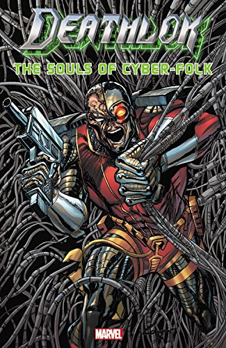
Even when working from full scripts, pencilers may exert a great deal of creative control. According to 90s Deathlok writer Dwayne McDuffie, penciler Denys Cowan “felt free to alter my panel breakdowns and shot descriptions whenever he had a better idea” (28).
Neil Gaiman even encouraged Andy Kubert to alter his 2003 scripts: “Feel free to ignore my suggestions if you can see a better way of doing it. (You are the artist.) … Also, there’s an awful lot to cram in here, so let me know if you need more room, and if I’m trying to jam in too much…” (Marvel 1602).

Penciler and inker relationships are complex too. Inker Eric Shanower was notorious for adding details to layouts, while Vince Colletta was notorious for eliminating them. John Byrne even voiced homophobic complaints about Bob Layton’s inking of his work:
I actually feel physically ill when I look at Bob’s stuff. […] It’s like everything is greasy and slimy. […] all his men are queer. They have these bouffant hairdos and heavy eye make-up and an upper lip with a little shadow in the corner which to me says lipstick. Even the Hulk. I will never forgive him for what he did to the Hulk’s face in the annual that we did together.

I remember my father looking at […] the finished inks […] and my father said, “Well this guy’s queer.” No, he didn’t look queer in the pencils, Dad.
When John Byrne inked Steve Ditko in the 80s, their styles clashed queerly too, creating Byrne-detailed figures arranged in signature Ditko poses.
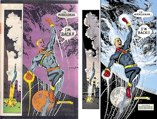
Unless the penciler is instead painting in a color medium—Alex Ross prefers gouache watercolors—color is added to comic pages last. Before Photoshop, this was accomplished during the printing process by overlaying color-separation boards and screening ink by percentages in dot patterns. The colorist would select color combinations for each discrete shape, and multiple assistants would cut the shapes from each board. Color decisions might also be indicated by the writer in a script or by the penciler in the margins of the layout. Because the artists’ boards remained black and white, colors can be altered with each publication. Alan Moore and Garry Leach’s first chapters of Marvelman originally appeared in black and white in Warrior magazine in 1982; the retitled Miracleman #1 was reprinted in color in 1985 by Eclipse Comics; and Marvel Comics reprinted it again in 2014 with a new color design by Steve Oliff. (Kevin Melrose discusses this in more detail here.)

The final product of a comic book consists entirely of ink on paper (originally the lowest grade, pulp paper), but the images are the result of multiple processes. At times it is useful to discuss each contribution independently, while at other times such divisions may be burdensome or indeterminable. Nathaniel Goldberg and I in “Economy of the Comic Book Author’s Soul” analyze contributors as a single, pluralistic author whose words and images display unified intentionality. We might also analyze a given comic as though it has agency itself. Unlike a traditional painting—which may be copied and mass distributed—a comic book is its multiple copies. The artboards may be considered works of art too, but the artboards are not the comic book produced from them. A comic book has no single original.
Superhero comics, because they tell stories through representational images, also create tensions between how a subject matter is depicted and the subject itself—in other words, between the story world of the characters (diegesis) and the physical comic book in the world of the reader (discourse). No tension between diegesis and discourse occurs in prose-only texts because the words on the page in no way resemble the world they linguistically evoke. But because comics discourse includes representational images, their diegetic content is ambiguous. Is a drawing of a superhero a photo-like document of the superhero as others in the story see him? Or is the drawing an interpretation of the character which may be in some way diegetically inaccurate?
This tension does not occur (or occurs much less) in the non-fiction of graphic memoirs and graphic journalism because the images represent real-world content and so are understood as interpretations. Graphic novels, because their content is fictional, create a greater tension, and superhero comics, because they are an amalgam genre that includes fantasy and science fiction, heighten it by depicting subject matter that both does not and often cannot exist. The diegesis-discourse tension poses a question: Do comic book superheroes exist as they are depicted, or do they exist independently from their depictions? This is a philosophical question I can’t resolve here, but the tension is a factor when analyzing superhero comics visually.


February 8, 2016
Framing the Dead
Actually, this post should be titled “Framing, Abstracting, and Closuring the Walking Dead,” but that’s way too many verbs, plus closuring isn’t a word. Or at least it wasn’t. Maybe it is now. This post is also a follow-up on three previous “Analyzing Comics 101” posts on, you guessed it, framing, abstraction, and closure.
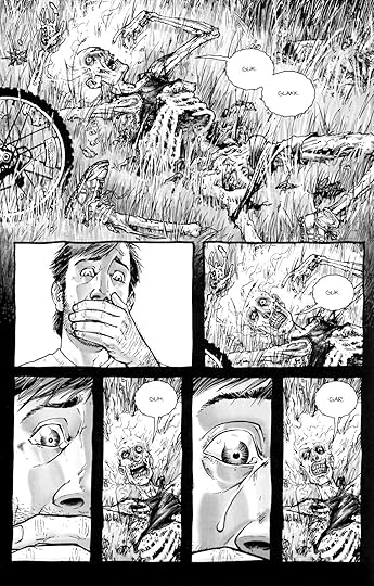
I’m once again picking apart the corpse of Tony Moore and Robert Kirkman’s The Walking Dead #1 to show how these concepts can come together. This time, just the first two pages will do the trick.

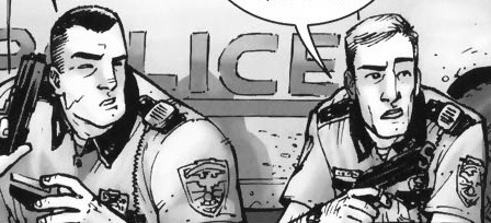
So framing first. The top full-width panel is symmetrical and misaligned, so the right side includes more than the primary subjects of Rick, Shane, and their police car which appear cropped in the foreground, plus the escaped convict and his truck in the middleground. The rectangular panel could include all of the rectangular police car, but instead provides surrounding detail, including a horse (the first hint at the Western motif), a Rotary Club sign (suggesting a small community theme?), and distant mountains in the background (further establishing the rural setting).
However, it’s the bottom panel that gives the initial framing its biggest meaning, since the open foreground space of that first panel parallels the page’s most important image in the bottom panel: Rick being shot. The bottom frame is symmetrical and proportionate, making the first misaligned framing a form of spatial foreshadowing. Moore also shifts the parallel angle of perspective, effectively rotating the shooter to the background, Shane to the middleground, and Rick to the foreground, the most significant visual space. Note also that Rick occupies the right side of the image, gaining further significance since as Anglophone readers we conclude the panel on right. We read top to bottom too, so Rick being shot occupies the concluding space of the overall page too (it’s also the peak image in an implied 4×2 grid, but we covered visual sentences and layouts elsewhere).
Rick is also emphasized because our perspective moves with him, beginning in panel five. These four middle framings are symmetrical while vacillating between proportionate and abridged, because the figures are sometimes cropped mid-chest, adding to the sense of Rick and Shane being trapped in a cramped space. Though drawn smaller than Shane in panels one and two, when Rick stands in panel three, he encompasses more space: his action literally makes him larger. Because the angle of perspective is the same in panels two and four, Shane remains the same.
Closure between the images is minimal. The first panel establishes the overall area, and the following five panels work within it, demanding little spatial closure. Though the time span of each panel and the gaps between them is inherently inexact, the first four transitions suggest no significant gaps, and so they imply a steady movement forward in time, requiring only basic temporal closure. The fifth transition, however, implies a gap in which Rick turns around to face the shooter. So in addition to temporal closure, the panel transition requires causal closure because the action of Rick turning is undrawn; we infer it in order to explain why Rick’s back is no longer turned to the shooter as it was in the previous image.
Finally, Tony Moore’s drawing style is roughly 3-3 on the abstraction grid, so it shows both a moderate amount of detail (translucent) and a moderate amount of contour warping (idealization). Arguably, the figures show a level of 3-4 abstraction, with intensified contours. In the second panel, Shane is impossibly wide and Rick impossibly thin, with Rick’s head roughly half the width of Shane’s shoulder.
The effect characterizes each through visual exaggeration and further establishes them as foils. Meanwhile, the shooter’s head contrasts the straight lines that compose Rick and Shane’s bodies with frenetic lines and lopsided features.
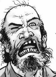
Though the effect is more striking, the shooter’s lines contours remain within an idealized range. Rick’s bullet wound, however, is intensified or even hyperbolic.
Since no human being could survive a wound that extreme, the image creates higher closure demand after the page turn because we retroactively understand the image to be exaggerated. There’s an overt abstraction gap between what is drawn and how it is drawn. And because a literal understanding of the image contradicts the story, we ignore it (diegetic erasure).

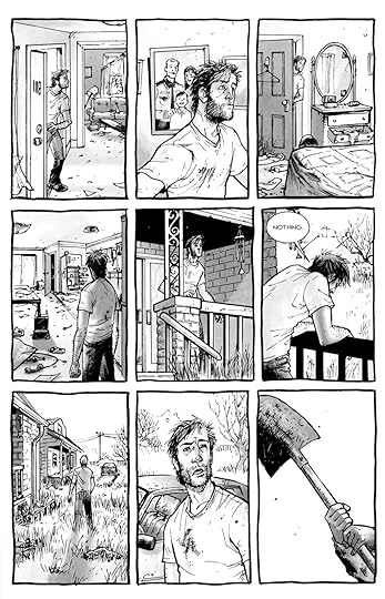
The leap to page two is major in other ways too. The image requires a great deal of temporal closure with details that also require a range of casual closure. After being shot, Rick was taken to a hospital–perhaps by paramedics in an ambulance, though most of the casual facts go unconfirmed. He is in a bed in a bedroom, not a critical ward or operating room, so presumably his wounds were successfully treated and he was left to recuperate. The time gap is ambiguous, but his beard growth suggest several days.
The framing marks a major change too. Though still symmetrical, the full-page panel is also expansive. Rick’s figure is the subject, but a great deal of the surrounding room is drawn for a spacious effect unlike the previous page’s variously proportionate and abridge panels. The angle of perspective shifts from parallel to downward, so we are no longer viewing the image as a character would but as if from a more omniscient vantage.
The style of abstraction has shifted too. While Rick remains at 3-3 (translucent idealization), the room is closer to 2-2 (semi-translucent generalization). The level of detail is much greater than on the previous page and the line contours are only warped slightly below the level of photorealism. Notice the line quality of the shadows and reflected chair legs on the floor.
The 2-2 image is also a full-page panel, giving it further significance. When the first zombie later appears on page six, we retroactively fill in additional closure into the temporal gap: the zombie apocalypse occurred while Rick was unconscious and safe behind his bedroom door. Page two is the most significant image in the issue, because it is 1) the most detailed and least abstracted image in a stylistic context of less detail and higher abstraction, 2) the first of only two full-page panels, 3) the most expansively framed image, and 4) the image demanding the highest amount and range of closure.
There’s plenty more visual analysis available on these two pages (haven’t even started to talk about the difference in Moore’s rendering of sound effects and speech yet), but you get the picture.


February 1, 2016
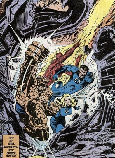
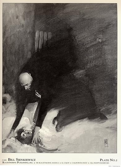
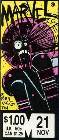
Abstraction Bingo with Bill Sienkiewicz
First time I saw a comic book by Bill Sienkiewicz (I’m told it’s pronounced sinKEVitch), my tiny adolescent brain exploded. It must have been one of his early New Mutants, so summer of 1984, just moments before I stumbled off to college. It wasn’t just that the cover was painted (I’d seen New Defenders do that the year before) but how dizzyingly un-comic-book-like his art looked to me. It took thirty years, but I finally have the words to describe it.
A couple of weeks back I offered an Abstraction Grid, a 5×5 breakdown of comic art according to amounts of detail and exaggerated contours. It looks a lot like a bingo board, and since I know of no comic artist with a wider range of styles than Sienkiewicz, he’s my first player.
Bingo starts with a free space, that one right there in the middle, and comics do too. The middle square is 3-3 on the grid, the style of most superhero comics. It combines a medium amount of detail (I call it “translucent” to differentiate from the two ends of the scale, “opaque” and “transparent”) and a medium level of exaggeration (I call it “idealization,” that sweet spot nestled between line-softening “generalization” and shape-warping “intensification”). Sienkiewicz, like most comics artists, started his career in the middle square:
3-3

I vaguely remember seeing some issues of Moon Knight as a kid, but the art didn’t register as anything special, because that was Marvel’s Bronze Age Prime Directive: draw like Neal Adams.
Perfectly good style, but if you slide over a square to the left, more detail is more interesting:
2-3
Sliding to the less detailed right is fun too, stripping those idealized forms down to something a little more basic:
4-3

Sienkiewicz can go even further, reducing subjects to minimal details, sometimes just undifferentiated outline shapes.
5-3:
1-3 is rare in comics, but disturbingly common in advertising. Photography provides the maximum amount of details, and Photoshop lets you idealize them:
The fourth row of the grid is intensification. Where idealization magnifies and compresses shapes but stays mostly within the bounds of naturalism, intensification steps out of bounds, usually by throwing proportions out of whack.
Sienkiewicz is a pro:
3-4

The exaggeration is more pronounced with more detail:
2-4


Less detail creates a more of a classic “cartoon” effect:
4-4

Meanwhile, the left half of this Stray Toasters face strips away eve more detail, so only the minimal number of lines remains:
5-4

And the sparse lines of this torso are impossibly regular too:
1-4 is rare, but sometimes a fashion ad blows it by Photoshopping beyond idealization and into inhuman intensification.

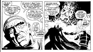
I call the top range of exaggeration hyperbole because it breaks reality completely. Sienkiewicz is one of the few comics artists who spends any time this high on the abstraction grid. His minutely detailed yet absurdly proportioned Kingpin from Daredevil: Love and War is one of my all-time favorites:
2-5
The Demon Bear by itself is 3-4 intensification, and the figure of the New Mutant facing it is your standard 3-3, but the combination steps into hyperbole:
3-5

These scribbles of Joker’s face and body are simpler but exaggerated to a similar level of unreal.
4-5

And then there’s cartoonish chaos of Warlock’s Bill the Cat face:
But, like most superhero artists, Sienkiewicz spends almost no time up in 5-5. That’s South Park terrain:

For 1-5 photography, stop by Celebrity Photoshop Bobbleheads:

Moving back down the grid now, the second row of shape abstraction is generalization, just a slight tweaking of line quality. The New Mutants here have a typical level of detail for a comic book, but the those lines evoke real-world subjects.
3-2
Some of these New Mutants (not Fireball and Warlock though) look distantly photographic, though with even less detail:
4-2

While this portrait of Lance Henriksen is dense with detail:
2-2
5-2 is rare, a fully realistic human figure in outline only. And most 1-2 photography hides its Photoshopping so well it registers as undoctored photography.
Sienkiewicz spends time in that photorealistic corner too though.
1-1
This next image from Big Numbers may be an altered photograph, with just a little detailed flattened.
1-2
1-3, 1-4, and 1-5 are rare since it defeats the point of photorealism to strip too many details away.
Finally, notice that many of Sienkiewicz’s best effects are a result of using more than one kind of abstraction in a single image:
The overall figure is 3-4 intensification (humans are not roughly 2/3rds legs). But while the top half of the figure has a medium level of detail, the legs are flat with not a single line of shadings, so 4-4. And though the gun is intensified too, it is impossibly large in relation to the figure, and so 3-4.
Skim back up the other images for more of these combo effects.
Meanwhile, how well did Bill do on the Abstraction Board? I count 16 out of 25 squares filled. Let me know if you find an artist with a higher score.


January 25, 2016
Words ‘n Pictures
That title means both “words and pictures” and “words in pictures,” because both phrases describe comic books. Although not all comics include words, essentially all superhero comics do. (A near exception, the five-page “Young Miracleman” story in the back of Miracleman #6 includes two talk balloons each containing the transformation-triggering word “Miracleman!” and a range of sound effects, newspaper headlines, and signage.) How images and text work together is one of the most complex and distinctive qualities of the form.

Words in comics have their traditional linguistic meanings, but they are also drawn images that must be understood differently than words in prose-only works. Their line qualities and surroundings influence their meanings. Dialogue and narration are traditionally rendered at a later stage of production by a separate letterer, after the penciler and inker have completed their work. The size, shape, and color of lettering can denote volume, tone, or intensity, especially when representing speech. Bolding is especially common, typically multiple words per sentence. Sound effects, however, are drawn by primary artists as part of the images. These are onomatopoeic words or letters that represent sounds in the story world. Often the lettering style is so expressive it communicates more than the letters’ linguistic meaning.

Words are typically framed within a panel. Spoken dialogue appears in talk balloons (traditionally an oval frame with a white interior), internal monologues in thought balloons (traditionally a cloud-like frame with a white interior), and unspoken narration in caption boxes (traditionally rectangular and colored, though sometimes narration appears in separate caption panels or in white gutters). Adding a pointer to a word container and directing it at an image of a character turns the words into sound representations or, if a thought balloon, into representations of an unspoken but linguistic mental process, both linked to the specific place and time of the depiction.

The absence of a pointer on a caption box indicates that the words originate from outside of the depicted scene. First-person narration with no pointer may be linked to a remote setting if the words are composed by a character from some other, implied moment and location that is not visually depicted. Though the words in talk balloons are understood to be audible to characters, the drawn words and containers are not visible within the story world even when drawn blocking story elements. As with lettering, the size, shape, and color of containers communicate additional meanings about the words. For talk balloons, the graphic quality of the balloon edges denotes how the words are thought, spoken, whispered, shouted, etc. Finally, the containers create semantic units similar to line breaks or stanzas in poetry.
Words also influence and are influenced by surrounding images that are part of the subject content. Pioneering comics artist Will Eisner identifies two kinds of images: a “visual” is a “sequence of images that replace a descriptive passage told only in words,” and an “illustration” is an image that “reinforces (or decorates) a descriptive passage. It simply repeats the text” (132). Scott McCloud goes further, identifying seven “distinct categories for word/picture combinations” (). Two of McCloud’s categories, “word-specific” and “duo-specific,” correspond with Eisner’s “illustration,” while the other five (picture-specific, intersecting, parallel, independent, montage) fall under Eisner’s “visual,” which “seeks to employ a mix of letters and images as a language in dealing with narration” (139).
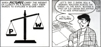
To indicate the level of image-text integration, we combine and arrange McCloud’s and Eisner’s categories in a spectrum, beginning with the highest level integration.
Montage visual: images include words as part of the depicted subject matter. This is the only instance in comics in which words are part of the story world. All other words are discourse only.
Interdependent visual: images and words communicate different information that combines.
Intersecting visual: images and words communicate some of the same information, while also communicating some information separately.
Image-specific visual: images communicate all information, while words repeat selected aspects.
Word-specific illustration: words communicate all information, while images repeat selected aspects.
McCloud also includes two categories that are not integrated, and we add two more.
Duo-specific illustration: images and words communicate the same information. Although this might appear to be the most integrated category, there is no integration if each element only duplicates the other so that no information is lost if either element is ignored. Words and images are independent.
Image-only visual: isolated images communicate all information. Since comics do not require words, this is the most fundamental aspect of the form.
Word-only text: isolated words communicate all information. This requires the highest level of reader visualization, an approach at odds with graphic narratives as a form.
Parallel visual: images and words communicate different information that do not combine. This requires the same level of reader visualization as word-only texts, but the presence of images complicates and potentially interferes with that visualization.
With the exception of the most integrated category, montage visuals, all combinations of words and pictures produce some level of image-text tension because words, unlike images, exist only as discourse. Though drawn on the page, words are not visually perceptible to the characters in the story. Images, however, depict content that is perceptible to characters, so drawn objects and actions appear as both discourse (ink on paper) and diegesis (the world of the story). A drawing of a superhero flying (discourse) communicates the fact that the superhero is flying in the story (diegesis). The words “the superhero is flying” communicate the same diegetic fact, but the ink-formed letterforms bear no resemblance to their subject matter. There is no overlap between diegesis and discourse. Since both words and images are made of ink lines on paper (because printed words are images), some lines in a comic exist only in the reader’s world and some appear to exist in both the reader’s and the characters’ worlds.
Graphic novels create further image-text tension by highlighting the potential gap between text-narration and image-narration. In graphic memoirs such as Art Spiegelman’s 1980-1991 Maus, Marjane Satrapi’s 2003 Persepolis, and Alison Bechdel’s 2006 Fun Home, the text-narrator and the image-narrator are understood to be the same person, the actual author. When a character in a graphic novel controls the first-person text-narration in caption boxes, it is not necessarily clear whether that character is also controlling the image-narration in panels. If the words are generated by an omniscient third-person text-narrator, does that same narrator generate the images, or are the images generated by a separate narrator?
Unintegrated image-texts imply a separate text-narrator and image-narrator. In the case of a duo-specific image-text, the two modes of narration duplicate information without any integration, as if two narrators are unaware of each other. Integrated image-texts, however, imply a single narrator controlling both words and images in order to combine them for a unified effect. At the center of the spectrum, a word-specific illustration implies an image-narrator aware of text but a text-narrator unaware of image. Similarly, an image-specific visual implies a text-narrator aware of images but an image-narrator unaware of text.
Parallel visuals are more complex; although the two narrations are independent and so seemingly unaware of each other at the level of the panel, the overarching effect is integrated. In such cases, the separate text- and image-narrations may create a double image-text referent, in which a word has one meaning according to its linguistic context but, when read in the context of the image, acquires a second meaning. Alan Moore is best known for this approach, having perfected it with Dave Gibbons in Watchmen.


January 18, 2016
Why Simple Is So Complicated (Analyzing Comics 101: Abstraction)
I’m teaching “Superhero Comics” this semester, and so I’m once again pulling out Scott McCloud’s abstraction scale:
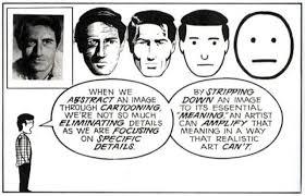
It begins with a photograph of a face and ends with a face comprised only of an oval, two dots, and a straight line. McCloud calls that last face a “cartoon” and the middle face the standard for “adventure comics,” ie superheroes. All of the faces to the right of the photograph further “abstract [it] through cartooning” which involves “eliminating details” by “focusing on specific details.” Computer programs can do the same kind of stripping down:
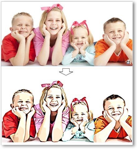
But some “simplification” isn’t so simple. Look at the different between this photograph and its cartoon version.

McCloud’s scale actually combines two kinds simplification. Each step to the right of his spectrum appears simpler because: 1) the image contains fewer lines, and 2) the lines are in themselves less varied. A line becomes smoother by averaging its peaks and lows into a median curve, and so the second kind of simplification is a form of exaggeration. Since exaggeration can extend beyond averaging McCloud’s spectrum actually requires two kinds of abstraction. Each face is altered both in density and in contour quality. Density describes the number of lines; contour quality describes the magnification and compression of line shapes. Abstraction in density reduces the number of lines; abstraction in contour quality warps the line shapes. The less density reduction and the less contour warpage, the more realistic an image appears.
I like McCloud’s five-point scale though, so I’ll offer two of my own.
The Density Scale:
Opacity: The amount of detail is the same or similar to the amount available in photography.
Semi-Translucency: The amount of detail falls below photorealism, while the image still suggests photorealistic subject matter.
Translucency: While reduced well beyond the range of photography, the amount of detail evokes photorealistic subject matter as its source material. This is the standard level of density in superhero comics art.
Semi-Transparency: The sparsity of detail is a dominating quality of the image, and subject matter can evoke only distantly photographic source material. Semi-Transparency is more common in caricature and cartooning.
Transparency: The minimum amount of detail required for an image to be understood as representing real-world subject matter.
The Contour Scale:
Duplication: Line shapes are unaltered for an overall photographic effect. Though naturalistic, reality-duplicating line shapes exceed the norms of superhero art by reproducing too much information.
Generalization: Line shapes are magnified and/or compressed to medians for an overall flattening effect that conforms to naturalistic expectations. Generalization is the standard level of abstraction for objects in superhero art.
Idealization: Some line shapes are magnified and/or compressed to medians while others are magnified and/or compressed beyond their medians for an overall idealizing effect that challenges but does not break naturalism. Idealization is the standard level of abstraction for superhero characters.
Intensification: Line shapes are magnified and/or compressed beyond their medians for an overall exaggerating effect that exceeds naturalistic expectations. If the intensification is explained diegetically, the line shapes are understood to be literal representations of fantastical subject matter within a naturalistic context. If the intensification is not explained diegetically, then the line shapes are understood as stylistic qualities of the image but not literal qualities of the subject matter. Explained or Diegetic Intensification is common for fantastical subject matter in superhero art; unexplained or Non-diegetic Intensification occurs selectively.
Hyperbole: Line shapes are magnified and/or compressed well beyond medians for an overall cartooning effect that rejects naturalism entirely. Hyperbole is uncommon in superhero art because the stylistic qualities of the image dominate and so prevent a literal understanding of the subject matter. Hyperboles in a naturalistic context are understood metaphorically.
The two scales can also be combined into a Density-Contour Grid:
1-5
2-5
3-5
4-5
5-5
1-4
2-4
3-4
4-4
5-4
1-3
2-3
3-3
4-3
5-3
1-2
2-2
3-2
4-2
5-2
1-1
2-1
3-1
4-1
5-1
Both scales take photorealism as the norm that defines variations.
McCloud’s photographed face is the most realistic because it combines Opacity and Duplication, 1-1 on the grid, demonstrating the highest levels of density and unaltered contour. It’s opposite is not McCloud’s fifth, “cartoon” face, which combines Transparency with Idealization, 5-3; its level of density reduction is the highest and so the least realistic possible, but its contour warpage is moderate and so comparatively realistic. Replace the oval with a circle to form a traditional smiley face, the contour quality would rise to Hyperbole, 5-5, the most abstract and so the least realistic position on the grid.
Cartooning covers a range of grid points, but most cartoons fall between 4-4 and 5-5, both high density reduction and high contour warpage. Charles Shultz’s circle-headed and minimally detailed Charlie Brown is a 5-5.

The characters of Archie Comics are some of the most “realistic” of traditional cartoons at 4-4.

McCloud’s middle, “adventure comics” face combines Translucency and Idealization, 3-3, the center point of the grid and the defining norm of superhero comic art.
Like all grid points, 3-3 allows for a variety of stylistic variation between artists, within a single artist’s work, and even within a single image, but it does provide a starting point for visual analysis by defining areas of basic similarity.


January 11, 2016
What It Really Takes to Get from Here to There (Analyzing Comics 101: Closure)
Reading a comic book is easy–even when there are no words to be read. You just look at a picture, and then at the next picture, and so on. But why do any of the pictures make sense side-by-side? What is your brain doing as it leaps from image to image?
In Understanding Comics, Scott McCloud defines the Gestalt psychology principle of “closure” as the “phenomenon of observing the parts but perceiving the whole” (though it more specifically indicates a viewer filling in visual gaps between disconnected parts) and applies it to comics gutters: “Nothing is seen between panels, but experience tells you something must be there!” He goes on to explain: “Comics panels fracture both time and space, offering a jagged, staccato rhythm of unconnected moments. But closure allows us to connect these moments and mentally construct a continuous, unified reality.”
McCloud focuses his analysis on gutters and therefore types of transitions possible between panels (though closure is independent of panels and gutters, since insets and interpenetrating images work the same ways). He comes up with six types:
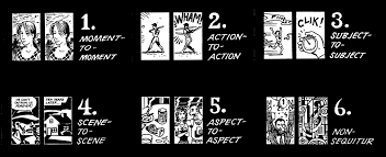
They work reasonably well, but his focus on panel transition has always struck me as slightly off. When I use it in class, students often don’t come to a clear consensus when analyzing any particular panel sequence. Moment-to-moment and action-and-action, for instance, are often ambiguous, sometimes combining identical leaps in time. And since actions do occur in McCloud’s moment-to-moment examples (a women blinks!), it’s not exactly clear what constitutes an “action.” Aspect-to-aspect can also be indistinguishable from subject-to-subject, both of which may or may not involve a movement in time, and so may or may not also be moment-to-moment or even action-to-action. And scene-to-scene might be a location leap and so also a kind of aspect-to-aspect at the big picture level, or a scene-to-scene can be in the same location but at a different time–so then how much time has to pass for an old scene to become a new scene?
These are annoying questions, but they really do come up when you try to breakdown a panel sequence with a roomful of students. So instead of categorizing transitions, my colleague Nathaniel Goldberg and I categorized types of closure while drafting our essay “Caped Communicators: Conversational Depiction and Superhero Comics.” Instead one all-purpose “perceiving the whole” process, we see four very different kinds of closure, each of which can occur by itself or in combinations.
Spatial: Subject matter drawn in separate images is depicted as existing in physical relationship to each other, typically as a result of panel framing. (What McCloud identifies as aspect-to-aspect, subject-to-subject, and some scene-to-scene transitions require spatial closure.)
Temporal: Undrawn events are depicted to take place outside of events drawn in separate images, typically as a result of panel transitions and so occurring as if in gutters. (What McCloud identifies as moment-to-moment, action-to-action, and some subject-to-subject and scene-to-scene transitions require temporal closure.)
Causal: Drawn action is understood to have been caused by an element absent from a current image but drawn in a preceding image. (None of McCloud’s transitions, not even action-to-action, accounts for this type of closure.)
Associative: A metaphorical relationship is depicted between two images in which one image is understood to represent some idea about the other image. (Though McCloud does not identify this type of closure, Jessica Abel and Matt Madden in Drawing Words Writing Pictures add “symbolic” to McCloud’s list of transition types. Such symbolic transitions require associative closure.)
It always helps to look at specific examples, so consider this three-panel sequence at the top of page 28 in Watchmen #8:

In the first image, artist Dave Gibbons draws the shadow of a statuette cast over the face of a frightened man kneeling on the floor. The second image shows the statuette in the fist of an attacker. Taken together, spatial closure is required to understand that the two images occur within a few feet of each other, with each image drawn from one of the two men’s points of view; this is true even though the white background emphasizes the attacker’s action but eliminates all other setting information. The second image also requires temporal closure because the statuette is behind the attacker’s head at an angle that would not cast the shadow seen on the victim’s face in the first image. Gibbons therefore also depicts a movement forward in time during which the attacker has cocked his arm back to strike.
The third image depicts a jack-o-lantern crashing to the floor with some falling books. It uses all four forms of closure. The pumpkin exists in the same space as the two now undrawn men (spatial closure). The pumpkin is crushed at a moment immediately following the second image (temporal closure). The falling books have been knocked down by the now undrawn victim striking the shelf behind him (causal). And, because it resembles a human head and breaks open in the panel where a reader anticipates the statuette striking the man’s head, Gibbons implies that the man’s head has been similarly damaged (associative). Alternatively, the pumpkin, as shown in the first panel, is already falling, because the leg of another attacker has knocked the shelf off balance. If so, then the pumpkin and the head of the victim are smashed at the same moment, with no causal closure but associative only.
So our closure types are deeply indebted to McCloud, but I think they also improve on his. I’ll be testing these out in my classroom soon, so hopefully my students will agree. More on that later.


January 4, 2016
The Enjambing Dead (Analyzing Comics 101: Visual Sentences vs. Page Layout)
Having taught my spring term seminar Superheroes a half dozen times now, I’m converting it to one of the gateway courses for Washington and Lee students entering the English major. The overhaul means jettisoning the pre-history of the genre (I love that stuff, but I could just hand my students On the Origin of Superheroes and be done with it) and focusing much more on comics as an art medium. So I’m trying to boil down the basics, the must-know criteria for analyzing a comic book.
So now it’s time invite Neil Cohn to the lectern. If you haven’t read his The Visual Language of Comics, please do. Meanwhile, here’s my boiling down of his visual language grammar.
Narrative panel types: images may be categorized according to the kinds of narrative information they contain and how that information creates a visual sentence when read in sequence:
Orienter: introduces context for a later interaction (no tension).
Establisher: introduces elements that later interact (no tension).
Initial: begins the interactive tension.
Prolongation: continues the interactive tension.
Peak: high point of interactive tension.
Release: aftermath of interactive tension.
Cohn only looks at comic strips, which typically express a single sentence in a linear arrangement of three or four panels, but longer graphic narratives can express multiple sentences on a single page or extend a single visual sentence over multiple pages. To analyze the different ways that can work, I’m adding some terminology to Cohn’s.
Closed sentences: two sentences that begin and end without sharing panels.
Overlapping sentences: sentences that share panels.
Interrupted sentence: an overlapping sentence that does not complete or initiate its tension before another sentence replaces it; sentences might share an Orienter, or an Establisher may introduce two elements that do not interact until later as a form foreshadowing.
Dual-function panel: in overlapping sentences, one panel performs two narrative functions. A panel may, for example, serve as the Release of one sentence and also the Orienter, Establisher, or Initial of the next. Or an Orienter may serve as the Establisher of an interrupted sentence that initializes tension later.
Sentence Layout: the relationship of visual sentences to pages.
Page sentence: a sentence that begins with the page’s first panel and ends with the page’s final panel.
Multi–page sentence: a sentence that extends beyond one page.
End stop: a page and a visual sentence end simultaneously.
Enjambed: a page ends before the visual sentence ends, also called a visual cliff-hanger.
This is all awfully abstract, so let me give specific examples from The Walking Dead again.
Robert Kirkman and Tony Moore like enjambment. Their first issue includes several cliff-hangers. The bottom row of page five begins with an Establisher (introducing the door to the already established figure of Rick), is followed by an Initial panel (Rick removes the piece of wood holding the door closed), and ends with a Peak (Rick is opening the door).

But the Release only appears after turning to page six. That full-page panel is also a dual-function panel because it serves as the Establisher (introducing the zombies to the already established Rick) for the next, overlapping sentence.

The turn from page nine to ten is similar. The first panel in the bottom row of page nine is an Establisher (Rick and the bicycle), followed by the page-ending Peak of Rick’s shocked reaction. The top of page ten provides the Release (we finally see what he sees).

A similar grammatical pattern repeats on pages thirteen and fourteen. The first panel in the bottom row of thirteen is an Orienter. The second is an Establisher (Rick’s face seems to be reacting to something, a sound presumably), and the last panel is an Initial. Turn the page, and there’s the Peak.

The visual grammar also shows that cliff-hangers only work on the final panel of a two-page spread, in order to prevent a reader’s eye from skimming to the critical image prematurely (which happens in my arrangements above).
Also, Moore and Kirkman don’t always enjamb their visual sentences. Page one, for instance, ends on a Peak. The page also begins with an Initial, followed by four Prolongation panels. Page one is a complete page sentence, both beginning and ending on a single page.
Instead of a Release, the next page begins with an Orienter (Rick in his hospital room) for the next visual sentence, which does not overlap.
In terms of interrupted sentences, page ten begins a new visual sentence with the top Establisher (introducing the bicycle zombie to the already established Rick), followed by two Initials (Rick and the zombie interact) in the second. The bottom row begins with two Prolongations, followed by a Peak (Rick’s tear) and a Release (the zombie closes its mouth).
The visual sentence appears to have ended when the next page begins a new sentence with no further interaction between Rick and the zombie. So page ten reads as a complete page sentence, until the bottom of page twenty-three continues the interaction with a Prolongation panel, retroactively showing that the visual sentence was interrupted.

Page twenty-four provides a new Peak (Rick shoots the zombie), followed by two Release panels (Rick looking down, the zombie with a bullet hole in its forehead).

Rick’s tear is also a Prolongation of his tear on page ten, an additional overlapping sentence that reaches its Peak in the next panel when Rick wipes the tear away. The final three panels are Releases. They’re also their own overlapping, three-panel sentence: Initial (Rick and the car), Peak (Rick gets into the car), and Release (car has driven off). The page and the issue conclude with an end stop.
And, concluding this post, my apologies to the world of poetry for driving off with your terms “end stop” and “enjambment.” Until now they only meant “a poetic device in which a pause comes at the end of a syntactic unit” and ” the continuation of a sentence without a pause beyond the end of a line.”


Chris Gavaler's Blog

- Chris Gavaler's profile
- 3 followers

