
Jayson’s Reviews > Harleen > Status Update

Jayson
is starting
Notes:
(1) This is essentially a European-style comic album. Not merely in spirit and execution, but dimensionally as well.
- It's strange for a Western publisher to use European paper sizes when they don't have to. Though, I guess, if you're going to emulate the format, you may as well have it look the part.
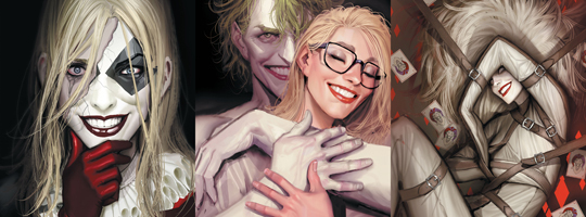
(2) I'm not often a fan of digital art, but this looks fantastic.
— Nov 21, 2021 04:30AM
Notes:
(1) This is essentially a European-style comic album. Not merely in spirit and execution, but dimensionally as well.
- It's strange for a Western publisher to use European paper sizes when they don't have to. Though, I guess, if you're going to emulate the format, you may as well have it look the part.
(2) I'm not often a fan of digital art, but this looks fantastic.

54 likes · Like flag
Jayson’s Previous Updates
Jayson
is on page 186 of 200
Book Three:
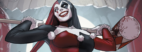
(1) As much as I enjoy top-quality art featuring Batman and his top rogues, this book really shines best when it focuses on just Harley, and keeps the typical Batman elements at arm's length.
(2) We get the obligatory breakout that's part of every Harley origin. Expertly executed, but nothing new.
- Really, only the second issue was wholly original to this book.
— Nov 22, 2021 09:25AM
Book Three:
(1) As much as I enjoy top-quality art featuring Batman and his top rogues, this book really shines best when it focuses on just Harley, and keeps the typical Batman elements at arm's length.
(2) We get the obligatory breakout that's part of every Harley origin. Expertly executed, but nothing new.
- Really, only the second issue was wholly original to this book.
Jayson
is on page 125 of 200
Book Two:
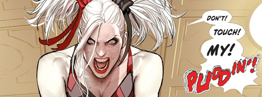
(1) Yup... this is a romance novel. There's little doubt about that.
(2) This was an improvement over the first issue. Whereas I thought that one was a somewhat padded-out spin on the standard Harley origin, this issue was both intriguing and compelling as an original story.
(3) I like how this hints at a future Poison Ivy relationship, but isn't winking too hard.
— Nov 22, 2021 05:10AM
Book Two:
(1) Yup... this is a romance novel. There's little doubt about that.
(2) This was an improvement over the first issue. Whereas I thought that one was a somewhat padded-out spin on the standard Harley origin, this issue was both intriguing and compelling as an original story.
(3) I like how this hints at a future Poison Ivy relationship, but isn't winking too hard.
Jayson
is on page 64 of 200
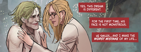
Book One:
(1) I'm quite impressed by the quality of writing here. Specifically, the lucidity of the prose. The story itself is neither anything special nor anything that hasn't been retold many times previously.
(2) The narration reads just like a romance novel. Nothing wrong with that, just an observation.
(3) The art's a treat, but the plot's a lot of fat to chew through.
— Nov 21, 2021 09:30AM
Book One:
(1) I'm quite impressed by the quality of writing here. Specifically, the lucidity of the prose. The story itself is neither anything special nor anything that hasn't been retold many times previously.
(2) The narration reads just like a romance novel. Nothing wrong with that, just an observation.
(3) The art's a treat, but the plot's a lot of fat to chew through.
Comments Showing 1-14 of 14 (14 new)
date newest »
message 1:
by
Andrew✌️
(new)
-
rated it 5 stars
Nov 21, 2021 04:34AM
 I read this one last year and I liked. The story is intriguing and the illustrations are fantastic!
reply
|
flag
Andrew wrote: "I read this one last year and I liked. The story is intriguing and the illustrations are fantastic!"Glad to hear you like it so much. I've been hearing a lot of similar praise about this book. I would have read it last year along with seemingly everyone else, but it didn't quite make it to the top of my very long TBR :)
 Wow, the art is really amazing! I'm looking forward to hear your thoughts about this. =)
Virginia Ronan wrote: "Wow, the art is really amazing! I'm looking forward to hear your thoughts about this. =)"
Wow, the art is really amazing! I'm looking forward to hear your thoughts about this. =)
Virginia Ronan wrote: "Wow, the art is really amazing! I'm looking forward to hear your thoughts about this. =)"Thanks! I've been looking forward to this for a while, primarily because of the art. Granted, interior art isn't as heavily rendered as the covers I posted, but it's still very impressive.
I think digital painting's only going to become better and more prevalent as technology advances. I don't think art like this could have existed a decade age, certainly not at this pace of production.
Mizuki wrote: "The art looks so stylist!!!"I agree! The best advertisement for this book is to just show the art :)
 Jayson wrote: "Mizuki wrote: "The art looks so stylist!!!"
I agree! The best advertisement for this book is to just show the art :)"
Okay, so the stories aren't all that great isn't it? XD
Mizuki wrote: "Okay, so the stories aren't all that great isn't it? XD"I have no idea about the stories. I just mean that, especially for an author without a firm track record, the art is sufficient on its own to draw interest to the project.
 Love the art but wasn't a huge fan of some aspect in the story.
Mastersheep wrote: "Love the art but wasn't a huge fan of some aspect in the story."
Love the art but wasn't a huge fan of some aspect in the story.
Mastersheep wrote: "Love the art but wasn't a huge fan of some aspect in the story."I sort of feel the same way. My main issue with the story is that it doesn't need to be nearly as long. Though, if there's going to be padding, it may as well look as nice as this. Looking good really mitigates how much of a drag it feels.
 The Black Label books’ dimensions fit perfectly on a tablet screen. Not a coincidence, methinks.
Paul wrote: "The Black Label books’ dimensions fit perfectly on a tablet screen. Not a coincidence, methinks."
The Black Label books’ dimensions fit perfectly on a tablet screen. Not a coincidence, methinks.
Paul wrote: "The Black Label books’ dimensions fit perfectly on a tablet screen. Not a coincidence, methinks."Ah, I never thought of that. Perhaps you're right that it's no coincidence. Though, I don't know whether there's a tablet big enough where you wouldn't still have to do some zooming to read the text, in which case being able to fit a tablet screen perfectly wouldn't really matter since no one's spending all that much time entirely zoomed out anyway. Still, entirely possible. 🤷♂️
 Jay...hope this is a great one for you. Happy reading!
Fran wrote: "Jay...hope this is a great one for you. Happy reading!"
Jay...hope this is a great one for you. Happy reading!
Fran wrote: "Jay...hope this is a great one for you. Happy reading!"Thank you very much, Fran 😁👍
